Hadfield Group: Visual Identity for FinTech POS

Amirul Hakim


Hadfield Group Hero
Section 2
The Problem
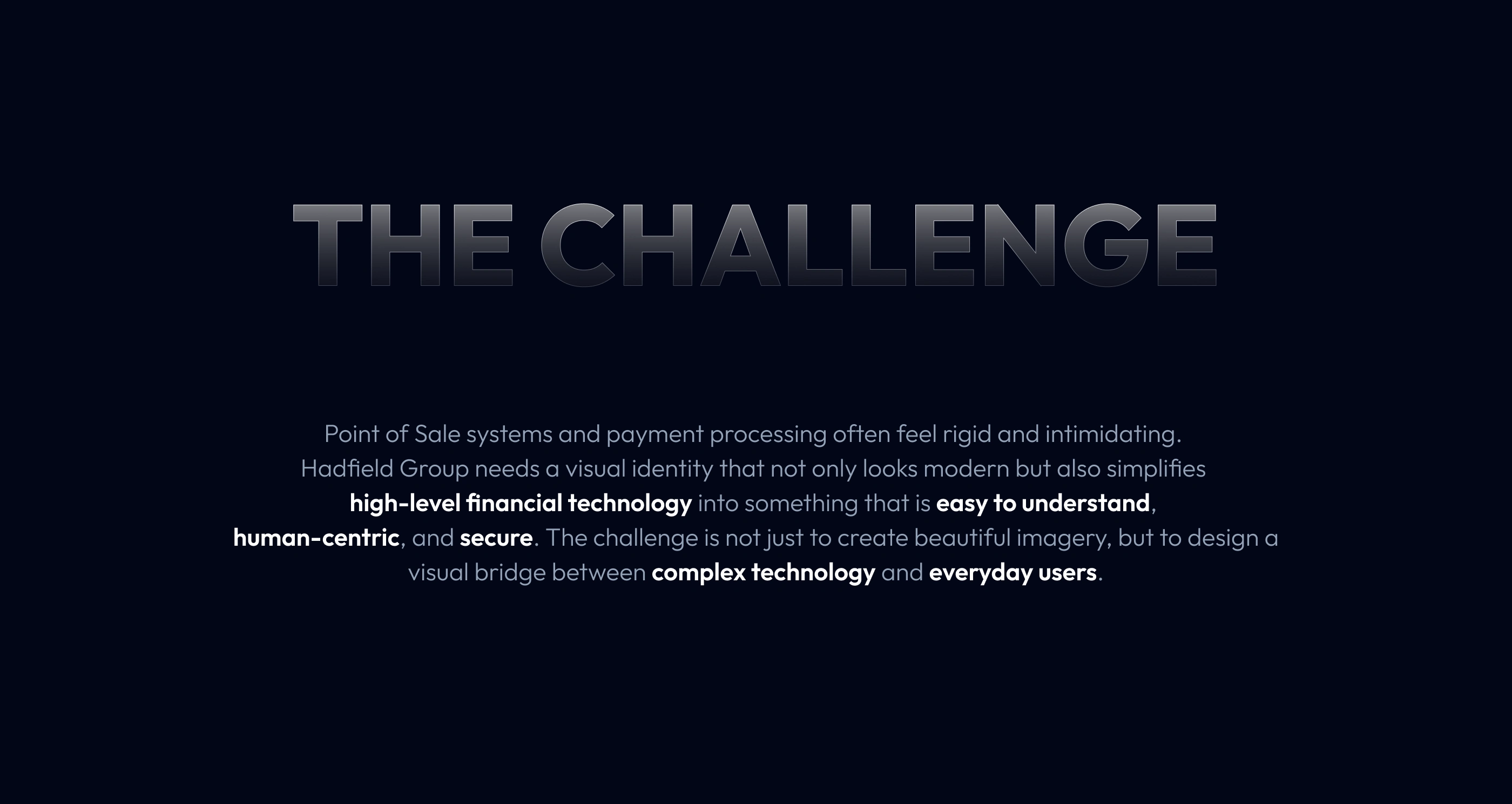
Hadfield Group builds POS systems, payment processing, and software for restaurants, retail stores, and small businesses. Their platform is deeply complex: dozens of integrated features spanning credit card processing, payroll, scheduling, online ordering, compliance, and more.
Explaining all of that in text alone is a losing battle. Users (business owners, tax consultants, finance managers) don't always know the industry terminology. They need to see what a feature does before they read about it.
Hadfield Group needed a visual identity system that could translate complex FinTech concepts into something immediately understandable, across their entire product and marketing ecosystem.
Section 3
Section 4
The Process
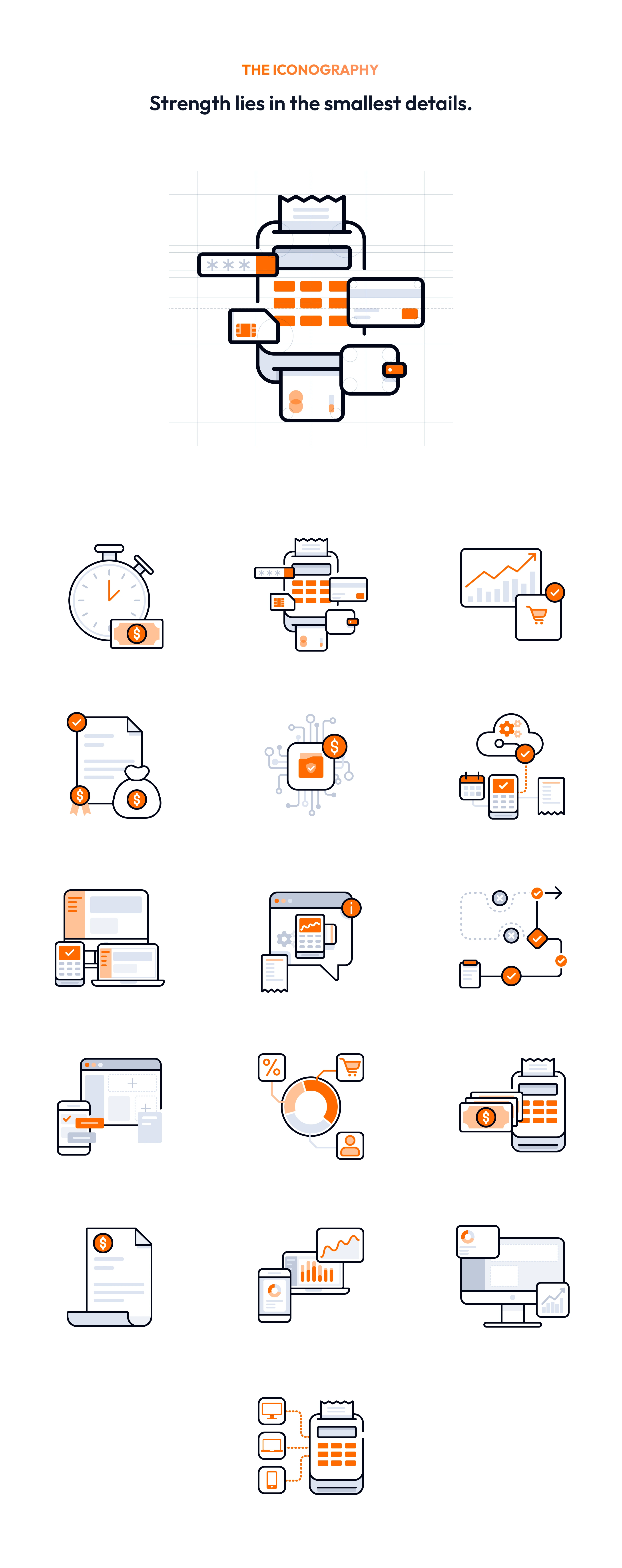
Step 1: Learn every feature. Before sketching anything, I studied the function of every feature in the Hadfield Group platform. You can't illustrate what you don't understand.
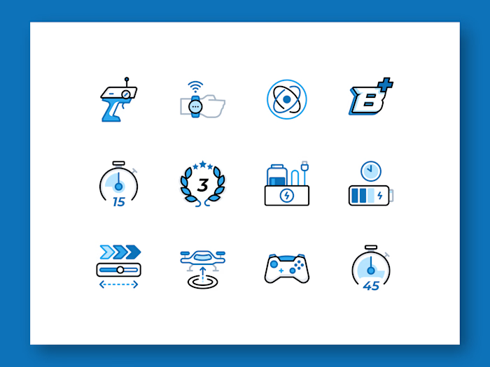
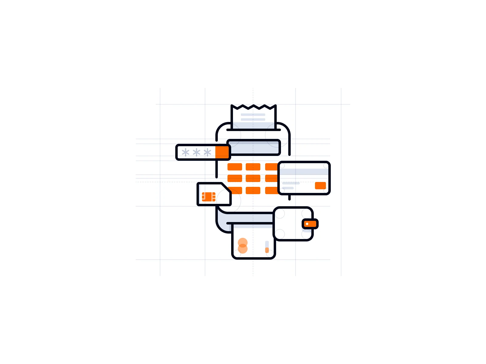
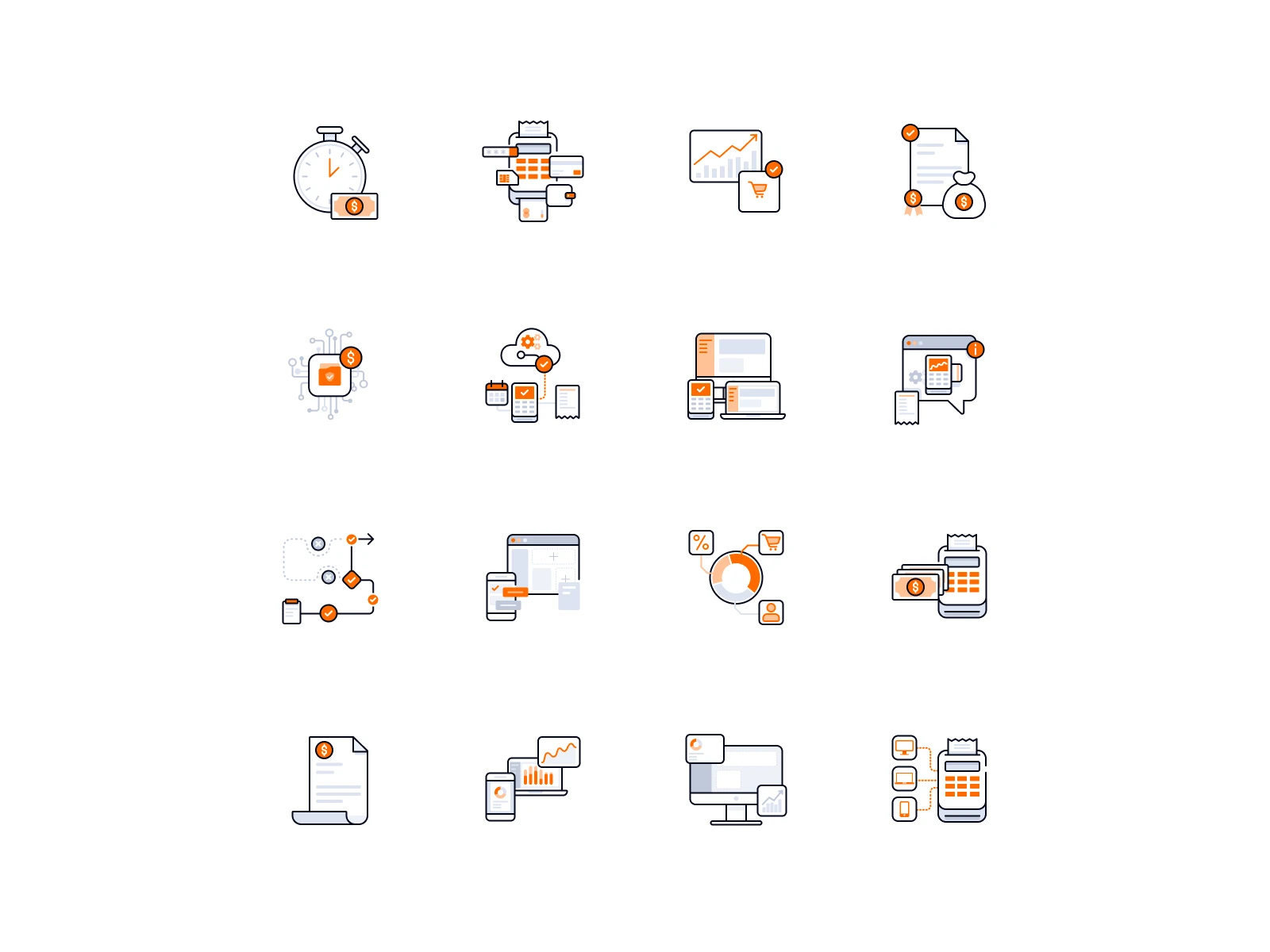
Step 2: Visual sketching and reference. I sketched visual concepts using universally recognizable objects: calculators, receipts, laptops, EDC machines, debit cards, cash, wallets. The goal was to find the most commonly understood visual shorthand for each feature, so users could grasp meaning in under a second.
Step 3: Design and animate. I built each icon on a custom grid to enforce consistent sizing and stroke weight across the family. Colors were set according to the Hadfield Group brand guidelines. Once the static icons were finalized, I created animations for each one.
Section 5
Section 8
Section 9
The Key Design Decision
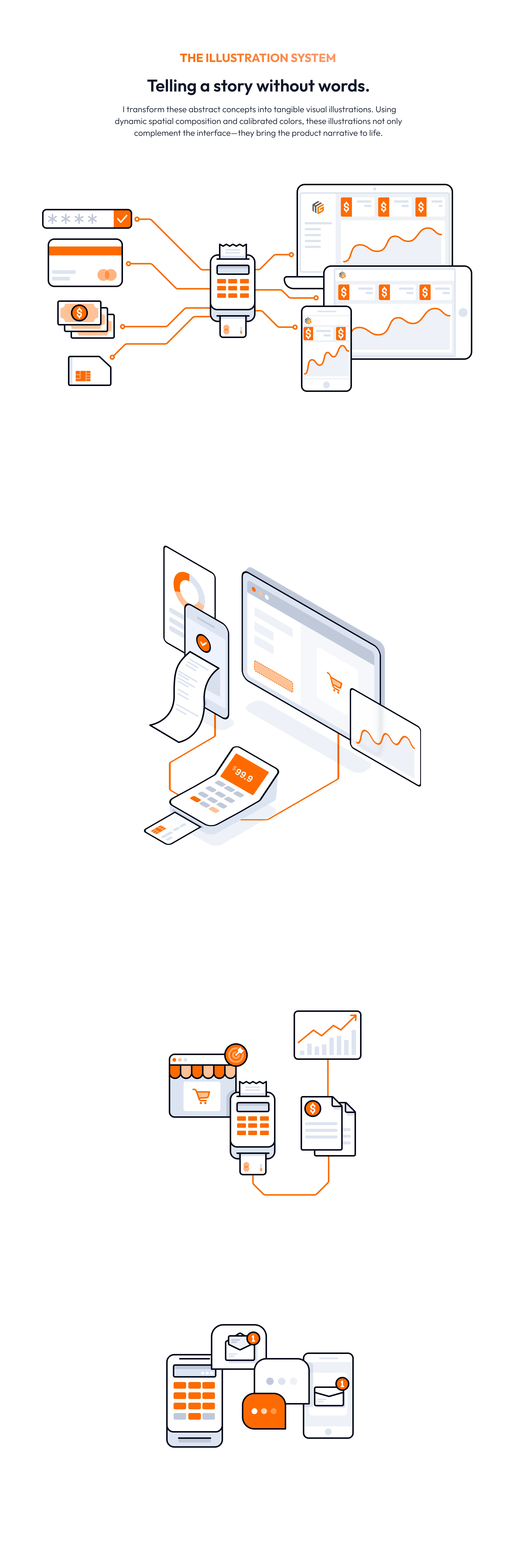
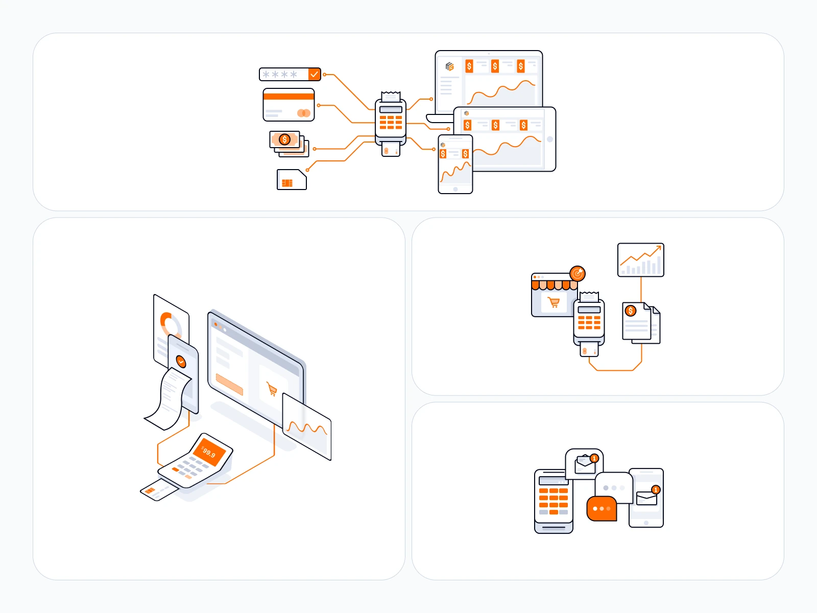
While studying the Hadfield Group brand, I noticed their logo uses an isometric perspective. That became the creative anchor for the entire project.
I designed the hero illustrations using the same isometric technique. This wasn't just about matching the brand visually. Isometric illustration has a practical advantage: its semi-3D viewpoint makes complex scenes easier to parse. You can show multiple elements (a POS terminal, a receipt printer, a card reader, a dashboard) in a single composition without it feeling cluttered.
The result: hero visuals that feel native to the Hadfield Group brand while making their most complex product stories digestible at a glance.
Section 11
The Outcome
The illustrations and animated icons are live across the Hadfield Group website, including their HG Academy education hub where the visuals support articles on PCI compliance, POS systems, payment processing, and small business operations.
The isometric hero illustrations and icon animations successfully bridge the gap between Hadfield Group's technical complexity and their audience's need for clarity. Business owners, finance managers, and consultants can now scan a feature and understand its purpose visually, before reading a single line of text.
Like this project
Posted Jun 17, 2026
Created isometric illustrations and an animated icon system for Hadfield Group’s POS platform, turning payment, compliance, and operations features into clear visual explanations used across its website and HG Academy.
Likes
3
Views
24
Clients
Hadfield Group