Bröne · Brand Identity for Senercom

Fernando Moux


Context
Senercom has spent years delivering electrical and energy projects in the Magallanes Region, in Chilean Patagonia. Along the way they saw a clear opportunity: a brand that could connect with the end customer in a more direct and modern way.
The brand
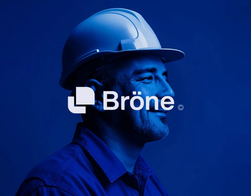
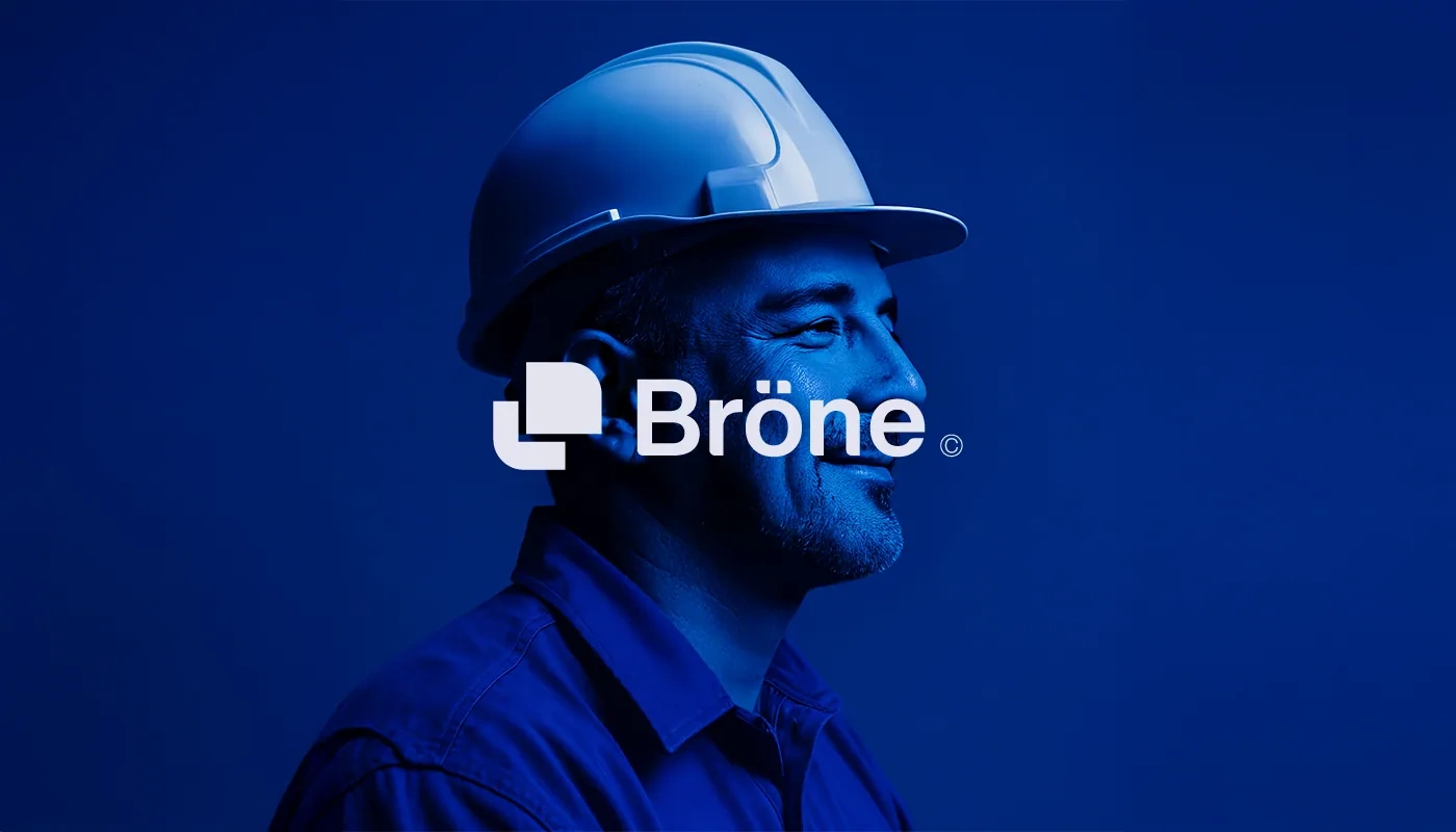
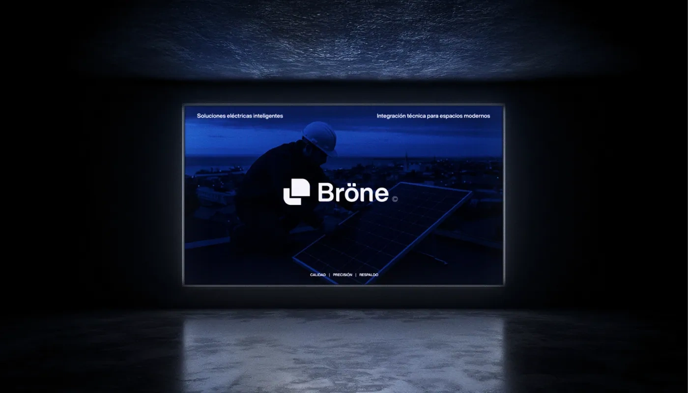
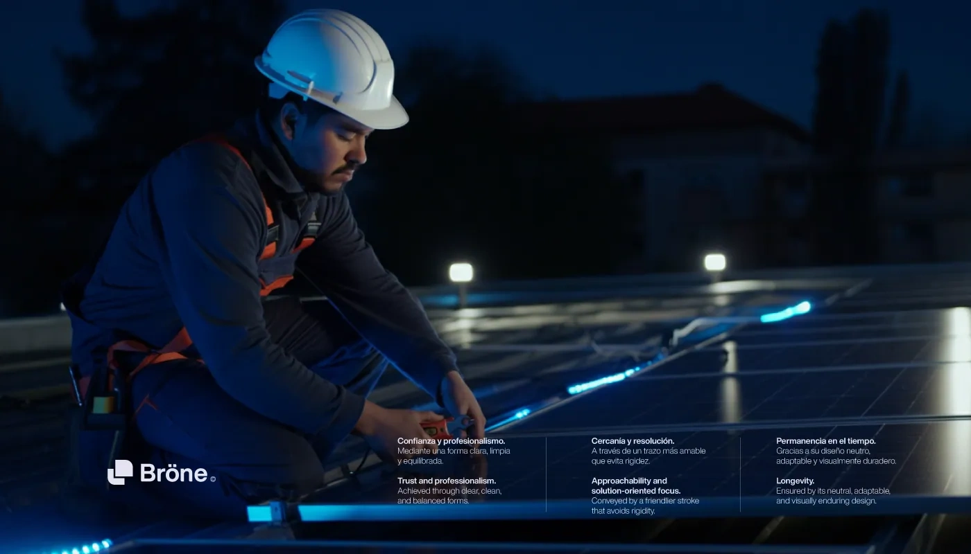
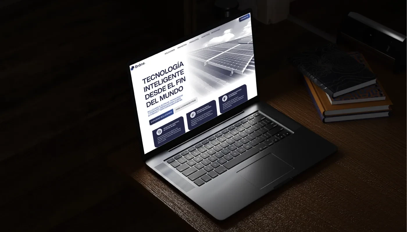
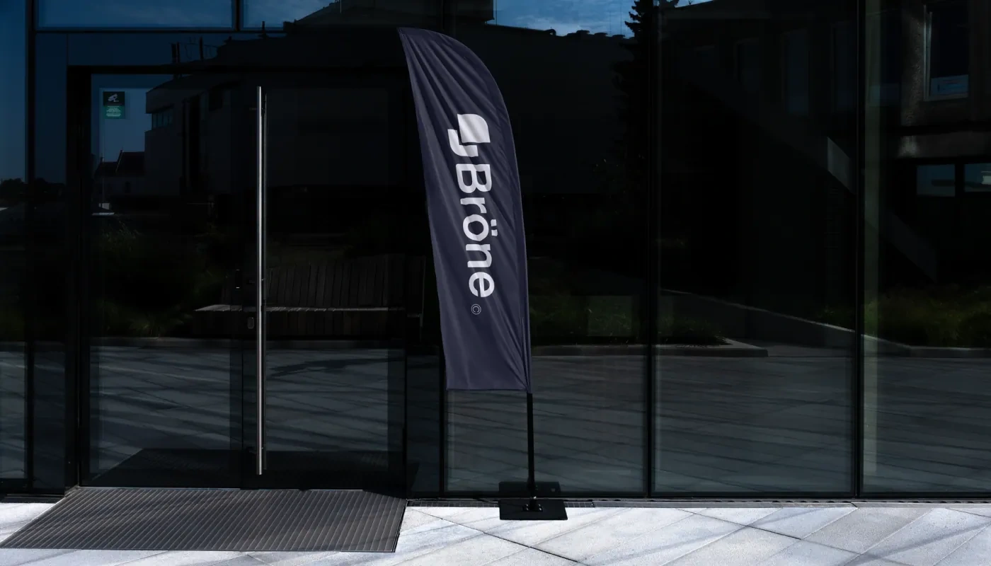
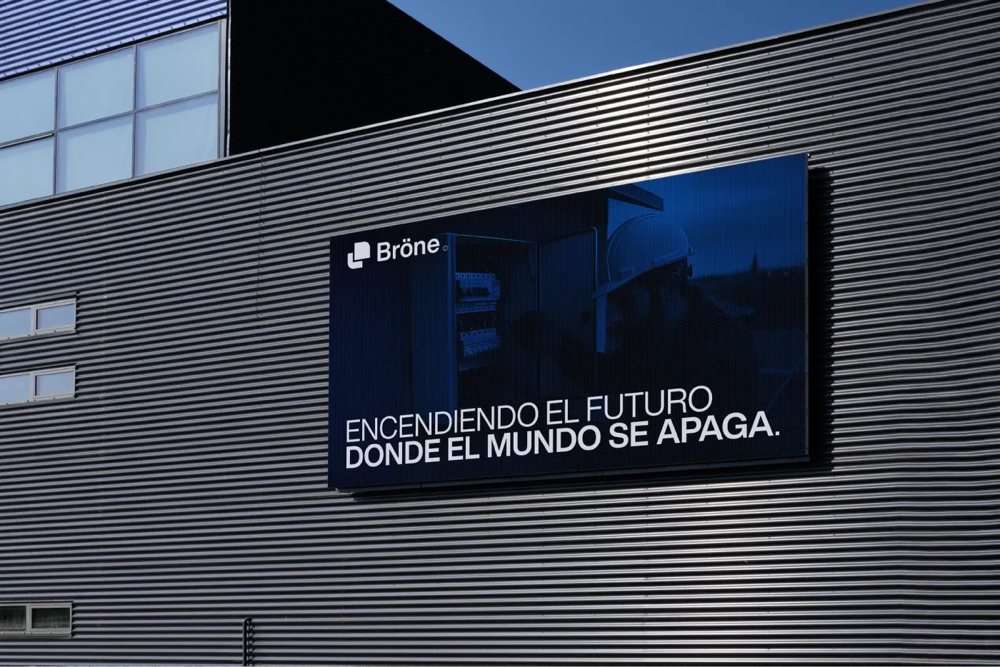
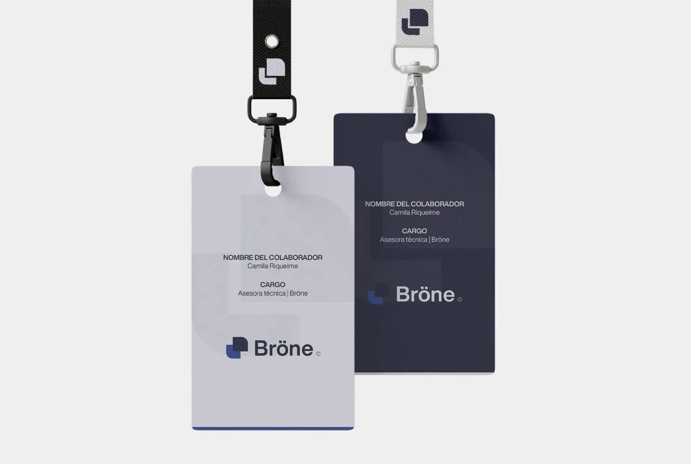
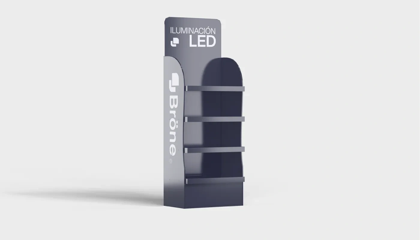
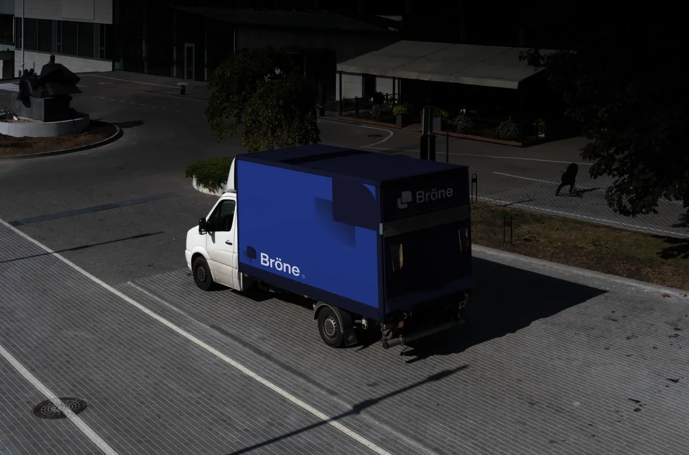
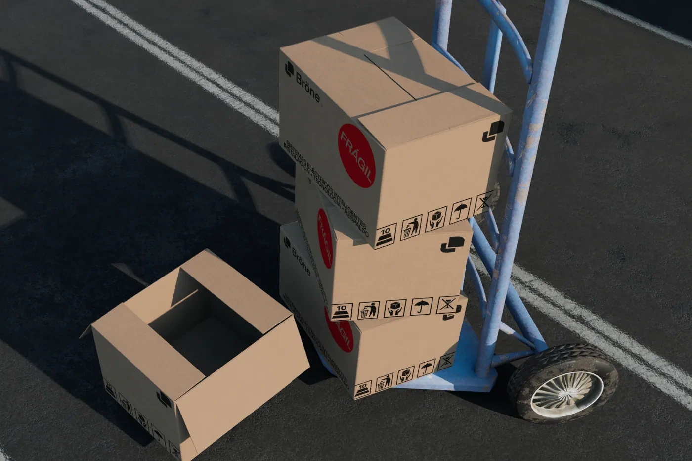
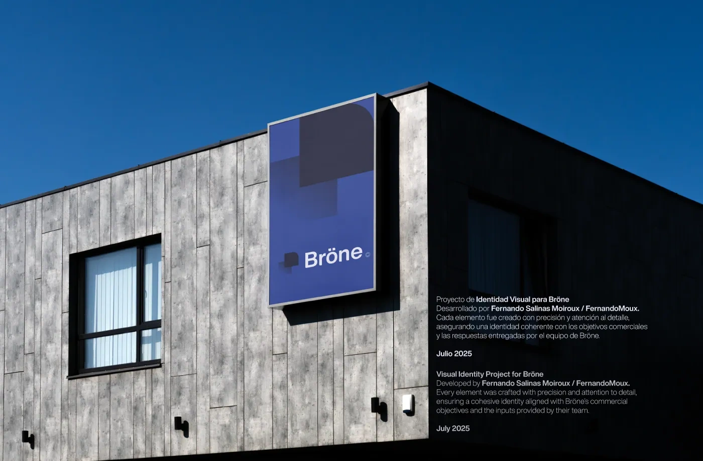
Bröne was born as Senercom's commercial brand. It doesn't replace the company, it complements it. Senercom stays focused on engineering, technical execution and industrial solutions. Bröne offers high-performance electrical products, personal advice and a refined look. The goal was to carry Senercom's technical know-how and the trust it had built into a service that feels faster and closer.
The symbol
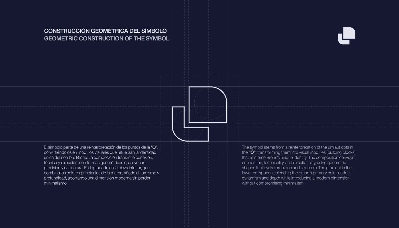
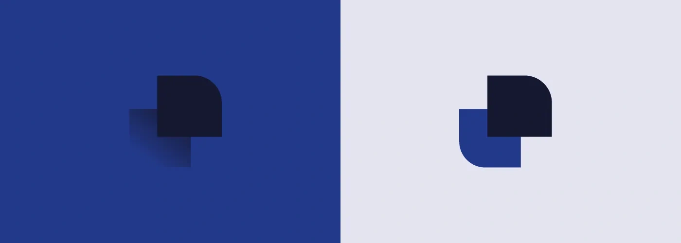
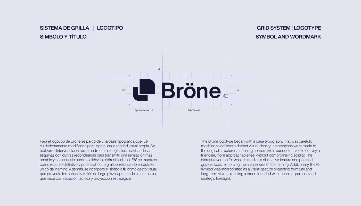
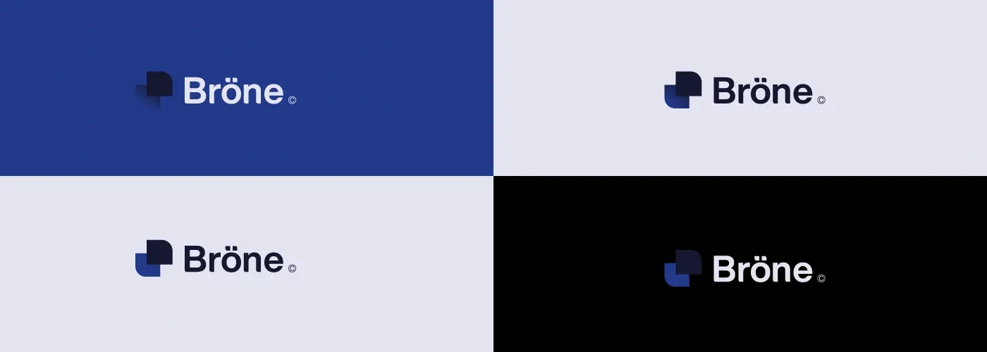
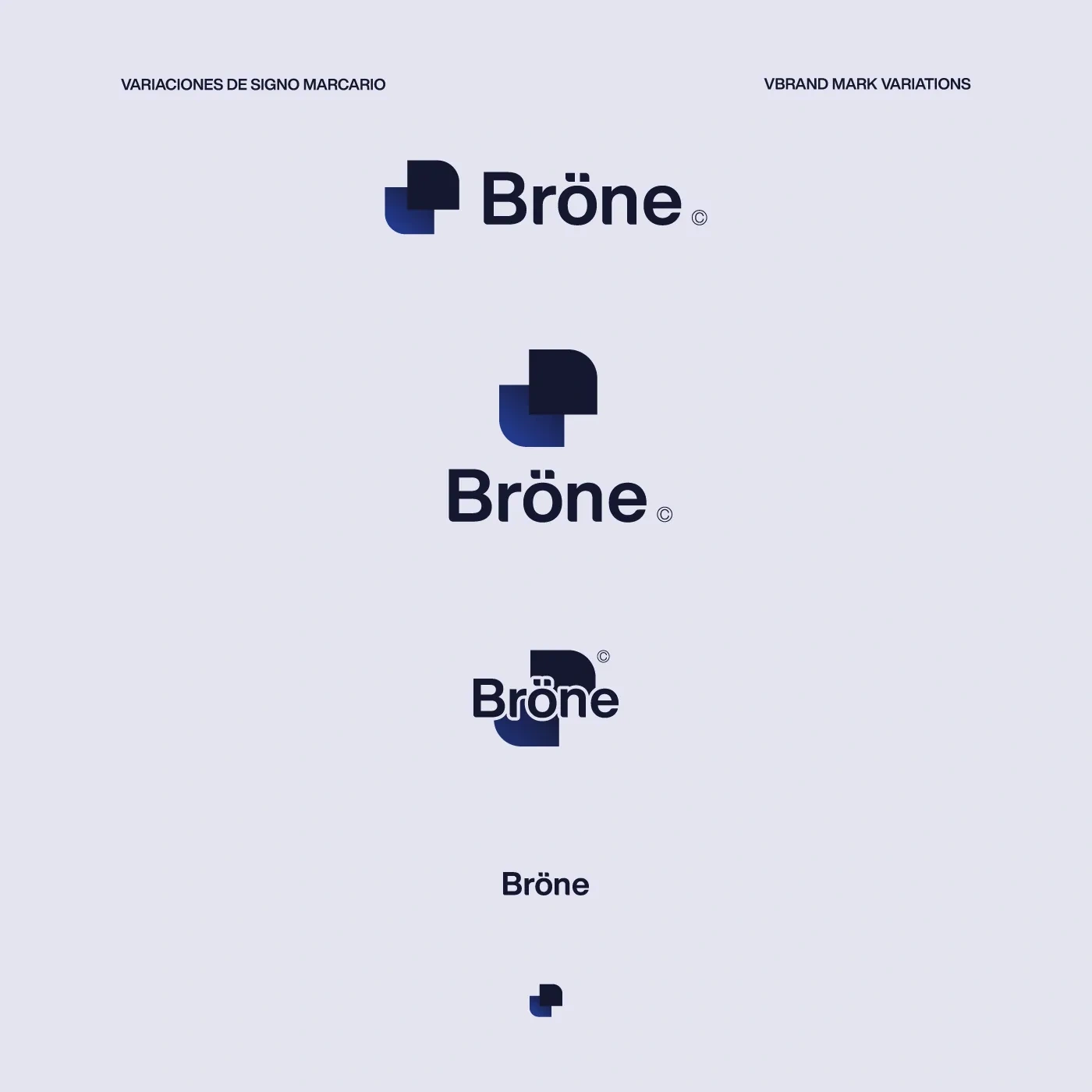
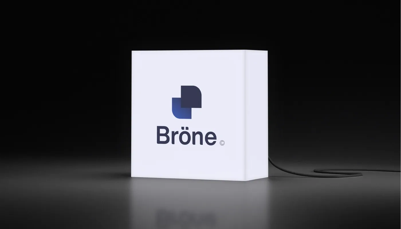
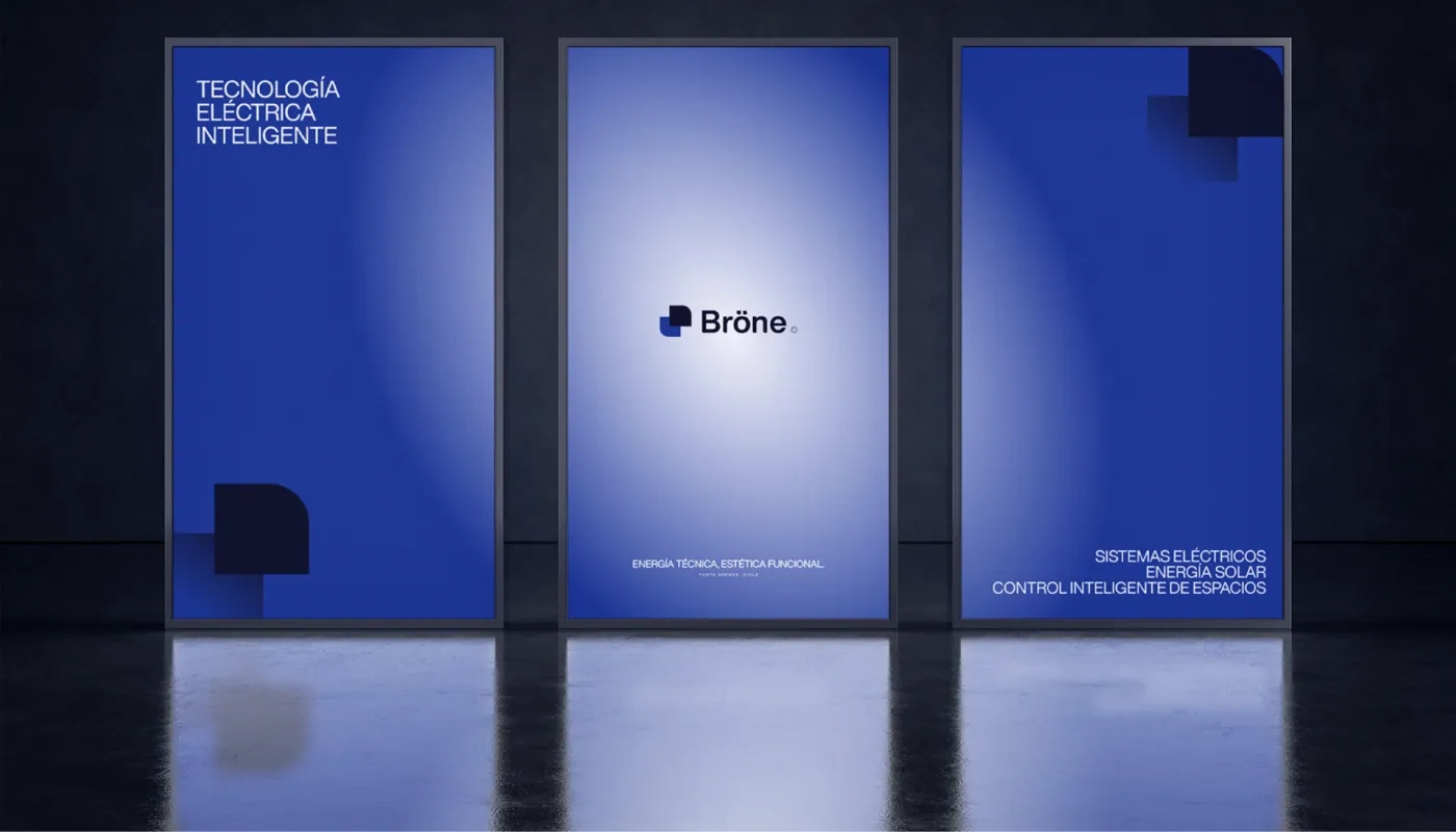
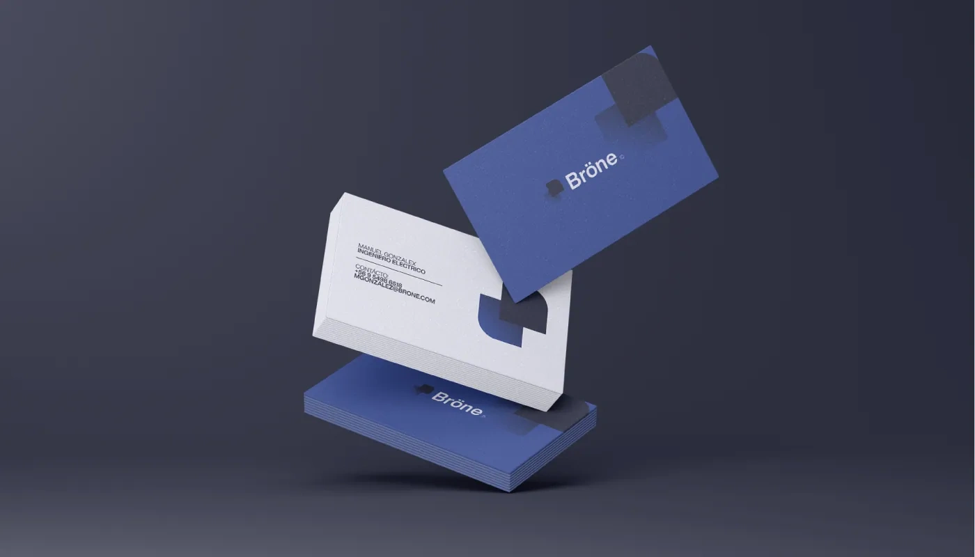
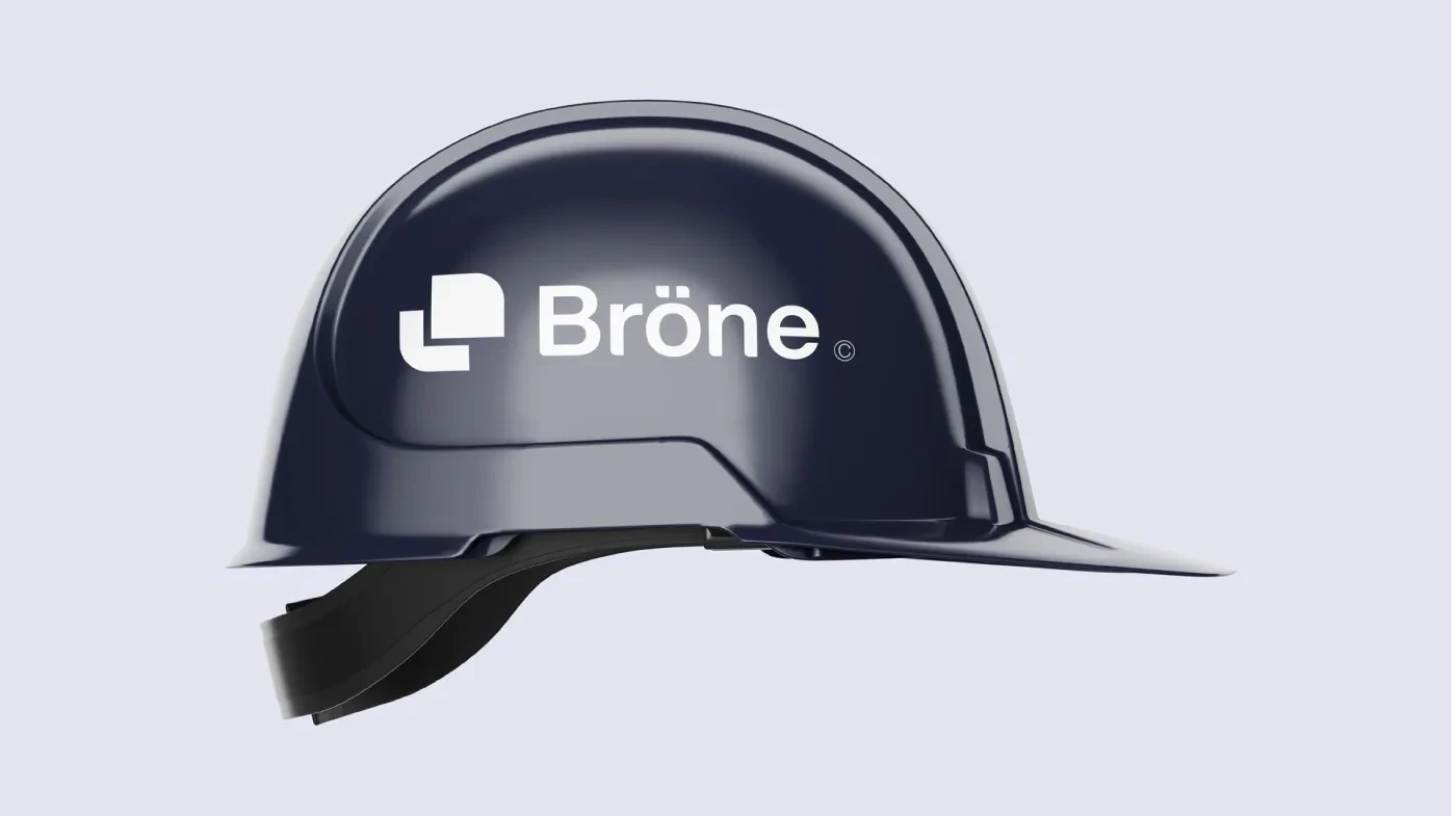
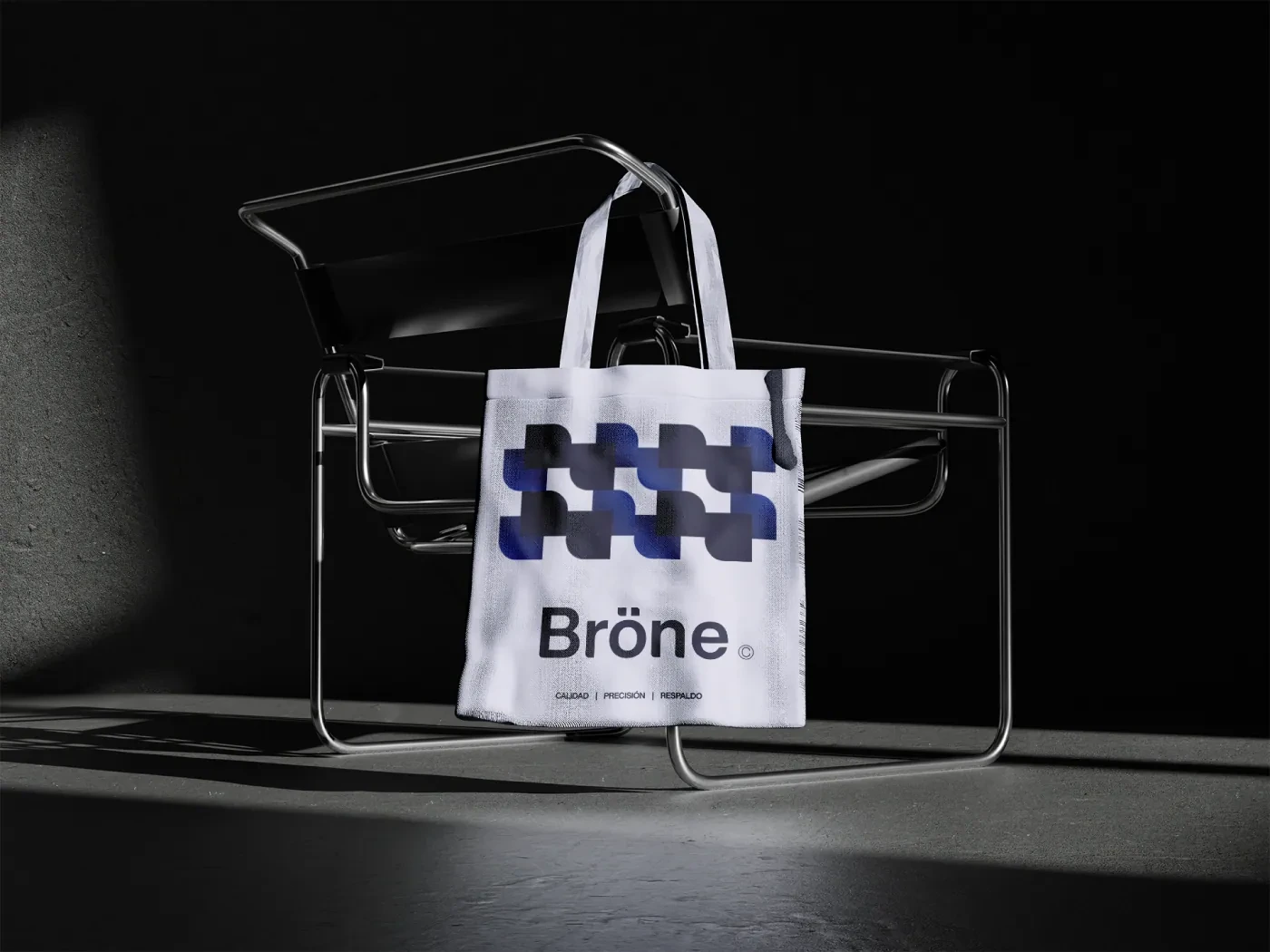
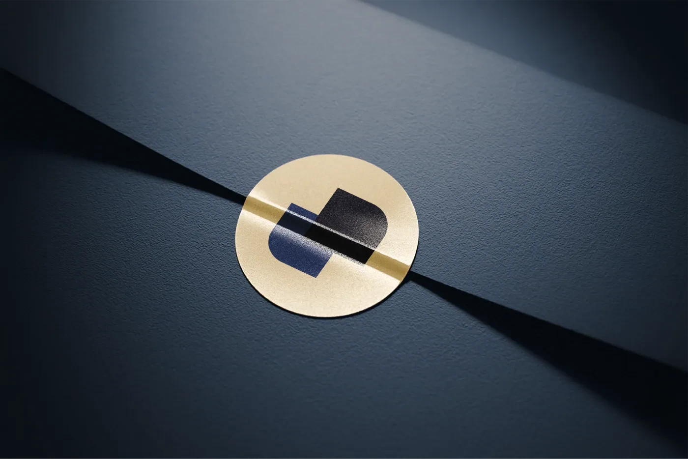
It starts from the umlaut dots of the Ö, turned into building blocks that speak of connection, precision and direction. The gradient in the lower piece adds depth without losing simplicity.
The wordmark
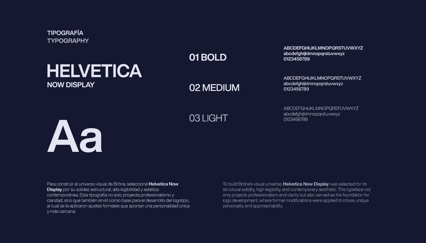
A modified typeface with softened, rounded corners, so the brand feels technical but approachable. The umlaut stays as a distinctive detail that makes the name its own.
Brand creation · Visual identity · Applications
Like this project
Posted Oct 1, 2026
The commercial brand of Senercom, an electrical and energy company from Chilean Patagonia. Same technical backing, a closer way to reach the end customer.