Responsive Landing Page Design for Zorali

Samson Bojesomo


A Landing Page Built for the Outdoors, Designed to Work Everywhere
Client: Zorali — technical, comfortable outdoor apparel and gear (Overland Pants, Merino tees, All-Climate fleece, backpacks)
Role: Landing Page Design
Result: Estimated 25-50% increase in traffic
The Challenge
Outdoor apparel shoppers are particular about two things at once: does the gear look genuinely technical and durable, and does the brand feel real rather than a generic "lifestyle" outdoor label. Zorali needed a landing page that could carry both showcase a hero product (the Overland Pant) with enough visual weight to justify a premium price, while making sure the page held up cleanly across every device a shopper might land on, from a laptop to a phone mid-hike-planning session.
The Approach
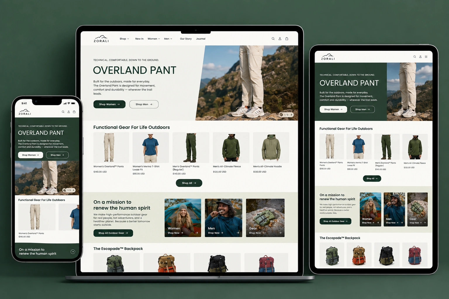
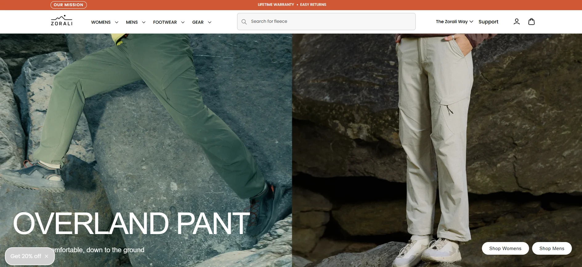
Hero — Hero Product, Hero Positioning The landing page leads with a single flagship product, the Overland Pant, framed with "Technical. Comfortable. Down to the Ground." directly above the name. Rather than opening with a generic brand statement, leading with one specific, technically-described product signals credibility immediately this isn't a lifestyle brand borrowing outdoor aesthetics, it's gear built for actual use. Dual CTAs ("Shop Women" and "Shop Men") split traffic efficiently right from the first screen.
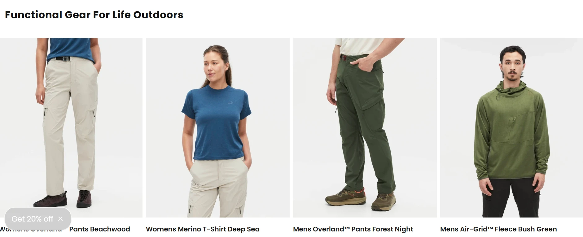
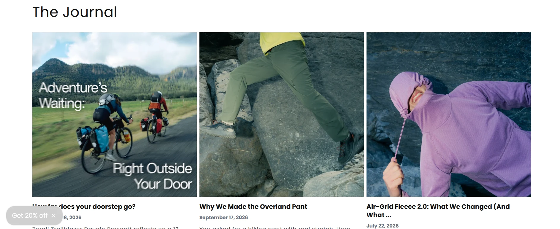
Functional Gear Grid — Letting the Range Speak Beneath the hero, a clean product grid (Overland Pants, Merino T-Shirt, All-Climate Fleece, All-Climate Hoodie) with consistent pricing and photography establishes the breadth of the line without overwhelming a first-time visitor — five hero products, not fifty, keeps the page focused and fast to scan.
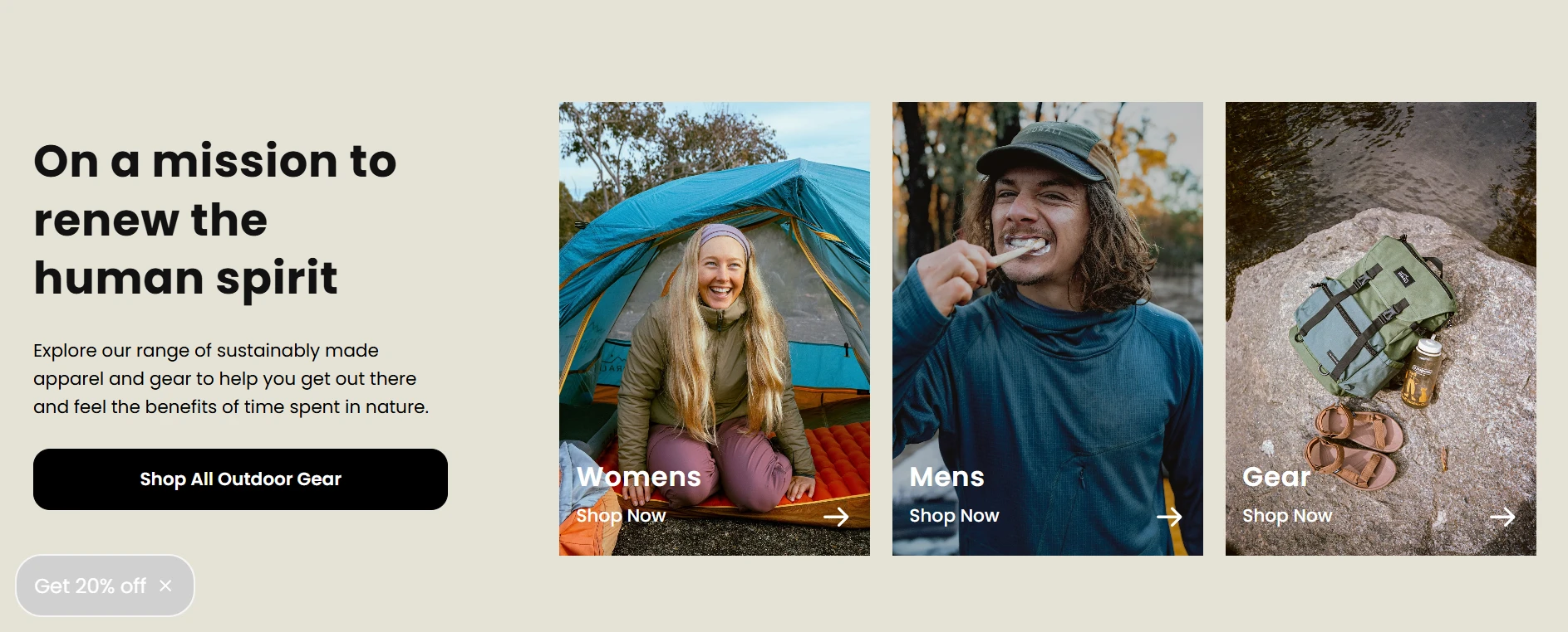
Mission Section — Values Without Slowing the Page Down "On a mission to renew the human spirit" is given a compact, three-way split (Women / Men / Gear) rather than a long-form brand story — communicating purpose and audience segmentation in the same section, so the mission statement doubles as a navigation aid instead of a scroll-slowing detour.
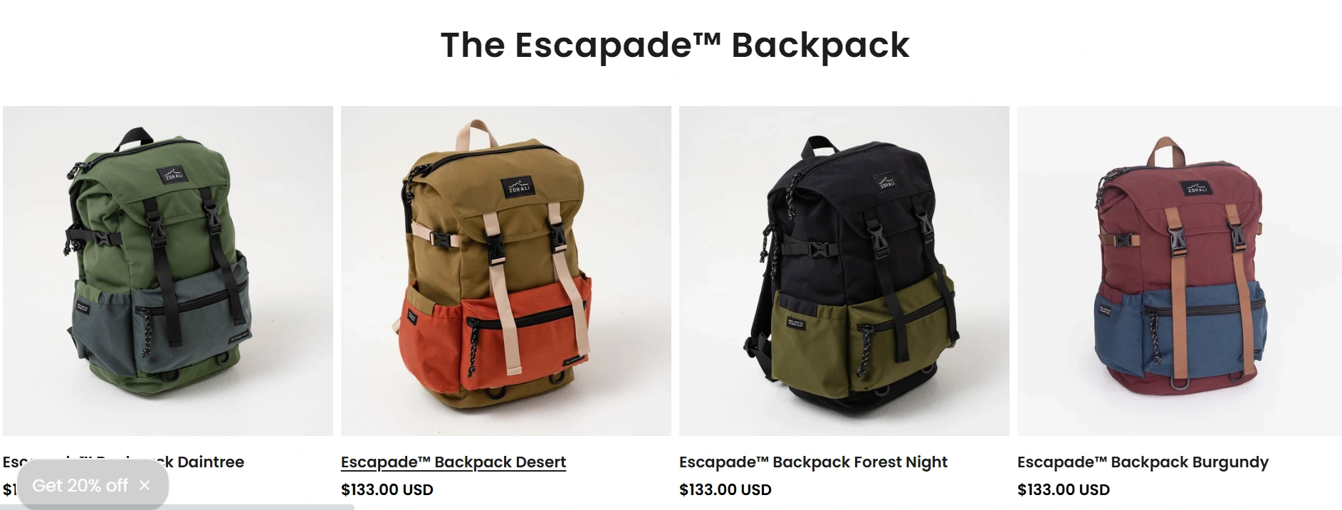
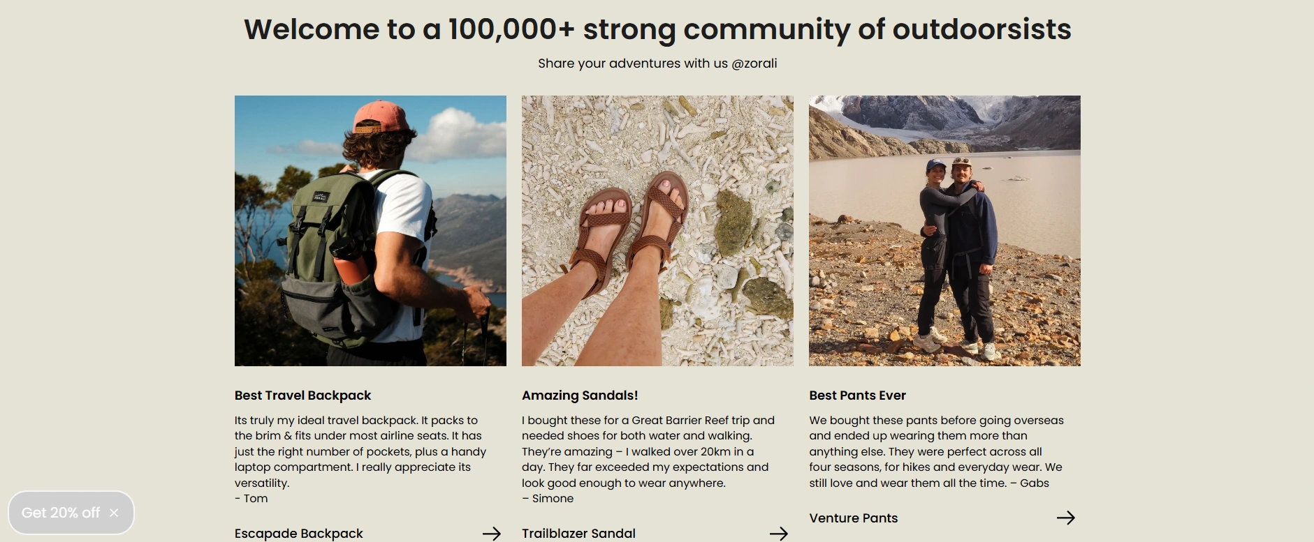
The Escapade™ Backpack — A Second Product Spotlight A dedicated section for the brand's backpack line, shown across multiple colorways, gives a second hero moment to a product category outdoor shoppers specifically browse for — treating it as its own spotlight rather than folding it into the general grid.
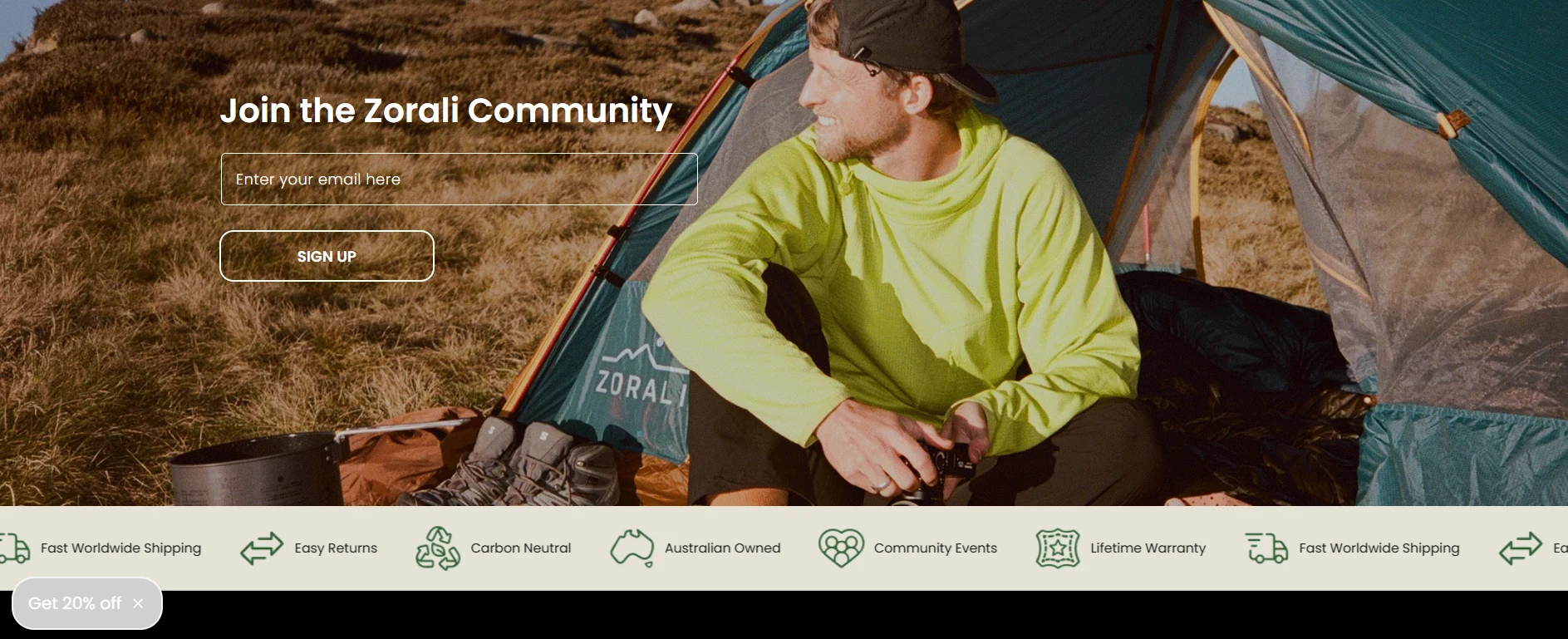
Fully Responsive by Design The layout was built and tested across desktop, tablet, and mobile from the start — not adapted after the fact. Given how much outdoor-gear research happens on mobile (often while actually outdoors, or planning a trip on the go), keeping hero messaging, product grids, and CTAs equally clean and functional at every breakpoint was central to the design, not an afterthought.
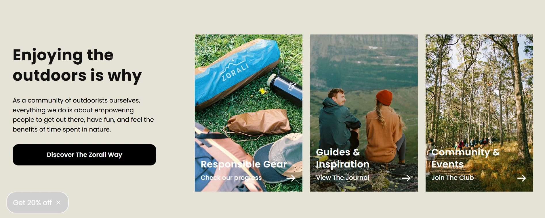
Visual & Brand Direction A deep forest-green and cream palette, paired with clean sans-serif type, gives Zorali a premium-technical feel — closer to a considered outdoor brand than a mass-market sportswear look — reinforcing the "technical, comfortable" positioning stated in the hero copy.
The Results:
Since the landing page went live, Zorali has seen an estimated 25-50% increase in traffic.
Tools & Skills Used
Landing Page Design · Responsive Web Design · UX/UI Design · Brand & Visual Design · E-commerce Merchandising
Want a landing page that works as hard on mobile as it does on desktop? Let's talk.

Like this project
Posted Sep 22, 2026
Designed a responsive landing page for Zorali, boosting online traffic 25-50%.
Likes
4
Views
7
Clients
Zorali