Papa Johns UK: "Let's order a pizza!"
Elliot Rylands
Overview
As the lead product designer at Flipside Group, I spearheaded the redesign of the Papa John’s pizza ordering app, collaborating closely with a talented team of engineers and brand designers. Our mission was to reimagine the entire ordering experience—from selecting and customising pizzas to applying deals and finalising payments. My primary role was to lead the product design, focusing on building intuitive user flows that seamlessly integrated the brand’s identity while enhancing usability.

Problem Statements
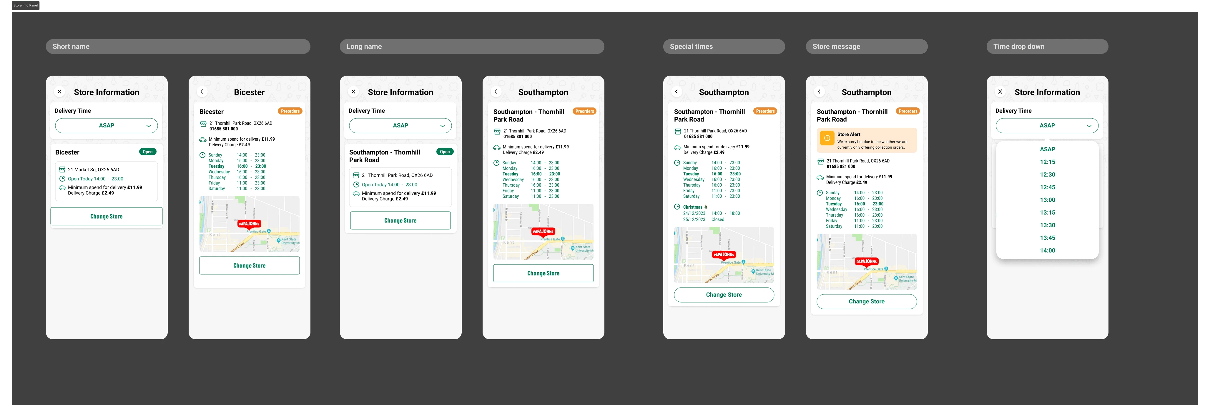
Cluttered and Overwhelming User Interface: The previous version of the Papa John’s app presented users with a cluttered interface, making it difficult to navigate the ordering process. Users struggled to locate specific features, leading to a frustrating experience. The lack of a clear visual hierarchy contributed to confusion, especially during the customisation of pizzas and the application of deals.
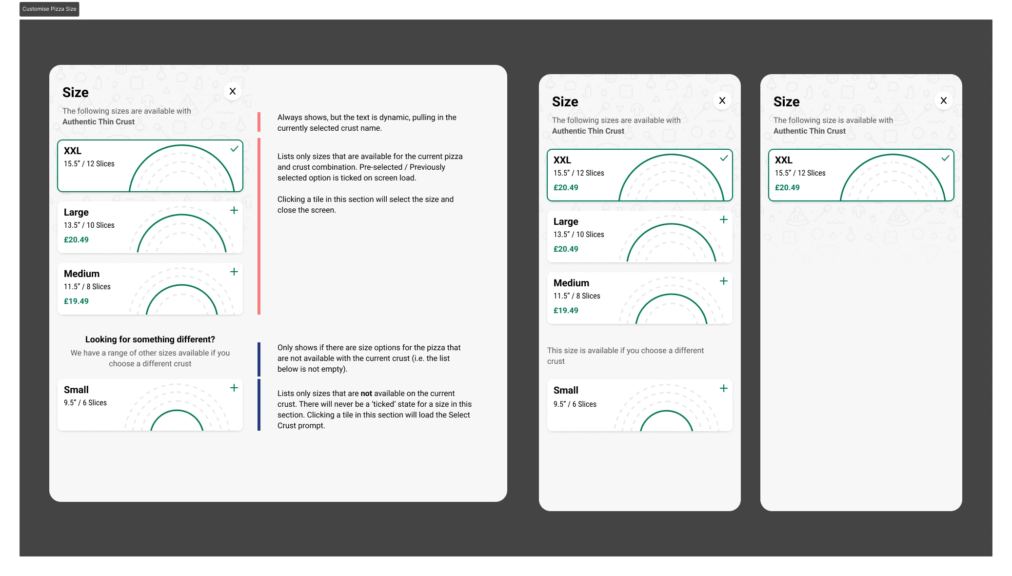
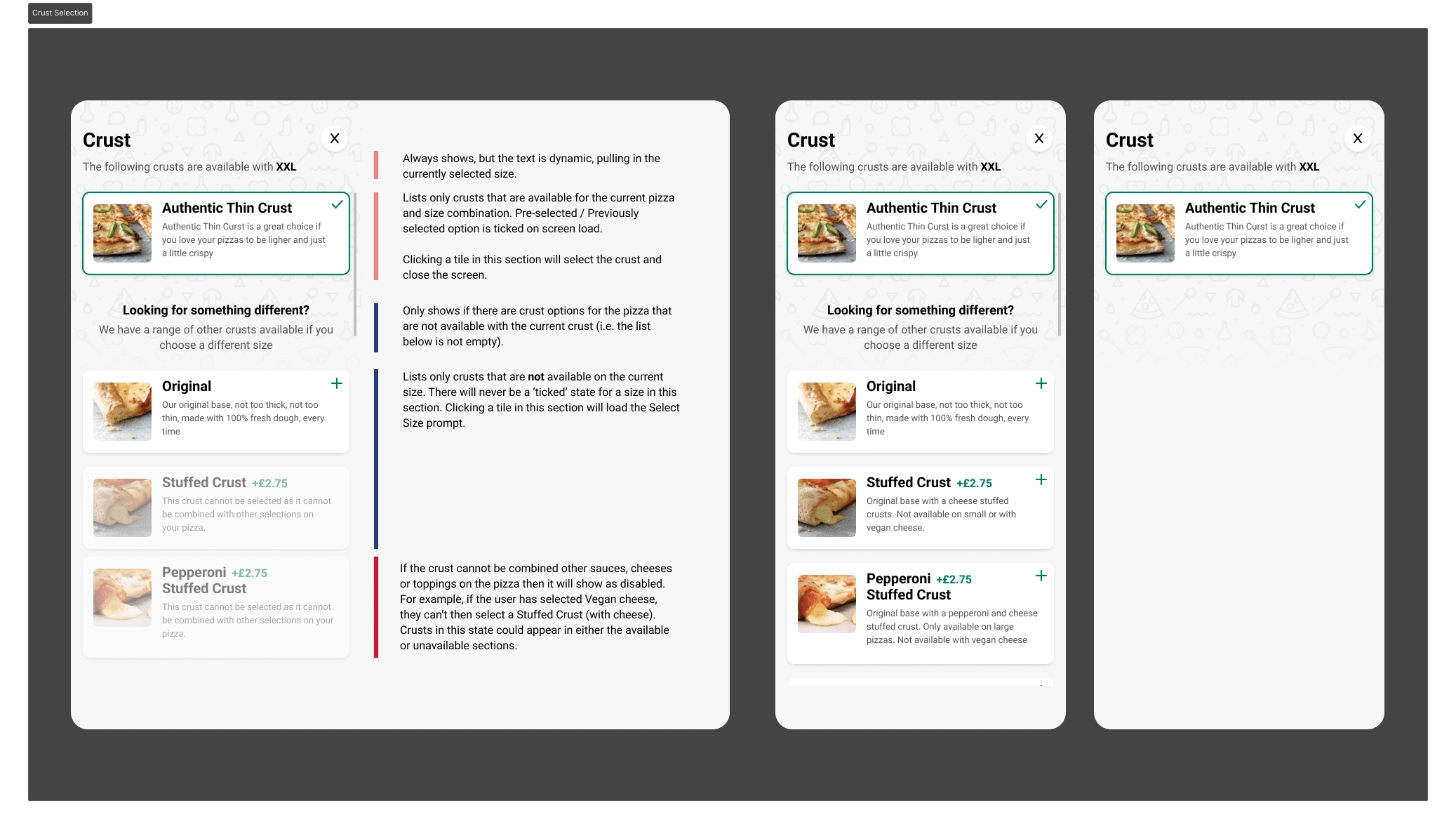
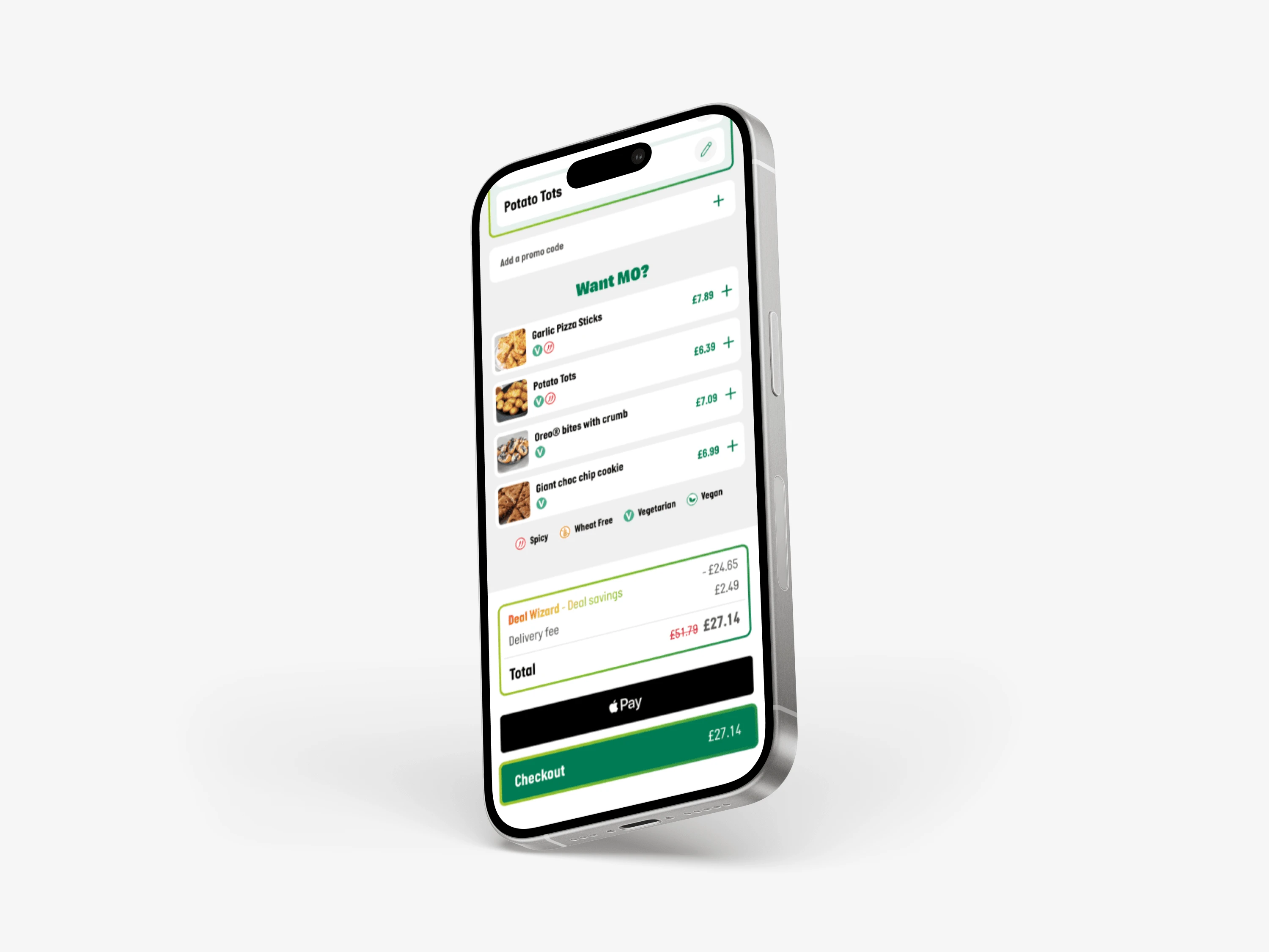
Complex and Confusing Customisation Process: The customisation options in the old app were not user-friendly. Customers found it challenging to add or remove toppings, adjust quantities, and understand pricing changes. The process was often tedious, leading to abandoned baskets and incomplete orders.
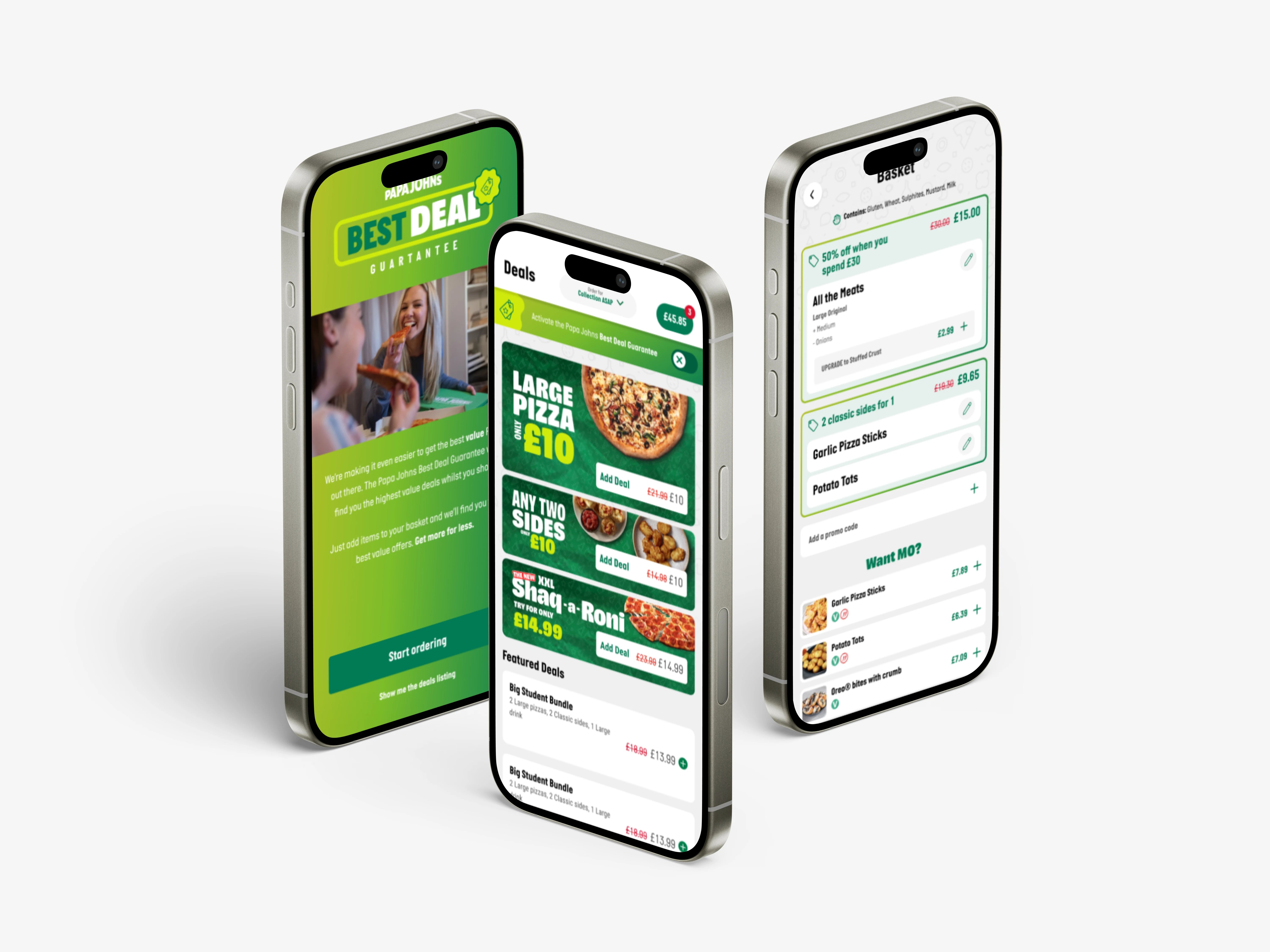
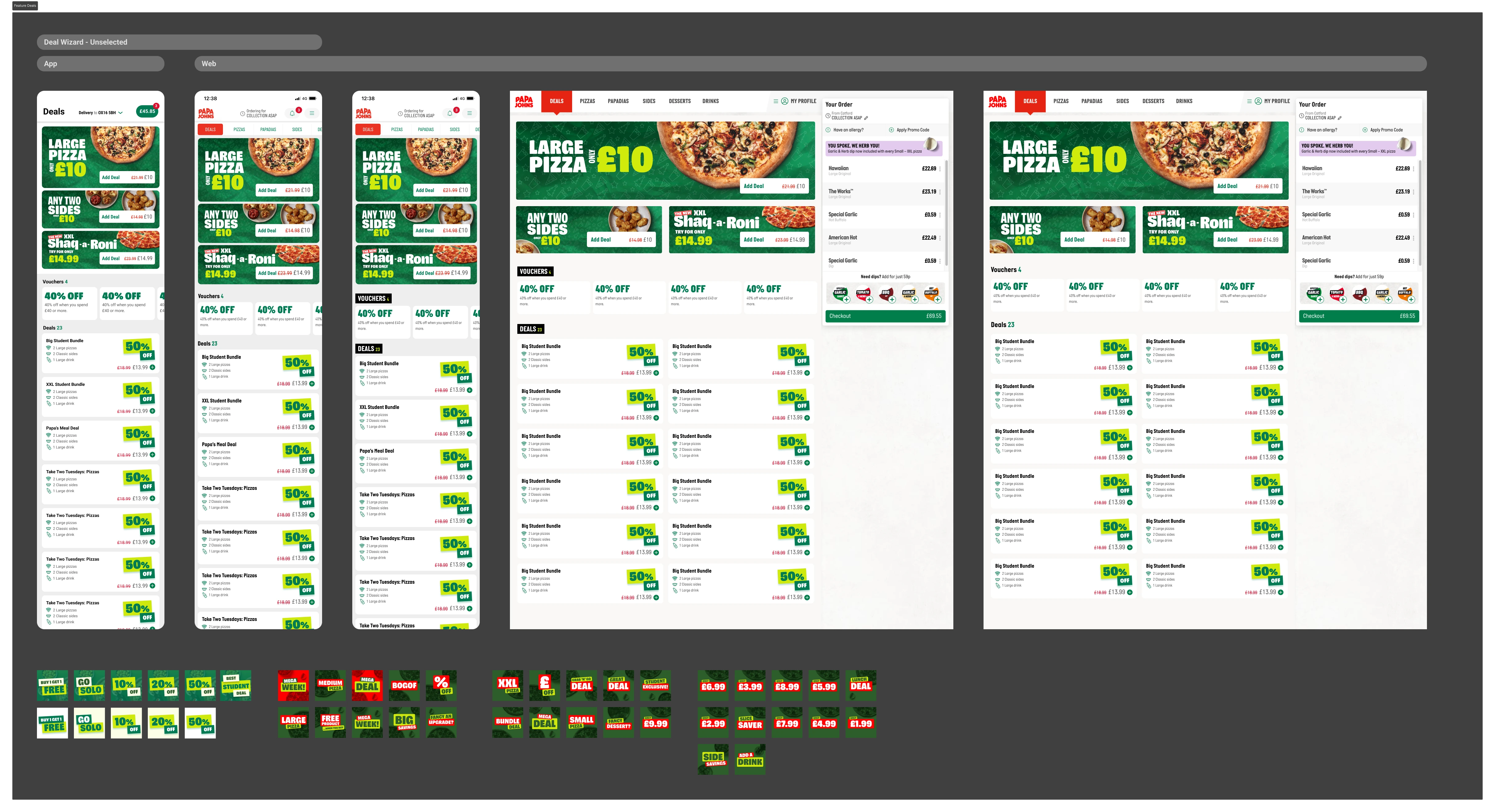
Limited Visibility and Access to Deals: The app's deals and promotions were not easily accessible, often buried under multiple layers of navigation. Users were either unaware of available deals or found it too cumbersome to apply them, missing out on savings and reducing overall satisfaction with the app.
Inefficient Checkout Experience: The checkout process in the old app was lengthy and complicated, with multiple unnecessary steps. Users often encountered difficulties when entering payment information or applying discounts, resulting in a high abandonment rate at the payment stage.
Our Approach
1. Simplifying the User Interface with a Focus on Brand Identity
I led the redesign with a clear goal: to simplify the user interface while enhancing the Papa John’s brand presence. We adopted a clean and modern design language that was both visually appealing and functionally efficient. By utilising the brand’s colour palette, typography, and imagery, we ensured that the app reflected Papa John’s identity at every touchpoint, creating a cohesive experience.
Key Changes:
Streamlined the navigation to highlight key actions such as ordering, customising, and checking out.
Introduced a consistent visual hierarchy, ensuring that important information, such as deals and customisation options, was easy to locate.
Reduced cognitive load by decluttering screens and focusing on essential tasks.
2. Redesigning the Customisation Process
The customisation process was entirely reimagined to be more intuitive and user-friendly. I worked closely with engineers to create a dynamic and responsive customisation flow that allowed users to see real-time updates to their order as they selected toppings.
Key Changes:
Implemented a drag-and-drop interface for adding and removing toppings.
Introduced real-time pricing updates as users customised their orders, providing transparency and clarity.
Created a visually engaging experience by incorporating high-quality images and animations that responded to user interactions.
3. Enhancing Deal Visibility and Accessibility
To ensure that users never missed out on a deal, we integrated promotions and discounts into the user journey more effectively. Working with brand designers, we placed deals prominently within the app, making them impossible to miss.
Key Changes:
Featured current deals on the home screen and throughout the ordering process.
Implemented a one-tap application of deals during checkout, simplifying the process for users.
Used personalised recommendations based on user behaviour to highlight relevant deals.
4. Streamlining the Checkout Process
The checkout process was re-engineered to be as efficient as possible. By reducing the number of steps and ensuring that payment options were clear and accessible, we significantly improved the conversion rate.
Key Changes:
Consolidated payment and delivery options into a single, easy-to-navigate screen.
Introduced multiple payment methods, including digital wallets, to cater to a wider audience.
Simplified the application of discounts and vouchers, reducing user frustration and basket abandonment.
Final Outcome Sample
The Outcome
The redesign of the Papa John’s app resulted in a significantly improved user experience, with higher customer satisfaction, reduced basket abandonment, and increased conversion rates. The collaboration between product design, engineering, and brand design at Flipside Group was pivotal in delivering an app that not only met the functional needs of users but also reinforced Papa John’s brand identity in a competitive market.
Like this project
Posted Sep 3, 2024
I spearheaded the redesign of the Papa John’s pizza ordering app, collaborating closely with a talented team of engineers and brand designers.