Thrive Learning: Build a new website to improve conversion

Introduction
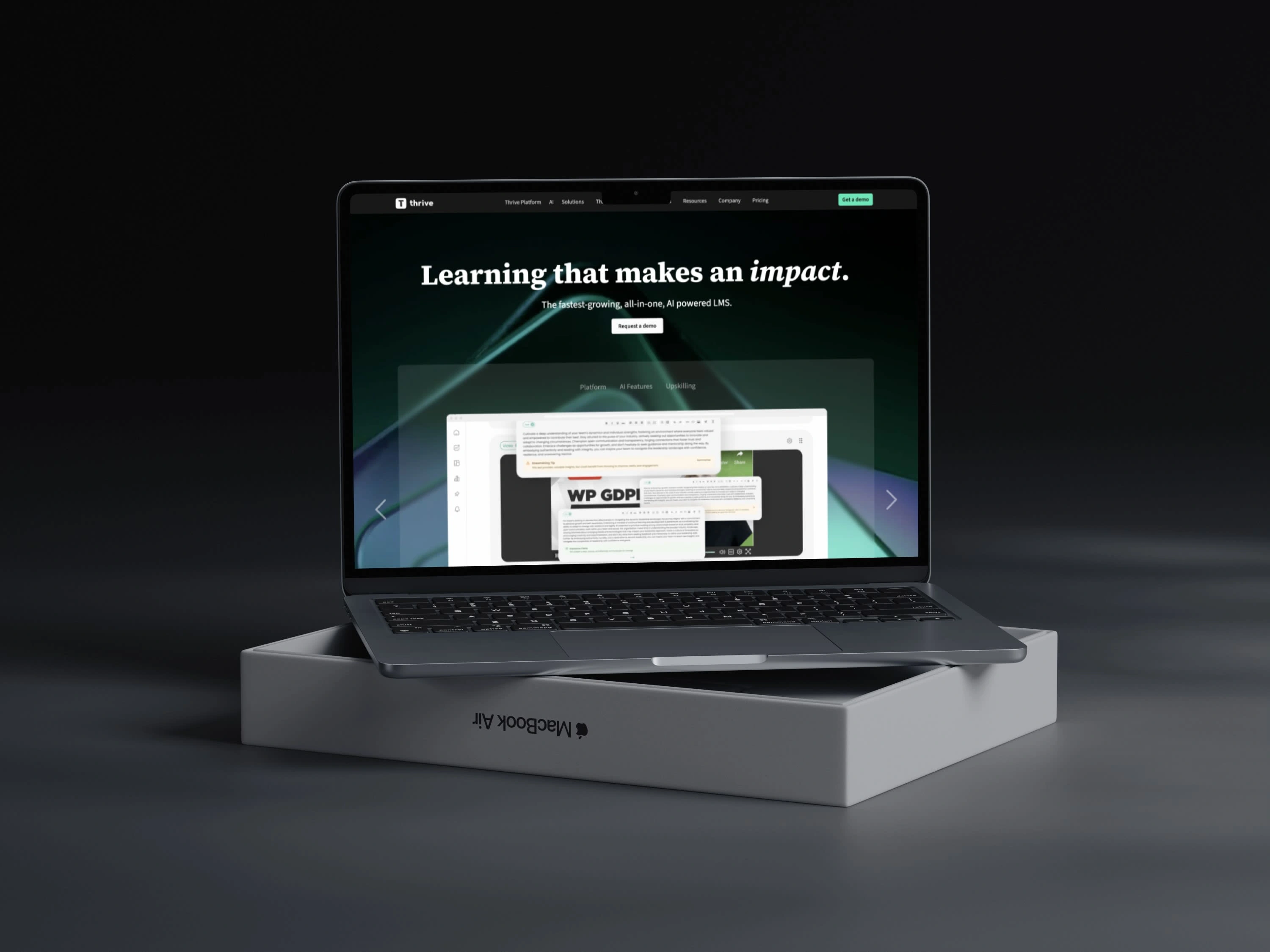
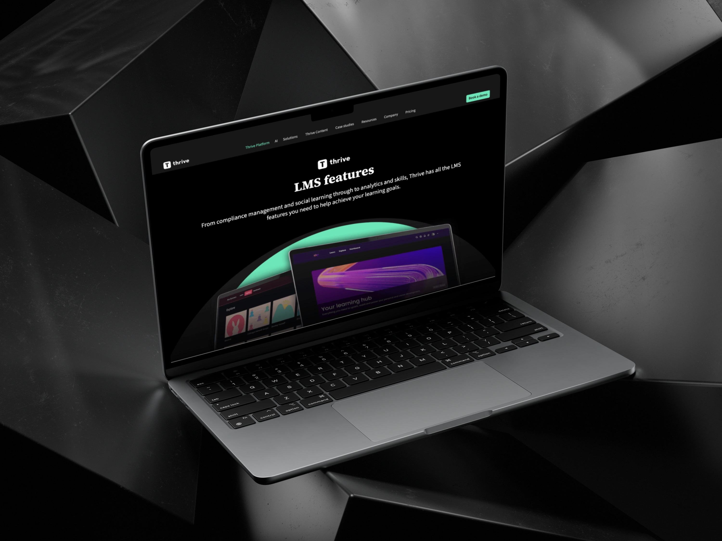
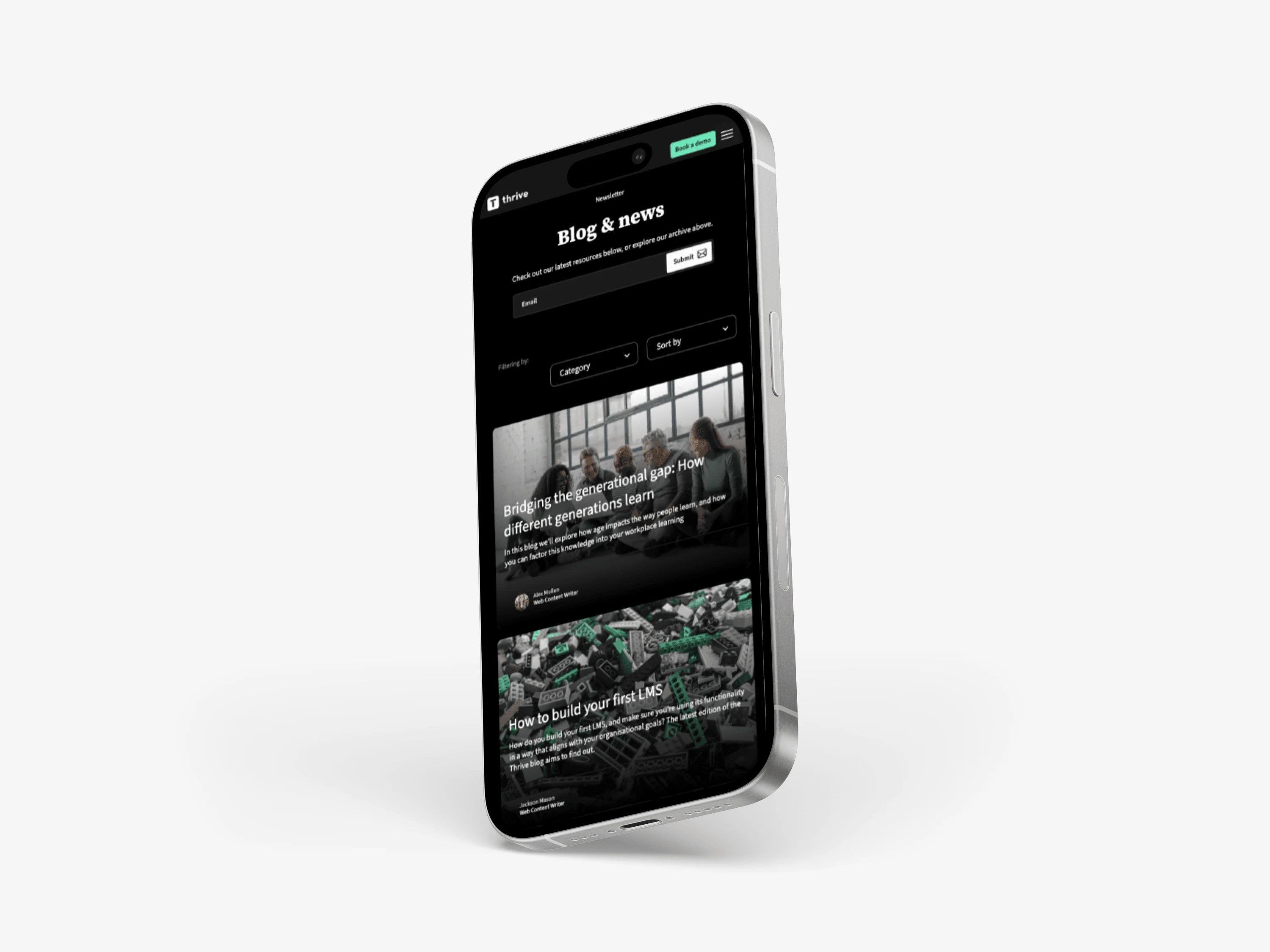
As the lead designer for Thrive Learning’s website redesign, my role was to create a modern, interactive experience that better communicated the company's unique selling proposition (USP) while improving user engagement and conversion rates. Using Figma and Webflow, along with interactive libraries like Matter.js, I delivered a cutting-edge, responsive website that not only visually engaged users but also clarified Thrive's product offerings and enhanced overall usability. The project involved user research, restructured information architecture, and the creation of a comprehensive design system, ensuring the new site was future-proof and scalable.
Discovery and User Research
The redesign began with an in-depth discovery phase where I collaborated with Thrive Learning's key stakeholders. I conducted user testing sessions with their leadership team to gain insights into:
Audience expectations: Understanding the primary user base, which included HR professionals and learning managers, and how they navigated the site.
Product clarity: Evaluating how well the previous design communicated Thrive's LMS features, including AI-powered learning, compliance, and social learning.
Conversion objectives: Identifying the goals for the website—such as increasing demo requests and improving lead generation.
Through these sessions, I gathered critical feedback on what was missing: clarity in the product offering, easier navigation, and a modern, interactive design that reflected Thrive’s innovation.
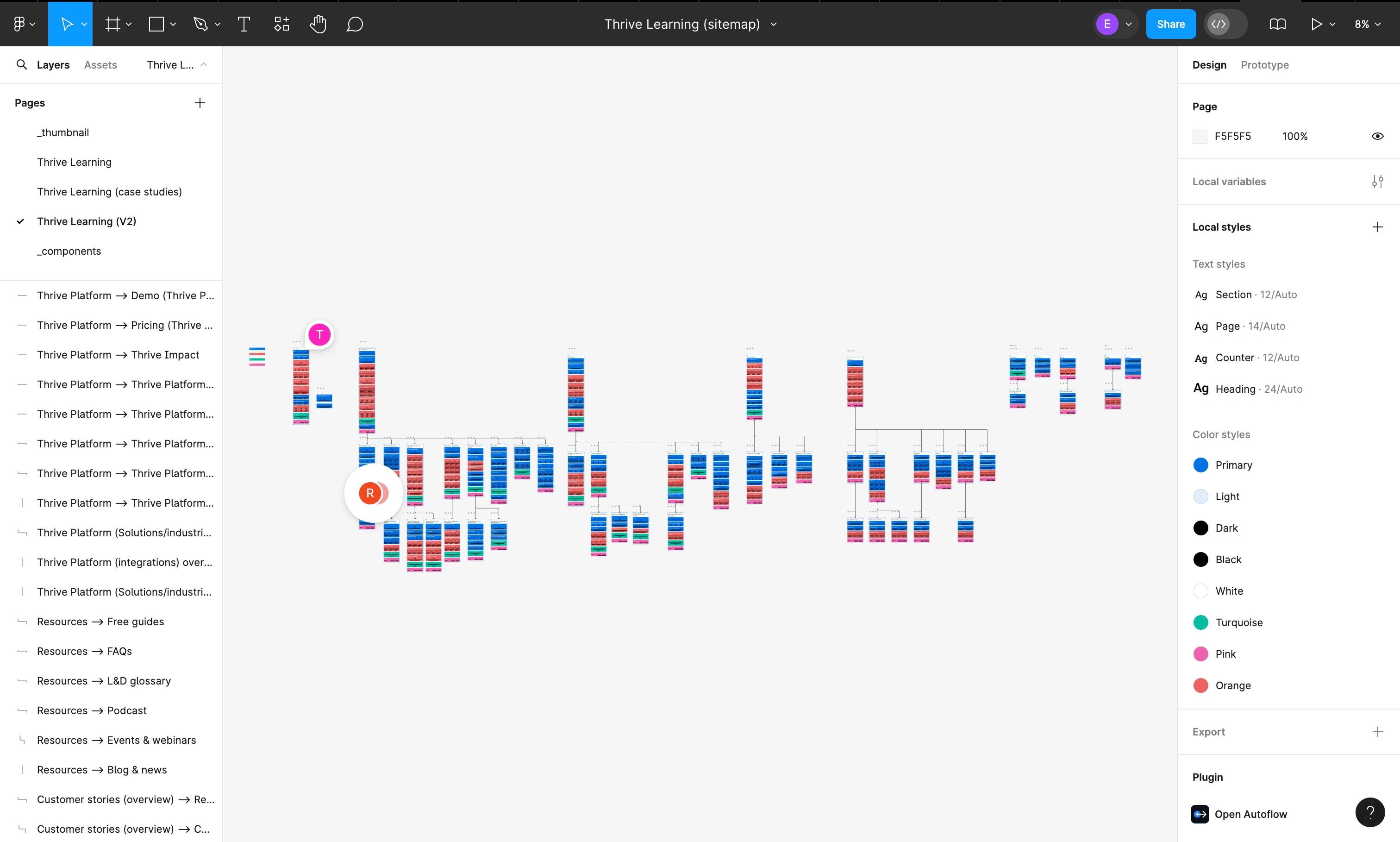
Information Architecture and Collaboration
Working closely with senior figures at Thrive, I led the redesign of the information architecture (IA) to:
Streamline the user journey from landing on the homepage to requesting a demo or exploring features.
Group relevant content, such as case studies, features, and integrations, in a way that was easily discoverable.
Ensure the site was scalable, enabling future growth as new products or services were introduced.
This collaborative process ensured that every team member was aligned on how the website would best communicate Thrive’s value propositions.
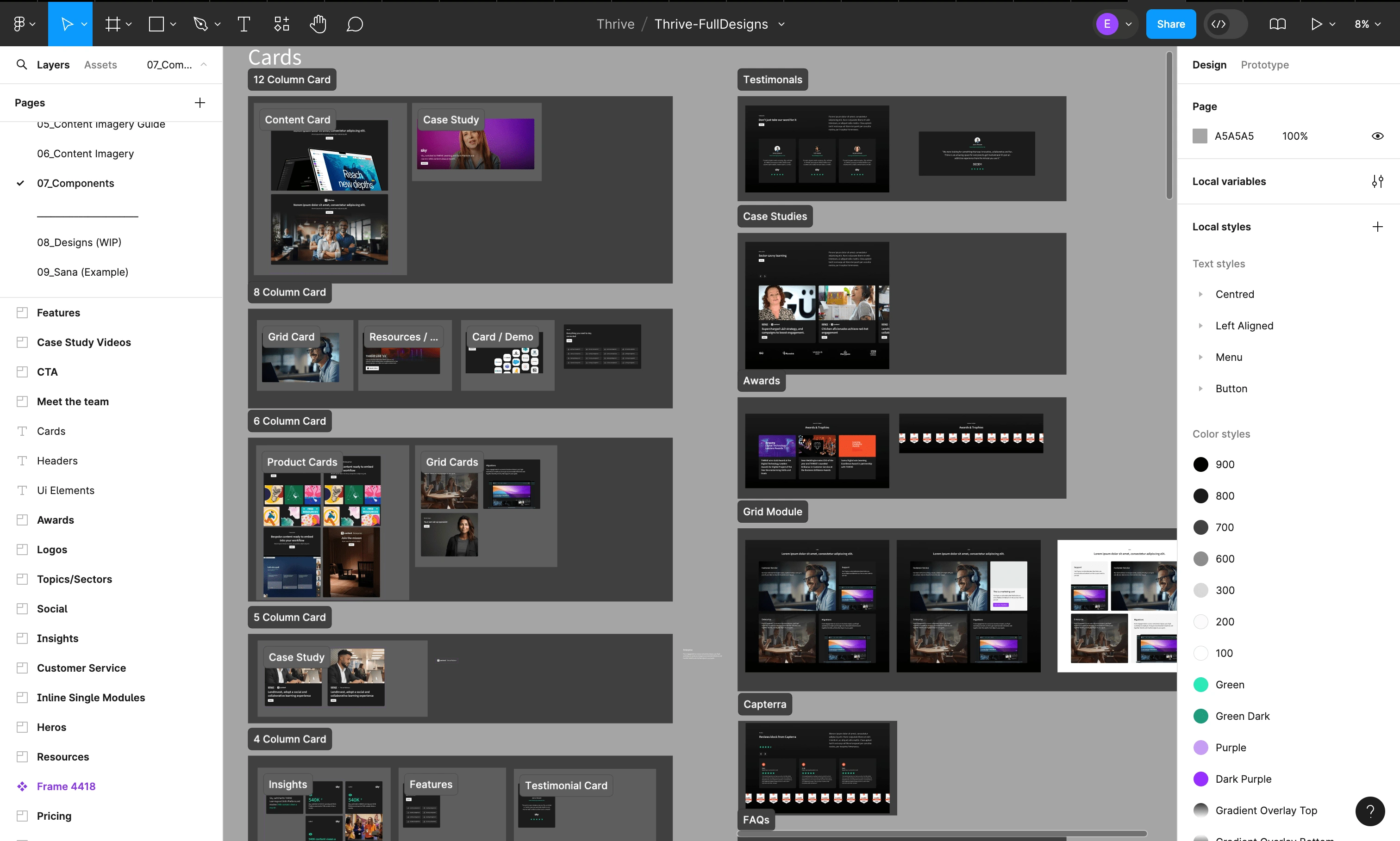
Design System and Component Library
I developed a brand-new component library to initiate a design system for Thrive, creating consistency across their digital touchpoints. This included:
A comprehensive set of UI components, from buttons and forms to interactive content blocks, all designed to be scalable across multiple screen sizes.
Responsive design solutions that adapted seamlessly to large desktop, desktop, tablet, mobile, and small mobile breakpoints. Each page was meticulously designed to ensure that interactions, readability, and visual appeal were maintained across all devices.
The foundation for a design system that Thrive could continue to build on for future projects, ensuring visual coherence and brand identity consistency across platforms.
Interaction and Responsive Design
To elevate user engagement, I focused on designing interactive experiences. Using Webflow’s interaction libraries and Matter.js, I implemented:
Interactive effects that enhanced the storytelling on key pages. For example, scrolling animations and hover effects were added to highlight Thrive's unique features in a dynamic, engaging way.
Responsive prototypes that allowed for real-time interaction demonstrations of the design, helping stakeholders and developers understand how the final product would function across devices.
This level of interaction added a modern touch to the website, aligning with Thrive’s forward-thinking brand identity.
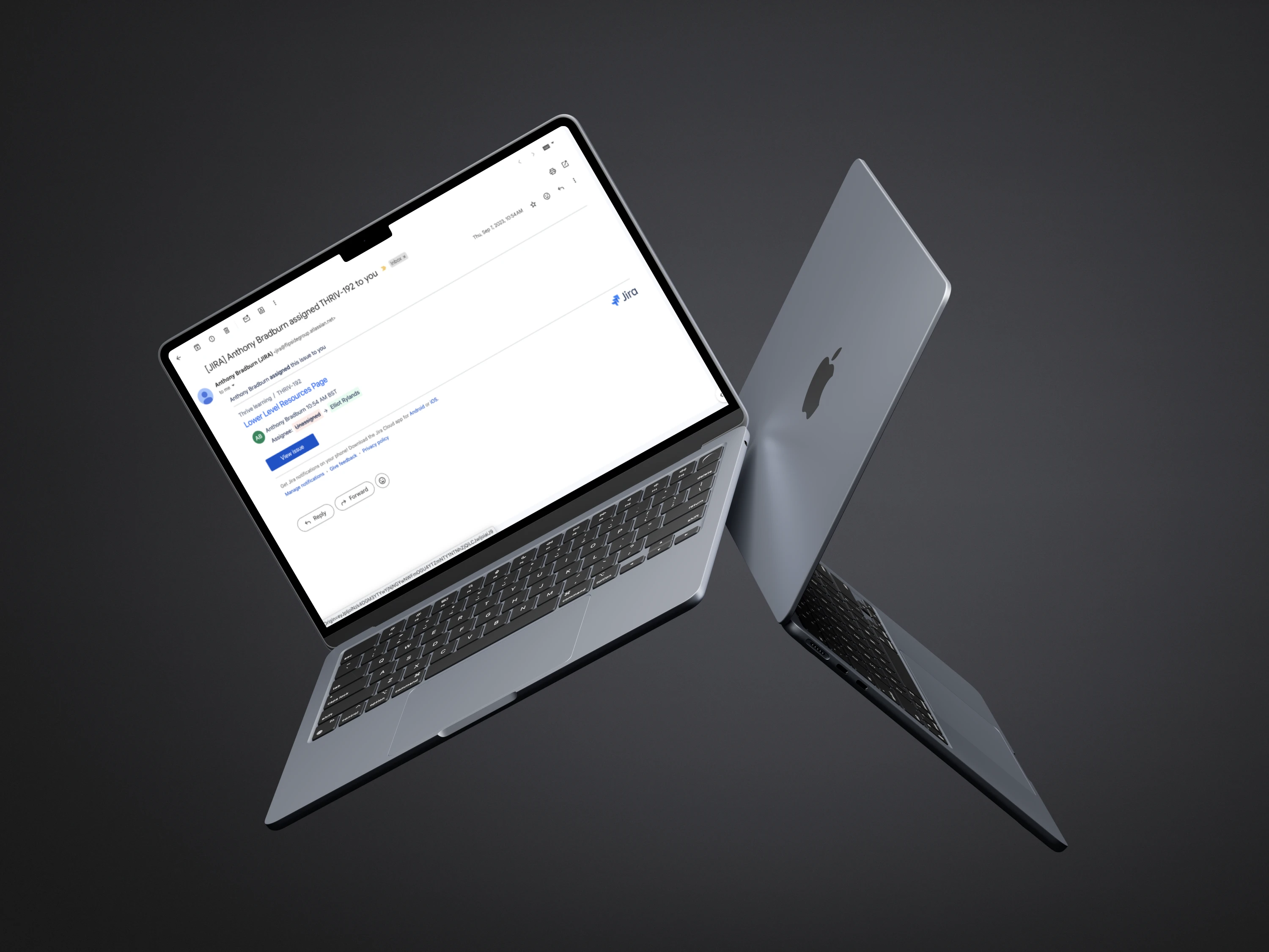
Development Collaboration and Task Management
I worked in Jira to manage daily tasks and communicate effectively with the project management team from Flipside Group and the engineering team at Web Kings. This included:
Daily stand-ups and sprint planning to ensure the project remained on schedule.
QA and feedback sessions to validate that the design was implemented according to the specifications and delivered an optimal user experience.
Workshops to troubleshoot any development challenges and ensure seamless collaboration between design and development.
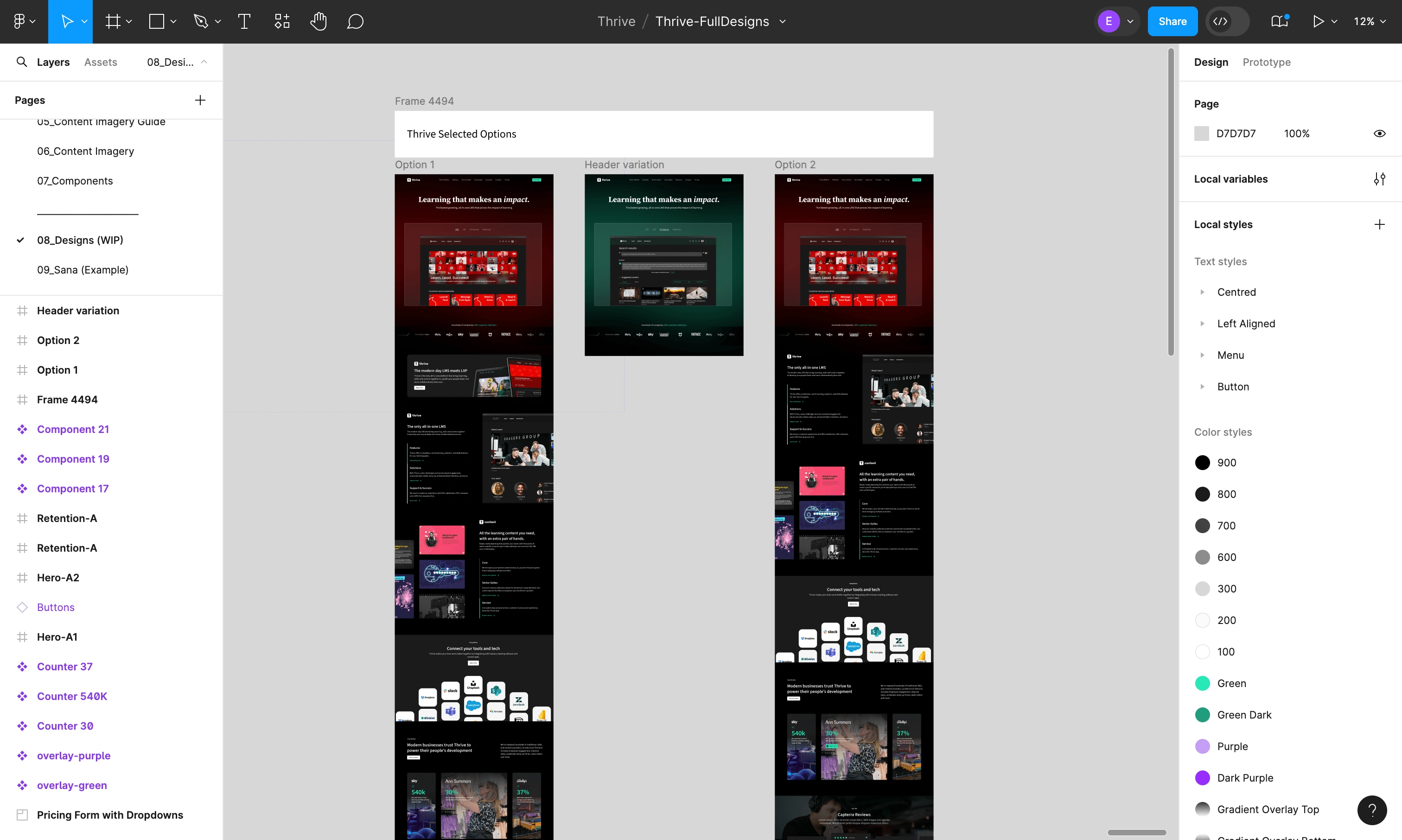
Conclusion and Business Impact
The redesign of Thrive Learning’s website resulted in a more user-centric, engaging, and conversion-focused platform. Key results include:
Improved user experience, with clearer navigation and a more intuitive product showcase.
Increased conversion rates for demo requests due to a more streamlined information architecture and enhanced product clarity.
Scalability: The new design system provided a foundation for Thrive’s future digital growth, making it easier for their internal teams to manage and update the website.
The project was a collaborative success, combining the strengths of user research, interaction design, and responsive development to deliver a website that truly reflected Thrive Learning’s innovative approach to learning and development.
Like this project
Posted Sep 9, 2024
I was hired to design a modern, interactive website that better communicated the company's unique selling proposition (USP).
Likes
0
Views
18

