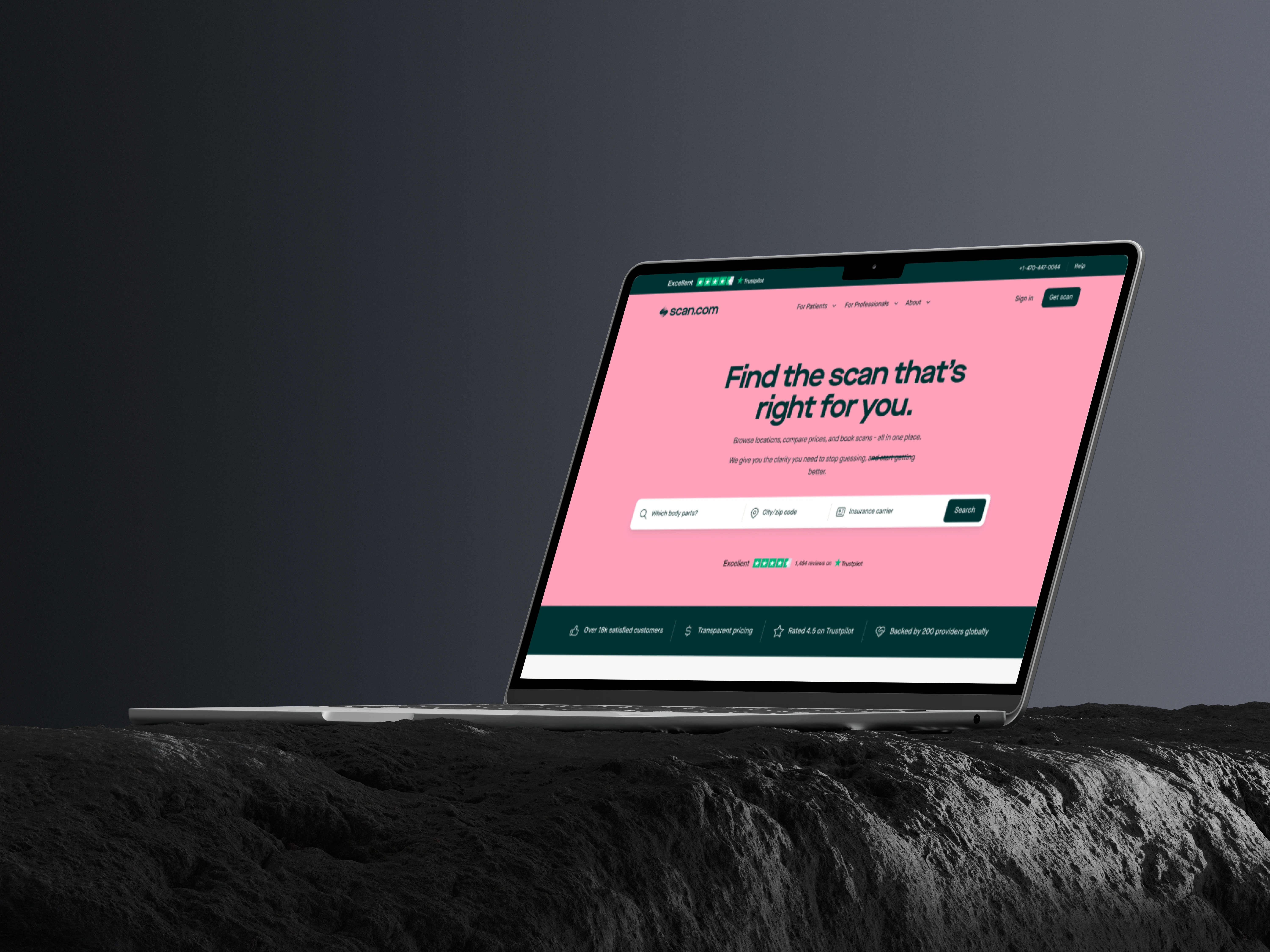
Scan.com: Designing the B2C Patient Booking Funnel for Scan.com
Elliot Rylands
Overview
As a StaffProduct Designer, I led the design of the B2C patient booking funnel for Scan.com, aiming to streamline the process for patients booking medical scans and drive conversions through seamless account creation. The project focused on improving the user journey, guiding patients from booking their scan to signing up within the patient portal. Through a combination of user experience optimisation, clear navigation, and a conversion-focused design, we significantly improved the patient onboarding process and increased conversion rates.
Problem Statements
Complex and Confusing Booking Process: The previous booking system lacked a clear user journey, causing confusion among patients attempting to schedule scans. The absence of a straightforward step-by-step flow often led to abandoned bookings and low user engagement.
Low Conversion from Booking to Account Creation: While patients could book scans, the transition to creating an account within the patient portal was poorly optimised. As a result, many users completed their bookings without creating an account, missing out on the benefits of the portal and reducing engagement for follow-up care.
Inconsistent User Experience Across Devices: The existing booking flow did not adapt well to different devices, especially mobile. This created friction for users who preferred to book and manage their appointments on smartphones or tablets, further affecting conversion rates.
Our Approach
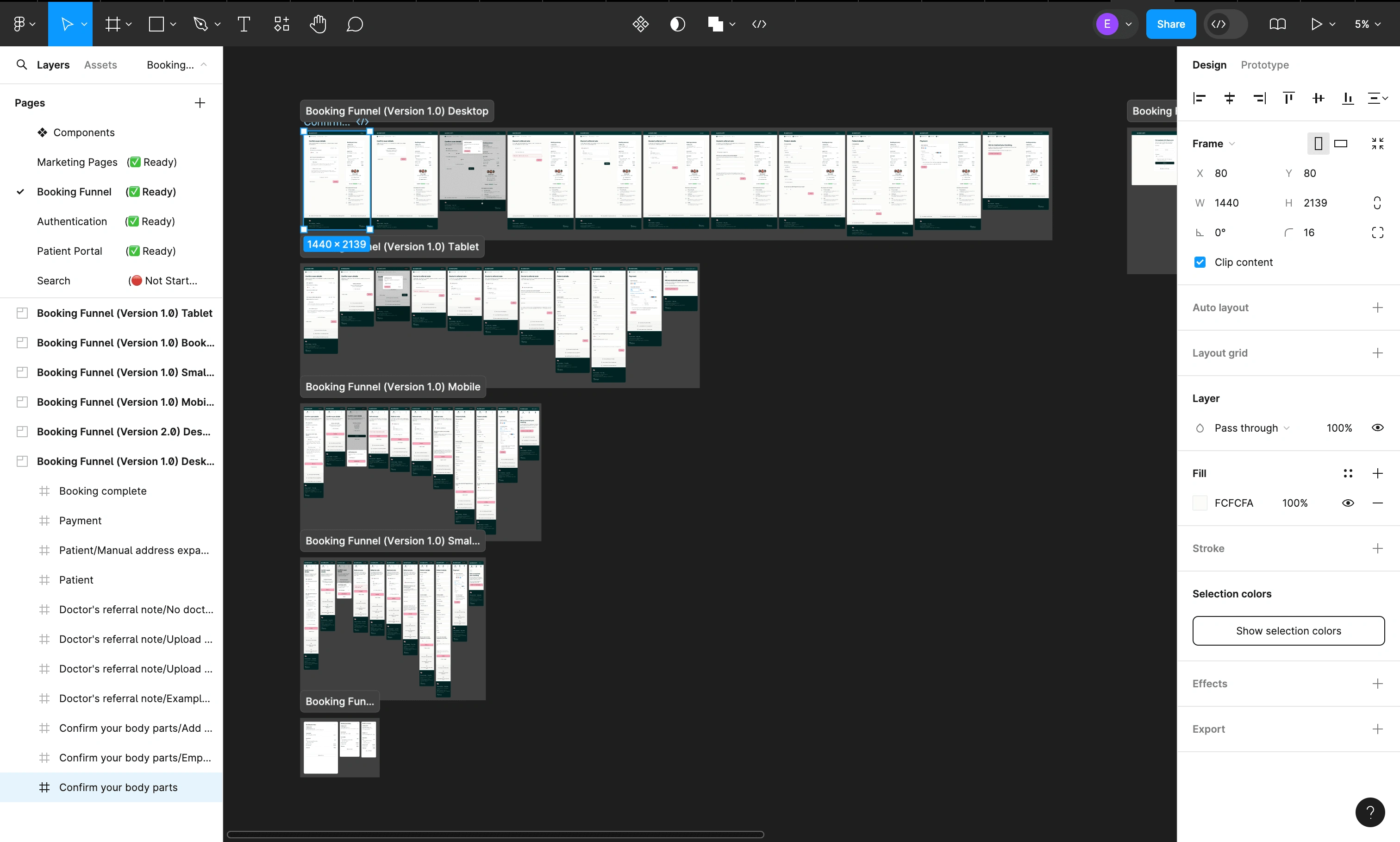
1. Streamlining the Booking Funnel
The primary focus of the redesign was to simplify and clarify the booking process, reducing friction and guiding patients smoothly from start to finish.
Key Changes:
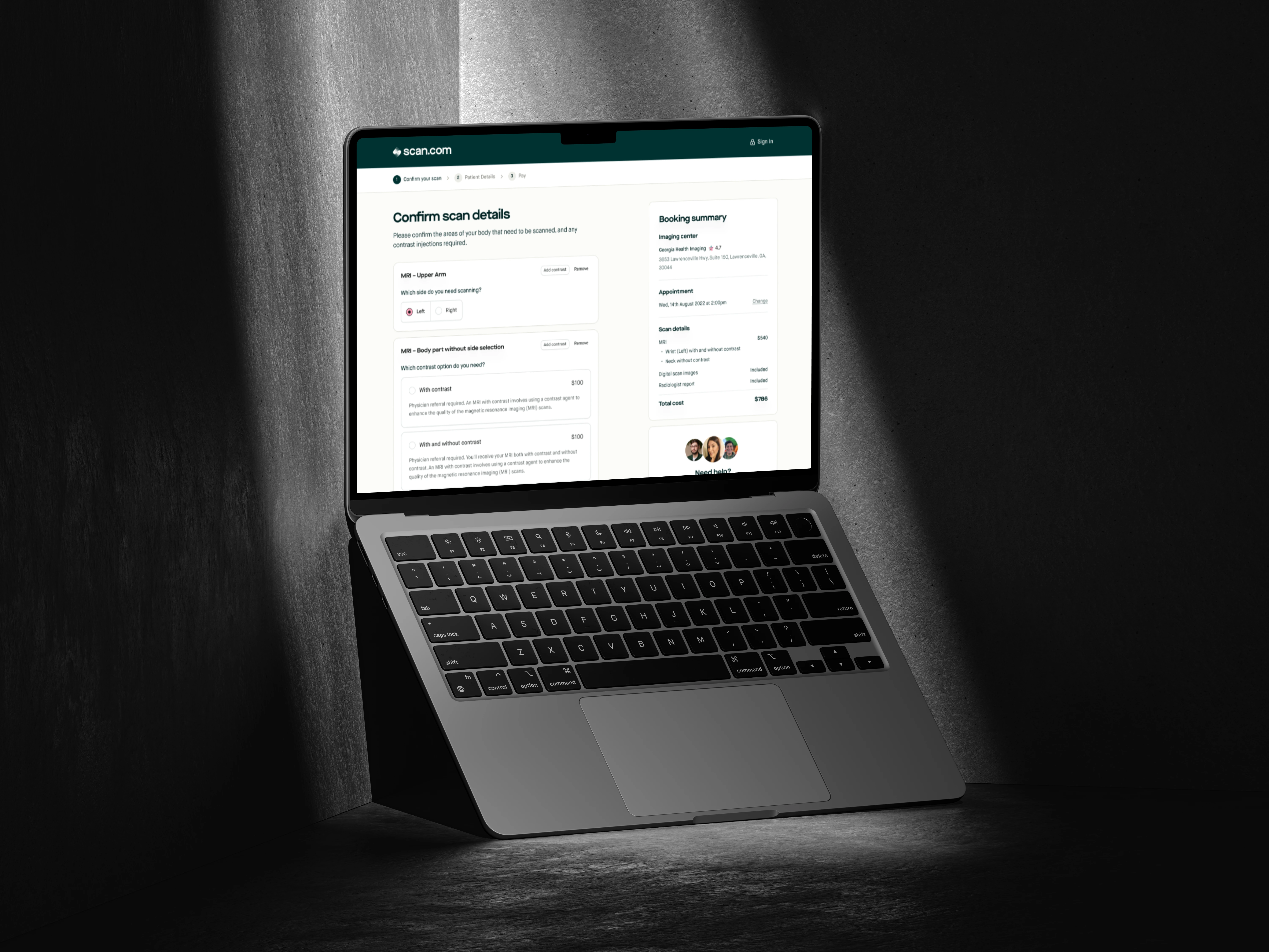
Step-by-Step Guided Flow: I introduced a clear, step-by-step booking process, breaking down the journey into manageable, digestible stages. Each step was designed to reduce cognitive load and ensure that users could easily understand what to do next.
Progress Indicators: To keep patients engaged and aware of their progress, I implemented visual progress indicators at the top of the booking funnel. This helped reduce anxiety and encouraged users to complete the entire process.
Simplified Input Forms: I reworked all input forms for patient details, scan preferences, and medical information to ensure they were intuitive and required minimal effort. By removing unnecessary fields and providing autofill options where applicable, we minimised the time spent on each step.
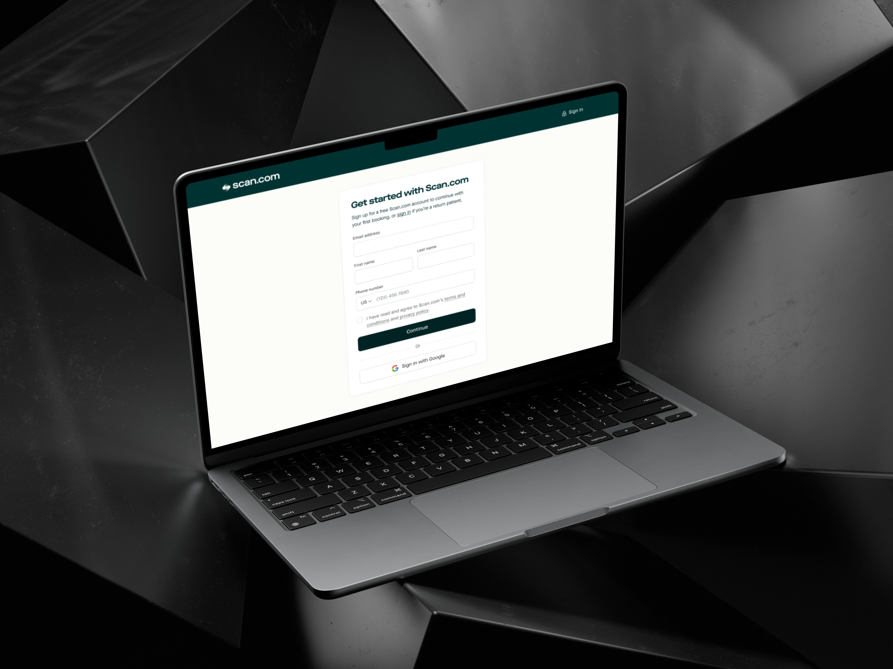
2. Conversion-Focused Account Creation Integration
One of the most critical aspects of the redesign was the integration of the account creation process into the booking funnel. The goal was to make signing up for an account feel like a natural part of booking a scan, rather than a separate, optional step.
Key Changes:
Seamless Transition: I ensured that the final step of the booking process naturally led users into creating an account. Instead of presenting account creation as a separate task, we framed it as the final part of securing their booking, highlighting the benefits of managing their scans through the portal.
Incentivising Account Creation: To encourage account creation, we showcased the additional value of the patient portal, such as easy access to scan results, follow-up reminders, and appointment management. These incentives were displayed prominently during the booking process.
Quick Account Creation: I designed a streamlined, one-step account creation process where users could quickly create their accounts by setting a password or logging in through social authentication. This reduced the friction of having to input unnecessary information after booking.

3. Mobile-First, Responsive Design
Given the increasing trend of users accessing healthcare services via mobile devices, it was essential to ensure that the booking funnel was optimised for mobile responsiveness.
Key Changes:
Mobile-First Approach: I designed the booking funnel with a mobile-first approach, ensuring that every stage of the process was easily navigable on smaller screens. This included larger, touch-friendly buttons, clear navigation, and mobile-optimised form fields.
Responsive Design Across Devices: The new funnel was responsive across all devices, providing a consistent user experience whether the patient was on a desktop, tablet, or smartphone. This consistency helped to eliminate confusion and maintain engagement across platforms.
4. Personalisation and Contextual Messaging
To further improve conversion rates, I incorporated personalised messaging and contextual tips throughout the booking process. This helped reassure users and guided them through any potential pain points.
Key Changes:
Contextual Help: I included subtle tooltips and context-based help messages within the booking flow to guide users through the more complex steps, such as selecting scan types or understanding medical terminology.
Personalised Touches: By using the patient’s input data (such as scan type or medical condition), I personalised parts of the journey to make the user feel more connected to the process. For example, we would reference the specific scan type they had chosen when encouraging them to create an account for better management.

5. Post-Booking Confirmation and Follow-Up
Once the booking was completed, I designed a clear and reassuring confirmation page with the option for users to easily navigate to the patient portal to manage their appointment.
Key Changes:
Clear Confirmation Page: The booking confirmation page provided a comprehensive summary of the appointment, with links to the portal and reminders of why account creation was beneficial.
Follow-Up Communication: Automated follow-up emails were designed to encourage users to create accounts if they hadn’t done so during the booking process, ensuring multiple touch-points for conversion.
Results & Impact
The redesigned B2C patient booking funnel led to significant improvements in user experience, conversion rates, and patient engagement with the portal. Below are some key statistics from the project:
35% Increase in Completed Bookings: The step-by-step guided flow and streamlined forms resulted in a 35% increase in completed bookings, with fewer users abandoning the process midway.
50% Growth in Account Creations: The seamless integration of account creation within the booking funnel, coupled with strong incentives, led to a 50% increase in users creating accounts upon booking their scans.
20% Improvement in Mobile Conversions: With the new mobile-first design, there was a 20% rise in conversions from mobile users, thanks to the optimised experience on smartphones and tablets.
Enhanced Patient Engagement: Post-booking engagement with the patient portal saw a significant boost, with users returning to the portal for scan results, follow-ups, and additional medical services. This helped increase long-term engagement with Scan.com’s services.
Conclusion
The redesign of Scan.com’s B2C patient booking funnel was a comprehensive and data-driven effort to improve user experience, drive account creation, and optimise conversions. By focusing on a streamlined, intuitive booking flow and embedding account creation into the process, I was able to significantly increase both booking completions and long-term engagement with the patient portal.
Like this project
Posted Sep 4, 2024
I led the design of the B2C patient booking funnel for Scan.com, aiming to streamline the process for patients booking medical scans.