72/100: A Full UX Audit of Takealot.com by Brigitta van Besouw72/100: A Full UX Audit of Takealot.com by Brigitta van Besouw

72/100: A Full UX Audit of Takealot.com

Brigitta van Besouw


Brigitta van Besouw

Need a UX audit for your own product, or want to see what a full teardown looks like before committing to one?
I work across UX audits, UI design, UI art, and full UX flows, helping teams find where friction is actually costing them conversions, then fixing it with something intuitive and grounded in real user behaviour. This Takealot audit was self initiated, but the same process applies to any product that needs a clear eyed review.
The full report goes deeper than what's shown here, and it's reserved for Takealot employees. If that's you, message me directly and I'll send it over.
If you're sitting on a product that could use that kind of scrutiny, or just want to talk through what an audit would look like for your team, reach me at
If you enjoyed this project, a Like is always appreciated and helps more people discover my work.
Follow along for more:
Like this project

Posted Oct 26, 2026

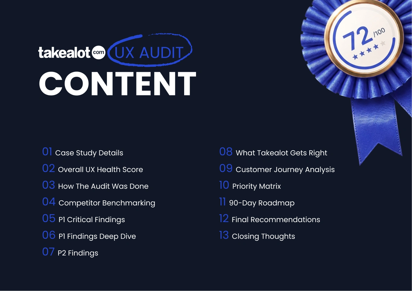
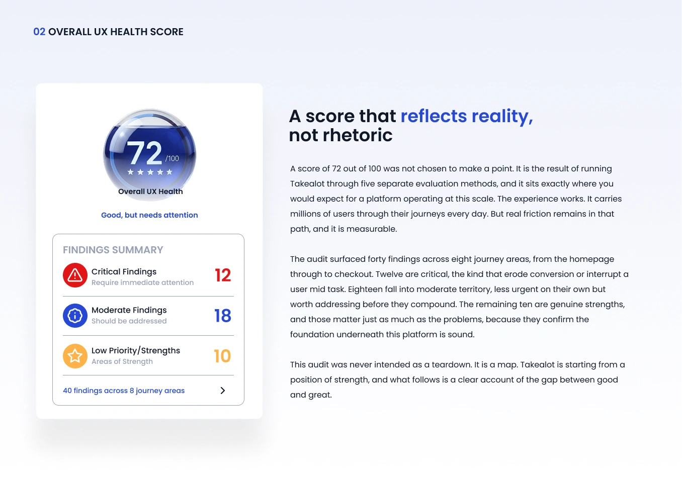
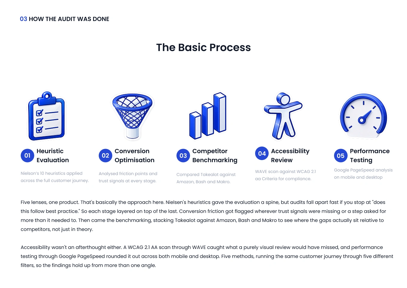
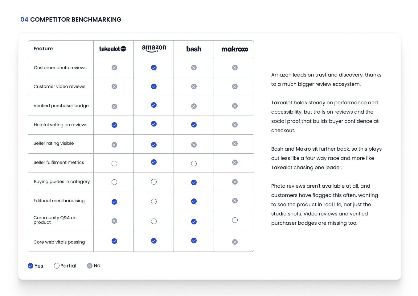
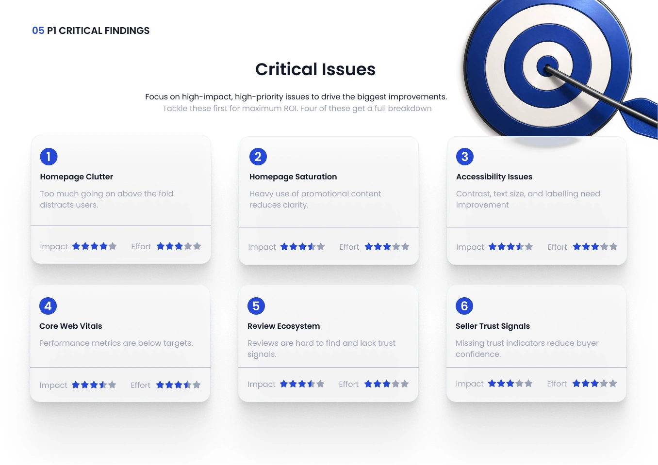
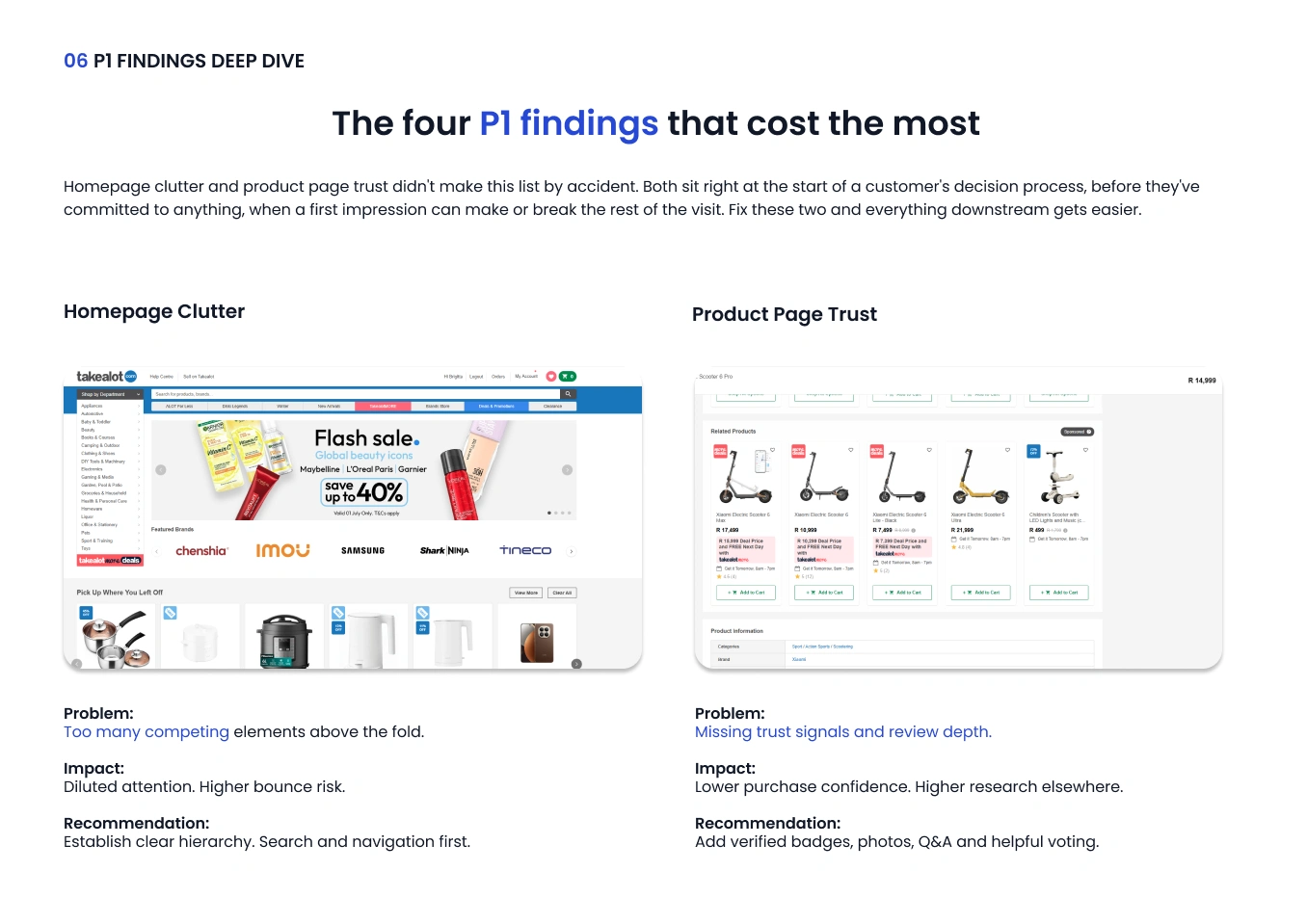
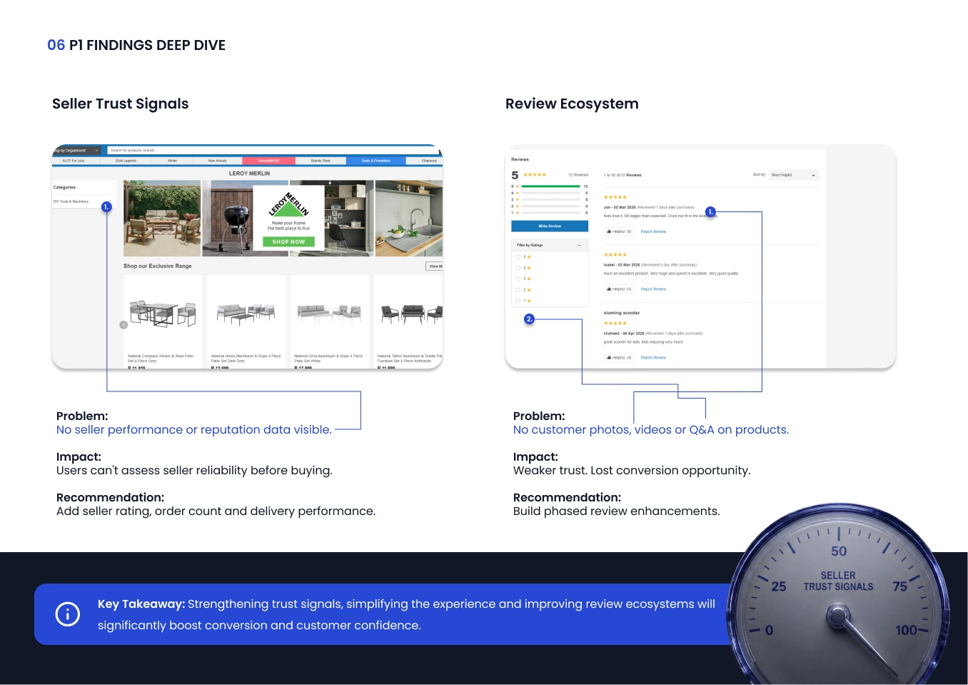
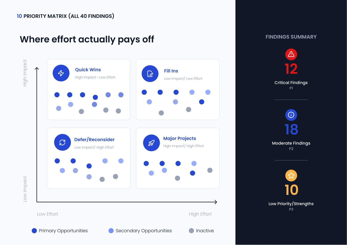
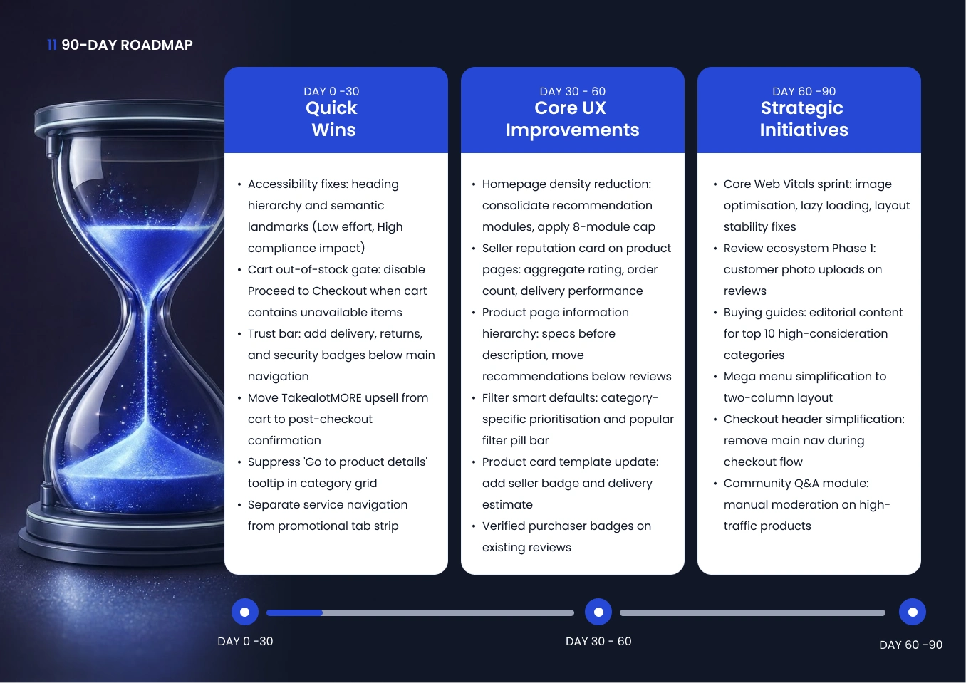
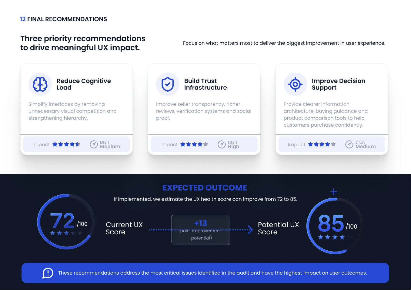
A self initiated UX audit of Takealot, South Africa's largest online retailer, built to see how a platform operating at this scale actually holds up under scrutiny. The audit runs Takealot through five methods: heuristic evaluation, conversion optimisation review, competitor benchmarking against Amazon, Bash and Makro, an accessibility scan against WCAG 2.1 AA, and performance testing across mobile and desktop. Forty findings came out of it, spanning the full customer journey from homepage to checkout, with a 90 day roadmap showing exactly how to close the gap. This wasn't commissioned. It's independent work built to show how I think through a product end to end, not just where the visual problems sit, but why they're costing conversions and what fixing them actually looks like in practice.