
The problem
Tanner Jensen, VEYSO's co-founder, emailed us on October 27. It was three lines long. VEYSO needed a polished website as fast as possible, and could we talk tomorrow?
We talked the next morning, then met his partners. They had meetings the next Friday that couldn't move, so they wanted the final homepage with their developer by Thursday evening and a first draft early in the week. We said yes and the proposal was signed the same day.
The plan was a launch website in Figma covering home, shop, telehealth, membership and about, desktop and mobile, homepage first, everything by November 20. Their developer would build it. Our job was a file he could build from without guessing.
Where we started
VEYSO already had a landing page in progress. The wordmark and the earthy greens were worth keeping, so they stayed. The structure and type had to work much harder for a brand that sells health, so we started again from the information up.
VEYSO's landing page before the project
We set a new headline face, ABC Arizona, and wireframed seven pages in grey boxes before any visual design. VEYSO commented right on the wireframes. At the same time we built a moodboard from Mobbin, anchored on Function Health, with references from clinical, data led products all the way to warm lifestyle brands.
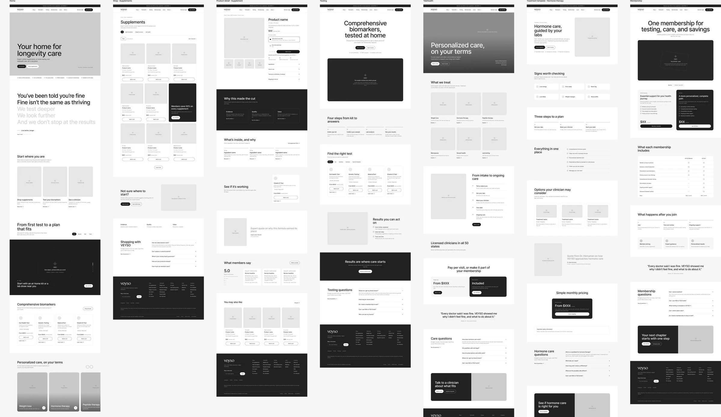
Grey box wireframes for seven VEYSO pages
Four directions, then two
Round one put the same content and type into four directions, each a different idea of what premium longevity care looks like.
Editorial: photography led and warm, carried by VEYSO's own film and brand photos
Graphic: photos inside arches and circles drawn from the wordmark
Glass: frosted panels floating over film, with a plan preview in the hero
Clinical: results first, with the member dashboard leading every section
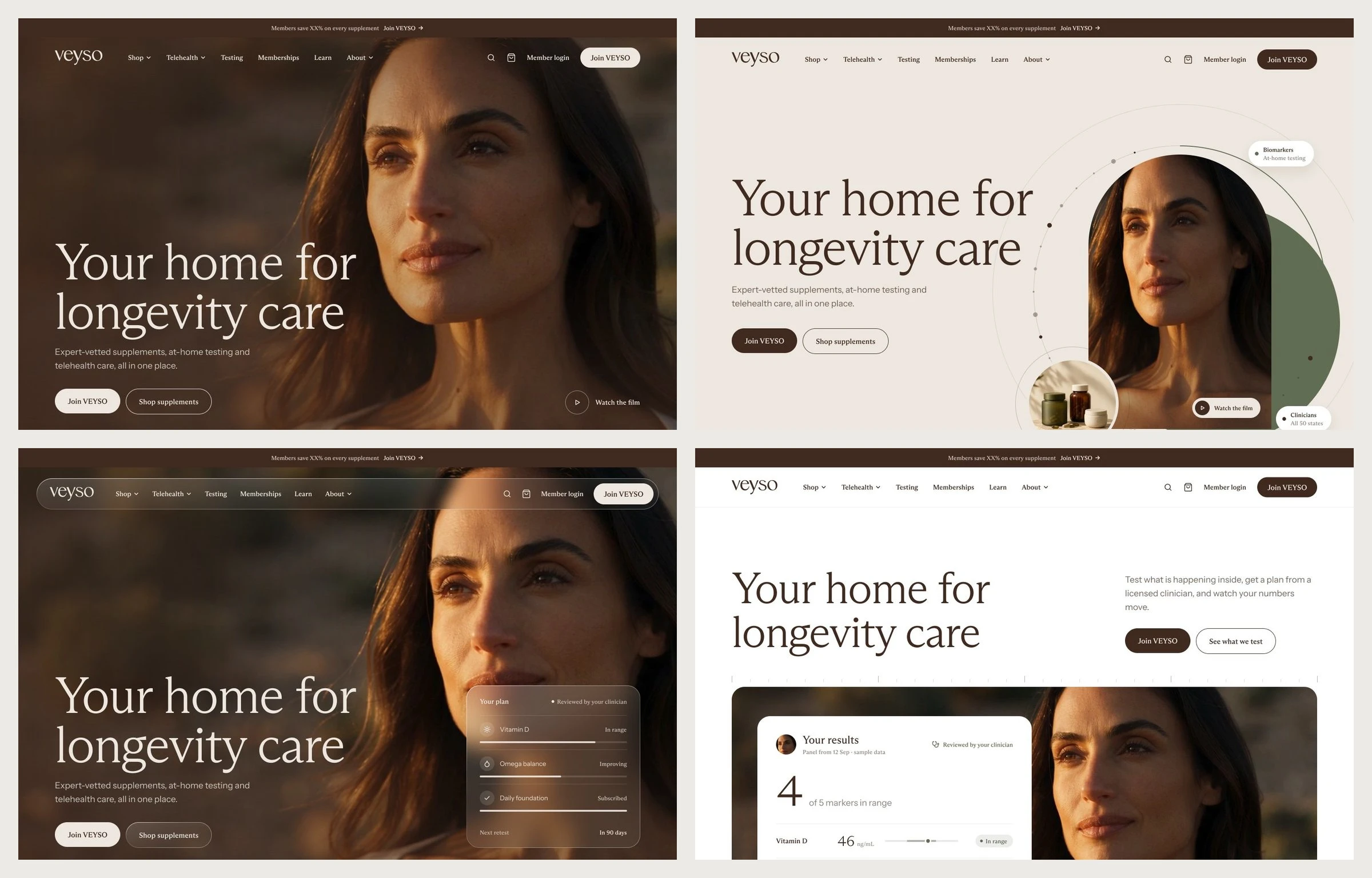
Four round one homepage directions for VEYSO
Round two narrowed it to two. Performance went crisp, white and high energy, closest to WHOOP. Bento went calmer and more product led, with a bento grid of the member's results, plan and test kit. VEYSO picked Performance.
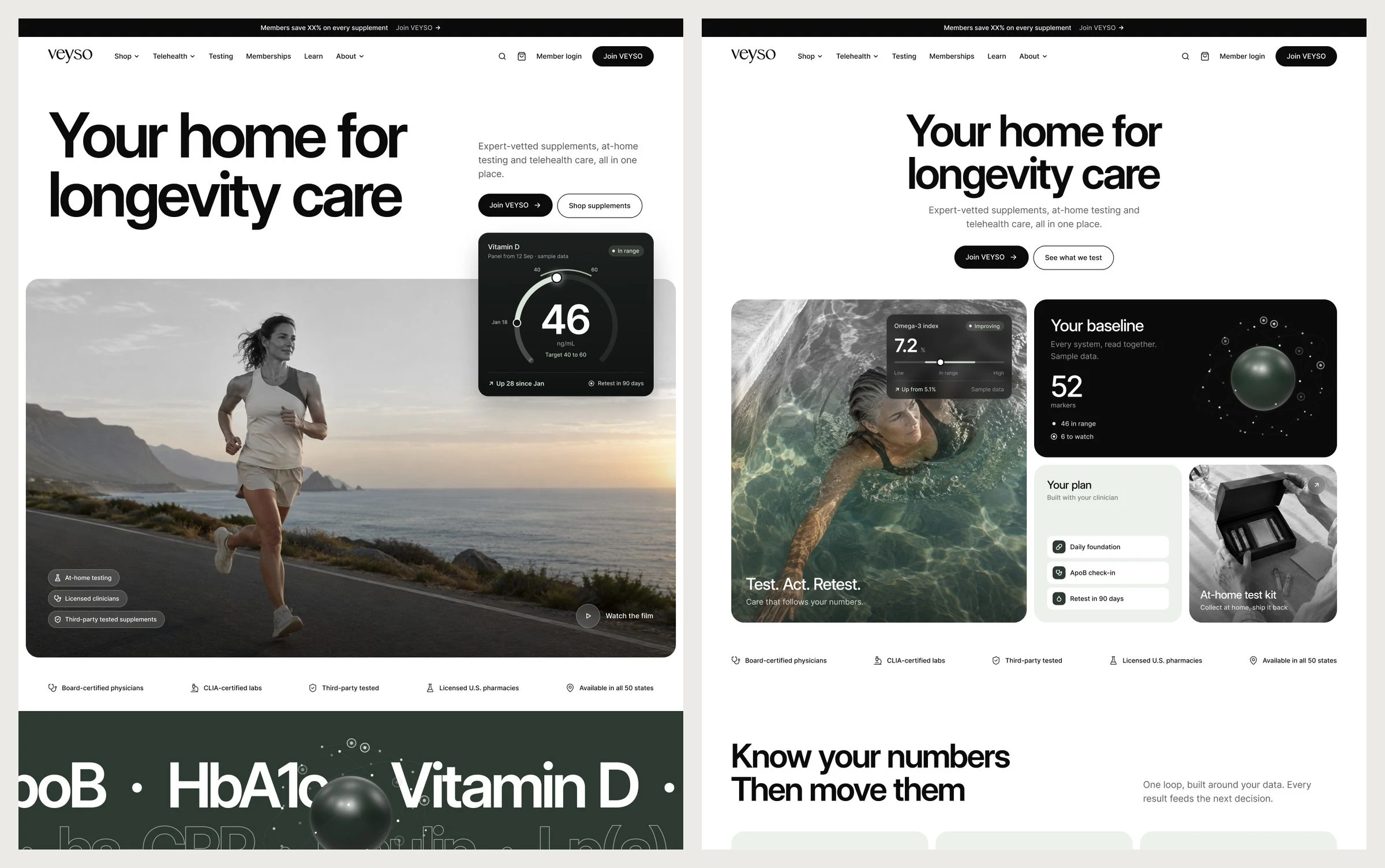
Round two homepage options, Performance and Bento
39 notes, answered in the file
On November 3 VEYSO left 39 notes on Performance, right in Figma. Round three answered every one of them in a change log next to the design: what they asked, what changed and where. The hero lost its color fade, every photo got a warmer golden hour grade, the nav turned to glass and results animate on scroll.
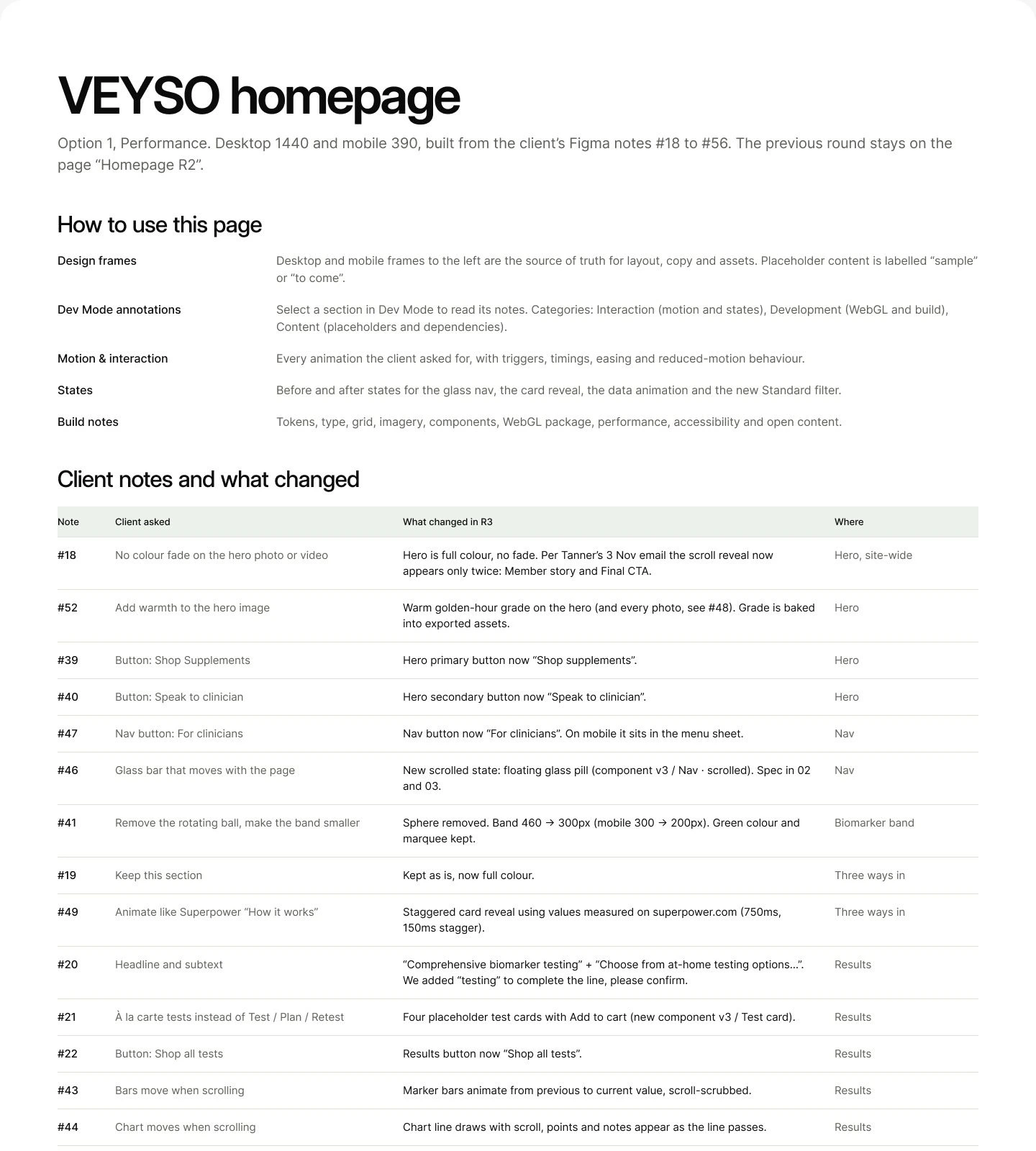
Change log board listing each VEYSO note with what changed and where
For the hero photo, we dropped each of VEYSO's picks into the real hero on desktop and mobile so they could choose by looking at the page. Round three went out as a handoff on November 5 with motion specs, states and build notes. By November 9 their developer had the homepage on a live preview.
The rest of the site
The inner pages went out in one pass on November 9 and 10: shop, product detail, testing, telehealth, a treatment template, membership, learn and about. Telehealth provider details wouldn't be public, so those pages carry no clinician photos. On November 12 we added a Coming soon page to hold the domain while the build caught up.
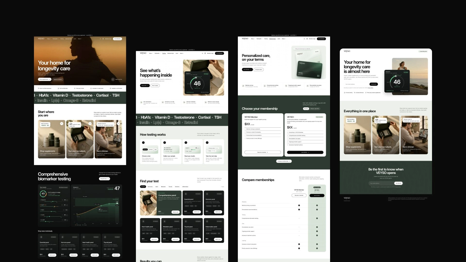
VEYSO website pages laid out side by side
The 67% moment
On November 16 Tanner told us the site felt balanced at 67% browser zoom and too big at 100%. He didn't want everything shrunk at the cost of readability. We checked, and the live preview matched the Figma file one to one. The build was right and the scale itself was the issue.
So we rebuilt the scale across every page. The homepage headline went from 136px to 88px and the hero from 1,276px to 760px. Body text, labels, buttons and fields kept their size. Fluid rules now hold those proportions at 100% on any screen.
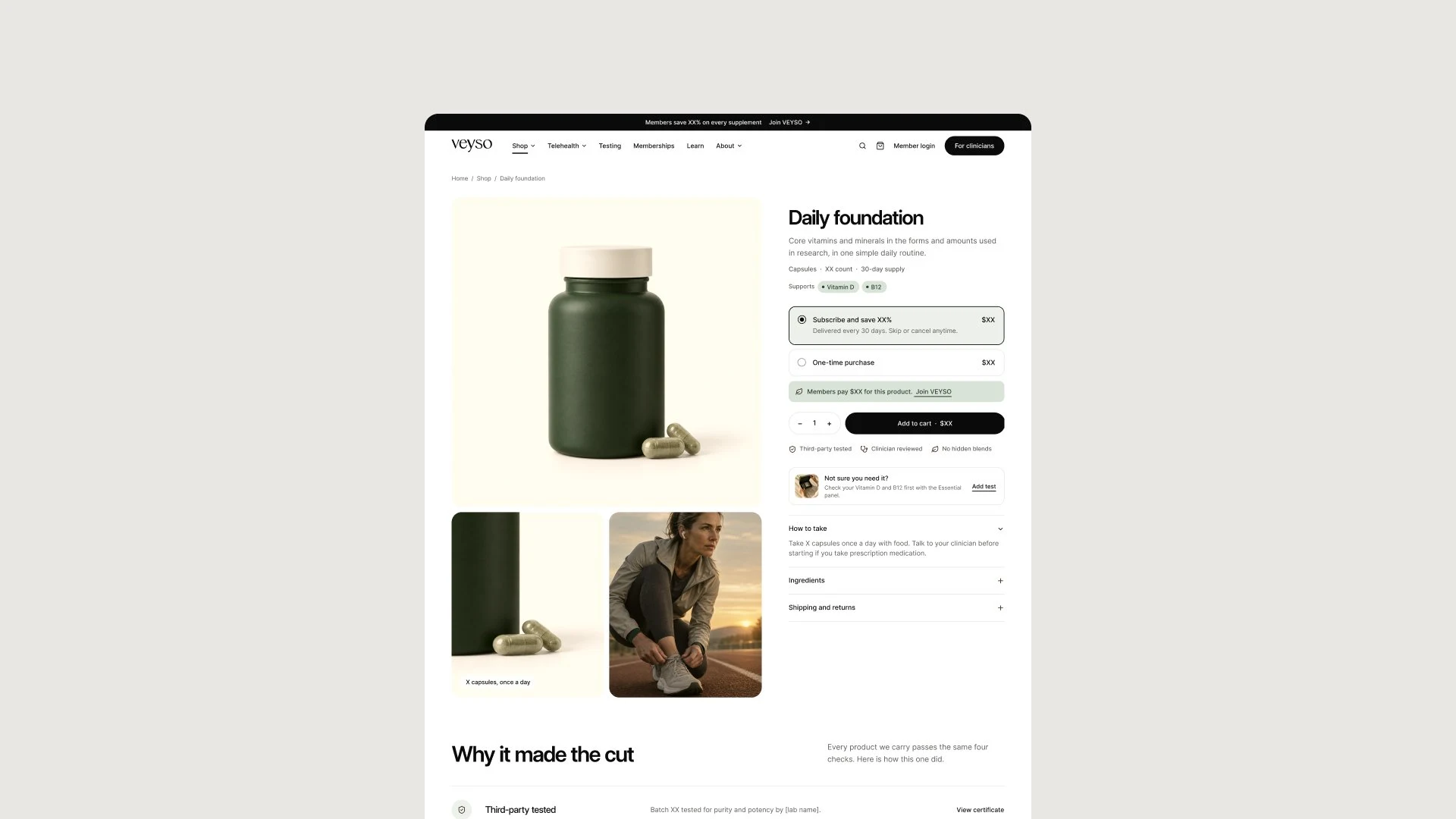
VEYSO product page for the Daily foundation supplement
The final hero and handover
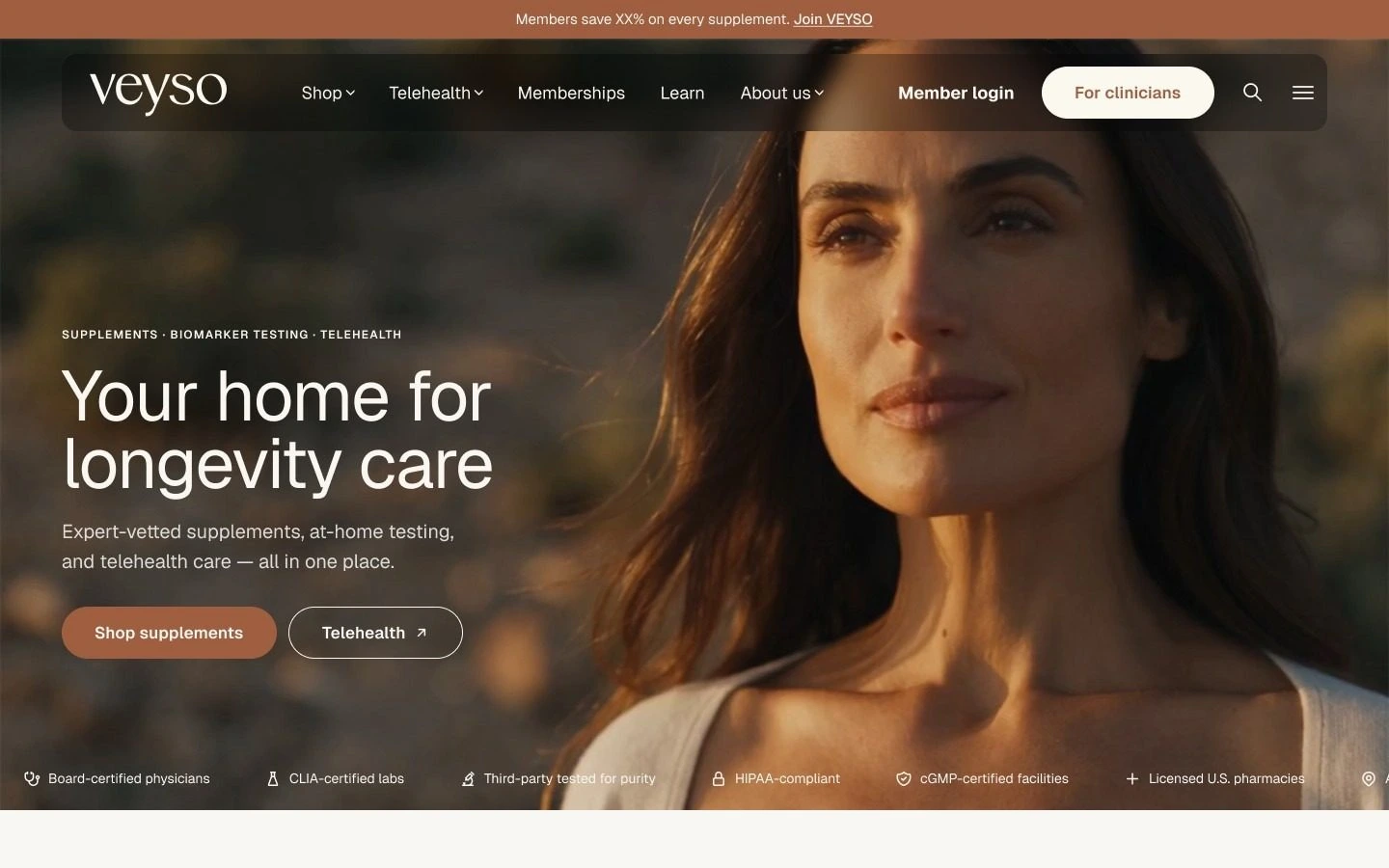
VEYSO wanted a more premium first impression, so we moved to a full bleed hero that fills the first screen. On November 17 their video went into the homepage and About heroes, playing on load and looping. We handed over the final file the same day, with a Read me board for the developer and a mobile version of every page at 390 wide.
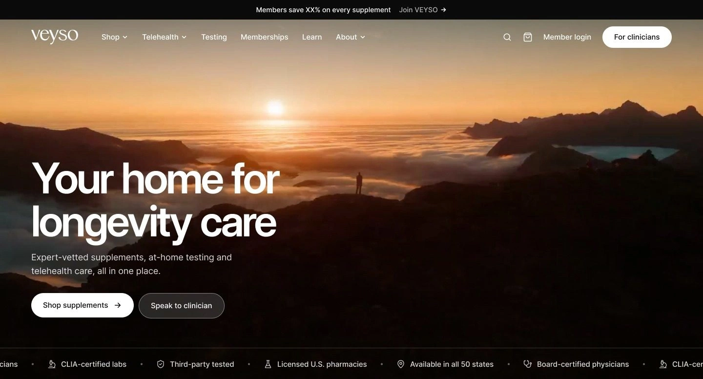
Final VEYSO homepage hero over a sunrise landscape
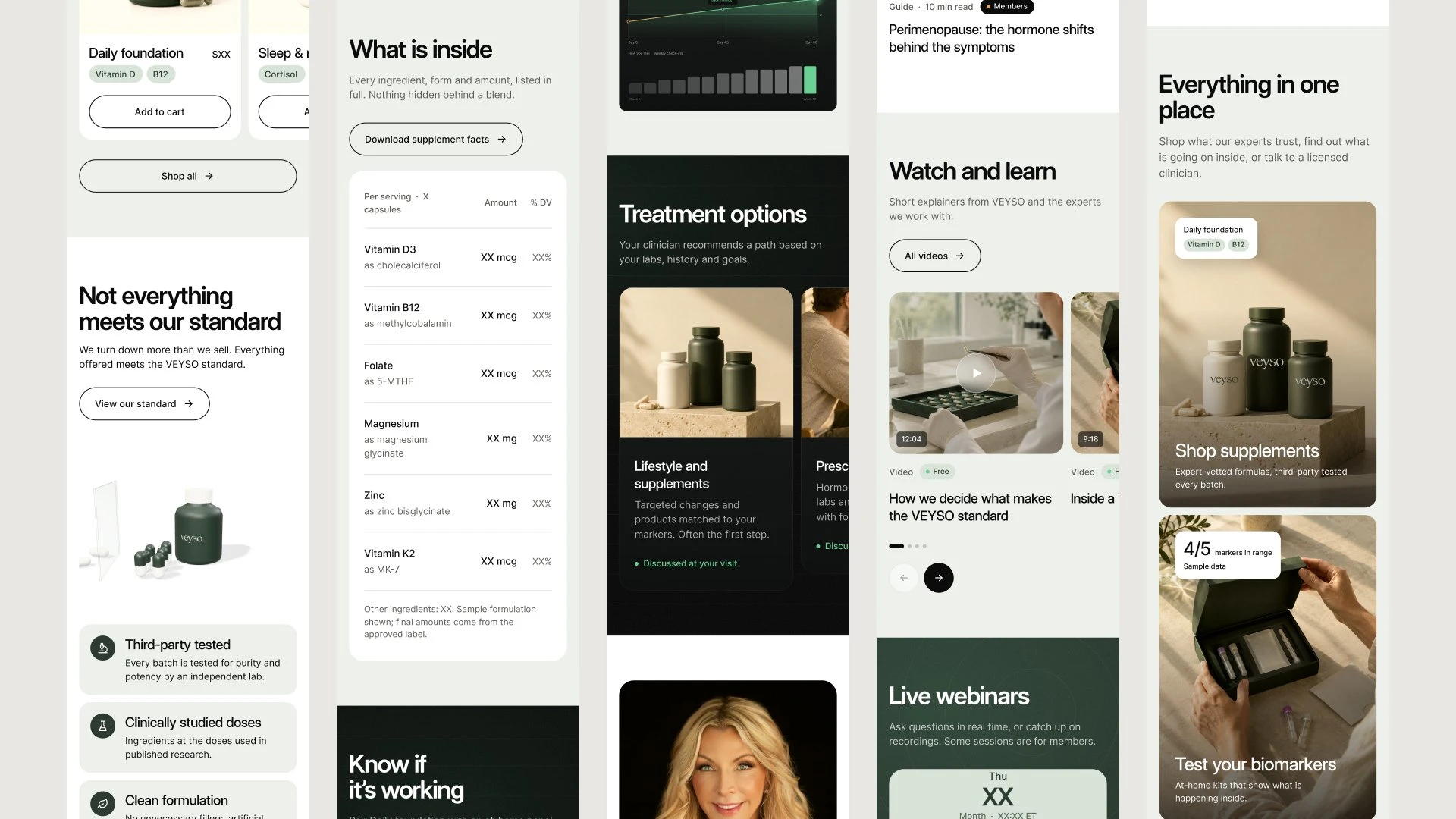
VEYSO mobile screens for supplements, testing and telehealth
Outcome
VEYSO went from a three line email to a final, developer ready file in 21 days. Four directions became two options, then one. Round three answered 39 notes, and the site grew to ten pages, each on desktop and mobile. The site is still being built, so there are no launch numbers yet.
Daniel is an exceptional designer! His artistic talent, creativity, and attention to detail are unmatched. Communication was seamless, turnaround times were incredibly fast, and he consistently exceeded expectations. Highly recommend!
Tanner Jensen, VEYSO
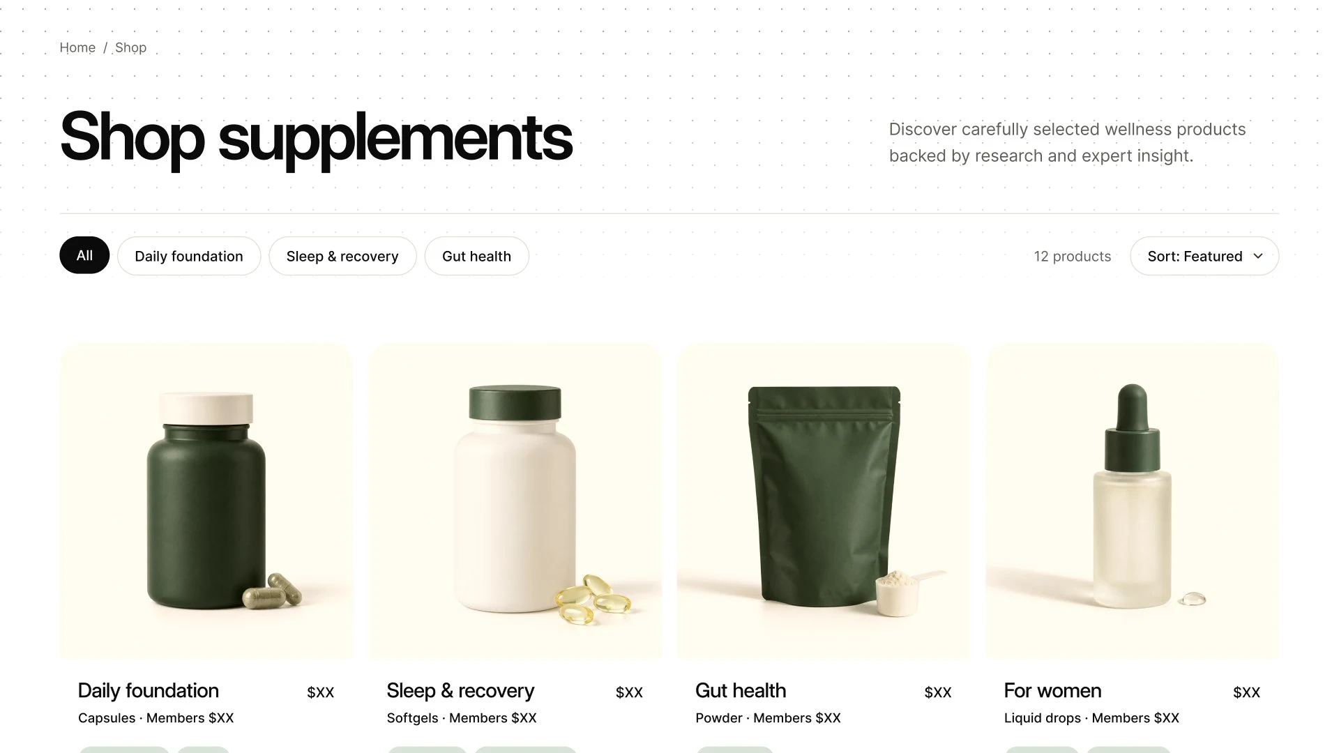
VEYSO Shop supplements page
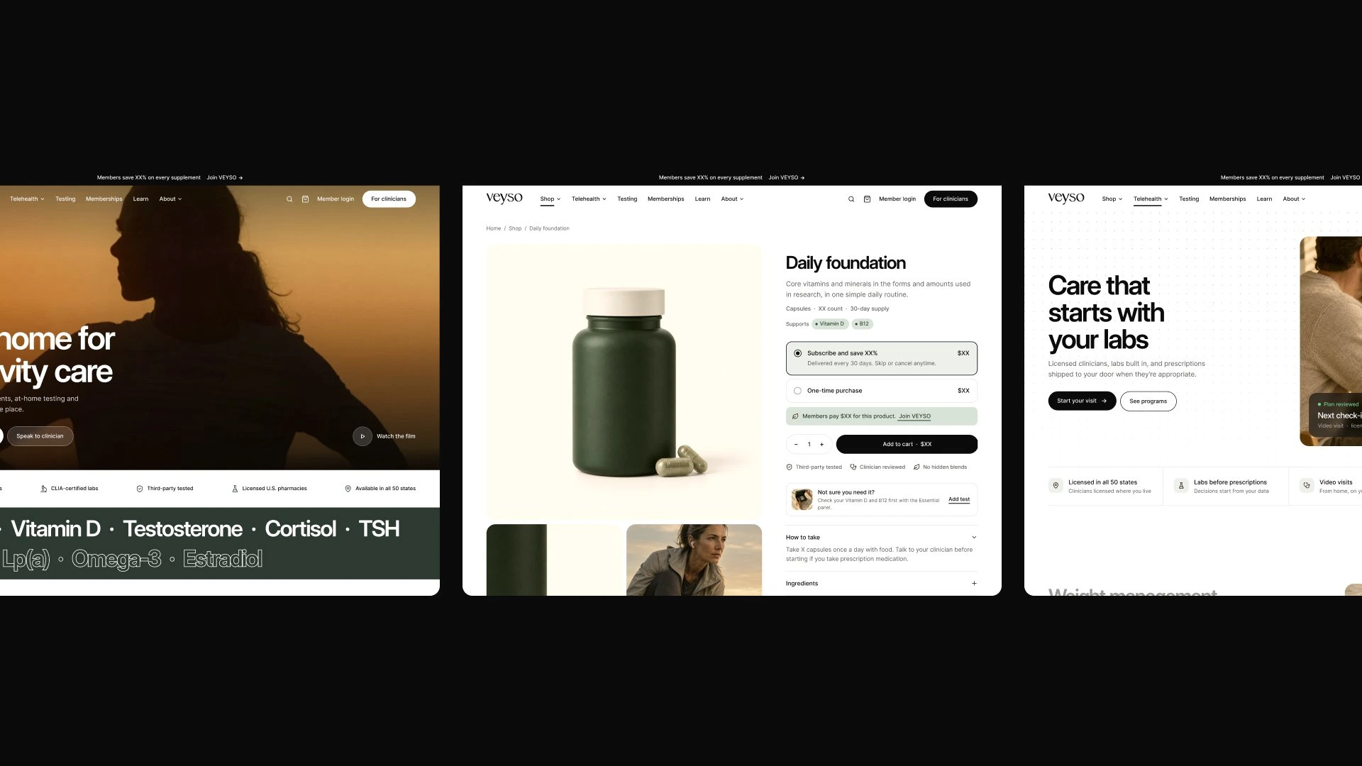
VEYSO homepage, product page and telehealth page in a row
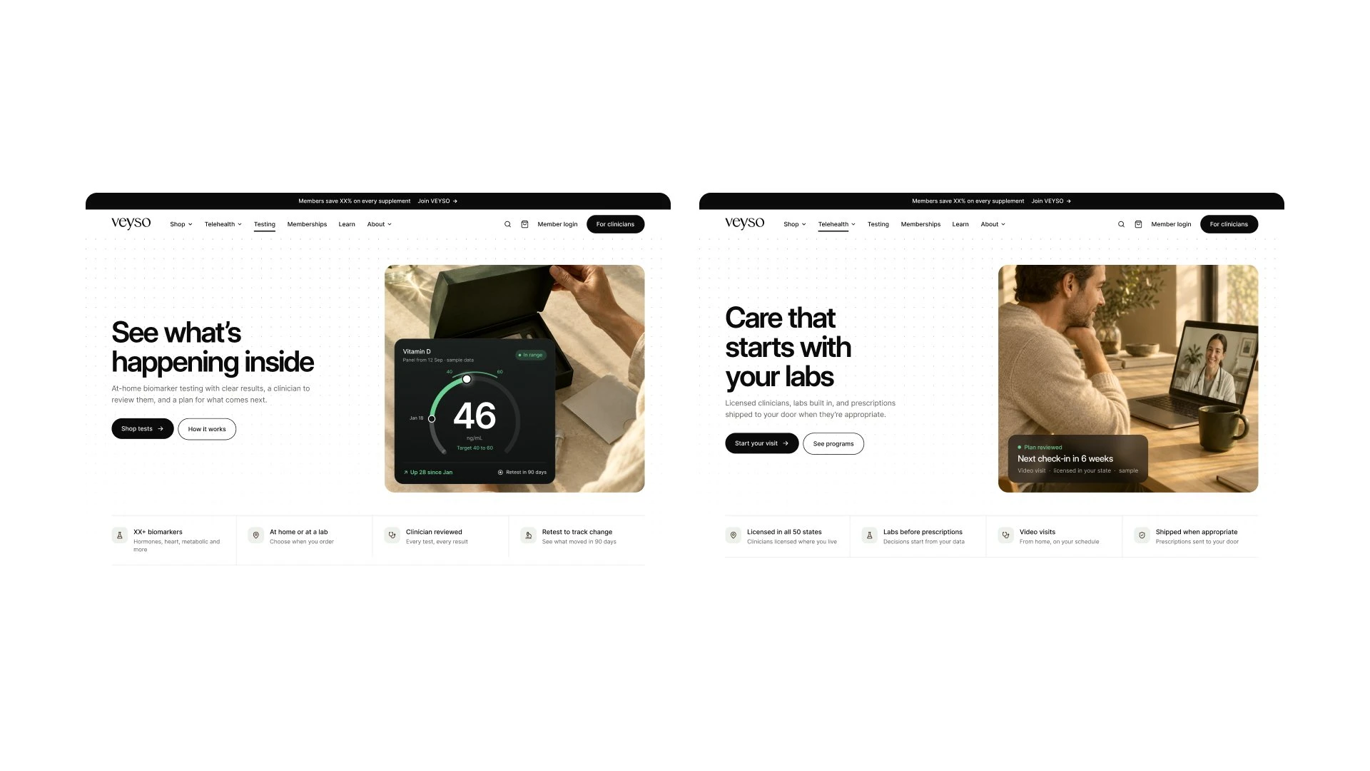
VEYSO testing and telehealth pages side by side
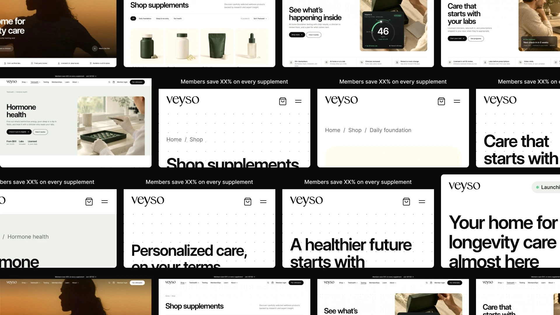
Wall of VEYSO desktop pages
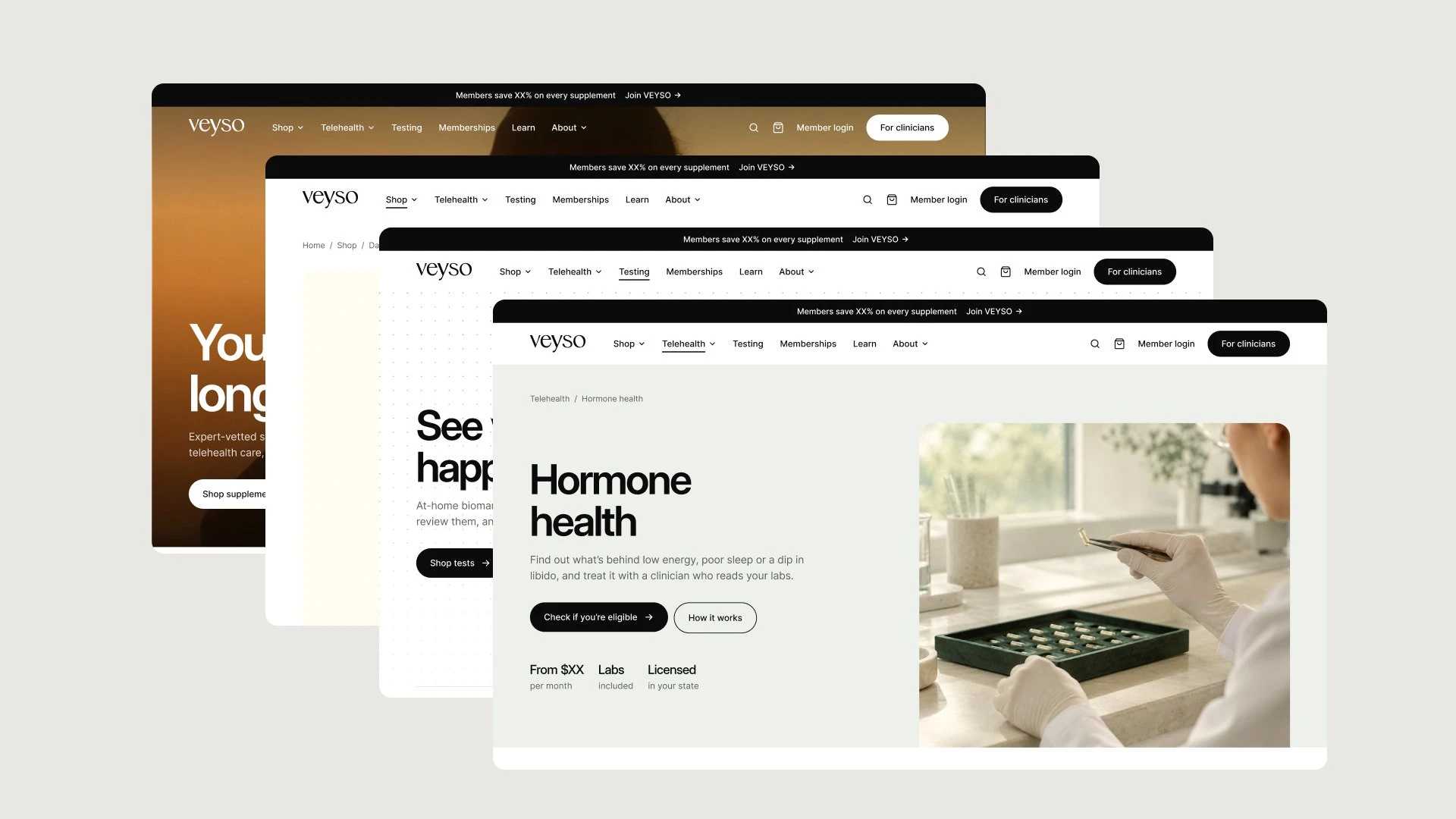
Stack of VEYSO pages ending on the Hormone health treatment page
Design by BrightStudios, led by Daniel G. Bright
0 likes · 0 views · Nov 20, 2026
VEYSO brings supplements, at home biomarker testing and telehealth into one place. We designed ten pages in Figma, desktop and mobile, and handed their developer a build ready file in 21 days.
Timeline
Oct 27, 2026 - Nov 17, 2026

