Koéna
Ruby Brewster
The Brief
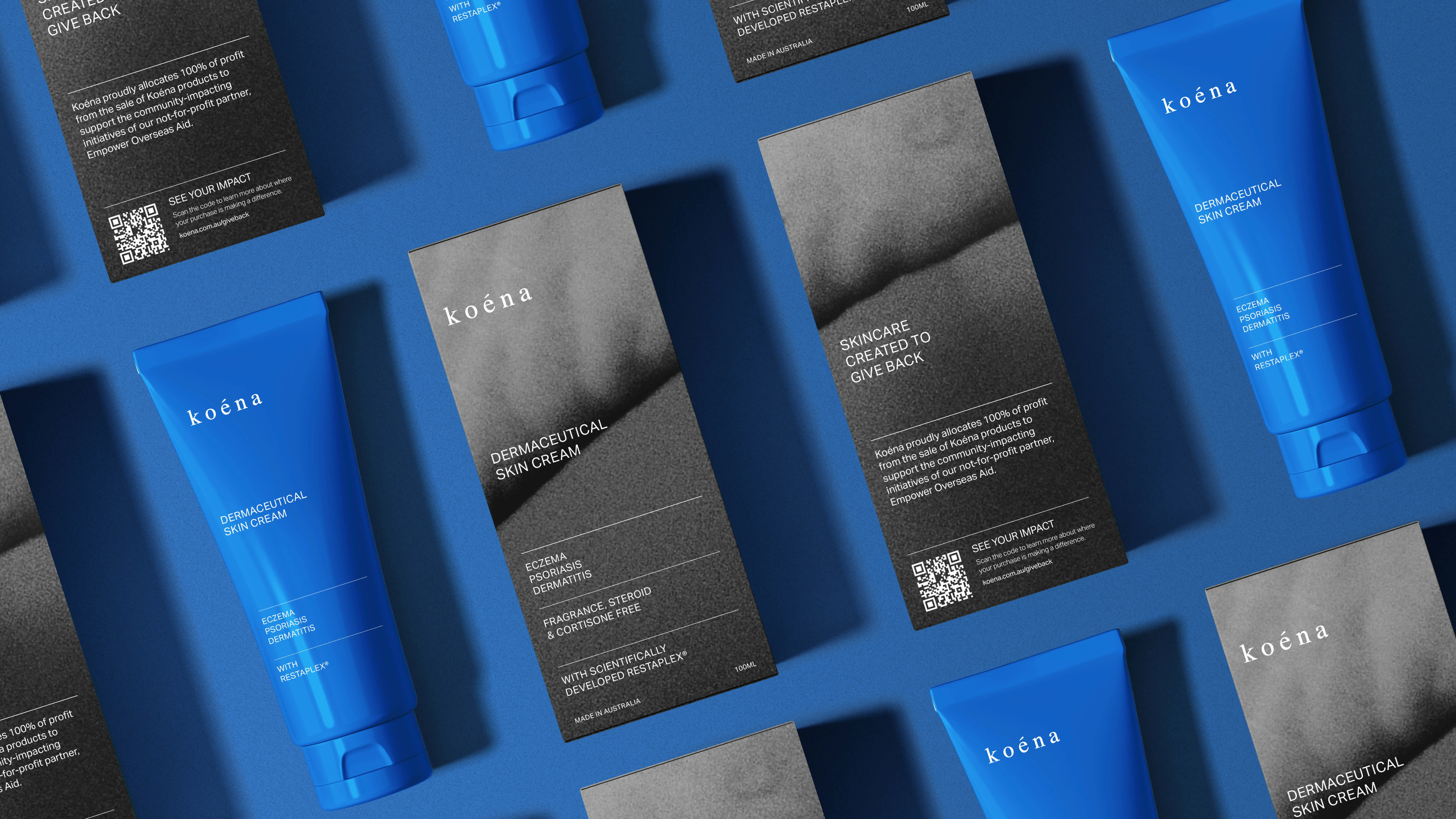
Koéna is the Hawaiian word for balance - a word that forms the 2 principles of this skincare brand's vision:
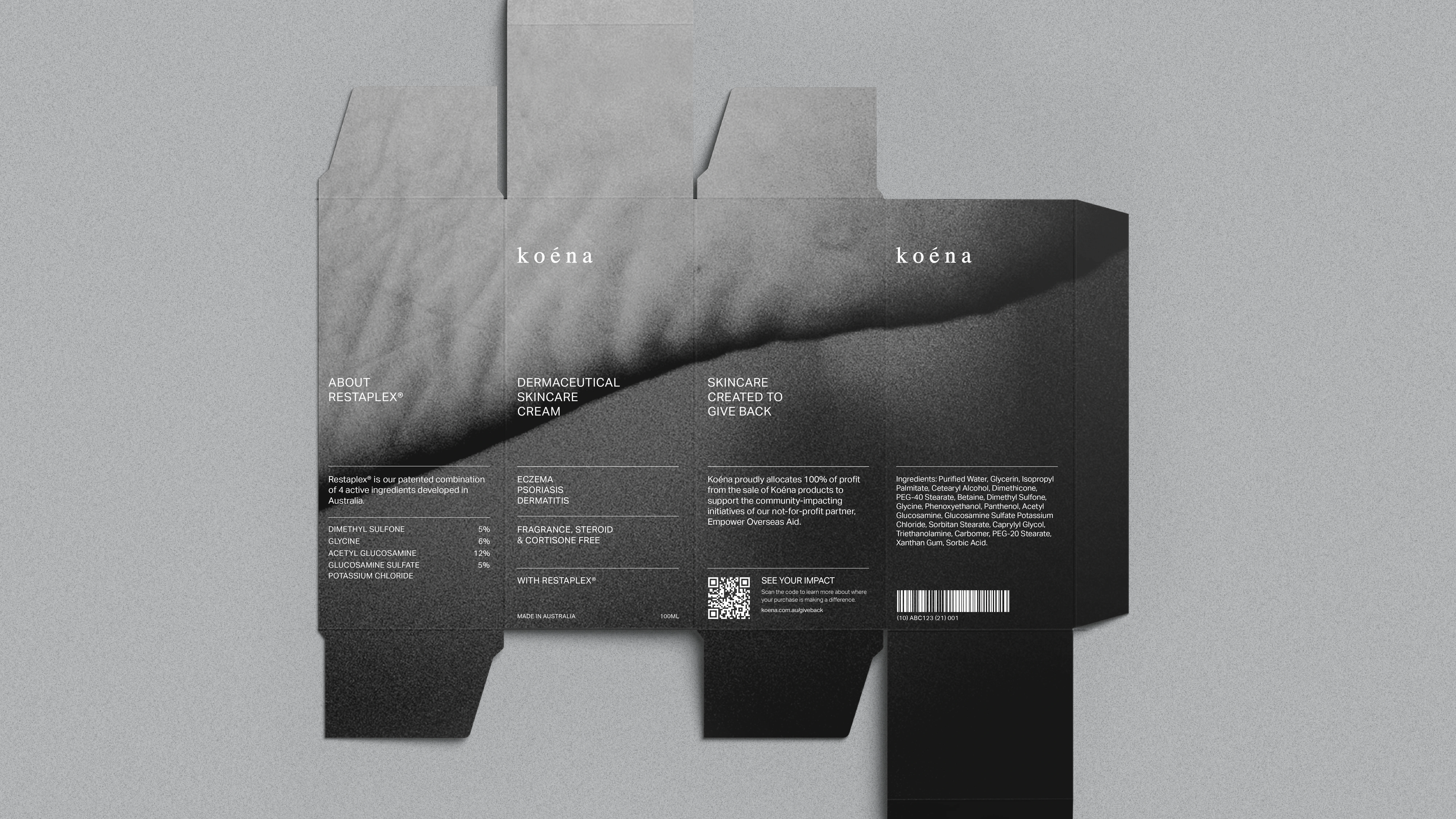
Restoring balance to skin for individuals suffering from inflammatory skin diseases, using a combination of 4 unique scientific ingredients.
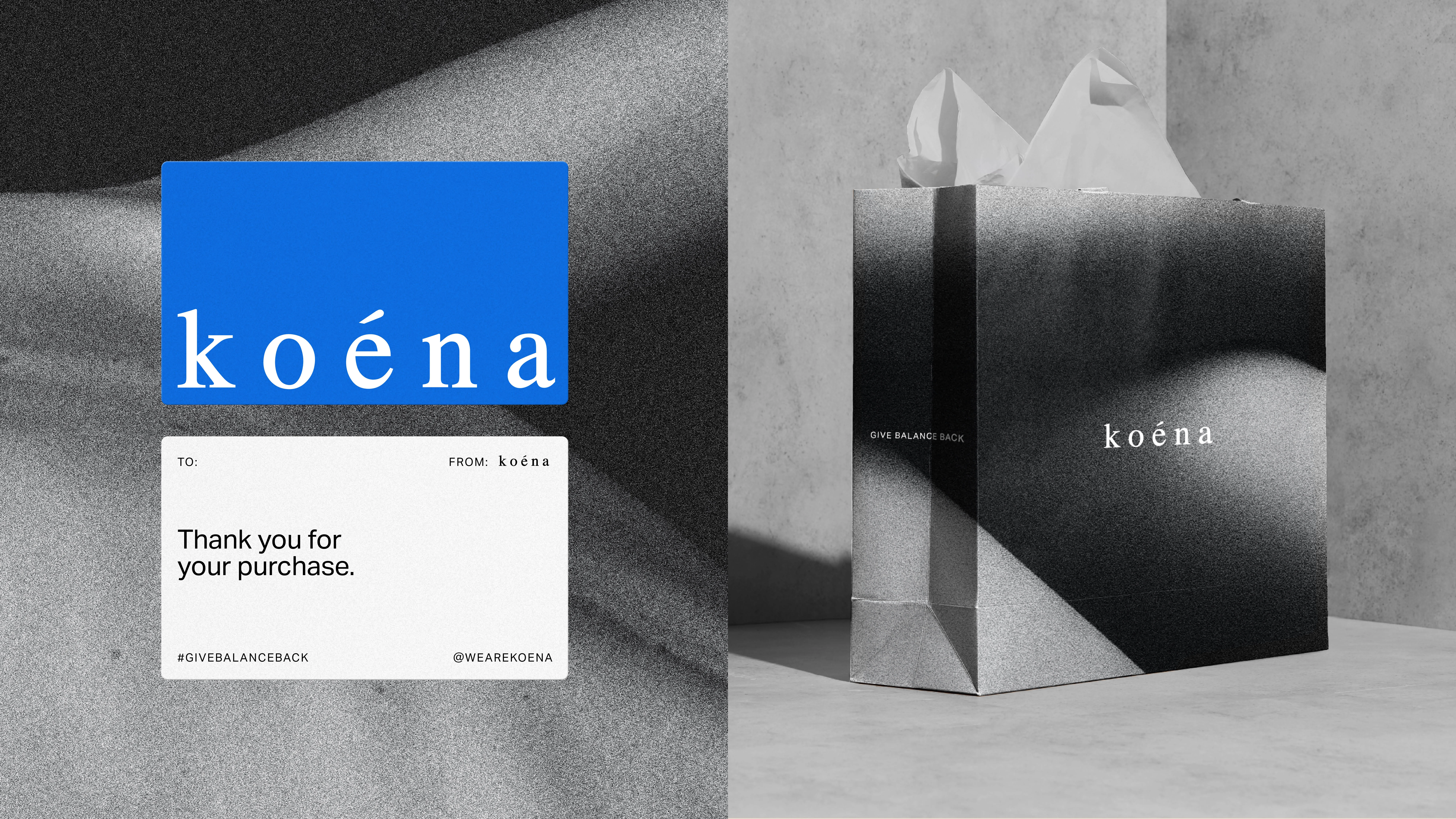
Giving balance back to those in need by channeling 100% of profits to communities in need.
The Design Solution
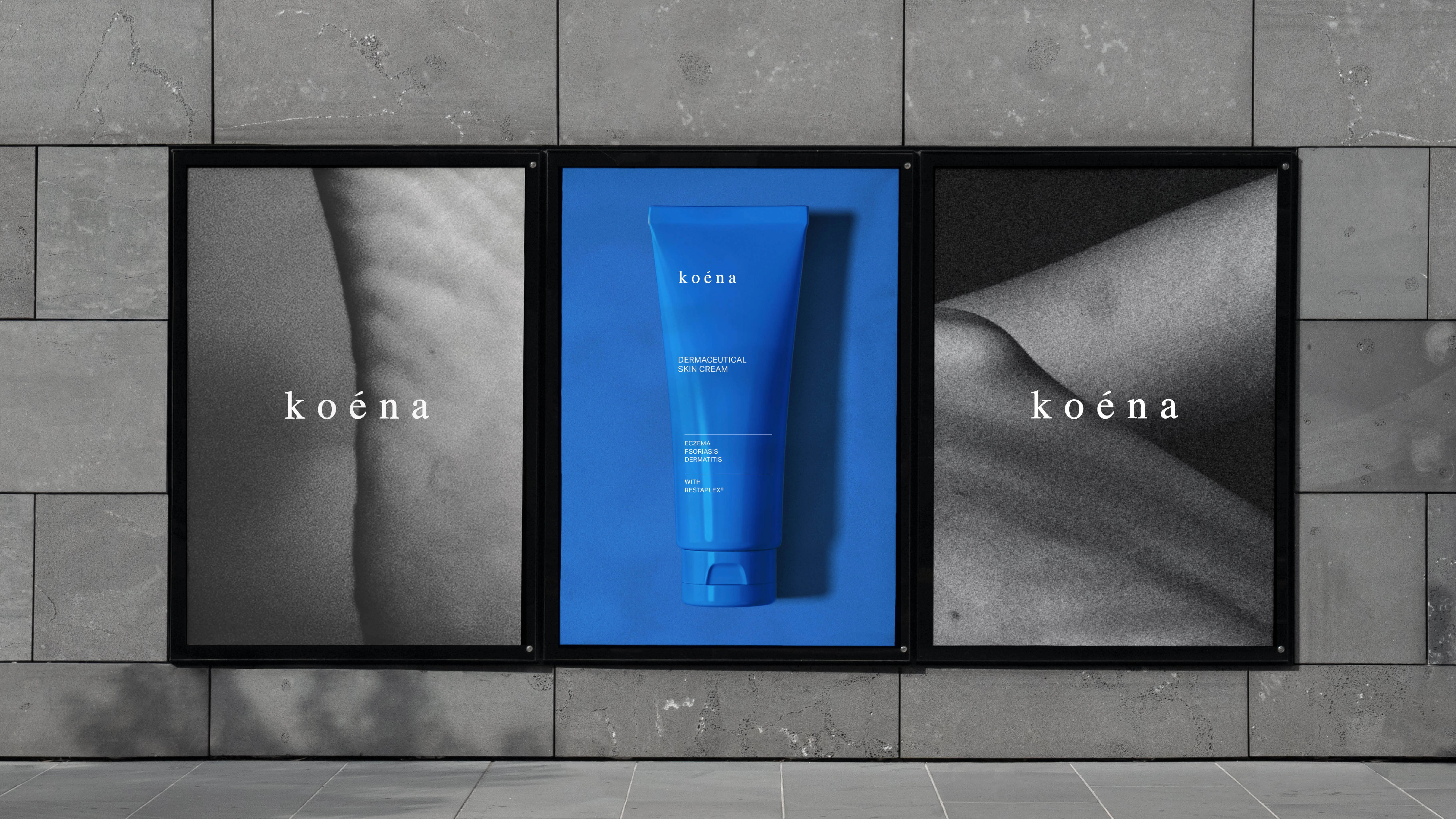
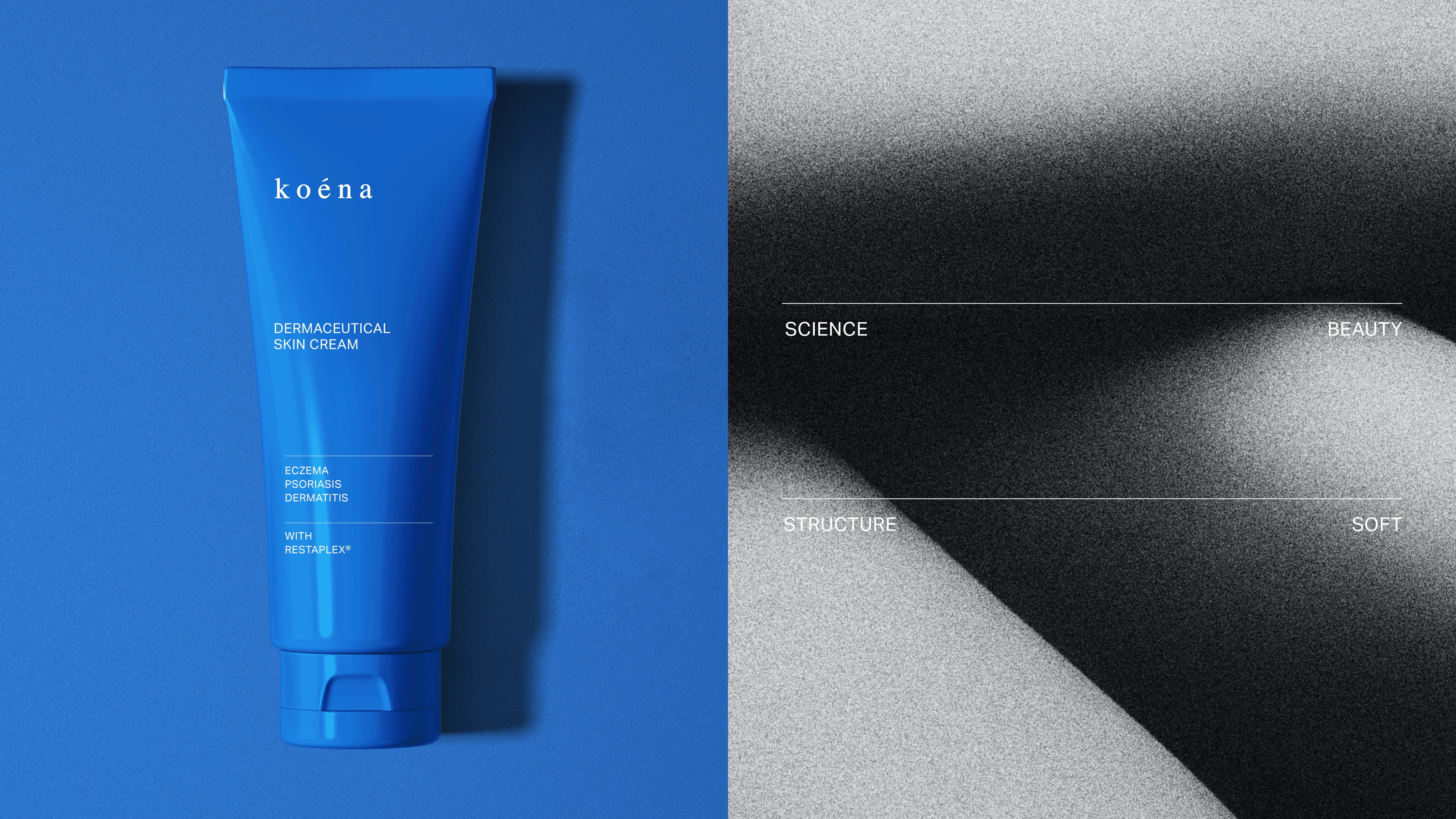
The visual identity also shows a balance between the beauty and science world. It is soft yet structured, beautiful but informative, toeing the line between cosmetic and medical.
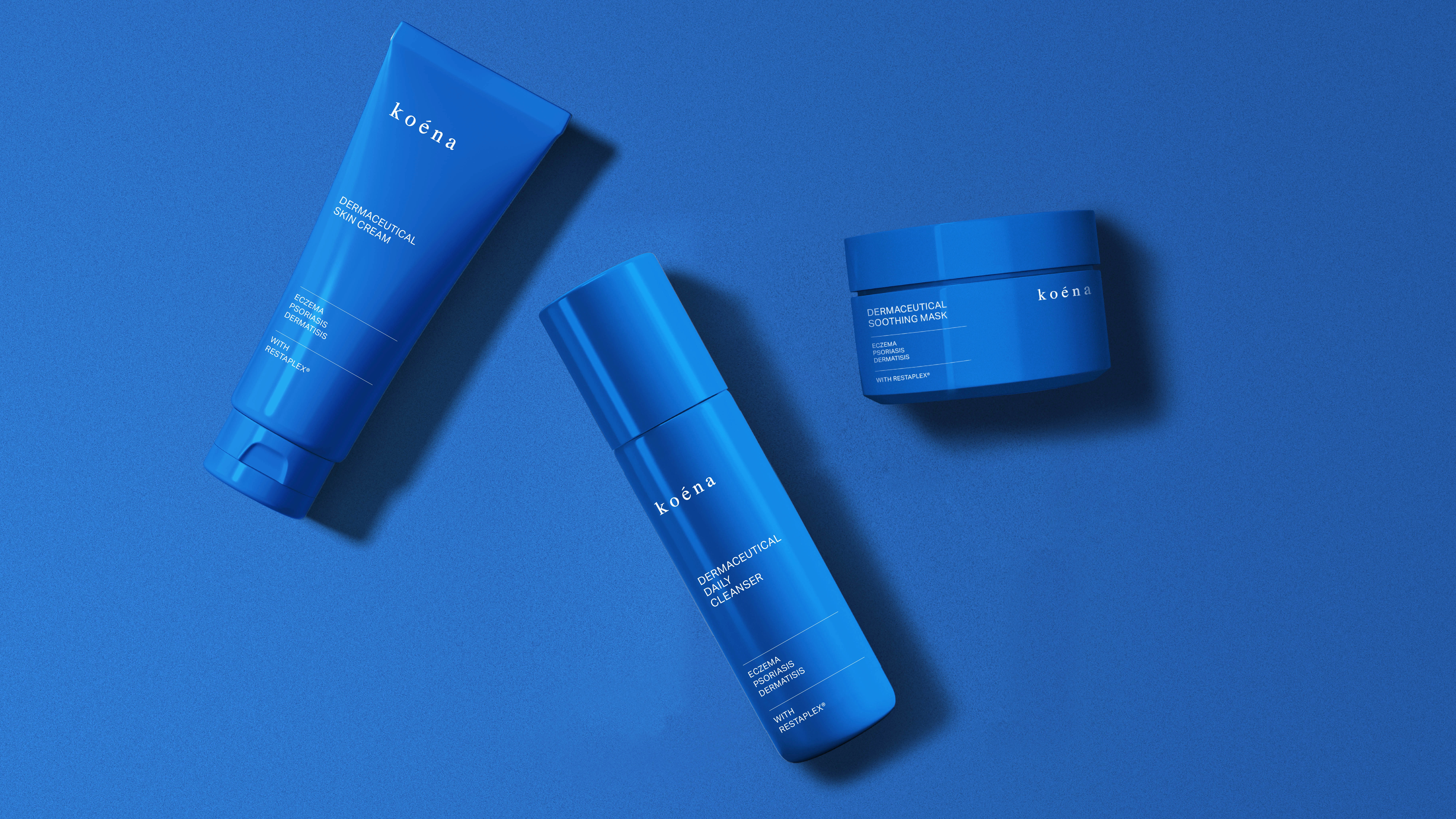
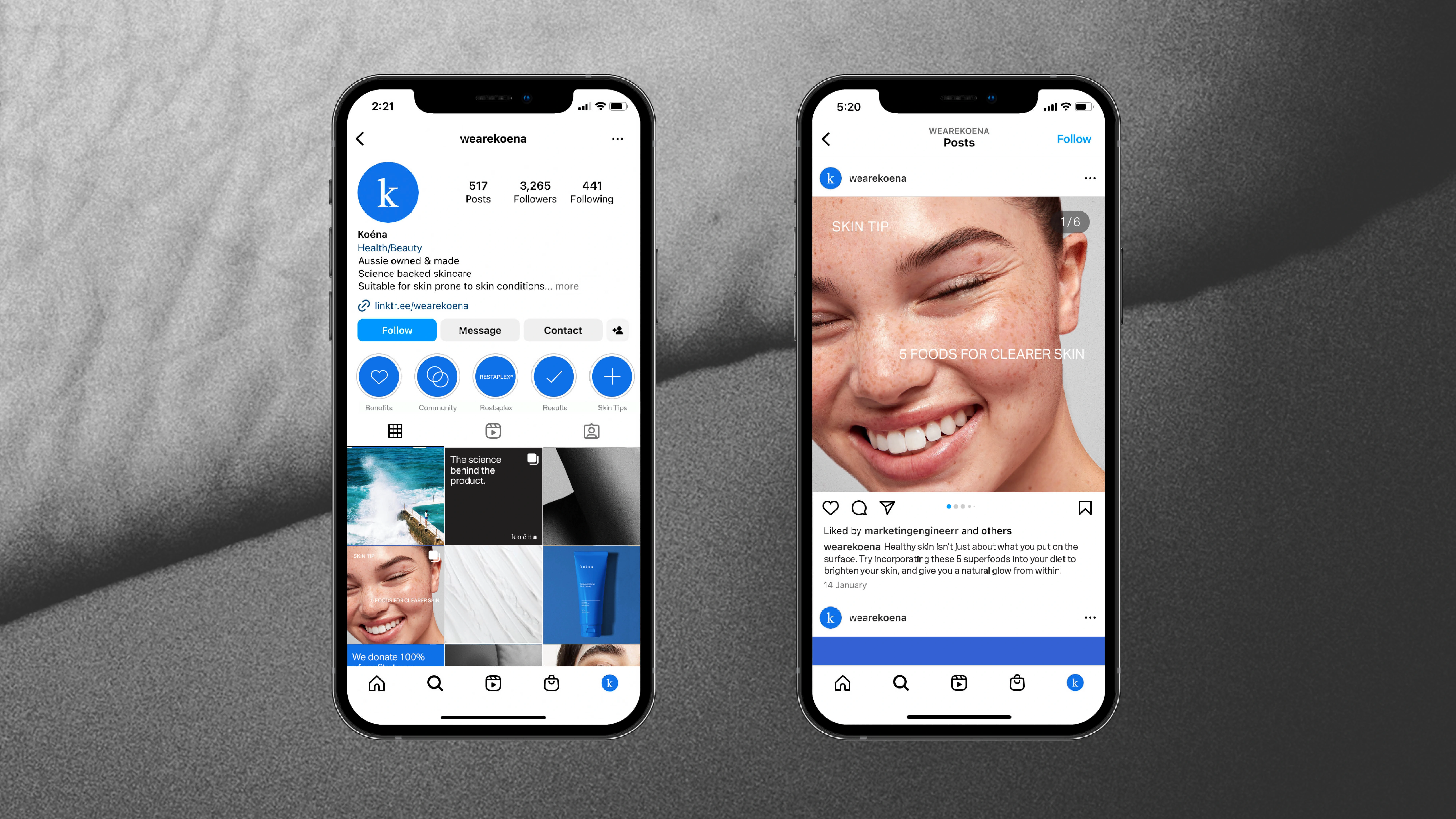
The cobalt blue colour was chosen as the brand's signifier, to help the product stand-out on a predominantly white pharmaceutical shelf. Art direction for the brand is focused on pictures of skin on the macro level, allowing the brand to feel close and personal but also scientific.
Deliverables:
Visual Identity & Brand Book
Packaging Design
Printed Stationary
Social Templates
Like this project
Posted Mar 26, 2024
Visual identity for Australian-based skincare brand that is balanced between the worlds of beauty and science.
Likes
0
Views
14