Sedated Knits
The Brief
Sedated was a brand born out of lockdown, creating 'mindful knits' - hand crafted from eco-conscious materials, to make you feel warm, comfortable and light as a cloud. Sedated approached me to create a brand that felt high-end and refined - but with an edge.
The Design Solution
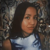
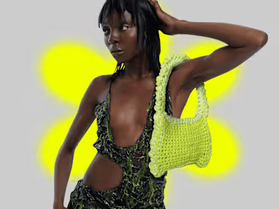
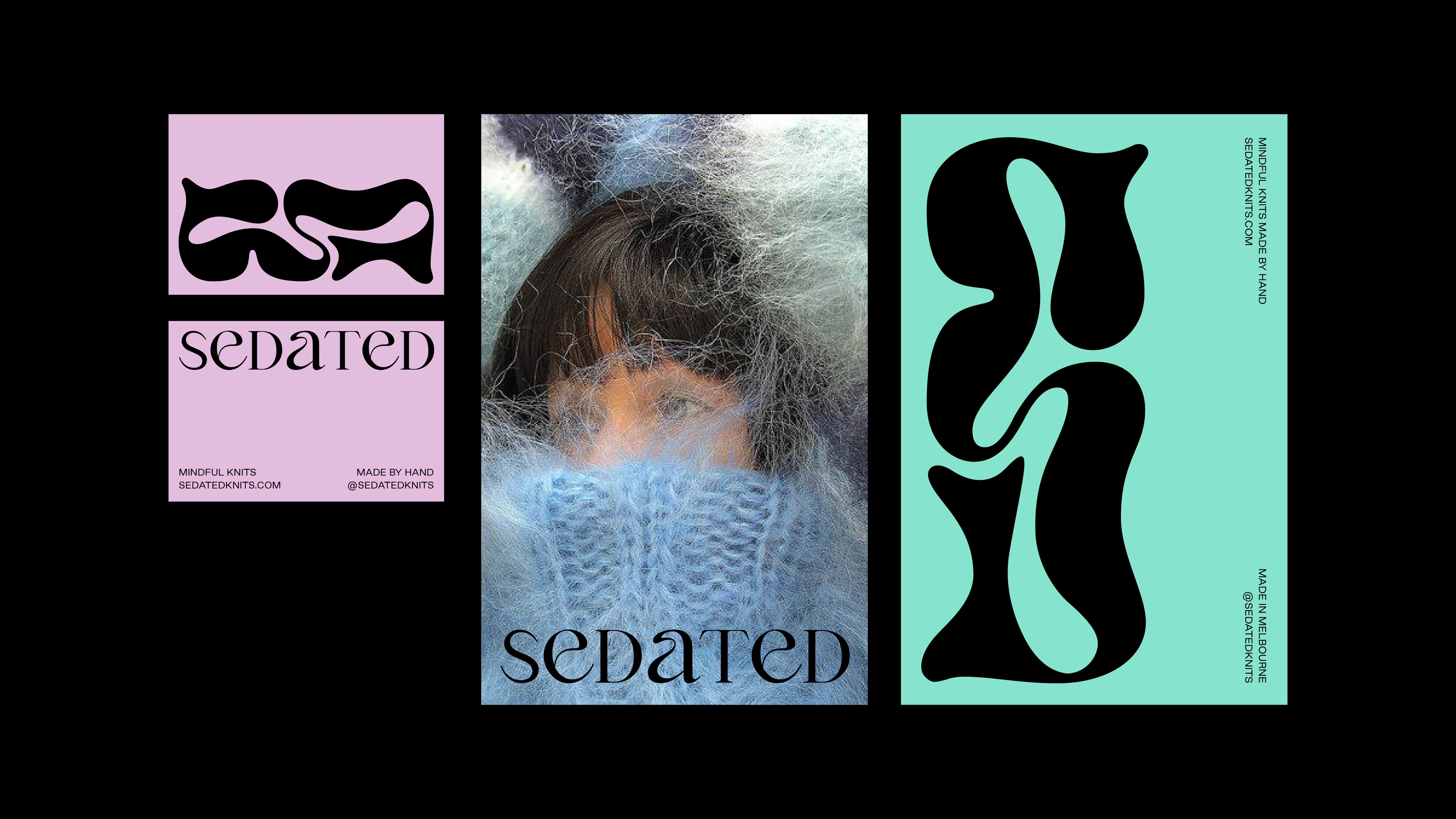
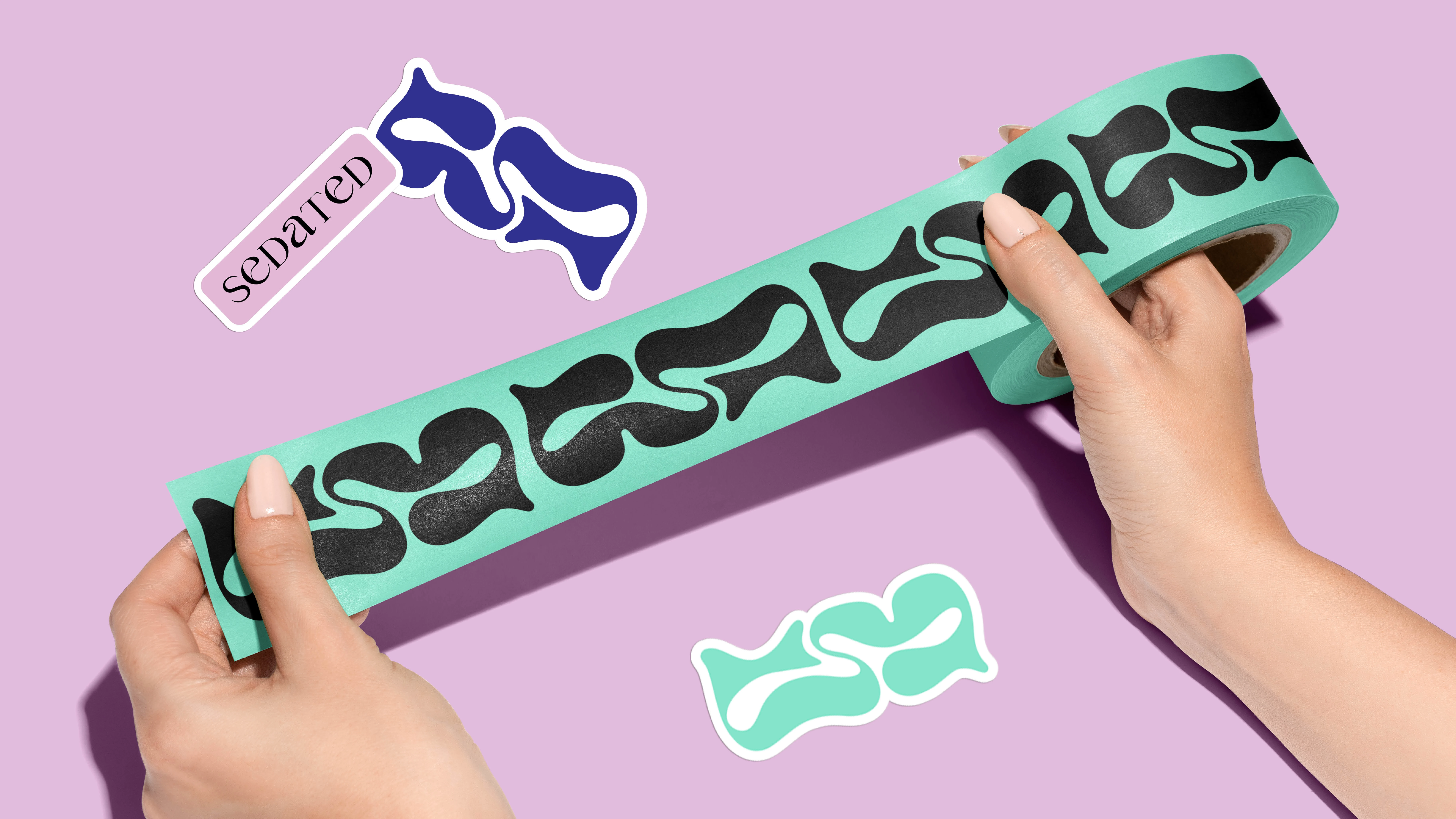
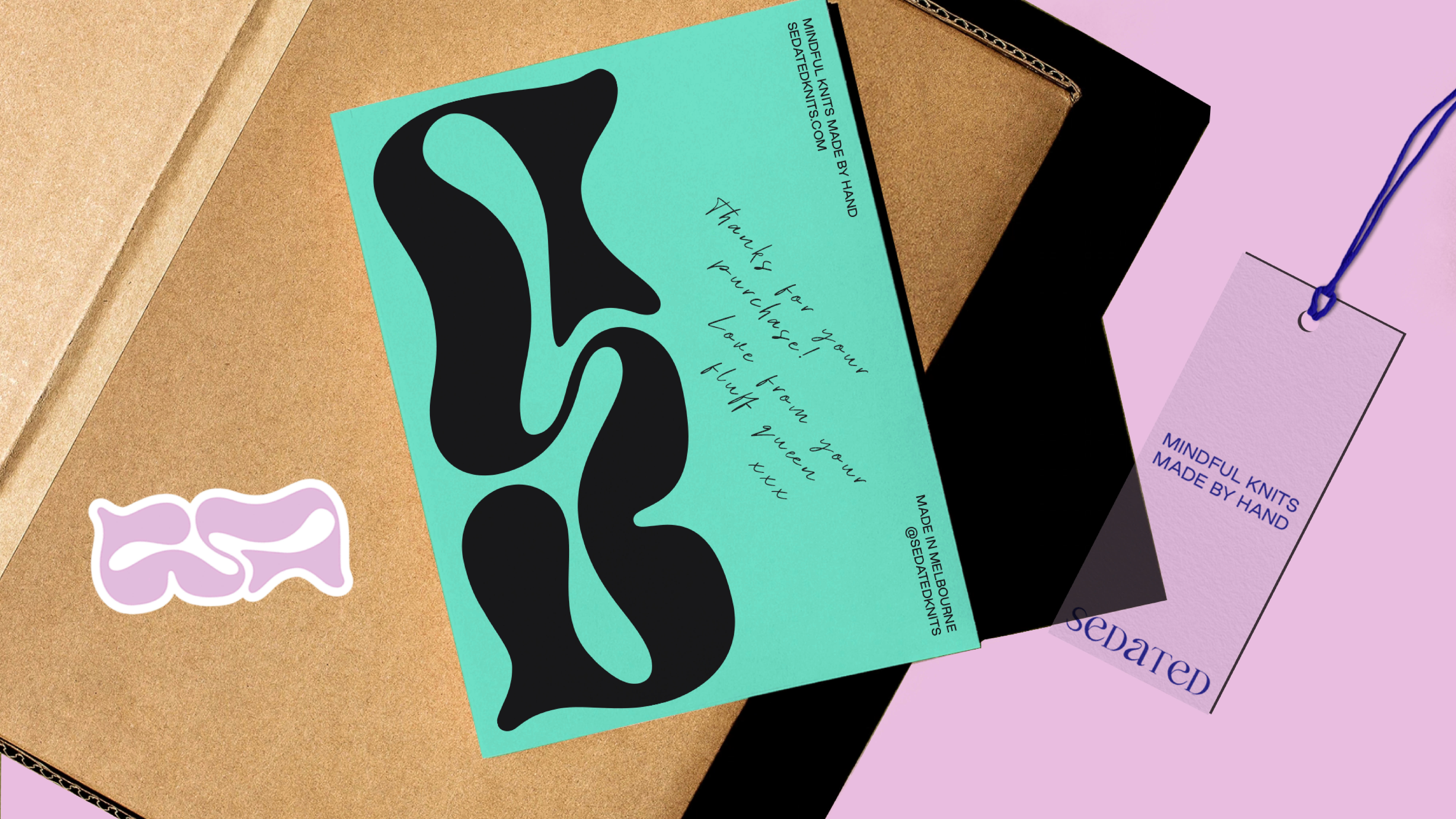
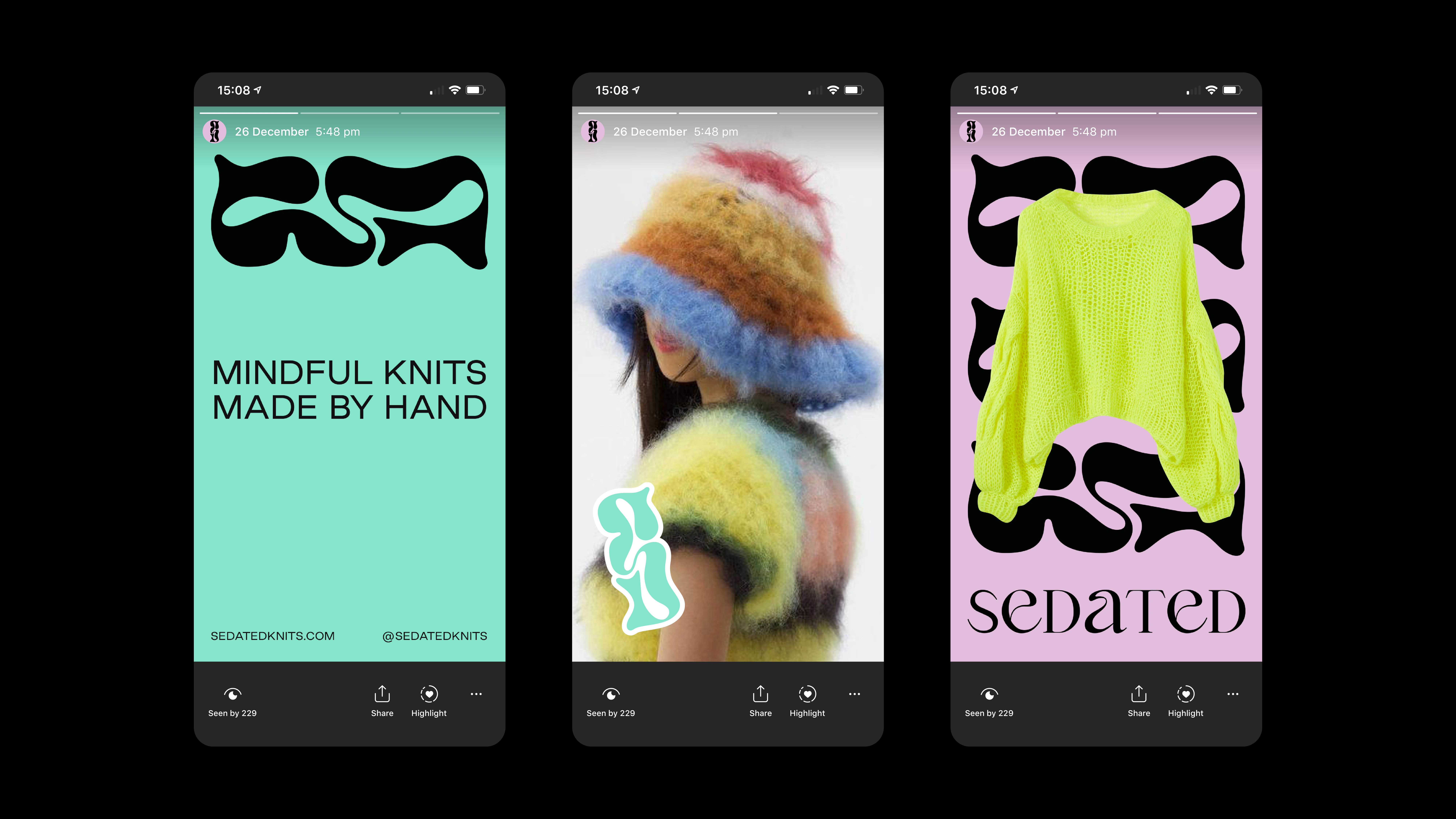
The connected curves in the logotype and an 'S' brand mark are inspired by the fluid weaving movement of knitting, creating a unique signifier for the Melbourne-based knitwear brand. The wordmark also mimics this with fluid curves within the lettering. A simple palette of two bright pastels are used for a pop of colour, but always using black as a way to bring the brand back to sophistication. Photography for the brand focuses on the fluffiness of the wool and high quality of the garments, the models feel enveloped in cosy, fluffy knits.

Like this project
Posted Mar 15, 2024
Creating a high-end but edgy identity for Melbourne-based knitwear brand - Sedated.
Likes
0
Views
25
