Connections Tab Redesign for BIZICHAT
Mark Williams
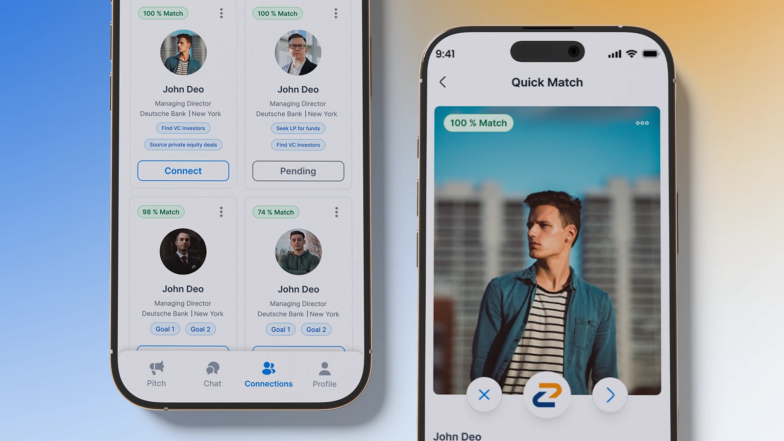
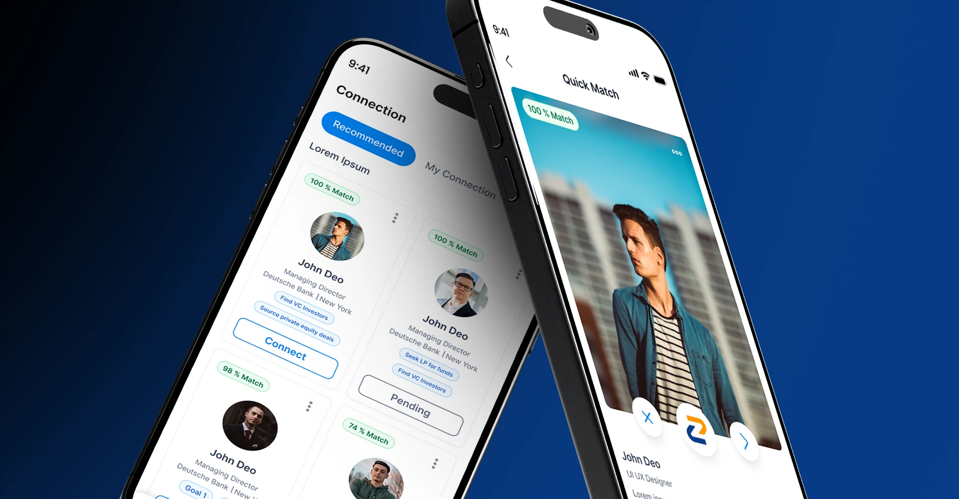
We redesigned the Connections Tab to enhance the contact summary, improve discoverability of the Quick Match feature, and create a more intuitive user flow. The result? A cleaner, more engaging experience that encourages users to interact with key features seamlessly.
Project Overview
BIZICHAT requested a UX and UI redesign for their Connections Tab, with a focus on improving the contact summary and enhancing the Quick Match feature.
The goal was to make the Quick Match feature more discoverable and engaging by subtly guiding users into it.
This involved redesigning a single screen while ensuring smooth navigation and clarity for the user, with the ultimate aim of boosting engagement.

Our Process
Low Fidelity Wireframe
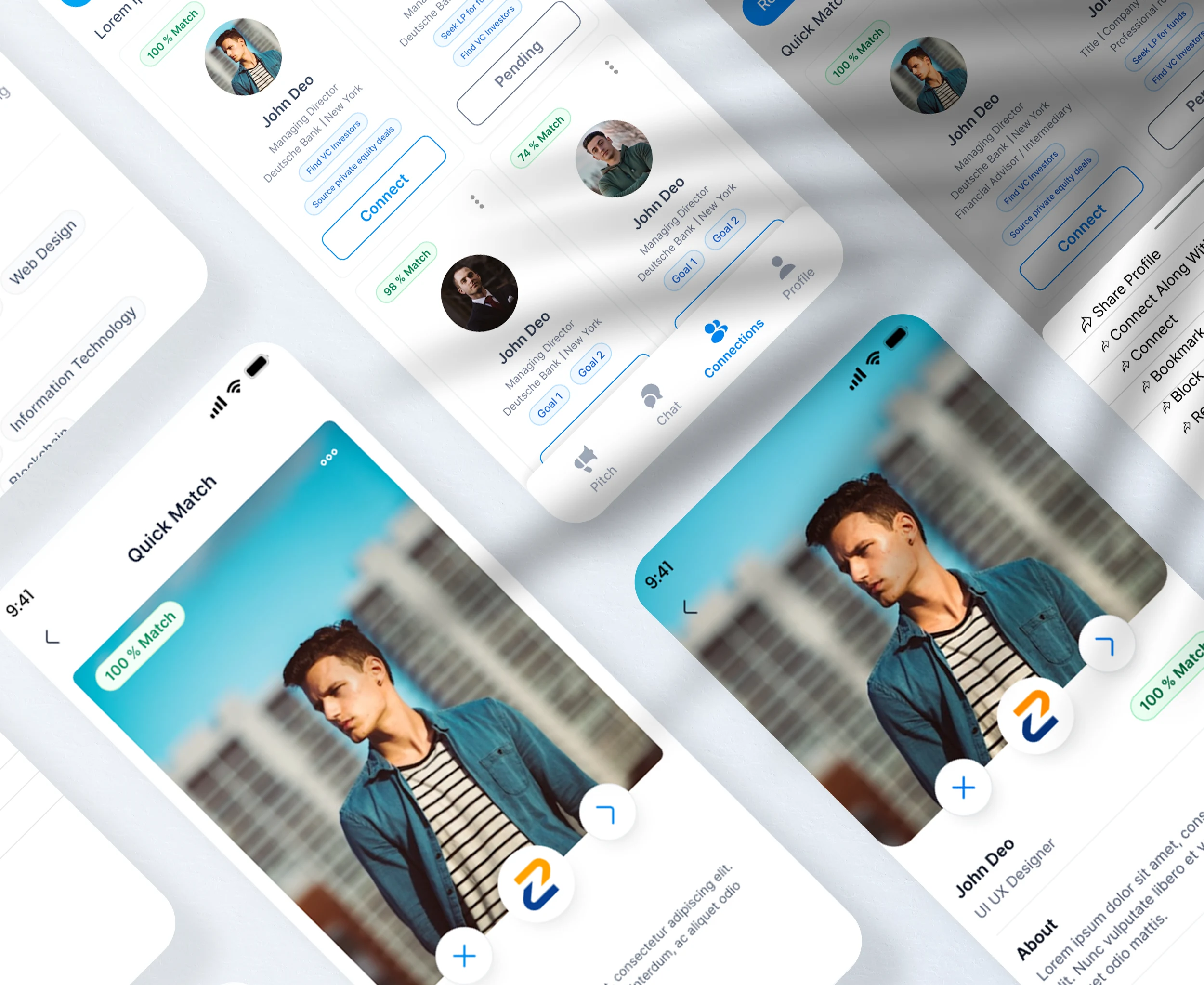
We started by designing low-fidelity wireframes that focused on improving the contact summary template and exploring alternative entry points to Quick Match.
These wireframes included annotations that explained the rationale behind each design change and how it would improve usability and user engagement.
User Flow & Quick Match Teasing
We worked on guiding users toward Quick Match by introducing subtle hints within the Connections Tab.
The goal was to keep users intrigued and encourage them to explore Quick Match without being overly pushy. We also ensured the Quick Match entry points were intuitive and easy to navigate.
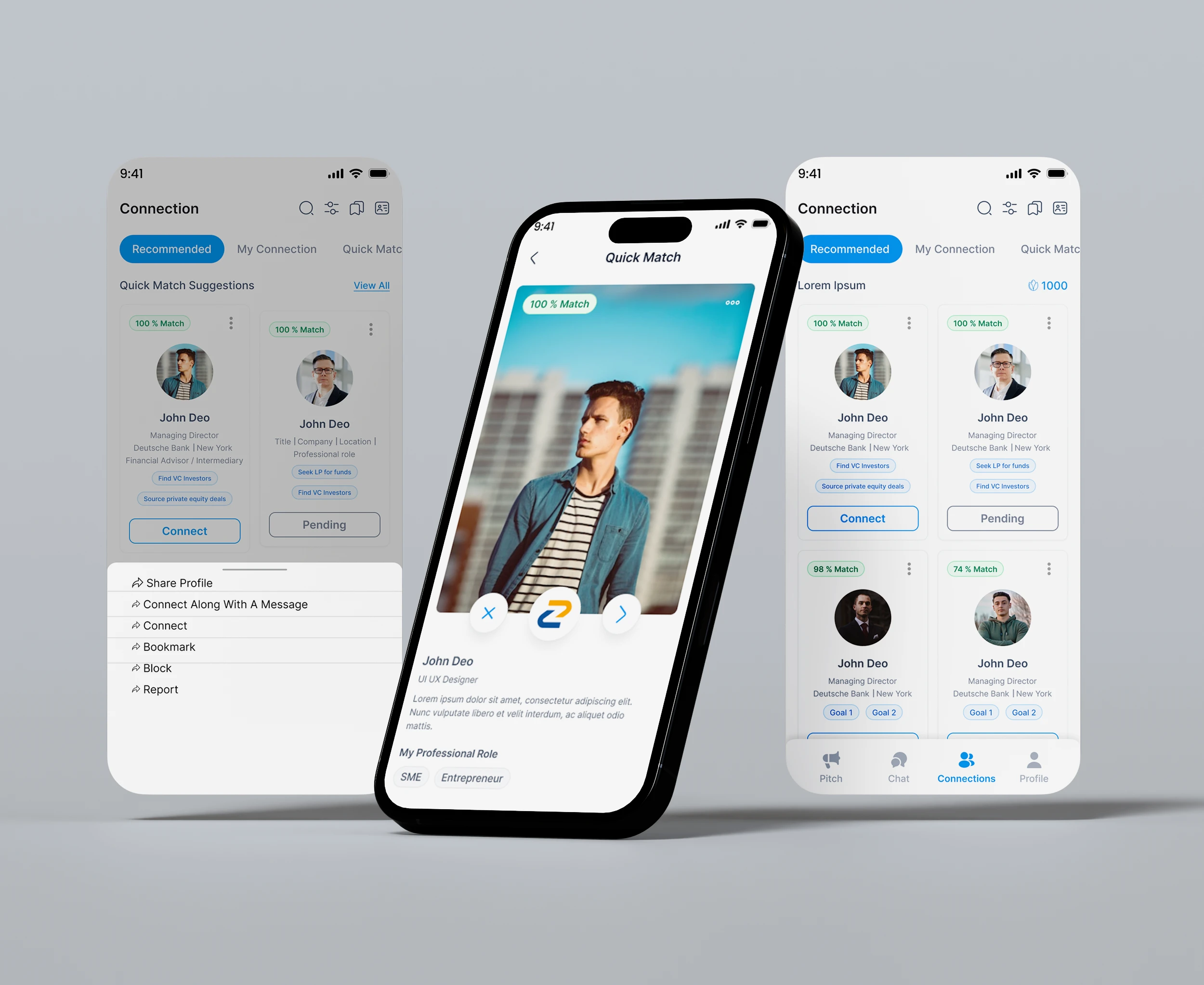
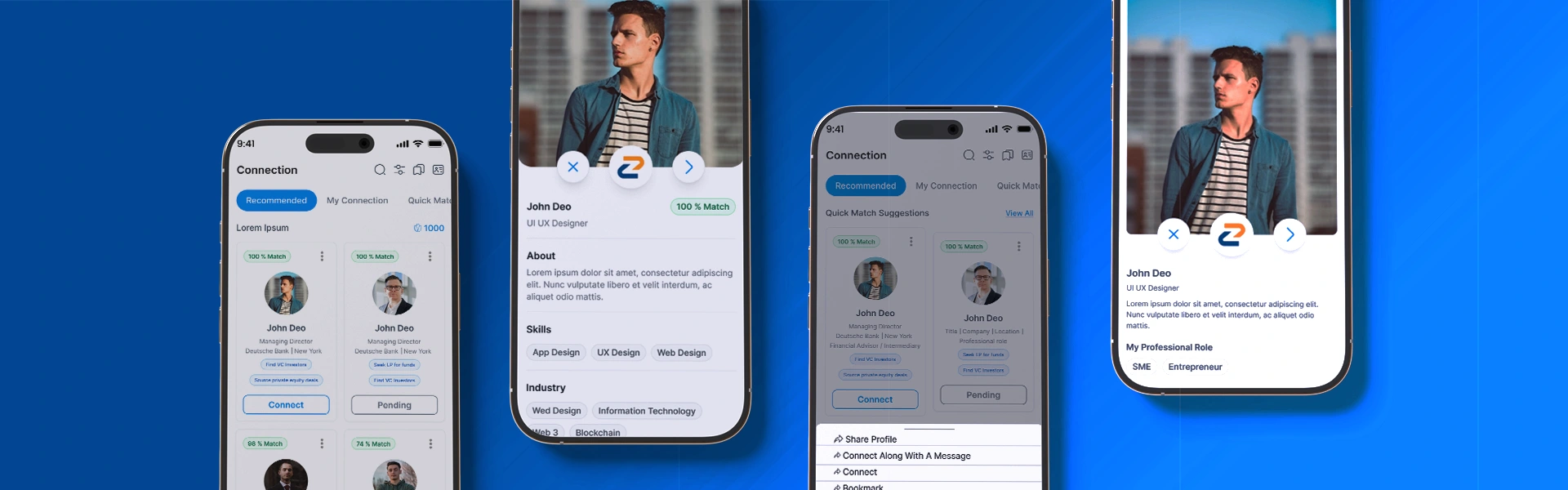
High Fidelity UI Design
The last phase was the high-fidelity design phase. We implemented visual changes that felt fresh and modern, to make the design functional and visually appealing.
The new UI focused on engagement and intuitiveness to improve the overall experience.
The Challenge
The main challenge was to create a design that:
Improved clarity and engagement in the contact summary template.
Designed an intuitive flow for users to easily discover and access Quick Match without overwhelming them.
Subtly teased Quick Match within the Connections Tab while maintaining a clean, user-friendly interface.

The Outcome
The redesigned Connections Tab now:
Features a clearer, more engaging contact summary that highlights key information effectively.
Subtly encourages users to explore Quick Match through strategic entry points and design cues.
Provides a smooth, intuitive user flow that enhances navigation and makes it easier for users to access the Quick Match feature.
Like this project
Posted May 16, 2025
Redesigned the Connections Tab for clearer contact summaries, better Quick Match visibility, and a smoother, more intuitive user flow.
Likes
0
Views
10