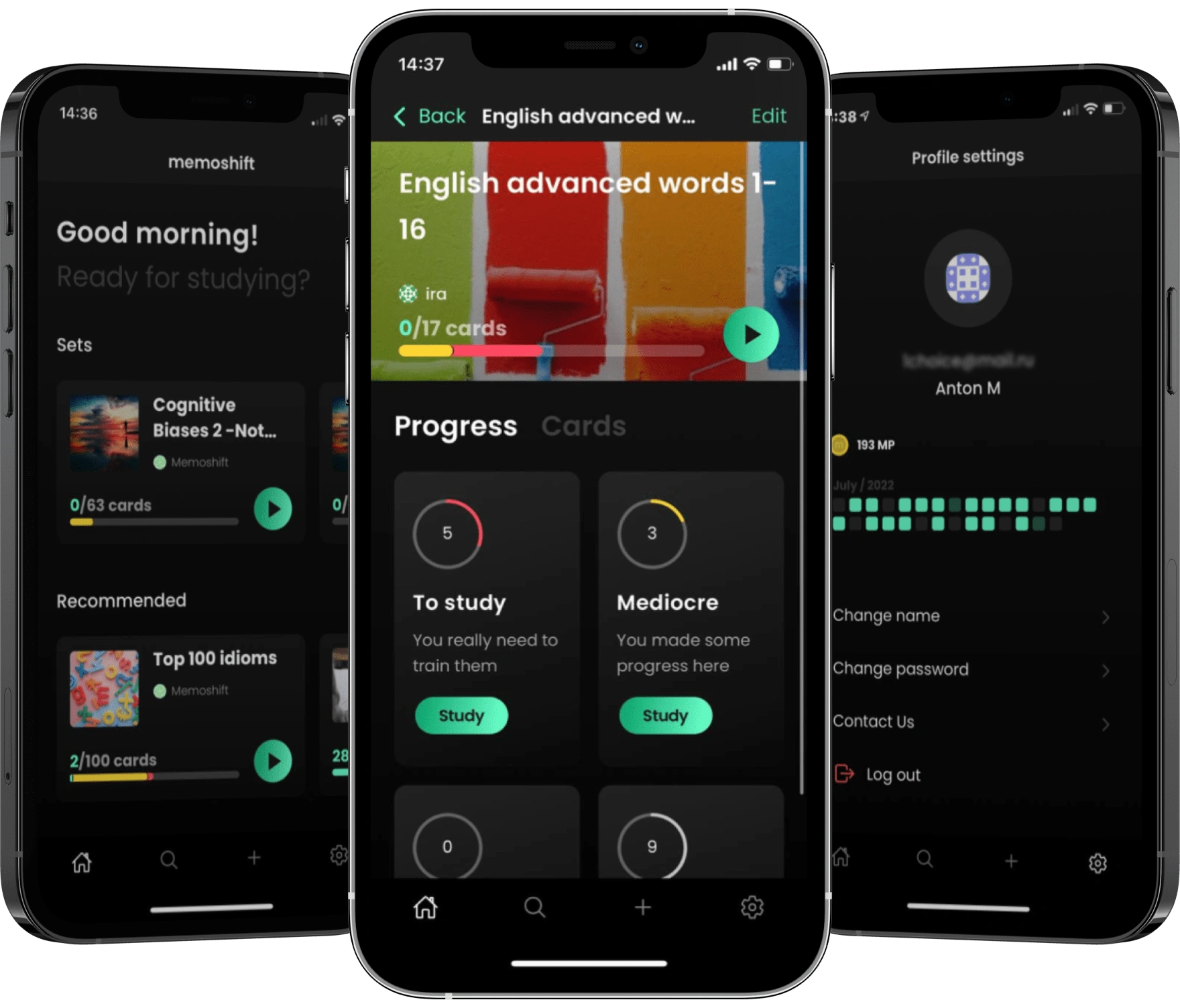
Memoshift - mobile app for efficient flashcards study
In collaboration with one talented developer, we made a mobile app that aims to improve experience of studying flashcards — make it efficient, easy, and pleasant to use.
Once upon a time..
..there was a developer who struggled with every flashcard app he used. One app had good UX, but a poor algorithm without the ability to learn only weakly memorized cards. Another app had all functionality he needed, but UX and UI were terrible. Finally, he was tired and exhausted, with no hope, as he wanted to do his own app, but he also knew that he would most likely give up in the middle. But not this time! As he met one extremely talented UX designer (guess who is writing this text), and they agreed to bring this flashcard app to life.
UX Research
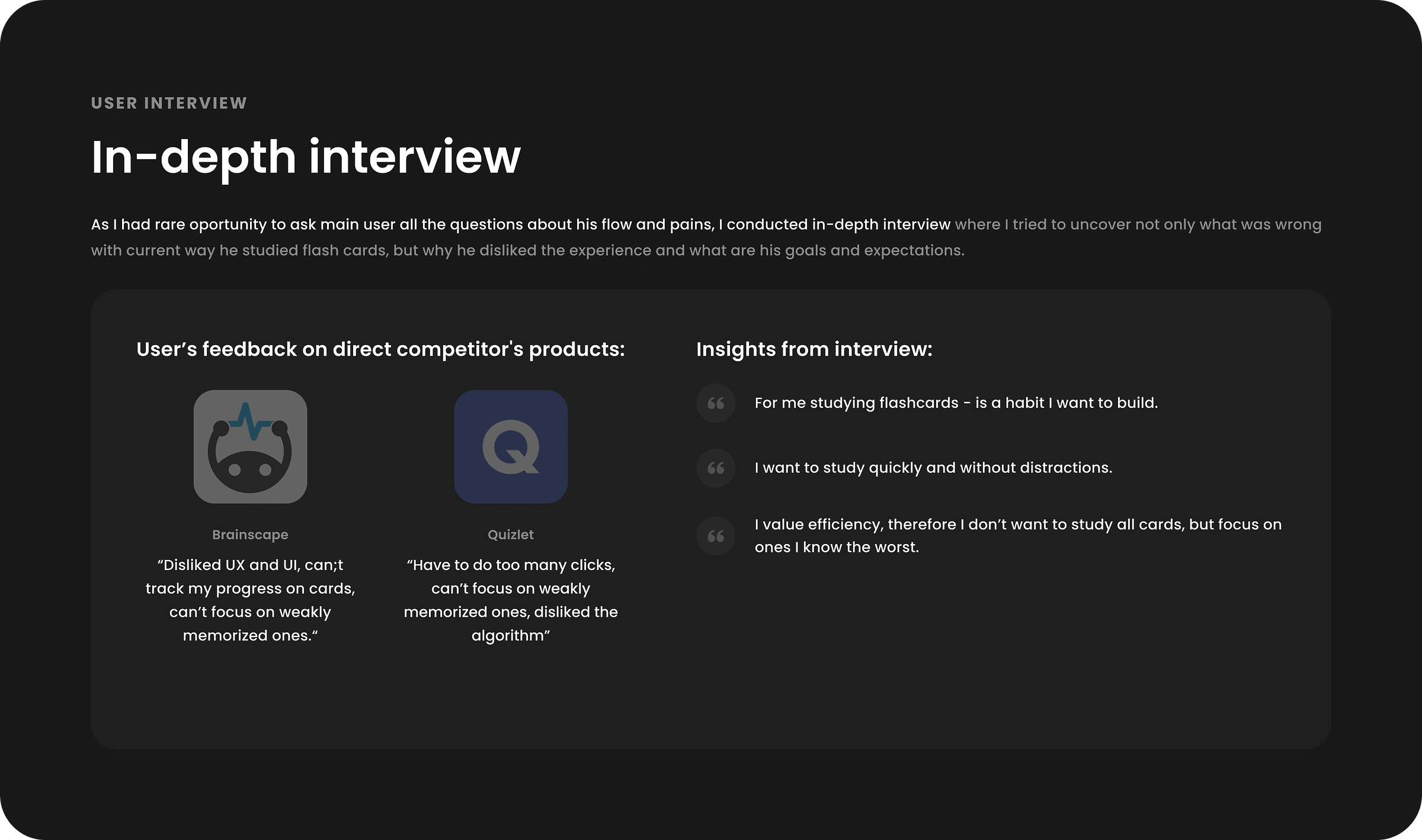
First, I talked to our main user and developer at the same time to uncover motivation (what drives user to study cards), pains (what's wrong today) and conditions (when and where he studies). The main complain was inefficiency of the process because there is no way to study only badly memorized cards.
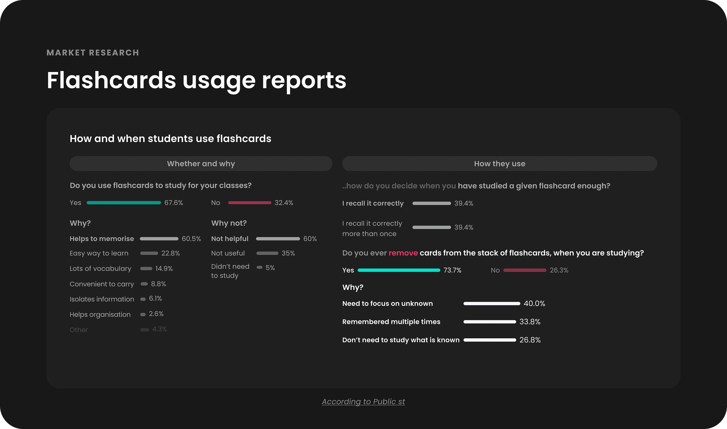
Then I analyzed research papers to understand better user's behavior and explore potential hypothesis. I was surprised to see that 73.7% of students remove cards from set because they already remembered it or wanted to focus on unknown ones.
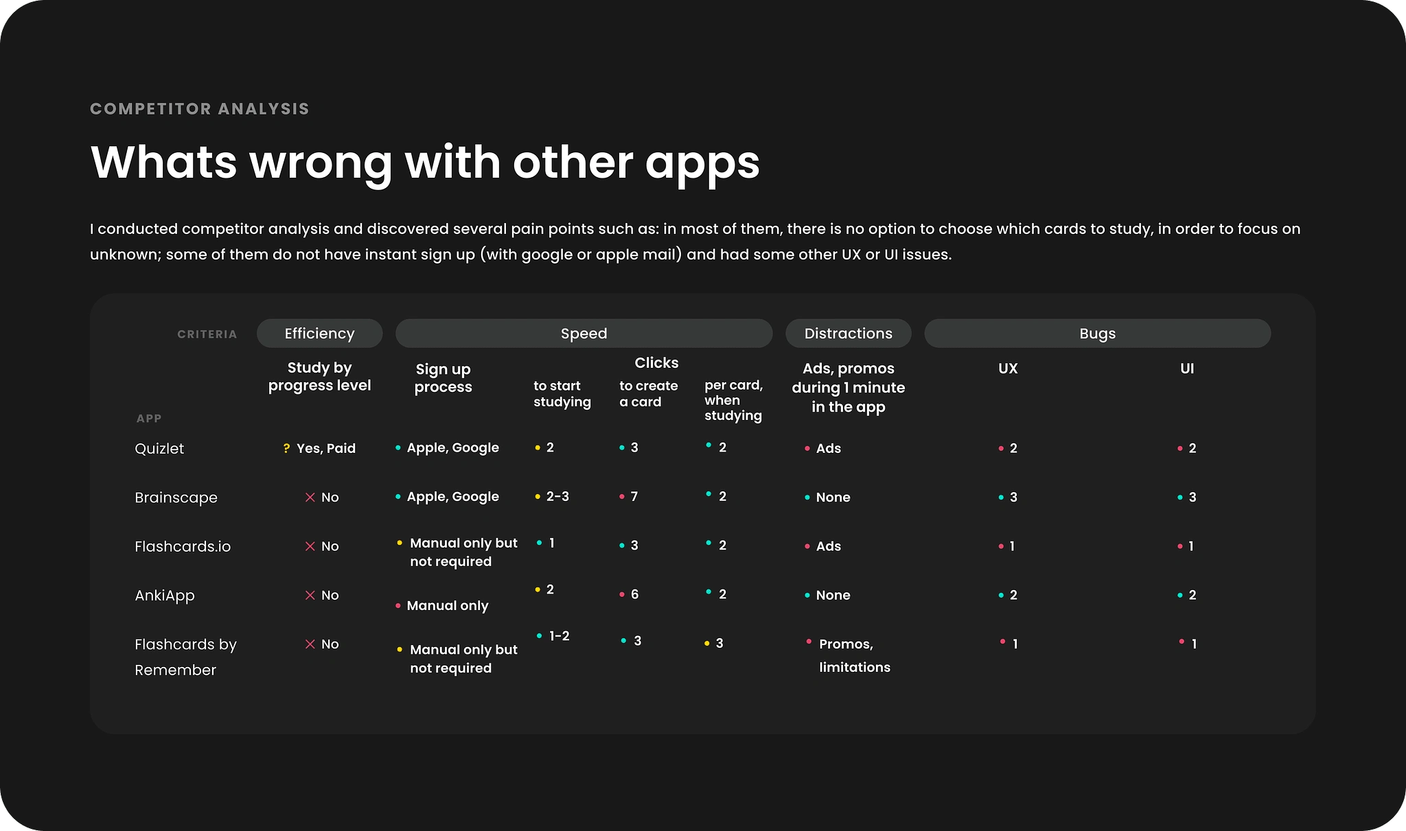
Then I analyzed direct and indirect competitors to understand better the where the main friction happens and how it could be optimized. Main findings were pretty high number of unnecessary clicks that users have to make in order to study or create a card.
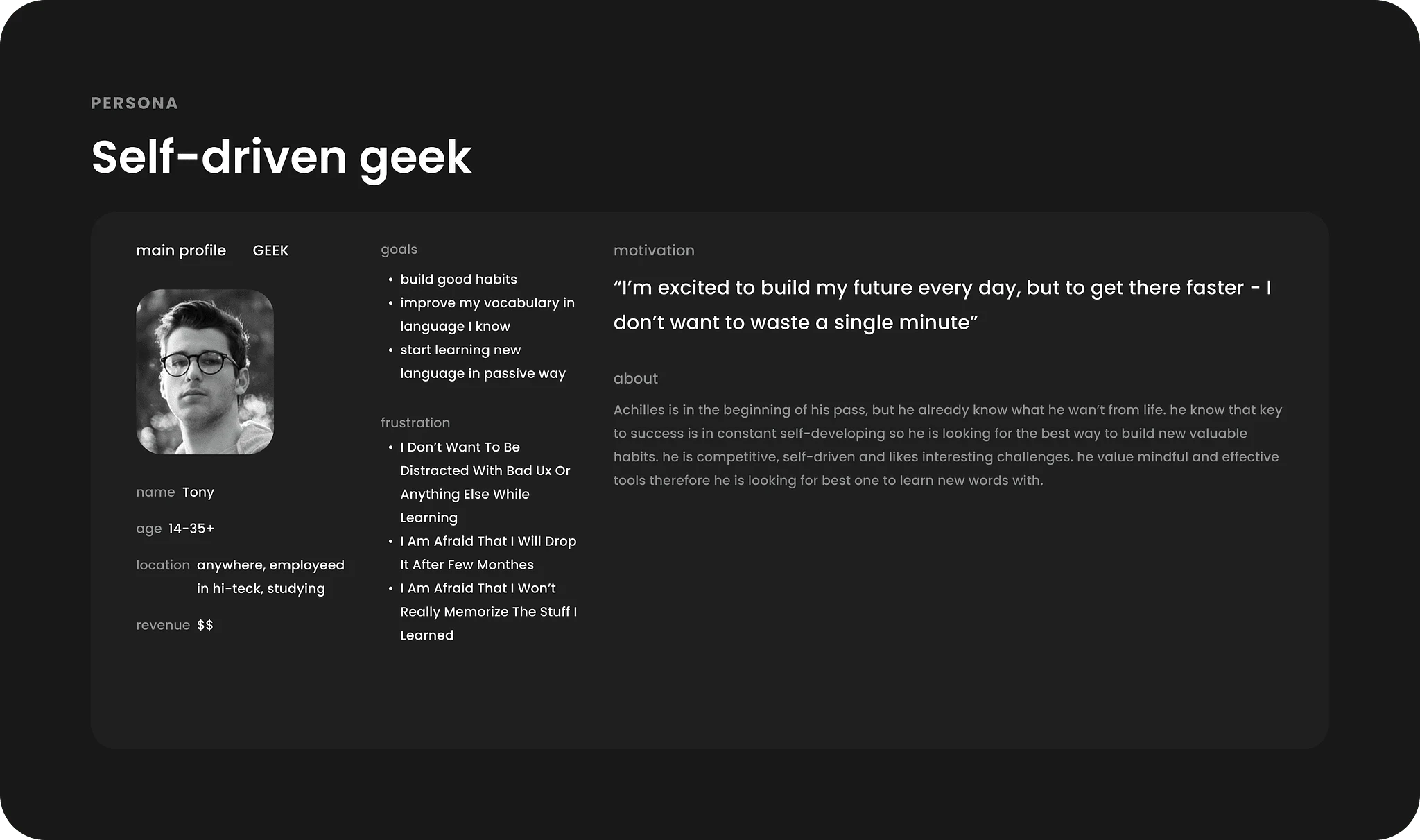
Even though I had main user in front of me, I created a persona to imagine better a potential group of people with similar motivations and pains.
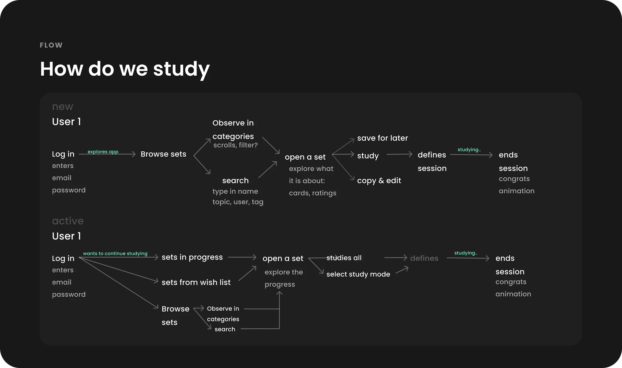
To understand better the studying process and map all scenarios, I created detailed user flow of new and existing user.
UX Design
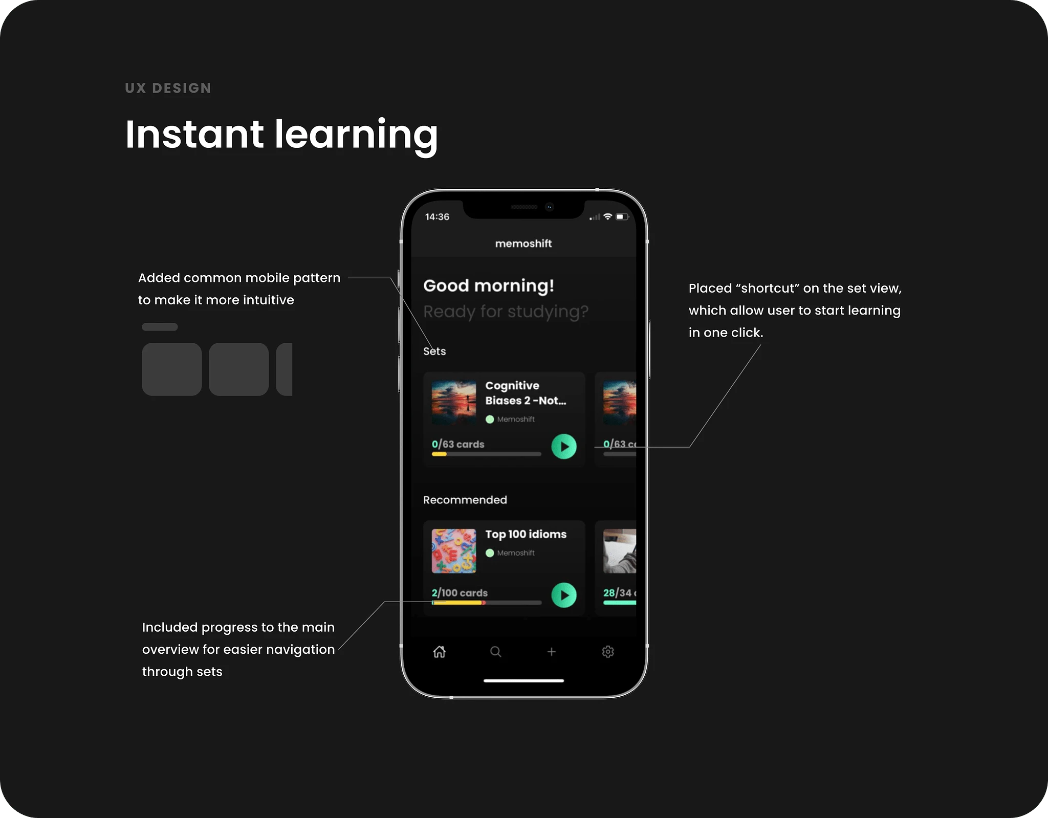
My first suggestion was make the ensure efficiency by reducing unnecessary clicks and allow study cards right away. I also used common mobile patterns to ensure that app feels native.
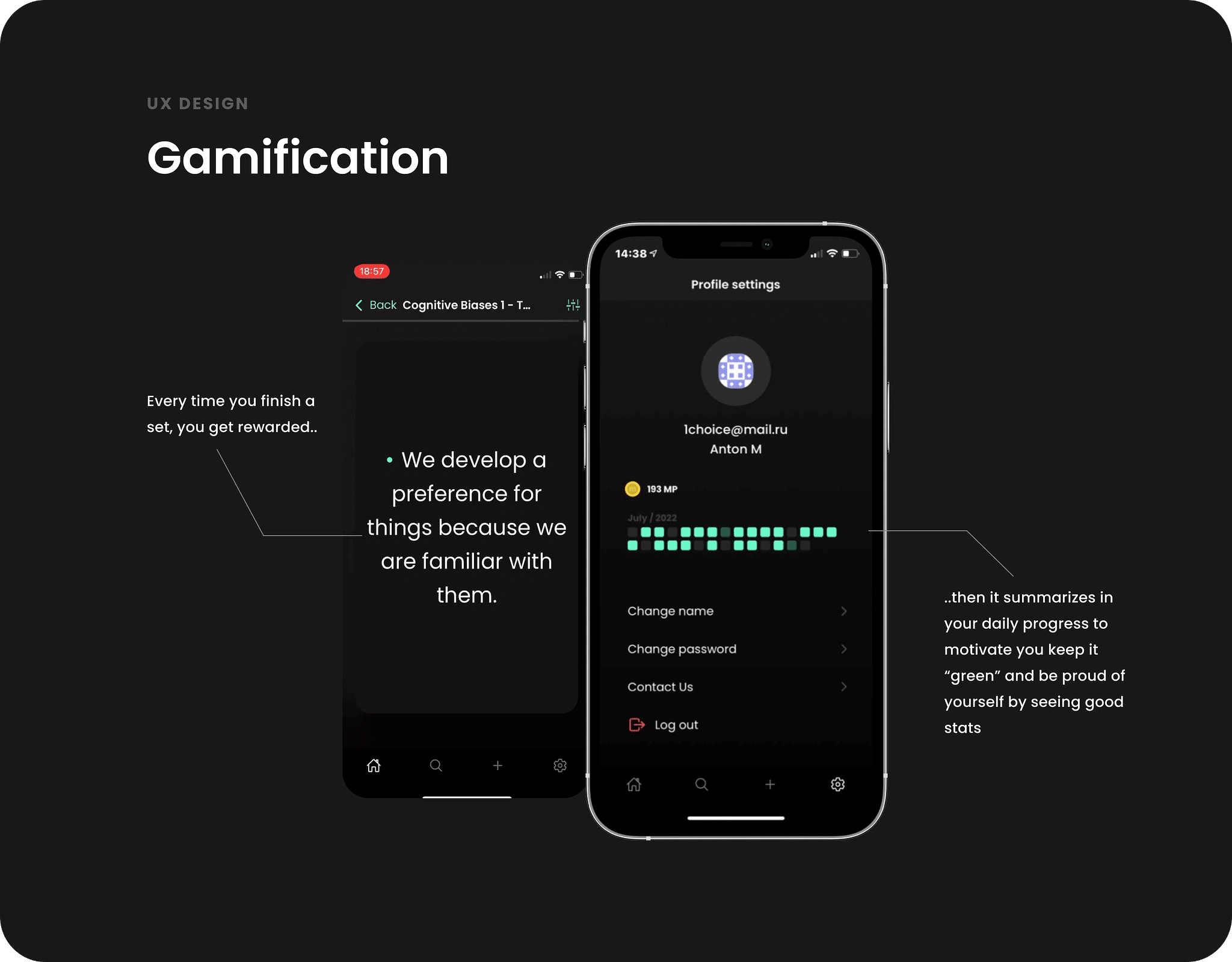
Because main user mentioned that studying is not just about the cards but a habit he wants to maintain, I added some gamification elements to it and ensured he is motivated by seeing his progress over time.
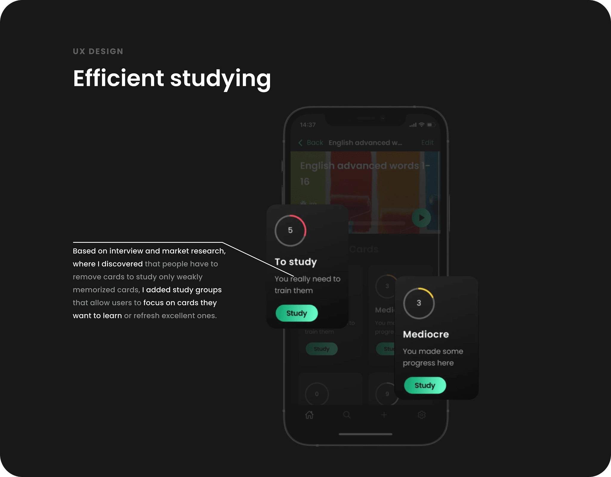
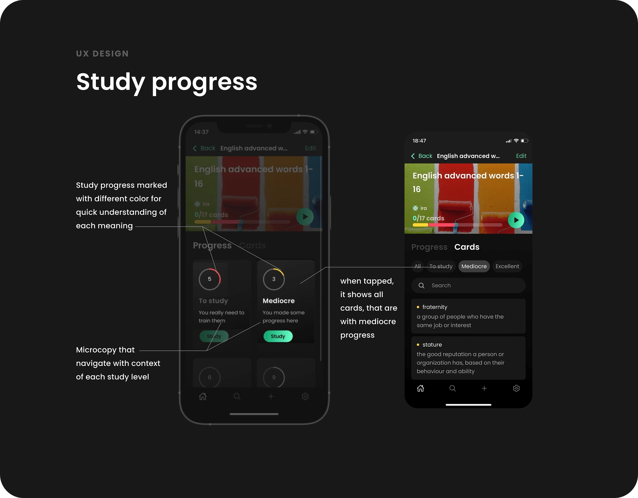
From interview and research it was clear that there were a need to focus only on badly memorized cards, hence I suggested study groups which allows to select which cards of this set you want to study: refresh known ones or focus on unknown.
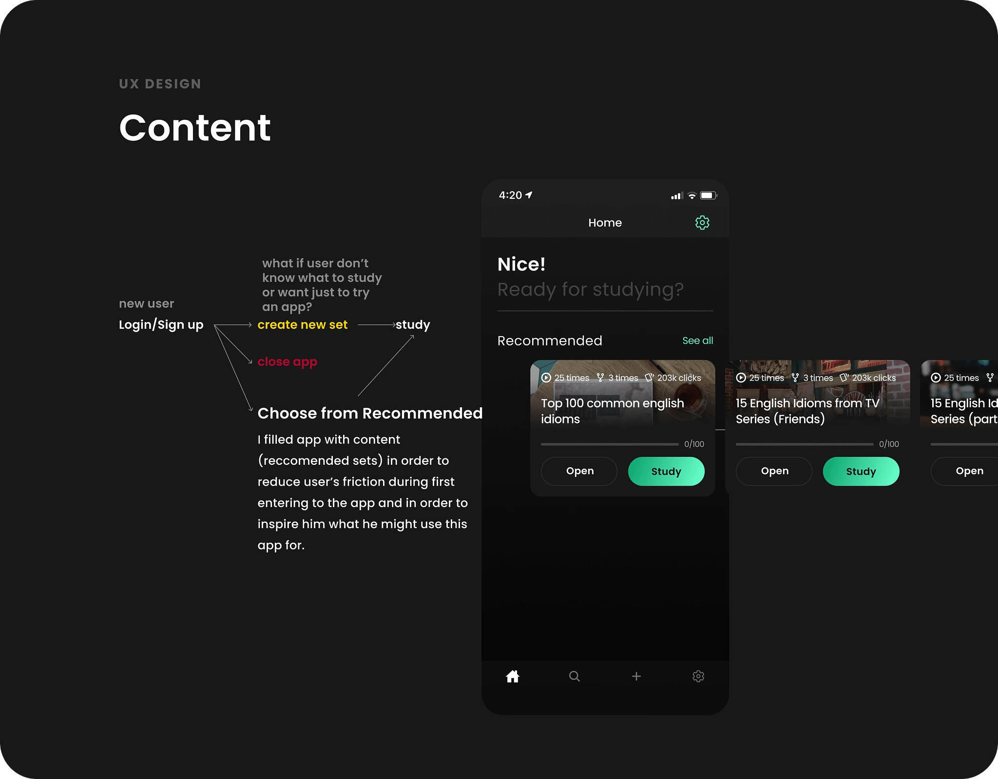
And from competitor analysis it was also clear that for new users it takes a lot of clicks and effort to simply try an app, so I ensured that once user opens it first time, it is filled with sets which he can start studying immediately. It allowed us to increase user conversion by 47%.
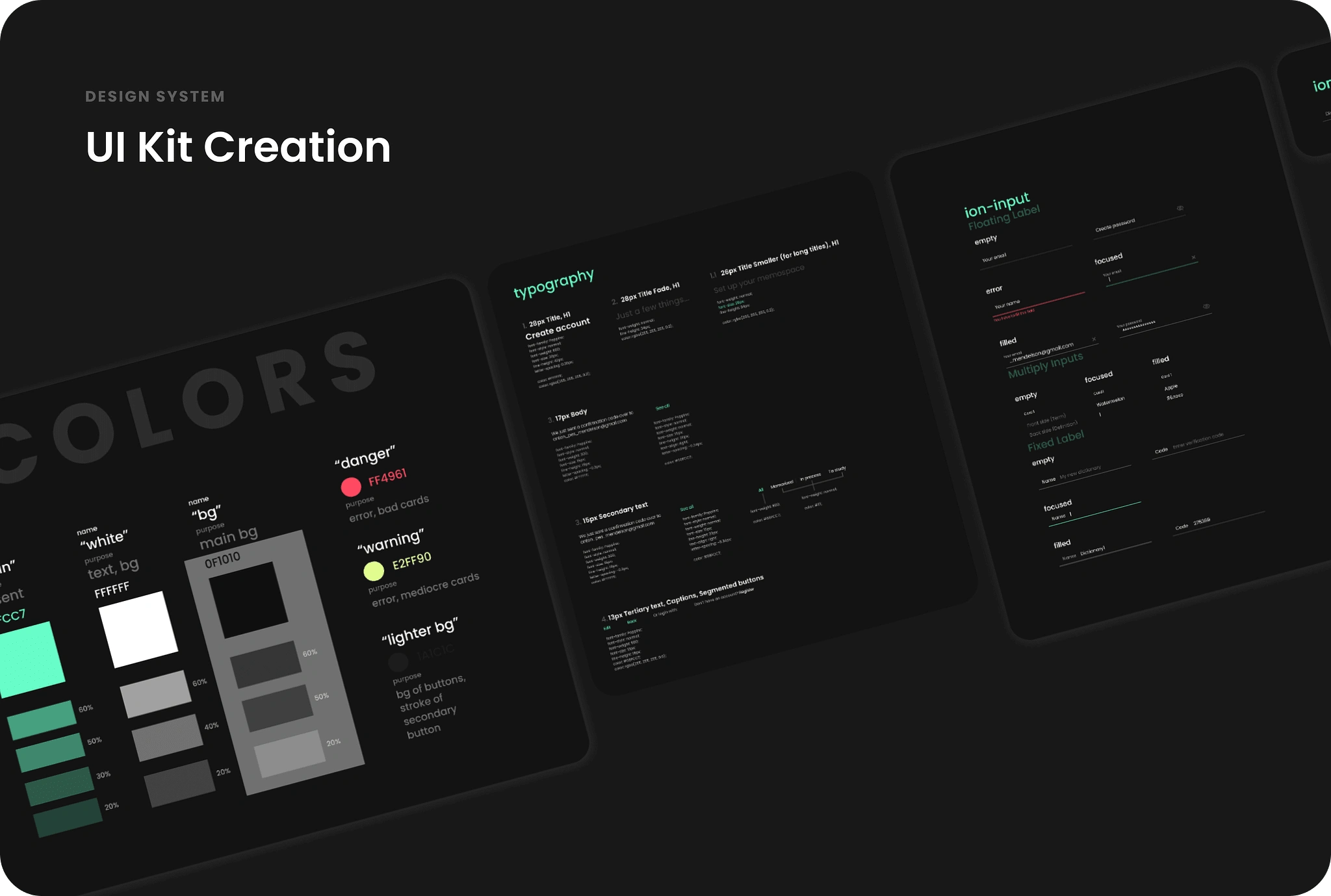
Besides UX solutions, I created UI kit ensuring it was easy to use and navigate.
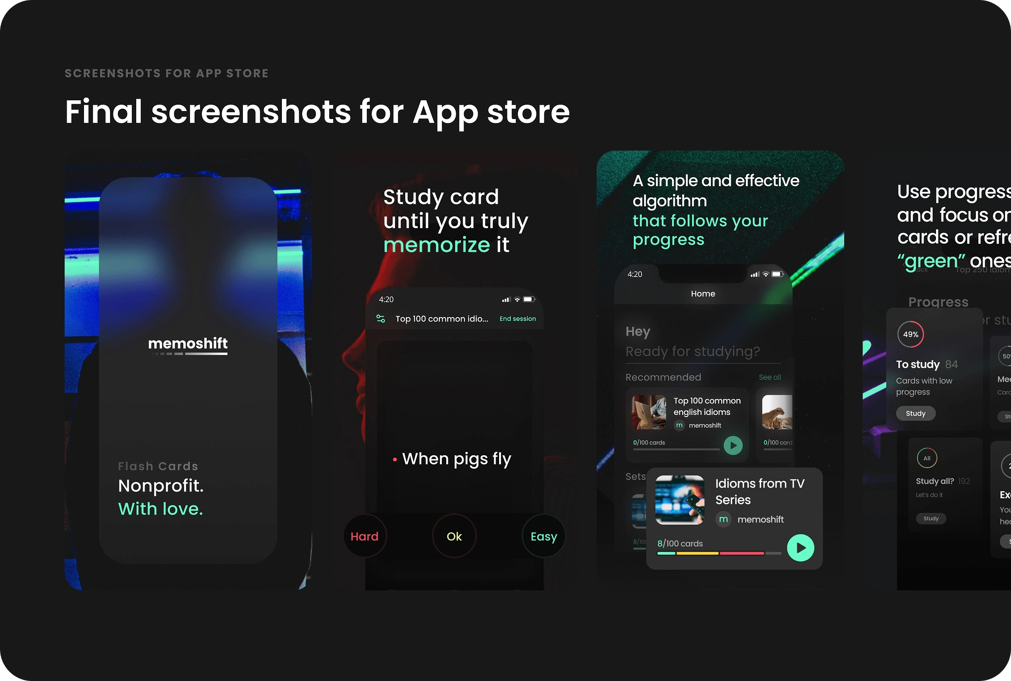
And then we launched!
During creation of Memoshift, I learned:
to put my product designer's ego aside and not to force decisions I think are right, but listen to my partner, discuss, compromise and do everything that leads to success of our product;
to organization myself and wear hat of Project Manager for our small team, drive processes and think about product on a roadmap;
to test as earlier as possible and the importance of onboarding process as we spent significant amount of time debating about flows and solutions (while we were too much into context) and after launch we discovered that there were basic things we've missed (such as onboarding, or "delete set" feature that came as a first request from users etc).
Like this project
Posted Sep 15, 2023
In collaboration with one talented developer, we made a mobile app that aims to improve experience of studying flashcards — make it efficient, easy, and pleasan
Likes
0
Views
14
