Website redesign: from Wordpress to Framer
As the sole designer at Planck, I am usually responsible for product design. However, as they say, working for a startup is like riding a roller coaster.
In this case study, I want to describe how I drove our website’s redesign and successfully transferred 16 pages and over 50 blog posts from WordPress to Framer in 5 weeks. As a result, this redesign played a key role in Planck's successful PR campaign.
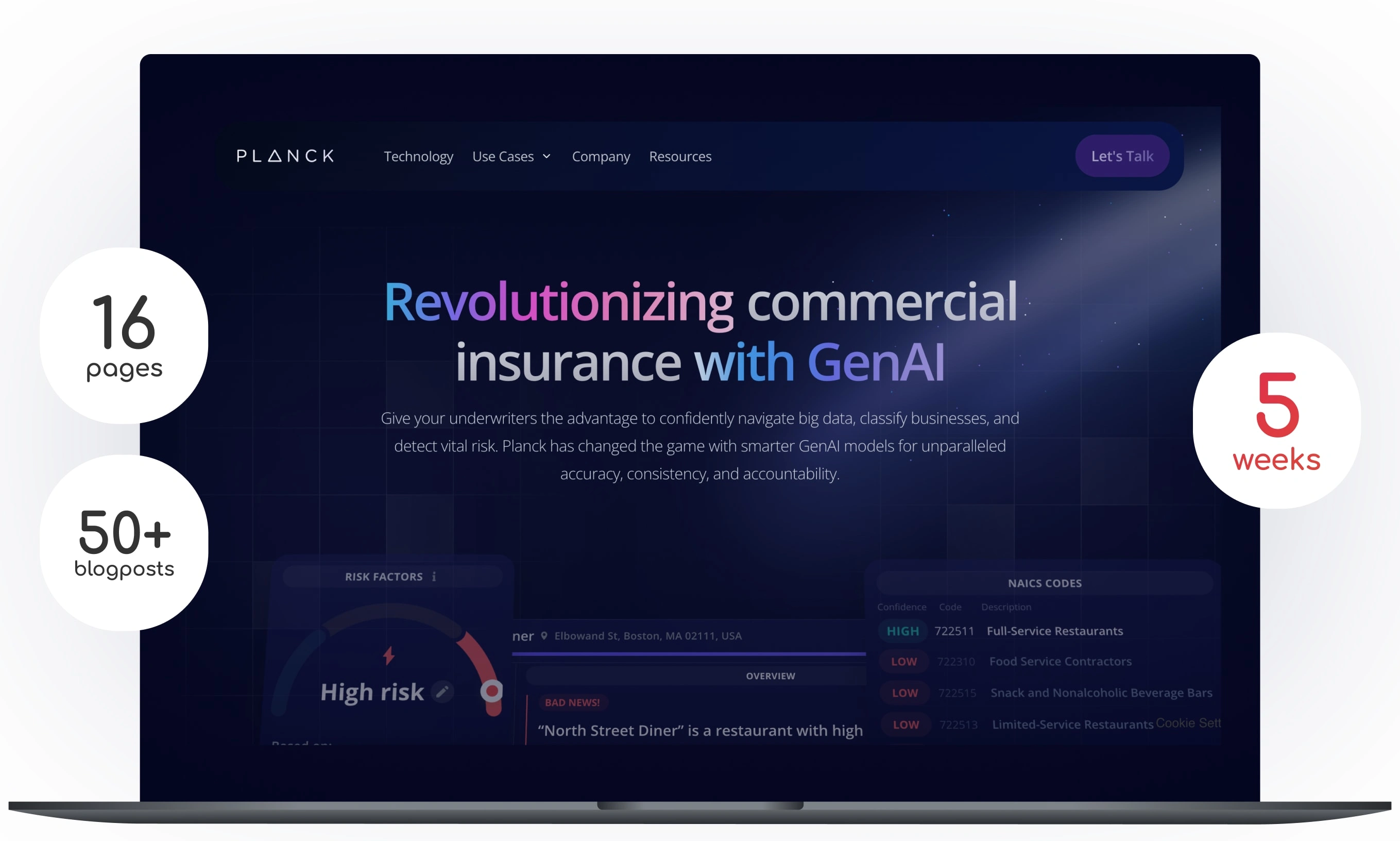
16 pages, 50+ blog posts from Wordpress to Framer in 5 weeks
Custom animation for Hero section
CTA section
Custom form, connected to Hubspot
Custom navigation
Interactive blocks
Timeline to showcase the process
Migrated over 50+ blog posts
Table of content:
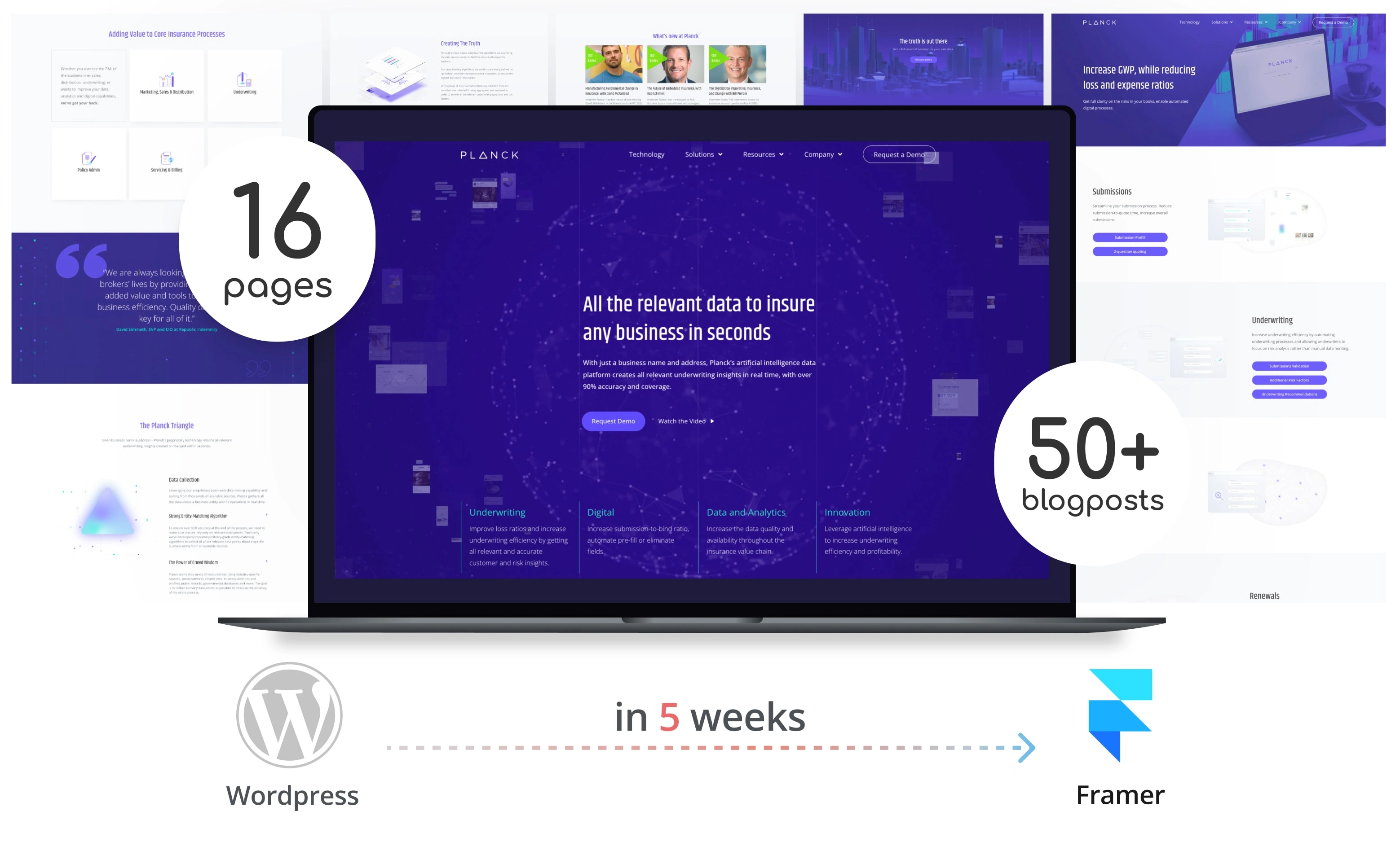
16 pages and over 50 blog posts from WordPress to Framer in 5 weeks
The problem
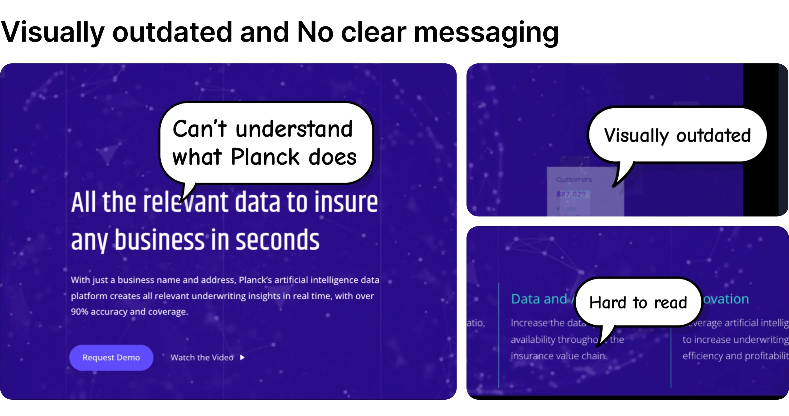
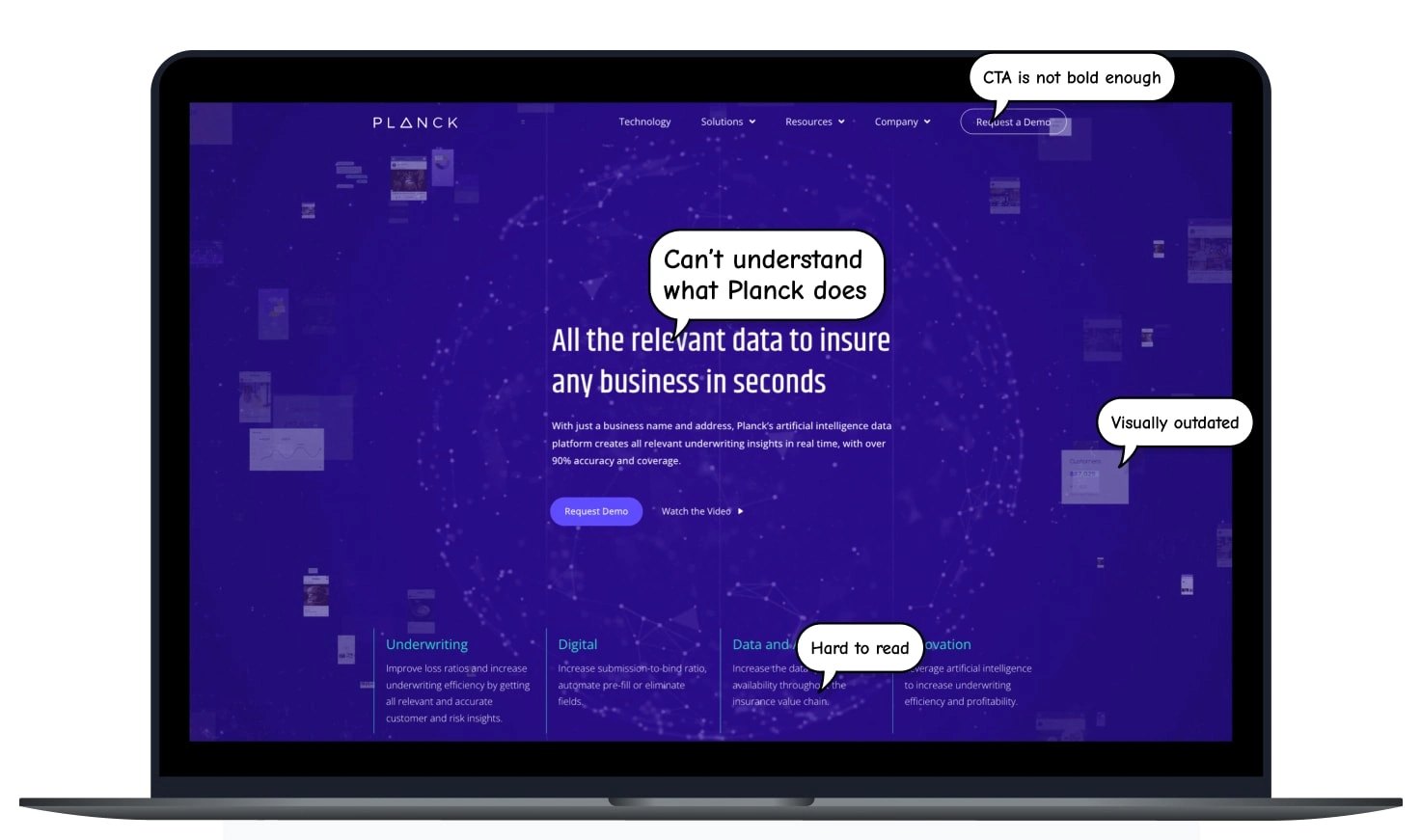
Visually outdated and no clear messaging
We had an important annual conference and planned a PR campaign where our website had to play a key role. However, it was visually outdated, hard to understand what our startup does, and we wanted to convey the same vibe of exclusivity we had planned for our booth.
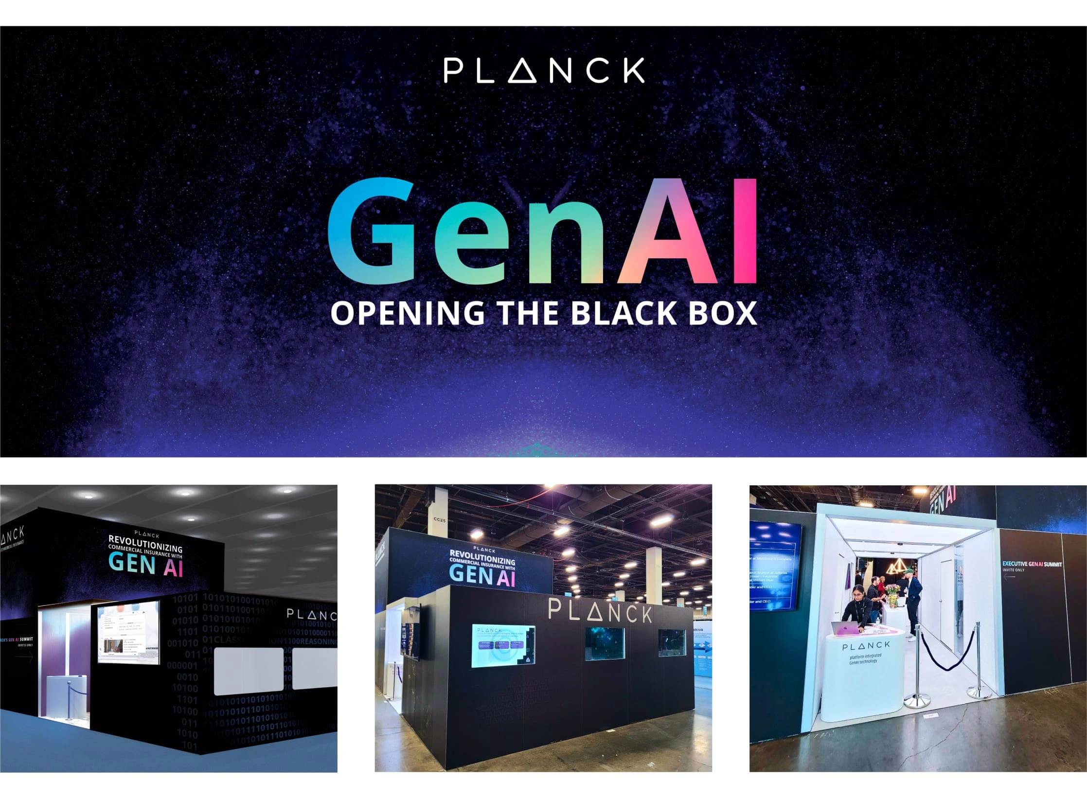
The booth we planned as part of our PR campaign
Our team
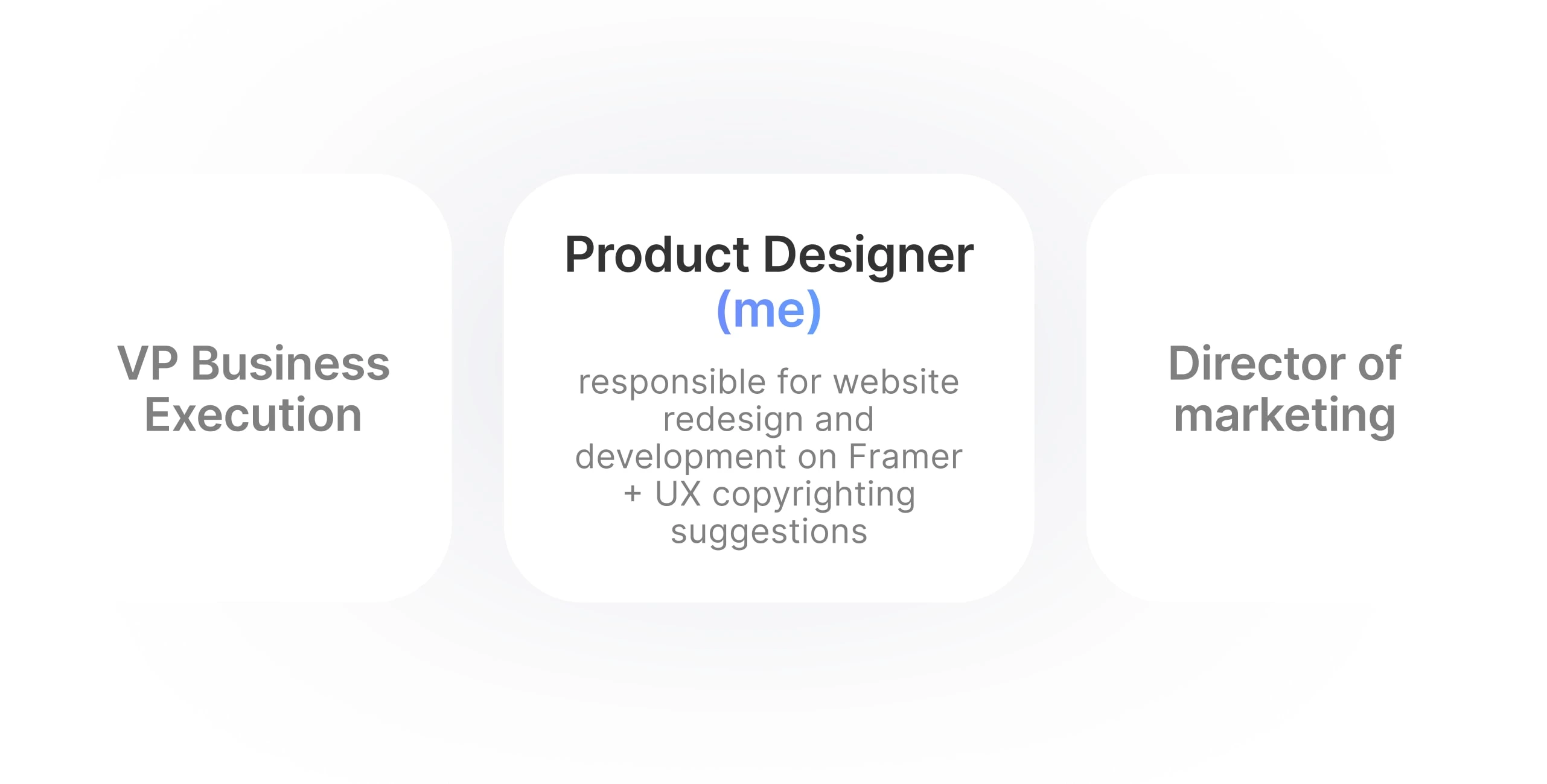
Our small yet focused and agile team
In addition, we actively sought feedback from the CEO to ensure the messaging and designs were aligned with business goals. During this process, I presented designs and shared the rationale behind my decisions.
My role
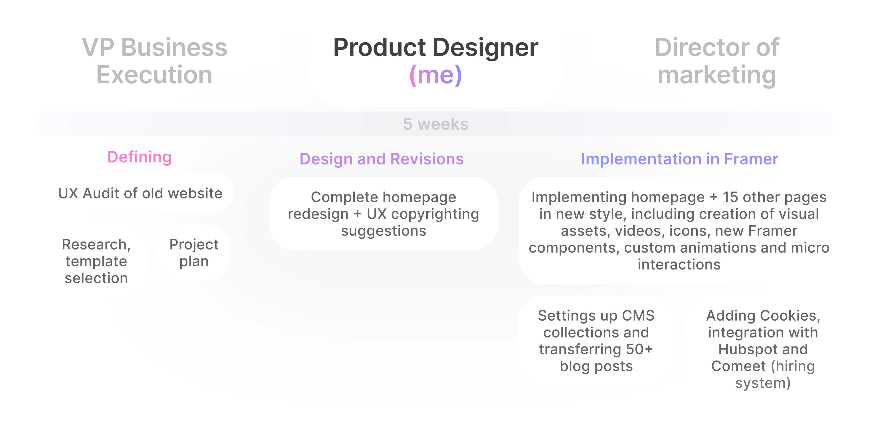
My role
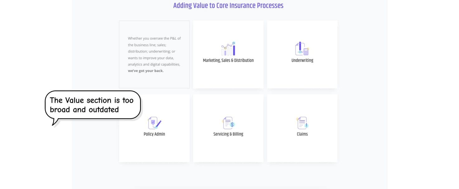
Conducted UX audit of the old website
Here is how our website looked before the redesign and what didn't work:
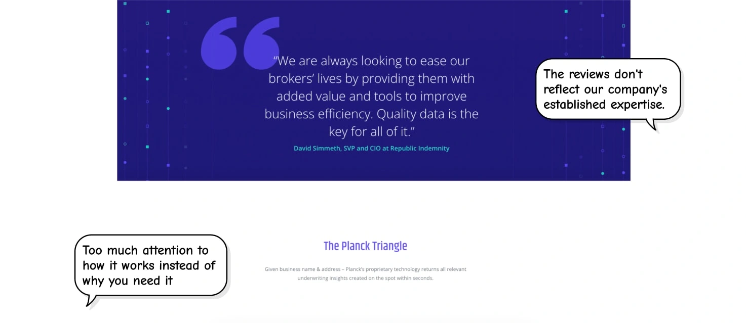
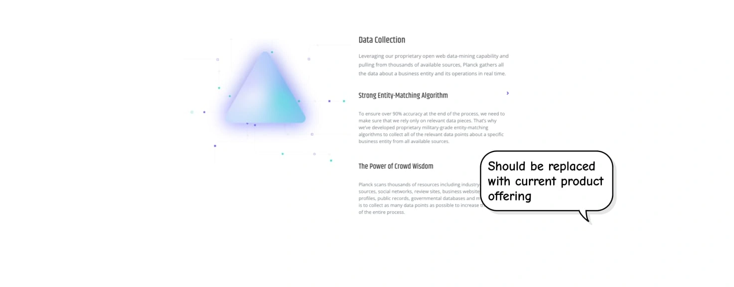
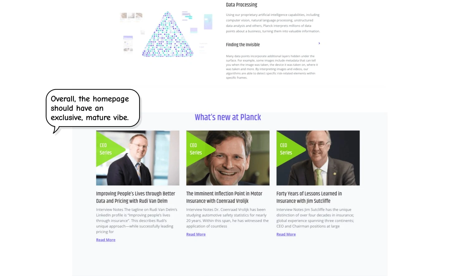
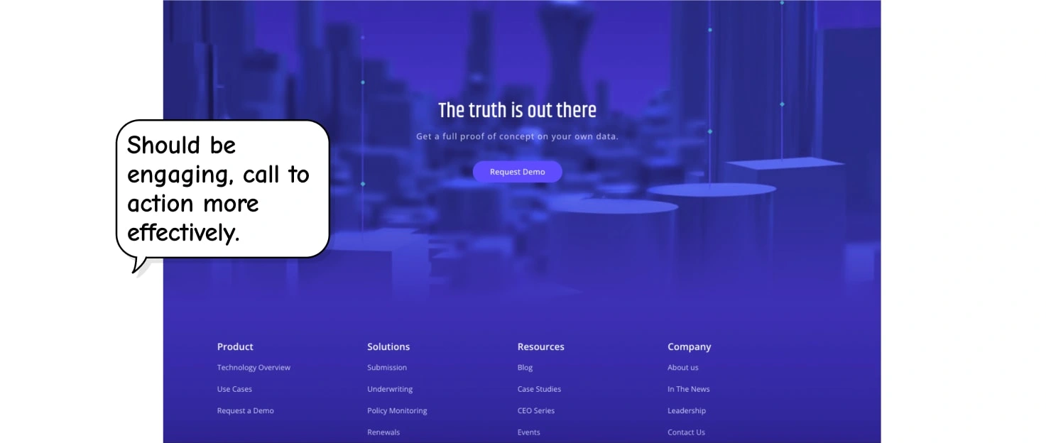
Convinced to migrate from Wordpress to Framer
I aimed to unleash the full potential of our website, so I convinced our VP of Business Execution to migrate from WordPress to Framer, outlining both short- and long-term benefits of that migration. As a result, it enabled us to create a truly outstanding website.
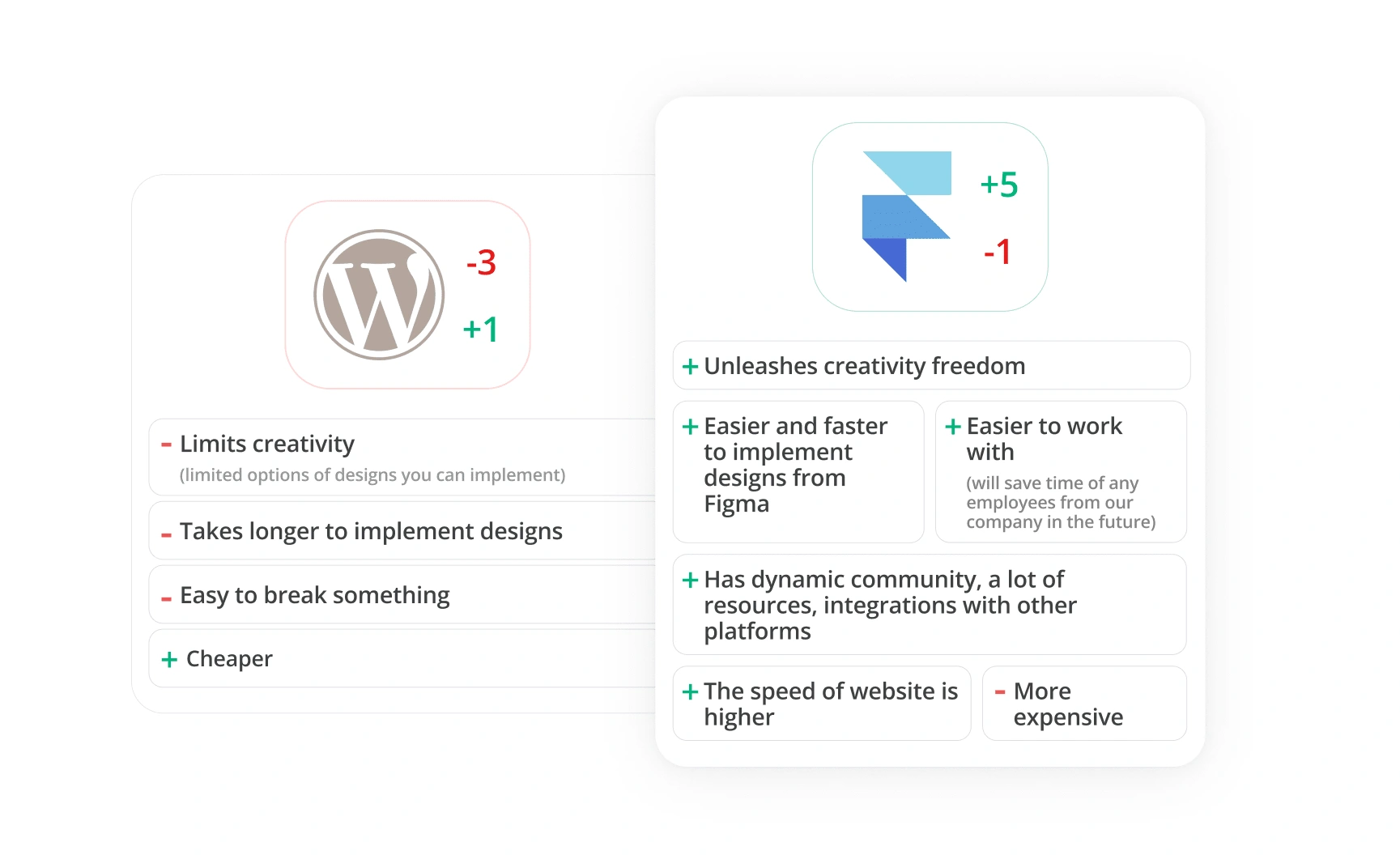
Comparison between Wordpress and Framer, key benefits of Framer
Main challenges:
Define a new visual language that will give our website a modern look with an exclusive and mature vibe, and align it with the booth design.
Completely redesign the homepage and develop it in Framer.
Rebuild 15 other pages in Framer in the new style, and transfer over 50+ blog posts.
Complete all of this within 5 weeks.
Suggested a template and visual direction
To save valuable time without compromising quality, I suggested we purchase a template and got a clear “yes.” I went over 50+ of them, picked and presented the most relevant ones: a light and a dark one.
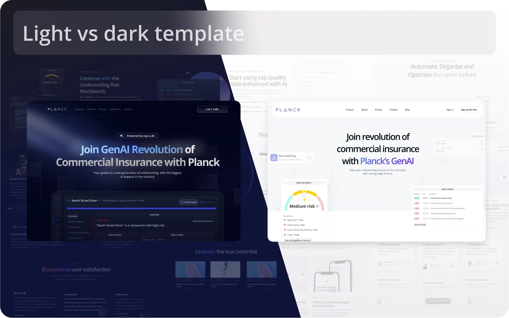
Light vs Dark comparison
While we all liked the white one and it was easier to migrate, the dark one was captivating and way more impressive, plus it aligned better with the booth we planned to have. The only concern our CEO raised was that the dark one would require transforming all our platform screenshots into dark ones, which could take time. I assured him I would make it happen.
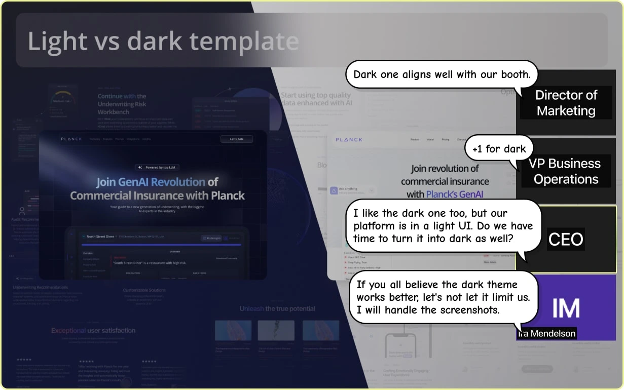
Discussion of the Pros and Cons of the Dark Theme
Defined project timeline plan
Then the intense work began. To stay on schedule, I proposed a clear plan for each page to streamline the process and prevent over-perfecting. I shared this plan with the team so everyone could track my progress.
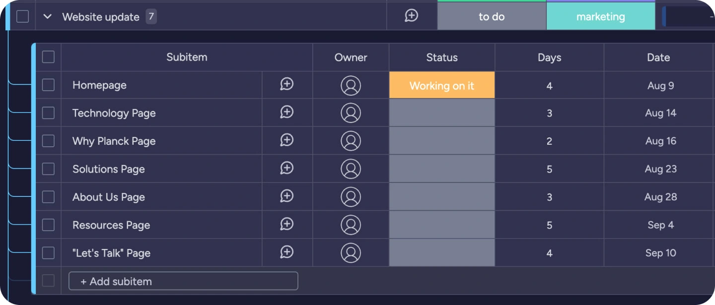
Project Timeline Plan for 5 Weeks
Explained design decisions
In a few days, I presented the first sections of our future homepage together with suggested content and got the CEO's approval. Each design review actually went too well to be true until once our CEO asked to add more details and elements to the hero section, like this:
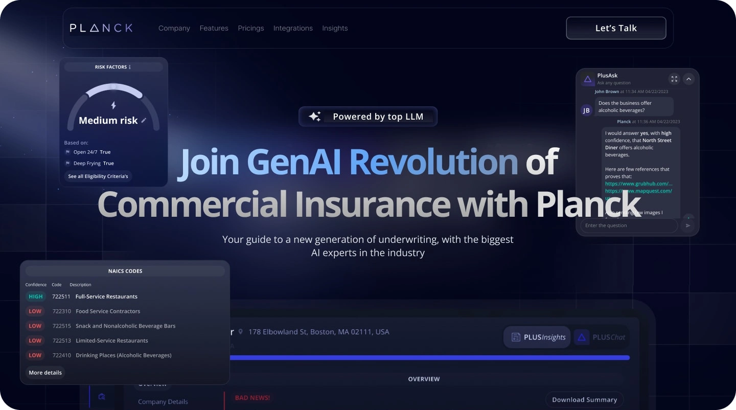
Possible Hero Section
I knew it would make the hero section too busy, but instead of simply disagreeing, I asked why he thought it was needed. It turns out he believed users wouldn’t scroll and had only a second to scan the page’s content. I was aware that this was based on an outdated UX myth. Instead of simply disagreeing, I provided articles [1, 2] that backed up my point with solid research data. The CEO was convinced, and we shifted our focus to prioritizing content on scroll, ensuring that the most captivating elements appeared first.
Here is the final Hero section:
Final Hero section
The outcomes
As promised, in under 5 weeks, our website, including 16 pages and 50+ CMS blog posts, was successfully transferred and live. The outcomes were remarkable:
The transformation of our website led to a significant increase in traffic,
The feedback from our valued clients was overwhelmingly positive,
Website became the centerpiece of a highly effective PR campaign, amplifying our brand's reach and influence.
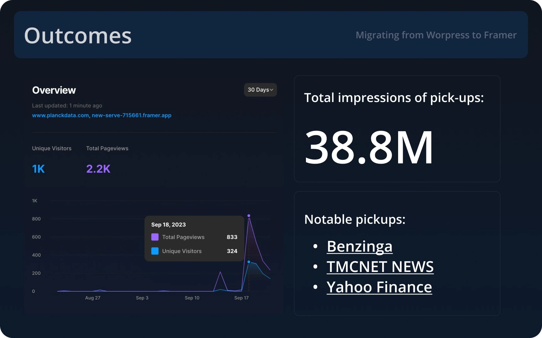
Increase in website traffic, mentions in magazines
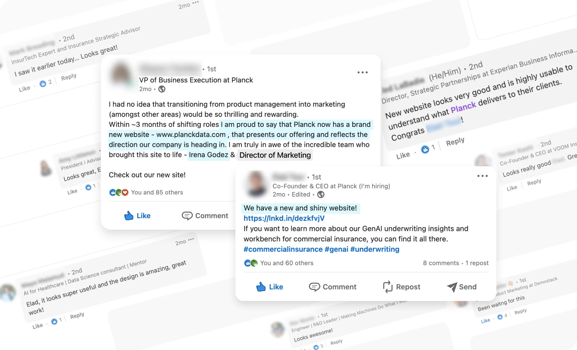
Overwhelmingly positive feedback
You can explore it here: https://www.planckdata.com/
Some screenshots of custom components, added to template:
Custom animation for hero section
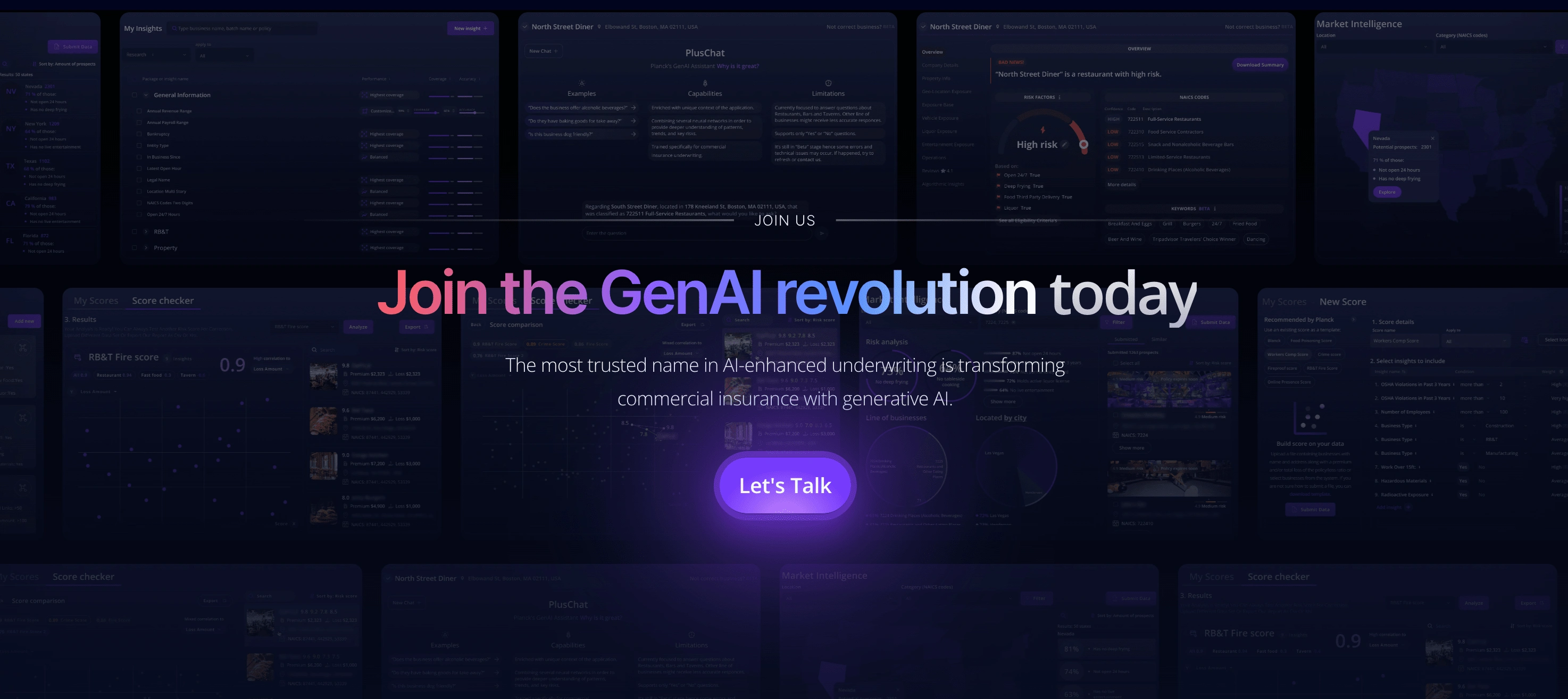
CTA section
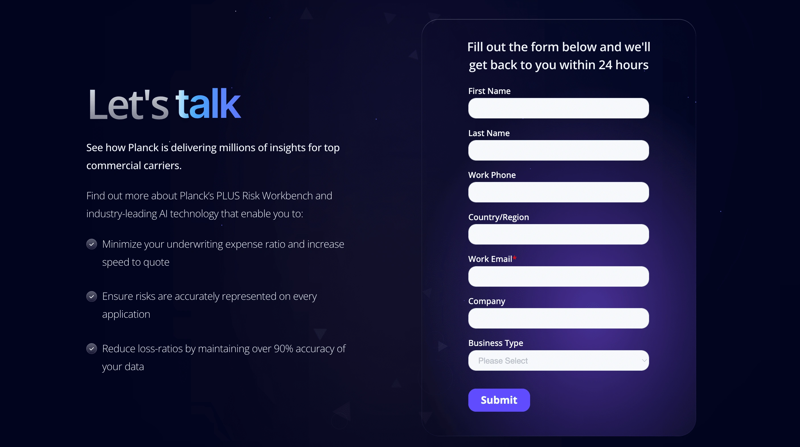
Form, integrated with Hubspot
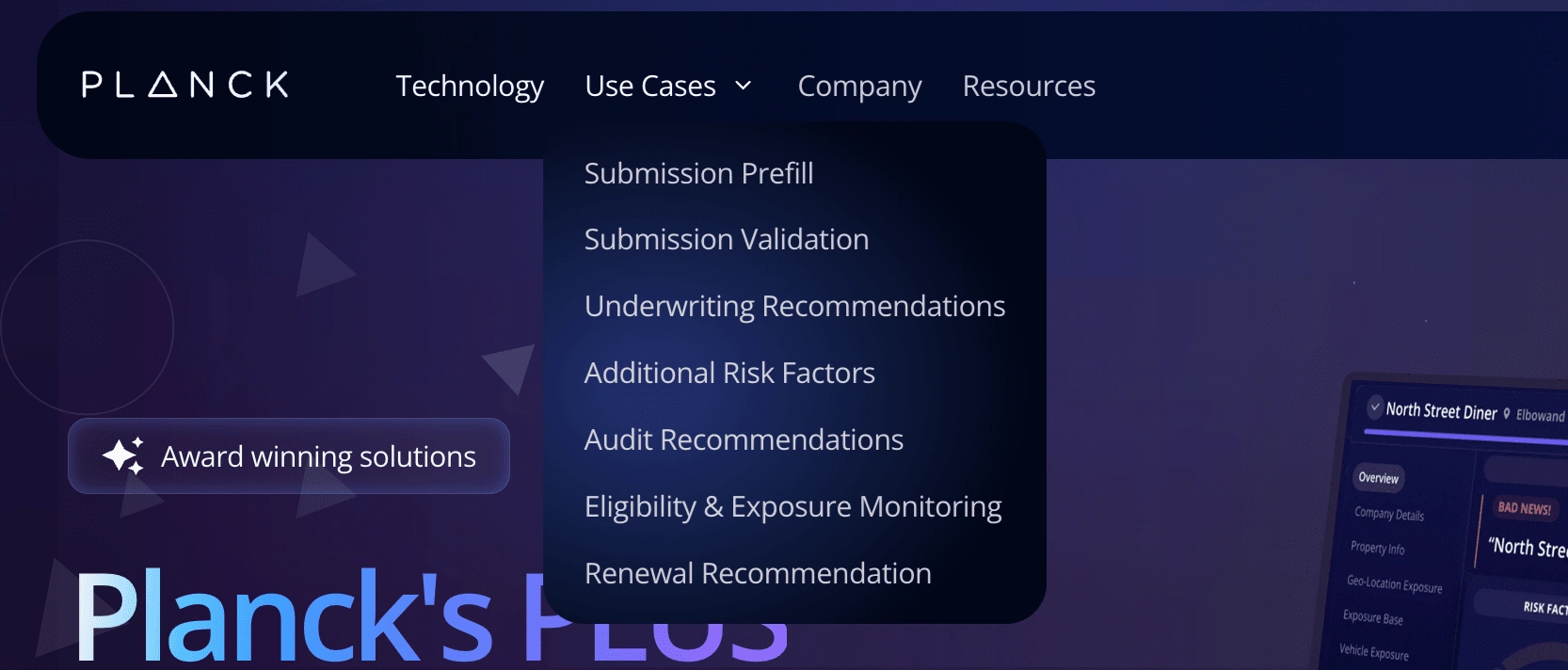
Custom navigation
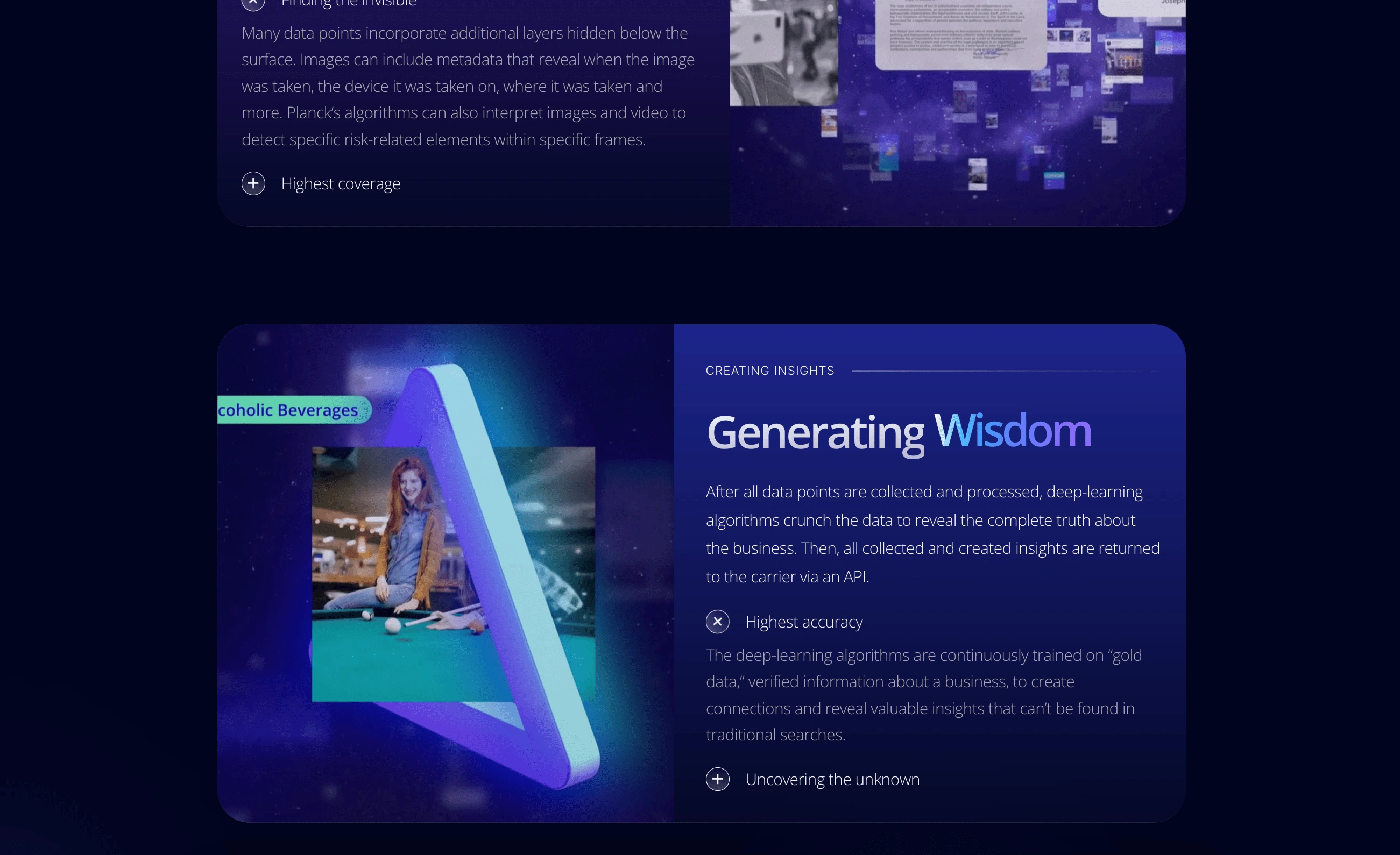
Interactive blocks
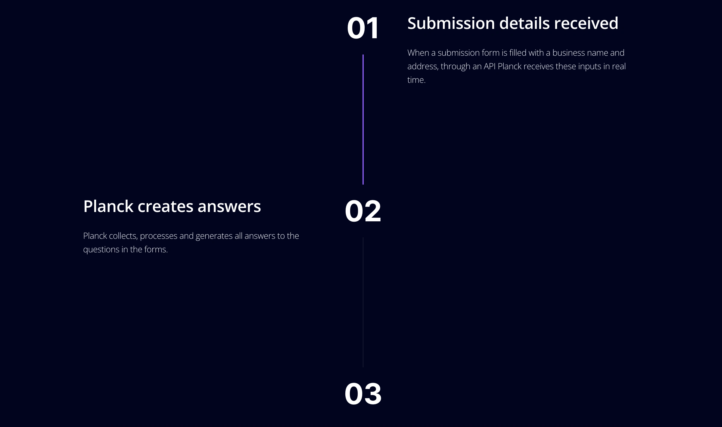
Timeline to showcase the process
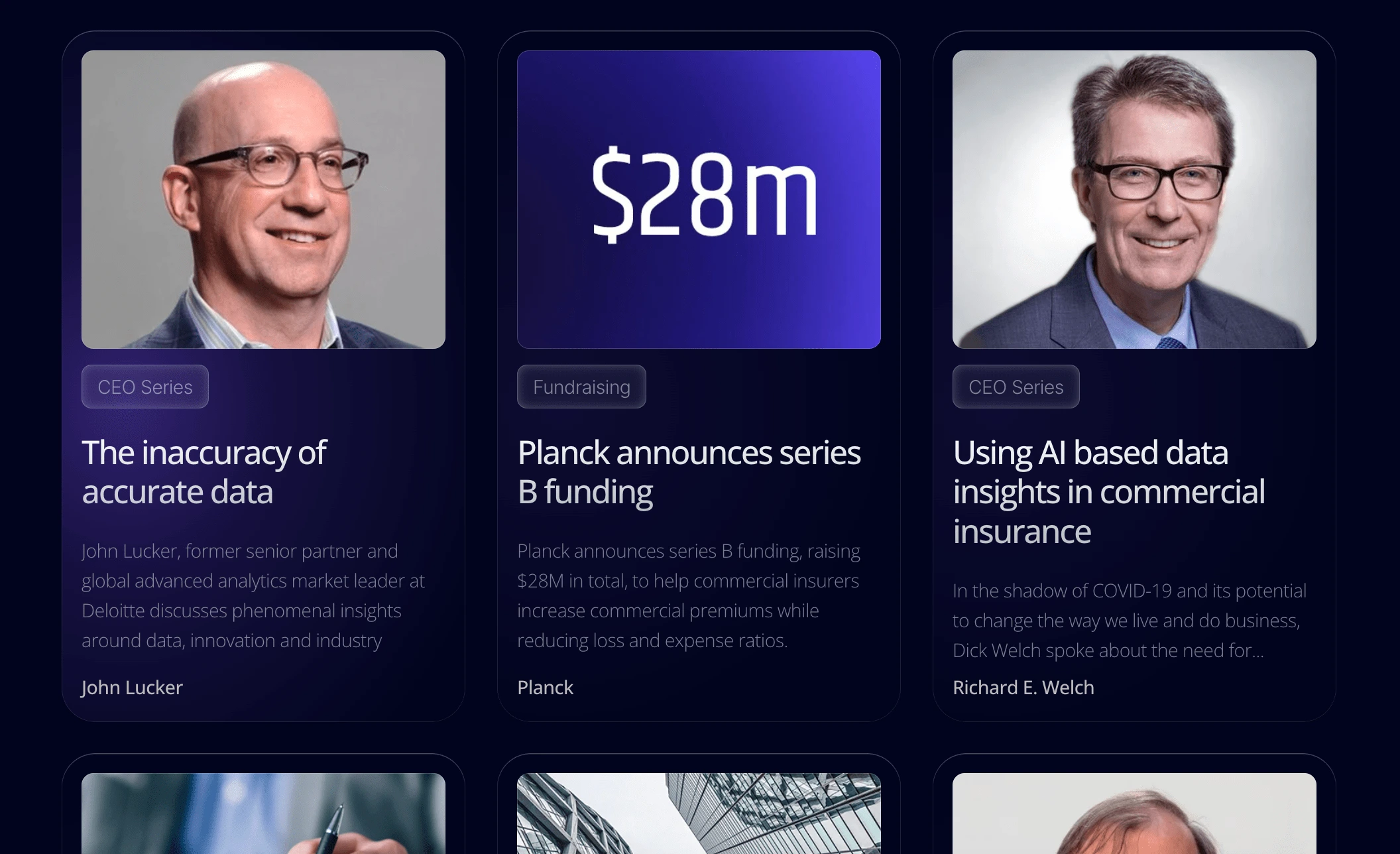
Blog posts
Got questions or need help supercharging your website for marketing success? Don't hesitate to reach out!
Like this project
Posted Nov 28, 2023
Transformed an outdated website into a modern, fast, and fully responsive one in just five weeks, leading to increased traffic and a successful PR campaign.
