Built with Replo
Landing Page Conversion Rate Optimization for Natural Catch
AL Foysal
How I Increased Natural Catch's Landing Page Conversion Rate by 67% in 15 Days — A Full CRO Case Study
Project Type: Conversion Rate Optimization (CRO) | Landing Page Optimization
Industry: DTC eCommerce | Health & Wellness | Premium Food & Nutrition
Timeline: 15 Days
Result: Conversion Rate Increased from 1.5% → 2.5% (+67% Relative Lift)
The Brand
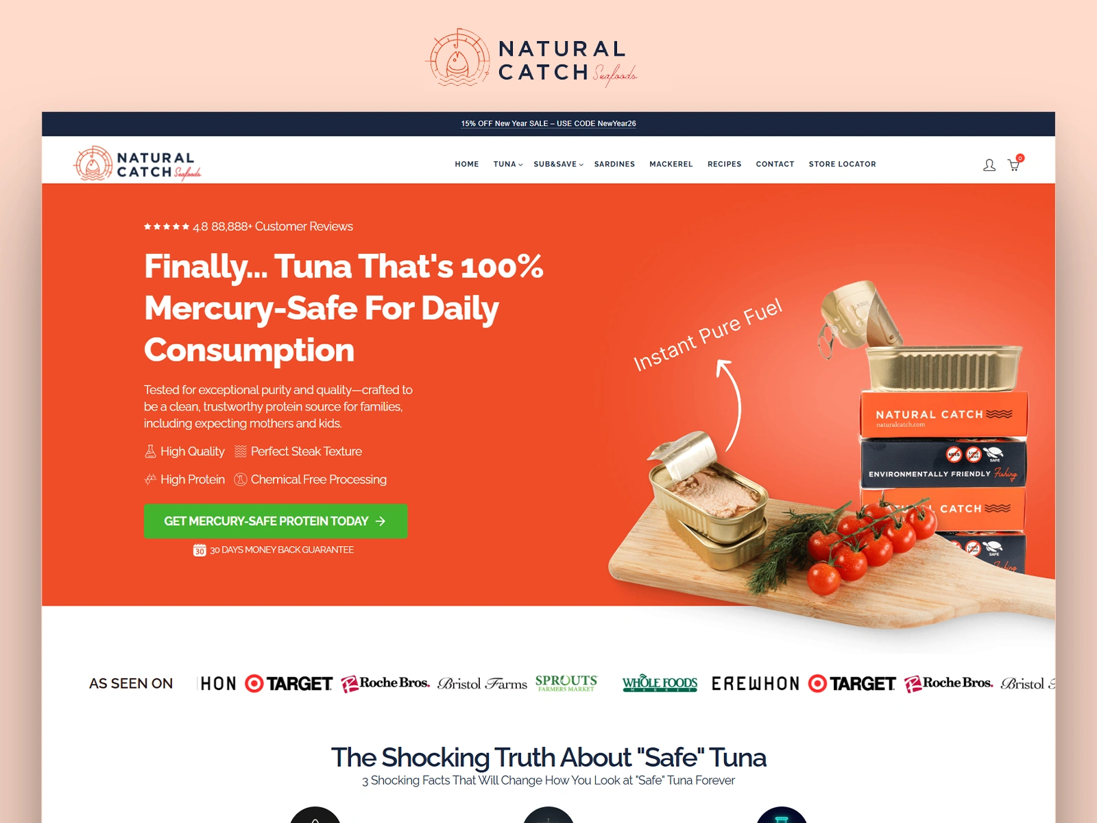
Natural Catch is a premium DTC canned tuna brand built around one core promise: mercury-safe protein you can eat every day. With 88,000+ customer reviews, a 4.8-star rating, and shelf space at Whole Foods, Erewhon, and Target — the brand had credibility. What it didn't have was a landing page that converted.
When I came in, the homepage was converting at 1.5%. Fifteen days later, it was at 2.5% — a 67% lift — with no changes to traffic, ad spend, or audience targeting. Every gain came purely from optimizing how visitors experienced the page.
What I Found: 6 Conversion Killers
1. The hero section led with fear but didn't close with proof fast enough.
The headline activated mercury anxiety well. But the brand's most powerful credibility signal — 0.15 PPM mercury, 6x stricter than FDA standards — was buried three sections deep. Visitors were leaving before they ever saw it.
2. The "Shocking Truth" section created anxiety without resolution.
Three alarming stats about mercury in mainstream tuna were presented as a standalone block. The problem? The page didn't immediately follow with Natural Catch's solution. Fear without resolution = abandonment, not conversion.
3. Trust signals were scattered, not stacked.
Natural Catch had exceptional proof: batch testing, BPA-free cans, full traceability, FDA registration, zero-bycatch fishing, pregnancy-safe certification. These were spread across the page with equal visual weight — meaning skimmers missed most of them.
4. The comparison table appeared too late.
The competitor comparison table was one of the most persuasive assets on the page. It was showing up after most visitors had already made up their mind. Moving it earlier could catch buyers at peak decision-making intent.
5. The urgency offer felt tonally off-brand.
The page spent its entire length building a premium health brand. Then the closing section hit visitors with a loud "40% OFF TODAY ONLY" that felt disconnected from the premium narrative — creating subtle doubt rather than confident action.
6. No mid-page CTA.
The primary CTA appeared in the hero and at the very bottom — with nothing in between. Visitors who engaged deeply with mid-page content (the warmest, most purchase-ready visitors) had no direct path to buy.
What I Changed
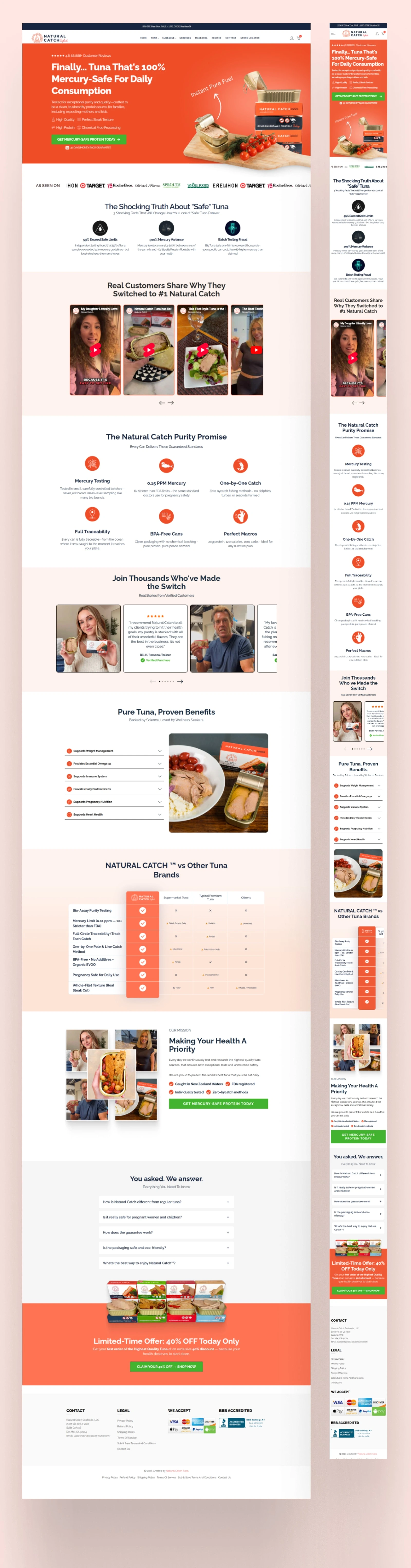
Hero Section Restructure
Moved the 0.15 PPM mercury stat and the 88,888+ reviews badge into immediate proximity below the headline. Transformed the hero from a claim-making section into a claim-plus-proof section — reducing the work visitors had to do to believe the core message.
"Shocking Truth" Section Reframed
Added a transitional element at the end of the fear section that flowed directly into the Purity Promise. This turned the section into a two-act narrative: problem exposed → solution introduced. Classic problem-agitate-solve structure applied at the page level.
Trust Signal Stacking
Reorganized the Purity Promise icons to lead with the two highest-impact proof points for the target audience — individual batch testing and mercury limits — and rewrote the supporting microcopy in buyer language, not brand language.
Comparison Table Repositioned
Moved the head-to-head competitor table to appear earlier in the scroll journey, right after the Purity Promise section. This catches visitors at the moment they're already leaning toward buying and gives them the final push they need.
Urgency Offer Realigned With Brand Voice
Rewrote the closing offer section to connect the discount to the brand's health mission. Instead of leading with the discount mechanic, the reframed version led with the health benefit — making the offer feel like a brand investment in the customer, not a clearance sale.
Mid-Page CTA Added
Inserted a secondary CTA immediately after the comparison table — the highest-intent moment in the scroll journey. Gave engaged mid-page visitors a direct conversion path without requiring them to scroll to the bottom.
Results
Within just 15 days, the landing page conversion rate jumped from 1.5% to 2.5% — a 67% relative lift. Traffic and ad spend remained completely unchanged throughout the entire process. Every single gain came from optimizing how existing visitors experienced the page.
The Core Lessons
Front-load your best proof. Most visitors won't scroll past the hero. If your strongest credibility signal lives below the fold, most buyers never see it.
Fear-based copy needs immediate resolution. Activating anxiety without a fast solution frame causes abandonment, not conversion.
Brand tone and sales tactics must match. Tonal inconsistency between a premium narrative and a discount CTA creates subconscious doubt.
Your mid-page visitors are your warmest leads. Give them a CTA before they have to scroll to the footer.
Services: Landing Page CRO · Direct Response Copywriting · UX Copy · eCommerce Conversion Strategy
Skills: CRO · DTC eCommerce · Health & Wellness Marketing · Consumer Psychology · Shopify · Landing Page Strategy
Like this project
Posted Feb 21, 2026
Optimized Natural Catch's landing page by fixing copy flow, trust signals, and CTA structure. CVR jumped from 1.5% to 2.5% in 15 days. No ad spend changes.
Likes
0
Views
8