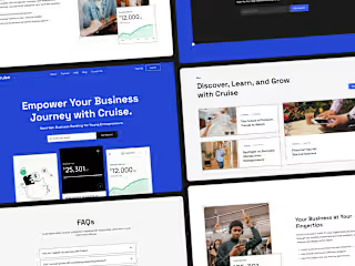
Website Refinement Driving ESG Impact with Blockchain Innovation
Strategic, high-impact website refinement aligning Purpose for Profit’s mission with a polished, trust-building online presence.
Crafting a cohesive redesign to inspire trust, amplify Purpose for Profit's ESG mission, and showcase blockchain's power for sustainable change—all in 20 hours.
Client Overview
Purpose for Profit is the world’s first on-chain endowment and tokenized credit fund for Environmental Social Governance (ESG) initiatives. Committed to addressing the U.S. affordable housing crisis, Purpose for Profit provides low-interest loans to businesses building sustainable communities and diverse housing options. The Purpose to Profit mission is to leverage blockchain to drive positive economic change for a greener, more inclusive world.
The Challenge
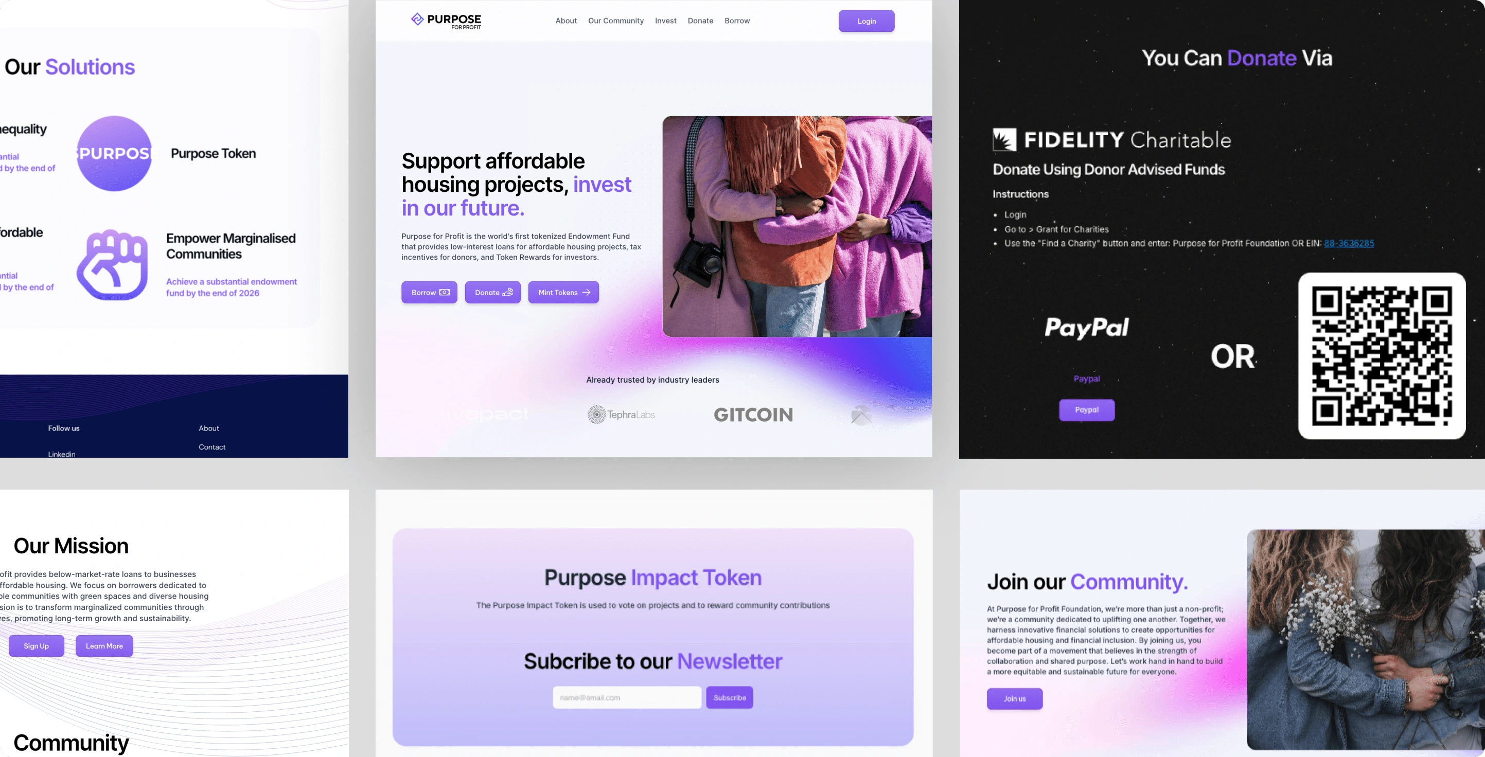
Purpose for Profit’s initial website was visually overwhelming, with bold, out-of-context images and colours that didn’t align with the brand’s values or establish the credibility and trust essential to their mission. The design lacked cohesive direction, making it difficult for users to quickly grasp the organization’s purpose. With only 20 hours allocated for the project, I was brought on board to refine the existing website, helping Purpose for Profit create a credible and impactful online presence to support their marketing efforts and prepare for investor meetings.
Before
Project Kickoff: Establishing the Vision and Strategy
Through a focused consultation, I identified actionable goals to align the design with Purpose for Profit’s values while creating an intuitive, user-friendly experience. Working closely with the client, who envisioned a design inspired by traditional finance and non-profit aesthetics (avoiding the typical "crypto" look), we collaboratively reviewed brand adjectives and conducted a thorough page-by-page audit. This process helped highlight meaningful elements to retain while also identifying content gaps that needed addressing.
Vision and Strategy: Establish credibility and trust through strategic simplification and thoughtful refinement. Our goal was to clearly showcase Purpose for Profit’s unique value propositions and guide users toward calls to action, instilling confidence in their engagement with the organization. We emphasized core messaging and usability to ensure a clear, impactful user experience.
With this aligned vision, I developed a cohesive plan that prioritized high-impact changes within the 20-hour constraint. The approach focused on creating a more cohesive and purposeful website with a fresh, refined aesthetic that captured the essence of Purpose for Profit’s commitment to leveraging blockchain innovation for positive, sustainable change.
Design Execution: Building a Cohesive and Purposeful Experience
With the strategy in place, the design execution focused on translating these principles into specific actions and tangible results:
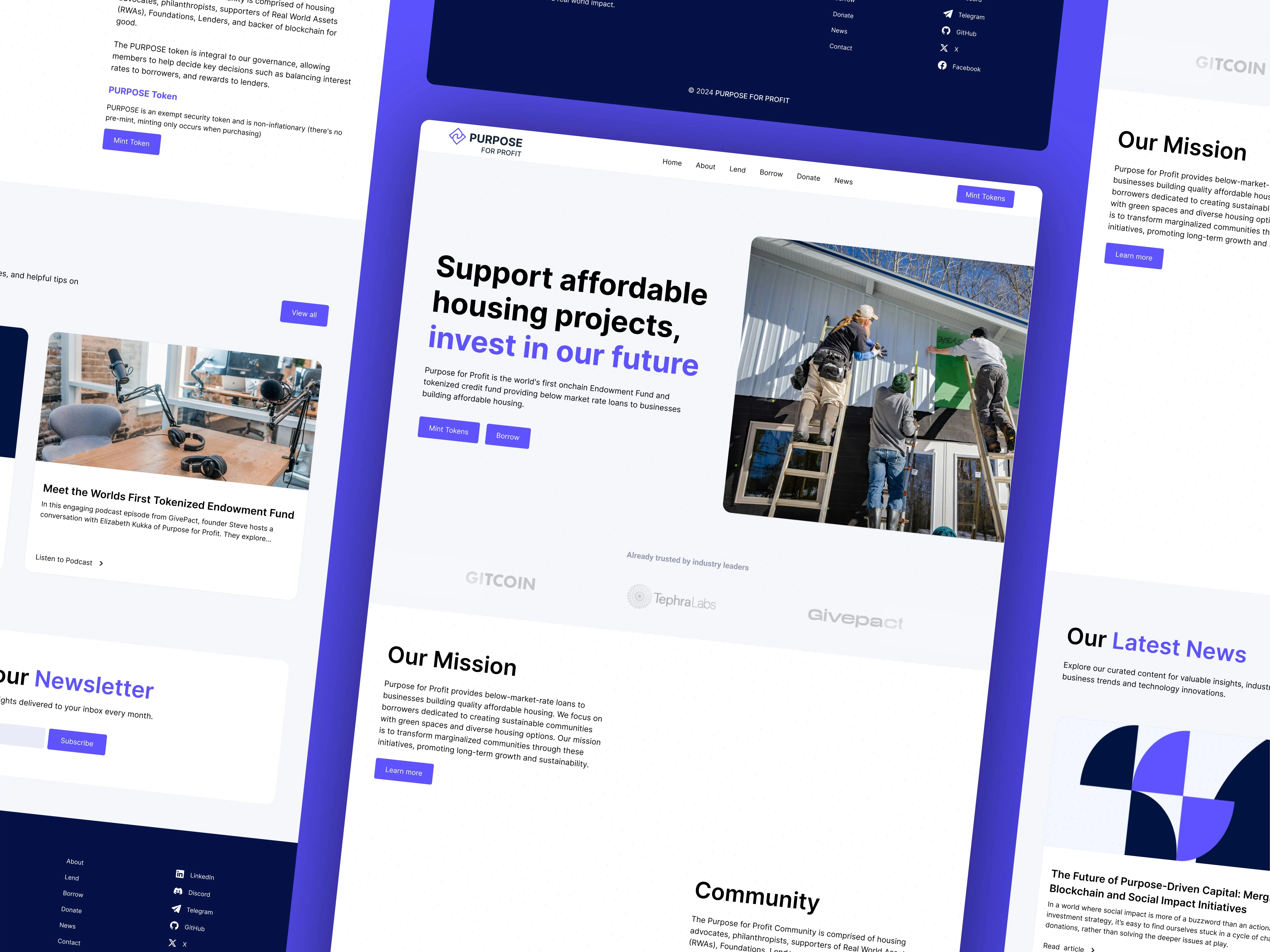
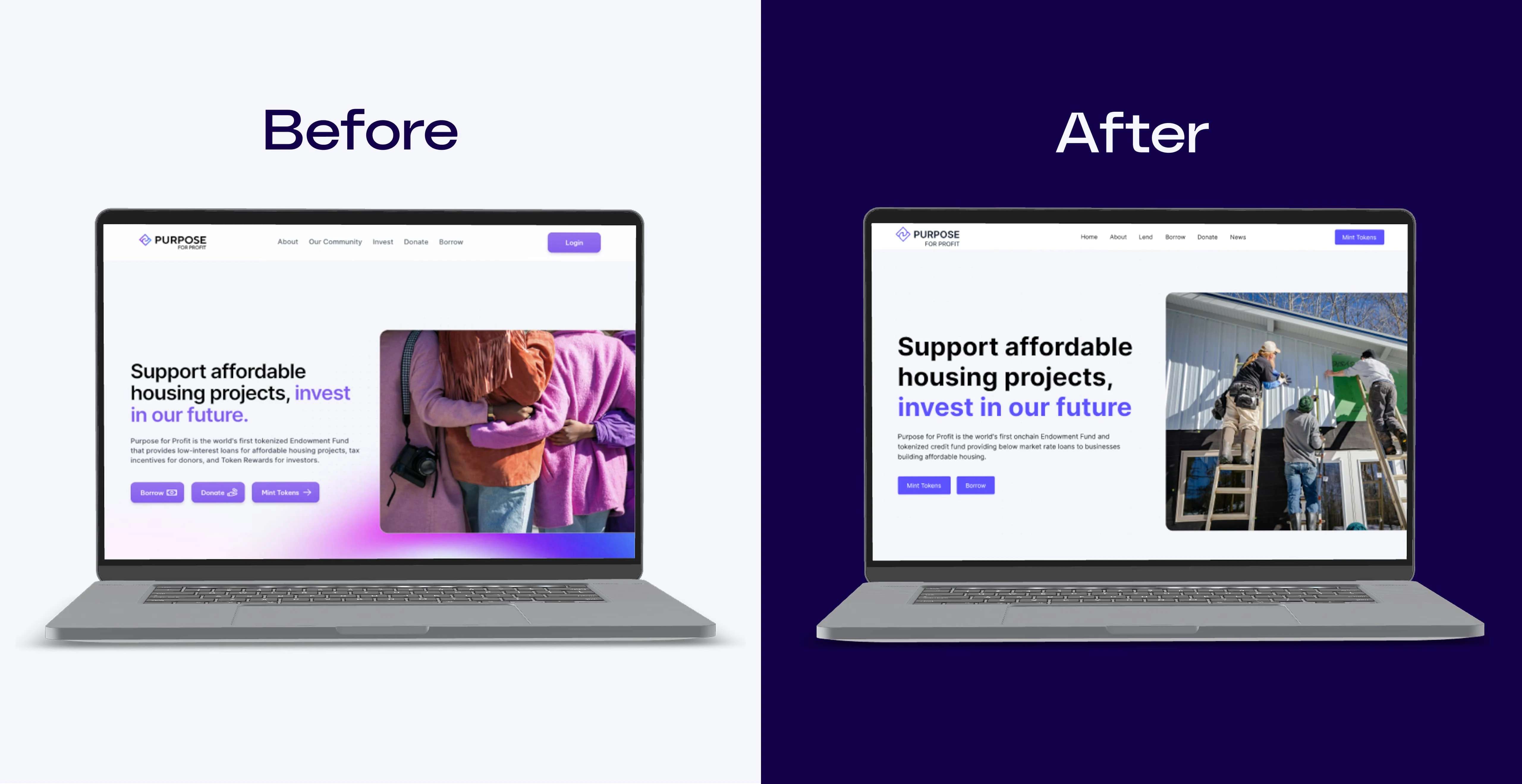
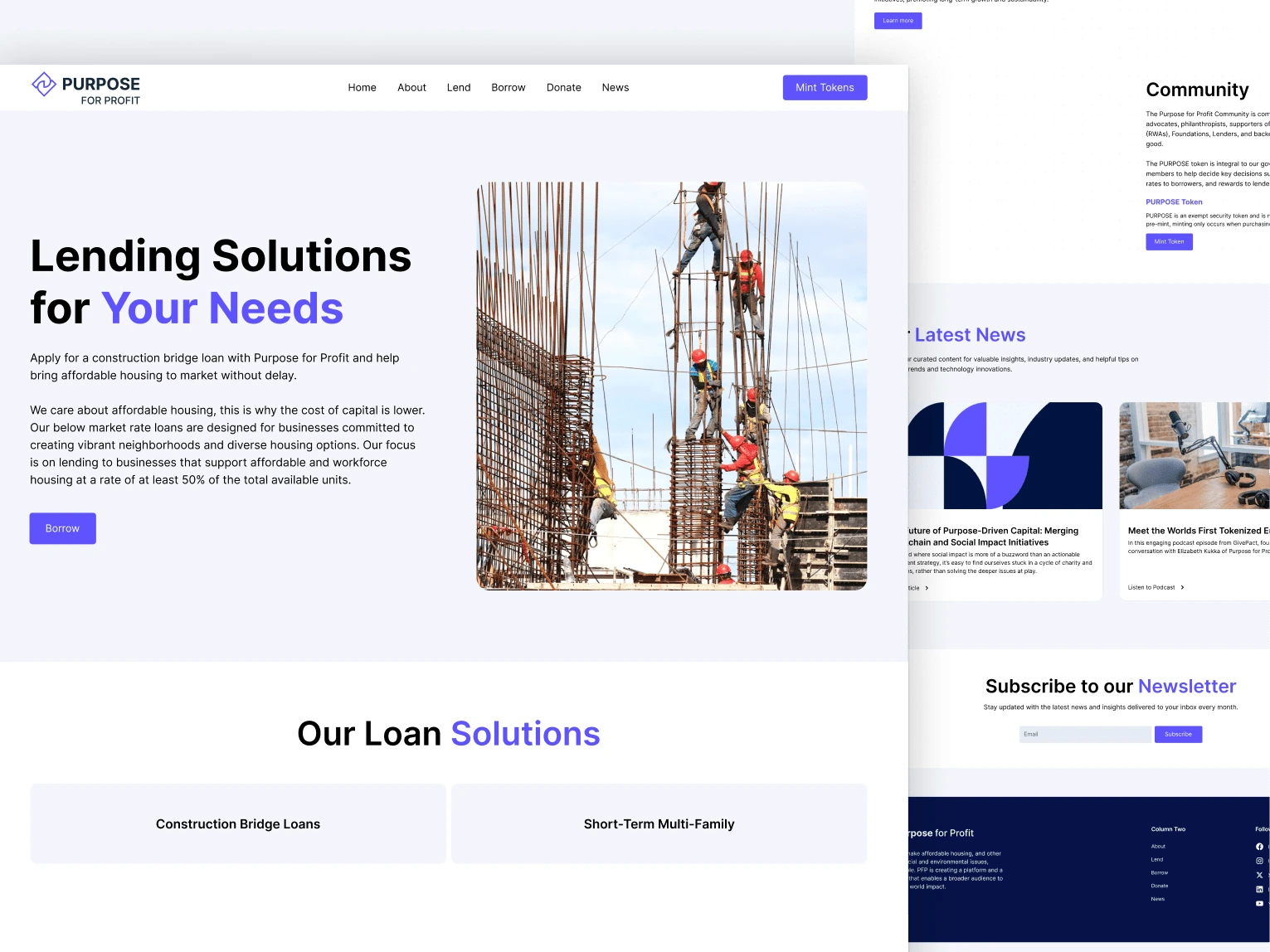
Refined Colour Palette: The original magenta-purple was updated to a deeper violet, blending blue (trust) and purple (innovation) to align with Purpose for Profit’s mission. This refreshed colour scheme, with cool blue and white backgrounds and black text, achieved a cohesive, modern look.
Relevant Photography: Images were curated to consistently reflect the brand’s values, replacing visuals that lacked alignment with the project’s mission.
Optimized Use of Visual Elements: Wave backgrounds and gradients were removed, while the subtle dot patterns were retained to emphasize themes of finance and blockchain without overwhelming the design. This approach allowed essential components to breathe, focusing attention on primary messages and calls to action.
Typography Selection: Given the project’s focused timeline, Inter was thoughtfully retained for its clean and modern qualities. The typeface’s refined, and accessible style not only reinforces the brand’s credibility but also creates a welcoming and engaging tone that resonates with Purpose for Profit’s mission and values. Its versatile weight options enabled a clear visual hierarchy, guiding users seamlessly through content and enhancing the overall user experience.
Logical Information Architecture: The site’s structure was refined to improve navigation, with the community page renamed to “News” to function as a hub for updates and thought leadership, keeping users informed about Purpose for Profit’s latest initiatives.
Meaningful Copy: Collaborating with the CEO, content was refined to be both relevant and informative, supporting the organization’s mission and engaging the audience effectively. Calls to action were strategically placed within the content, such as inviting users to learn more about initiatives or contribute to the organization’s efforts. Buttons such as "Learn More," "Join Our Community," or "Donate Now" were carefully positioned to drive the user experience toward the desired interactions
Before and After
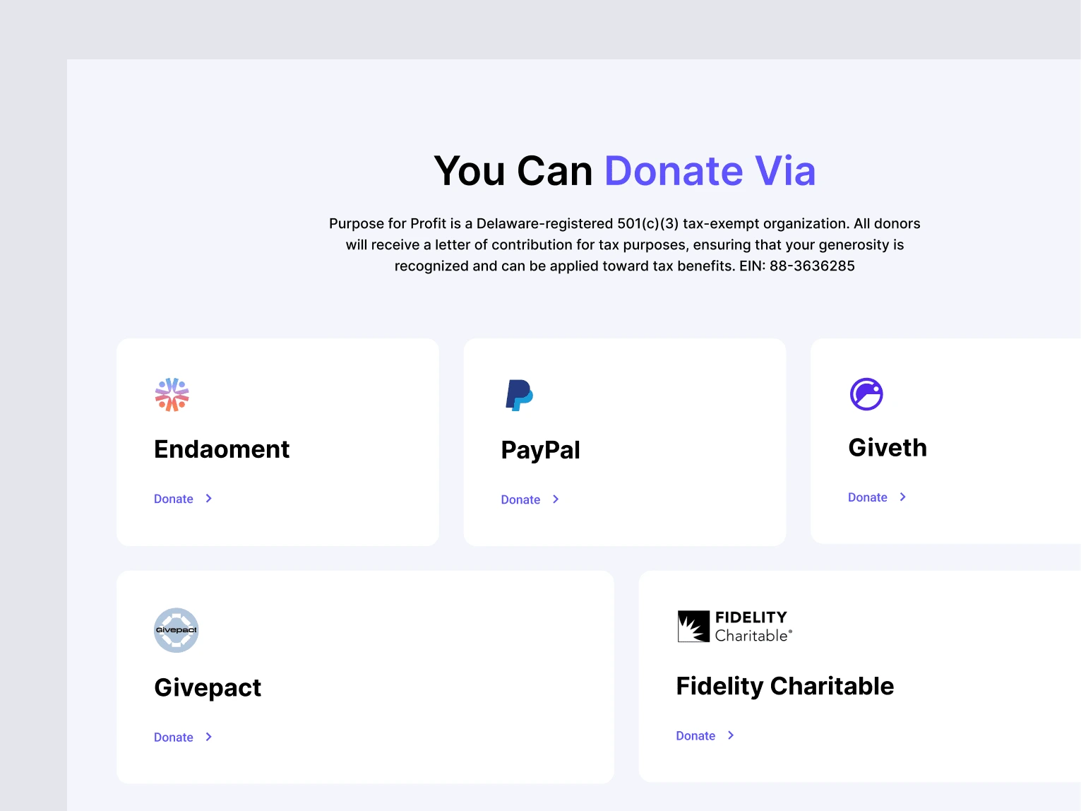
Donate
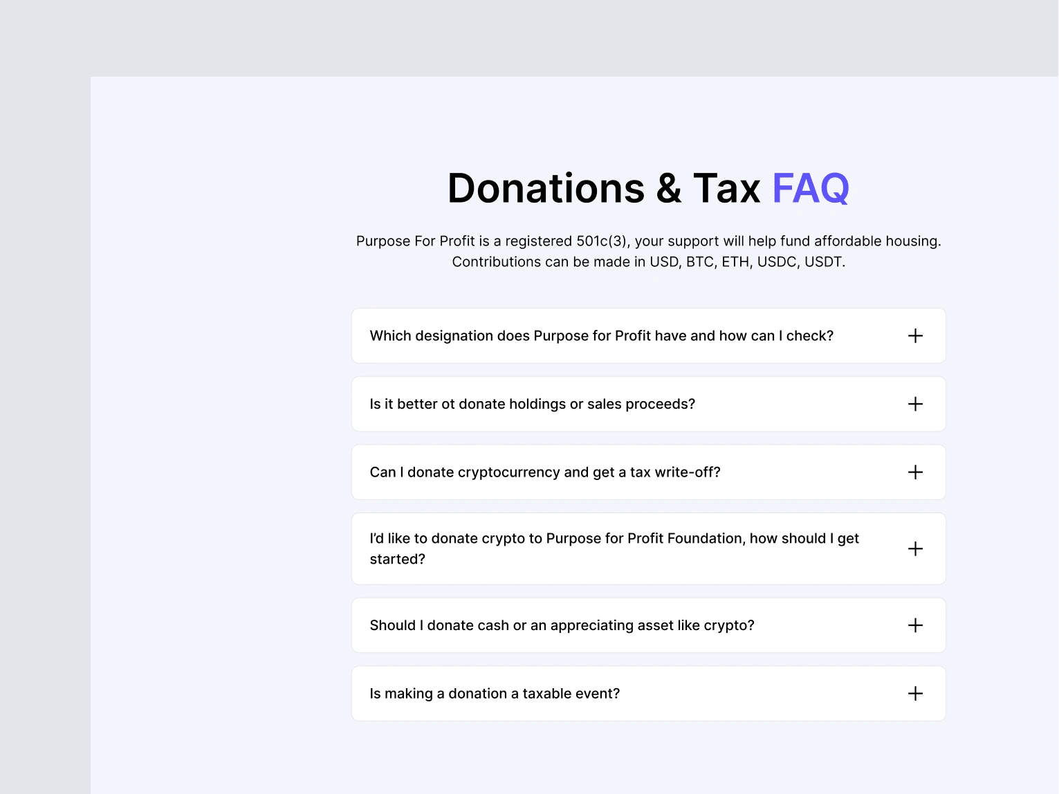
FAQ Section
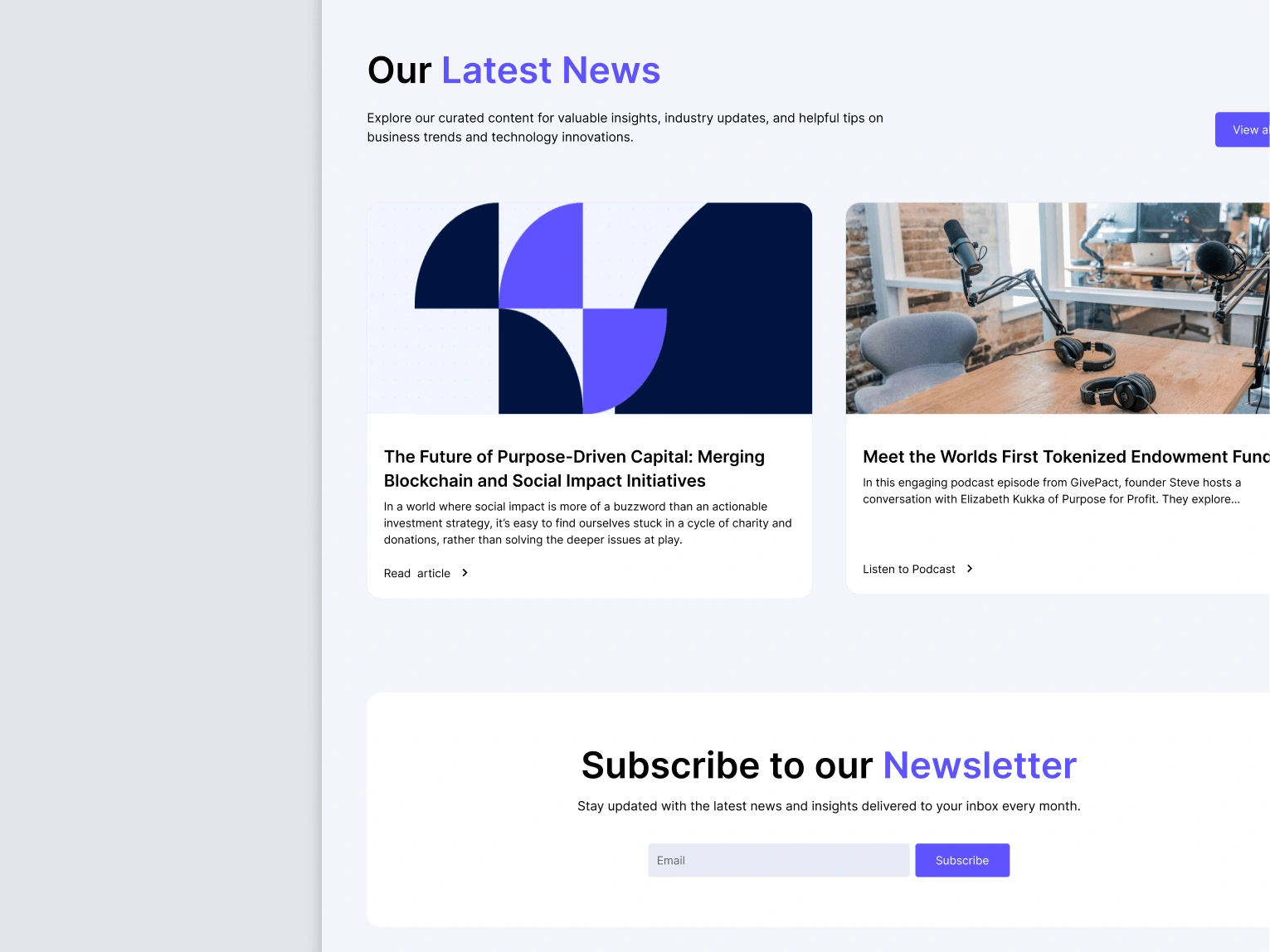
Latest News and Subscribe CTA Sections
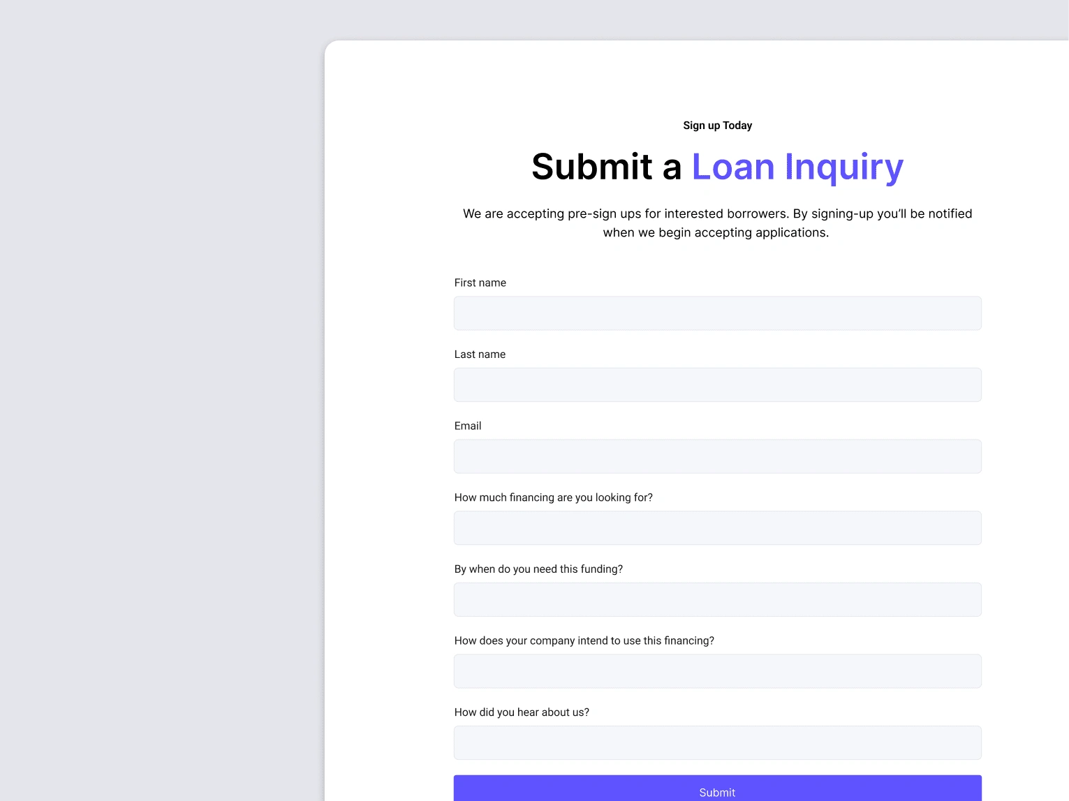
Submit Loan Inquiry Form
Impact and Results
This project exemplifies how strategic design and refinement, rather than a complete overhaul, can yield high-impact results—especially under tight timelines.
Within a fast-paced 20-hour timeframe, the refined design achieved a polished and cohesive digital presence aligned with Purpose for Profit’s mission of driving impact. This allowed them to confidently launch their website, establishing a trustworthy and impactful online presence that supports their marketing efforts and prepares them for investor meetings.

Let’s work together
Interested in collaborating? Let’s connect! Let's start with a complimentary 30-minute design consultation to explore your vision and goals. Looking forward to creating something amazing together!
Like this project
Posted Nov 7, 2024
Crafting a cohesive redesign to inspire trust, amplify Purpose for Profit's ESG mission, and showcase blockchain's power for sustainable change—all in 20 hours.
Likes
0
Views
13
Timeline
Sep 23, 2024 - Nov 4, 2024


