ABLE - Design System
Brian Porter
The Design System
My strong opinion is that traditional design systems often lock you into a singular styling for each component, with little nesting of sub-components (elements;-) limiting the product designers creativity rather than addressing each UI challenge uniquely and allowing them to build or expand on the components capabilities. With ABLE I wanted to find a different approach.
As teams and codebases expanded, the need for consistency and reusability in both code and visual style became evident. A simple redesign of a clients (BlueQueue) user accounts area highlighted the necessity for a better design and build process. I led a small team to explore solutions, ultimately deciding to build the design system. We named it the ABLE design system.
Done Different
To avoid the pitfalls I had witnessed in other organizations, I started with a few simple principles to guide our decision-making process. These principles allowed us to collaboratively build things how we needed while providing everyone the opportunity to contribute their ideas.
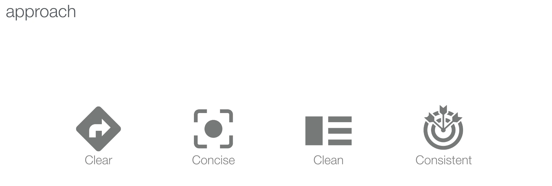
My goals for the design system at a high level follow my 4 C's:
Clear structure and organization
Concise and to the point
Clean in form and function
Consistency across all devices
With any team that decides to adopt the design system we want to...
1. Foster Creativity
The system and its components should be flexible enough to encourage variation, deviation, and creativity, while acknowledging that conventions can—and will—be broken.
2. Code as the Source of Truth
Code represents our closest relationship with customers. Ensuring designed components remain in sync with their coded counterparts is crucial to our success.
3. Collaborate and Contribute
Design systems should reflect the structure and nature of the organization they serve. Therefore, the current team must create the tools that the current team needs.
The Outcome
On the design side, we deconstructed components into their fundamental styles, elements, components, modules, and pages adhering closely to widely accepted atomic design principles. Like Russian nesting dolls, these design objects seamlessly fit together and function across various use cases, promoting a "write once, deploy to many" approach.
Styles
Fundamentally, theming is used to modify "skin" existing elements and components to apply a visual style to an application. However, themes can control far more than a change in the colors. The theme in the ABLE design system consists of the following style, dictionary and library files:
Color Styles
Text Styles
Effect Styles (Shadows & Treatments)
Icon Library
Illustration Library
Brand Library
Spacing Dictionary
Size Dictionary
Time, Interaction, Motion, Audio, Haptic Dictionaries
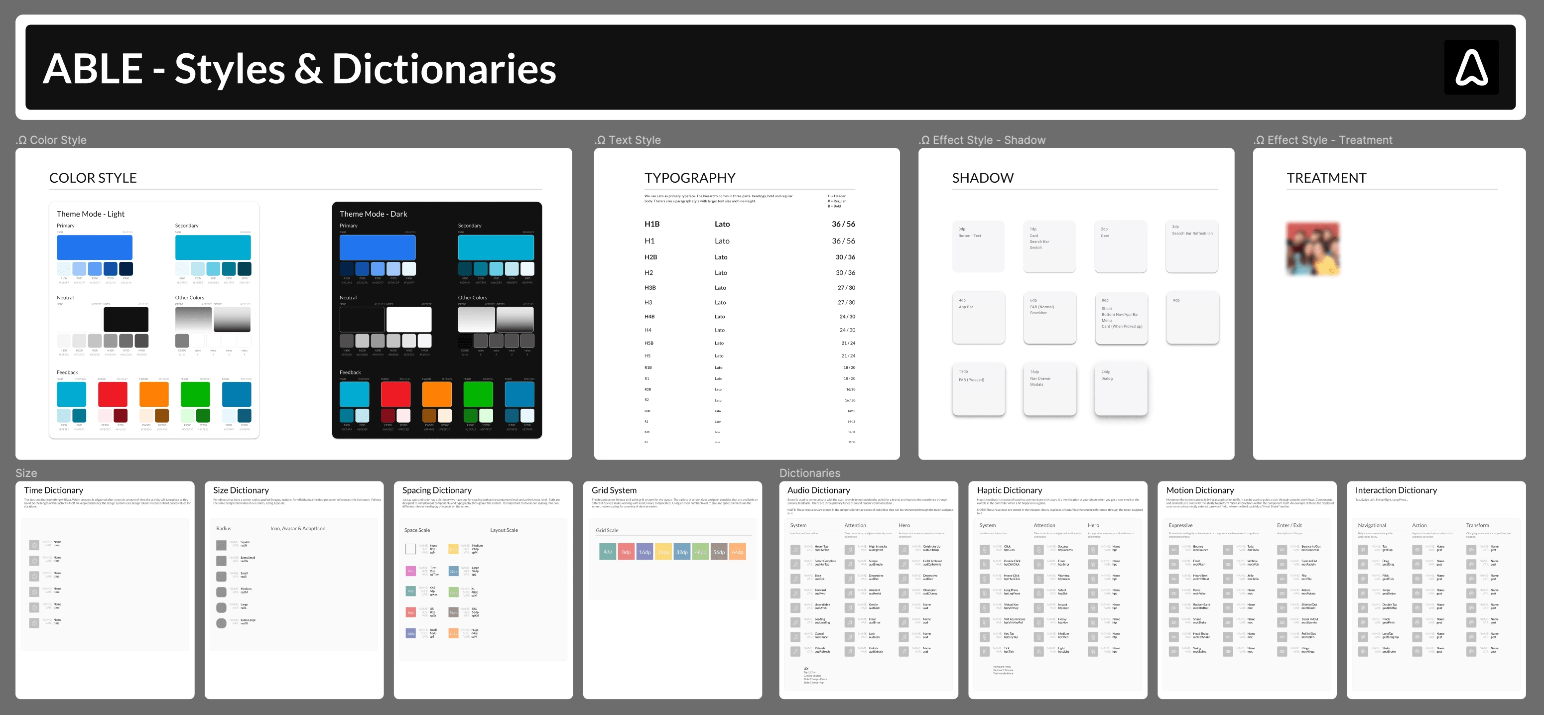
Figma - Base Styles & Dictionaries
Elements
These are objects that can't be broken down further, the individual interface building blocks used to construct the components of the design system. Each element has their unique styling properties, such as typeface, color, size, and spacing, which are pulled from the styles and libraries.
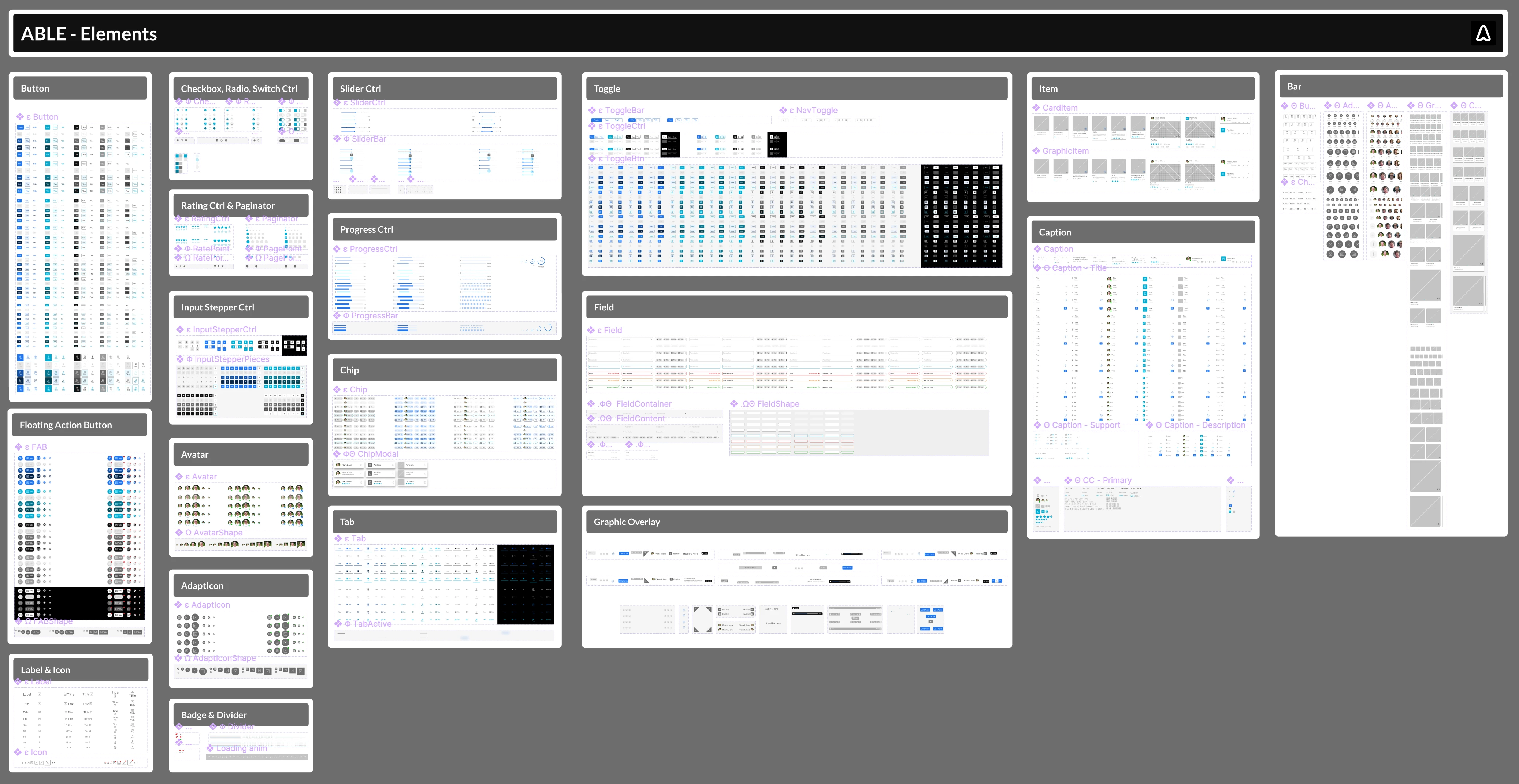
Figma - ABLE Elements
Components
The interface objects built out of elements or by nesting other components, with a background surface and spacing, to serve as a reusable object in building interfaces. Components dynamically scale horizontally to fill the width of the screen, but in 99% of cases DO NOT scale in height.All components are designed to stack vertically on top of one another, with no vertical spacing between them.
With ABLE our definition of a Component goes beyond those that you typically see in other frameworks like Bootstrap, Angular or Ionic which, for the majority of screen objects, all stop at the Element level under our definition of an Element here.
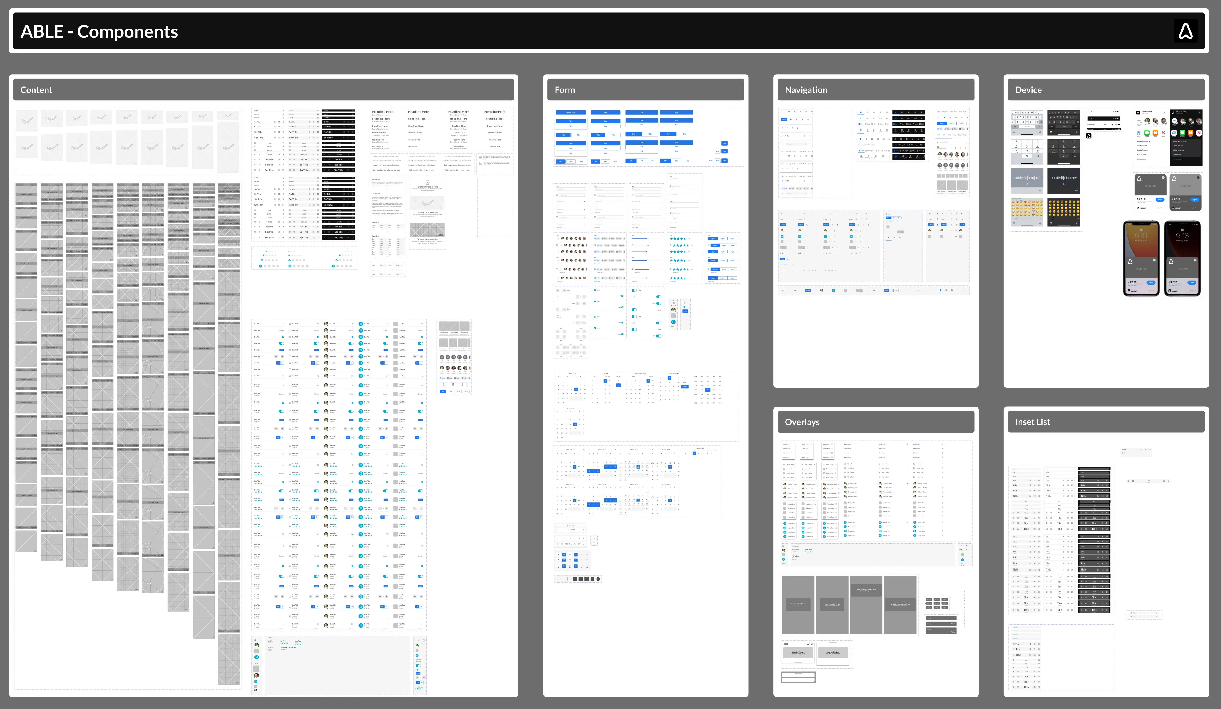
Figma - ABLE Components
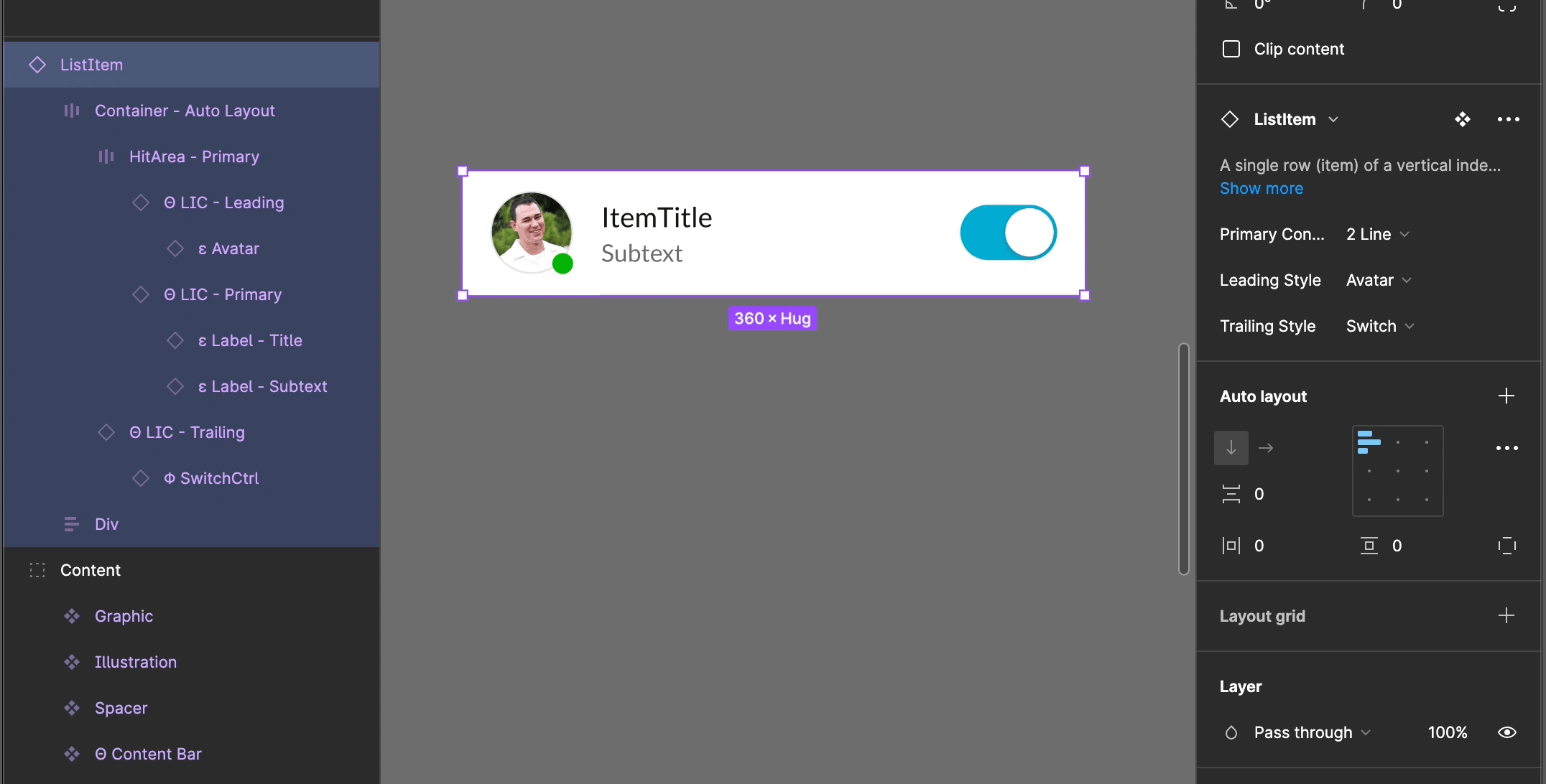
Figma - ListItem Component Properties
Modules
Groupings of components, with a specific purpose are considered to be modules in the ABLE design system. With heights and inner component spacing being handled at component level we're able to quickly stack component to create consistent experiences.
With every application there are functions that are repeated like, copy, reorder, delete, etc. and that's where "Globally" used modules come in handy.
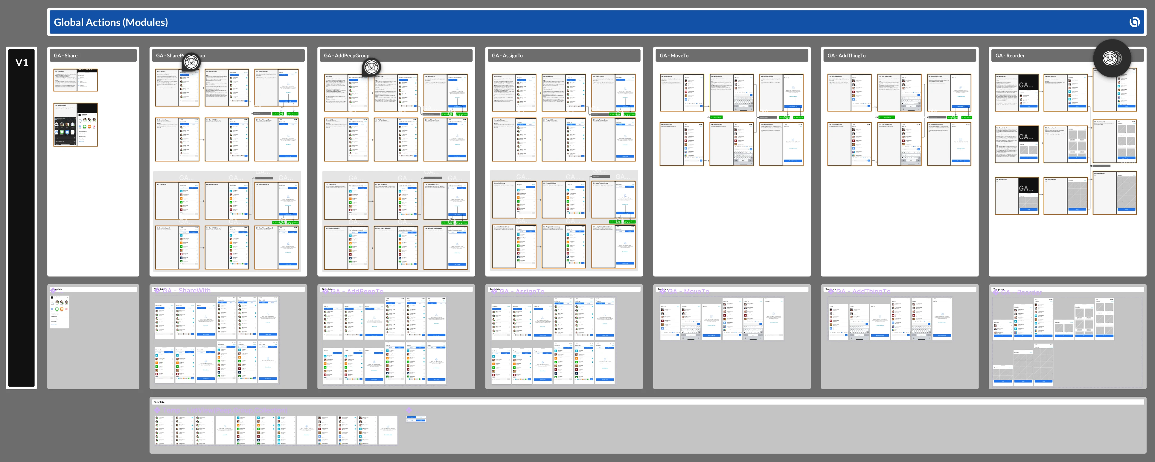
Figma - ABLE Modules
Note: We also chose to build these global actions at the mobile breakpoint and scale the experience up. Something I learn back with the iFactr framework... always design to the lowest common denominator, to not run into design debt down the road.
Design to Development
Moving from pure design and into functional production quality code has long been a hurdle every ux product designer has had to find a solution to. In my early days that meant physically sitting next to the developer and providing direction on each screen objects form (spacing, color, style, font and image assets), and function (it's reaction to user or event triggers). Today, with the introduction of no-code and low-code tools like Webflow I'm able to reproduce the Figma designs one-for-one as Webflow components.
Component Properties
Going beyond a components and modules that react to device breakpoints we've built component properties to make each highly adaptable to different use cases. For example the same "Button" component can take on many different sizes, shapes, and styles by easily adjusting its default properties. And these are properties that anyone from a no-code stakeholder to the React.js developer can make to fit their needs.
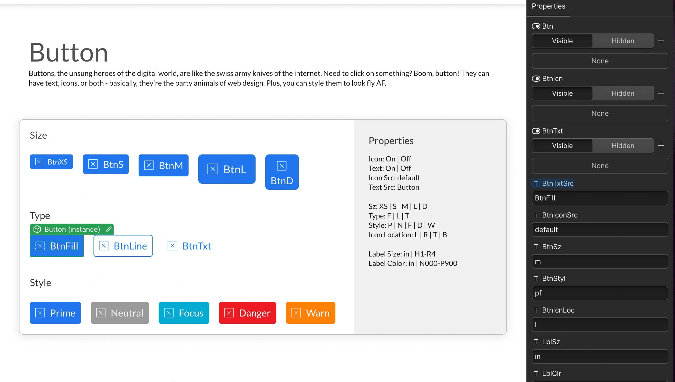
Webflow - ABLE "Button" Component with its properties
All of the buttons shown in the image above are altered from the baseline "Button" component. Note, it's not shown but, you can even turn the icon or text on or off to suite your needs.
The Code
In the past the code coming out of these processes were less than ideal. However, with Webflow and Devlink as a product designer with html/css skills I'm able to now output ready to use Next.js components with clean code.
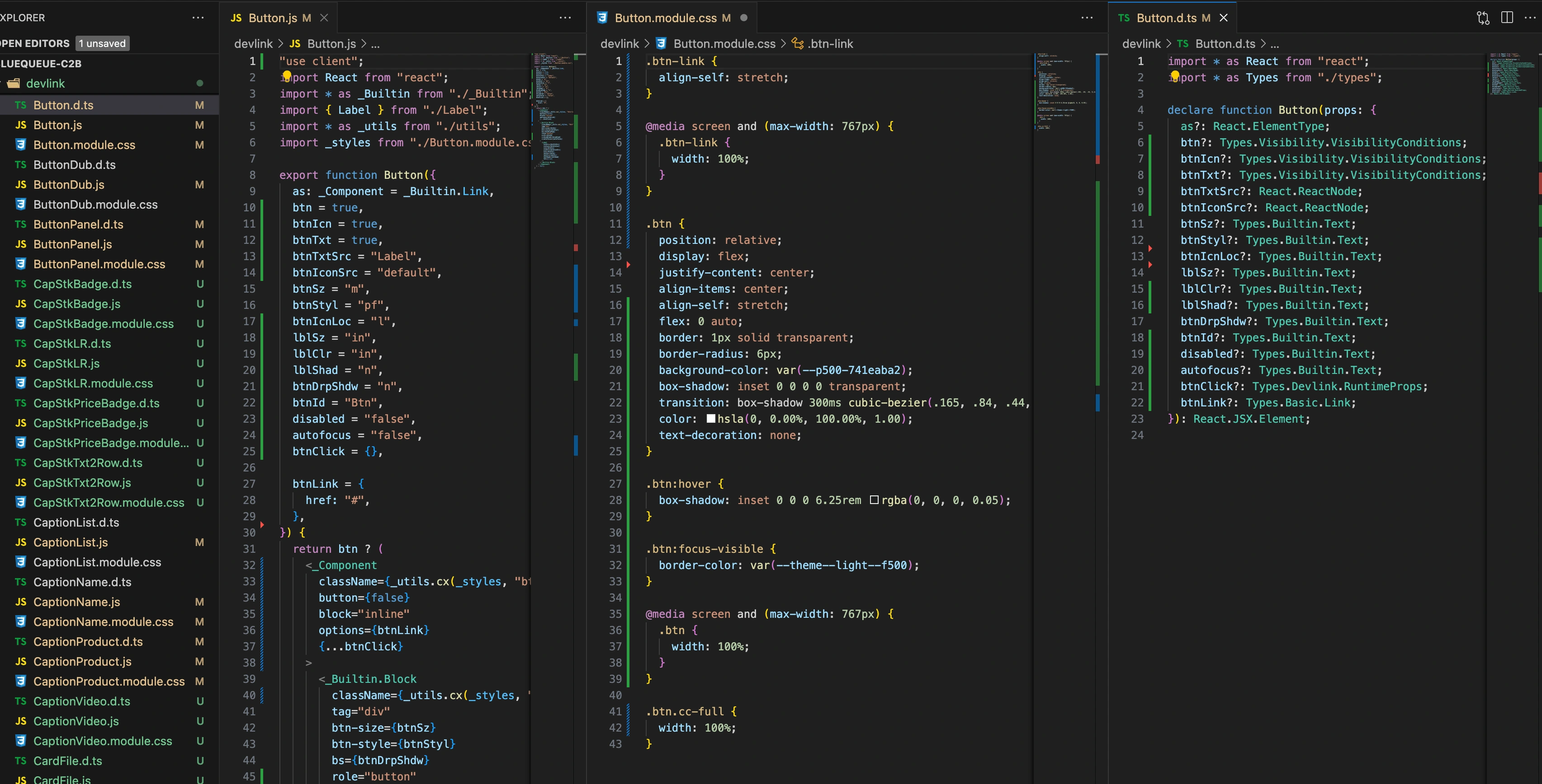
VS Code - Next.js "Button" component code
The developers appreciate not having to pixel push, I've streamlined the stakeholder to design, to dev pipeline, and now provide the developers with all the component hooks they need to populated and alter screen content.
Like this project
Posted Jun 19, 2024
Product Design Architect of this atomic design system. Designed in Figma, built in Webflow, deploying to React (Next.js) for mobile, web and desktop SaaS apps.