Abhiruchi Brand Identity | Indian Restaurant Branding
Pinaka Creative Studio
Abhiruchi - Restaurant Brand Identity
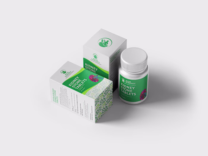
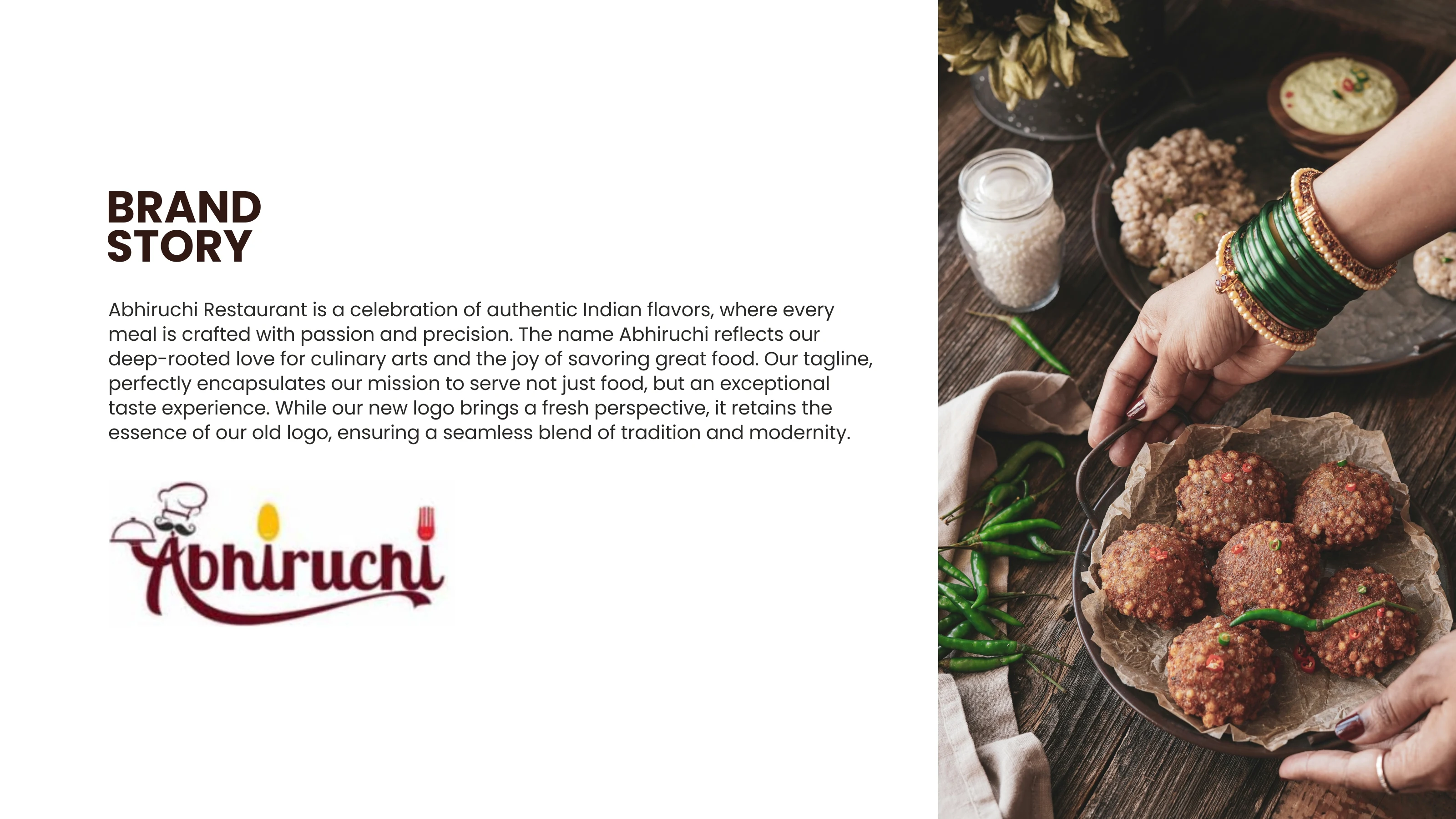
Abhiruchi had a logo. It had a chef hat, a moustache, a fork, a spoon, a cloche. It had everything except a reason for any of it to be there.
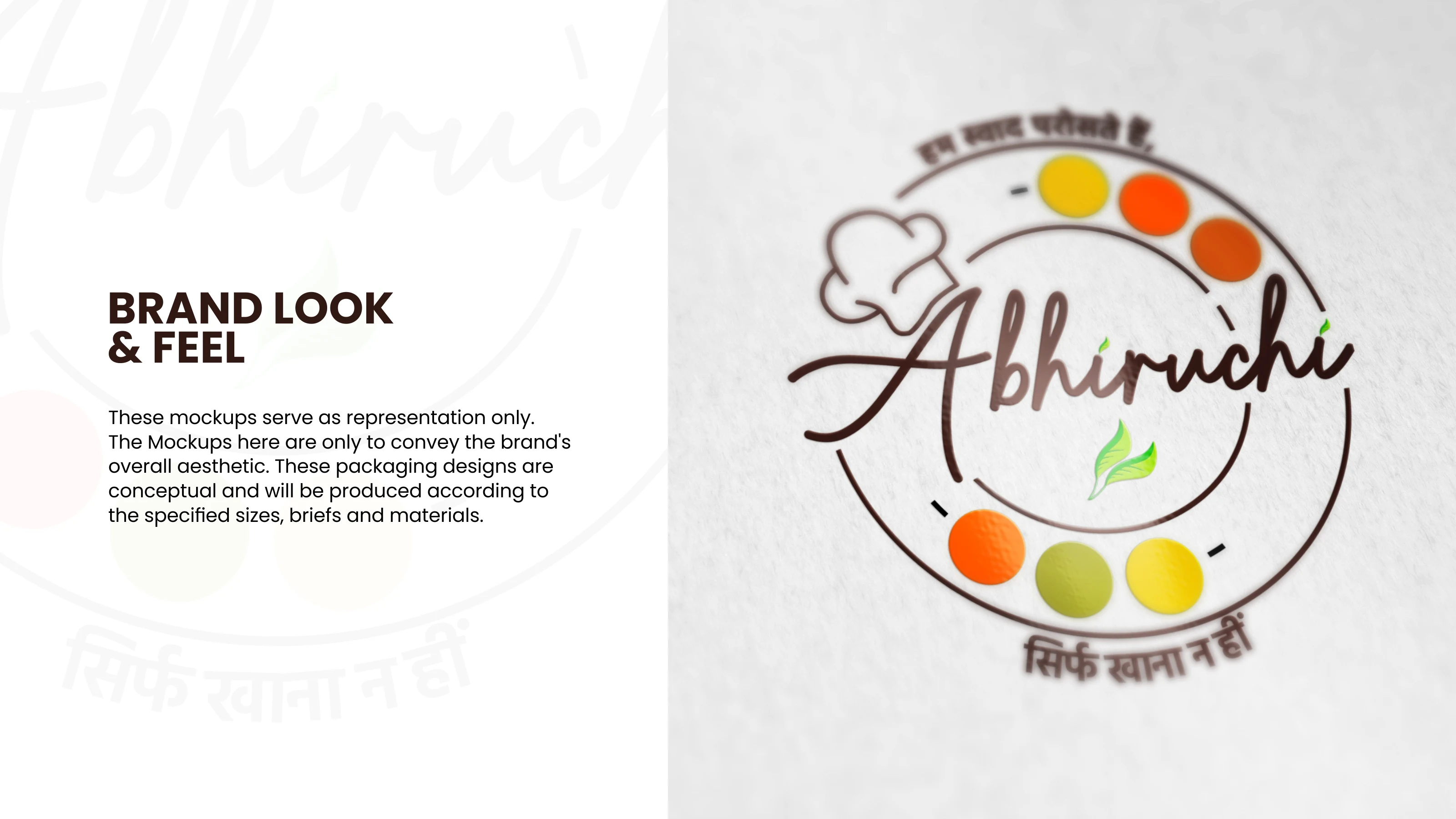
They came to us through a referral: a homestyle restaurant and tiffin service serving corporates, colleges, and anyone craving a proper Ghar ka Khana (Homemade Food) experience. The brief was simple: make it feel like a Thali (Indian Traditional Food Plate).
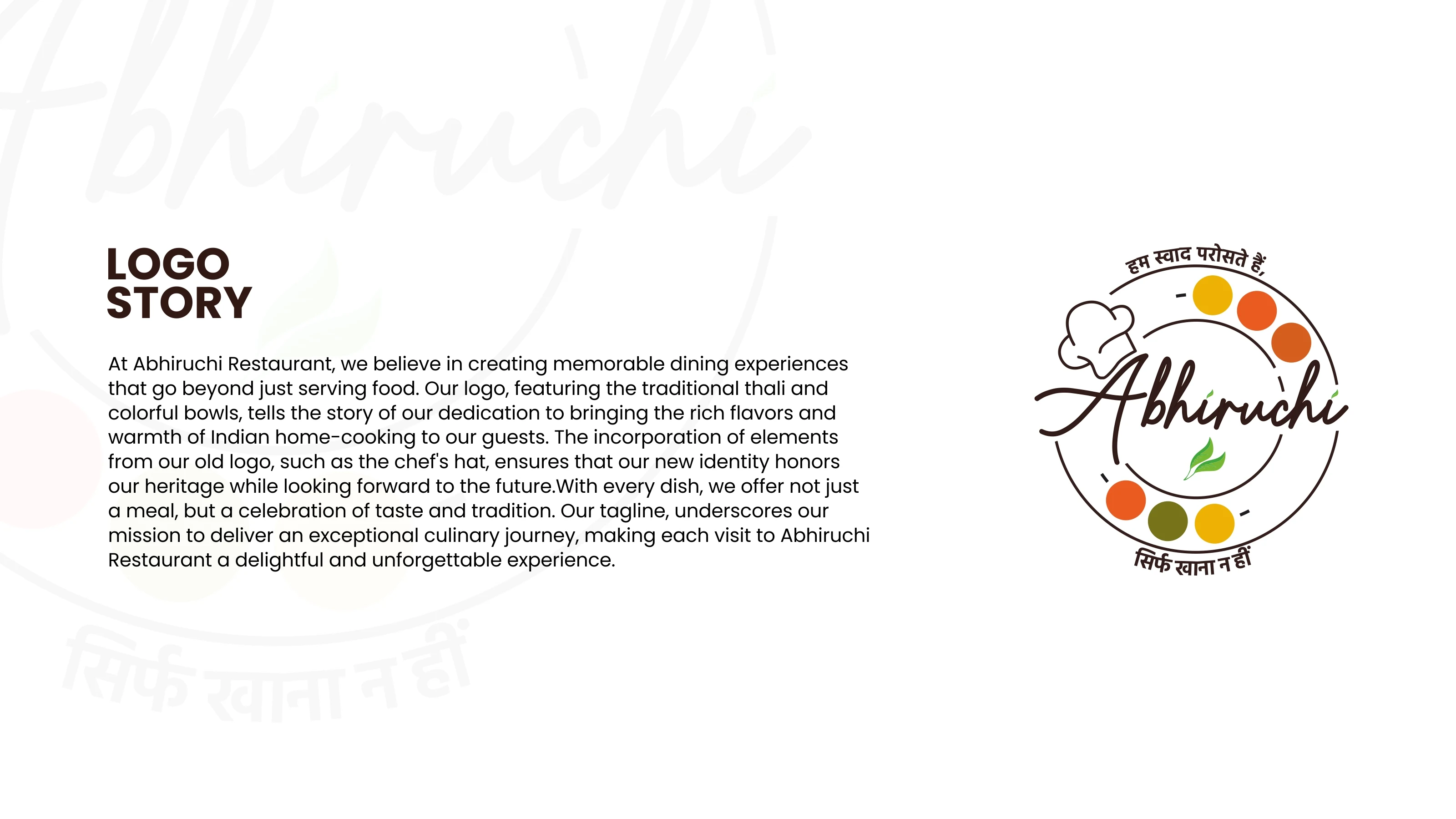
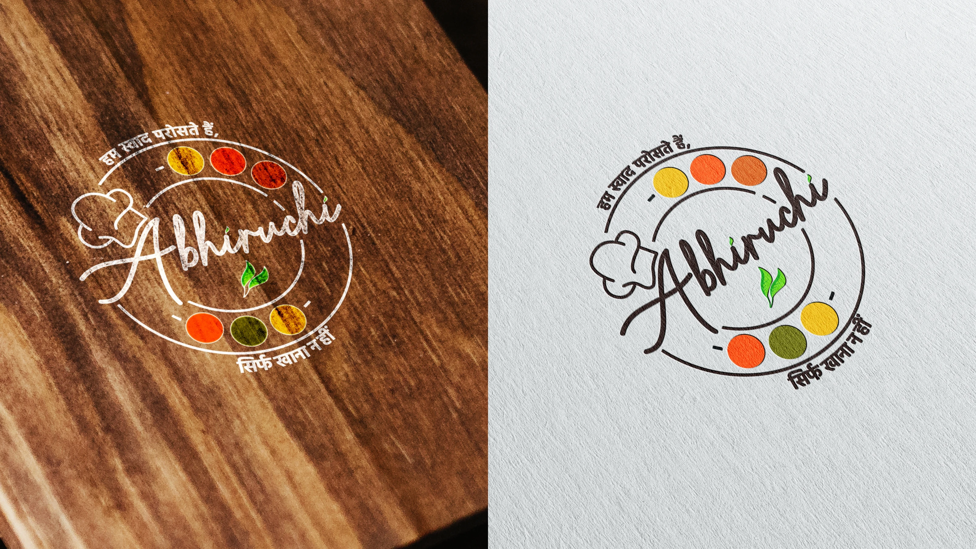
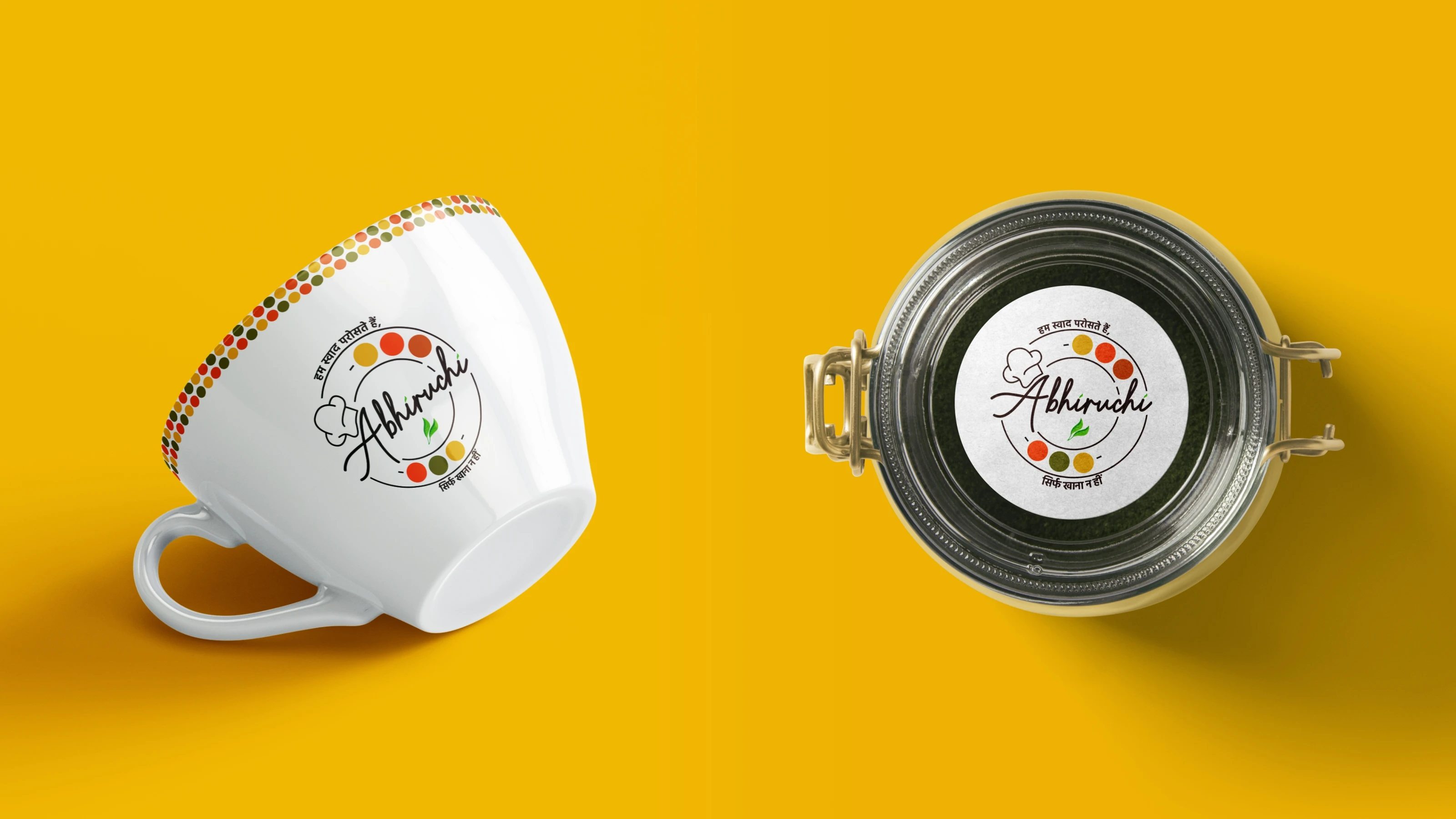
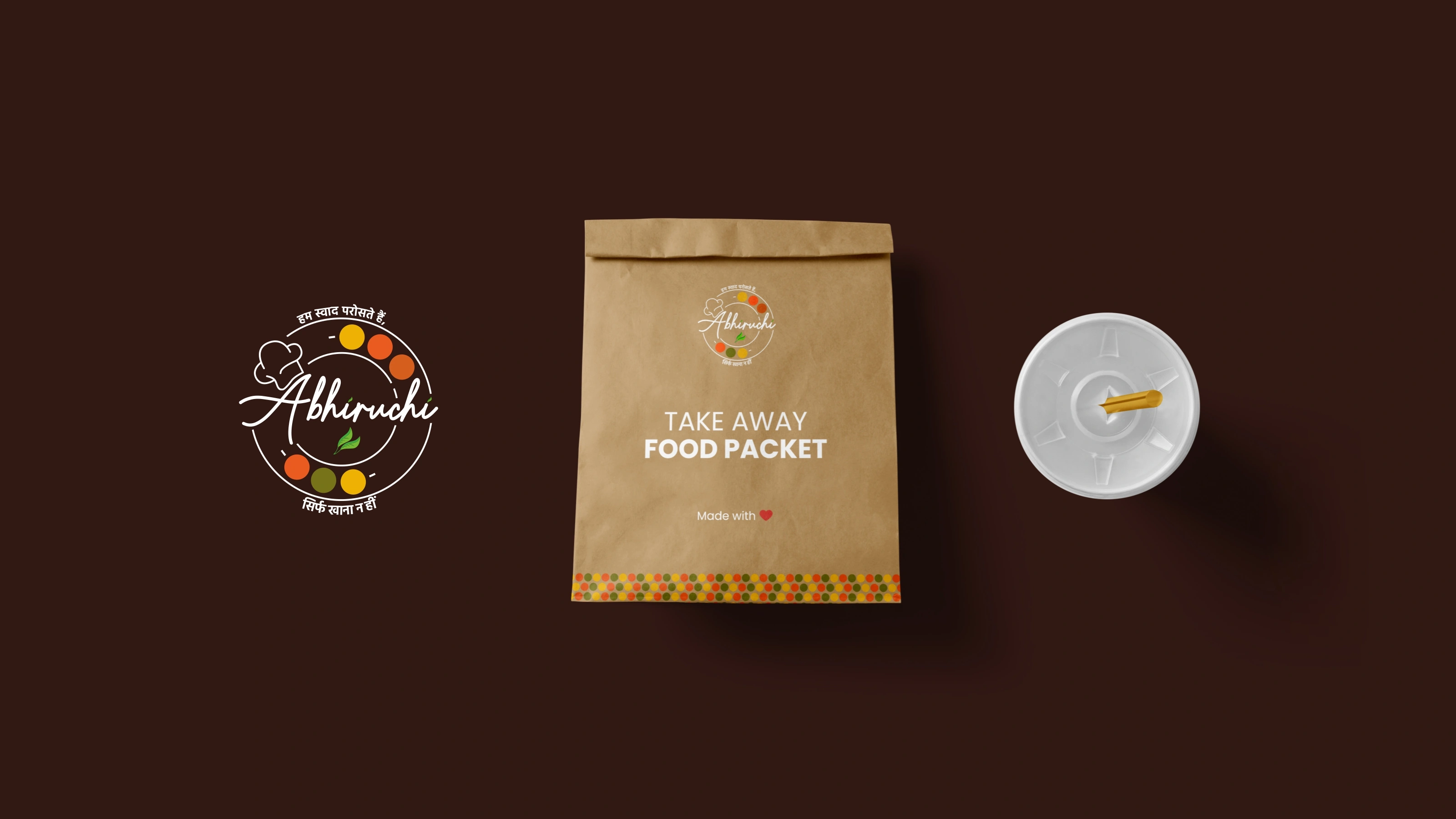
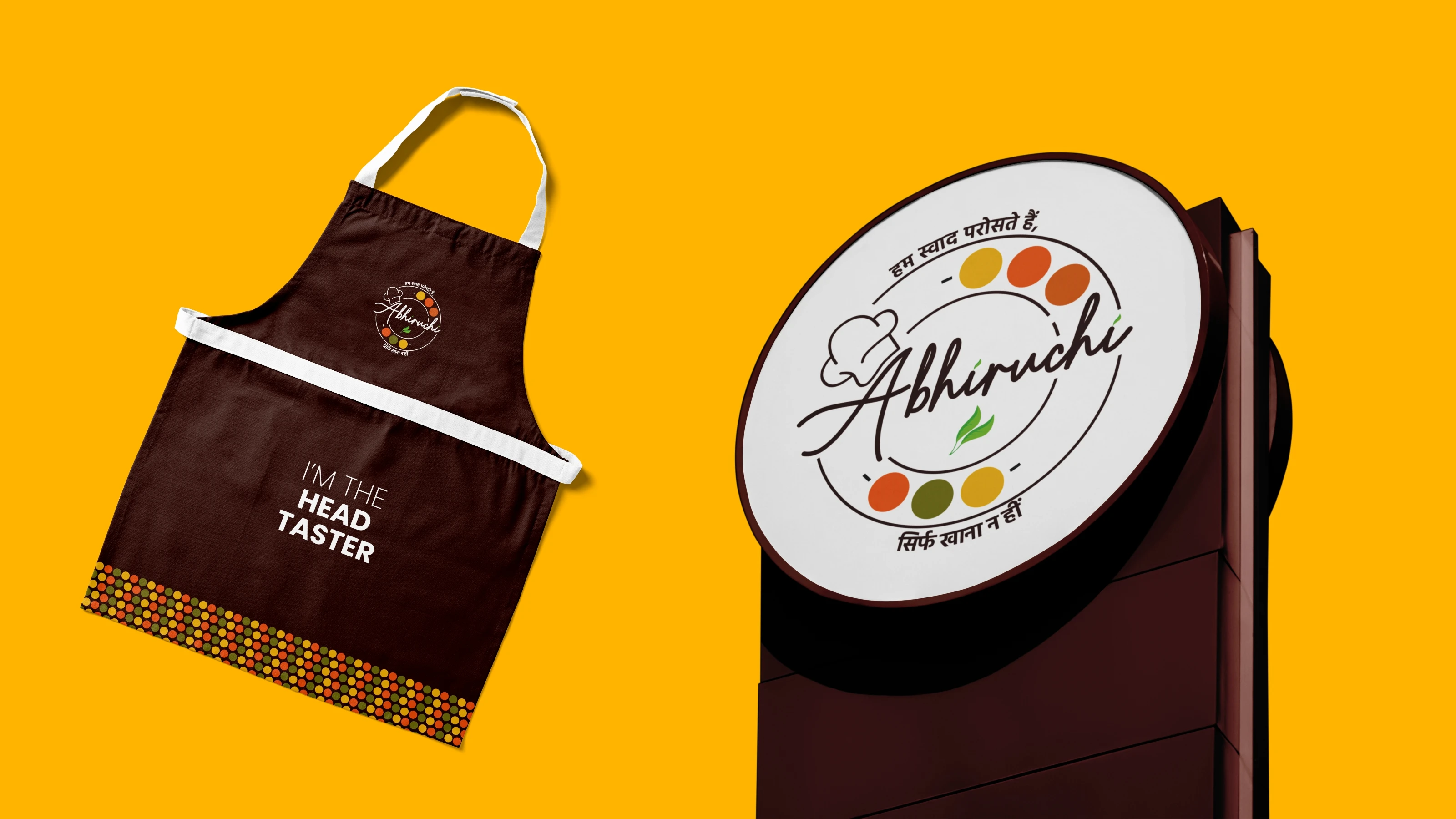
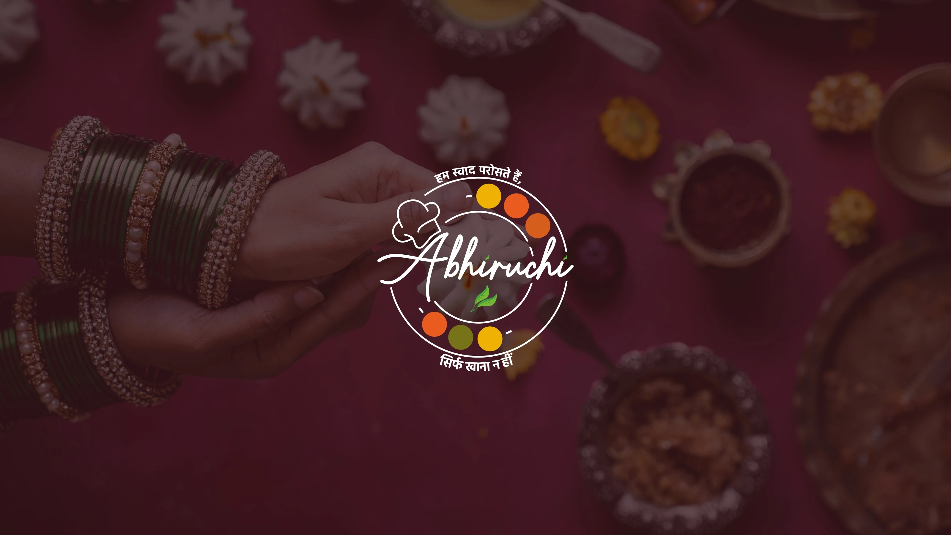
So that's exactly what we built. The circular mark is a thali. The colored dots are the katories (Small Bowls), each a different hue representing the variety of food they serve. The chef hat stays, but now it earns its place. Two leaves replace the generic veg icon. And the tagline, "Hum Swaad Paroste Hain, Sirf Khana Nahi" (We serve taste, not just food), wraps it all together.
Every element has a reason. Nothing is decoration.
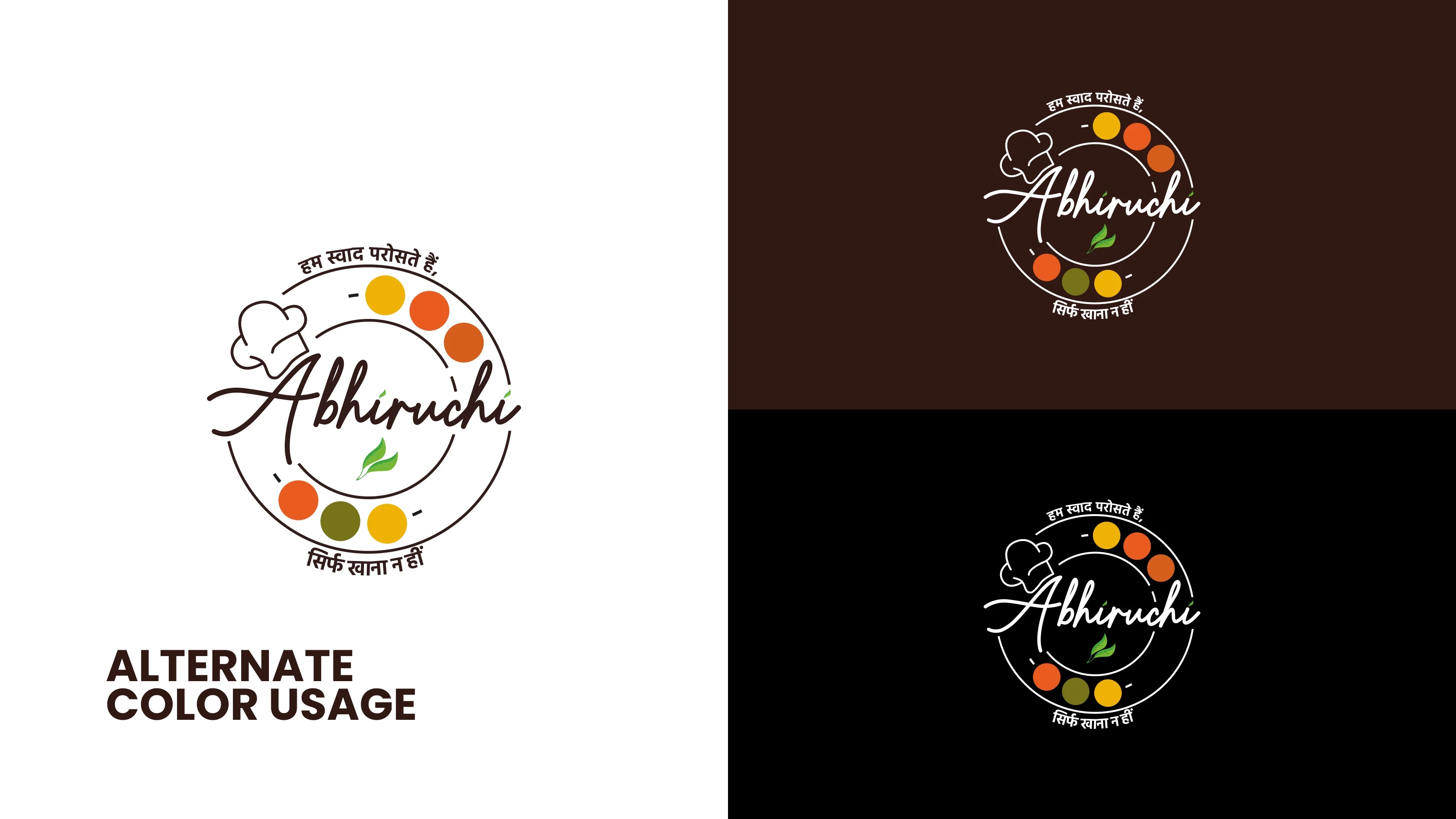
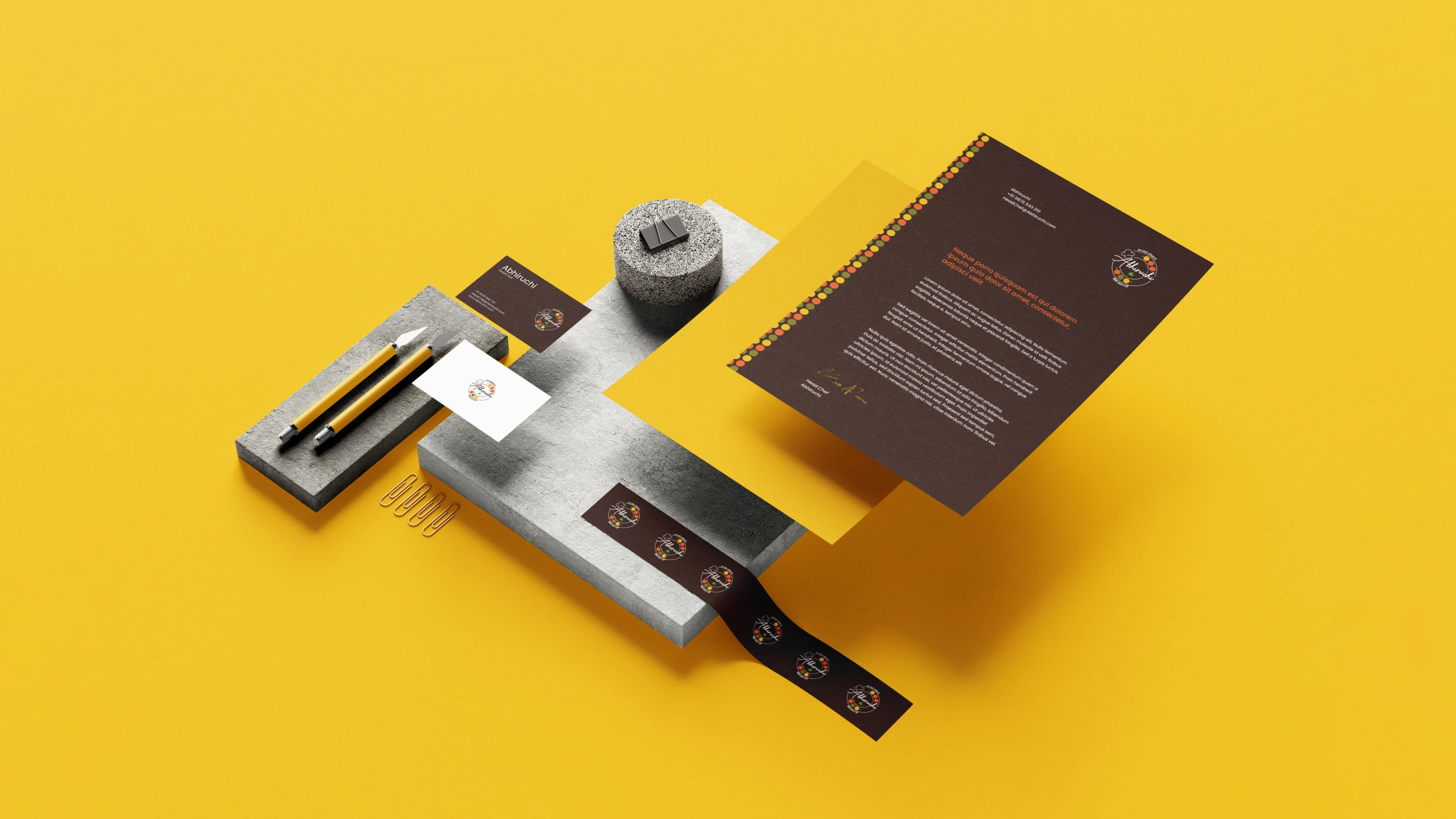
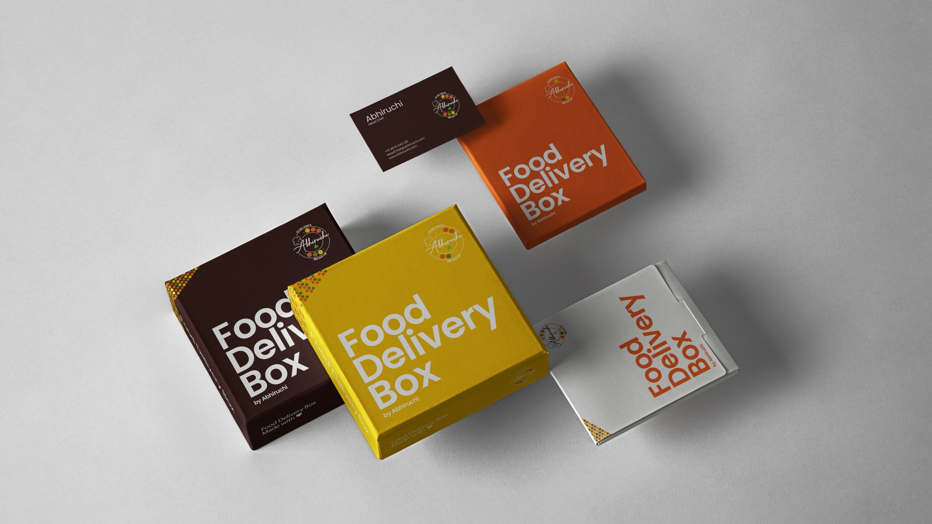
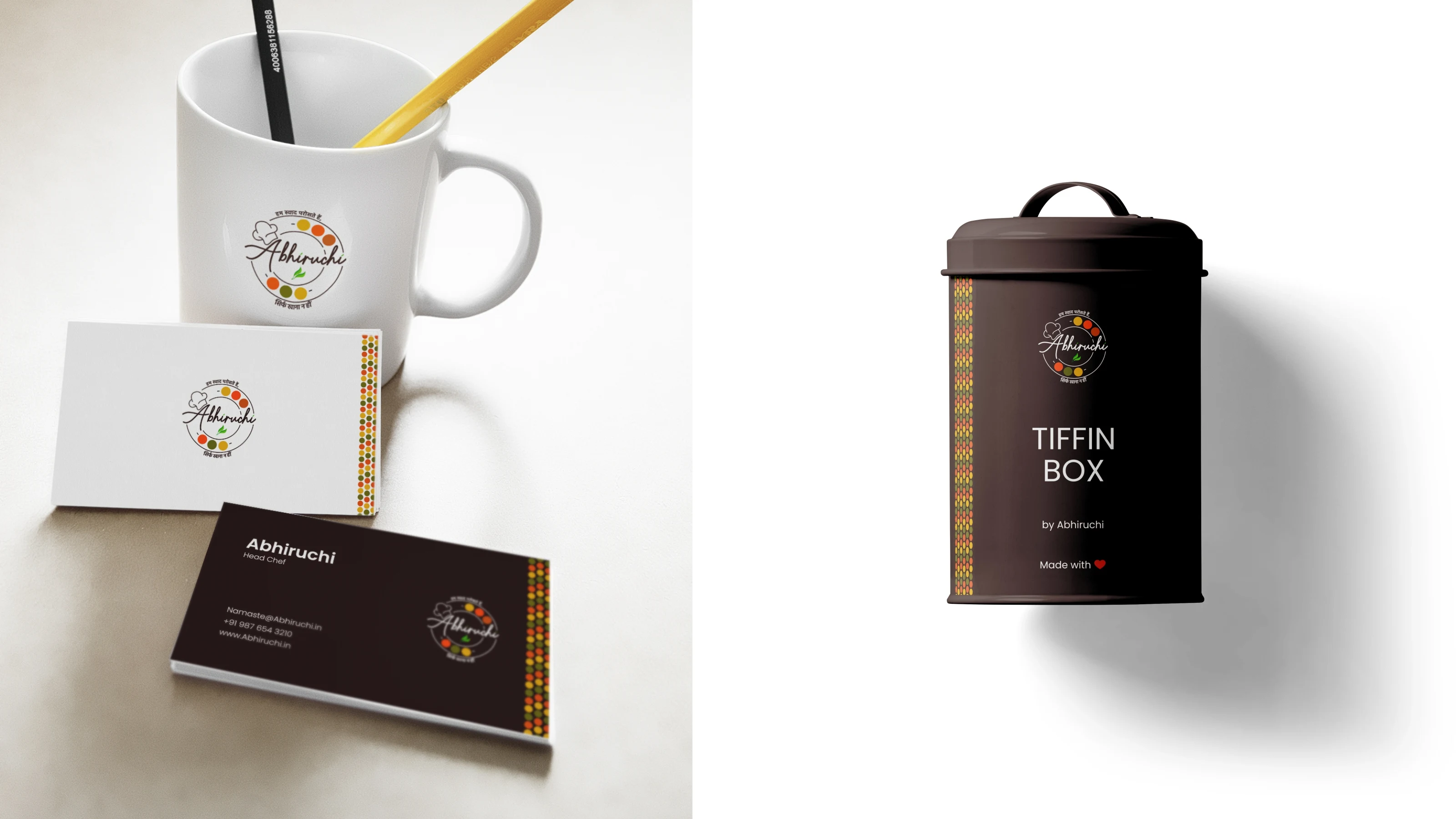
The brand is live across their packaging, tiffin boxes, and social media.

Thank you for watching, kindly give it a thumbs up, and if you're looking to elevate your brand with a unique and captivating identity, feel free to reach out to us. We're here to help your brand stand out.
Like this project
Posted Apr 25, 2026
Abhiruchi Brand Identity | Indian Restaurant Branding