Omeco Brand Identity and Guidelines
Pinaka Creative Studio
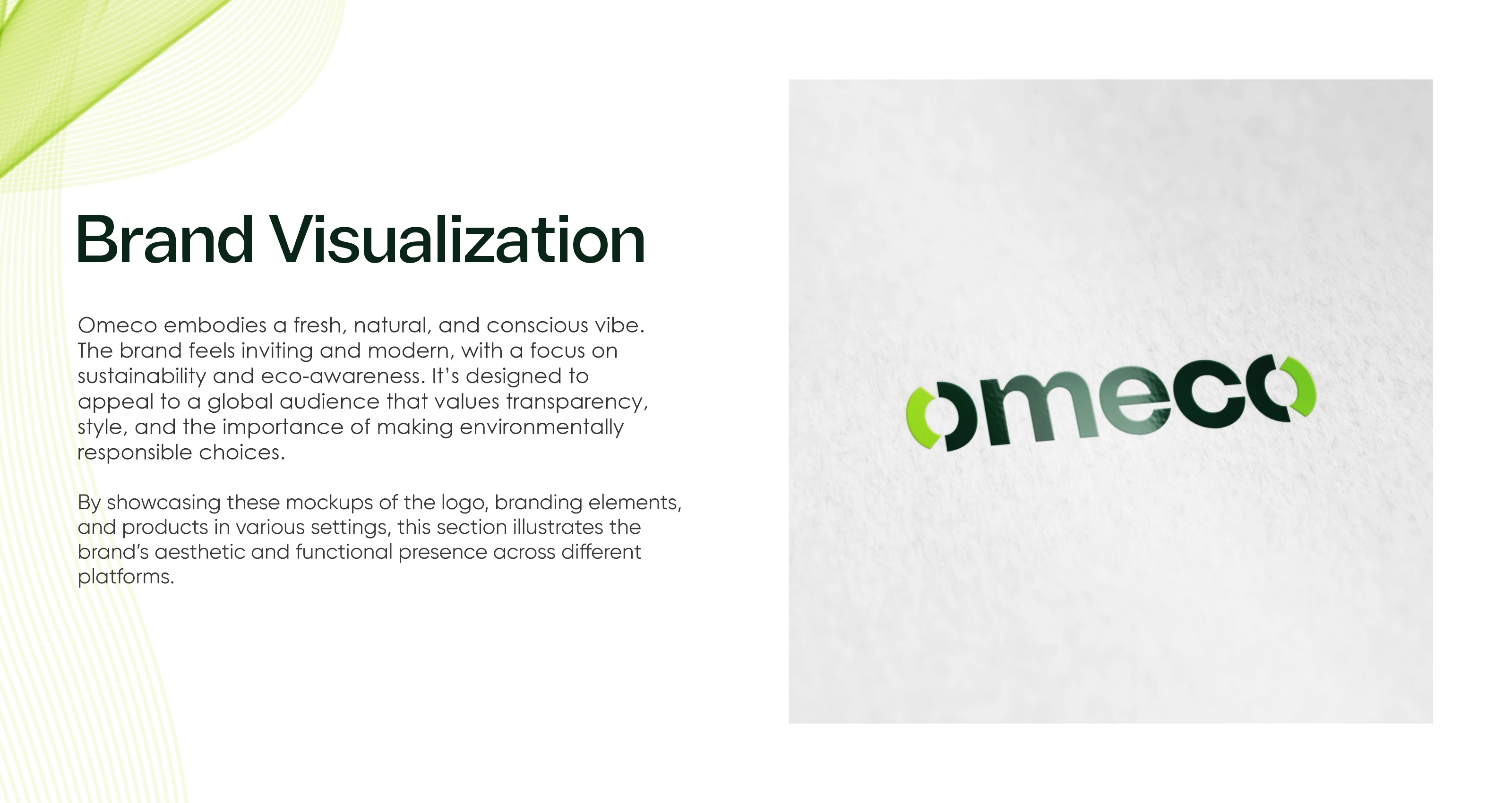
Omeco — Brand Identity & Design System
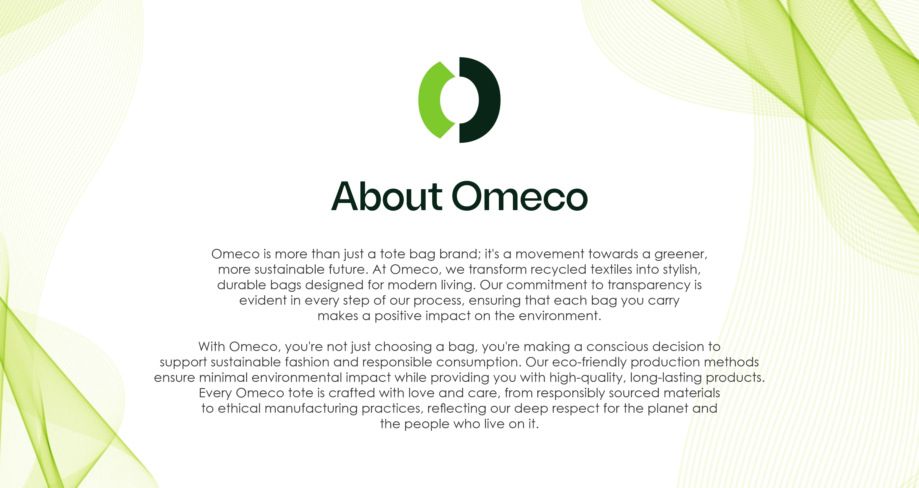
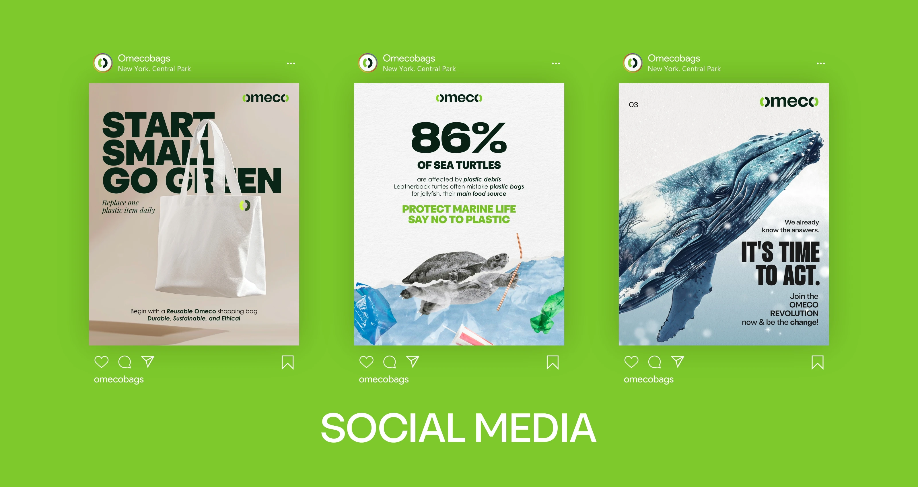
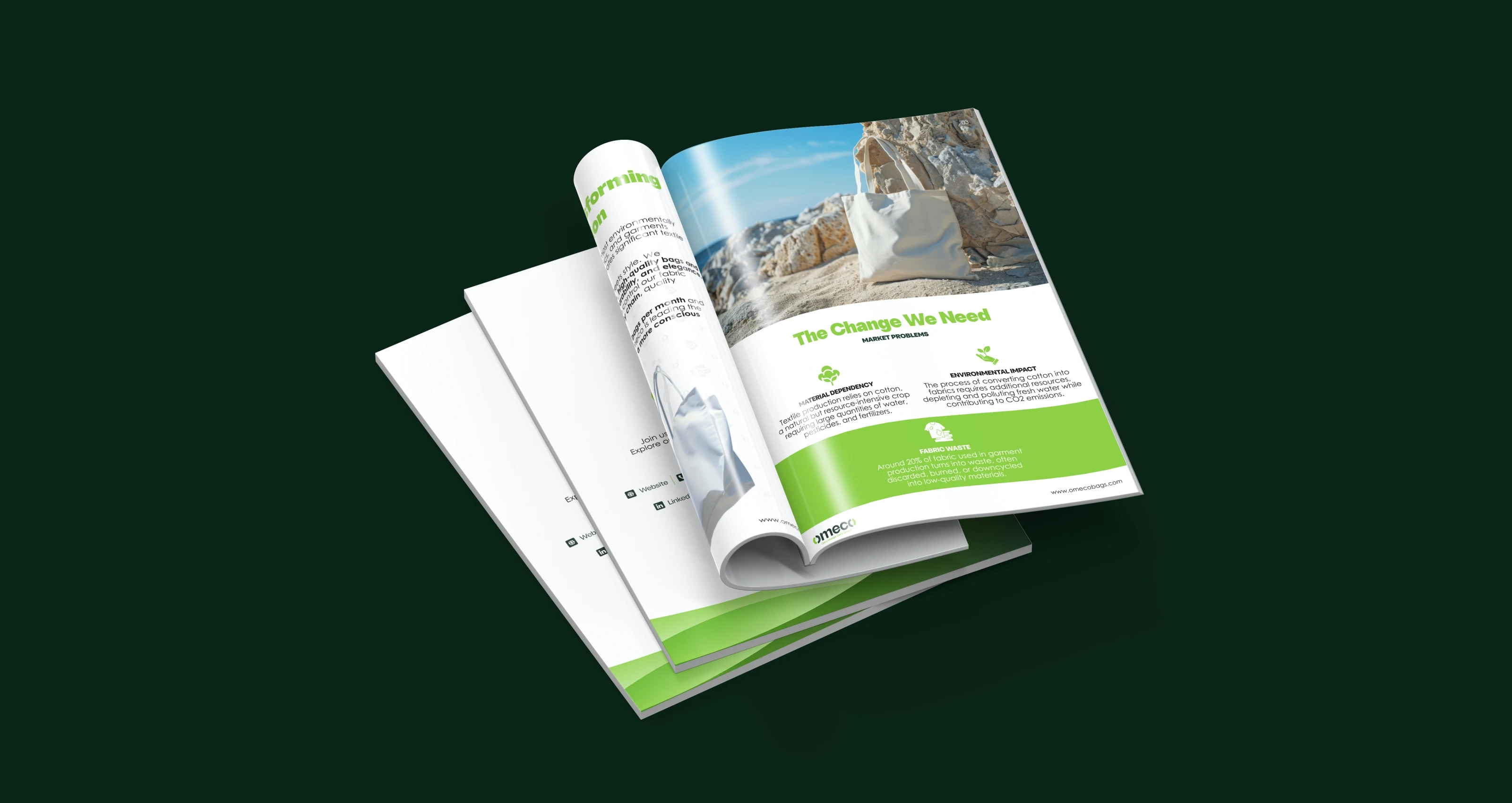
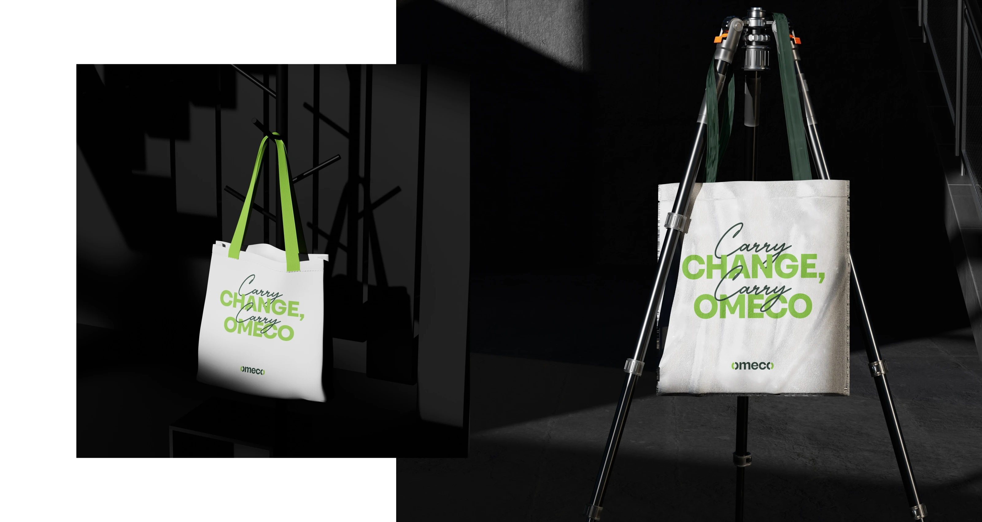
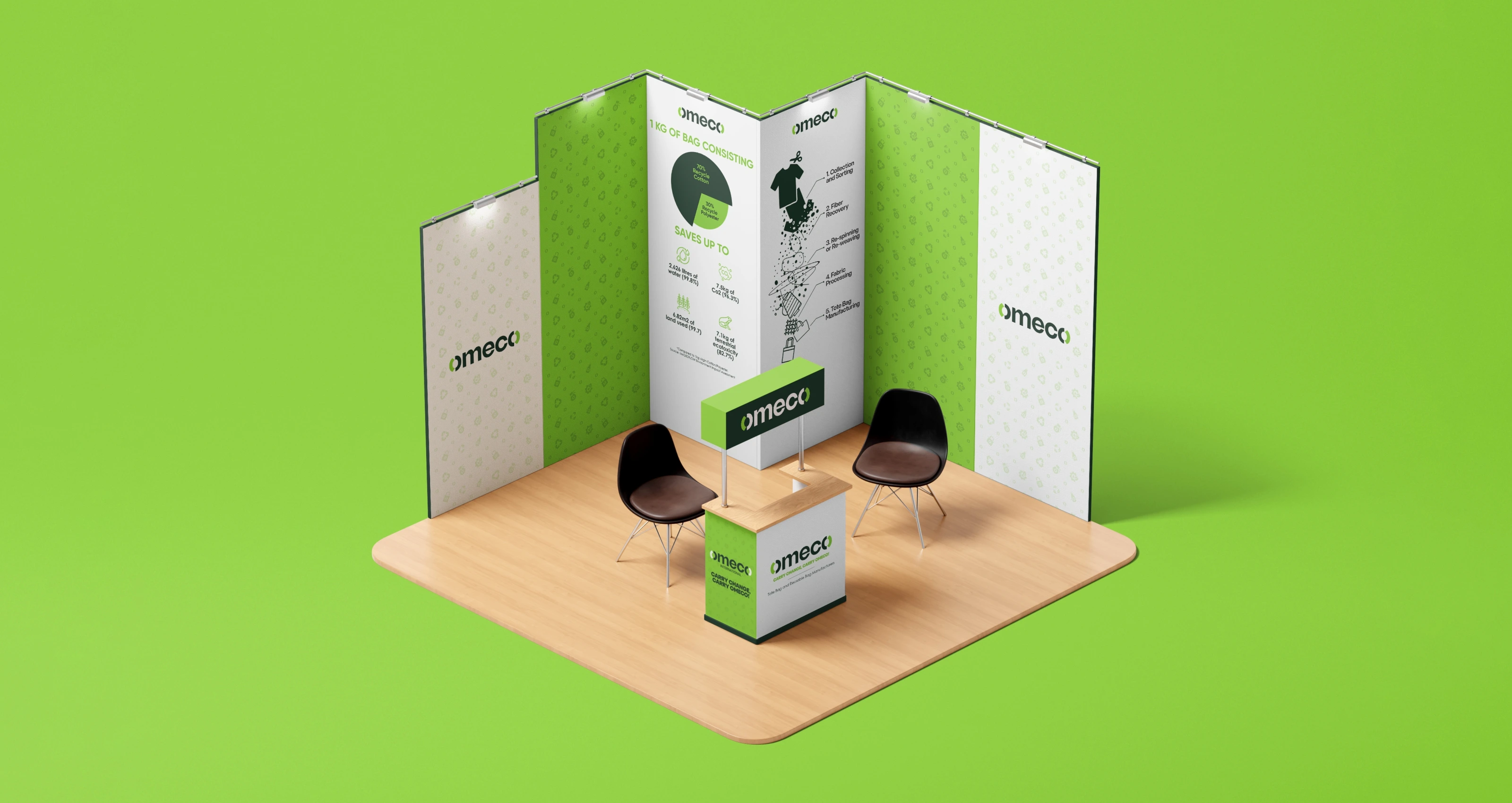
Omeco makes bags from upcycled and recycled textiles. Every bag comes with a TraceMyOmeco QR code so the buyer can track exactly where the fabric came from and what impact their purchase made. The brand philosophy is two words: Carry Change.
They needed an identity that could carry that weight without being preachy about it. Sustainable brands often fall into the trap of looking too earthy, too rough, or too activist. Omeco wanted to be stylish first, sustainable by design.
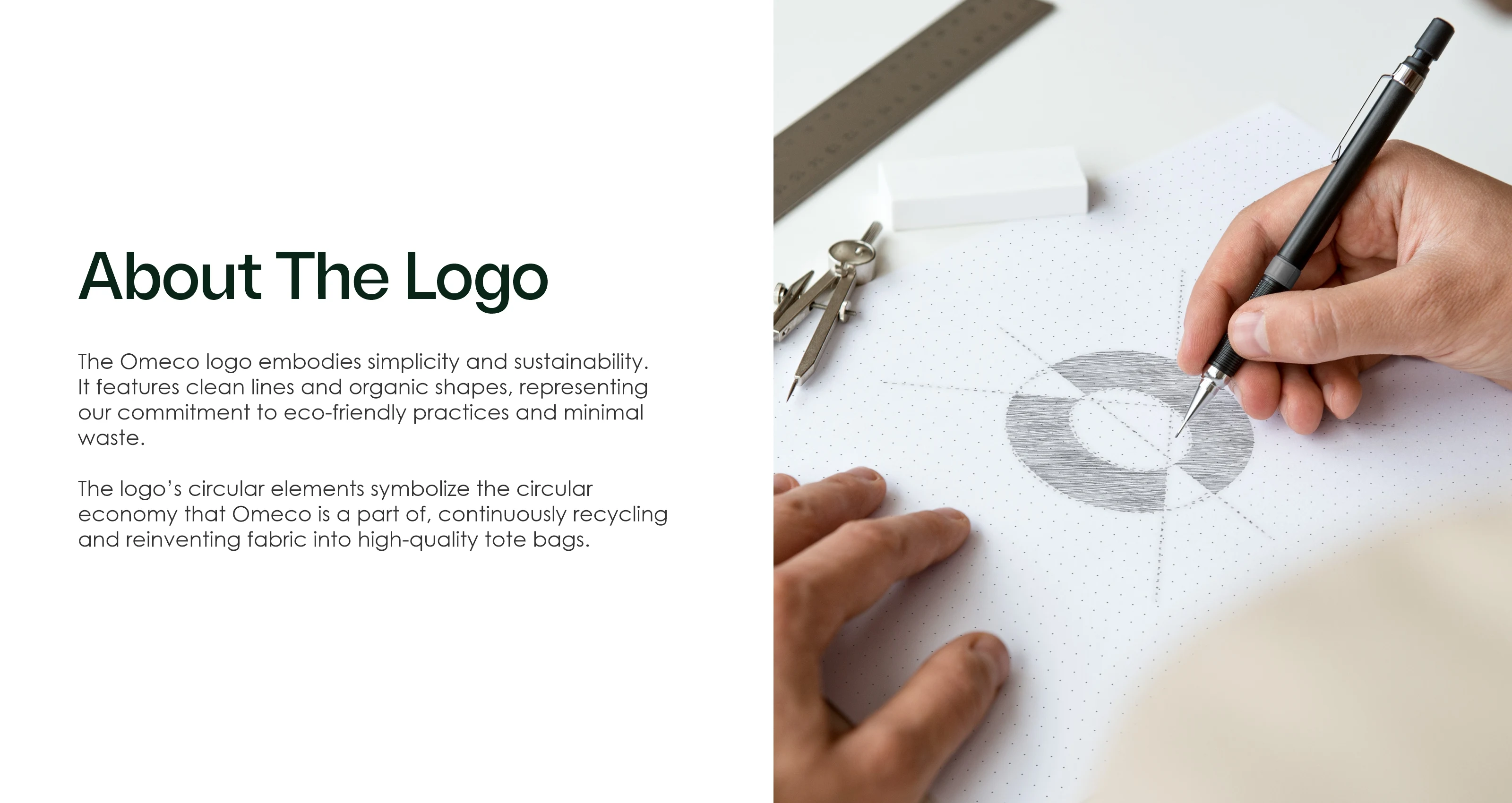
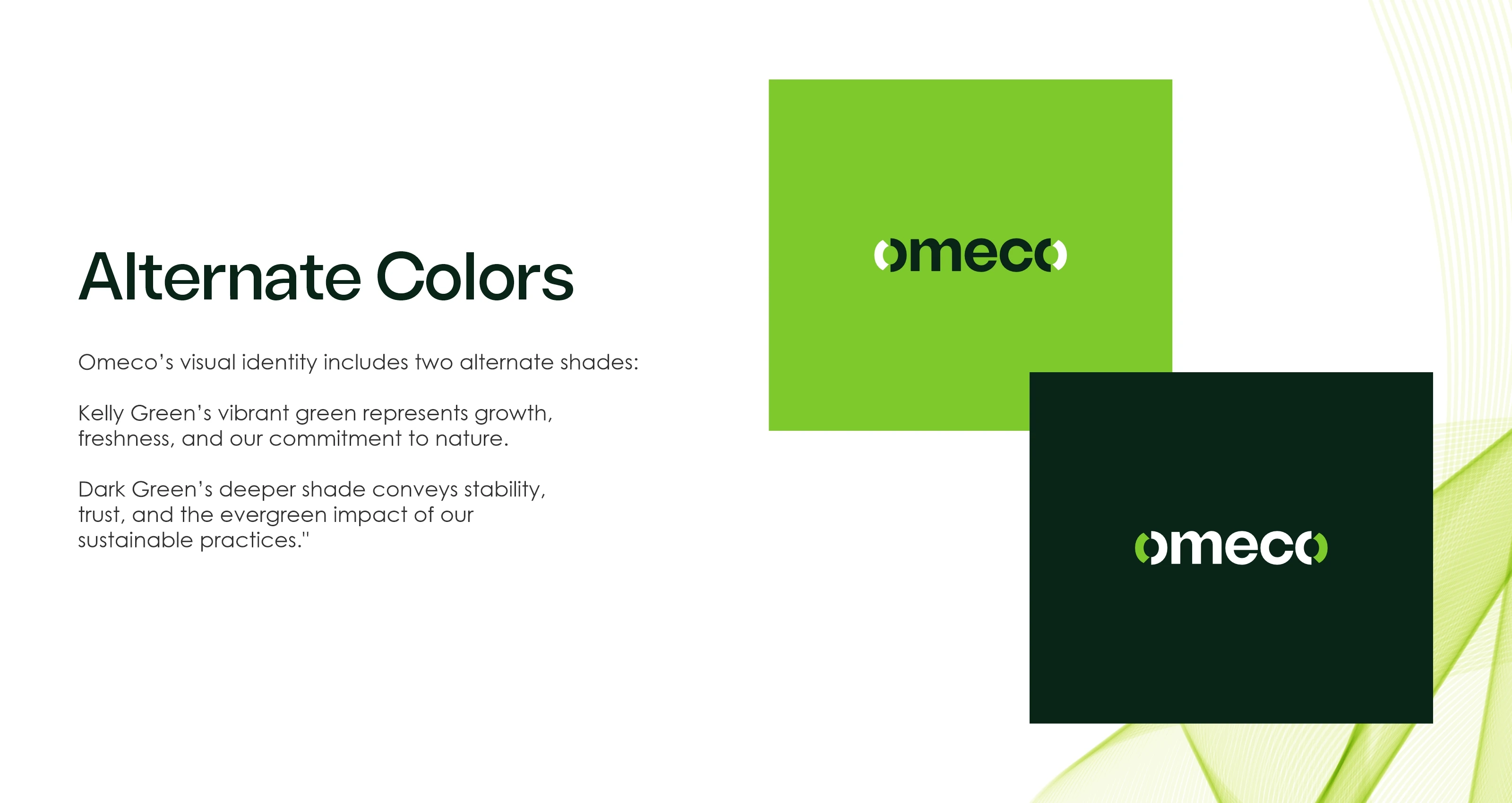
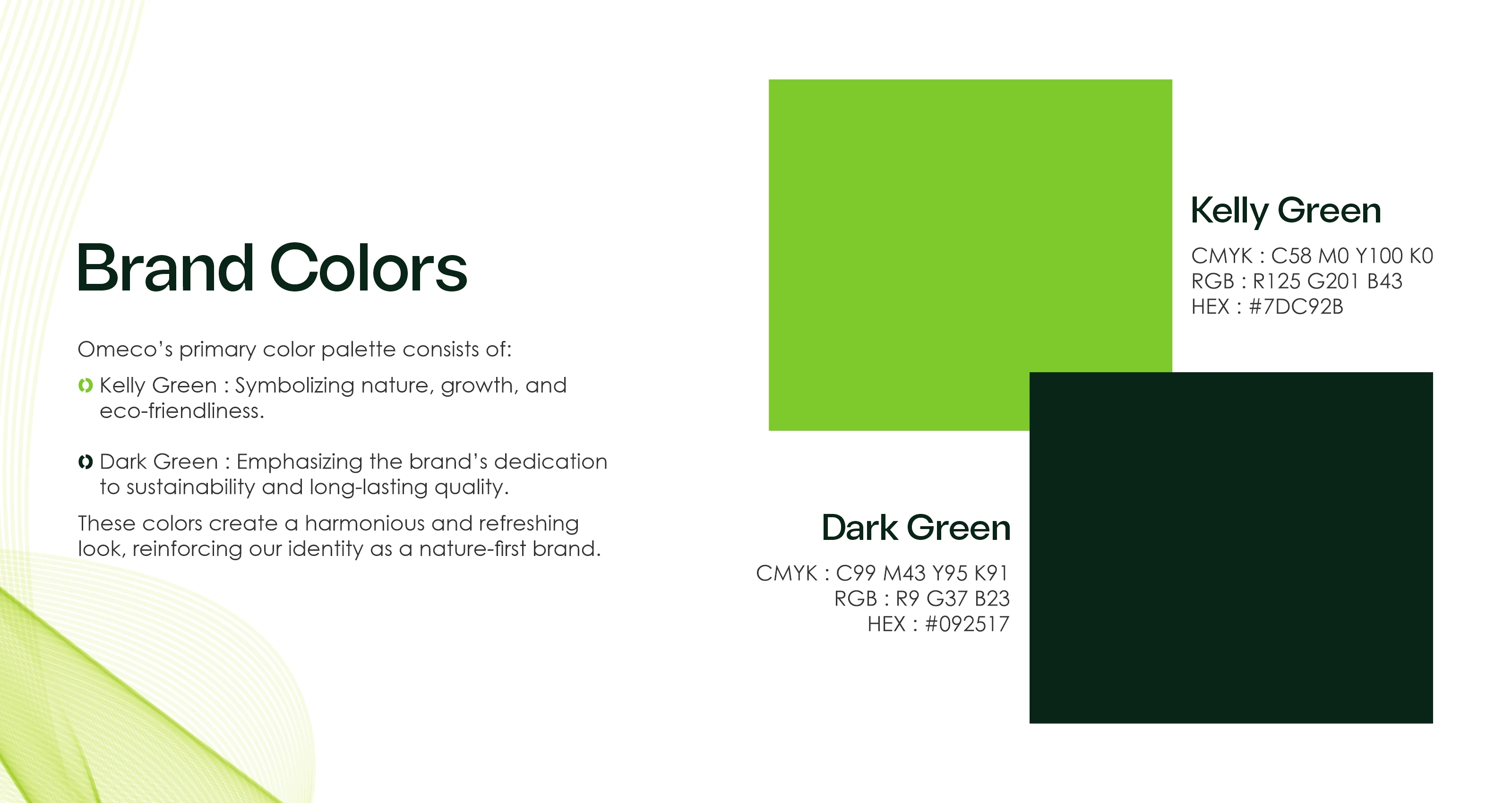
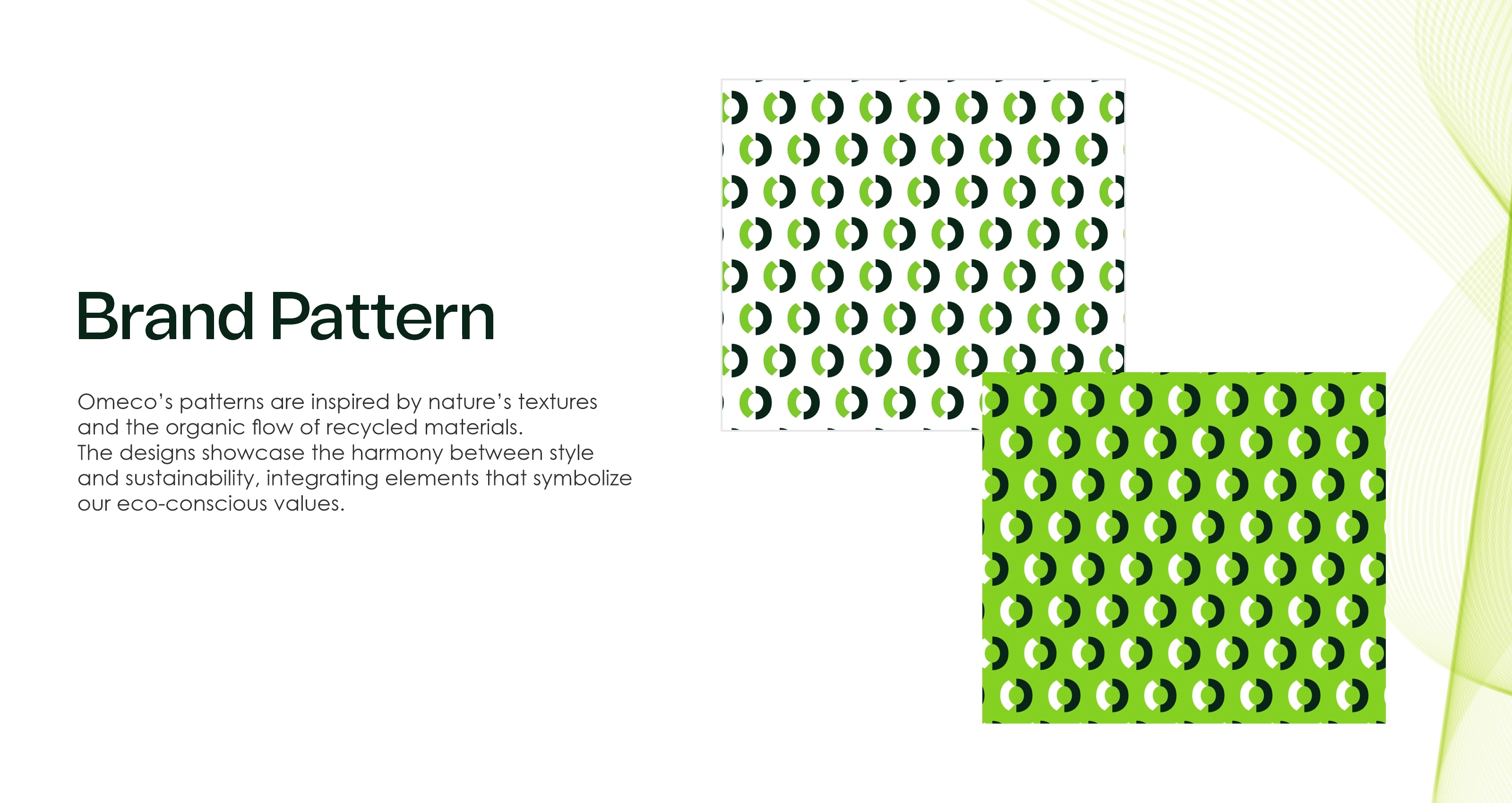
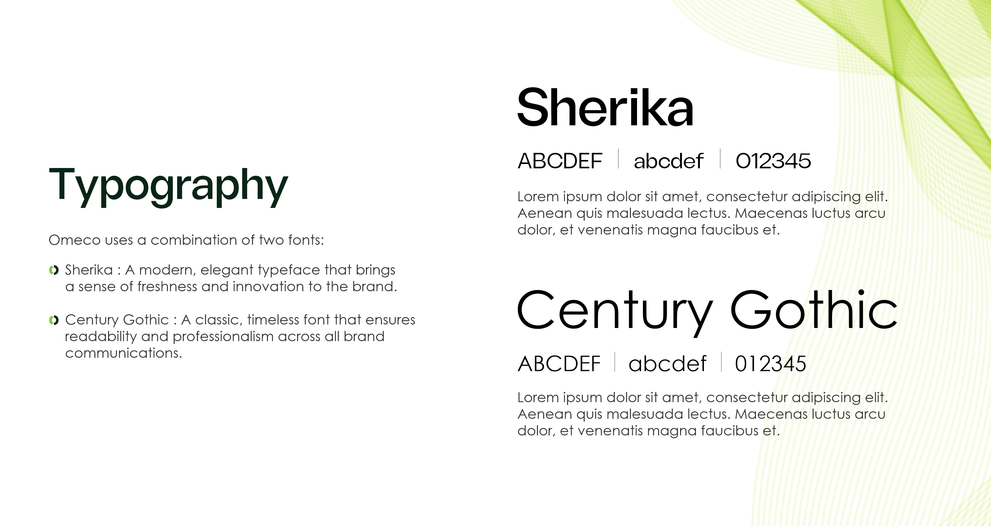
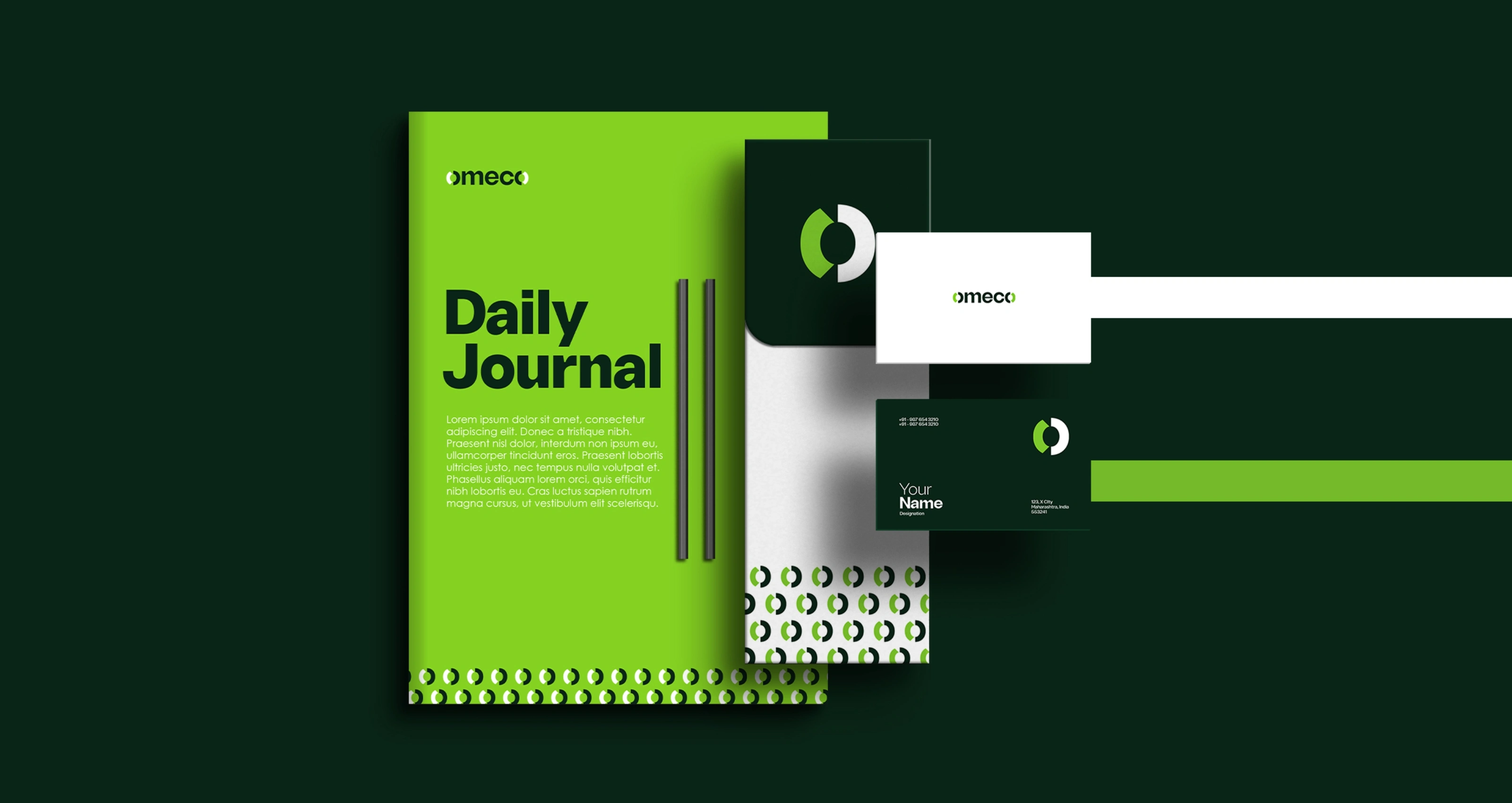
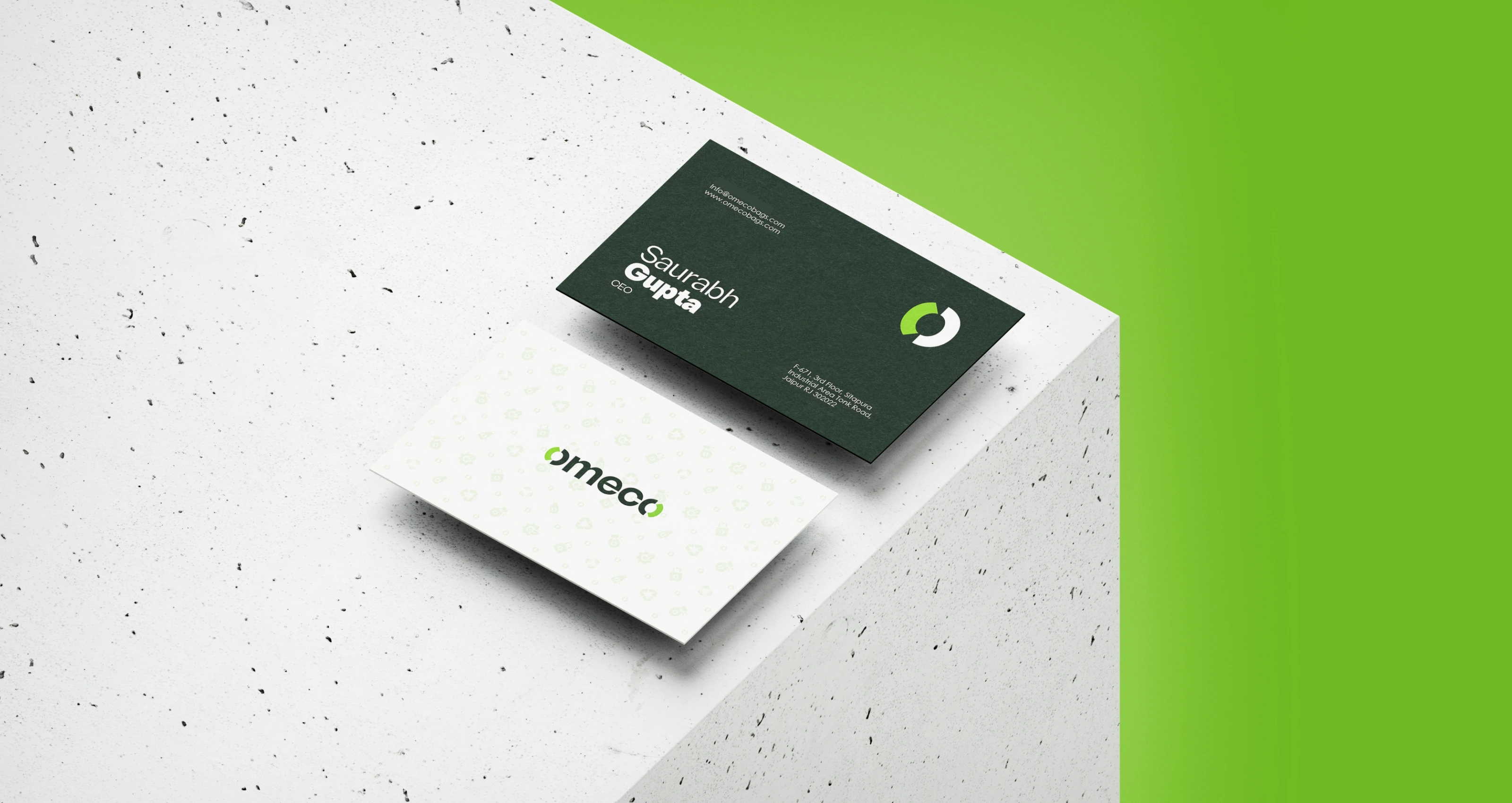
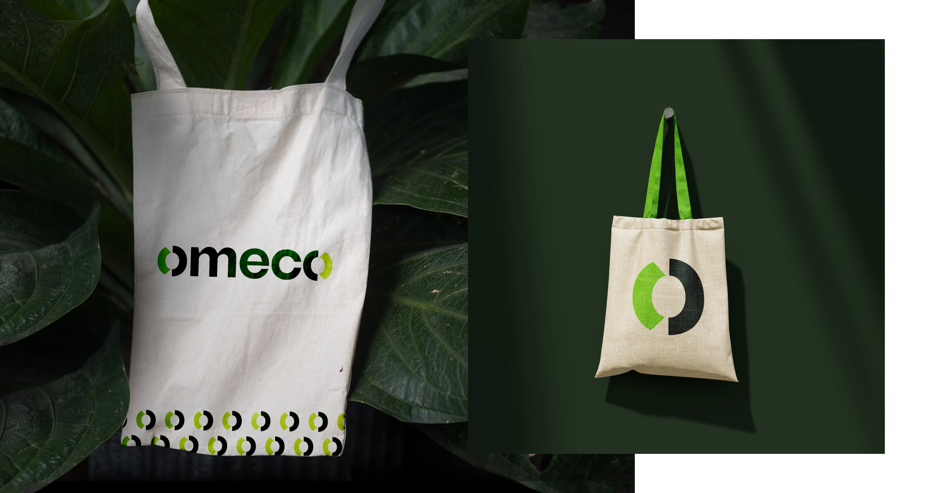
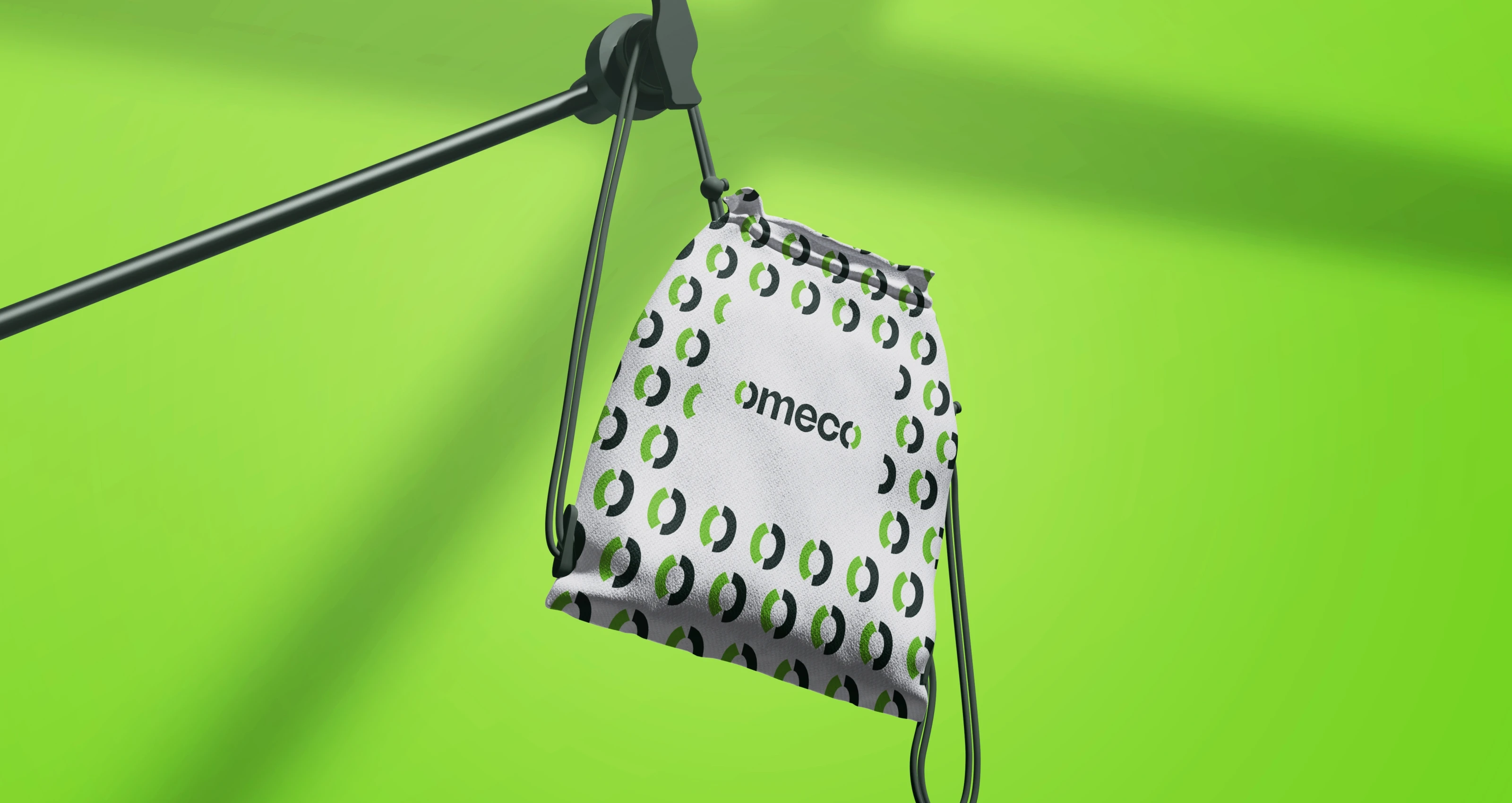
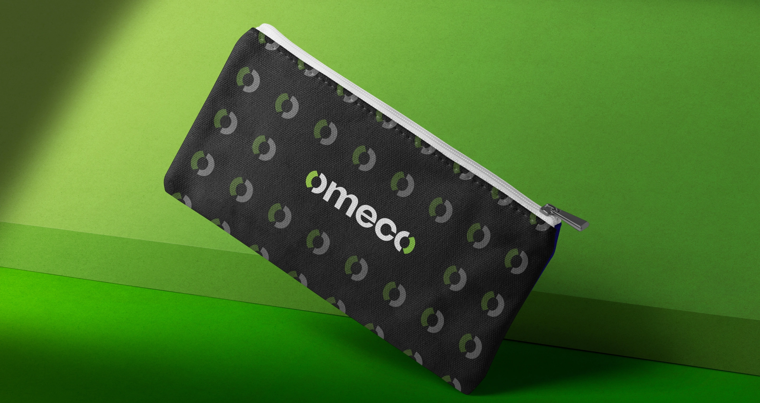
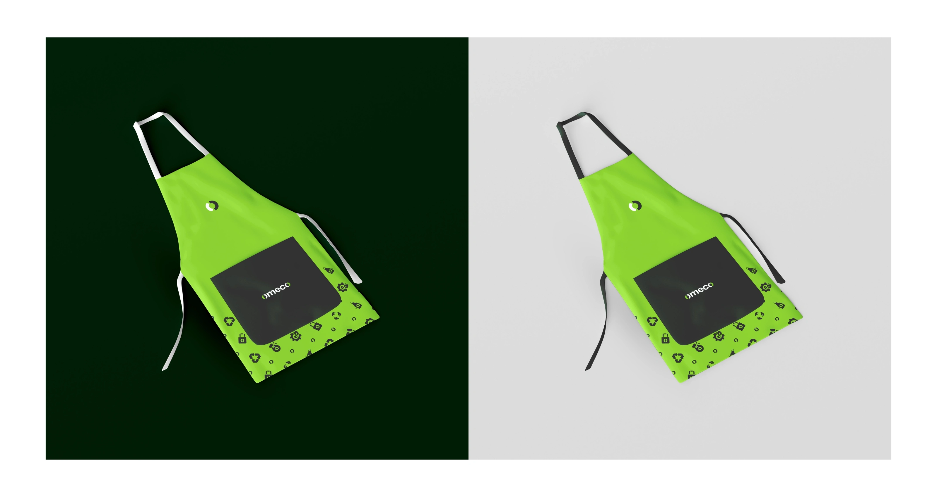
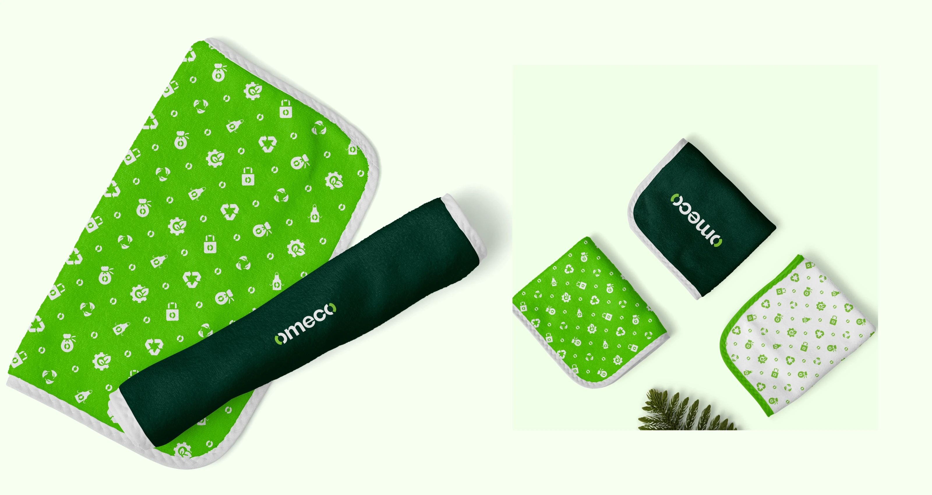
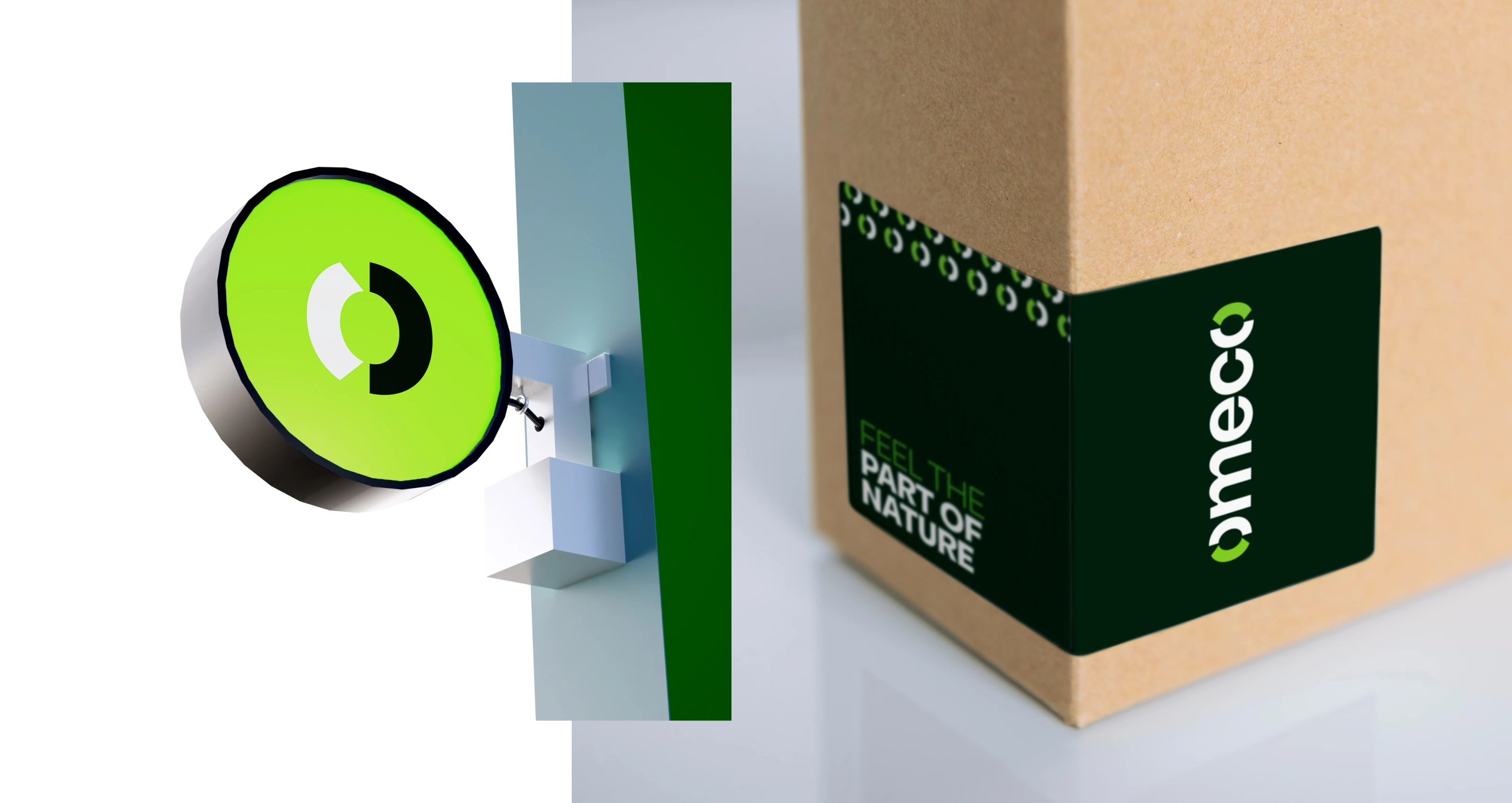
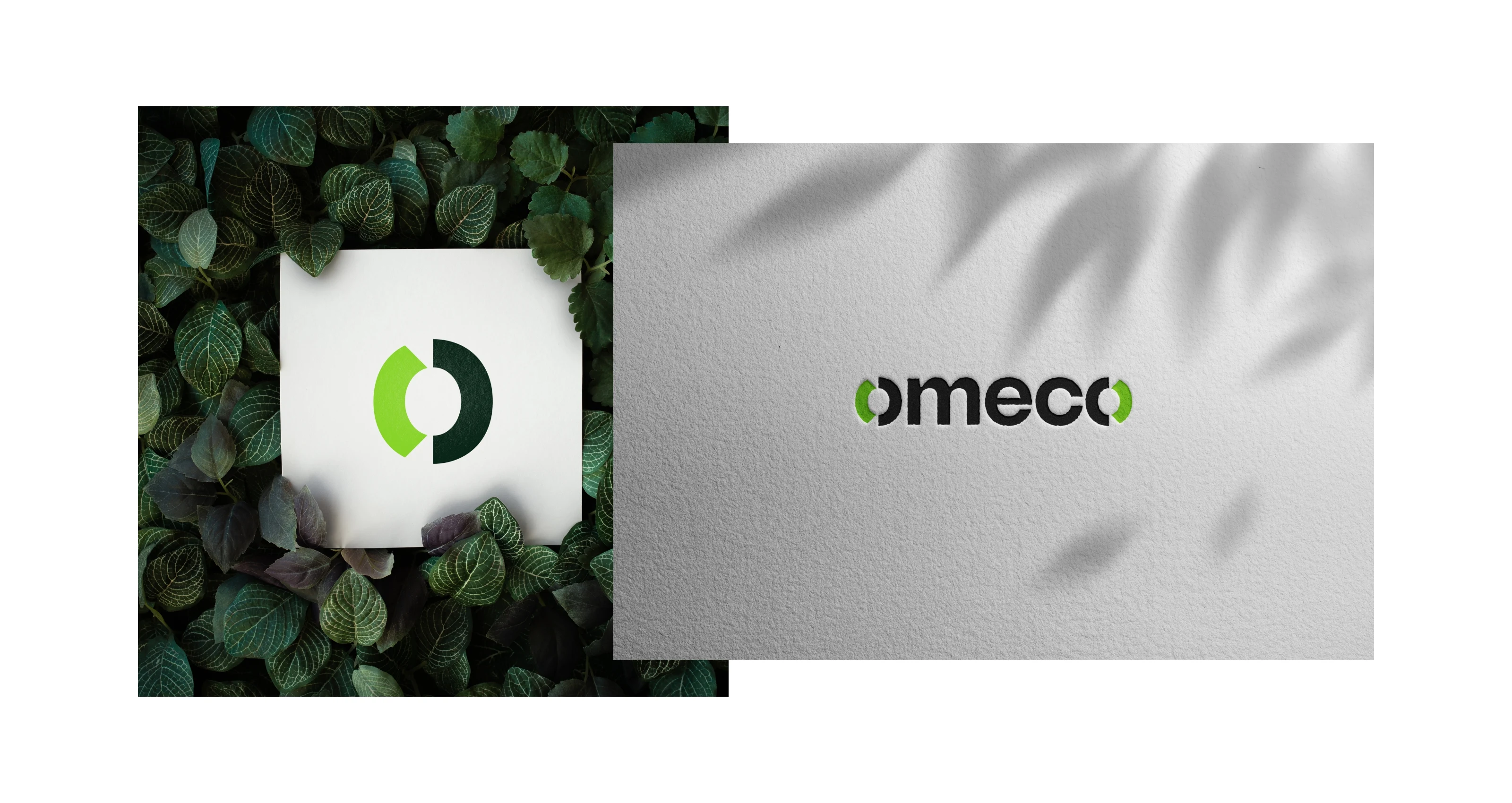
The mark we built is minimal and bold, a circular form that references continuity and the closed-loop nature of recycled material. Earthy tones grounded it, and clean modern typography kept it from looking dated. The full system covers logo construction, color and typography guidelines, bag tags, labels, grid systems, and print and digital mockups.
The brand is live at omecobags.com
Thank you
Like this project
Posted Apr 25, 2026
Omeco Brand Identity and Guidelines