Ayur Gurudev Logo and Brand Identity
Pinaka Creative Studio
Ayur Gurudev — Brand Identity, Packaging & Guidelines
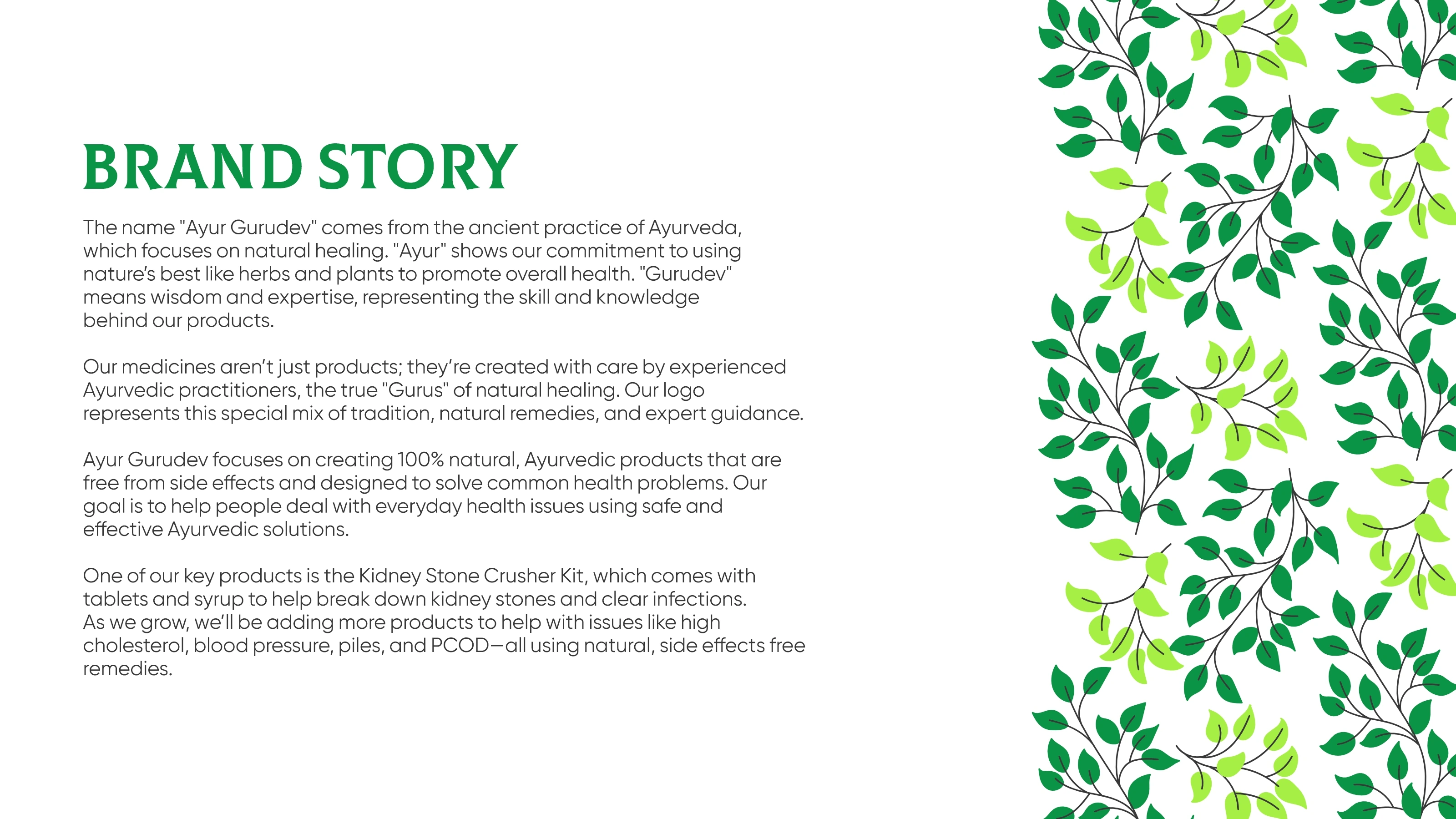
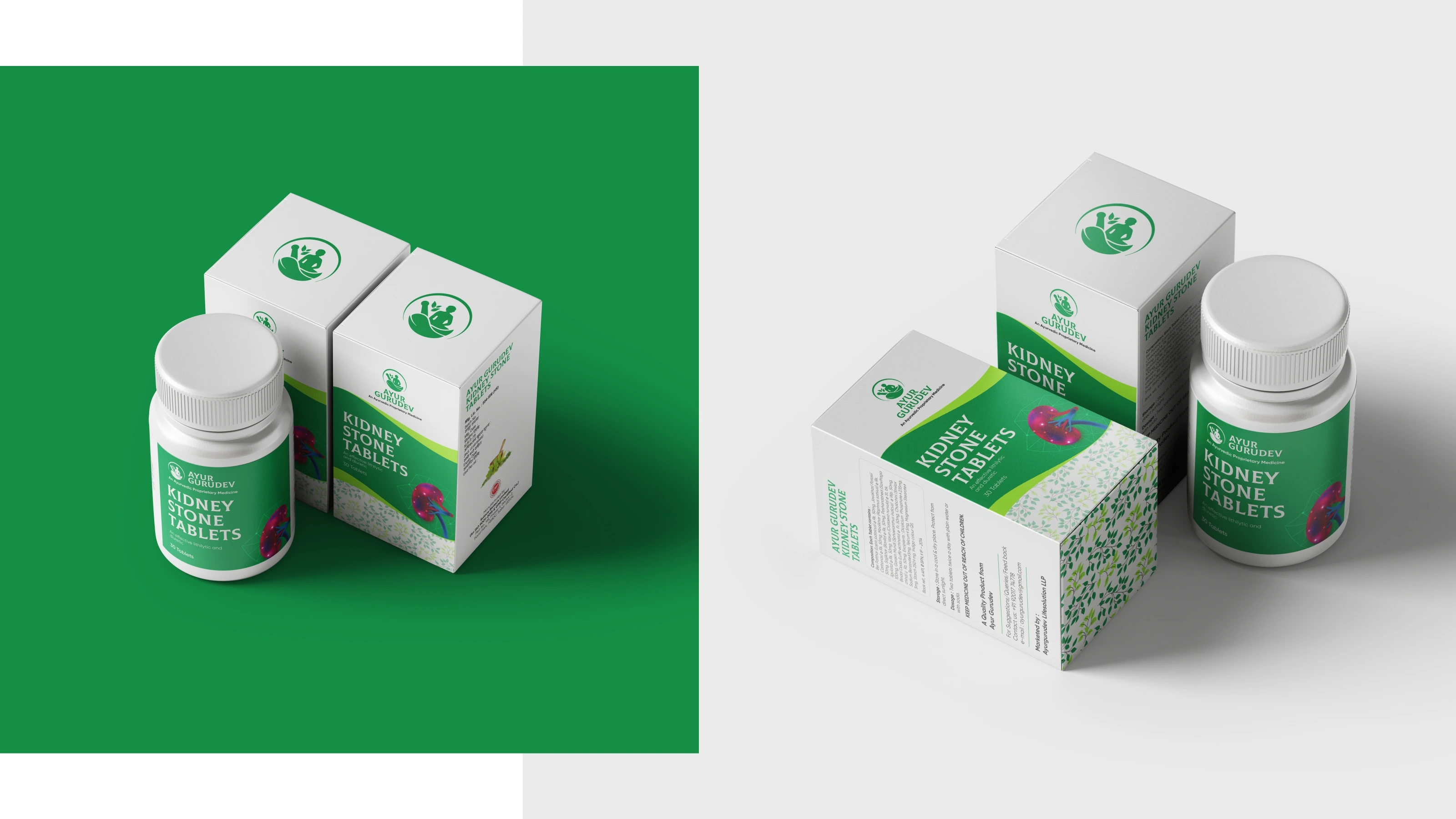
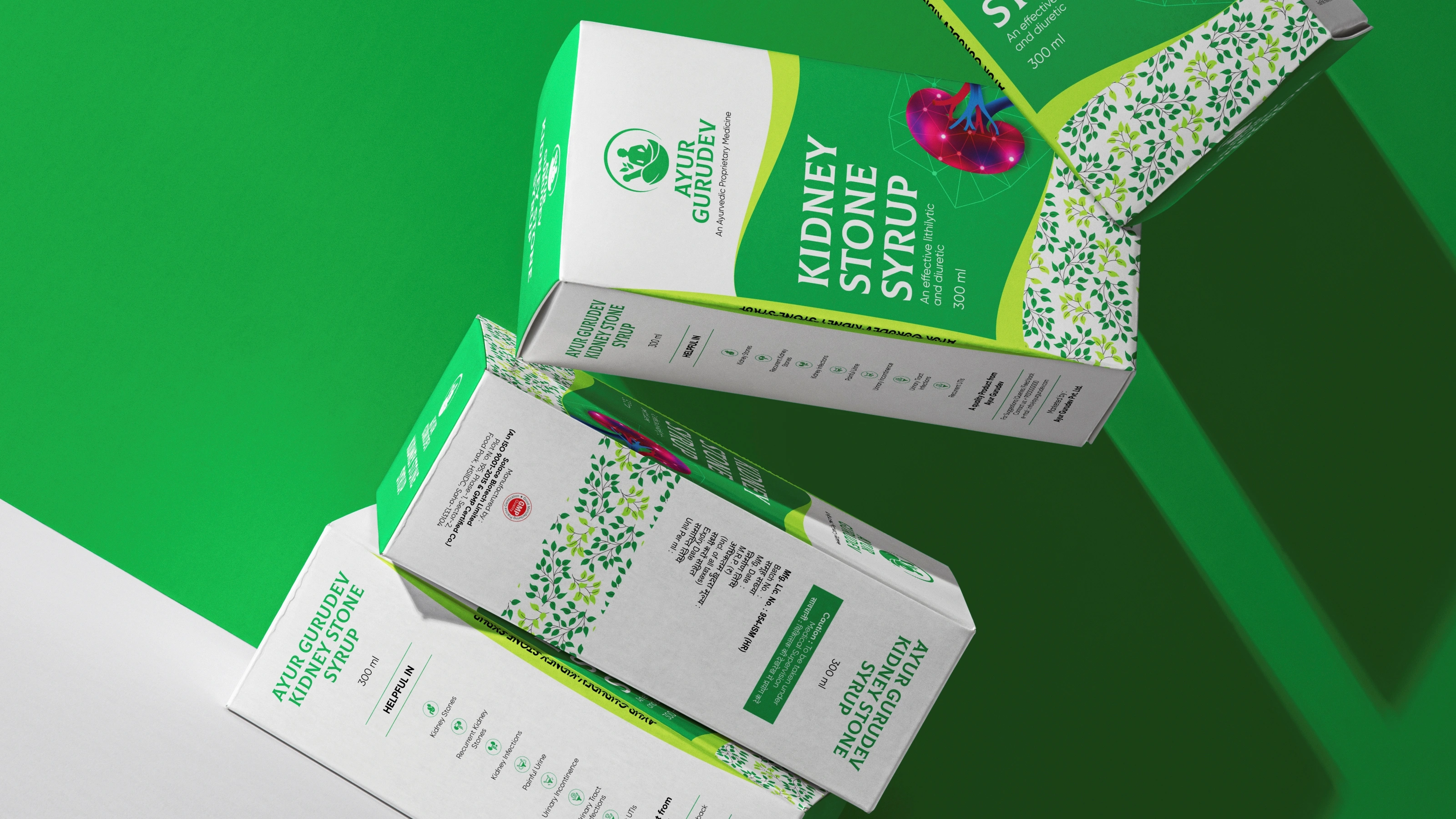
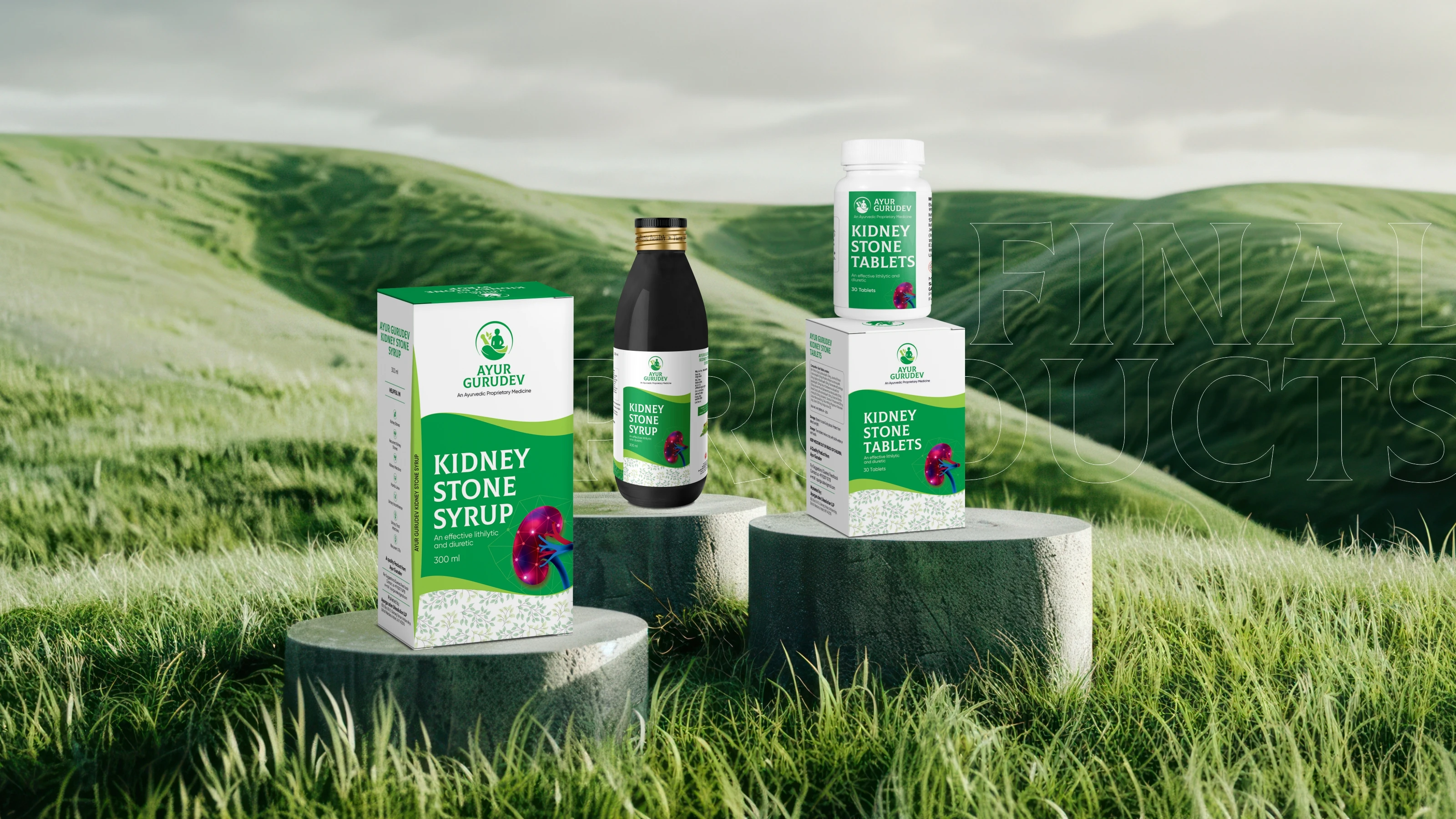
Ayur Gurudev is an Ayurvedic healthcare brand with a clear mission: solve real health problems without side effects. Their first product, the Kidney Stone Crusher Kit, combines a tablet pack and a syrup bottle into one complete treatment. More products for cholesterol, BP, piles, and PCOD are in the pipeline.
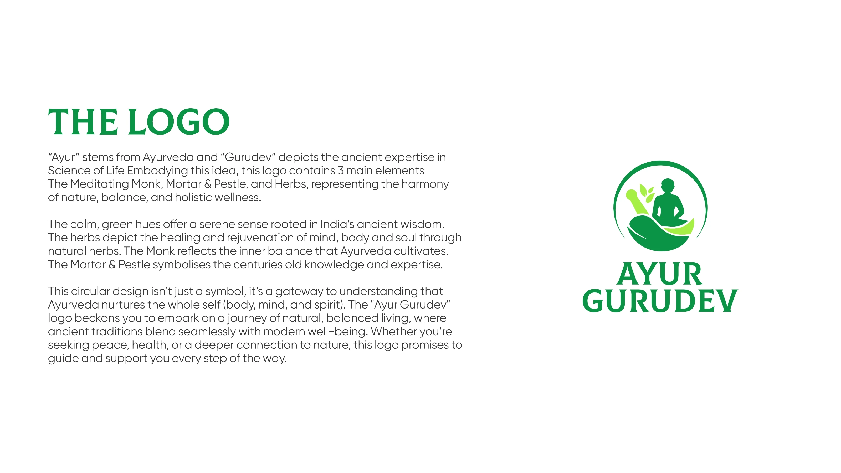
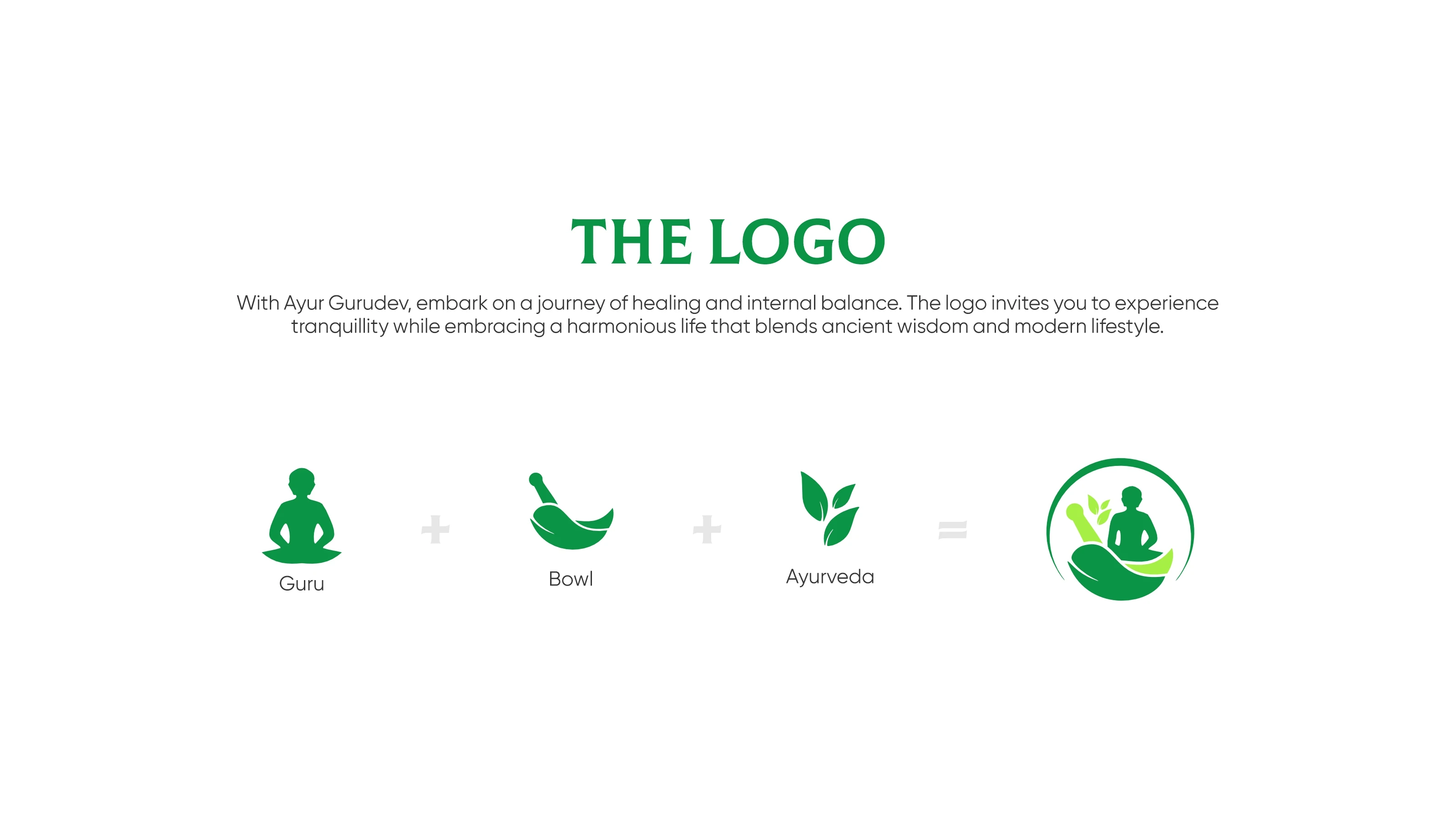
The client came with a clear vision rooted in the name itself. "Gurudev" called for a rishi-muni figure. "Ayur" called for herbs and nature. They gave us the concept and the freedom to go deeper.
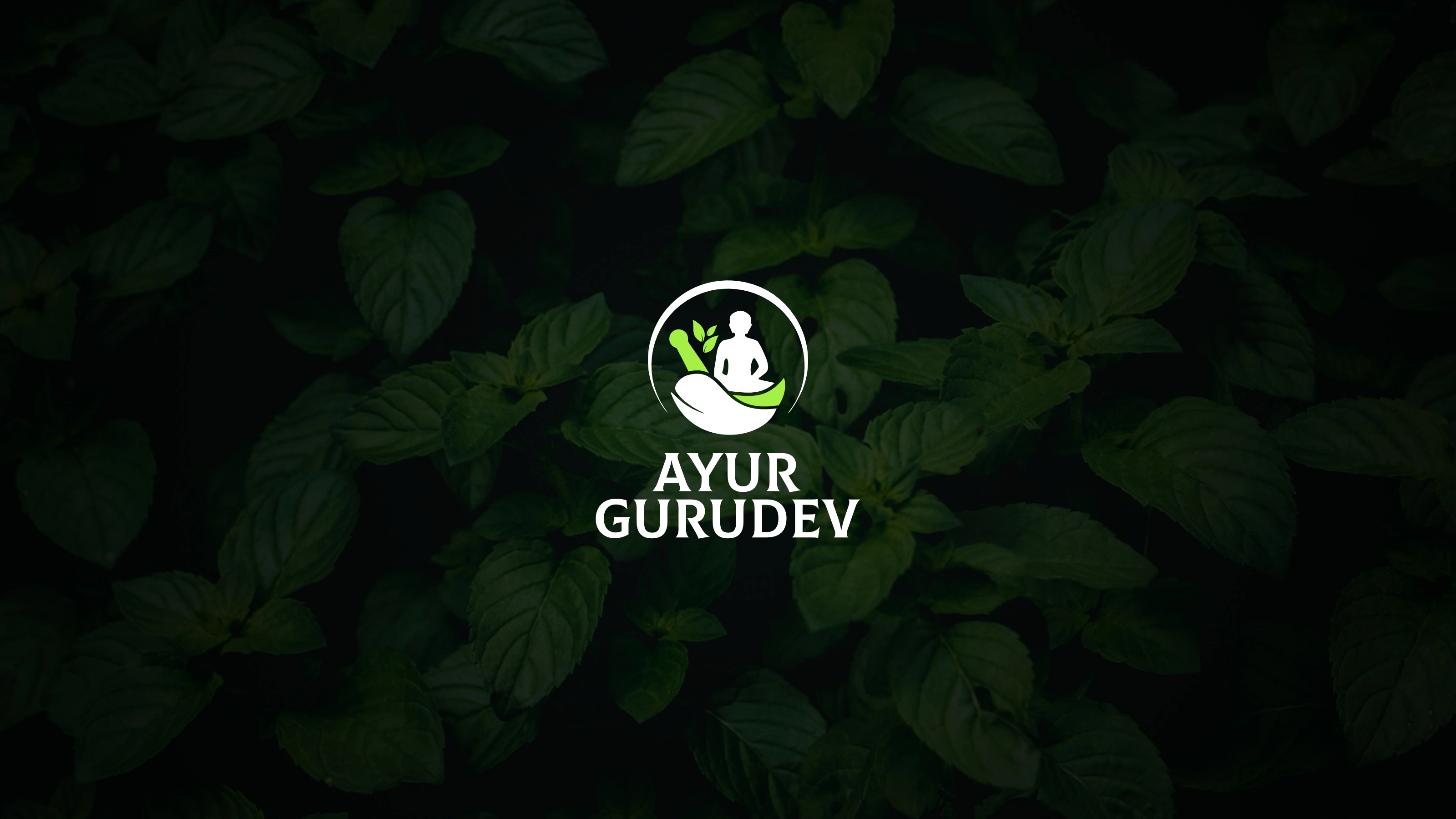
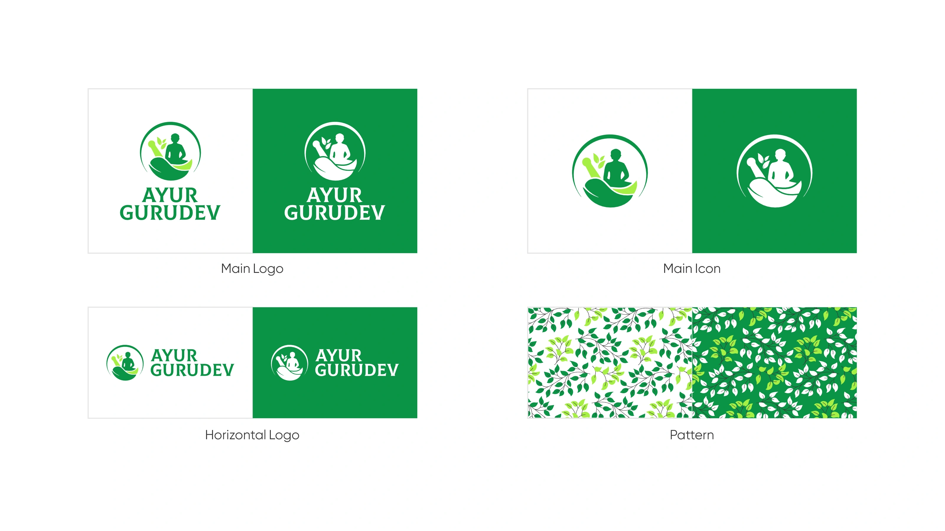
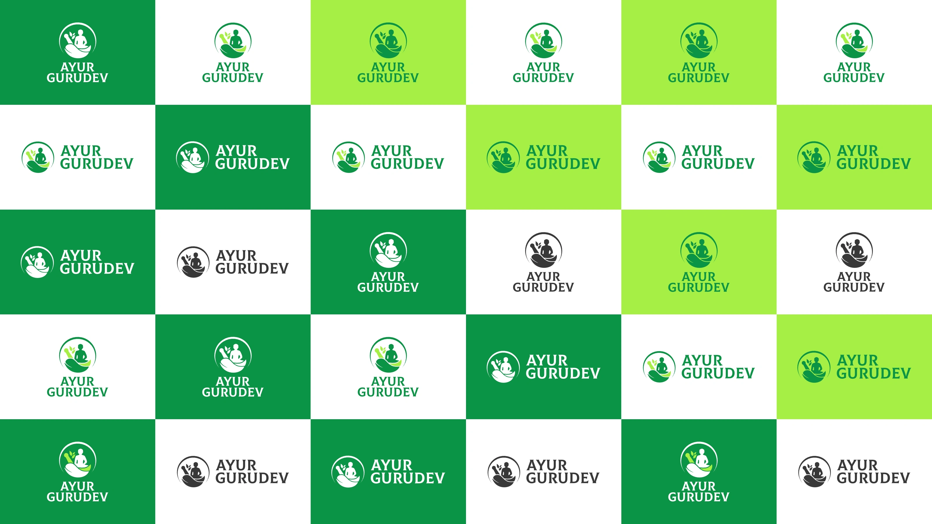
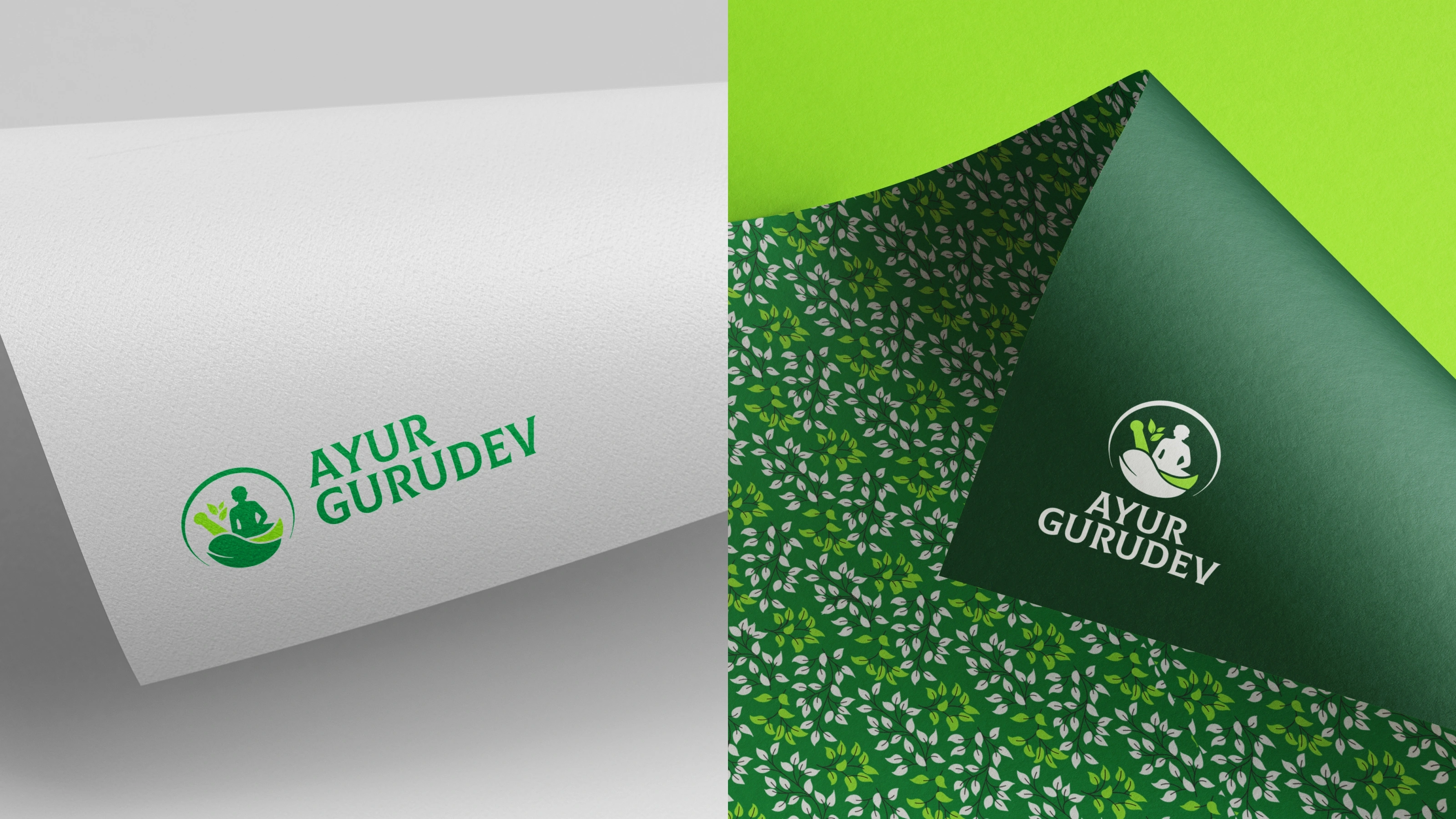
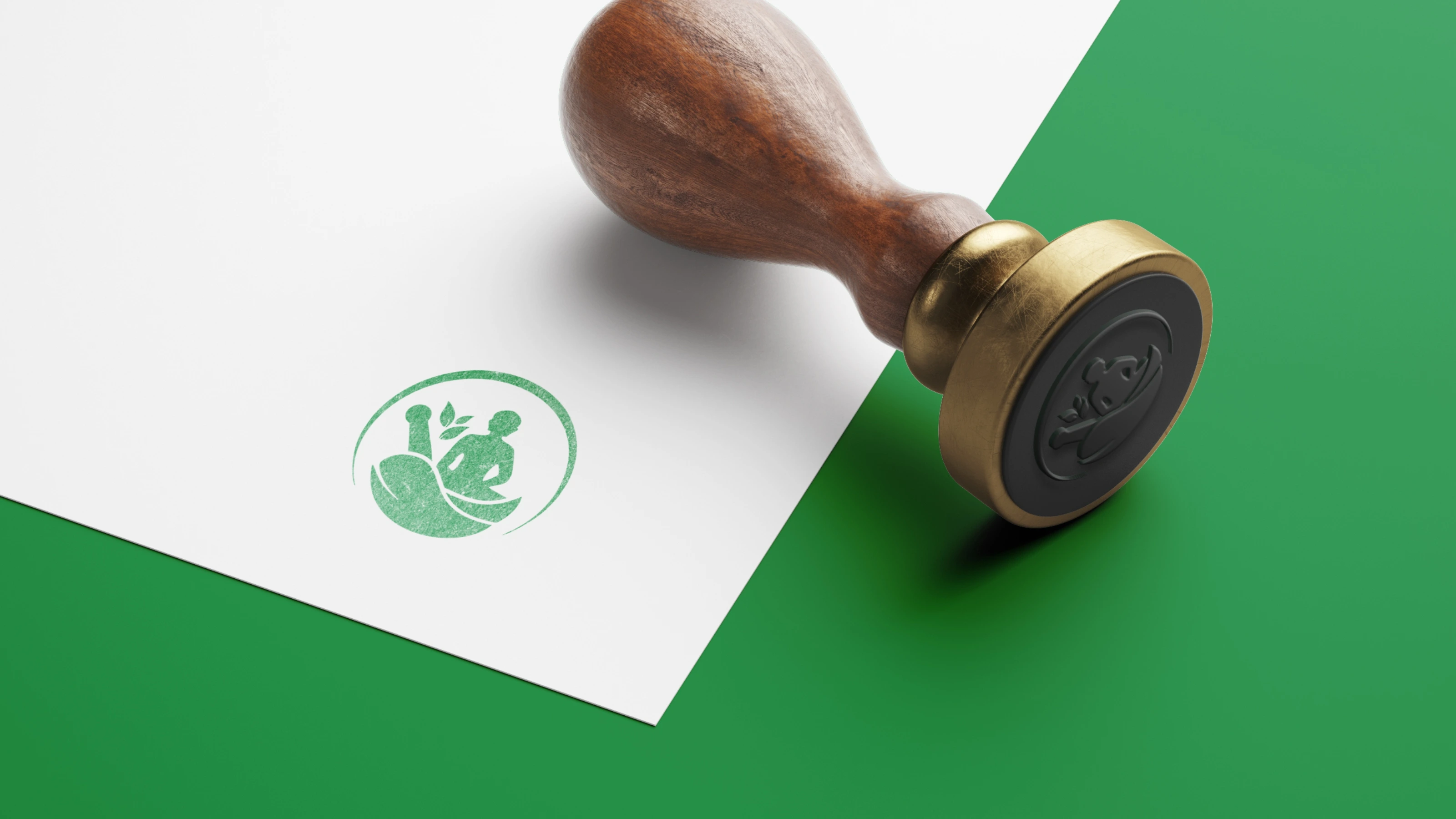
We explored over eight distinct directions, each interpreting the monk-and-mortar concept differently. The final mark is a circular emblem with a meditating sage resting in a mortar, surrounded by herbs. Peaceful, rooted, and instantly recognisable as Ayurvedic.
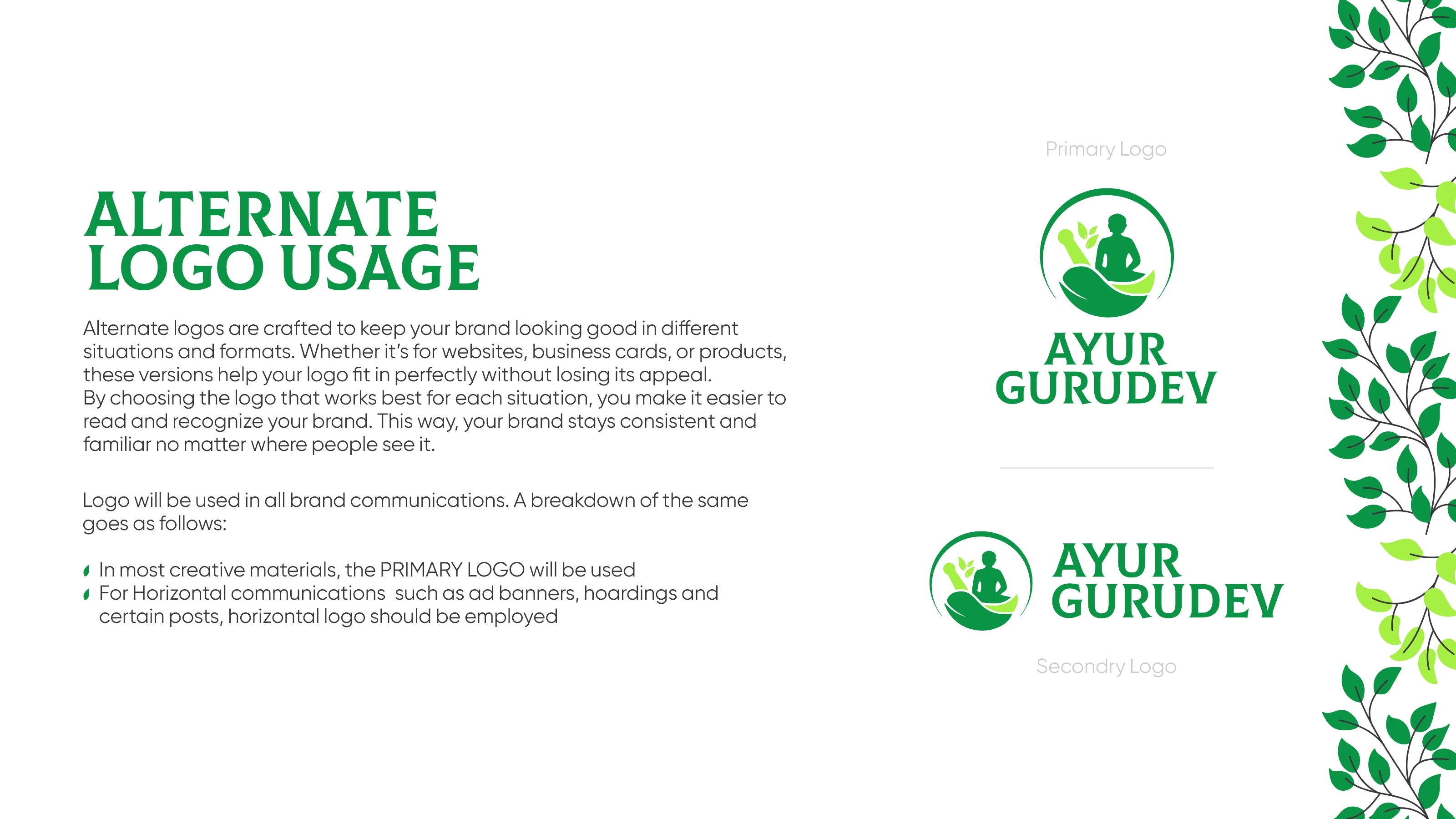
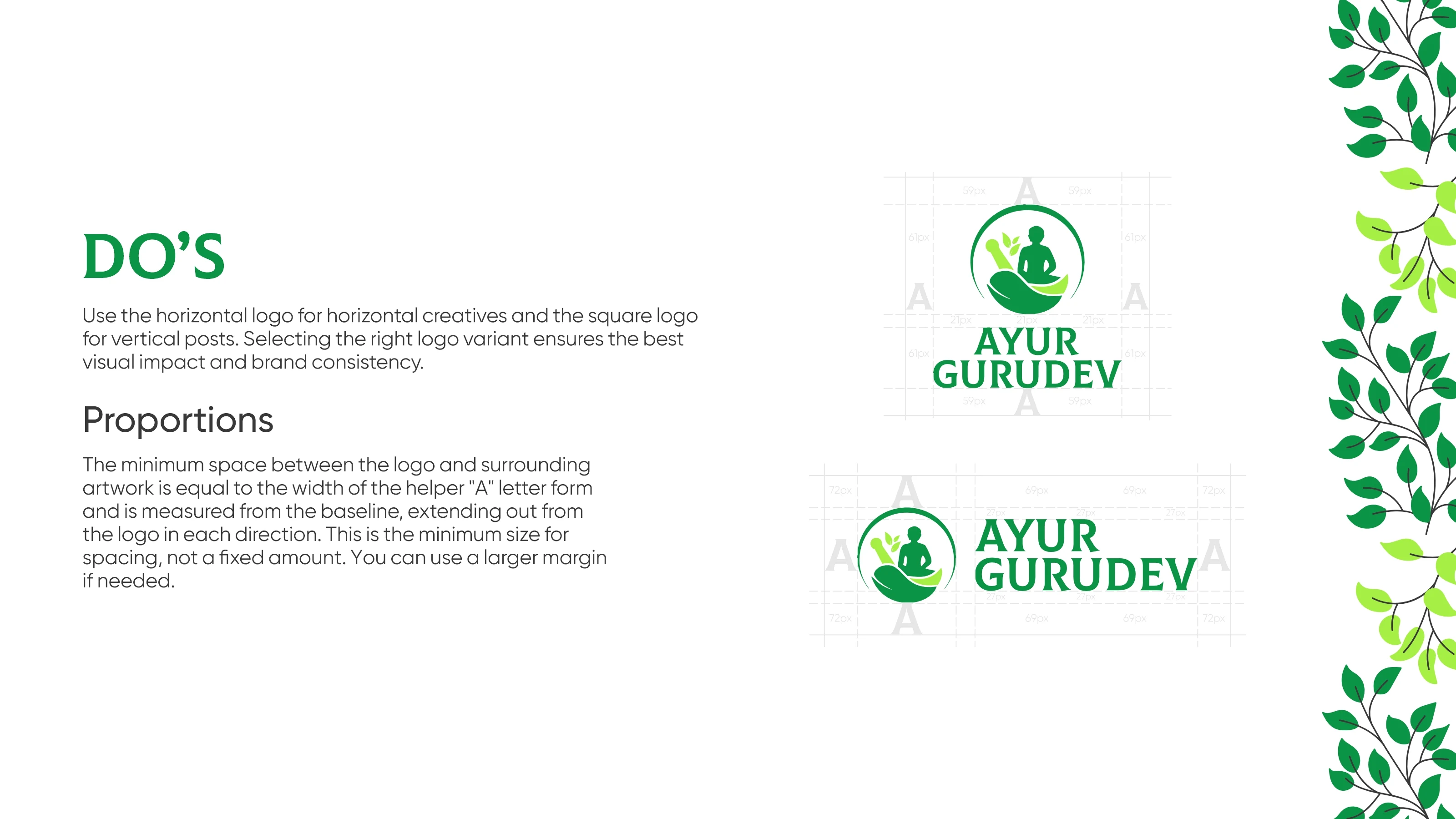
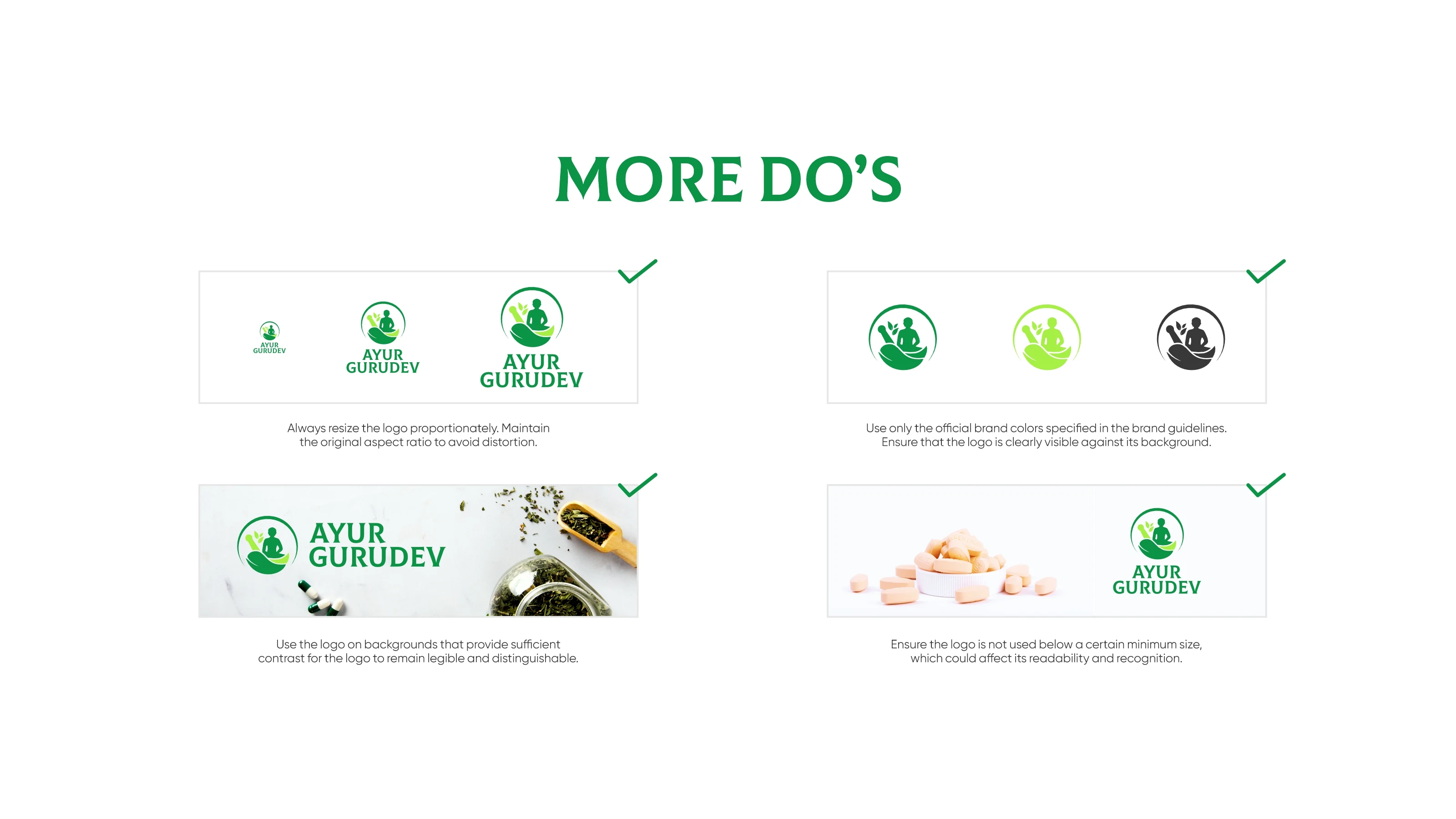
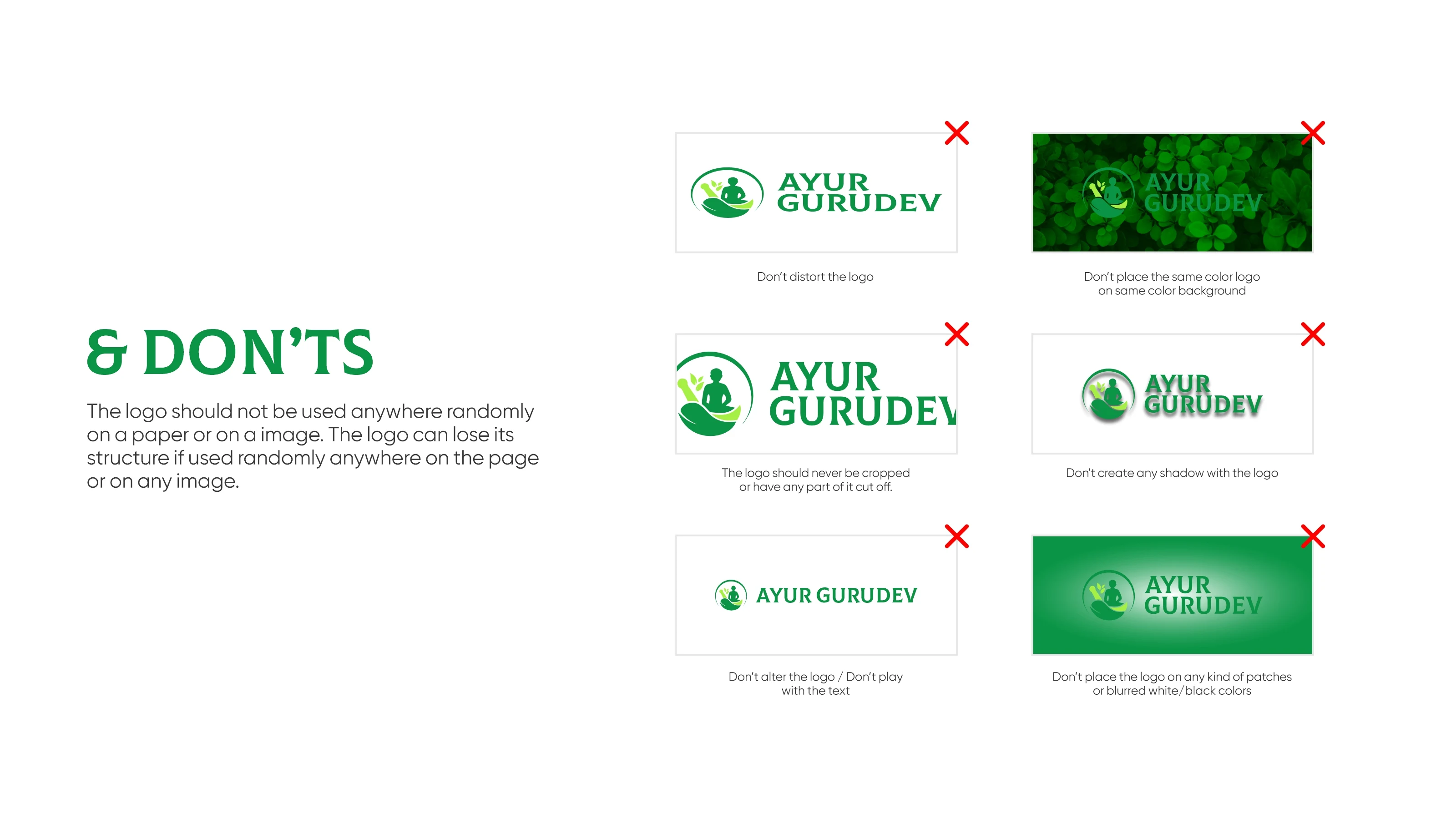
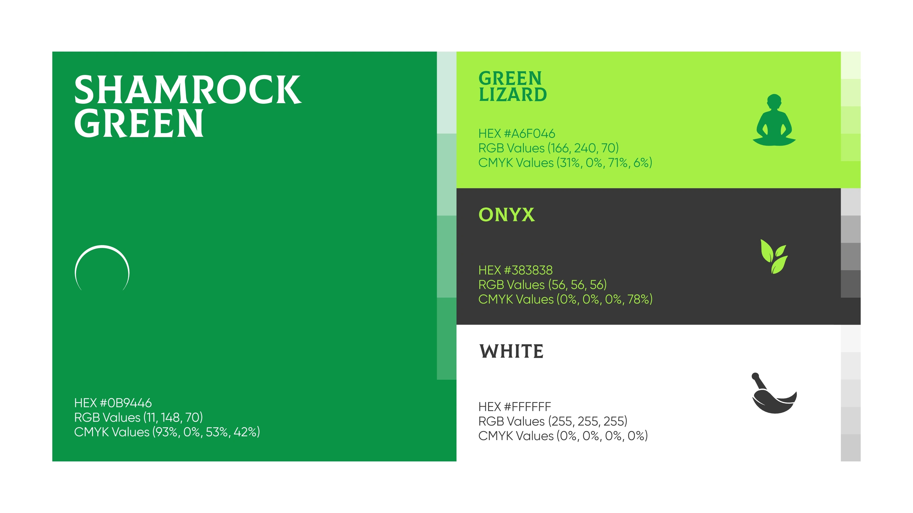
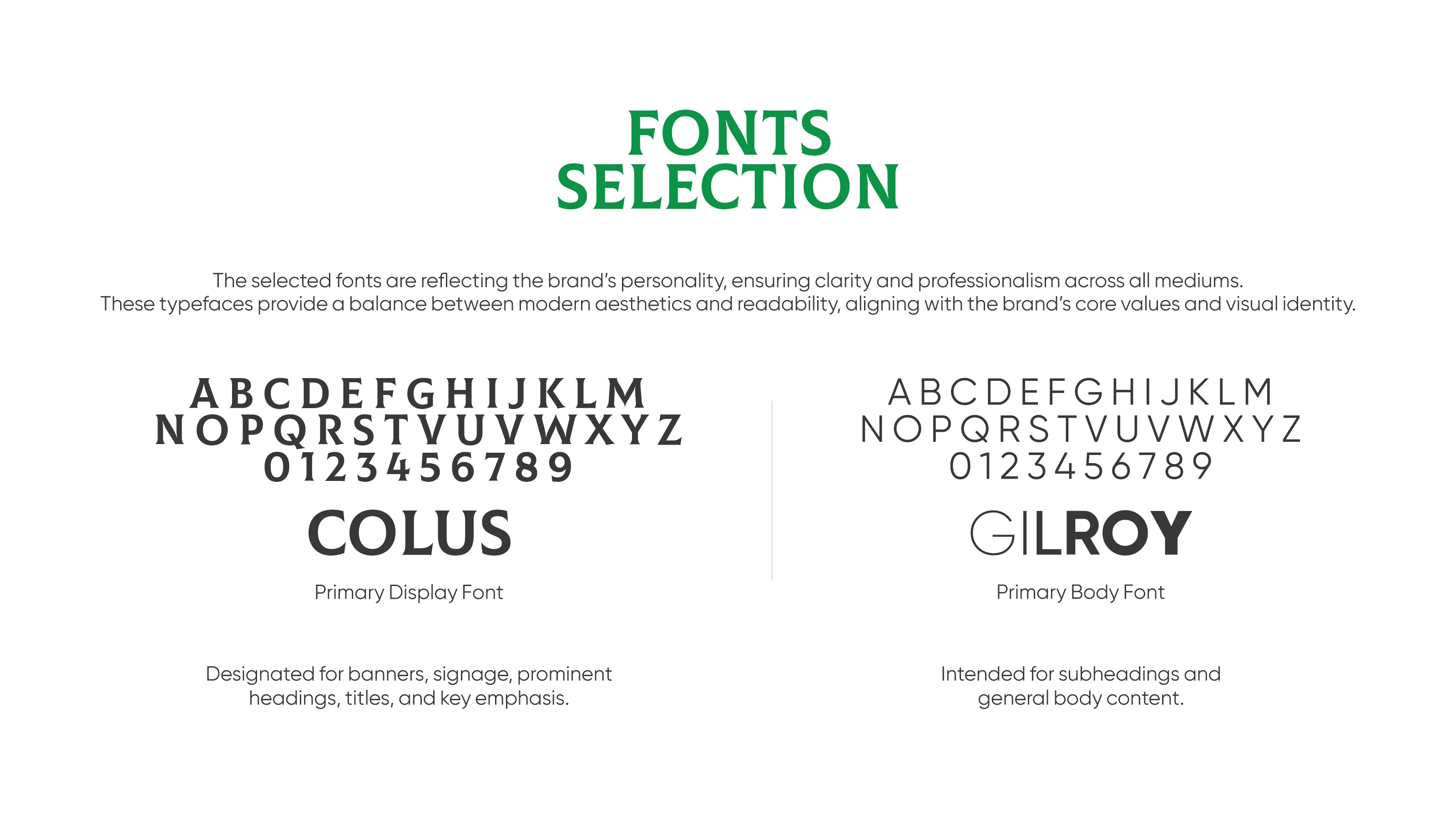
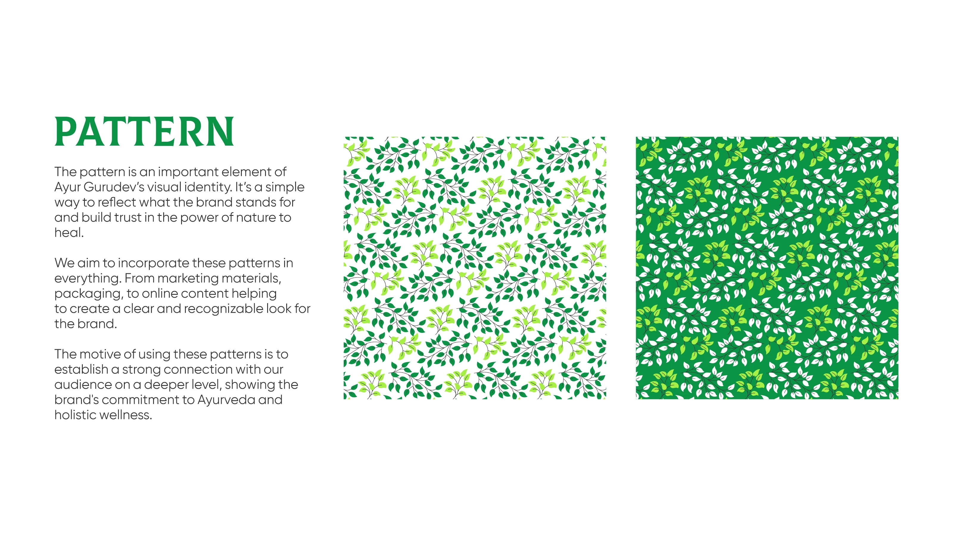
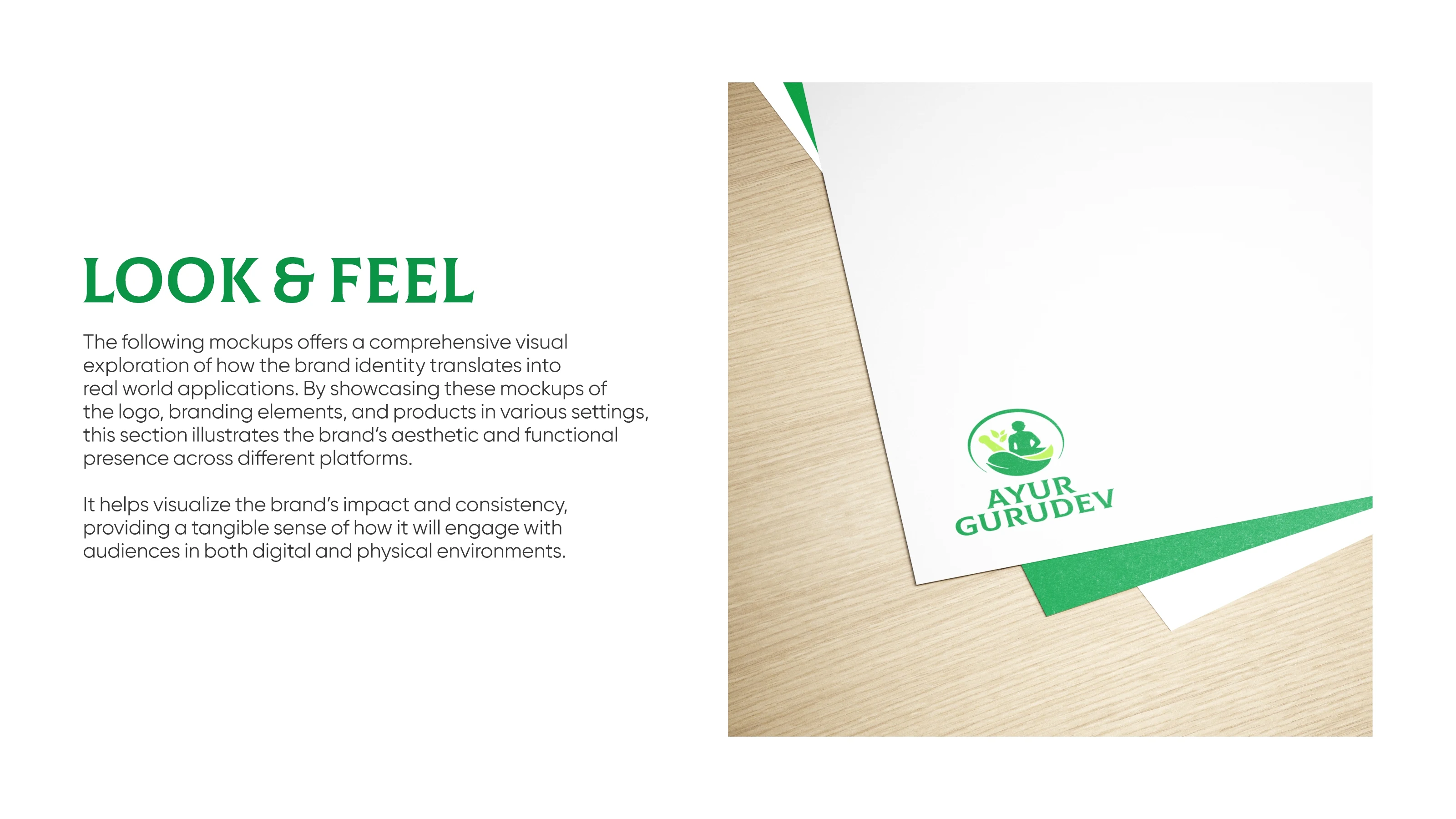
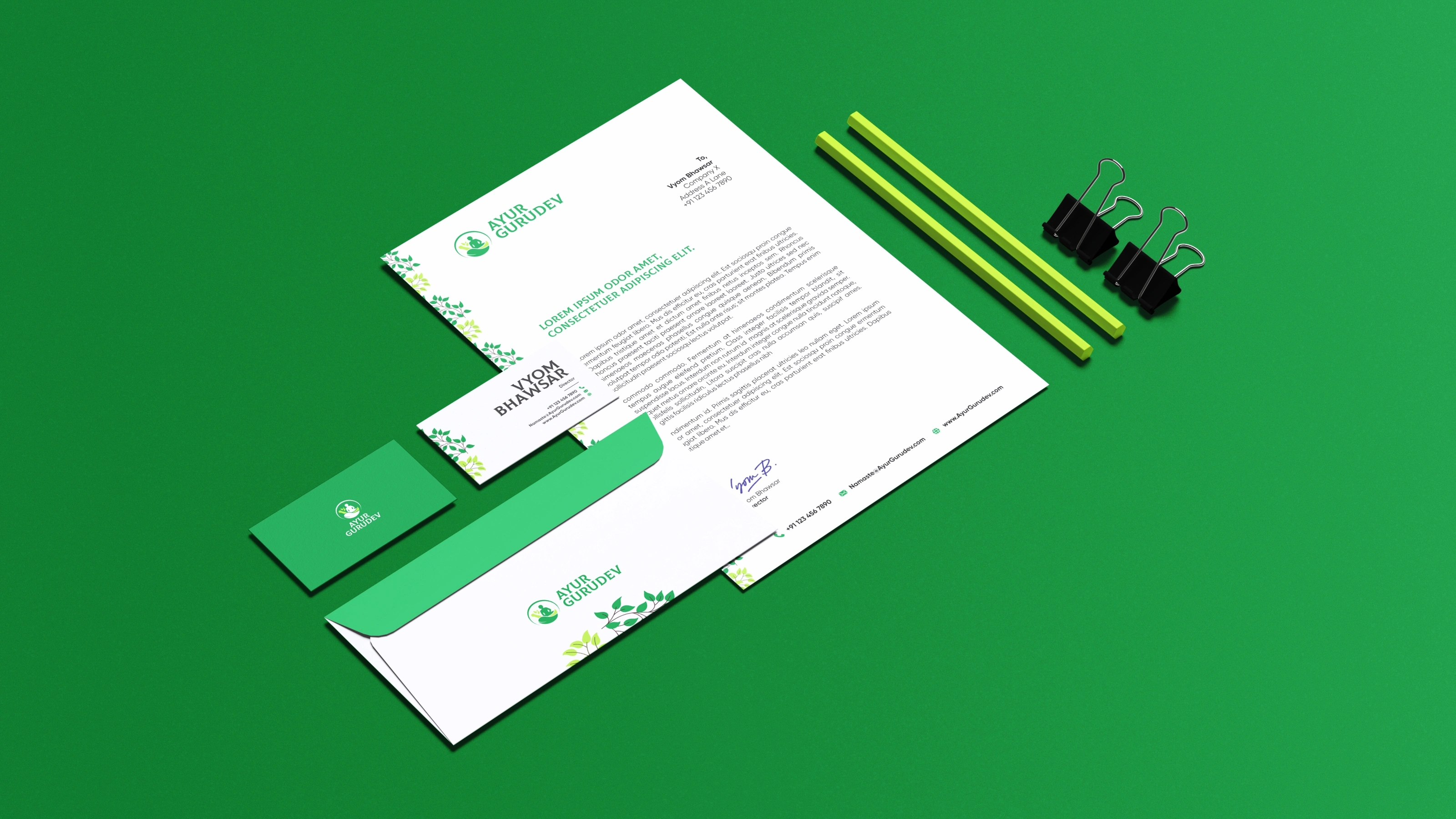
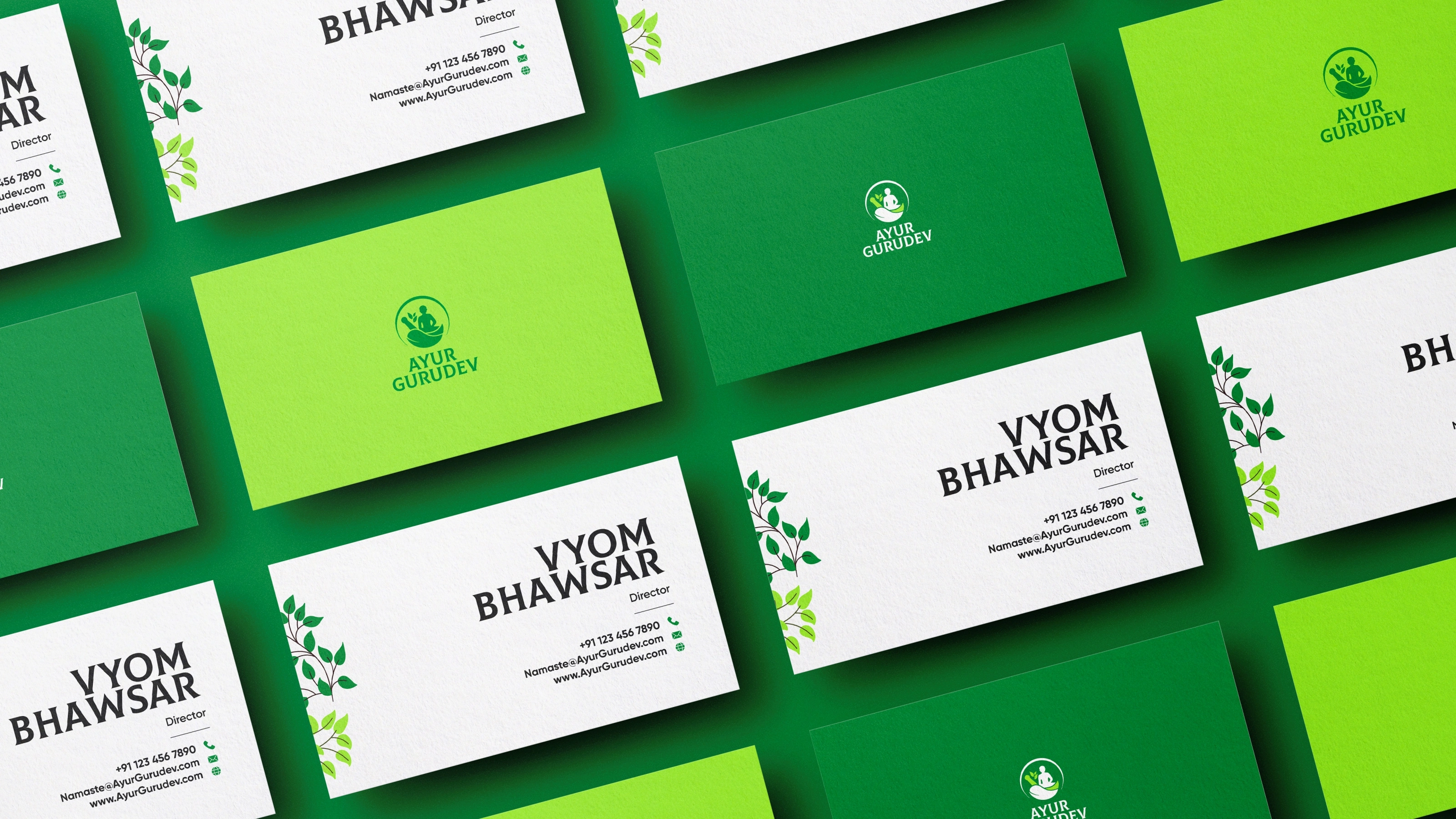
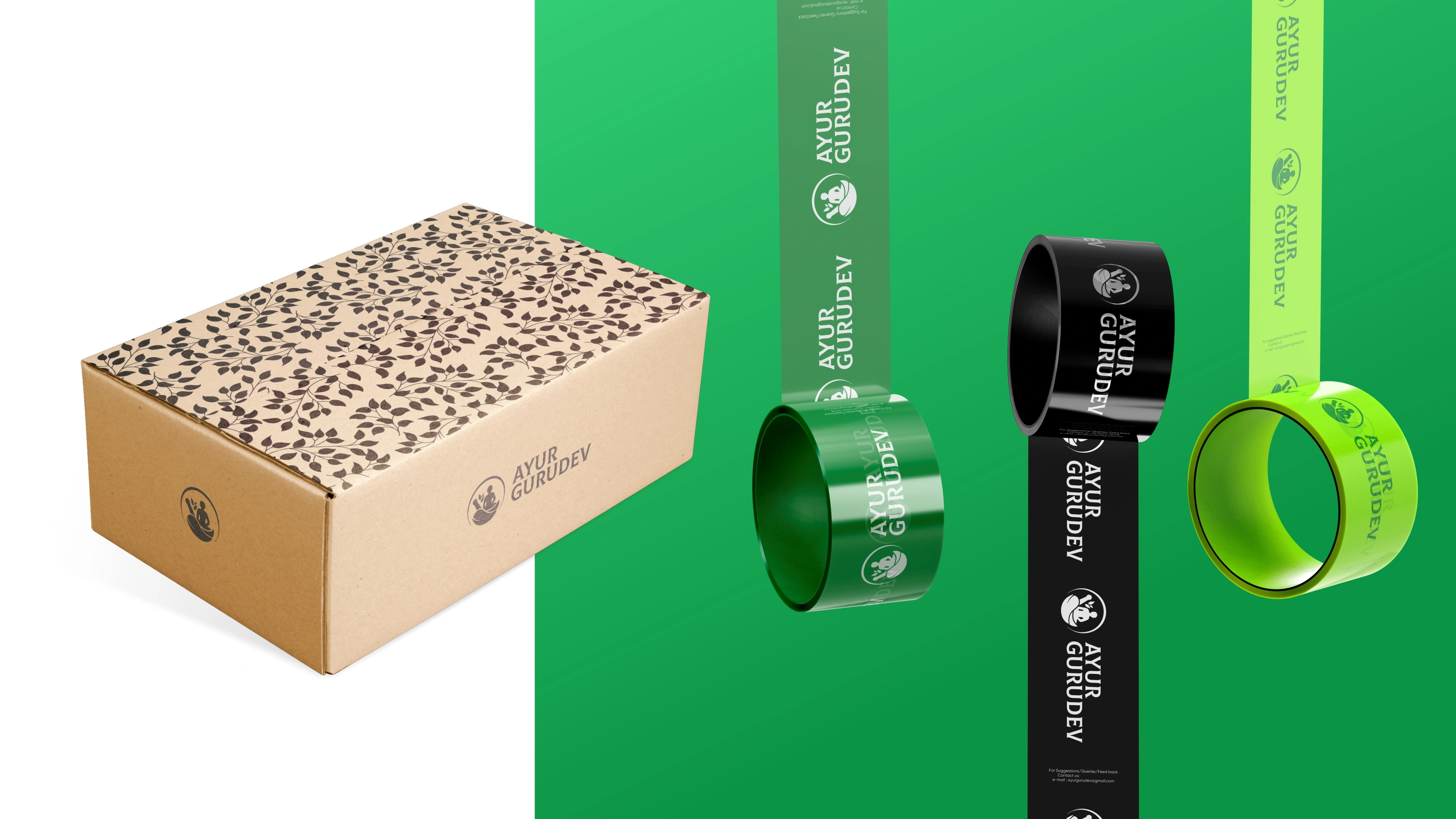
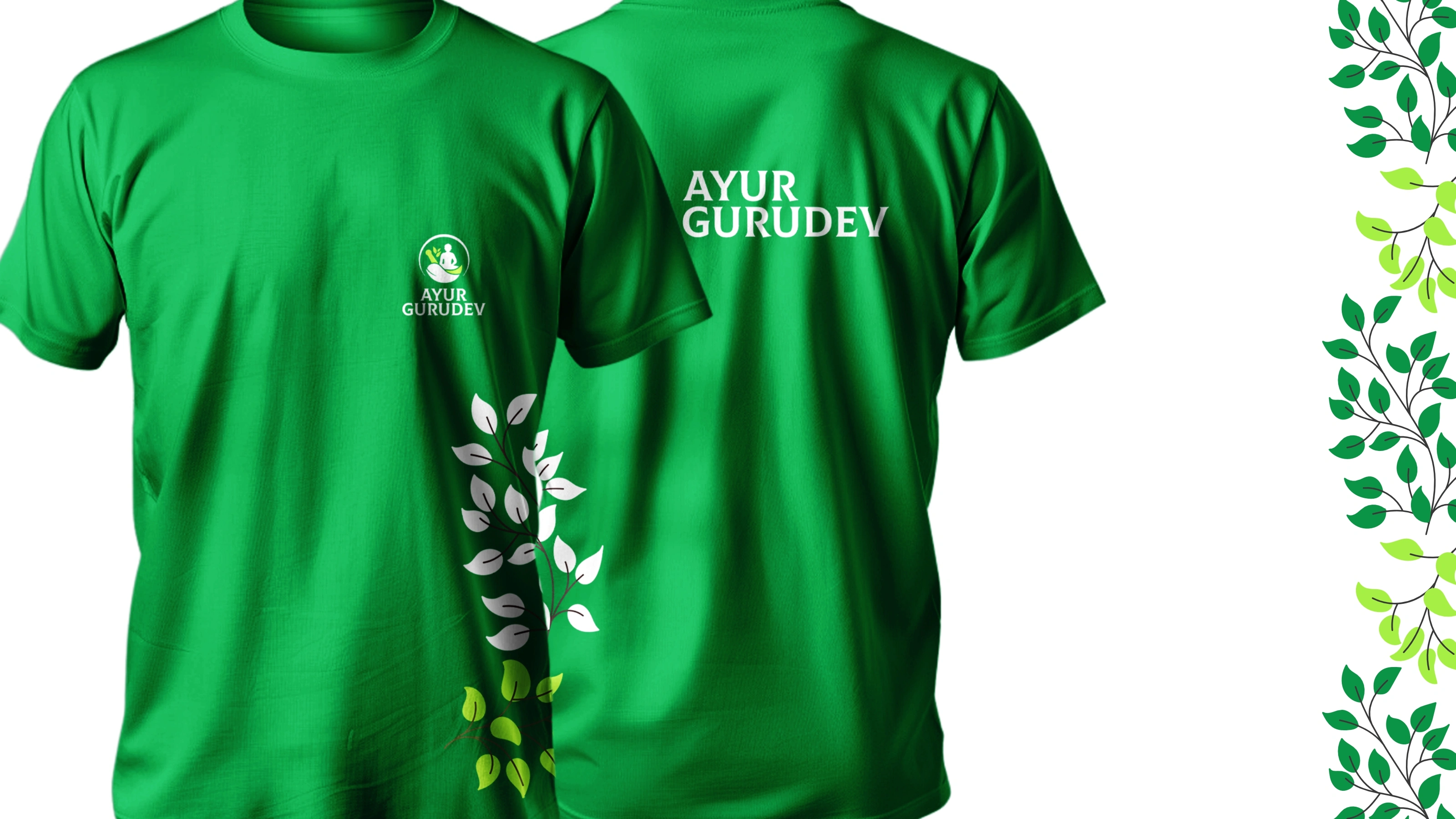
The scope went far beyond a logo. We built a complete brand system, including logo variations and usage guidelines, color and typography systems, a brand pattern, a full stationery suite, employee ID cards, product packaging for both the syrup bottle and tablet box, a diet chart, FAQs, a product manual, thank you cards, and a wooden-finish cardboard outer box.
The brand is live at ayurgurudev.com


Like this project
Posted Apr 25, 2026
Ayur Gurudev Brand Identity and Guidelines