Futurecast Crypto Platform Branding and Website Development

Simon De Ridder


Making a case for calm in a very loud room
Crypto is chaotic by design. Fortunes are made and lost daily, usually by people who couldn't tell you afterwards what actually happened, and the information that might have explained it is scattered across a dozen platforms.
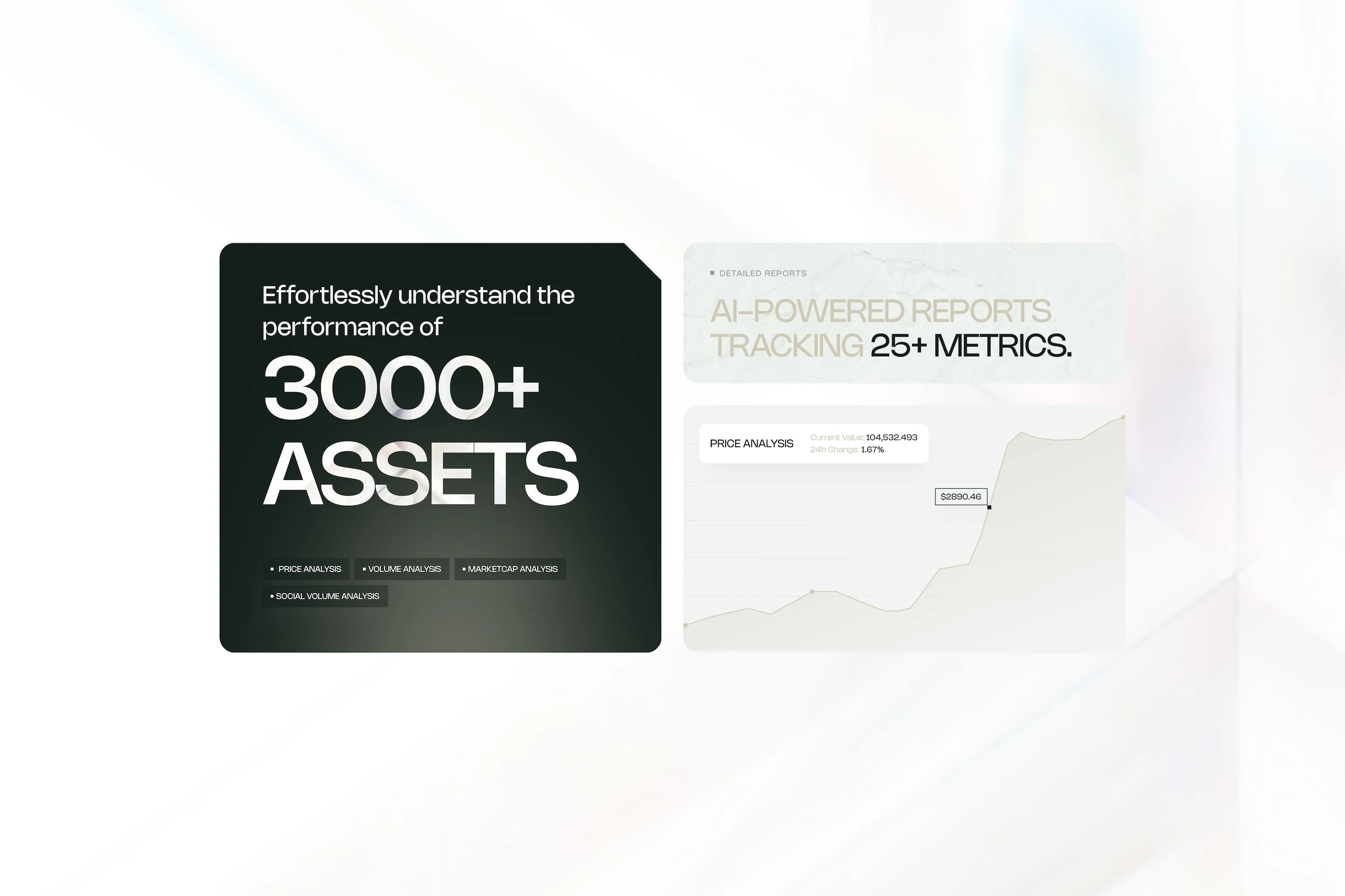
Futurecast wanted to fix that. The plan was a subscription platform where you pick the assets you care about and get AI-written reports and alerts on them — the company's own phrase for it was data, demystified. Edward Hickman was building it from scratch, and it needed a brand and a website before it had customers.
The problem wasn't standing out. It was being believed.
Futurecast was arriving into a category that already had Messari, Token Metrics and Entefy in it, and almost everyone in that space looks one of two ways: loud and hype-driven, or so dense you need a finance degree to read the homepage.
Copying either was tempting and wrong. People don't hand over investment decisions to a brand that feels flashy, and they don't hand them to one they can't parse. For a young company with no track record yet, the whole job was earning trust in the first five seconds.
Choosing restraint as the differentiator
Sophie Jean-Paul led the brand strategy and produced the brand book. I coordinated that work between Sophie and Edward, contributed to the logo and the overall look, then took the identity into the web design, the Webflow build, and the 3D.
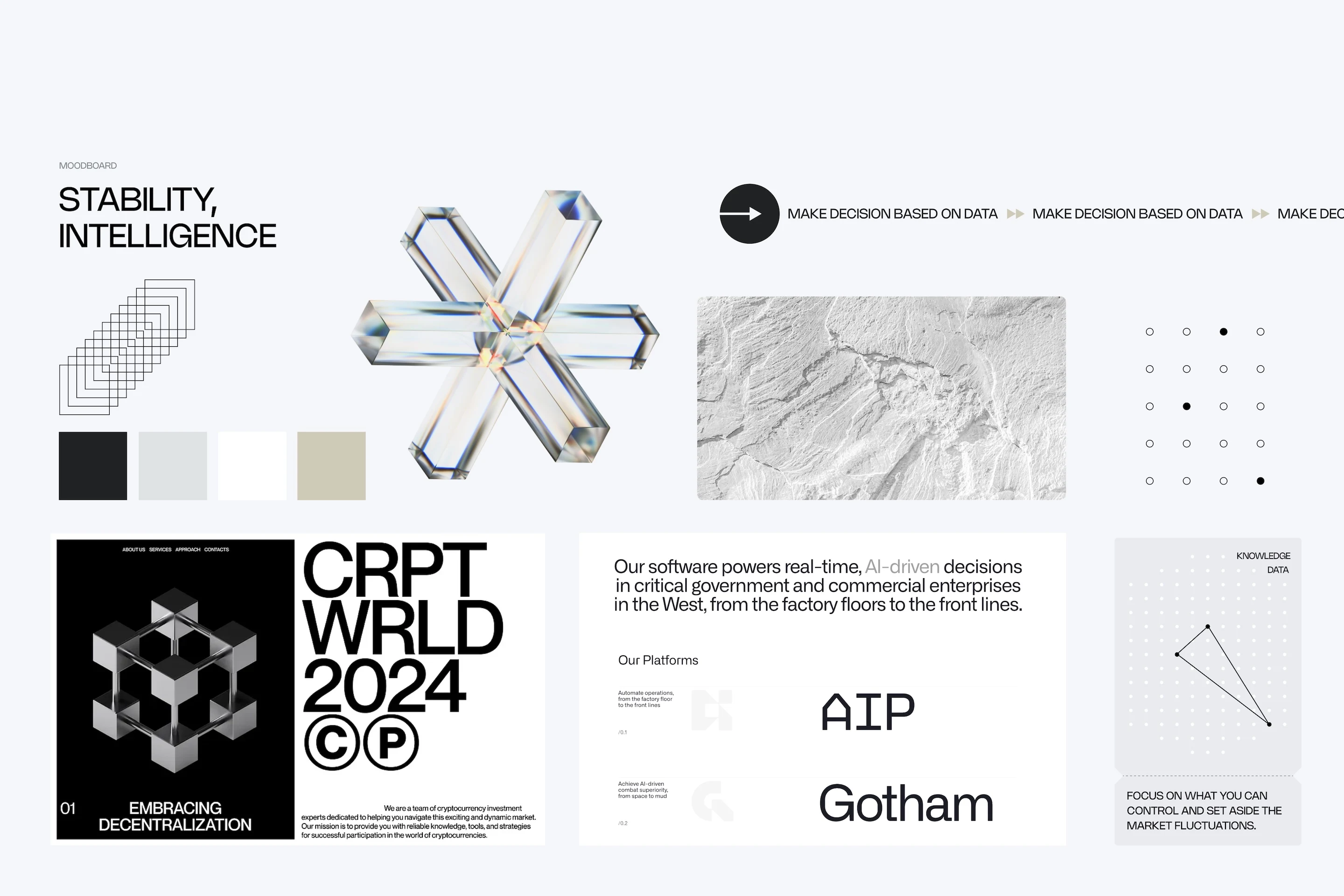
The strategy landed on an archetype — the Sage — and a tone that was stoic, objective and analytical. In practice that meant going quiet in a category that shouts. Near-black and off-white as the base, a desaturated gold used sparingly, Nohemi throughout, and a lot of empty space. Nothing on the page raises its voice. In that context, restraint reads as confidence.
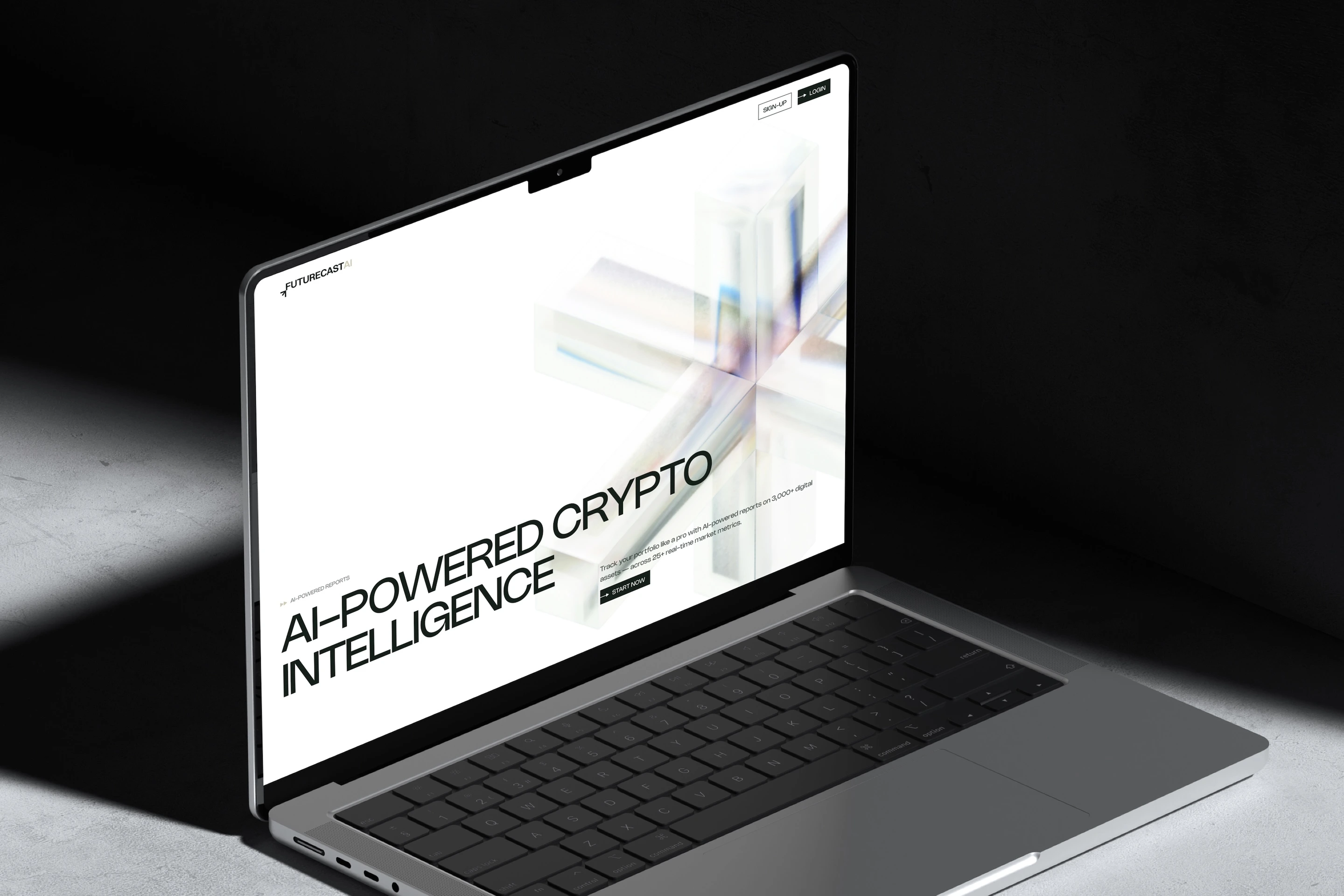
The idea I liked most tied the identity back to the product. Futurecast's promise was turning messy market data into something clear and valuable, so the brand's visual motif became exactly that: refined crystal objects, polished glass with a faint prism of colour through it. Chaos in, clarity out. That's what the 3D on the site was for — not decoration, but the argument the whole brand was making, in one image.
What the 3D actually taught me
This was my first time touching 3D. I was curious whether I could pull it off, so I watched some tutorials, learned Spline, and built the hero pieces. Five to ten hours, start to finish.
Making them wasn't the hard part. Getting them to run smoothly on a live web page was a completely different problem, and I'll be honest: it cost the site performance. The hero looked exactly as intended and the page paid for it.
The uncomfortable part is that the tradeoff argued against the brand itself. We had just spent weeks building an identity around calm and clarity, and then put something at the top of the homepage that made the first few seconds heavier. I'd handle it differently now — decide the performance budget before choosing the technique, not after. Learning a new tool and shipping it in the same project is a fair thing to do once; doing it without a weight limit is the part I'd change.
Where it landed
The site launched with a full identity behind it and a clean SEO foundation in Webflow — nothing elaborate, but structured properly so whoever picked up content and search later had a solid base rather than a mess to unpick.
I wasn't involved after launch, and Futurecast has since pivoted; the site I built is no longer live. So I can't tell you what it did for traffic or signups, and I'd rather say that than invent a result.
What I'd point at instead is the brand system itself, which still holds up: a coherent argument for why a stoic, quiet identity is the right answer in a category that mostly shouts. That reasoning is portable, and it's the part of this project I'd do again.
My role & tools
Brand coordination between Sophie Jean-Paul and the client, contributions to the logo and visual identity, then web design, full Webflow development, and the 3D hero visuals. Sophie Jean-Paul led brand strategy and the brand book. Figma, Webflow, and Spline for the 3D.
Like this project
Posted Aug 25, 2026
Developed brand and website for Futurecast's crypto platform using strategic restraint in design.