Dashboard for climate data
Cinzia Bongino
European Extreme Events Climate Index
The European Climate Index provides insights into significant weather-related hazards experienced across European countries. It offers a comprehensive overview by combining seven components: Extreme Max and Min Temperature, Drought, Extreme Precipitation, Hail, Fire, and Extreme Wind, with data from January 1981 until today.
In recent years, the definition of Extreme Weather Events has become a recurring theme in our daily news. The landscape and occurrence of seasons are being reshaped by severe tornadoes, floods, droughts, heat waves, fires, etc. The concept of 'extreme' is fast becoming the 'new normal,' marking the profound impact of climate change on the first century of the 2000s.
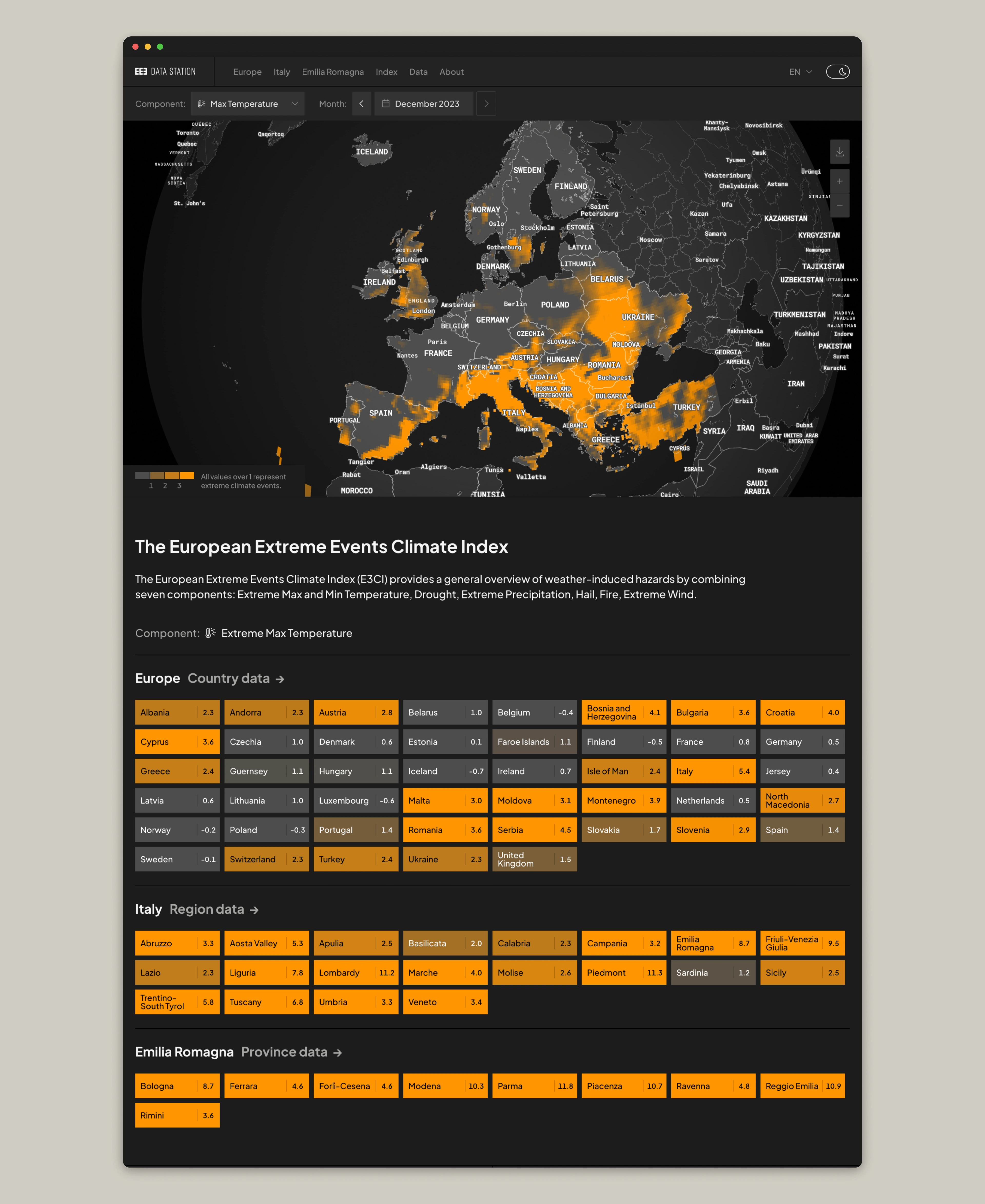
The European Climate Index emerges as a new reference tool, providing insights into the significant weather-related hazards experienced across European countries. Each of the seven components (Max and Min Temperature, Drought, Precipitation, Hail, Fire, and Wind) uses an indicator as a proxy for various hazards. The reference values are computed based on the 1981-2010 timeframe, while the E3CI presents a monthly standardised anomaly relative to these benchmarks. In simple words, climate events with values over 1 are considered extreme.
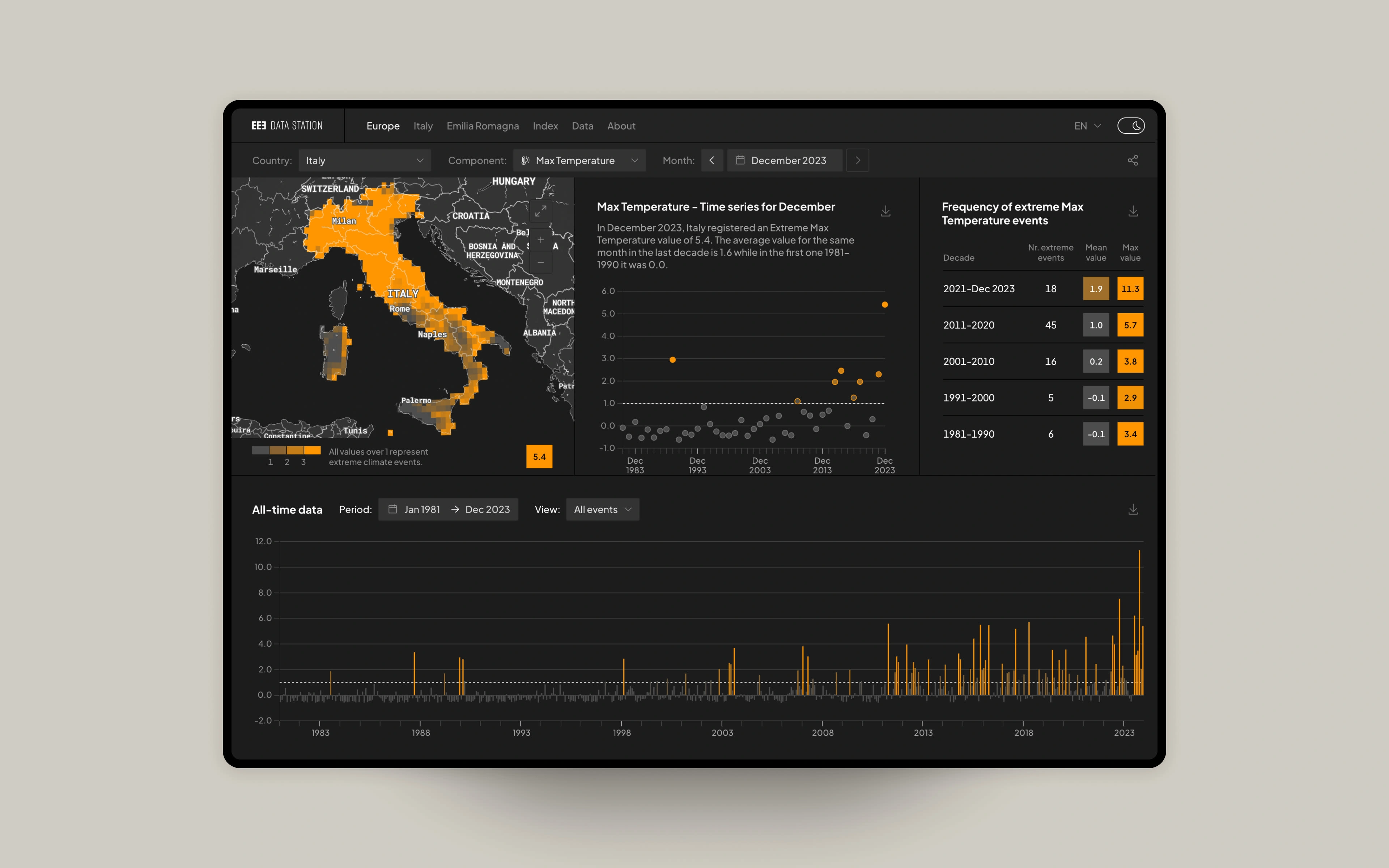
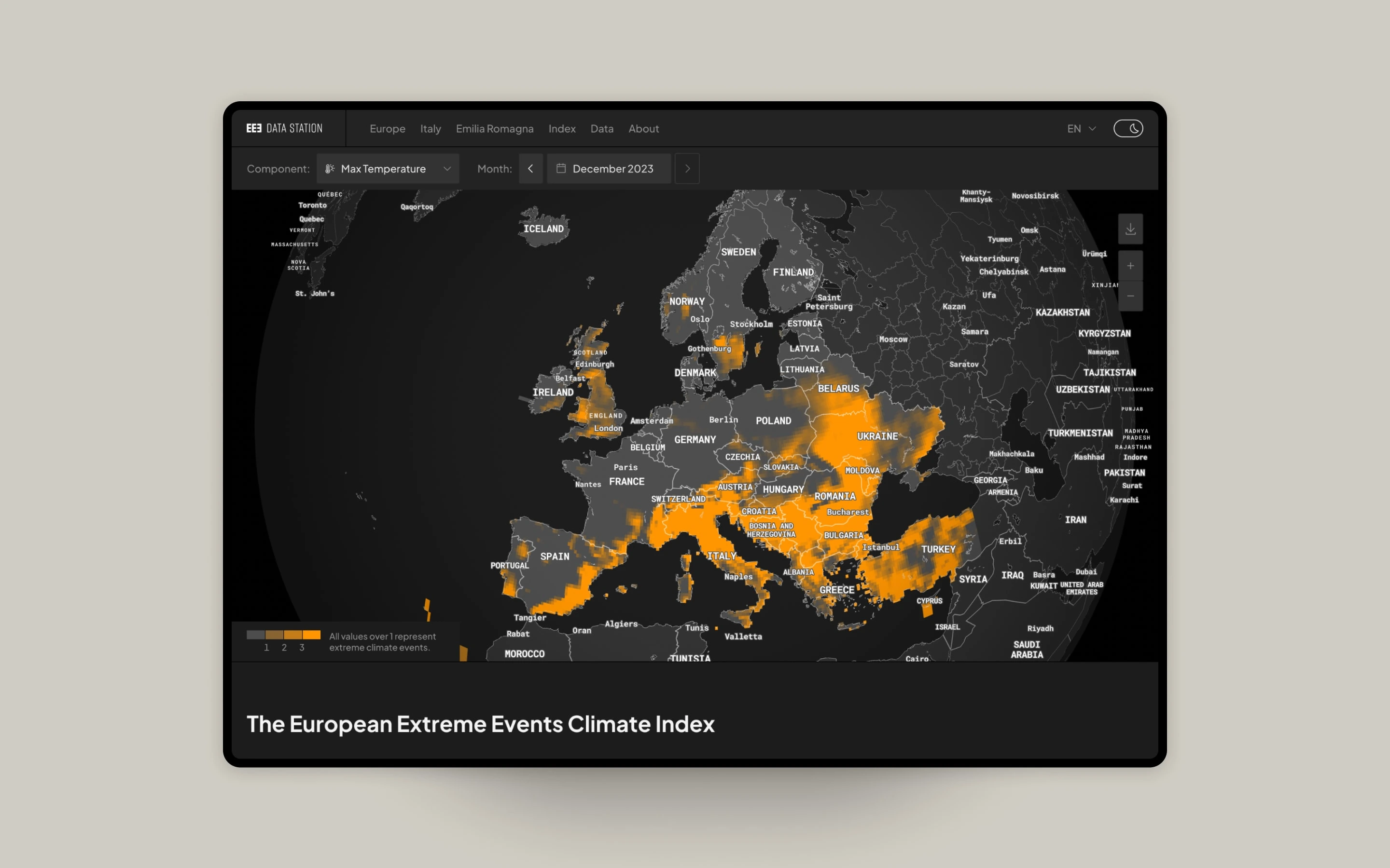
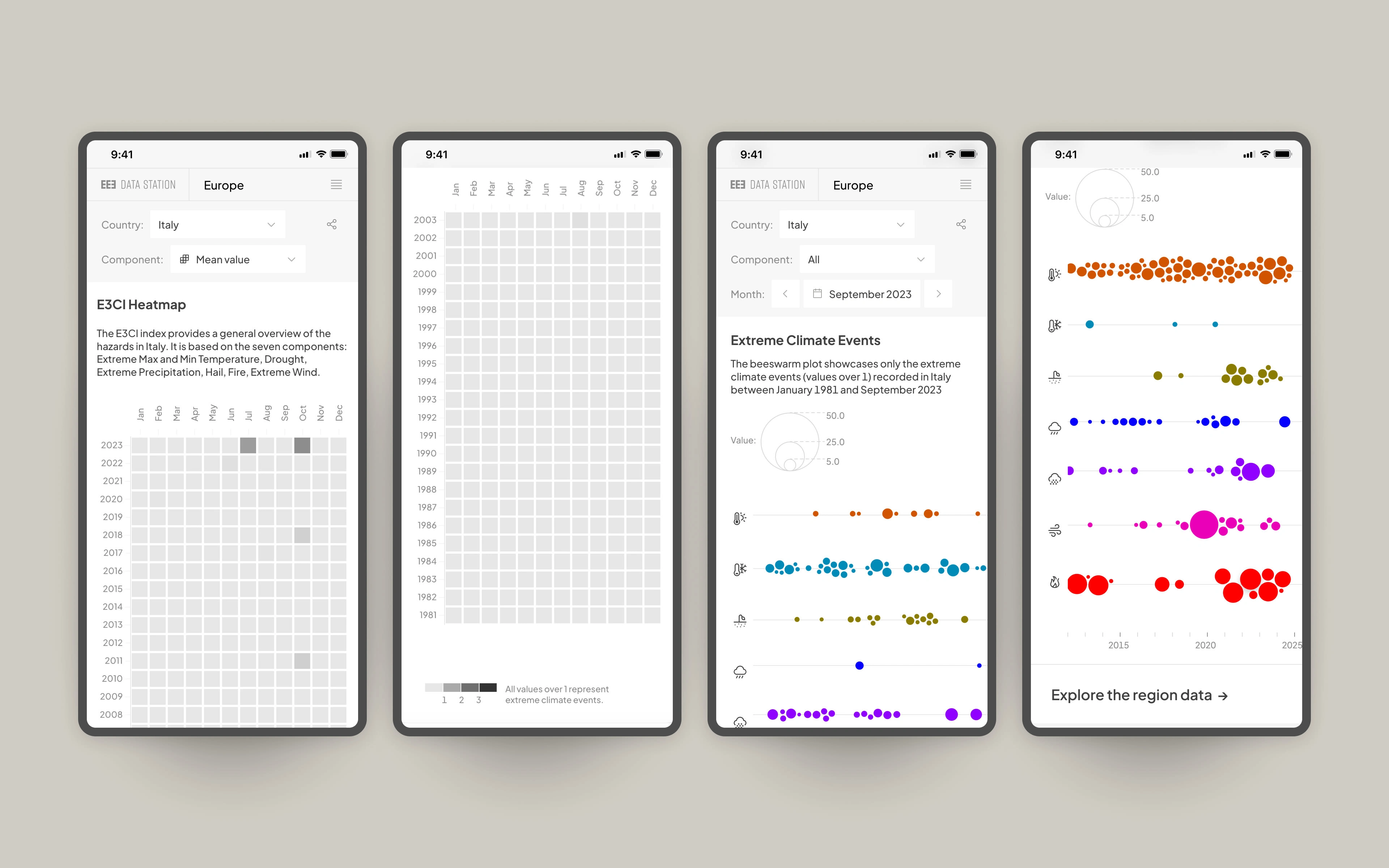
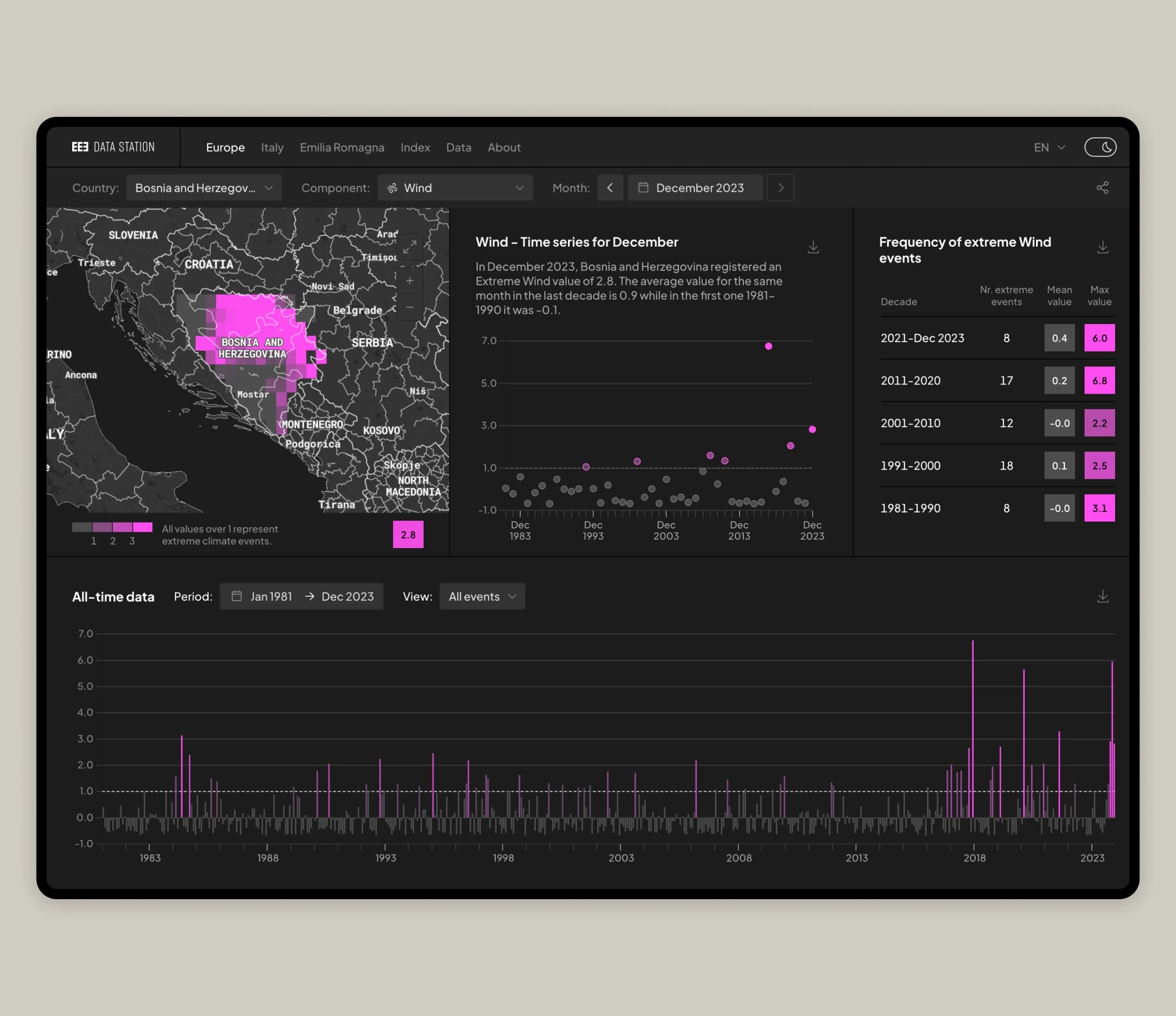
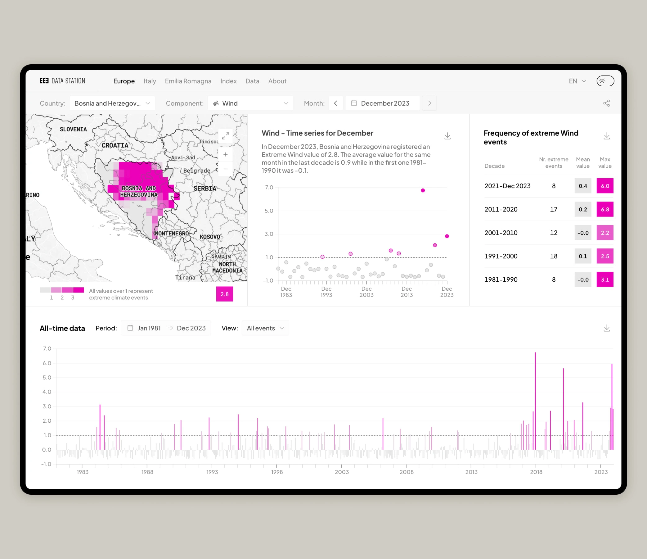
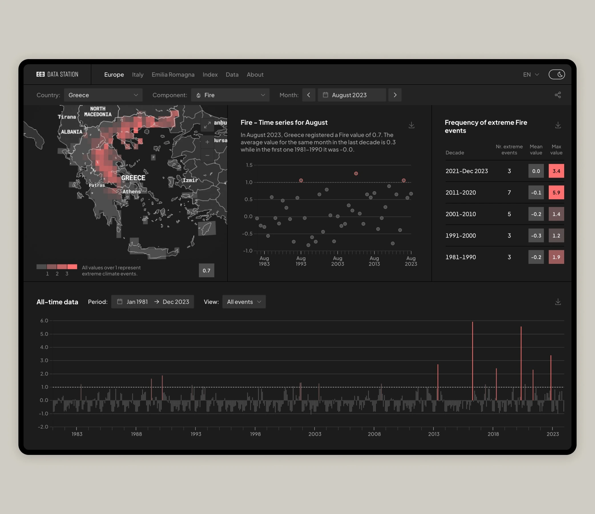
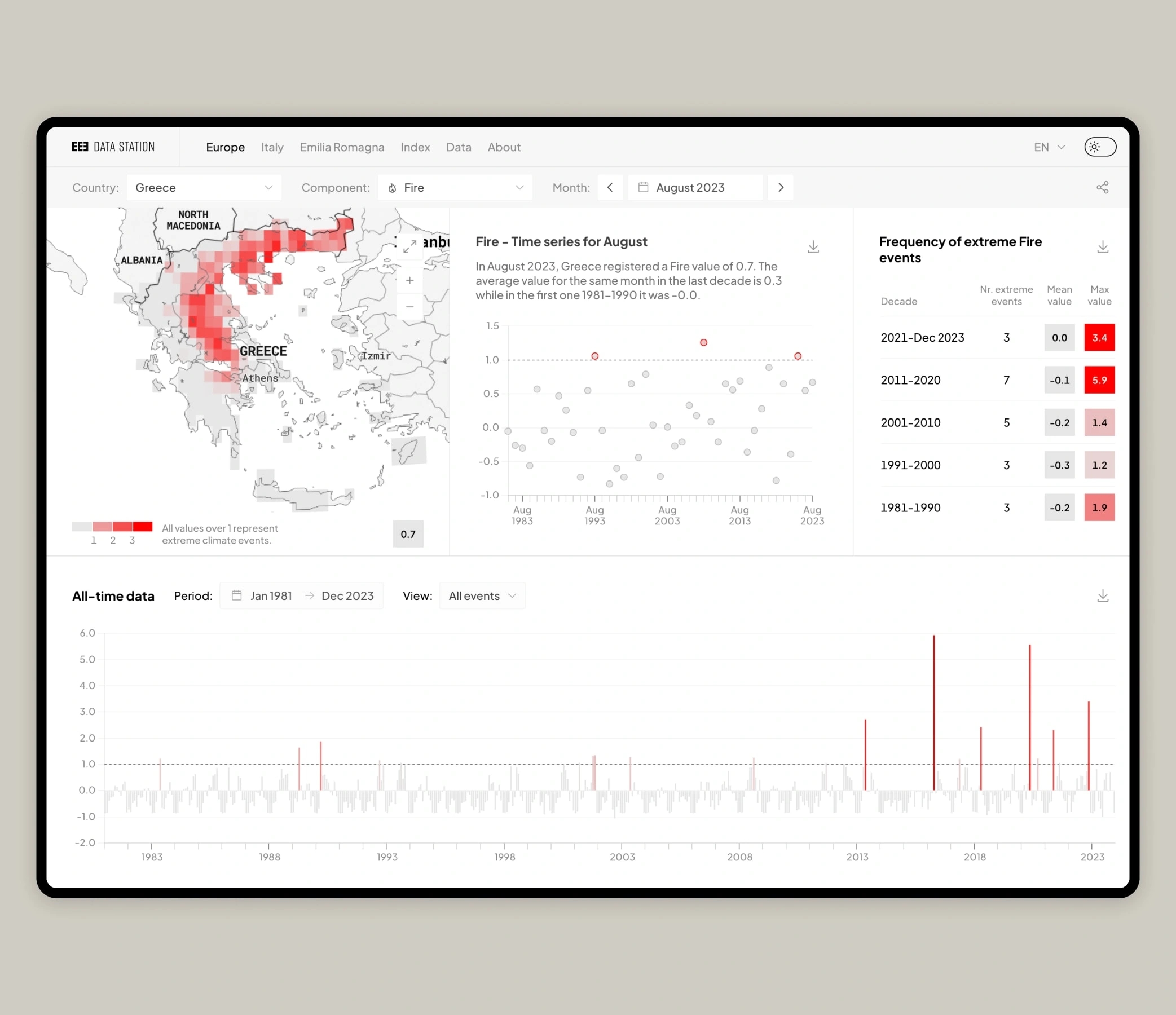
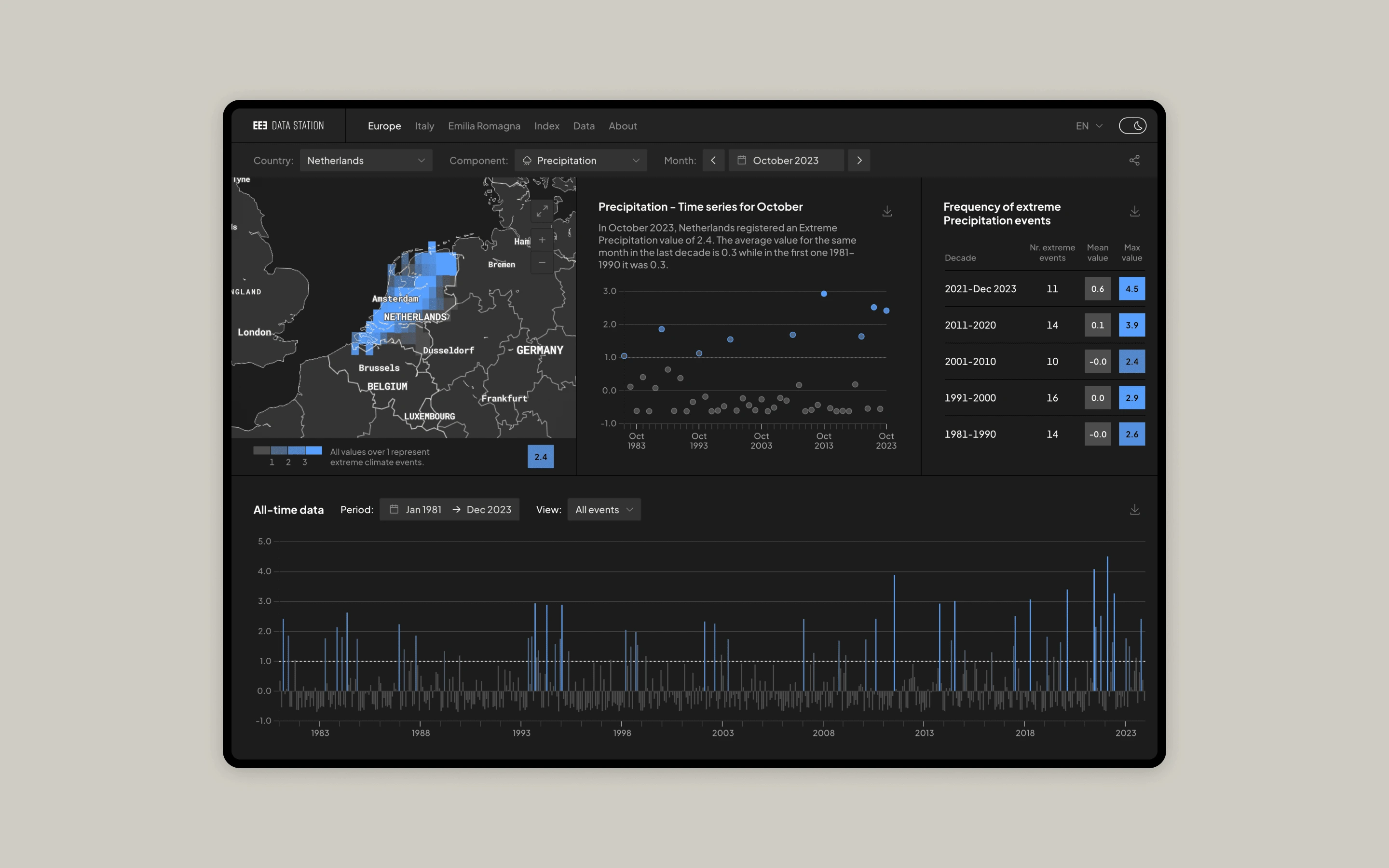
An interactive dashboard presents the latest data of each administrative unit (nation/region/province) through different visual models: a map, a plot chart, a table and a bar chart. The varying shades of color and the size/position of each data point convey the intensity of weather events, providing a comprehensive and visually engaging overview.
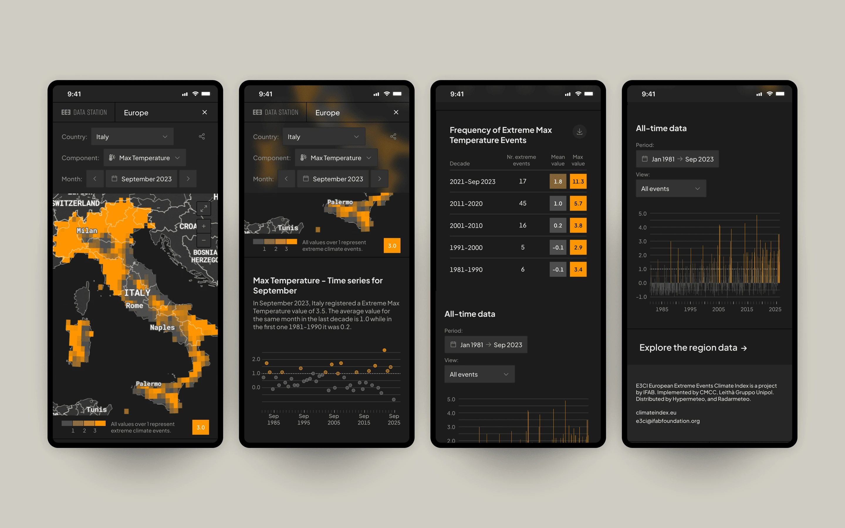
The upper section of the dashboard features a map illustrating the areas affected by extreme weather events, adapting based on the selected component and time period. Additionally, a plot chart facilitates the comparison of values for the same month over time, while a table lists the frequency of extreme-only weather events. At the lower section, an interactive bar chart presents historical data, which can be filtered by selecting a specific time period or visualising only the extreme weather events.
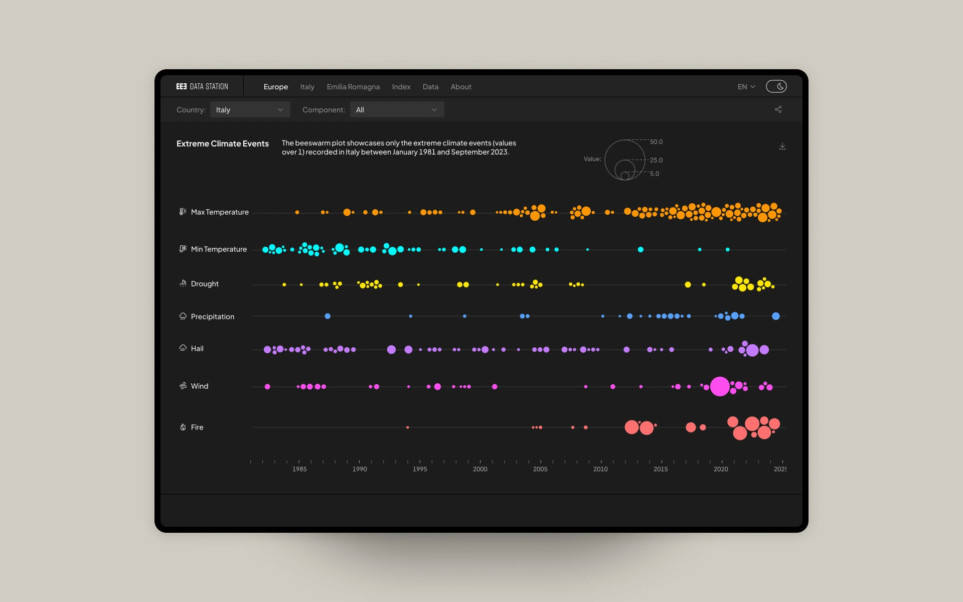
For each administrative unit, it is possible to compare the seven components through a bee swarm plot. The chart shows only the extreme weather events arranged in chronological order, with varying circle sizes based on thier intensities.
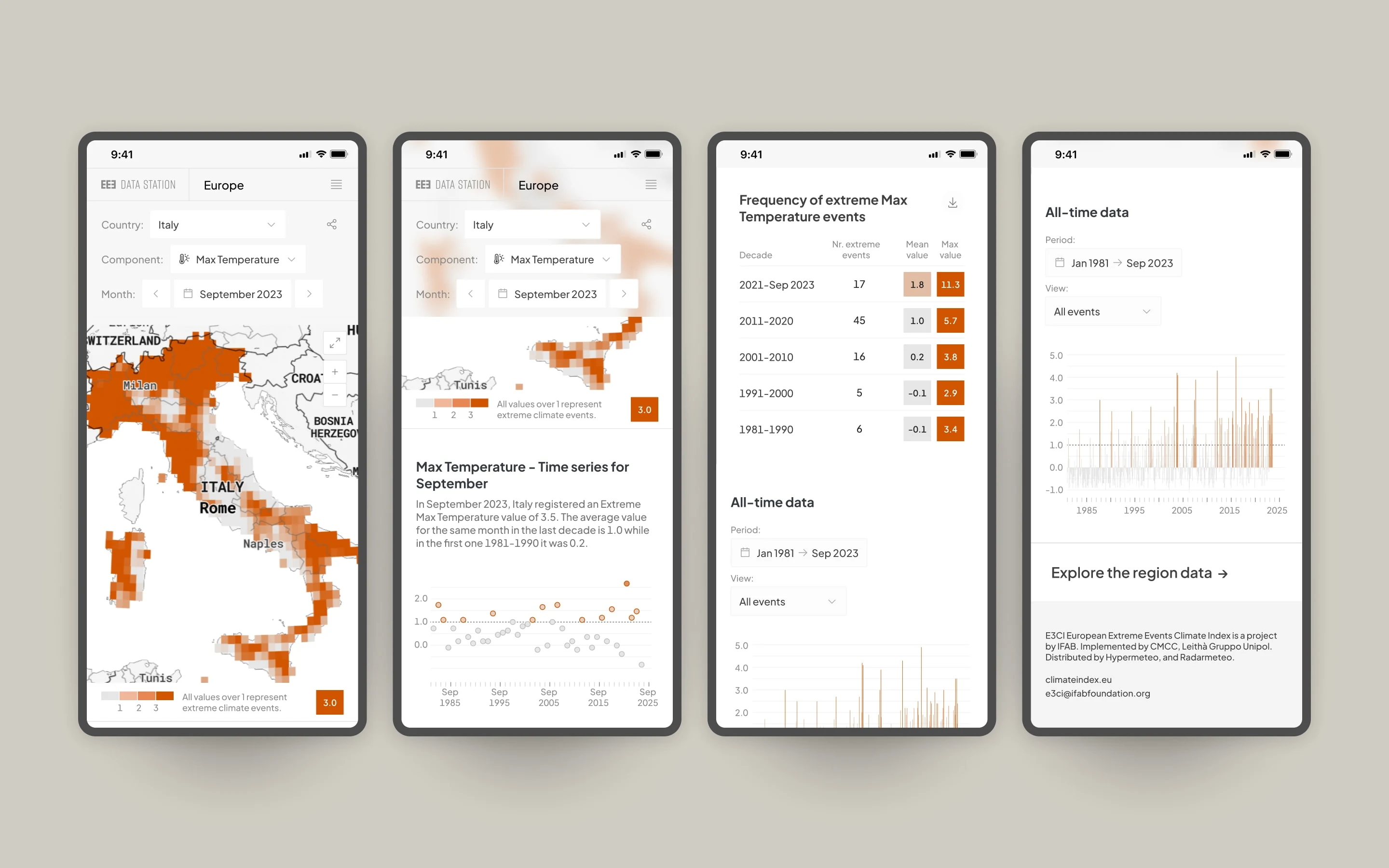
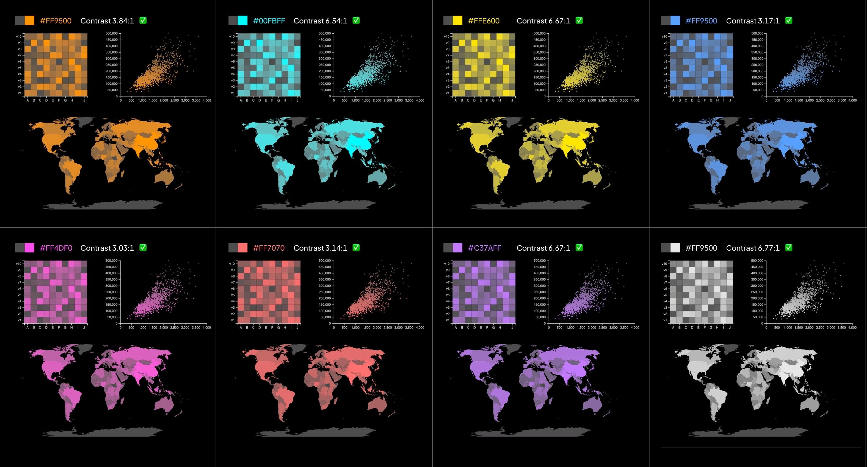
The platform is available with a light and dark theme that switches automatically based on user preferences, ensuring optimal readability in all lighting conditions.

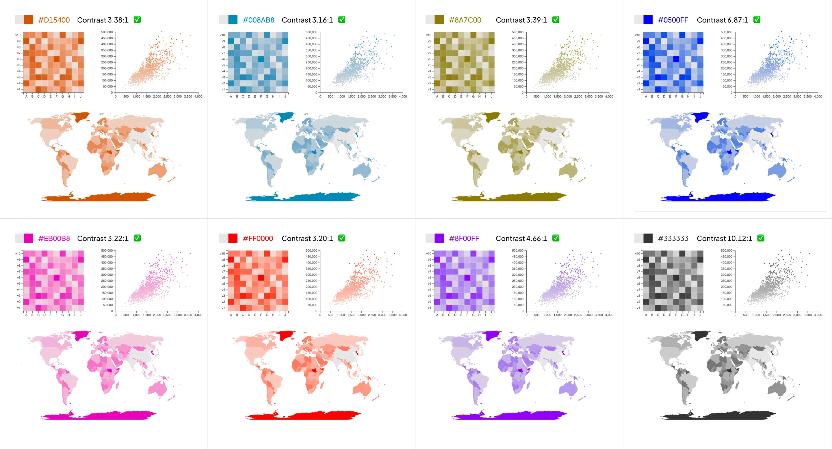
When comparing climate maps and charts from reputable sources, it becomes evident that there is a lack of standard rules for weather representations. Common practices like using a divergent color bar (from hue A to B) or a rainbow colour scale (with 7 or more hues) persist, despite causing perceptual issues for people with visual impairments.
The design of the data station highlights data through the use of color and charts. Given that climate events are classified as extreme when their value exceeds 1, using a continuous color range establishes a clear hierarchy based on the intensity of weather events. Additionally, each colour has been assessed with accessibility tools to ensure readability in both Light and Dark themes.
Full case study available here:
Like this project
Posted Mar 1, 2024
The European Extreme Events Climate Index provides insights into significant weather-related hazards experienced across European countries.
Likes
1
Views
57