Weebro Dashboard Design Project
Stephenie Amadhe

Project Scope
Platform: Web dashboard + mobile-responsive screens
Deliverables: User flows, wireframes, high-fidelity screens, interactive prototype
Number of Screens: 100+
Duration: 2-3 weeks
Tools: Figma
Overview
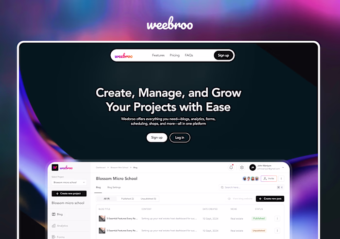
This project stretched the Weebro platform into a robust dashboard interface (with mobile responsiveness). The dashboard enables users to:
Monitor analytics and project metrics
Publish blog content and manage forms
Access shop and checkout flows (eCommerce integration)
Manage team permissions and settings
Navigate across modules via a dynamic sidebar / navigation bar
Objective
Design a dashboard experience for Weebro (web + mobile responsive) that gives users a powerful control center: to manage their projects, track performance, publish content, and run integrated commerce all from one central interface.
Flow Breakdown
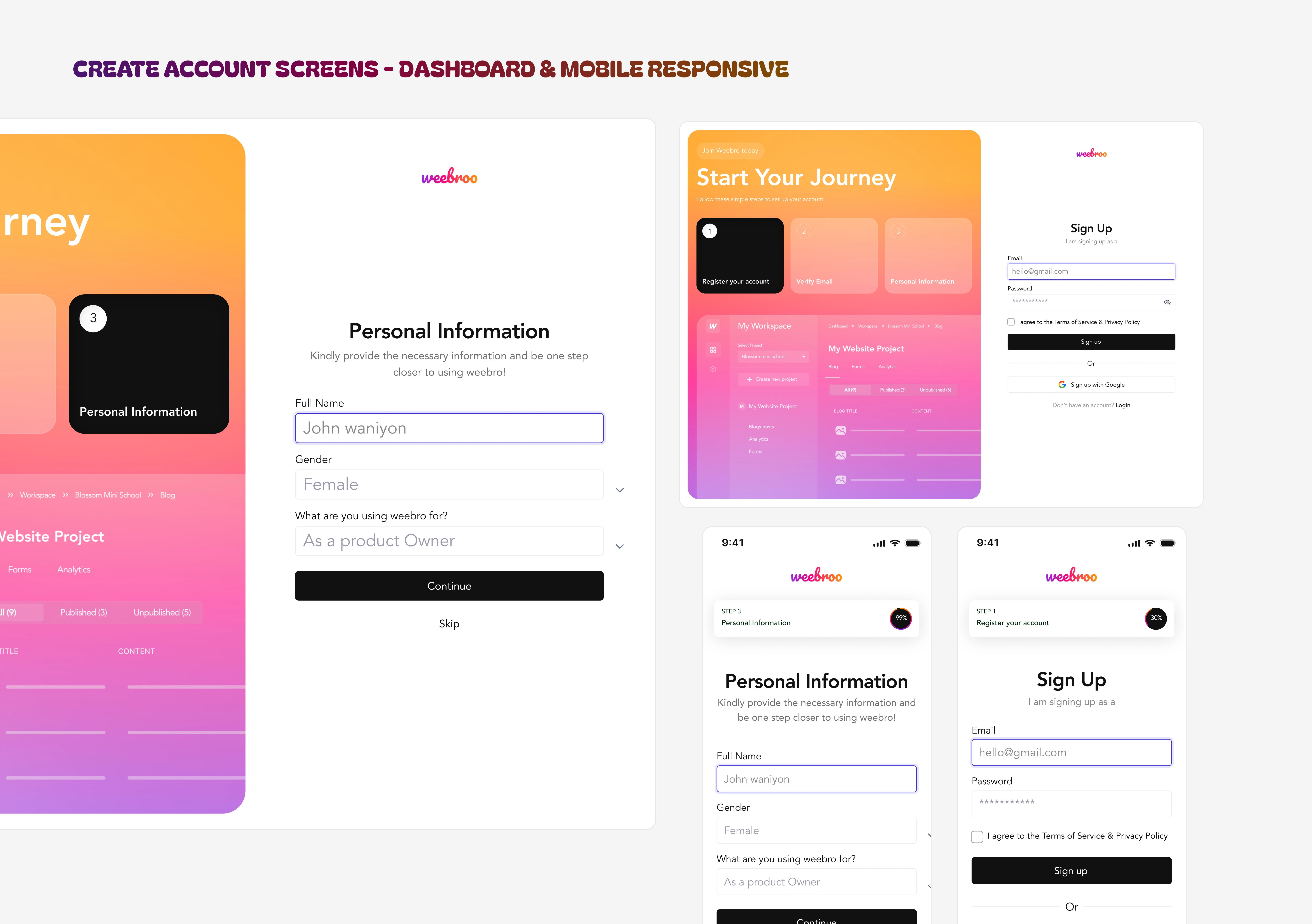
LOGIN / AUTH SCREENS
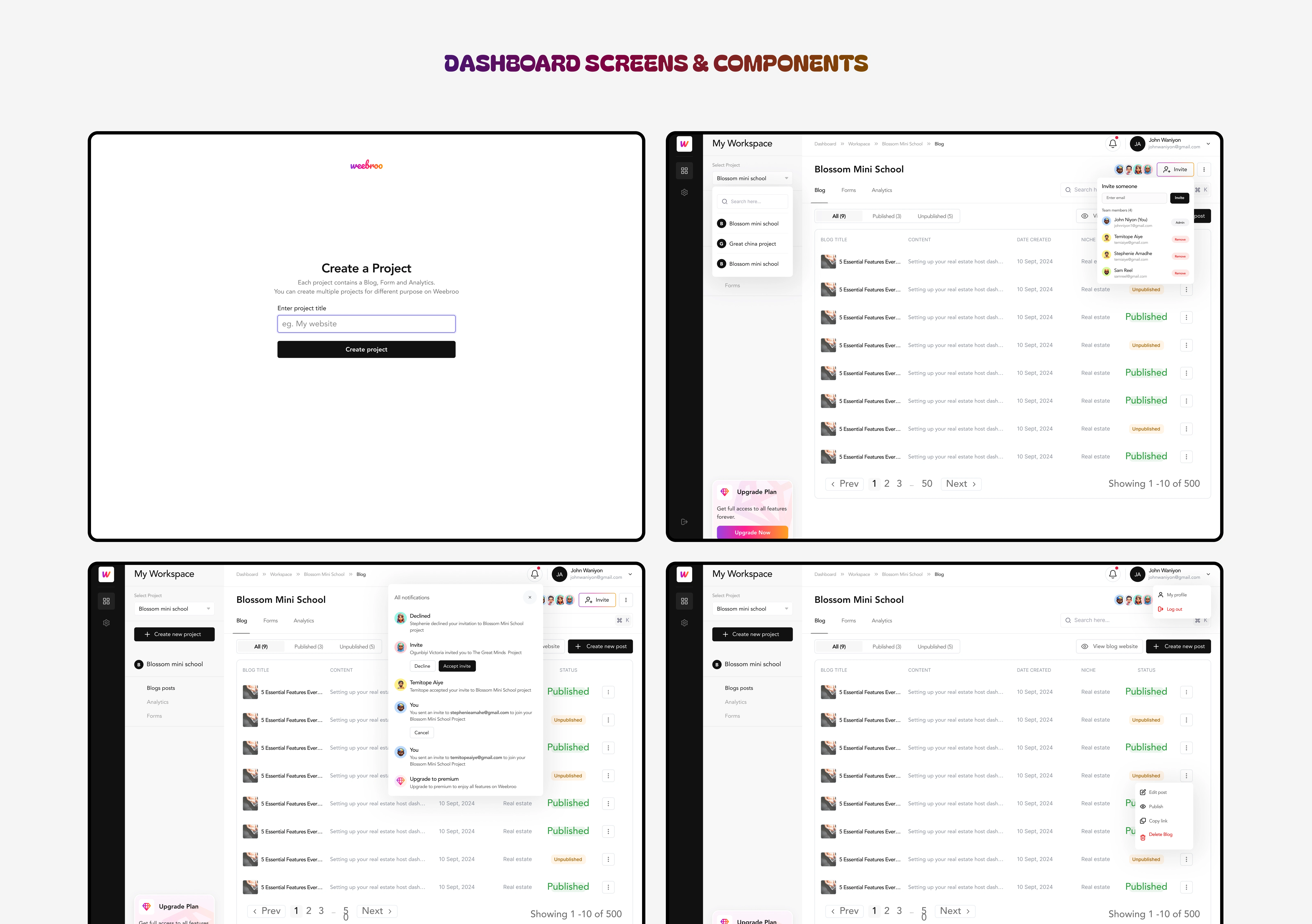
DASHBOARD SCREENS & DETAILED COMPONENTS
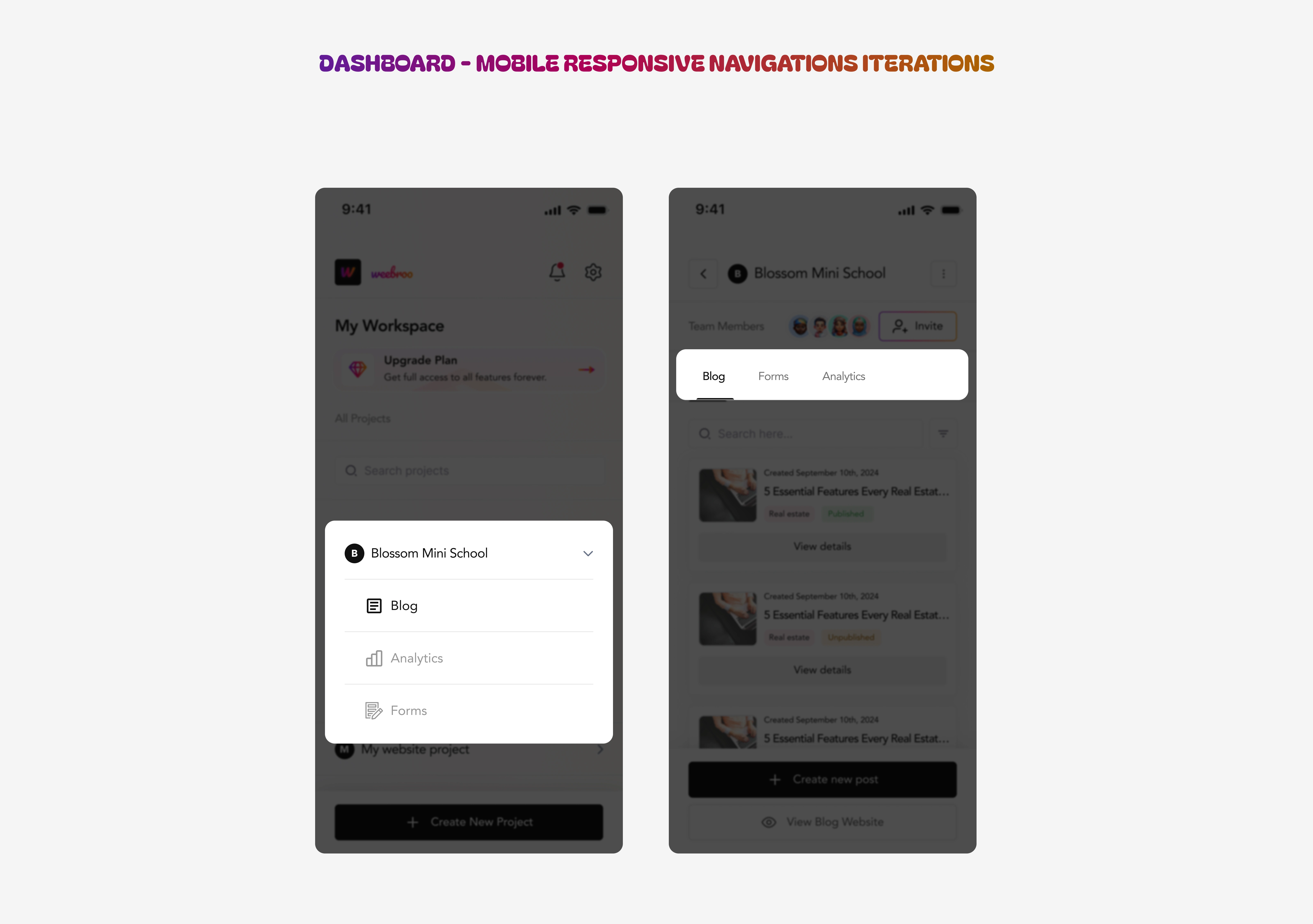
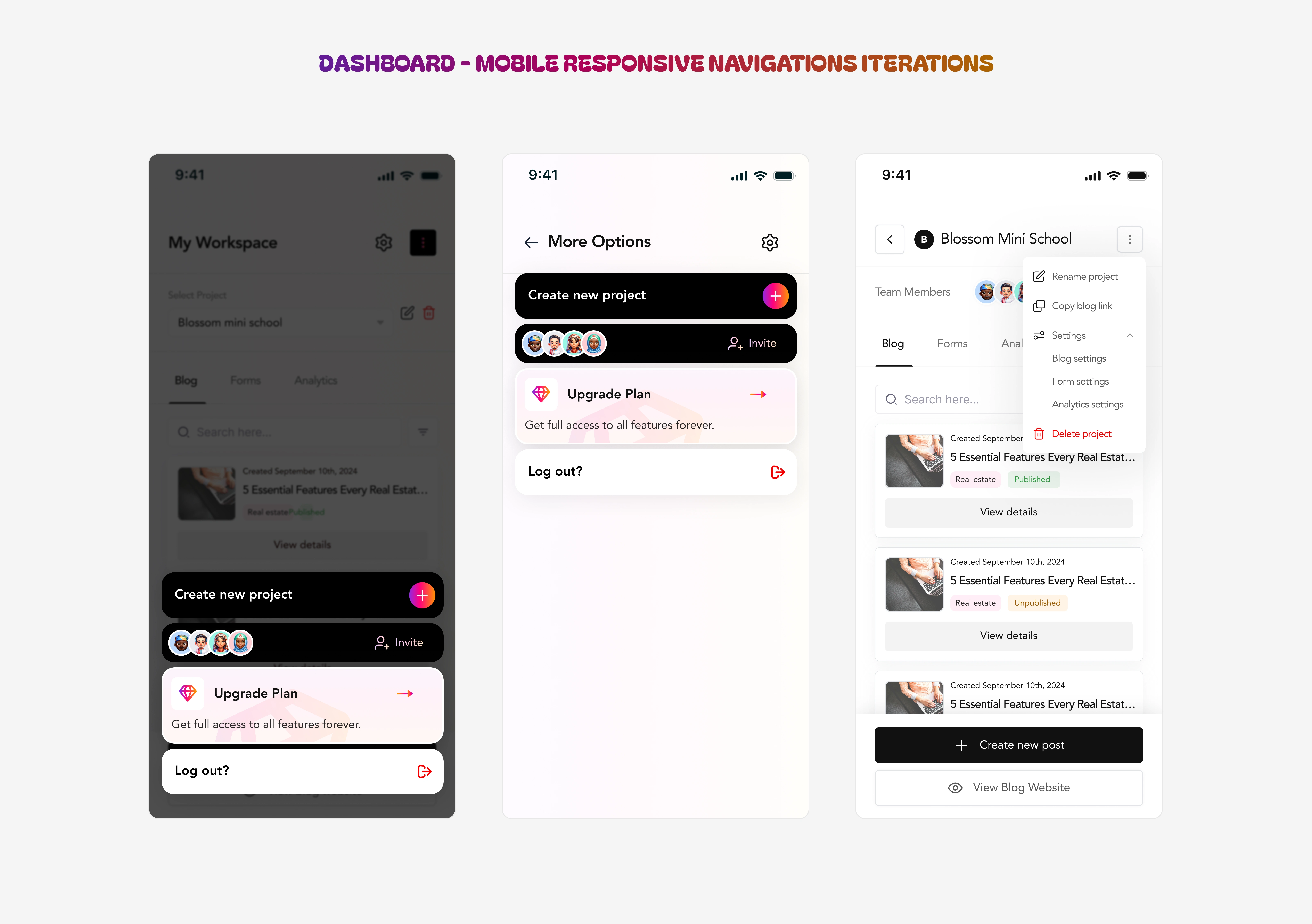
Challenges & Navigation Iterations
Because this dashboard covers many modules and features, the design needed to be clean, minimal, yet powerful and intuitive.
The complex navigation was the biggest design challenge. The dashboard was multi-faceted, and getting users to move across sections without confusion meant I had to design many iterations of sidebar / navbar flows (most especially for the mobile responsiveness) until we landed on a layout that felt cohesive.
USER PROJECT COMPONENTS ITERATIONS
MENU TAB ITERATIONS - MOBILE
These iterations is what led to the final screens for navigation. Simple UX, not disregarding functionality. Here’s a hint into my thought process ; The dashboard had to accommodate multiple modules (blog management, analytics, shop, checkout, and collaboration tools). The challenge was to maintain accessibility without visual clutter. Through several rounds of iteration, we achieved a design that was not only visually clean but also intuitively guided the user to their key tasks.
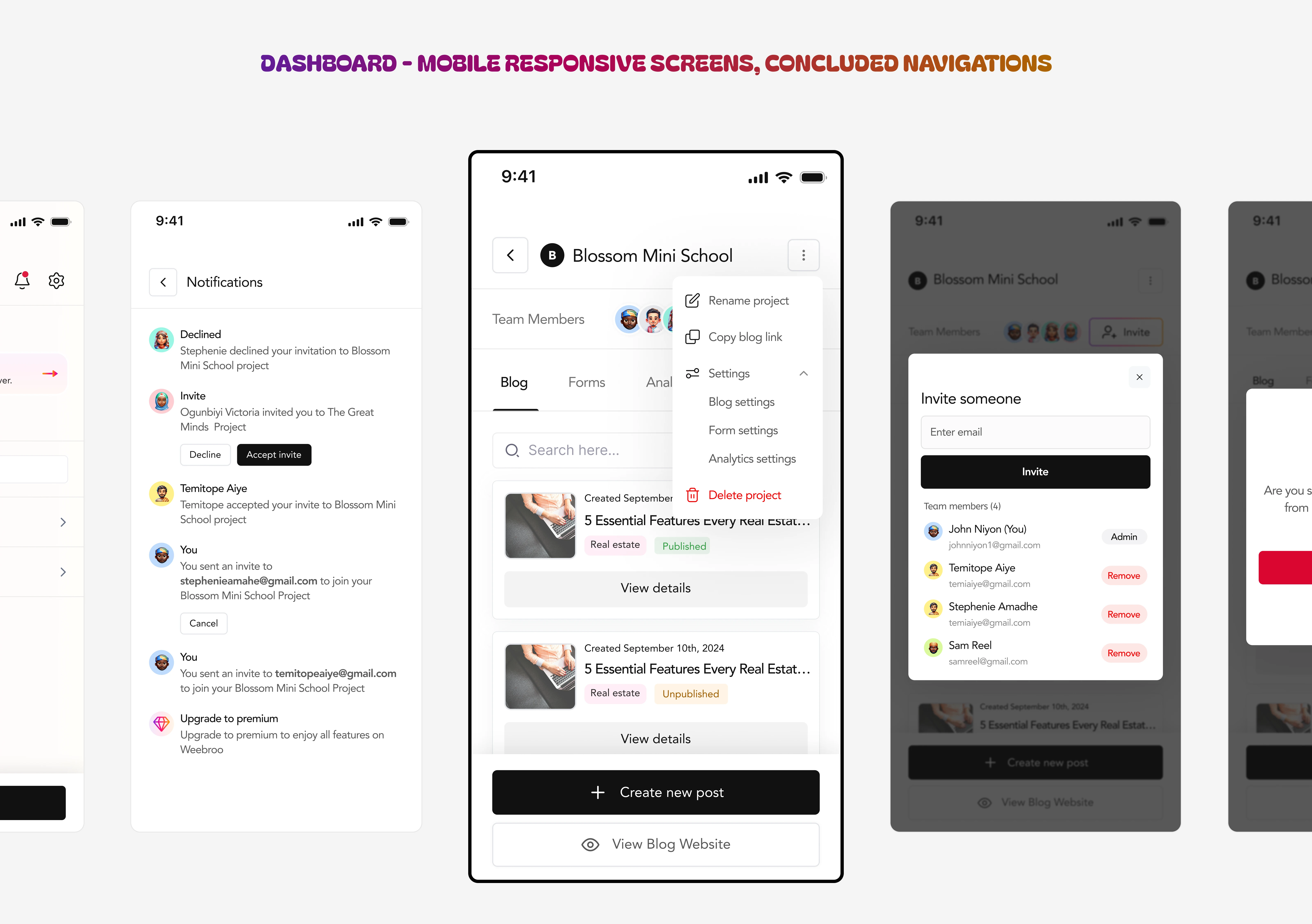
FINAL DASHBOARD ITERATIONS - MOBILE
Other Screens & Flows
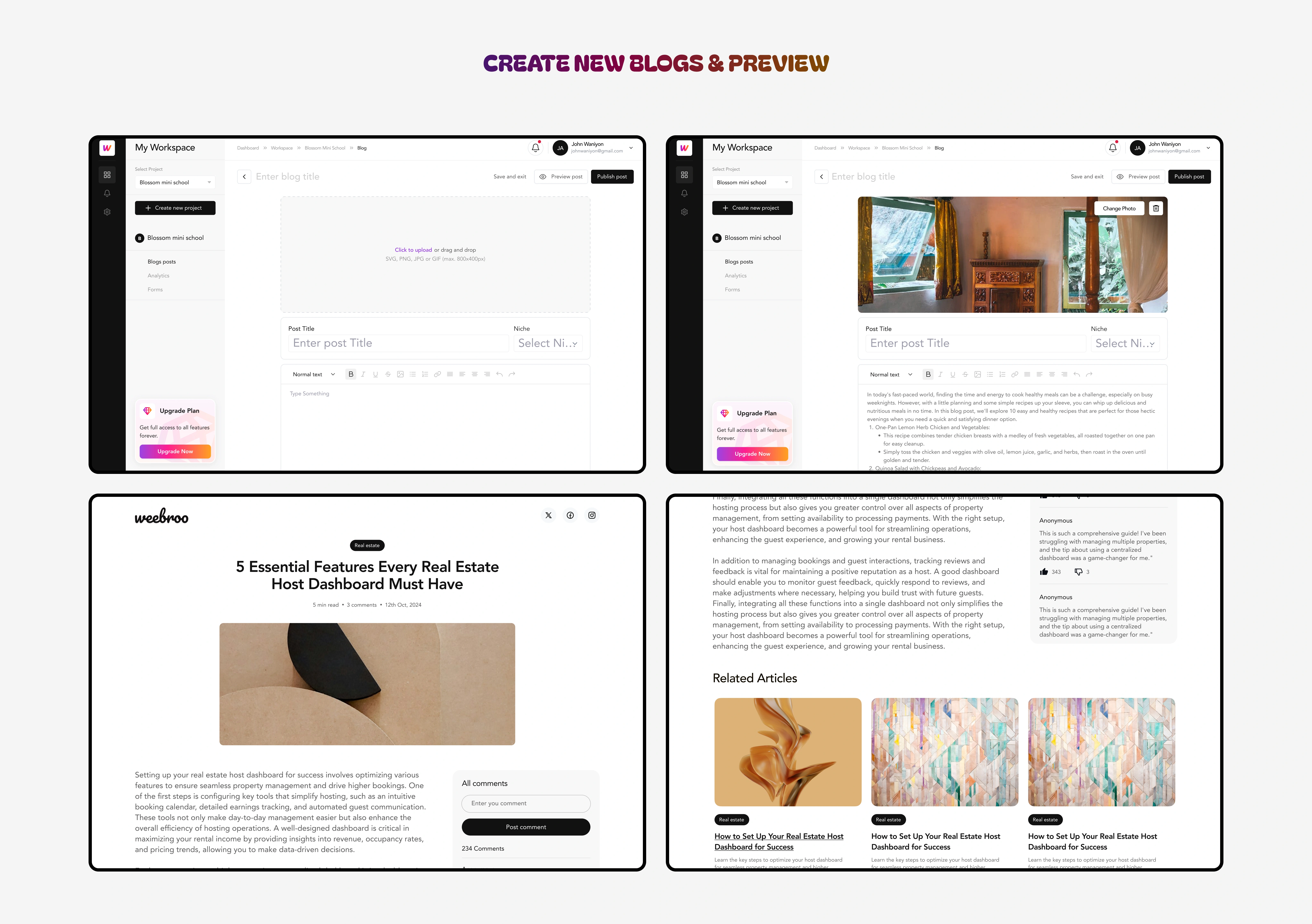
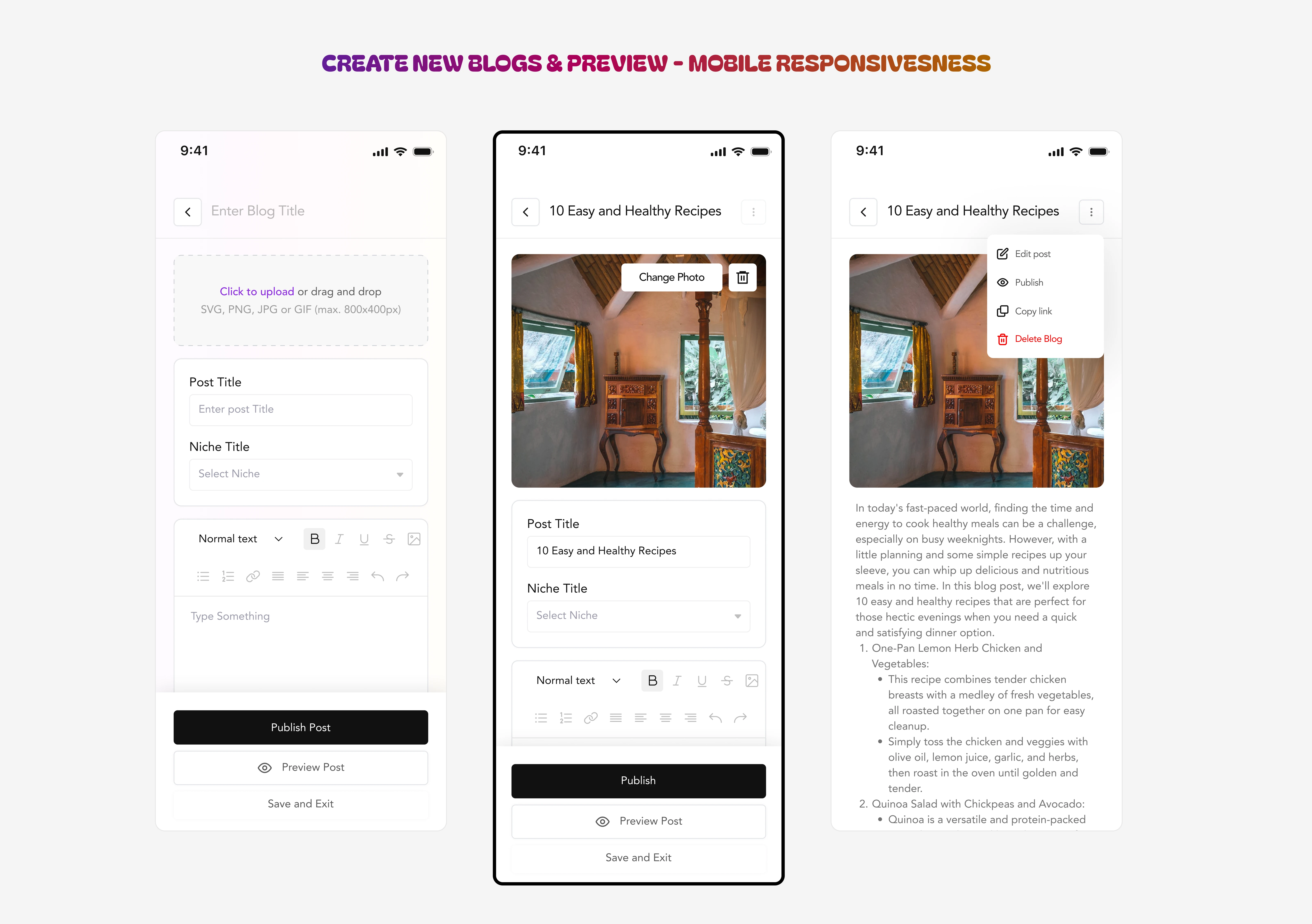
USERS CAN CREATE BLOGS AND PREVIEW HOW COPY WILL LOOK LIKE TO READERS
As mentioned earlier, this was a multi-faceted product with different internal functionalities, as shown below, users will be able to add products for their storefront.

ADD PRODUCT FLOW & COMPONENTS DISPLAY
Integrating e-commerce flows like the shop and checkout process was another exciting challenge, as it required merging a commercial experience within an otherwise operational dashboard. Ensuring that the e-commerce experience felt cohesive with the rest of the product was one of the highlights of this process.
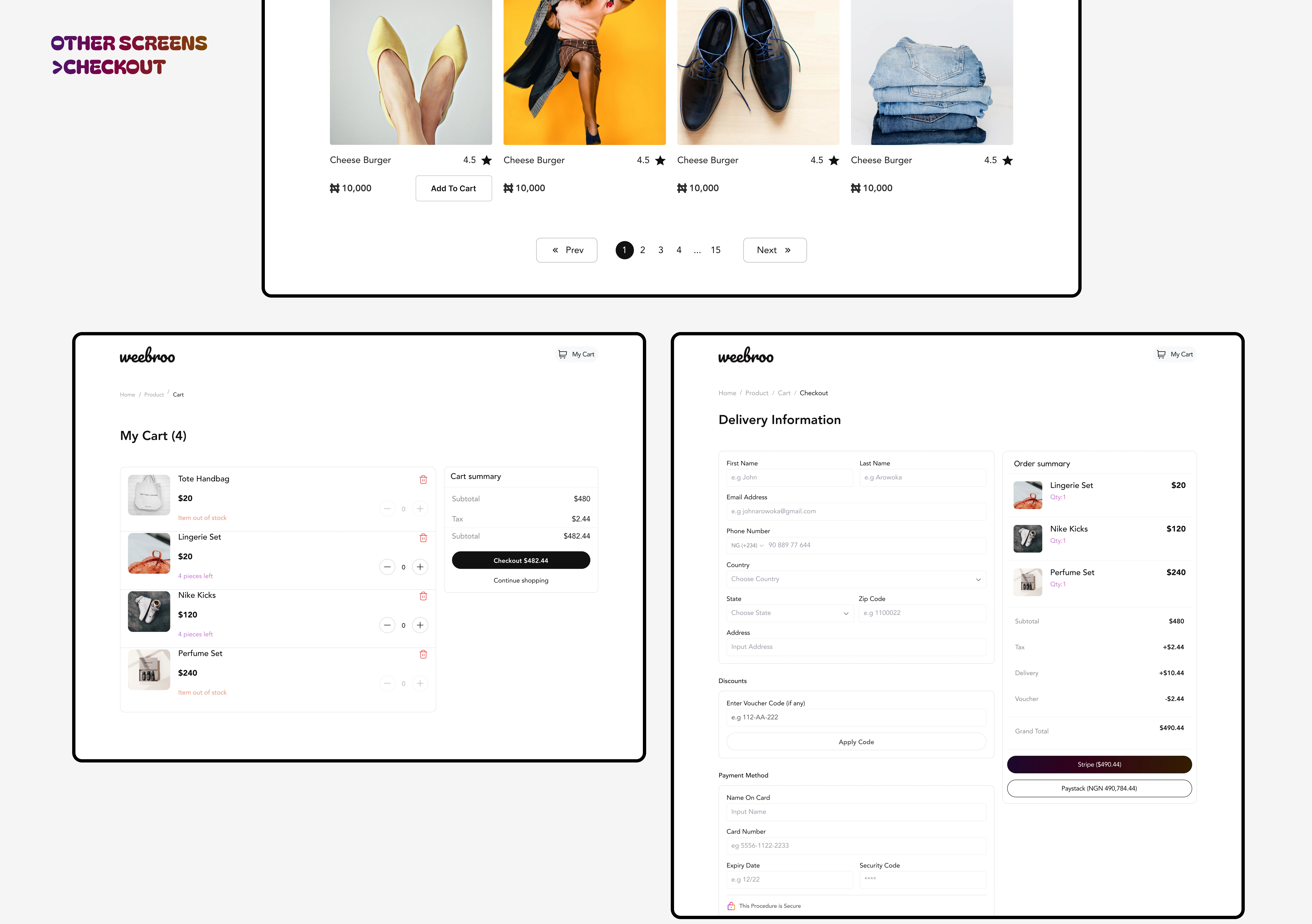
STOREFRONT & CHECKOUT FLOW
Introspection
This project taught me how iteration is my secret weapon. Even when a design looks “clean” and minimal, it often masks dozens of unseen iterations behind it.
Through this work:
I built a dashboard interface that balances elegance and functionality.
I strengthened design decisions by validating navigation through repeated testing.
I prioritized client satisfaction by staying flexible, presenting options, and iterating until both user and client needs aligned.
I ensured the final design wasn’t just pretty; it delivered good UX, modular scalability, and clarity across modules.
In the end, this dashboard is a testament to the power of iteration: you don’t often see the 20 prior versions, but they make the final one possible.
Figma File
Like this project
Posted Oct 25, 2025
Designed a responsive dashboard for Weebro using Figma, enhancing user navigation and e-commerce integration.
Likes
0
Views
6
Timeline
Jun 17, 2024 - Jul 5, 2024