
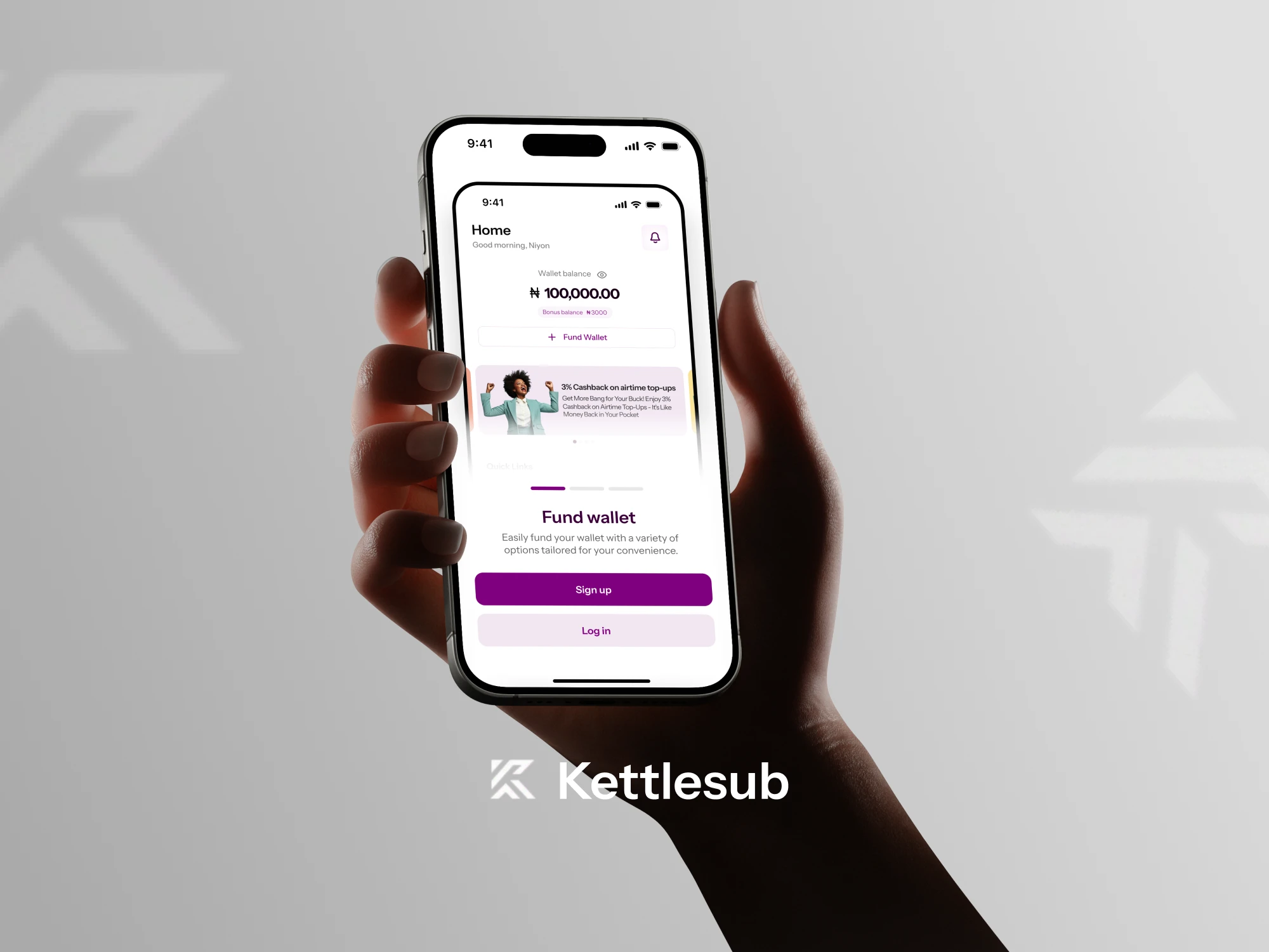
KettleSub — Bills Payment Platform
Overview
KettleSub is a bills payment platform that allows users to easily buy airtime, mobile data, and pay essential bills such as electricity, cable, and internet subscriptions all in one place .
I was brought in to redesign the user experience and refine the flow to make transactions fast, intuitive, and frictionless.
The goal of this redesign was to create a simpler, faster, and more intuitive experience for everyday users while maintaining reliability and trust for returning customers.
Project Scope
Number of Screens: 100+ mobile screens
Design Tool: Figma
Deliverables: User flow, wireframes, high-fidelity screens, prototype
Objective
To revamp existing product and design a seamless, user-friendly digital experience that makes everyday payments quick, transparent, and stress-free.
My Role
Product Design & User Flow Mapping
UI/UX Design (Mobile-first)
Interaction & Visual System
Prototype in Figma
The Challenge
The biggest challenge was simplifying a heavy transactional experience into a clean, easy-to-use mobile flow. The product also needed to balance user expectations, business goals, and clarity around core features like data purchase, airtime purchase, and payment history.
My Approach
This project went through several rounds of iterations. Each flow was reworked multiple times, testing navigation structures, simplifying steps, and ensuring important information stayed visible. I collaborated closely with stakeholders to align design decisions with business value and user efficiency.
Some screens (Before & After)
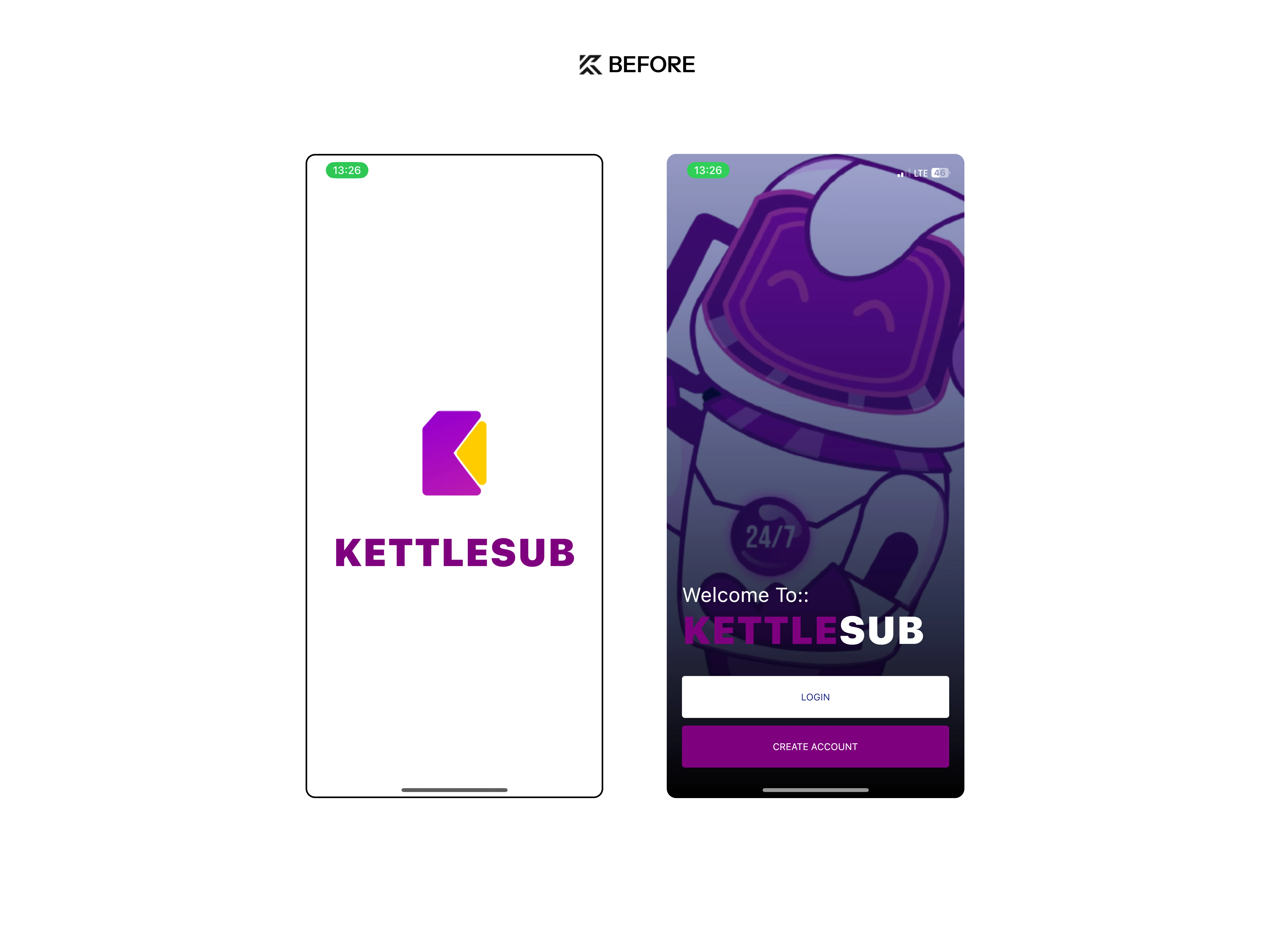
KETTLESUB ONBOARDING BEFORE REDESIGN
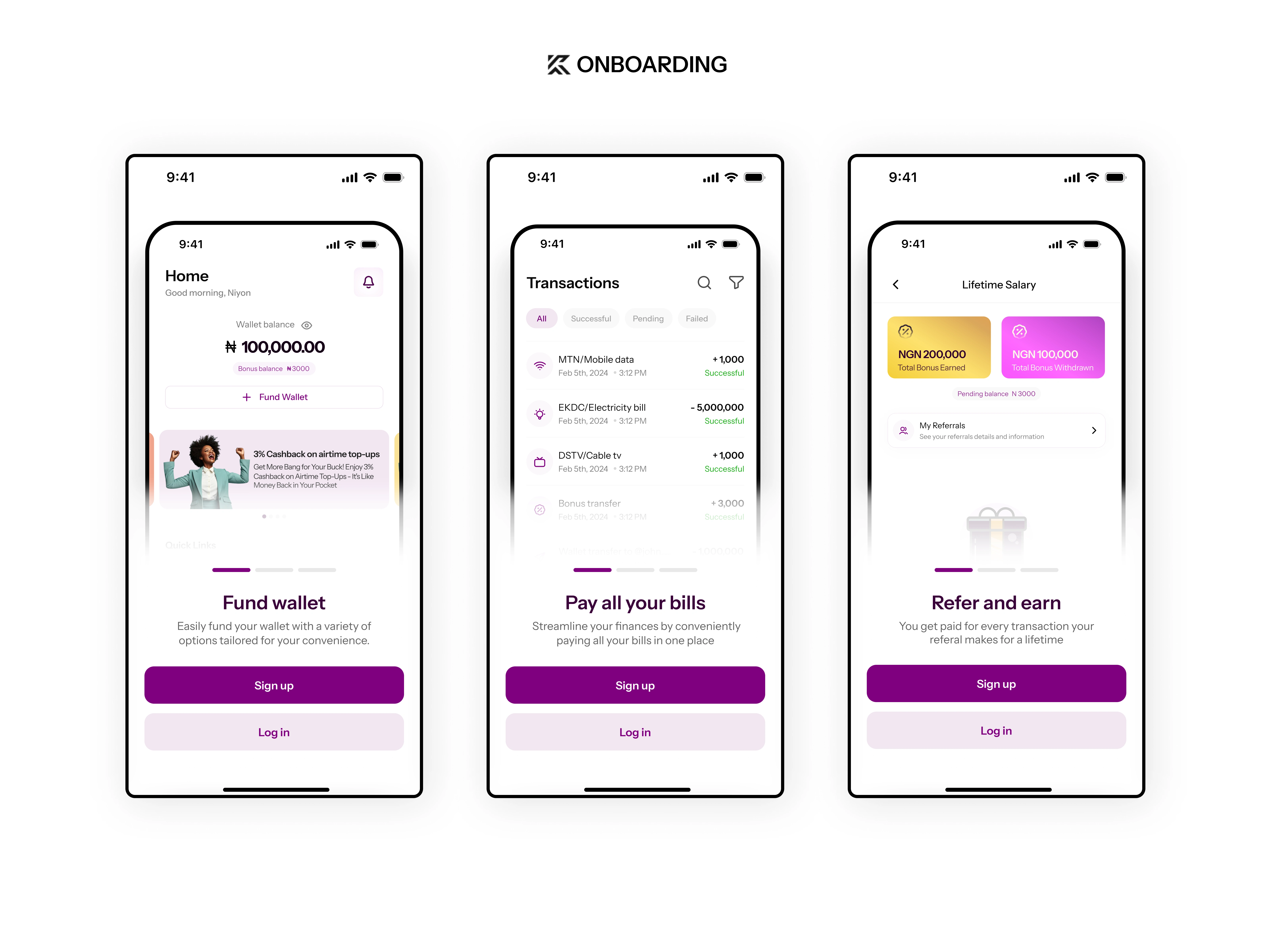
ONBOARDING AFTER REDESIGN - CLEAN UI WITH FOCUS ON IMPIRTANT FEATURES THE PRODUCT OFFERS
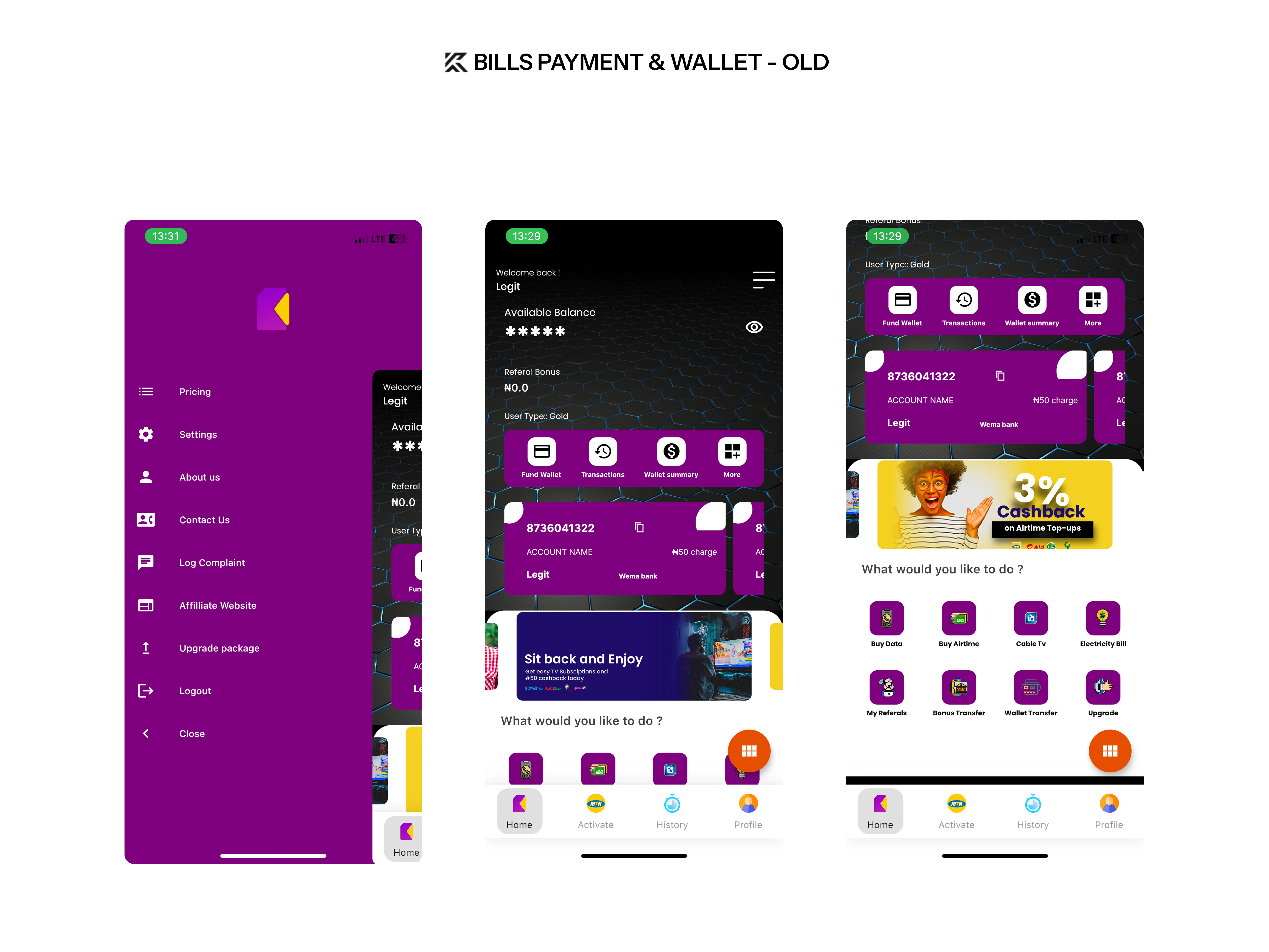
DASHBOARD & BILLS PAYMENT FLOW OLD
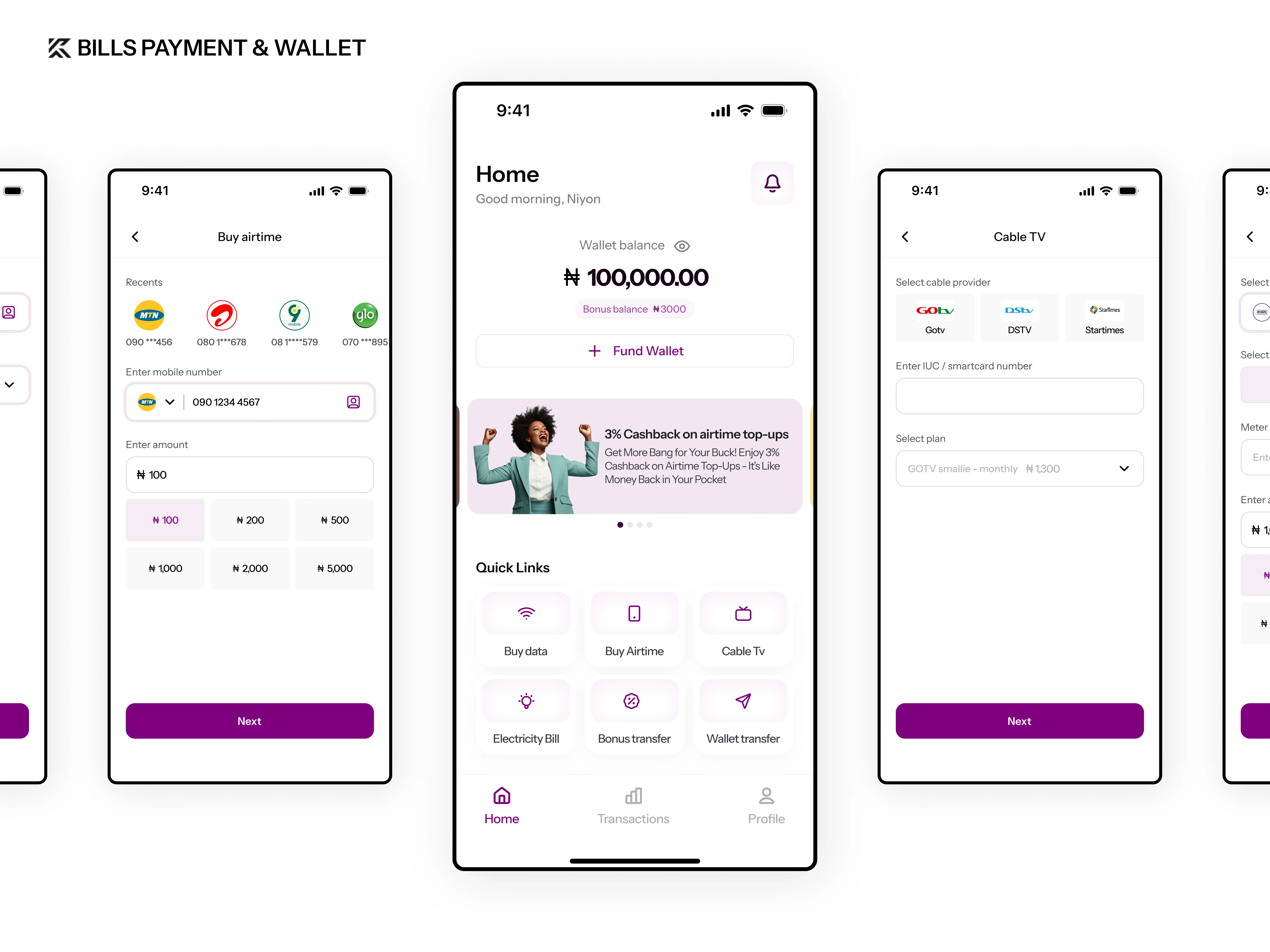
NEW & IMPROVED DASHBOARD FLOW WITH EASY ACCESS TO HIGH VALUED ACTIONS FOR USERS
Each design underwent several rounds of iteration to find the perfect balance between what worked best for users and what aligned with the client’s value proposition.
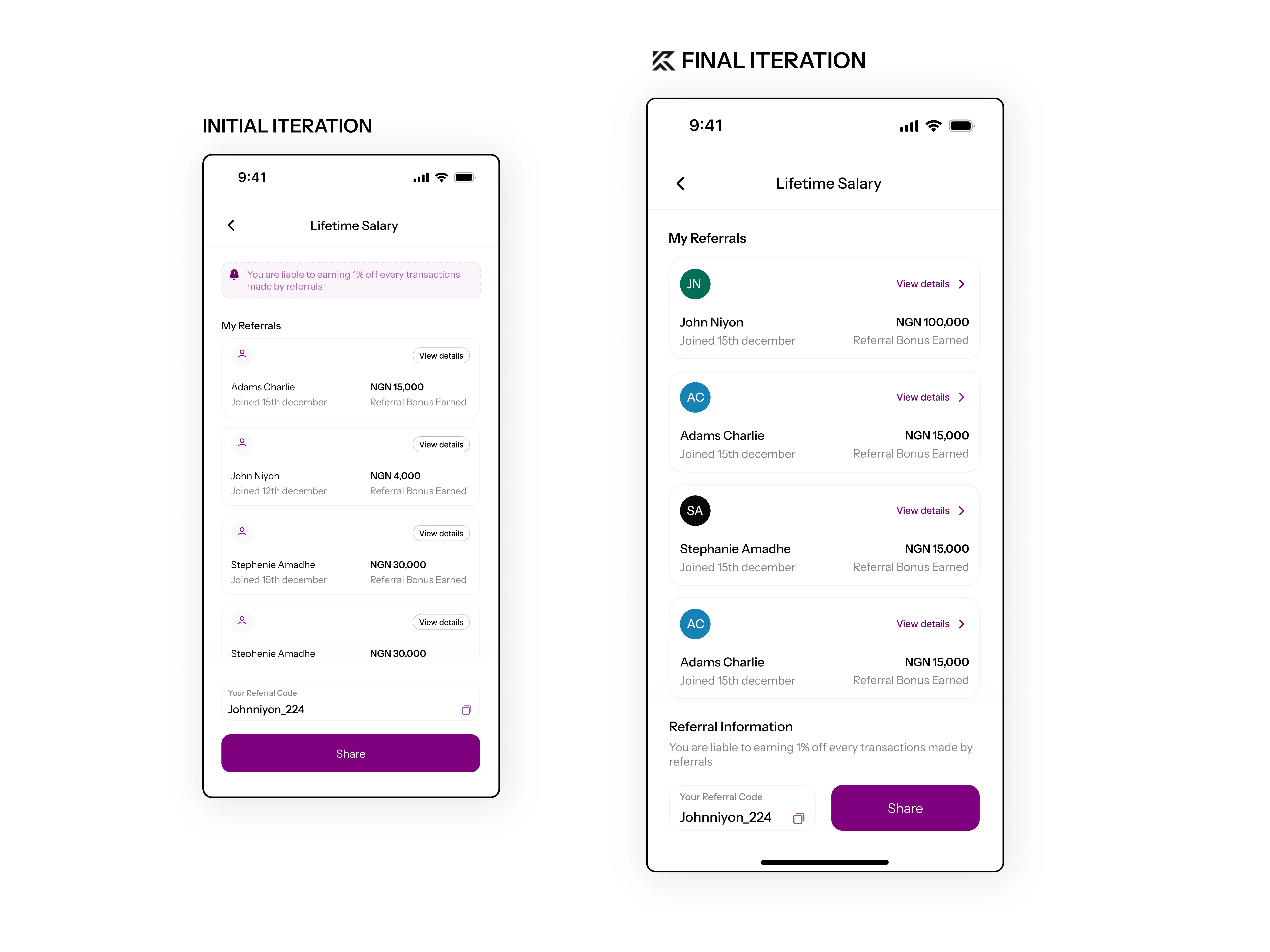
REFERRAL FLOW WENT THROUGH SERIES OF A & B UI TESTINGS AND RESEARCH, BUTTONS WERE PLACED IN POSITIONS THAT WOULD MOVE USER TO ACTION
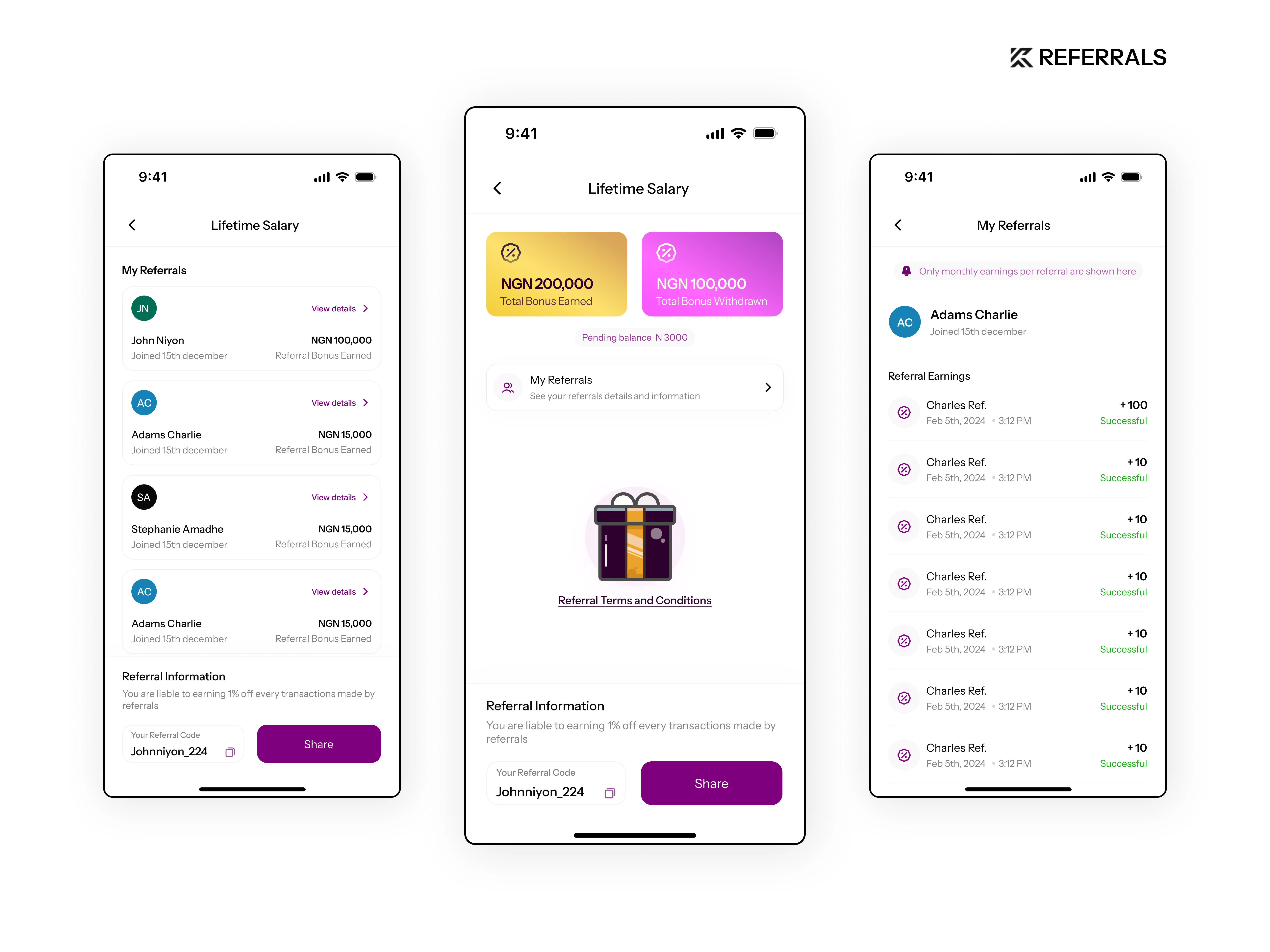
FULL REFERRAL FLOW & TRACKING
Project Outcome
A cleaner, structured payment experience that helps users complete transactions in fewer steps — improving overall efficiency, reducing friction, and increasing trust.
Conclusion & Reflection
Designing KettleSub was a rewarding process that challenged me to think deeply about how everyday transactions can be made faster, clearer, and more human.
Throughout the project, I learned the importance of balancing user simplicity with business goals ensuring that while the product is intuitive for users, it also aligns with the client’s core value proposition.
Most of the design decisions went through a rigorous iteration process to identify which flows best served both user needs and business objectives. This helped refine not just the interface, but the overall product experience and strategy.
Moving forward, I’d like to explore how features like transaction history visualization, smart bill reminders, and AI-assisted suggestions can further enhance user engagement and retention.
In all, KettleSub reinforced my belief that great design is a collaboration between empathy, strategy, and iteration and that every product, no matter how functional, should feel effortless to use.
Figma File
0 likes · 12 views · Oct 23, 2025
Redesigned KettleSub for a seamless, user-friendly payment experience.
Timeline
Mar 23, 2024 - Apr 30, 2024
