Built with Kajabi
Kajabi Website Redesign for Startup School for Seniors
Richelle Macachor
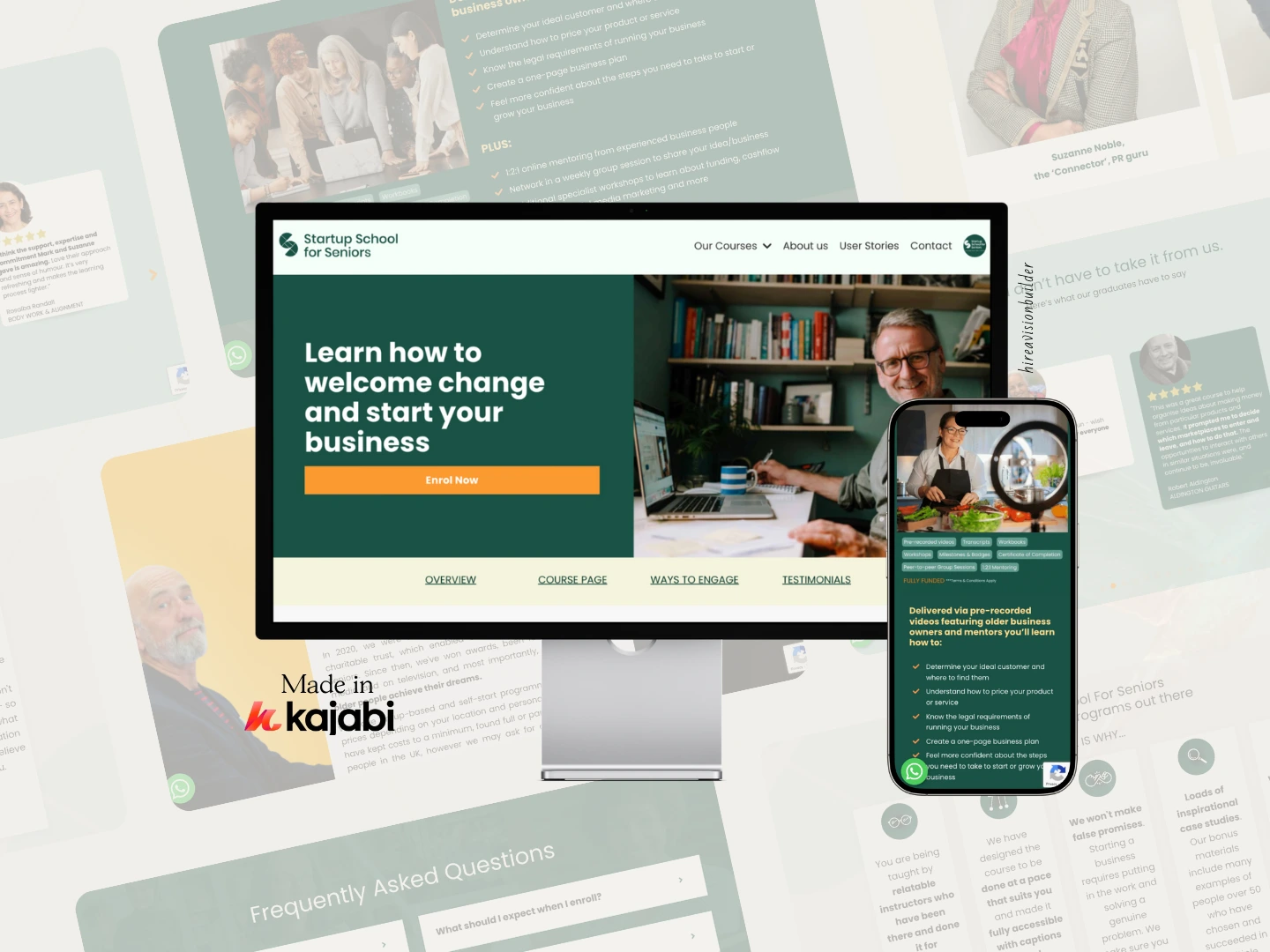
Startup School for Seniors (SSFS), led by entrepreneurs Suzanne Noble and Mark Elliot, is a UK nonprofit providing free business education for adults aged 50+. Their existing site had grown messy over time, with outdated layouts, scattered pages, and inconsistent user flows that weren’t supporting enrollment goals or the credibility of the program.
They had already worked with multiple Kajabi developers in the past — all of whom overpromised and underdelivered — leaving the site half-built, visually inconsistent, and difficult for their audience to navigate.
They needed a Kajabi website that was clean, modern, intuitive, and structurally aligned with the way older learners make decisions online.
The Stakes
For SSFS, their website is the front door to the entire organization. It needed to:
Build trust instantly with learners who may not be tech-confident
Communicate the legitimacy of their funder-supported program
Give a frictionless way to understand the offer and enrol
Represent Suzanne and Mark’s 10+ years of entrepreneurship credibility
A confusing, outdated, or inconsistent website was a direct threat to their mission — fewer enrollees, skeptical visitors, and missed opportunities to scale the program.
They didn’t just need a “better looking” site. They needed a build that supported user psychology, removed friction, and converted interest into real enrollments.
The Strategy
We rebuilt the entire Kajabi site around clarity, trust, and ease of use — designed intentionally for a 50+ audience. Key actions included:
Website Structure & UX
Completely restructured the site map to simplify navigation and improve the enrollment journey
Designed a conversion-focused homepage with clear storytelling, credibility cues, and direct next steps
Created a friction-free “How It Works” experience tailored to older adult learners
Optimized mobile layouts for readability and ease of scrolling
Kajabi Build & Design
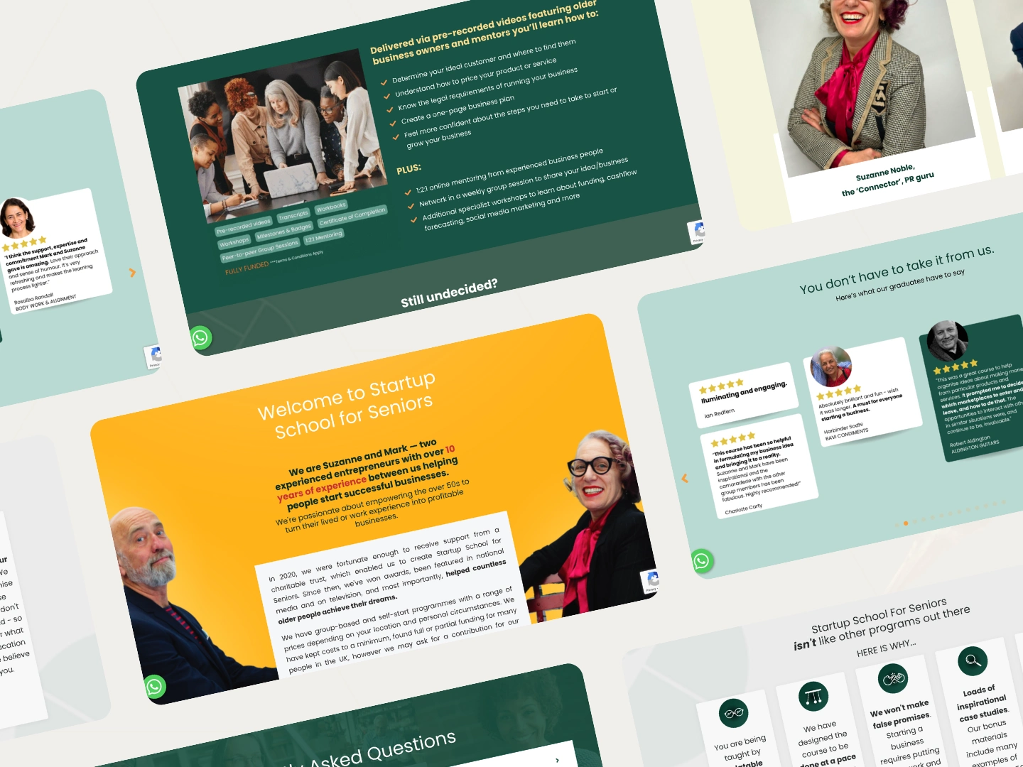
Rebuilt key pages (Home, Courses, About, User Stories, Contact) with cohesive branding and modern layout
Integrated custom design elements that matched the warmth and credibility of SSFS
Updated typography, spacing, and visual hierarchy for accessibility and readability
Cleaned up all duplications, outdated assets, and broken links from previous developers
Enrollment Experience
Refined the program pages to highlight outcomes, support, and community
Streamlined CTA placement so visitors always know their next step
Updated confirmation pages and micro-copy to reduce confusion
Client Empowerment
Ensured all pages were easy for Suzanne to update on her own
Delivered short training videos + a clean content folder system for long-term sustainability
The Shift
The new Kajabi site immediately transformed how SSFS was perceived — both by first-time visitors and long-time community members.
With a modernized design, intentional structure, and clearer messaging path, visitors could finally understand the program without clicking in circles or getting lost.
As a result:
More enrollees than they had ever received before
More learners completing the program
More positive feedback about the site’s usability and clarity
A direct improvement in user confidence and trust
Most importantly, Suzanne and Mark saw newfound potential for scaling the program — because the site finally reflected the professionalism and impact of their work.
View the live site here: https://www.startupschoolforseniors.com/
Your Next Move
If you’re ready to upgrade your Kajabi website — not just visually, but strategically — you deserve a build that feels clear, cohesive, and designed for actual conversion.
Let’s create a Kajabi site that does the heavy lifting for you: communicates your value, streamlines your user journey, and supports your growth.
Book a call and let’s build a Kajabi experience your audience will love.
Like this project
Posted Nov 14, 2025
Redesigned SSFS’s Kajabi site with clearer UX, modern visuals, and a streamlined journey that boosted enrolments and improved the experience for adults 50+.
Likes
1
Views
14