Crafting an efficient payment gateway solution for gleek.io
Felix Osiobor
CLIENT INTRODUCTION
Blocshop s.r.o. stands as a distinguished boutique software development agency, prioritizing the creation of meticulously customized, top-tier software solutions exclusively for a handpicked clientele. Its core emphasis rests on delivering software that is not only precisely tailored but also synonymous with excellence in quality.
CLIENT'S PROJECT
Gleek.io is a revolutionary tool that simplifies the process of crafting intricate software diagrams. With gleek.io, you can say goodbye to tedious mouse-driven tasks as gleek.io empowers you to effortlessly generate diagrams using just your keyboard, streamlining your workflow and enhancing your productivity.
Challenge
Gleek.io, a unique software for architectural diagrams, demanded more than premium features due to its distinctiveness. We understood the importance of an innovative payment gateway that breaks away from templated norms. This required a meticulous, empathetic approach to ensure seamless user adoption.
Our goal was to ensure a seamless transition for free-tier users to the paid tier, safeguarding against any potential loss of conversions.
Approach
I thoroughly explored gateway payment design options, aligning them with our unique needs. I actively sought feedback from colleagues and the product manager, seamlessly integrating it to refine and align the design with our project goals.
Services rendered
Product Design
Illustrations
UX interviews
Role
UX/UI design
User empathy advocate
Timeline
Sept. 2019 - Oct. 2019 (2 months)
Product platform
Desktop
Accomplishments
Crafted a tailored website that serves as a unique showcase for gleek.io, conveying its essence to users and visitors through innovative design
Delivered a thoroughly refined payment gateway design that facilitated users conversion
Additionally, revamped the app's UI, encompassing gleek.io's file management solution and the main application screen, to enhance the overall user experience.
🍃 Notable points · Solution process walk through
As with any design challenge, the foundational step involves the precise definition of the problem, an in-depth analysis of its root causes, and the formulation of potential resolutions to effectively address the issues at hand. It is this systematic approach that typically paves the way for the realization of anticipated objectives.
In pursuit of this methodology, I embarked on a journey to gain a profound understanding of the problem at its core.
Uncovering the problem
Following the standard software release protocol, it was decided to introduce an MVP (Minimum Viable Product) with the primary objective of gaining profound insights into user preferences and requirements. The reception was promising, as we received a substantial volume of valuable feedback, shedding light on users' precise needs and expectations.
To comprehensively assess user interactions with both the website I designed and the MVP of the application, we employed the analytical tool Hotjar. Through the generation of informative heatmaps, we discerned where users' attention was most concentrated and, conversely, where it waned. Armed with this invaluable insight, we strategically optimized our layout design, positioning it for maximum efficacy and success.
Iterative design solution
Step 1 - placing the pricing nav link
In this context, I undertook a comprehensive examination of the pricing page's design. Given the paramount importance of conversions within the project's scope, I strategically positioned the pricing page navigation link to be readily accessible while maintaining a delicate balance to avoid undue prominence.
By adhering to a concise selection of three top navigation links and strategically positioning the 'pricing' link at the final slot, this intentional arrangement was aimed at enhancing discoverability.
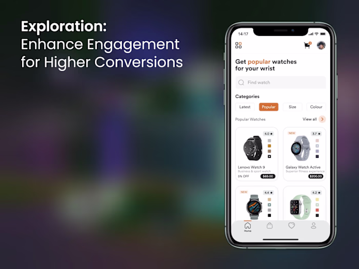
Step 2 - designing the pricing page
In this phase, I strategically crafted a user-friendly layout, prioritizing clarity for swift comprehension. A toggle component was introduced at the page's outset, enabling users to effortlessly switch between 'Billed annually' and 'Billed monthly' options.
Capitalizing on the left-to-right reading pattern of the English language, the preferred choice, 'Billed annually,' was thoughtfully placed on the left. This deliberate arrangement served the dual purpose of providing users with greater functionality while aligning with the business objective of enhancing conversion rates.
Step 3 - Things I considered
Leveraging established monetization UX patterns within the webpage, I meticulously accounted for the scenario in which users navigated from Billed annually to Billed monthly. To re-engage their interest in the Billed annually payment option, I strategically introduced a UI component.
This element was strategically positioned atop the Billed annually toggle button and would dynamically appear when users selected the Billed monthly option, effectively prompting their reconsideration of the annual billing choice.
Solving the pricing page for gleek.io
Solving the payment gateway experience on the website
Following the extensive efforts dedicated to refining the pricing page, it became paramount to ensure a seamlessly enjoyable payment gateway experience from a design perspective. I delved into various options to present this crucial step to users in a manner that not only instills a sense of accomplishment but also cultivates delight and satisfaction in their decision to acquire a product poised to elevate their software diagramming experience to new heights.
Explored - Alternative #1
Rather than adhering to a conventional payment gateway design, I employed a forward-thinking approach by amalgamating two key components. The primary aim was to ensure users were consistently reminded of the significant benefits they would acquire through the premium plan they were about to purchase.
The layout I crafted ingeniously positioned the premium plan's pricing and services on the left side, complemented by the payment details form on the right. This layout adheres to a well-established eCommerce pattern, which strategically maintains the purchased items within the user's field of view throughout the transaction. This persistent visibility serves as a reassuring reminder to users of the exceptional value they are gaining from their investment.
Premium plan features and payment form together
Explored - Alternative #2
We evaluated an alternative approach, which directed users to a dedicated payment gateway UI page, encompassing the payment form and all its functionalities.
However, upon careful consideration, this method deviated from the unique and special experience we aimed to deliver to users during the purchase of our product.
Consequently, we opted for alternative #1 over alternative #2, aligning with our goal to provide users with a distinct and gratifying payment process.
Dedicated payment gateway UI page featuring only the payment gateway
Payment gateway experience in the app
We strategically positioned monetization calls-to-action (CTA) within the application itself to actively prompt users to consider upgrading to the premium plan. These placements were thoughtfully selected to strike a delicate balance, ensuring that users were neither overwhelmed nor distracted from their seamless utilization of the free-tier plan. This approach sought to harmonize user experience with the promotion of premium features.
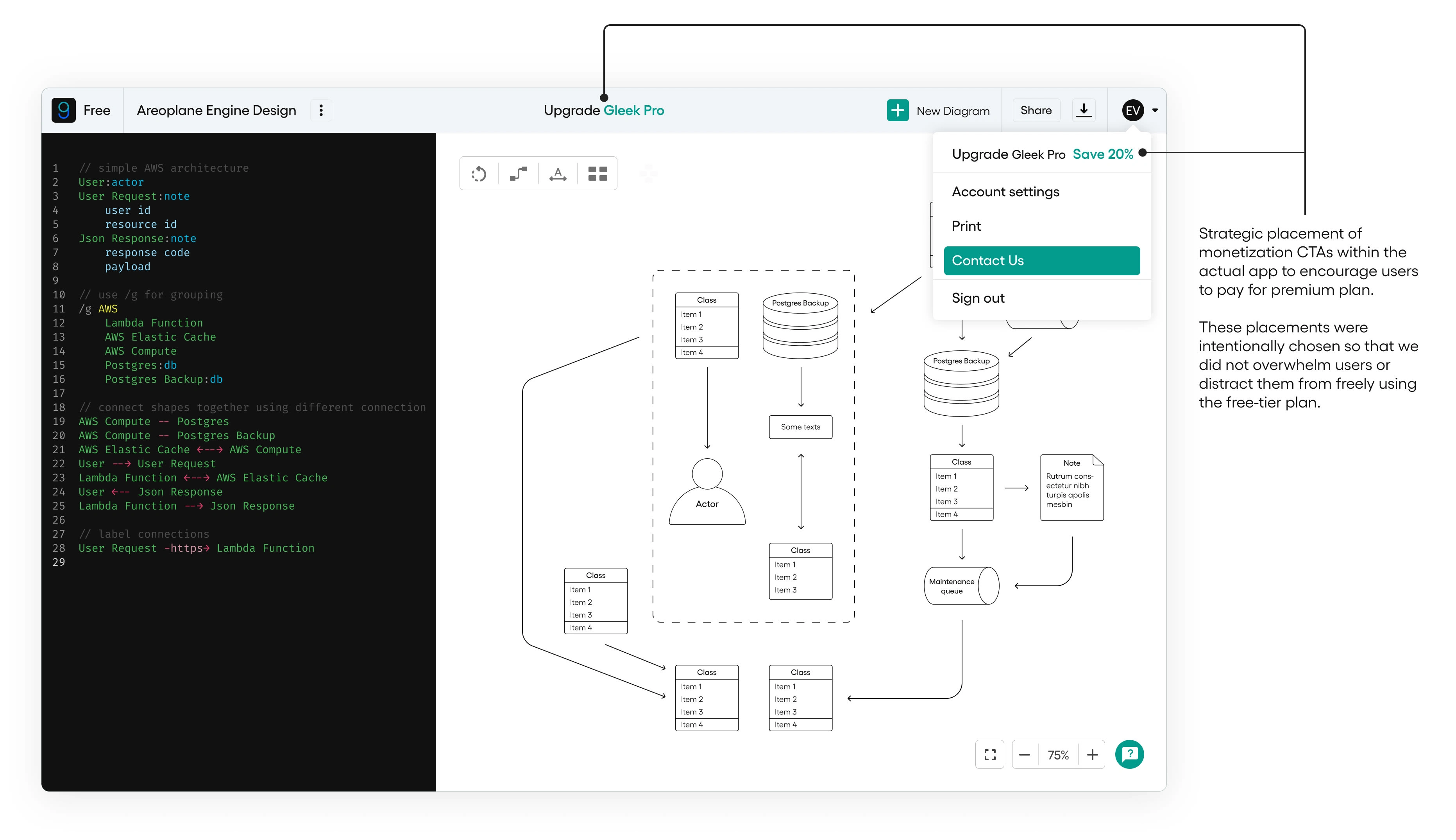
Strategic placement of monetization CTAs within the actual app
🌠 Key Takeaways
This endeavor was an investigative undertaking, one that demanded unwavering dedication to ensure its comprehensive success—a commitment I wholeheartedly embraced. My role encompassed a multifaceted approach, where I meticulously revamped the user interface (UI) of the gleek.io application. This was prompted by the discovery of certain suboptimal UI elements that posed a potential threat to the overall success of the product, particularly in the realm of payments.
The ultimate triumph of this project can be attributed to the collective brilliance of the Blocshop s.r.o. team. Collaboratively, we navigated challenges as they emerged, drawing from our informed insights to provide effective solutions. These solutions were meticulously crafted to propel the gleek.io product toward an unequivocal path to success, exemplifying the power of collaborative expertise.
🎮 Try is out
Now, allow me to introduce a personal favorite of mine—gleek.io—a platform I highly recommend you explore. I'm confident you'll appreciate its remarkable capabilities and recognize the immense value it brings.
As you embark on your journey of software architecture diagramming, gleek.io stands ready to become an invaluable tool for your brainstorming and visualization needs.
Like this project
Posted Sep 5, 2023
Gleek.io—Merging product design craftsmanship and data-driven decision making to build an impactful payment gateway. Nearly 1k users since its launch.
Likes
0
Views
54