Designing Packaging for a Vegan Cosmetics Line
Have you ever felt overwhelmed in front of the number of cosmetics at your local pharmacy? Have you ever wondered if the products sold in their beautiful packaging is actually working? Where the products used are made from?
It's usually hard to make a choice when choosing a new range of cosmetics products.
What influence you when making a final choice? Are you simply looking at the price? Are you determined your choice through a long comparison beforehand on the internet? Do you make your research based on influencers you found on social networks?
Are you aware of the products listed in the ingredients?
Brief
Today, the fresh wants to suggest a new range of cosmetics, a sustainable and natural line for everyone. The products are vegan and purely plant-based without animal testing.
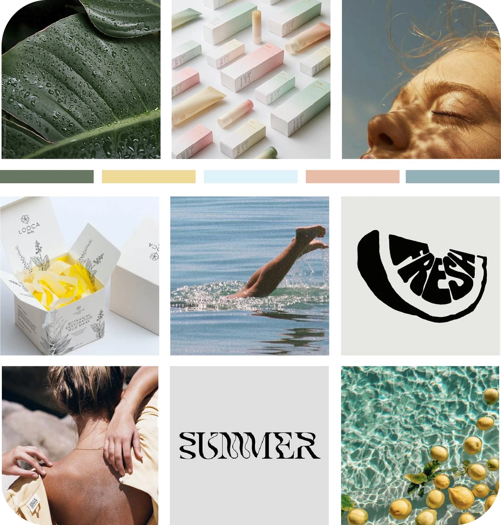
To implement that, the developing team and the main creator Anna at the fresh asked for developing a colorful yet luxurious visual identity. They want to play with pastel and fresh color palette, combined with playful but audacious typography.
The goal is simple. Bring back the real essence of cosmetic, use the nature we have around us to make quality products and targeting who ever want to try it. The products are middle-range so not part of luxury goods, but still a bit precious and really qualitative.
Anna is about to launch her product, she needs logo and packaging design now.
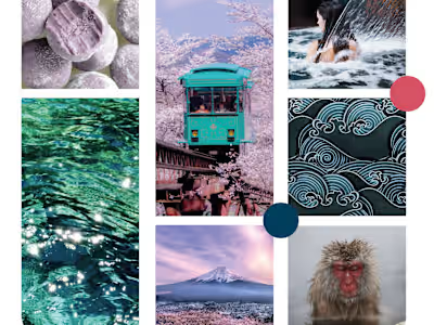
Create a moodboard for inspiration, to get started !
the fresh
the fresh is a New Zealand (Napier) brand locally made, from natural products only. The client wants a branding that can reflect that sourcing. The brand is young, dynamic and wants to influence the current fast-consumption of our society. They want to bring a fresh and strong vision of our world : consuming more sustainably and locally.
For that, I want to make the brand playful and friendly but dauntless with strong messages.
Veganism is still controversial in a lot of societies. In New Zealand, people are aware of veganism and we estimate the vegan population's pourcentage at an average of 10% in 2022, which is not too bad. As I've been leaving in New Zealand for 2 years (2020-2022), I can say that in fact, the local companies (cafes, restaurants, supermarkets) have developed quiet a large range of products to satisfy the vegan community. There is choice, competition between brands and depending on the town, you could even have quiet a nice selection of vegan restaurants.
The vegan range of cosmetics products exist as well and New Zealanders are proud of it : the antipodes is a competitor as well as ethique.
Logos

the main logo of the fresh
For this logo, I choose a bold font for the main word "fresh" as I want it to be impactful and strong. The word "the" is a bit more playful and young, so more attractive to the generation of 25-40 yo. Also, I choose to use a non capital letter to add friendliness to the image of the brand.
1: The main logo (first one on the left) is condensed with the "the" on the vertical. It's making it even more creative and unique.
2: The second logo is useful in case we need the logo to be fitting in a text or on a horizontal line.
3: The last version is the mark of the brand. "the f." should be enough to anyone who know the brand to associate it with the fresh.

1 2 3
Pictures
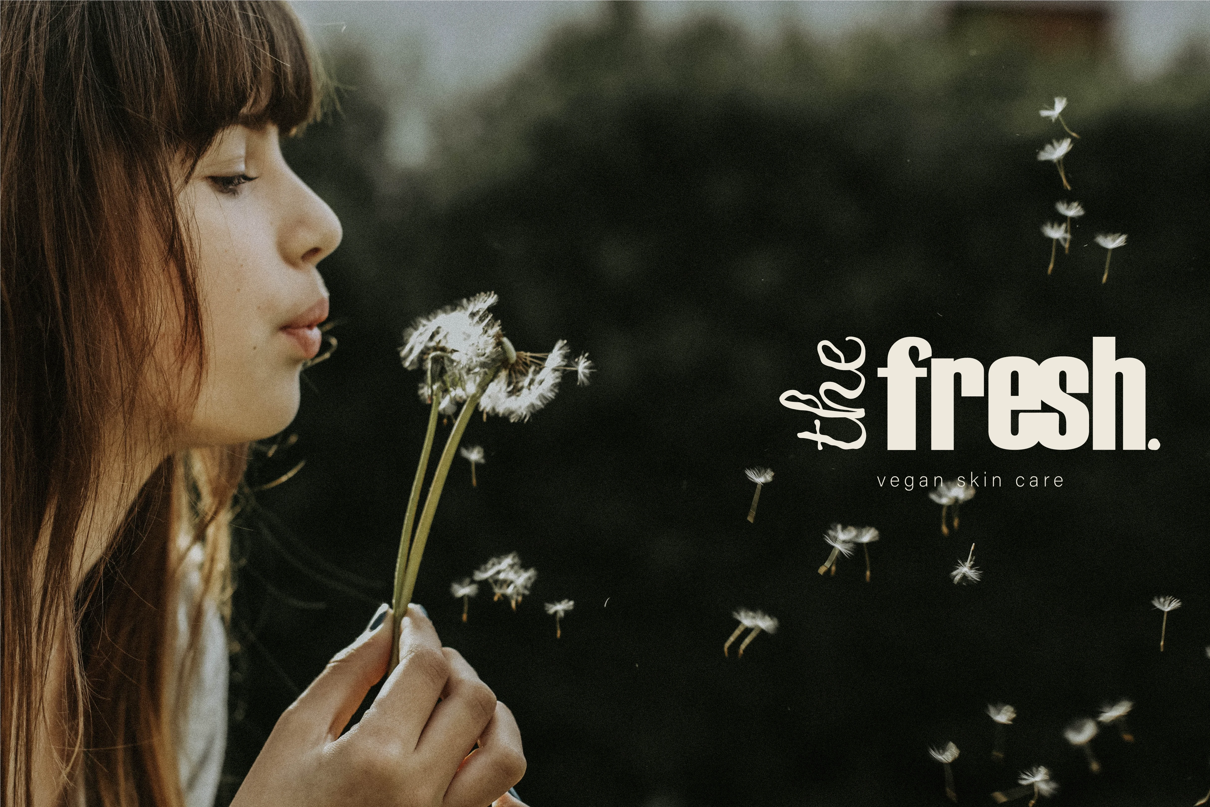
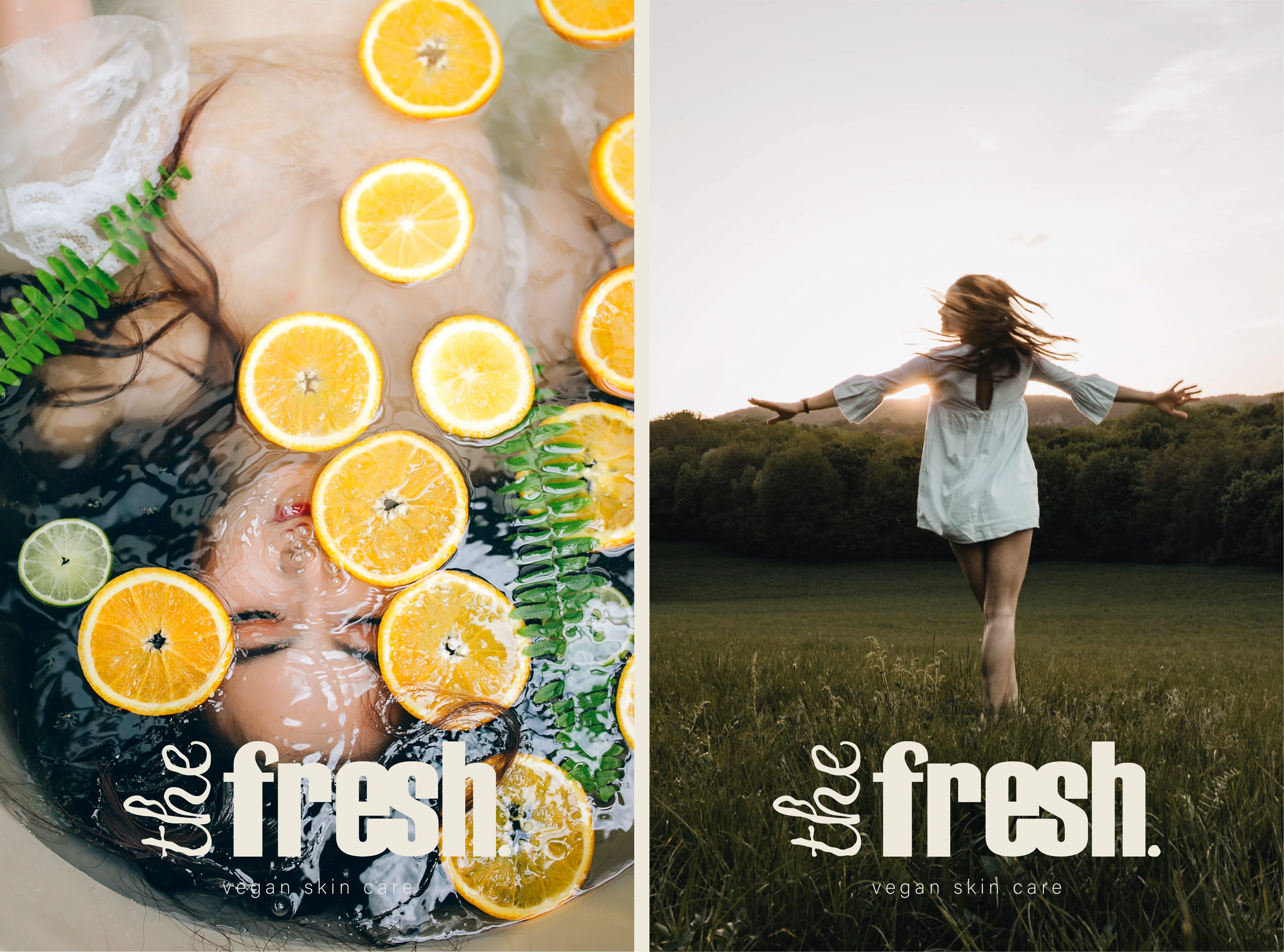
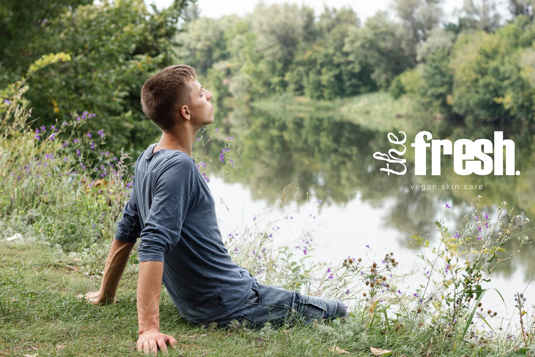
I choose to use pictures where we can identify easily ourself with. People are natural, without make up and much sophistication, in the nature outside, relaxing or taking time to enjoy their surroundings.
It gives a feeling of freedom, peacefulness and calm. It feels easy to connect with the brand and to trust it.
picture for the fresh
pictures for the fresh
picture for the fresh
Packaging
The packaging reflects the marketing we want to adopt here:
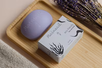
The color gradient around the green and beige are inspired by nature. The packaging itself is made of paper cardboard and the cream pot, of glass and both are recycled. Its also a main argument for a lot of customers : buying a brand which cares about recycling, without being even vegan. That's another angle to attract these customers and convince them the fresh is a well trusted brand.
The cover here is the "green" products range : made from mint and olive extracts. As a moisturizer, the jar is smaller and round which make the brand looks a bit fancier but useful and still simple.
I'm playing with beige and black to contrast the informations on the gradient background.
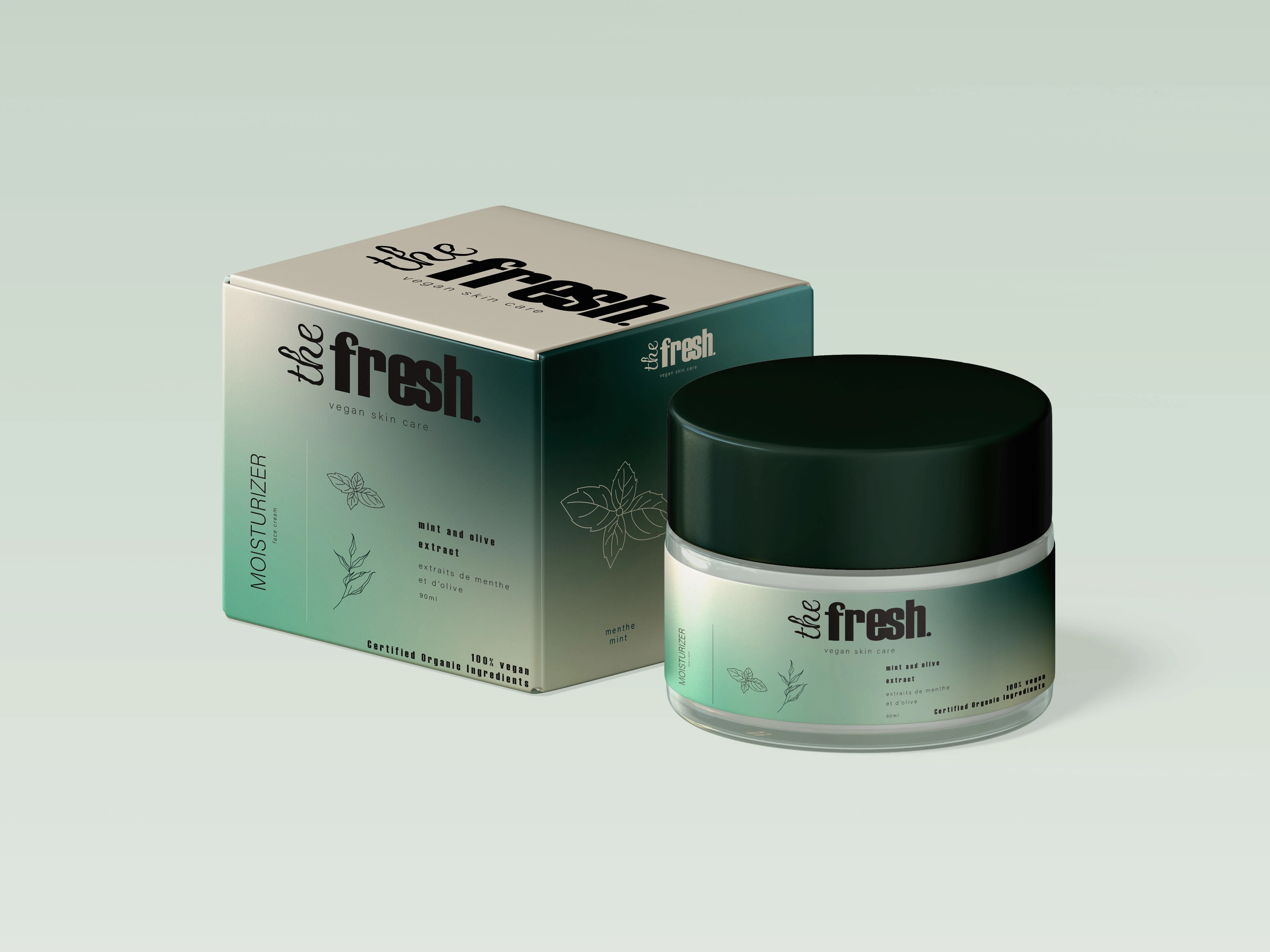
the fresh packaging for a moisturizer
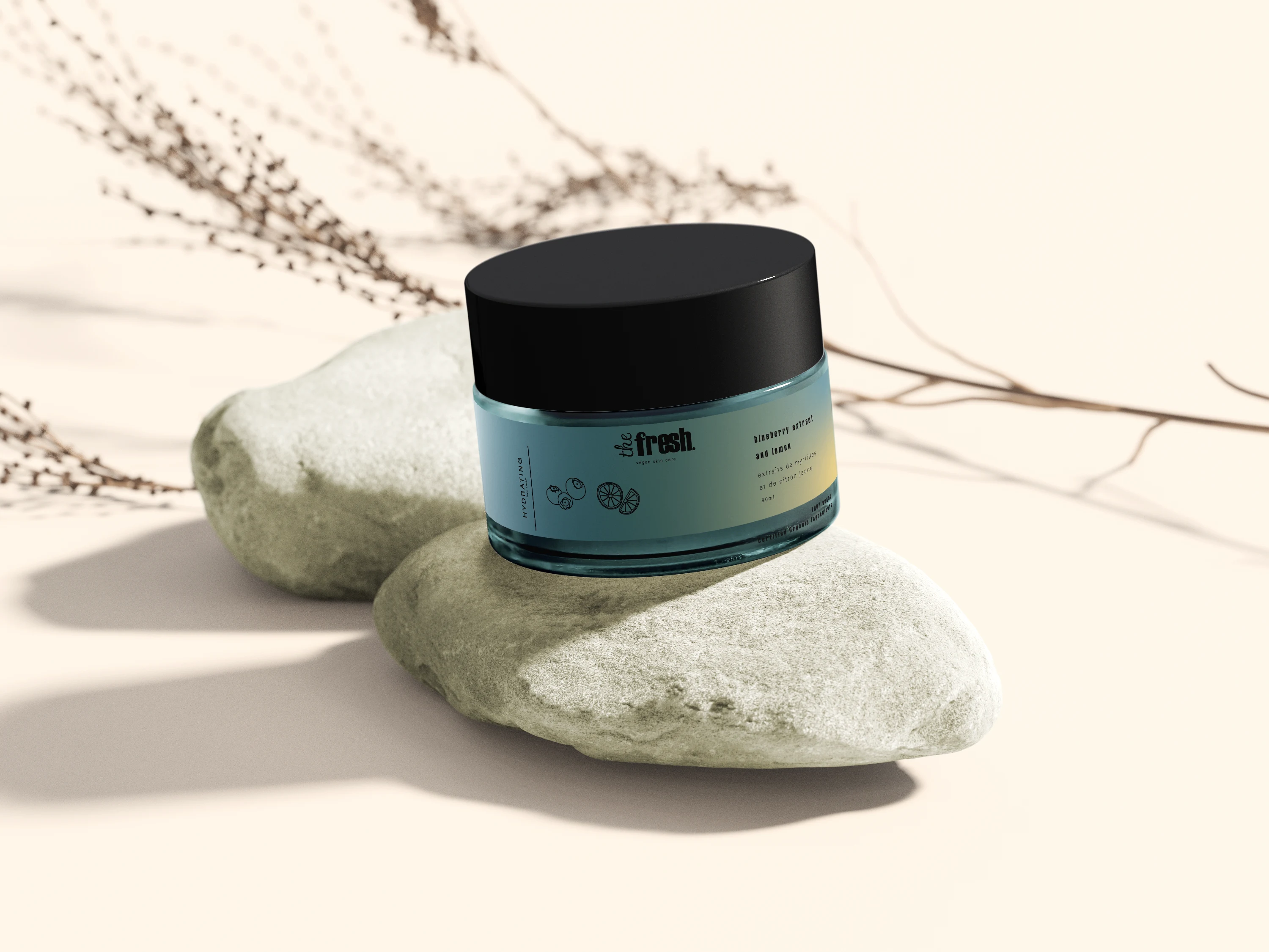
the fresh packaging for a hydrating cream
Illustrations
This is the kind of illustrations I like to use for the fresh.
They look playful, are easy to read and trendy. They will be eye-catching when targeting the young ones : the 20s.
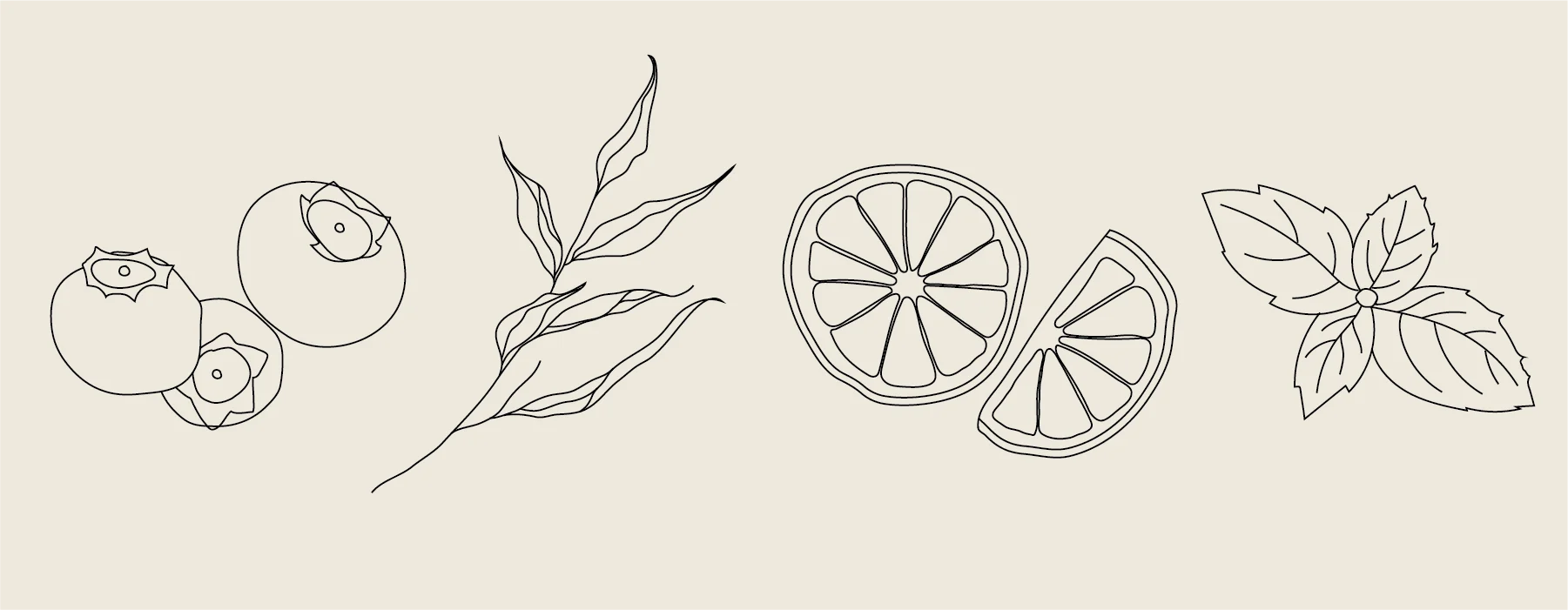
exemples of illustrations for the fresh
Marketing
An exemple of advertising support for our brand the fresh could be large paper with pictures related to nature combined with a picture of the product itself, for helping the customers connected everything : the brand, the product and the style of lifestyle its pretending to give.
People who are taking the bus can also be aware of the positive impact of public transport compared to individual cars on the environment. That's why it could be a great idea to create an ad at this place.
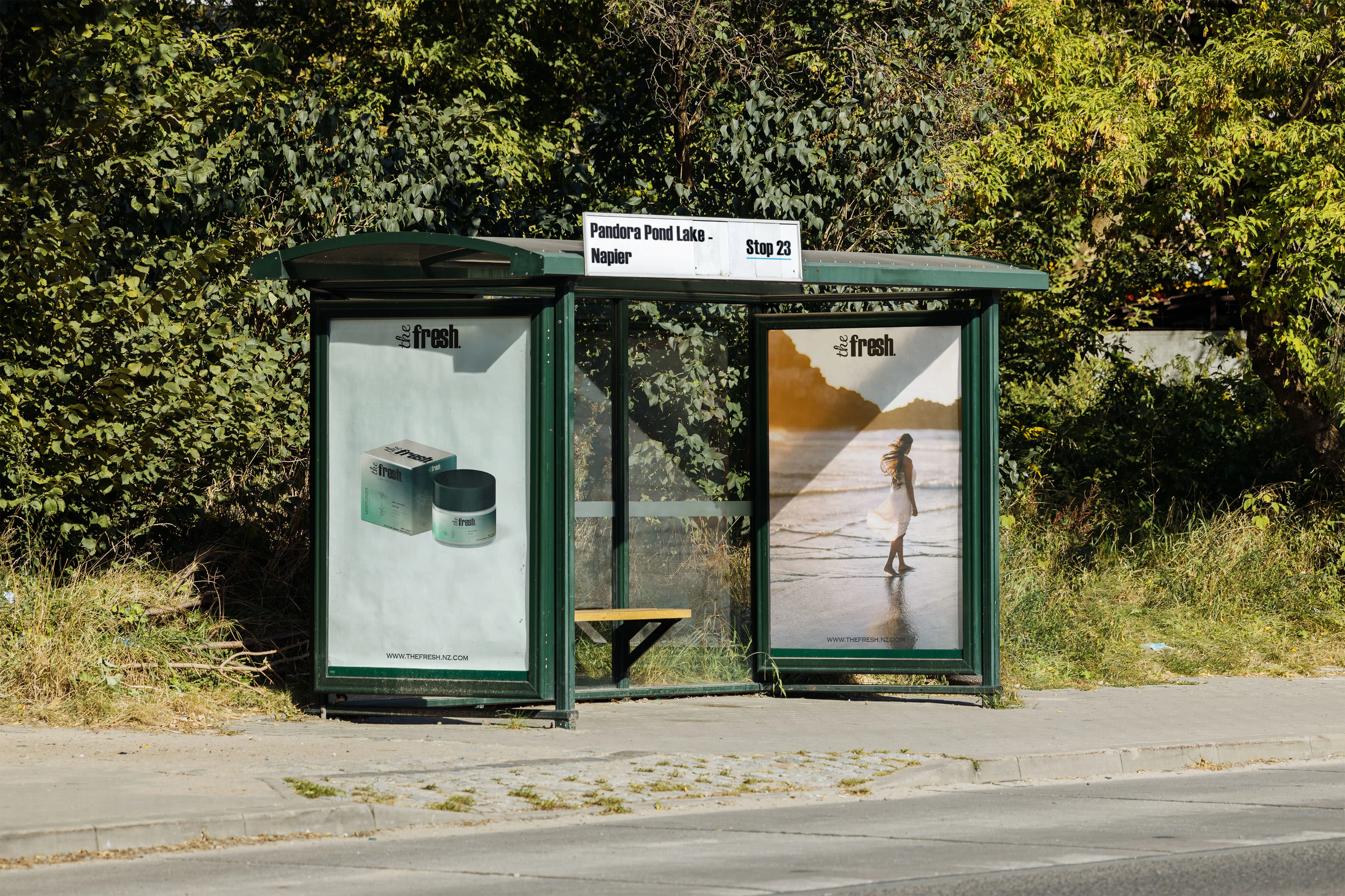
ad at a bus stop
TO DO :
Could add a flyer (for pharmacy) or social media kit : good support for attracting this range of customers as well
Hope you enjoyed it! :)
Like this project
Posted Mar 27, 2023
Created the Identity and Packaging for a vegan brand that aligned with their values while still being eye-catching and modern. Fresh and colorful!


