Who never thought about becoming more aware of its consumption?
Who never thought about becoming more aware of its consumption in its day-to-day life, nowadays ? That is a subject that touches many aspects of our daily choices.
Should I buy from a local farmer? Should I eat meat less often? Should I choose quantity or quality? Should I consume Bio - organic or save more money? Should I be vegan? Should I make my own product so I know what I'm eating?
So many questions now are getting in our heads when it's time to buy.
That's in this questionable environment that an eco-friendly soap brand is born : made from organic products and inspired by the ocean.
Mainsail is the most important sail on a boat, the one which is catching the wind and giving the ship its direction, while sailing.
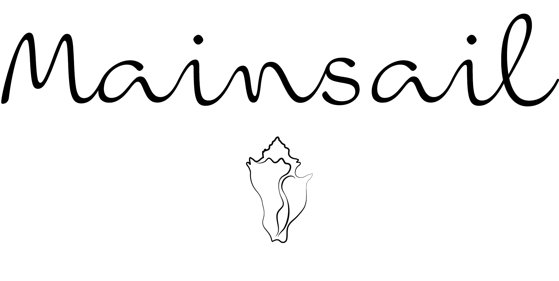
Logo Mainsail
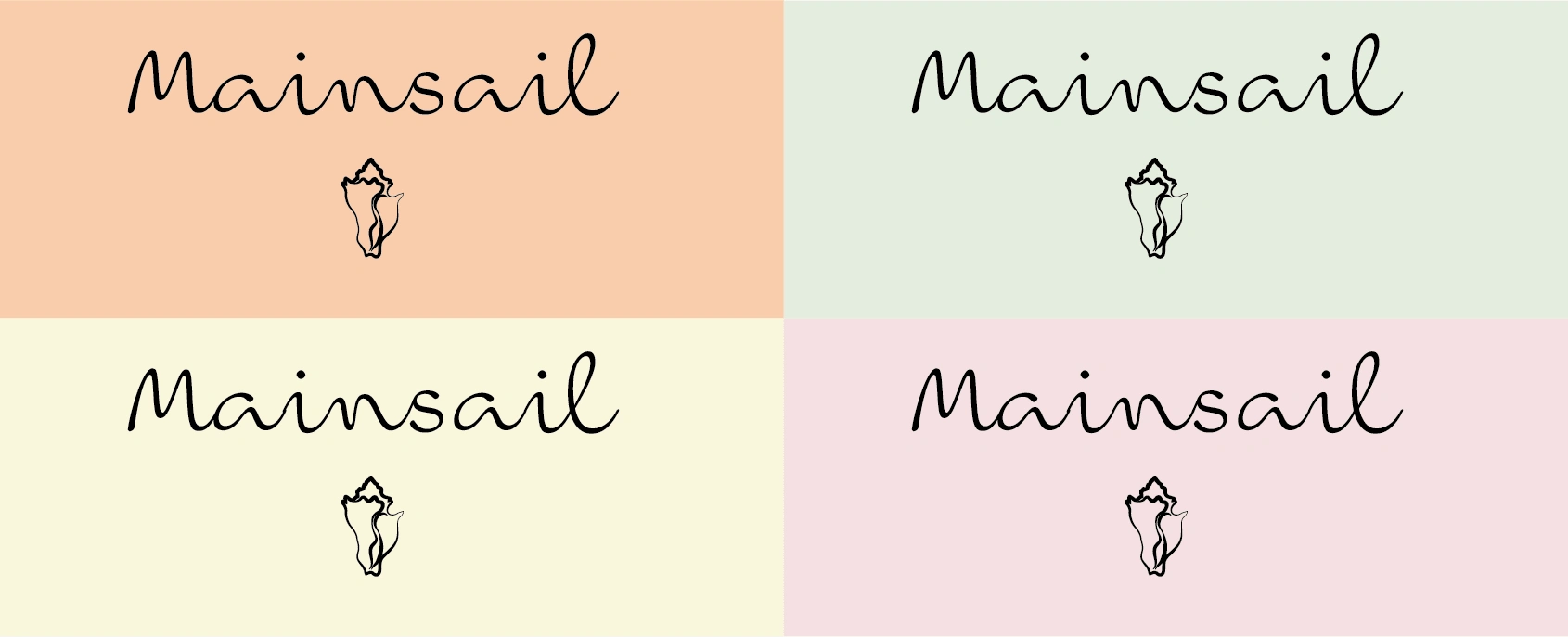
The logo is composed by the name of the brand "Mainsail" and the drawing of a beautiful and delicate seashell. I associated a seashell to the name of the brand because it's inspired by the ocean and the nature. It also gives an elegant look to its whole image.
The font Ballare Regular seemed perfect to me for this project ! The movement between the letters are reminding me the waves of the ocean and their irregularity. The handwriting is easy to read but quiet sophisticated.
Connected with the seashell's drawing, it gives the whole logo an unique look.
Range of products
The adaptation of the logo on different colors (scents).
The soap itself can be declined in different scents. To recognize them, I selected the colors dedicated to each scents. The colors will also be the base of the packaging (see next).

color palette depending of the soap's scent
I like the association of the logo with pastel colors, referring to the summer, ice cream colors or even seashells reflections.
Packaging
Our soap brand is destined to be sold in supermarkets and pharmacies. Because the brand is budget ranked, I wanted to do a clean ans simple packaging with only the main informations appearing. The competition is mostly using really bright colors or dark ones and have really full designs with a lot of informations. I wanted to avoid that !
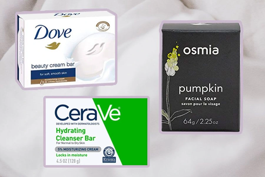
competition soap brand's packaging
This is the main packaging for our product : pretty simple, the eco-friendly box is in neutral tons, corresponding to the scent of the soap (here is lavender). We imagine the box made from thin but water-proof paper cardboard, nice to handle.
I wanted an easy to read packaging but also something different from the usual brands on this market. Also I drew sea weed and coral plants on the packaging to support the ocean vibe of the brand.
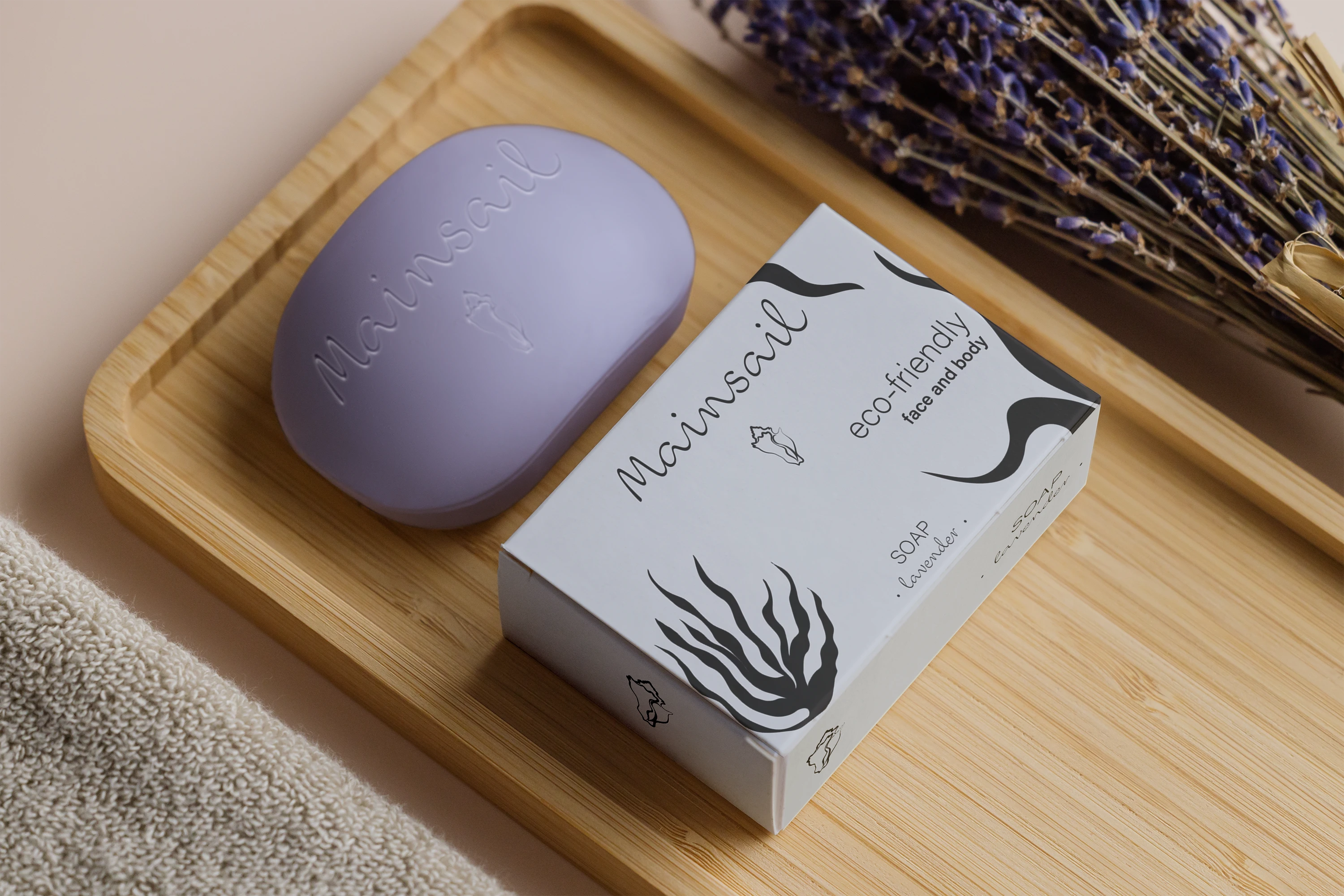
Mainsail soap packaging
What do you think of this visual identity ? Did you like it ?
:)
Like this project
Posted Mar 30, 2023
Mainsail, an eco-friendly Soap Brand
Likes
0
Views
16
Clients

Contra


