Creating a Packaging for a Family Board Game
Family Board Game
The card game for the whole family! From 5yo, you and your family can play asking funny questions to get to know each other better!
Logo
The new logo made a bit funnier than the original.
We can see the "o" in point in the form of a conversation bubble; and the bottom part of the "g" in talking representing the mouths of the characters used for the branding. The "t" at the beginning and at the end of talking point are trying to reach each other, as the links we are trying to build inside the family who's playing the game.
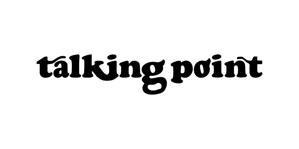
The stamp logo used to make it shorter (not used on the box but imagined on the cards inside the game). "tpc" from talking point cards.

Illustrations
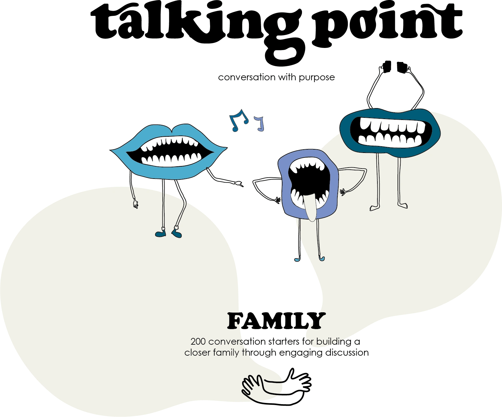
To attract the kids, I wanted to do something funny and eye catching. I realized some characters representing a family of 4, all of them laughing while playing together.
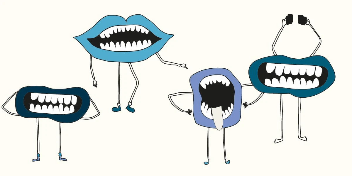
The packaging
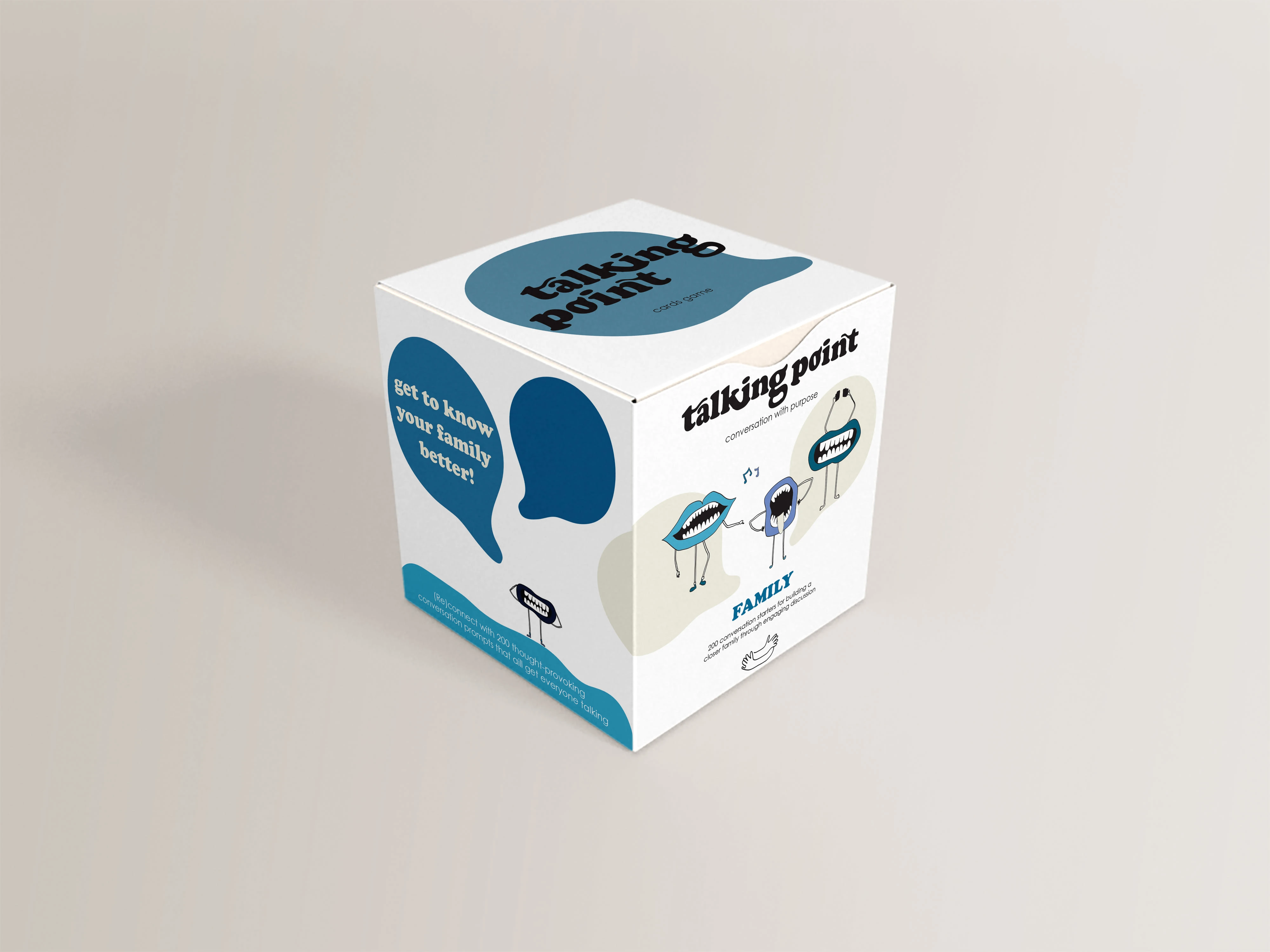
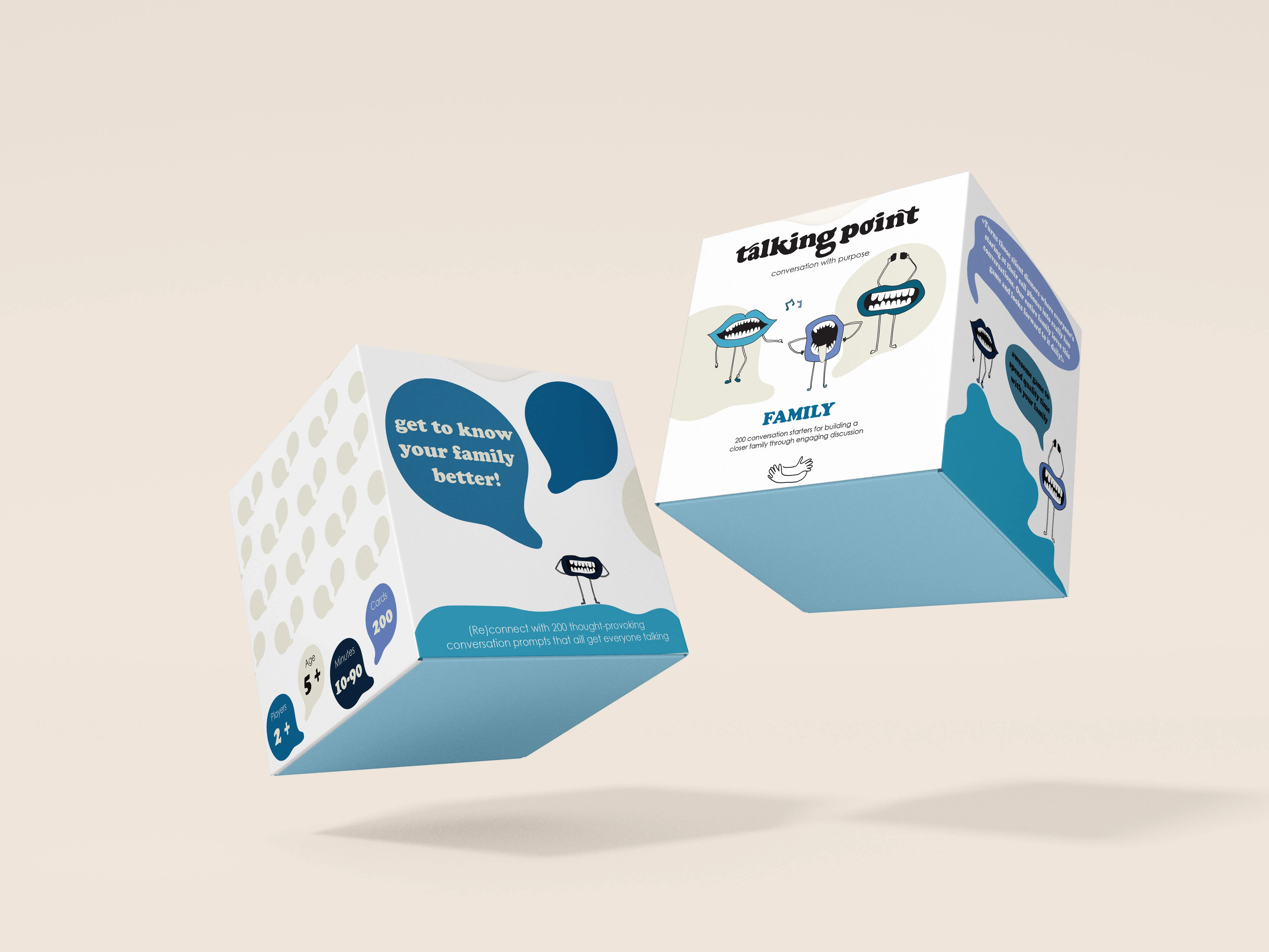
For this game box, I wanted a funny branding with nice but soft colors. I used the icon of the conversation bubble as background but also to make the characters talk to the customers.
Hope you enjoyed it!
Like this project
Posted Mar 27, 2023
Worked on a Family Board Game to make it attractive to kids and adults and funny. The blue color remained, but I changed the logo and its general image.
Likes
0
Views
20


