Redesigning the Image of a Seafood Restaurant in Greece
The Logo
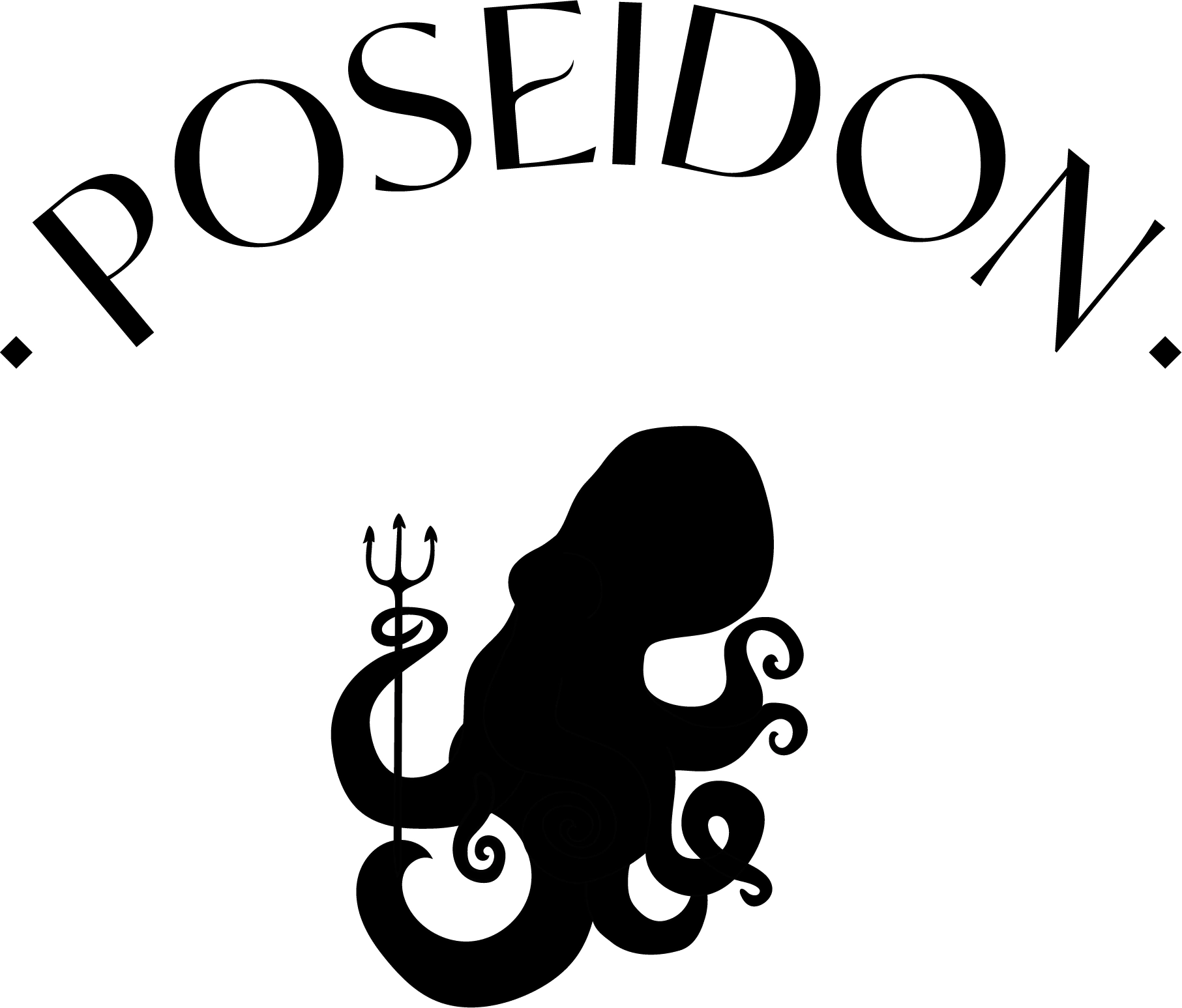
The restaurant is called Poseidon, for reference to the Greek God of the Sea. I choose to illustrate the restaurant with an octopus, one of the main dishes of the Menu. This one is holding a trident between its tentacles. The middle line of the letter E is reminding us on the octopus tentacles or the wave of the sea.
The second logo is horizontal and takes less space than the first one. I added "greek restaurant" with a manuscrit font to make it more accessible for the customers and welcoming. Also, it gives a sense of authenticity to the restaurant, which is selling local products and homemade dishes.

Illustration
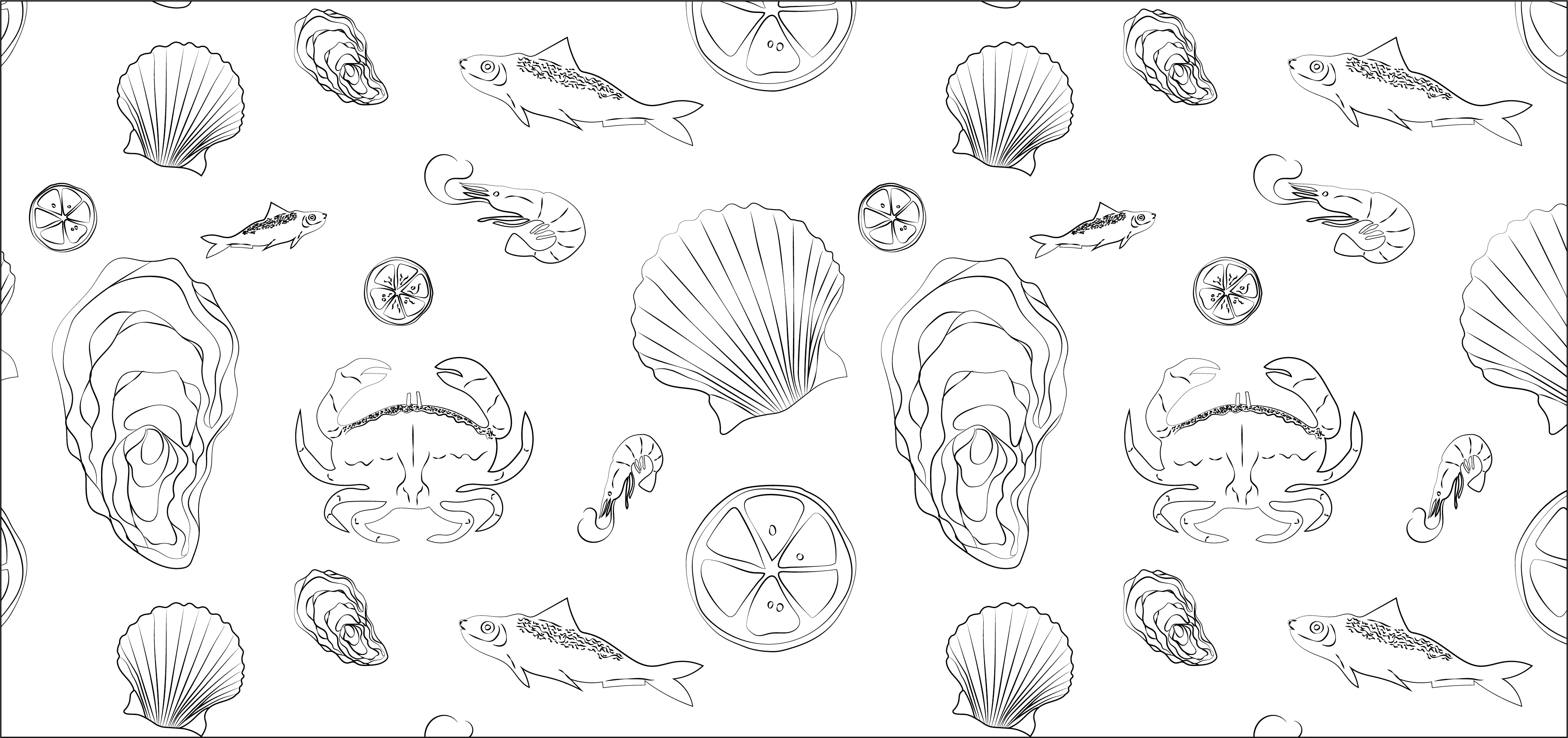
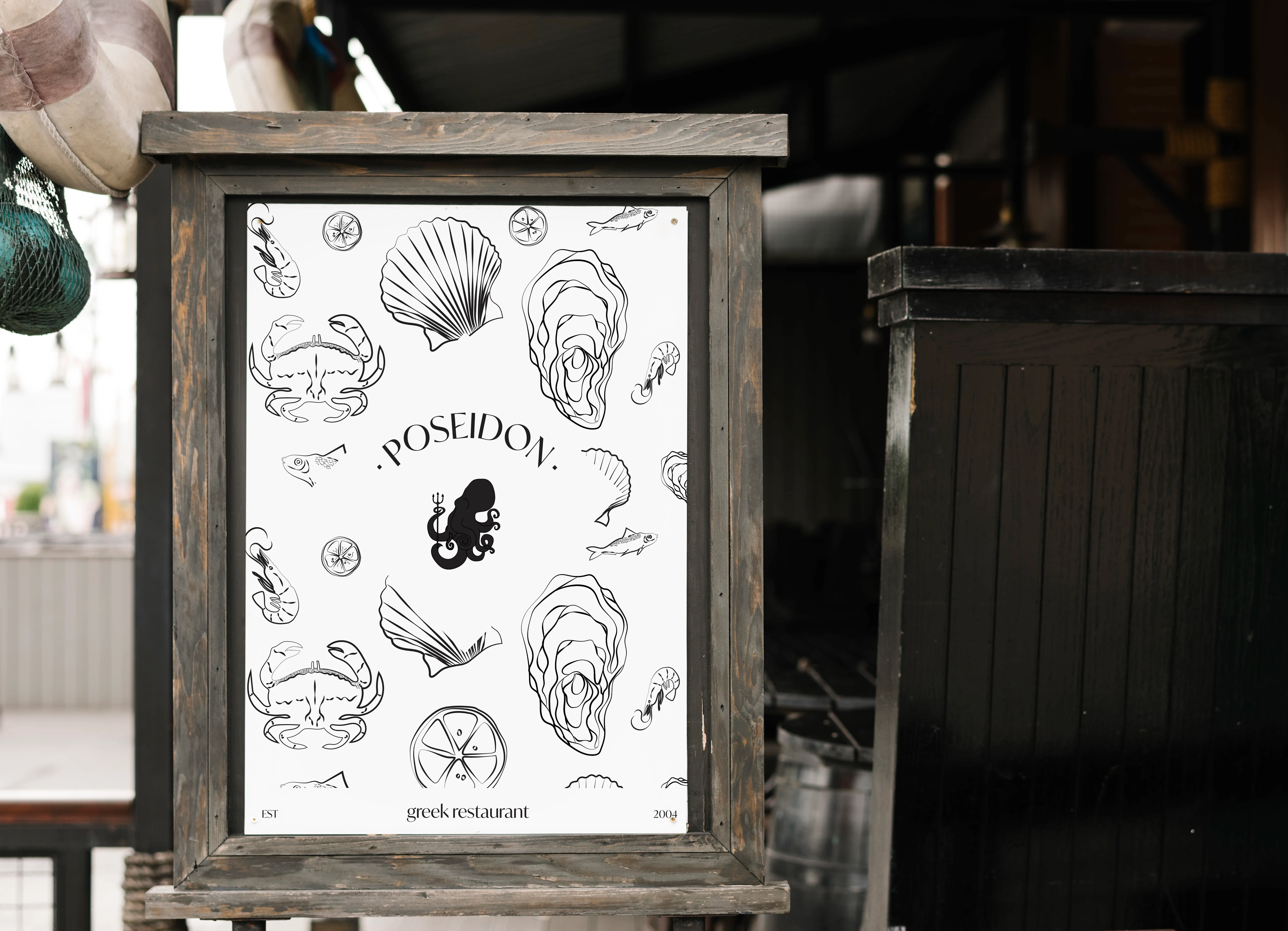
Black & white illustration for the traditional image of the brand, with handmade drawings. Used as a pattern and as a background on some presentation.
The color palette
I used blue&white for reminding on Greece symbolic color. The warmer colors referred to the color of seafood (shrimps or crab) but also on the sunset's color and the warmth of the summer.

The menu
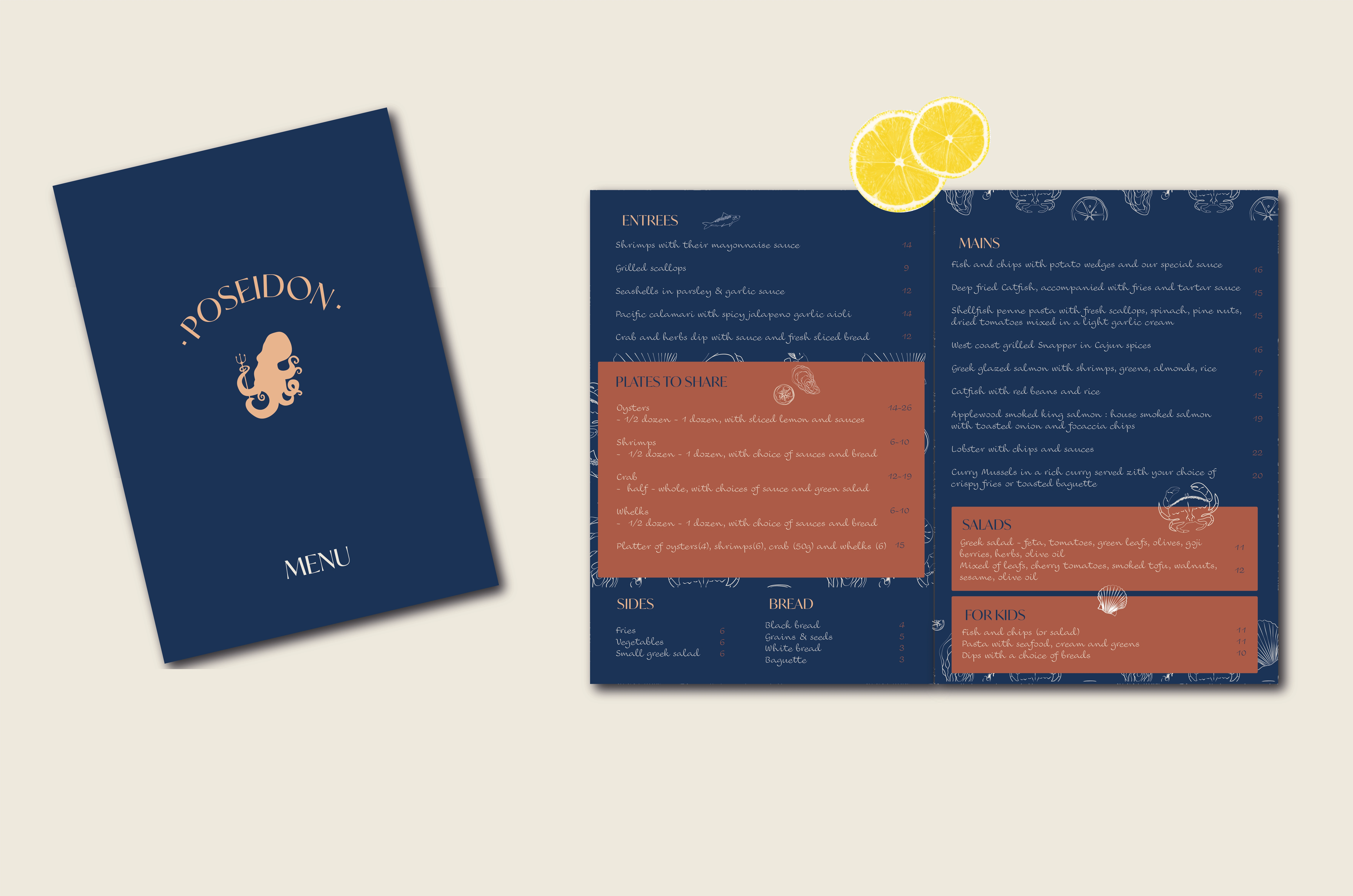
I choose to create a blue background for the menu.
I like the contrast with the "terracotta orange color" and the light touch thanks to the white pattern and drawings that we can find all over the menu.
Business Cards
The presentation
We can find this presentation board with the logo and the pattern, icons of Poseidon to attract customers in the front of the restaurant.
The pictures
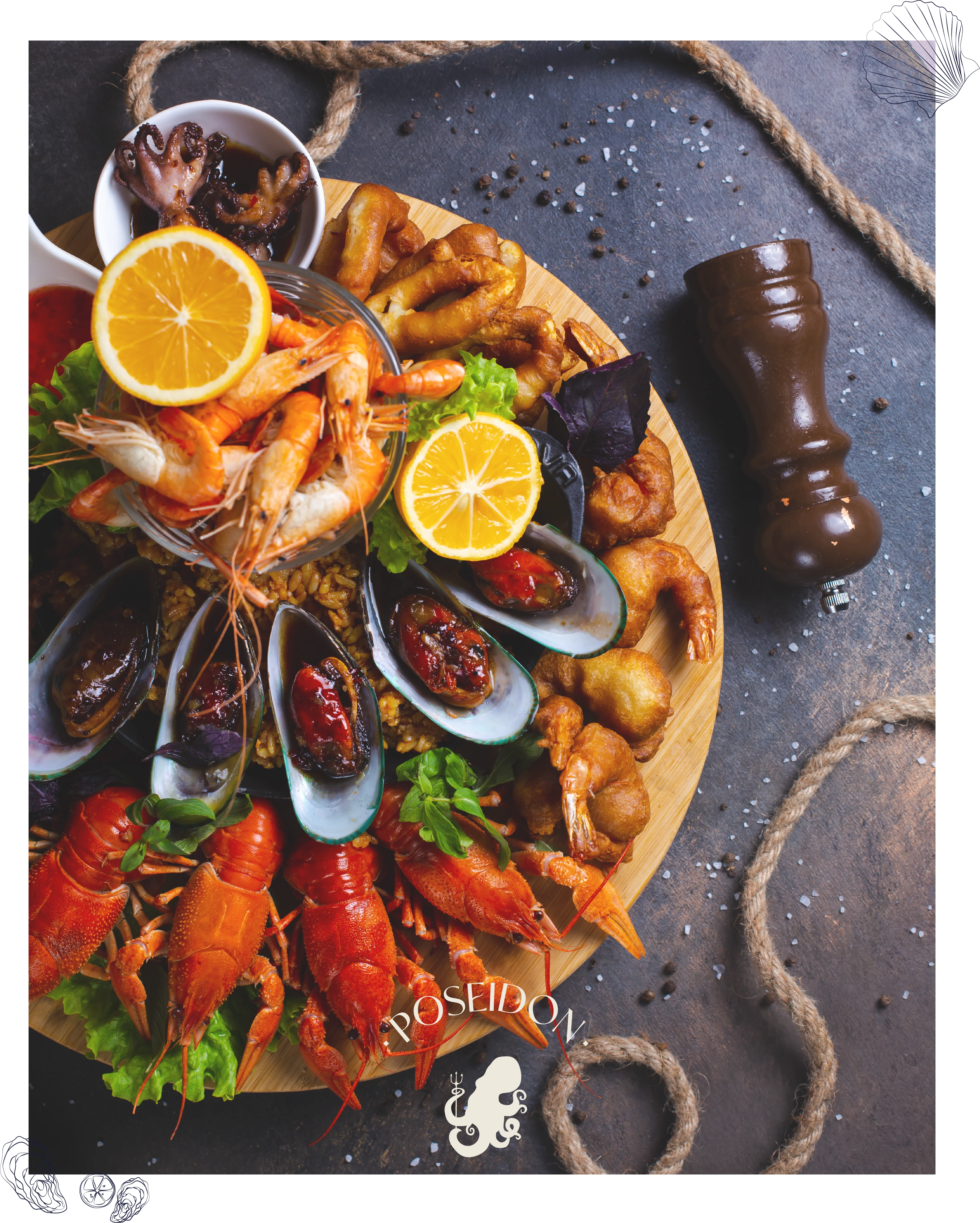
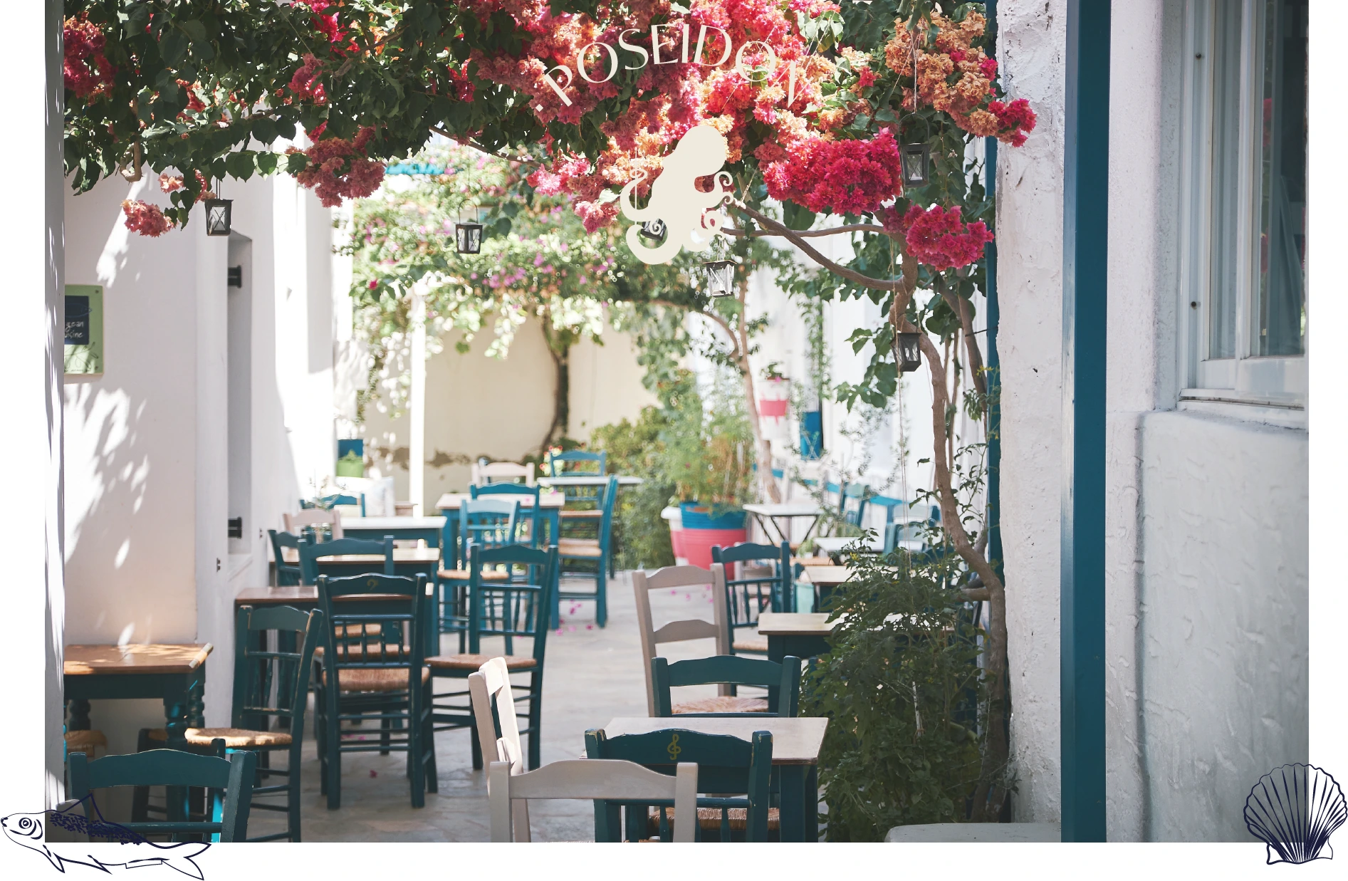
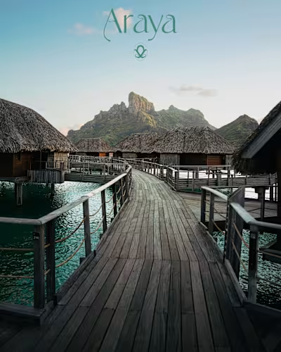
Photo of Poseidon's terrasse
Hope you enjoyed it!
Like this project
Posted Mar 27, 2023
Designed the brand identity of this new restaurant in Mykonos, Greece. Specialized in seafood, I wanted a modern and fresh look for its branding!
Likes
0
Views
16
Clients

Contra


