Dashboard Design For Finsight

Ayo Enitan


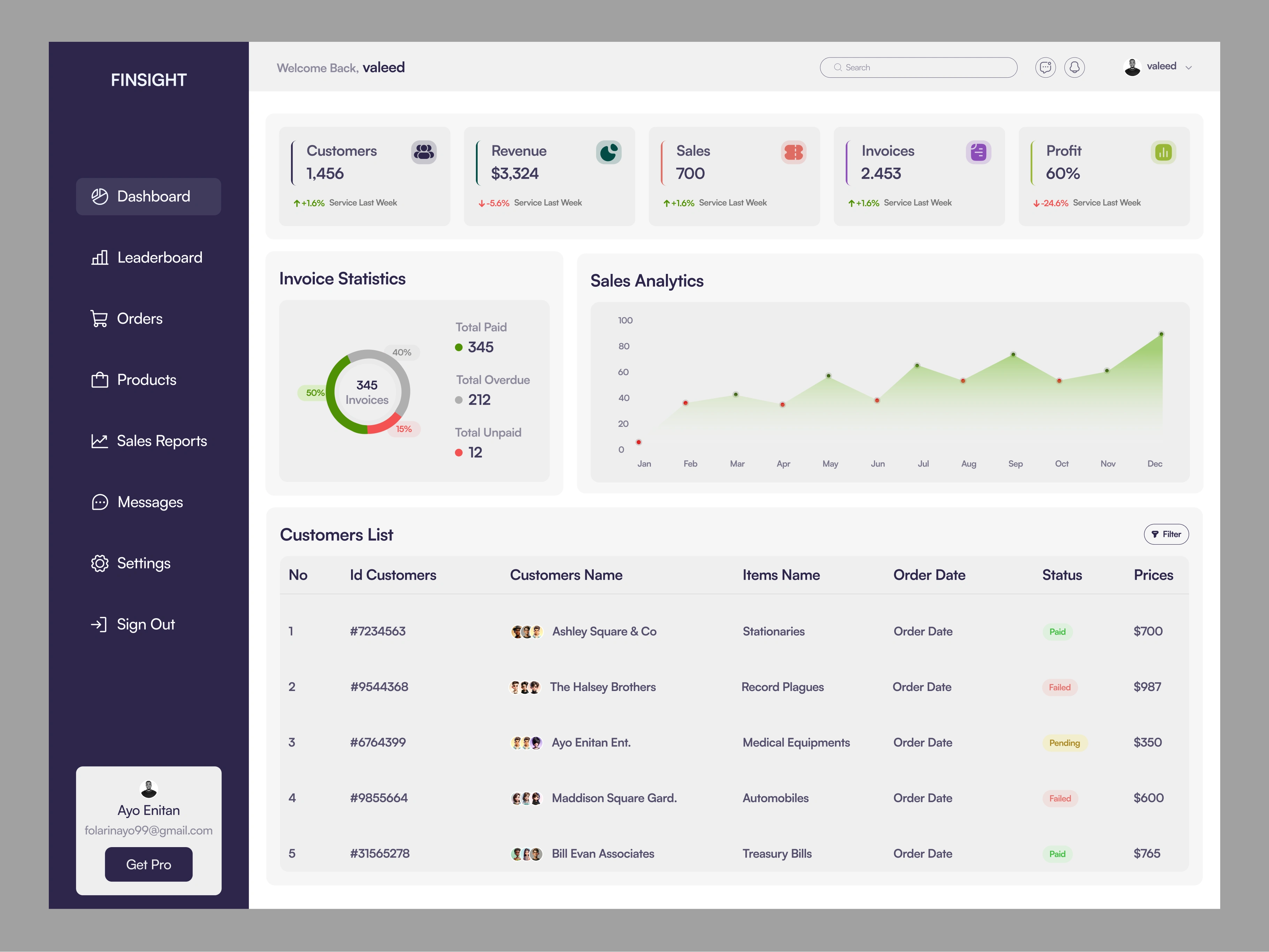
Dashboard Design For Finsight
Client: Fintech startup
Role: Product Designer (UI/UX)
Tools Used: Figma, Google Sheets
The Problem
The client’s internal finance team struggled with:
Scattered data across tools and spreadsheets
Slow reporting processes
Difficulty tracking invoices and customer behavior
Lack of actionable insights to guide business decisions
The Solution
I designed FINSIGHT, a modern and intuitive dashboard that brings all core financial data into a single interface. The goal was to empower teams to make faster, smarter, and more informed decisions.
Design Process
1. Research & Audit
Conducted a UX audit of their current workflow
Interviewed 2 finance staff to understand data usage pain points
Competitor analysis on finance dashboards (QuickBooks, Wave, Zoho)
2. Wireframing & Structure
Defined key KPIs: Revenue, Sales, Invoices, Profit, Customer count
Created low-fidelity wireframes to map information hierarchy
Prioritized real-time visibility and clean categorization
3. UI Design
Clean grid layout with emphasis on data clarity
Color-coded status indicators (Paid, Failed, Pending)
Sales analytics graph with monthly insights
Circular invoice chart for quick invoice health breakdown
Sidebar navigation with scalable components
4. Prototyping
Interactive prototype showcasing user flow and dashboard interaction
Usability-tested with 2 internal users from the client’s team
Key Features
Real-time customer, revenue, and invoice metrics
Visualized sales trends and invoice stats
Clear status labels for fast decision-making
Filterable invoice tables for better organization
Impact & Results
Reduced reporting time by 35% for finance team
Improved invoice tracking and client payment follow-up process
Helped leadership visualize business health at a glance
Enhanced team productivity with a central source of financial truth
What This Project Shows
My ability to design clean, data-driven interfaces
End-to-end thinking from research to polished UI
How thoughtful UX can create measurable business value
Like this project
Posted May 17, 2025
Designed FINSIGHT, a financial dashboard for smarter business decisions.
Likes
0
Views
0
Timeline
May 2, 2025 - May 3, 2025