Full Website Design For FinovateX

Ayo Enitan

💼 FinovateX – Designing a Website that Speaks Finance with Clarity
FinovateX wasn’t just building a fintech product they were redefining how startups, small businesses, and finance-savvy users interact with their money. With services like expense tracking, wealth management, investment insights, and digital banking, they had a solid backend. What they needed was a frontend that could match that power a website that would build trust at first glance, clearly explain their offering, and convert curiosity into signups.
That’s where I came in.
💡 The Problem
When FinovateX approached me, their old website felt more like a landing placeholder than a proper brand. It lacked structure, clarity, and a visual identity that reflected the forward-thinking, data-driven nature of the product.
They had the product. They had the value. But their digital presence didn’t show it.
It was my job to translate a complex product suite into a clean, conversion-focused website one that would resonate with startups, teams, and finance professionals looking for better tools.
🧩 The Design Process – From Idea to Interface
1. Discovery & Positioning
We kicked off with collaborative sessions to define their unique value proposition. I unpacked FinovateX’s core offerings from Checking Accounts and Credit Monitoring to Investment and Wealth Tools and restructured them into an easily digestible hierarchy.
2. Wireframing & Flow Planning
Using insights from our discovery, I designed a clear homepage flow that quickly answers:
• What is FinovateX?
• Who is it for?
• Why should I trust it?
• How does it work?
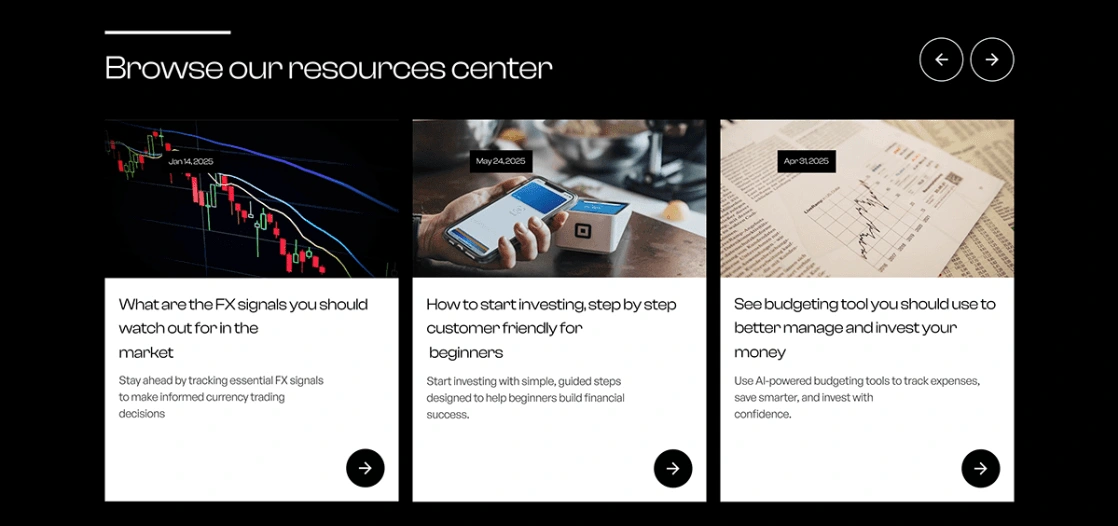
We mapped out supporting pages (Product Overview, Pricing, FAQs, Contact) with smart UX patterns that simplified complexity for first-time users.
3. Visual Design
I designed a crisp, professional UI blending fintech credibility with startup freshness. The result:
• A calming color palette with deep blues and confident neutrals
• Rounded cards and icons to add friendliness to the data
• Clear CTA hierarchy to guide visitors toward conversion
4. Micro-interactions & Framer Prototype
To make the site feel alive, I added subtle hover states, section reveals, and page transitions using Framer, giving FinovateX a site that didn’t just inform it engaged.
5. Developer-Ready Handoff
I delivered a fully responsive, production-ready website built in Framer with clean layout structure, scalable components, and clear documentation for future updates.
🚀 The Impact
The redesigned FinovateX site quickly became a powerful first touchpoint for potential users, partners, and investors.
• Improved brand perception FinovateX now looked as strong as it performed
• Higher conversion potential with clearer product storytelling and CTAs
• Credibility boost the design inspired trust in a space where trust is everything
FinovateX went from “just another fintech” to a brand that speaks confidently, clearly, and visually all without overwhelming the user.
Need a website that turns complex services into clear, conversion-driven experiences?
Let’s bring clarity, structure, and creative confidence to your next digital product.
Like this project
Posted Apr 29, 2025
Streamlined finance tracking UX, boosted task efficiency by 50%, and designed a clean, data-driven dashboard for smarter money management.
Likes
1
Views
0
Timeline
Jan 29, 2025 - Feb 3, 2025