Full UI/UX Mobile App Design For Coursetoma

Ayo Enitan

Full UI/UX Mobile App Design For Coursetoma
When Coursetoma came to me, they weren’t just looking for a designer they were building a learning platform with heart. The goal? To create a mobile app that not only helped users manage and track their courses, but also made learning feel more social, collaborative, and motivating.
At its core, Coursetoma wanted to bridge the gap between self-paced learning and community engagement empowering learners to not just consume content but share ideas, ask questions, and grow together. But their early-stage concept lacked structure, visual clarity, and most importantly a user experience that felt intuitive.
🧠 Understanding the Problem
The biggest challenge? Most learning apps felt either too rigid (pure LMS) or too chaotic (like social feeds). Users needed a way to stay organized with their learning and connect meaningfully with others. Many were dropping off mid-course due to lack of motivation or friction in the UI.
That’s where I stepped in to shape Coursetoma into a digital space that felt personal, purposeful, and easy to stick with.
🔧 My Process (Start to Finish)
1. Strategy & Research
I began by digging into the vision with the Coursetoma founders identifying user personas (students, young professionals, course creators), and mapping out their typical learning journeys. We explored pain points like course overload, low engagement, and poor tracking tools.
🎯 Goal: Create a seamless mobile-first experience where users can manage learning, track progress, and interact all from one place.
2. UX Architecture & Flow Mapping
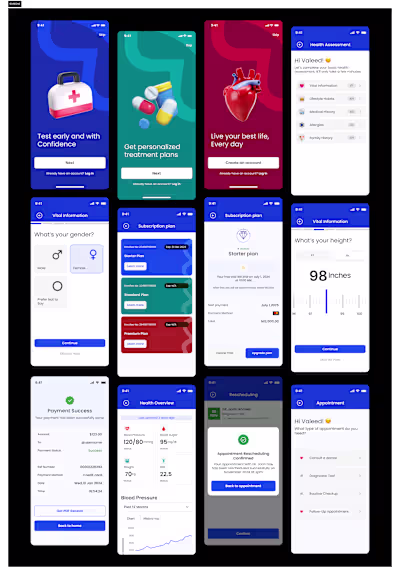
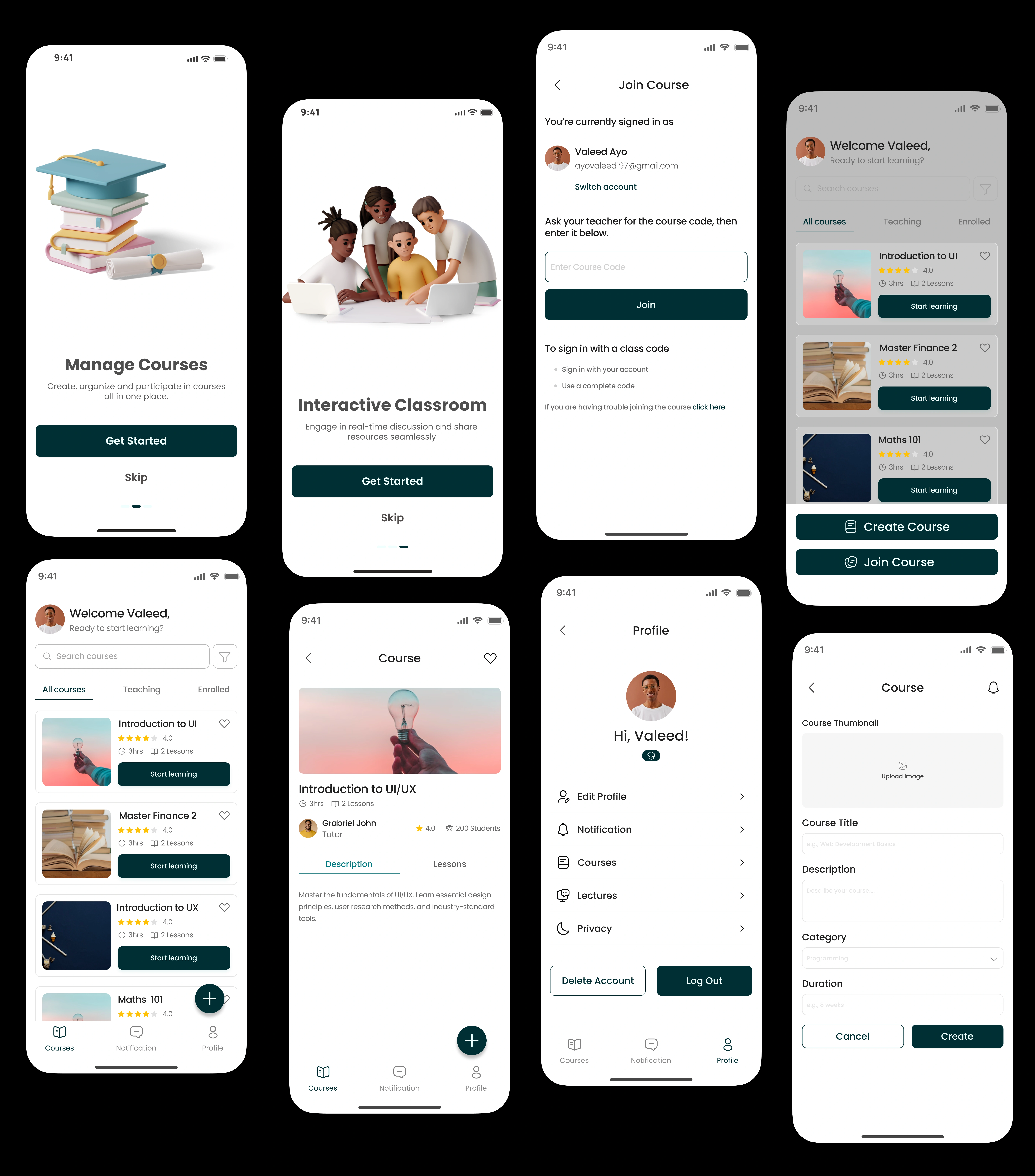
I designed the full app structure from the dashboard and course overview screens to discussion threads and profile tracking. The key focus was on reducing cognitive load and giving users a clear sense of progress and community at all times.
✍️ Wireframes were crafted to show smart course categorization, clean task views, and smooth navigation from solo learning to community chats.
3. UI Design & Visual Identity
The UI direction leaned toward soft, inviting visuals with an uplifting color palette and rounded cards. I incorporated motivational micro-interactions and calm typography to make the app feel less like a “task manager” and more like a learning companion.
🎨 Designed key screens: Home dashboard, My Courses, Progress Tracker, Resource Sharing, Peer Discussion, and Personal Profile.
4. Prototyping & Handoff
I built a clickable prototype to demonstrate flows and interactions, and worked closely with developers for a clean handoff including spacing, color tokens, and reusable components to speed up dev implementation.
🌟 The Outcome
Coursetoma went from concept to a full-fledged mobile product ready to scale.
Here’s what we achieved:
• Increased user clarity through structured navigation and course progress tracking
• Improved retention potential with built-in motivation triggers (progress bars, peer sharing)
• Humanized the experience through soft visuals and meaningful community interaction
Coursetoma isn’t just a course manager. It’s a learning ecosystem and I helped shape that vision into a real, usable product.
Like this project
Posted May 7, 2025
Built Coursetoma's core screen to unify course management, resource sharing, and student collaboration boosting engagement and organized learning.
Likes
0
Views
0
Timeline
May 2, 2025 - May 9, 2025