Built with Framer
Avenir: Framer Template
🥱 TLDR;
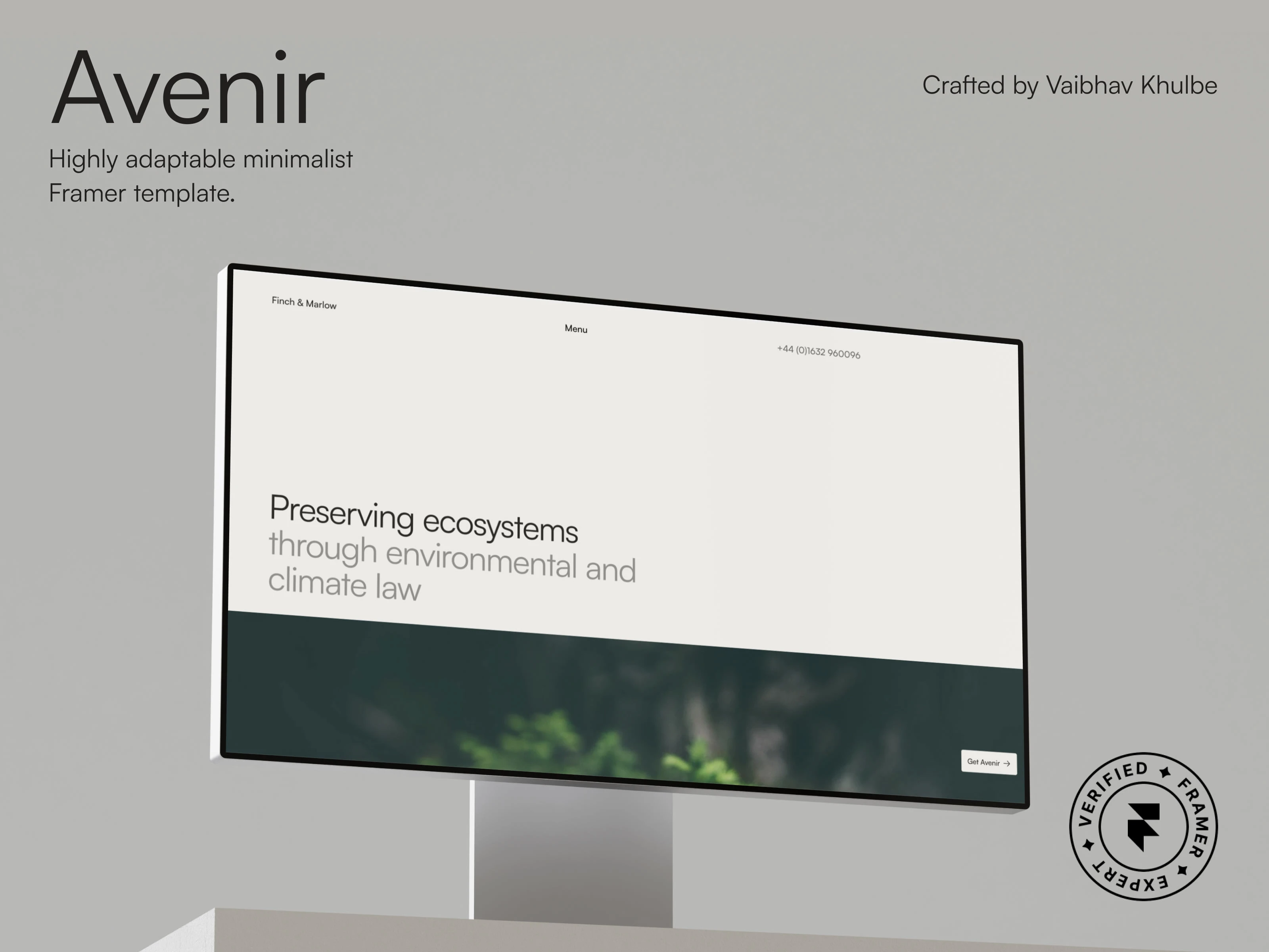
Avenir's graphic made in Figma for .
⤷ Live Preview: https://avenir.framer.website/
❇️ Project Overview
Avenir was born to provide a delightful blend of minimalism with buttery smooth experience. This results in an interface that's super clean, typography that's easily recognisable and animations that are bound to make it the smoothest Framer template out there.
Quick overview of the Avenir template.
This template has the following pages:
Homepage: introduces the fictional "Finch & Marlow" company and what it stands for. Big heading, ample amount of whitespace, and an equally massive image. Every page of the template uses a uniform page effect to make transitioning between the pages extra smooth. It uses a navbar component with an overlay, scroll sections, appear effects on some layers and sections, components for links, news cards and footer. Homepage also includes CMS collection items.
Expertise: shows what Finch & Marlow have expertise on. Comes with scroll sections, animations and sticky headers.
People: the team of the company with a card component for each person. Plus an additional "Large Desktop" breakpoint.
Case Studies: it uses CMS collection with filters to feature a specific case study.
News: similar to case studies, this page contains news card inside a news collection list.
Along with these, it also has About, Contact, Privacy Policy, Cookies Policy and 404 pages.
As a bonus, you also get a dedicated "Style Guide" canvas page where you can explore the color palette, typeface, font styles, and the grid layout used in the webpages:
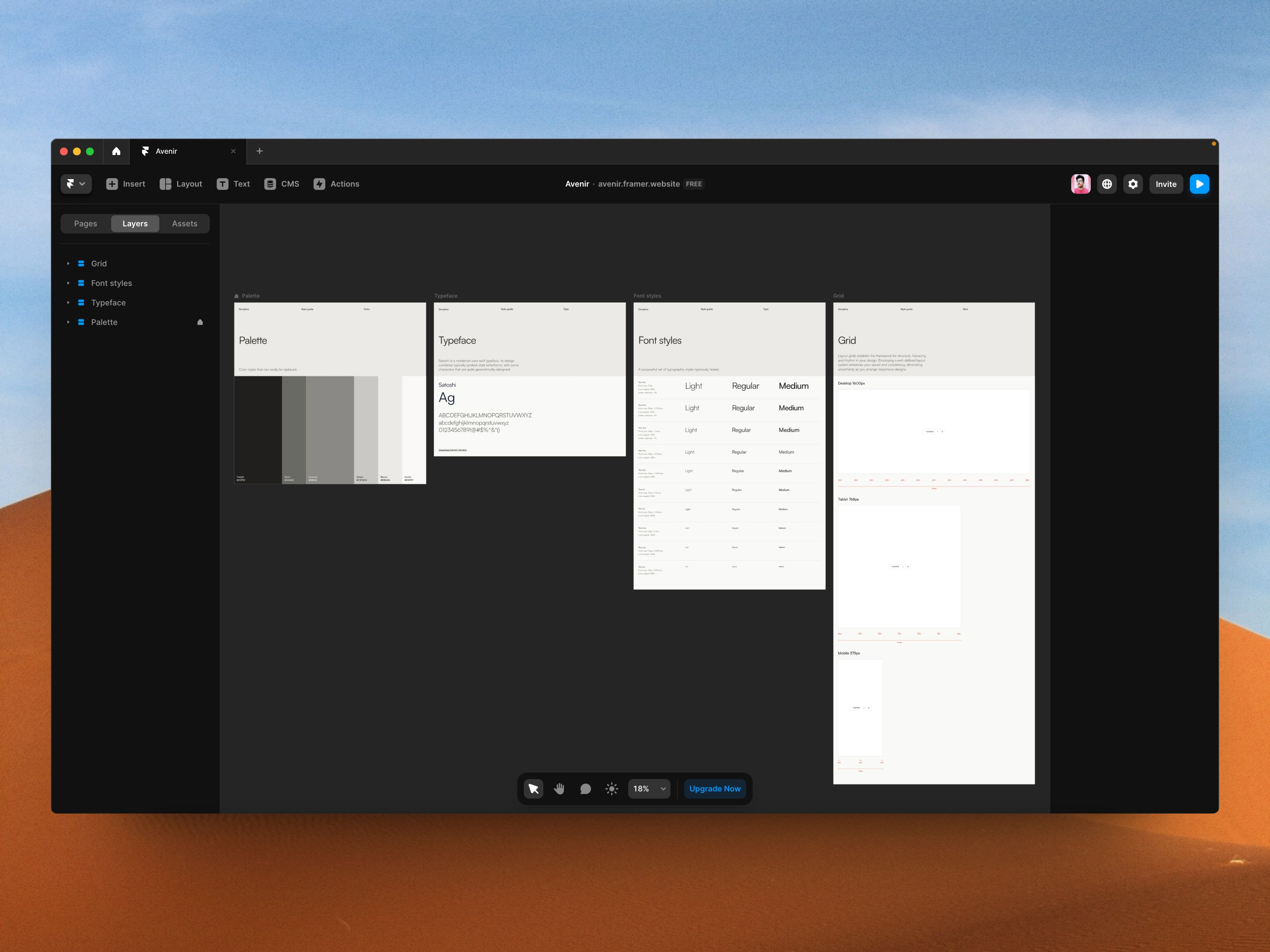
The "Style Guide" canvas page included in the Avenir template.
In the same way, you also get all the graphics and marketing assets I made, right on the "Graphics" canvas page:
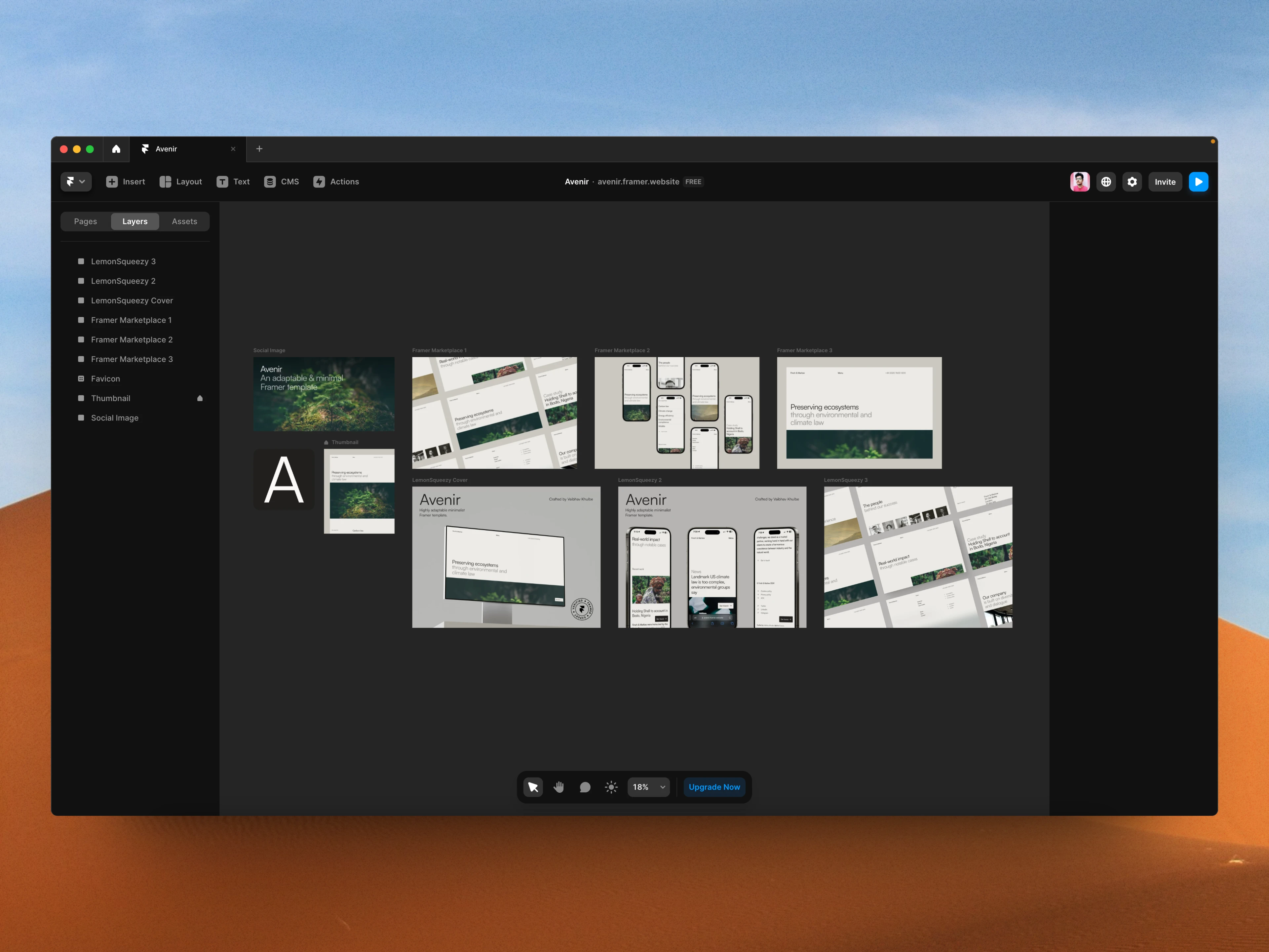
The "Graphics" canvas page included in the Avenir template.
✨ The Spark
If you ask, what makes Avenir so special? I would say the following things make it different from others and highly useable:
✧ The interface: if you see any of the pages of this template, you are sure to be greeted with absolute minimalism and super clean UI. It uses 6 color styles that hover around the hues of black and white and Satoshi sans-serif typeface.
✧ The animations: there is no overdose of animations or effects that may lead to the slowdown of the website. There are buttery smooth page effects, hover-based interactions on links, and section reveal animations. That's it, exactly how it should be.
✧ The content: most of forget how important the content of a website it specially when we are building a template. Avenir was built by taking the fictional "Finch & Marlow" environmental law firm in mind. All of the copy, images etc are based off this. Right from its homepage to the news pages, you will see hints of 'climate', 'environment' and 'law' coming together. No lorem ipsum here.
✧ The 'layer-focus': even if you are new to Framer, or want to modify a section in this template, you can understand, and easily do it without the need of extra help from a pro. You become a pro when you know that all the layers in each page were named semantically:
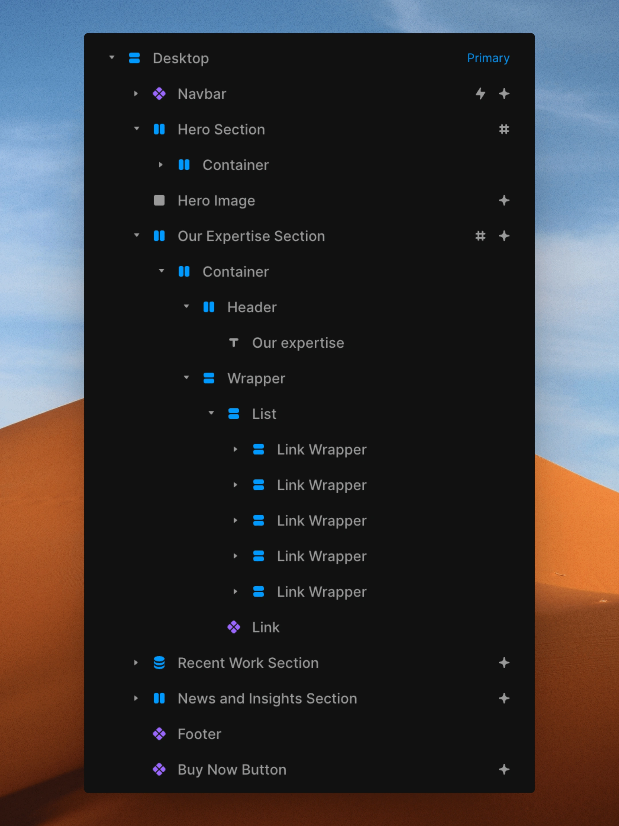
The layer naming of the homepage of the Avenir template.
✧ The accessibility: a big focus on almost all of my web projects is on accessibility to ensure people with disabilities can access and use the website content effectively. So next time when a person with disability turns on the voiceover app, they can easily identify what they are browsing, looking at or clicking the link on. Almost every possible element is accessible.
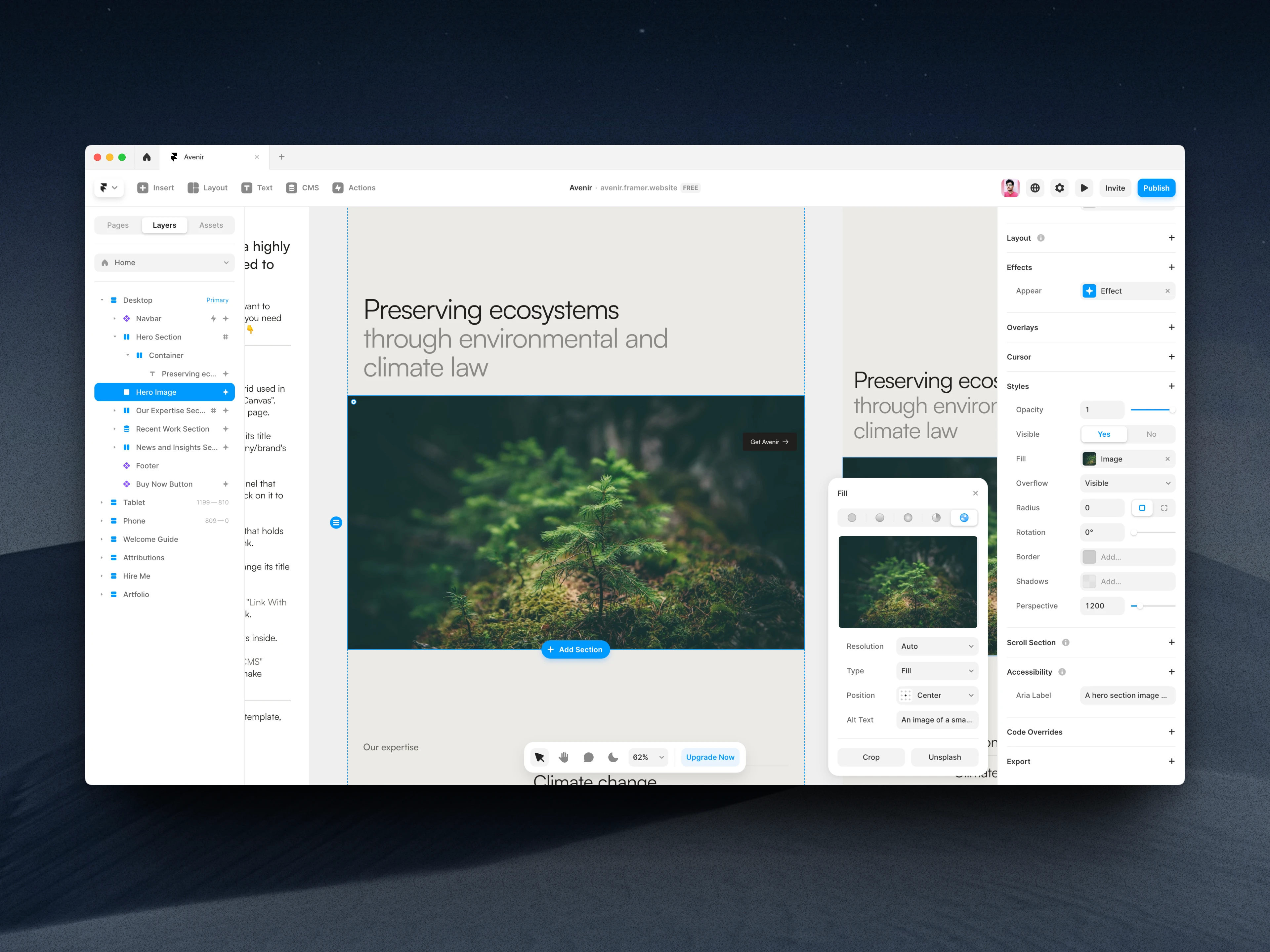
The accessible layer and image used in the template with appropriate aria label and alt tag.
✧ The customer-care: just like my previous Artfolio template, Avenir also has a "Welcome Guide" that shows each customer how to start customizing the template right after they open this project. I have included support links and how to contact me for any help they need.
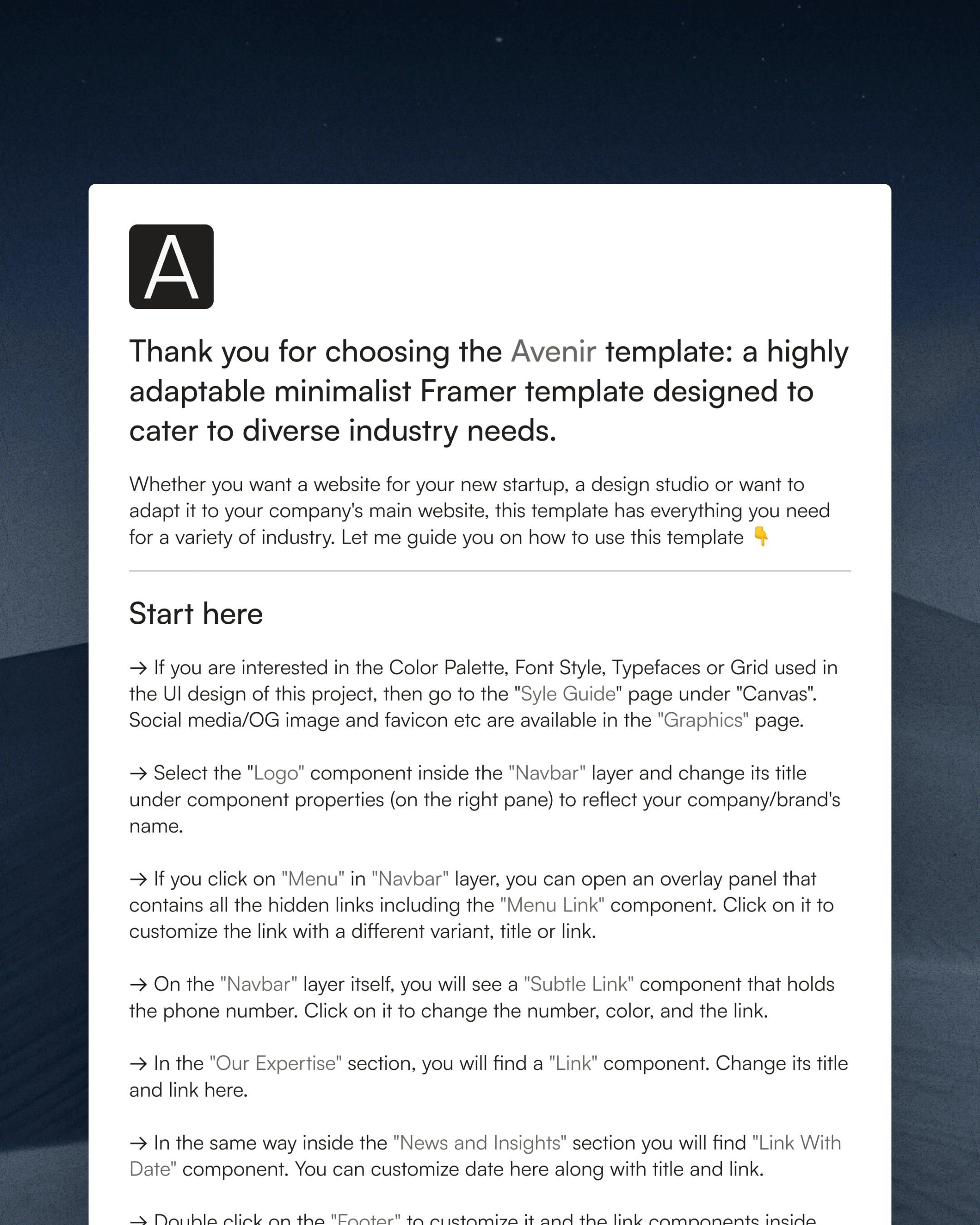
Aveir template's "Welcome Guide".
If you are fed up of flashy and SaaS-style templates for Framer, bet on Avenir. You will end in a calming state with its experience 💆♂️
Impressed? Want me to create a Framer website for you? Check my Framer service details here and send an inquiry! 🤝
Like this project
Posted Apr 1, 2024
I built Avenir, a highly adaptable minimalist Framer template designed to cater to diverse industry needs.
Likes
7
Views
833

