Built with Framer
Best Writing: Framer Website Development

🥱 TLDR;❇️ Project Overview✦ About the client: Best Writing✨ The Spark✦ What were the client's needs and goals?✦ Why did they choose me as an independent?🚀 The Process📸 Project Mockups📊 The Stats✦ Timeline: 15-20 days ✦ Budget: $1000✦ Number of components: 30+ ✦ Deliverables: Framer Remix link and the published website link💬 Client TestimonialImpressed? Want me to create a Framer website for you? Check my Framer service details here and send an inquiry! 🤝
🥱 TLDR;
The Best Writing team hired me to rebuild three pages of the existing Best Writing's website in Framer. These three pages and the whole website was built with Next.js and Tailwind CSS, I had to convert the homepage, membership page and the terms and conditions page to its Framer webpage equivalent.
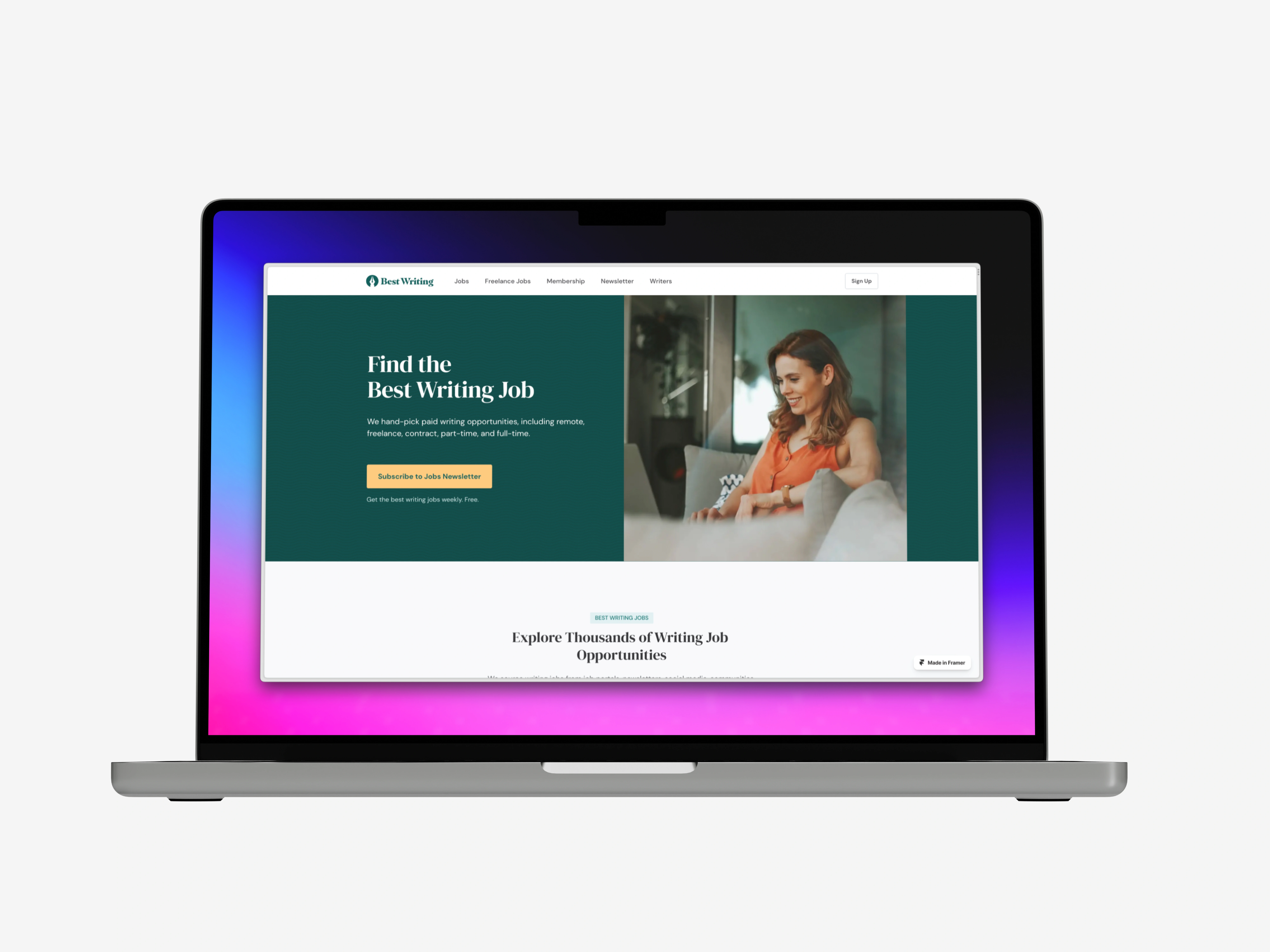
The homepage of Best Writing website.
⤷ Live Preview: https://bestwriting.framer.website/
❇️ Project Overview
✦ About the client: Best Writing
Best Writing is an all-in-one platform connecting writers with companies. They serve writers, editors, agencies, and businesses hiring content creators by providing educational content, career opportunities, and a community.
✨ The Spark
✦ What were the client's needs and goals?
Tomas Laurinavicius, Co-Founder & Chief Editor at Best Writing wanted me to work primarily on rebuilding the existing three pages: homepage, membership page and terms and conditions page in Framer.
They already had the website up and running but wanted to get a taste at the capabilities of Framer. For this, they started with three pages but if all went well, they would convert the whole website in Framer. For this, I was given a Figma document to inspect the design of the three pages. I had to convert most of the layout from Figma to Framer.
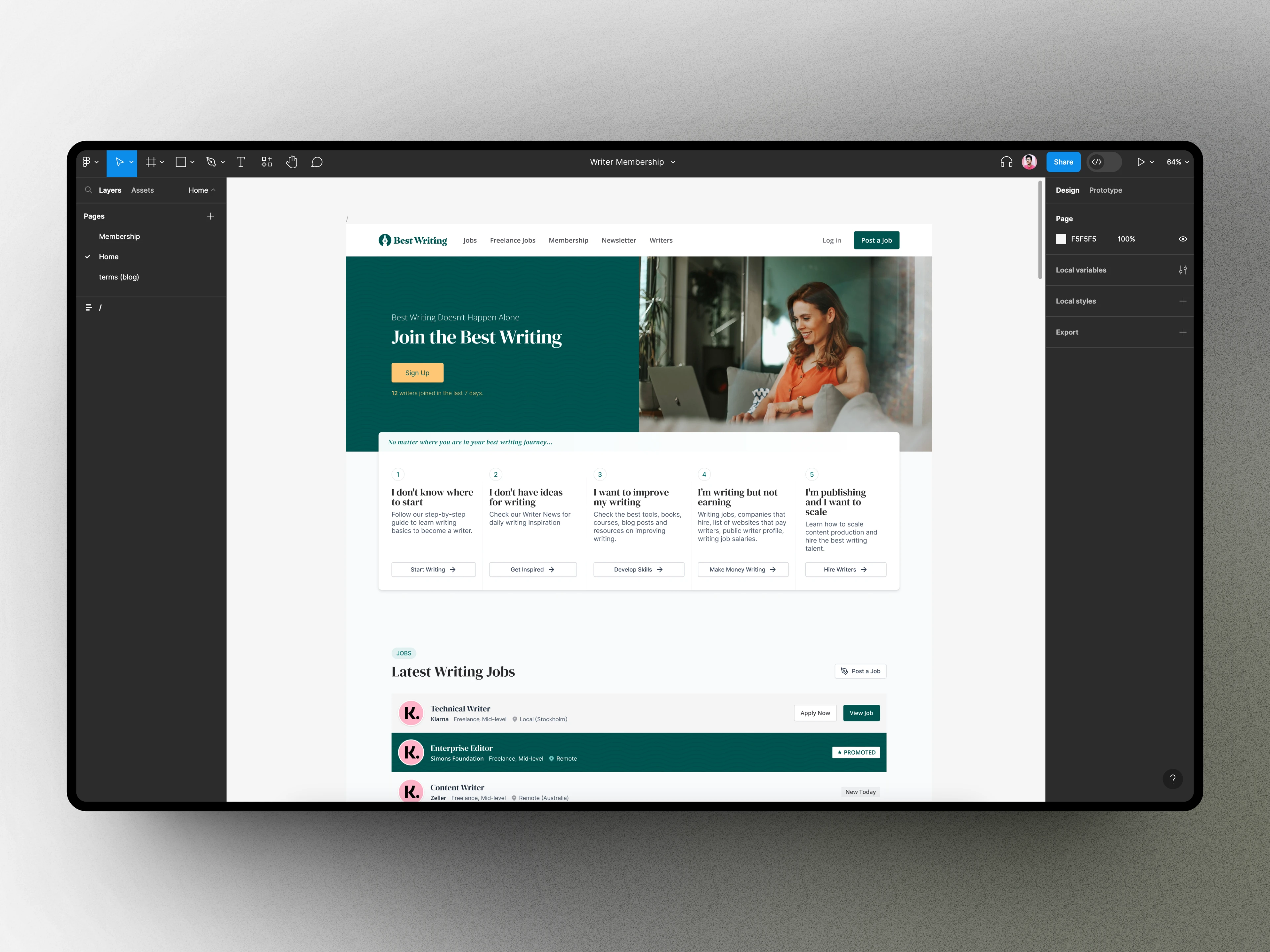
The Figma document of Best Writing website showing the homepage design.
✦ Why did they choose me as an independent?
In his own words, Tomas says:
I found Vaibhav's work on the Framer community site and was impressed by his skills and, most importantly, his curiosity and positive attitude. After checking out some of his work examples on Contra, I was convinced he was the right fit for my project. My gut didn't fail me. Vaibhav was a pleasure to work with and did a great job.
🚀 The Process
I completed the project in the following steps:
✧ Inspecting the current homepage: the alreadly published website was made in Next.js with Tailwind CSS styles. I first used Google's dev tools to inspect the raw HTML and CSS code for each of the page sections, elements and interactions. Also did the conversion of units since Framer doesn't (yet) support
em and rem responsive units.✧ Setting up Framer: created a new Framer project and laid down the basic site layout with responsive framer from the get go.
✧ Getting to know the Figma designs: I took a look at the provided Figma document for the three pages and inspected the colors, fonts, content, assets needed.
✧ Using the Figma → Framer plugin: then I used the Figma to HTML with Framer plugin to copy the individual sections designs in Figma and pasted them on the Framer canvas.
✧ Matching the design with the current webpage: my client Tomas said that we need to follow the content from the Figma file but the design should match the currently active homepage. So I needed to refactor some of my frames on the homepage and redo the changes.
✧ Sent each page for feedback: after each page was fully completed (including making it responsive), I sent them to Tomas for a review and feedback. Fortunately, Tomas always sent me a detailed feedback with annotated screenshots so that I could iterate better.
⤷ Solved a challenging thing: the background pattern element on the homepage needed to be repeated, should be an SVG file and must be responsive (full-width), I tried various no-code solutions in Framer to achieve something similar but failed....until I used my front-end development skills to create a custom component that followed all these rules and finally come up with a solution:
This results in the following background pattern on the header of the homepage:
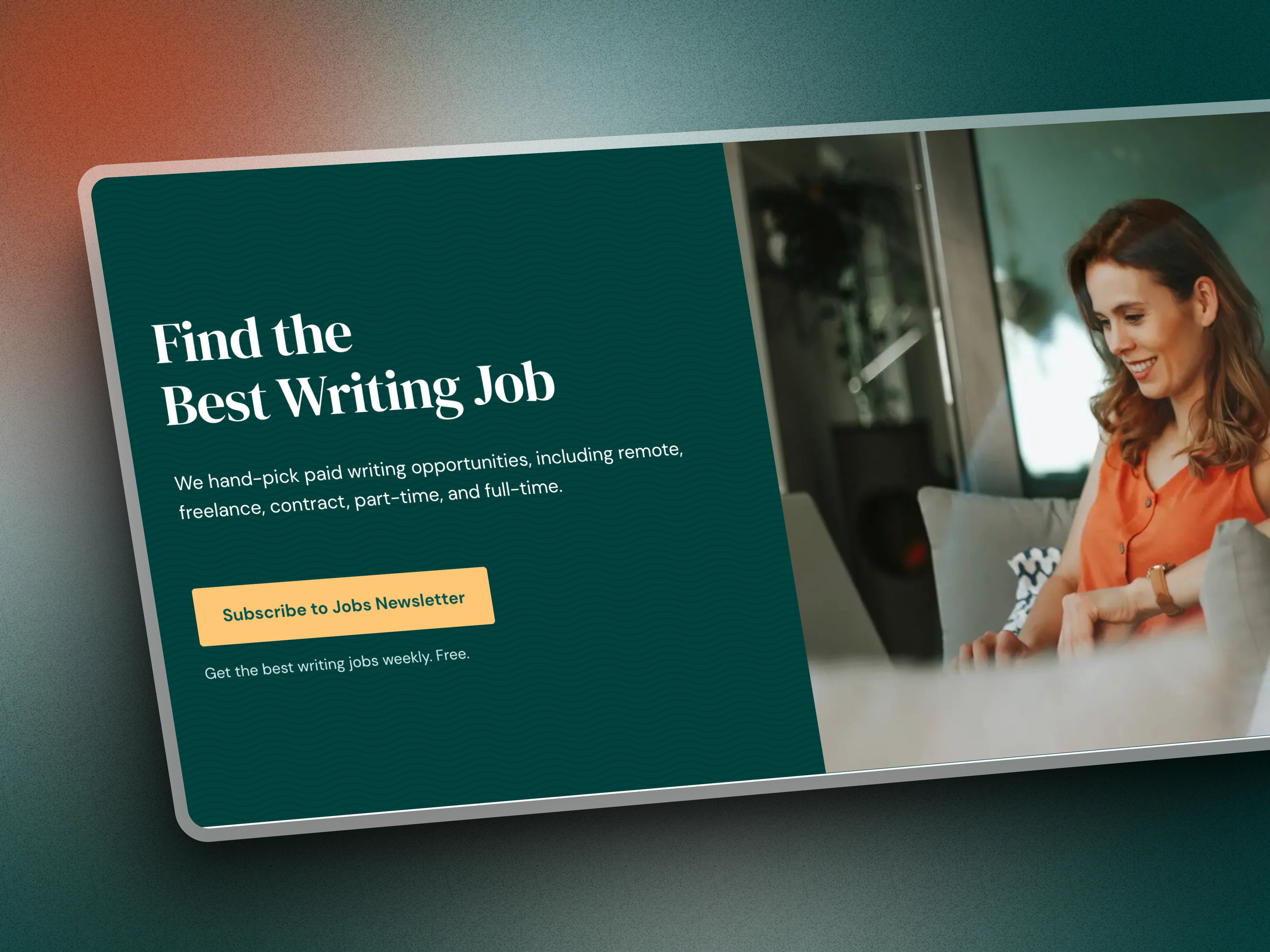
We can see the header background pattern on the green background (zoom in to see better).
✧ Made each element accessible and made it SEO friendly: I used Framer's native accessibility features to make sure none of the sections, headings, components etc are inaccessible. Also, I added the site favicon, Open Graph images and meta descriptions to make the website 100% SEO friendly.
✧ Final project delivery: did a final revision for website performance, SEO, accessibility, responsiveness, design and shared the published link and the remix file link to my client.
📸 Project Mockups
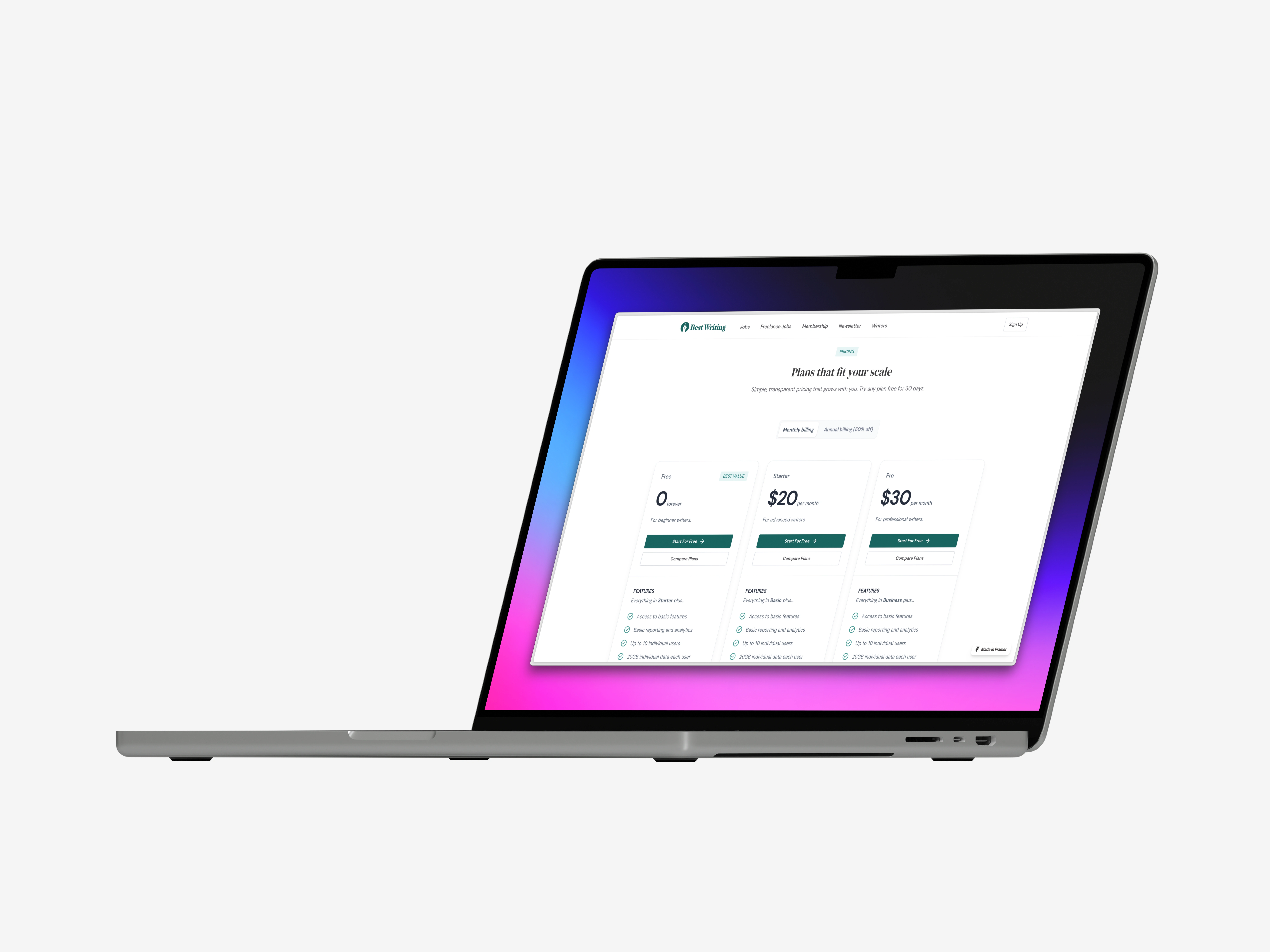
The Membership page with the pricing table
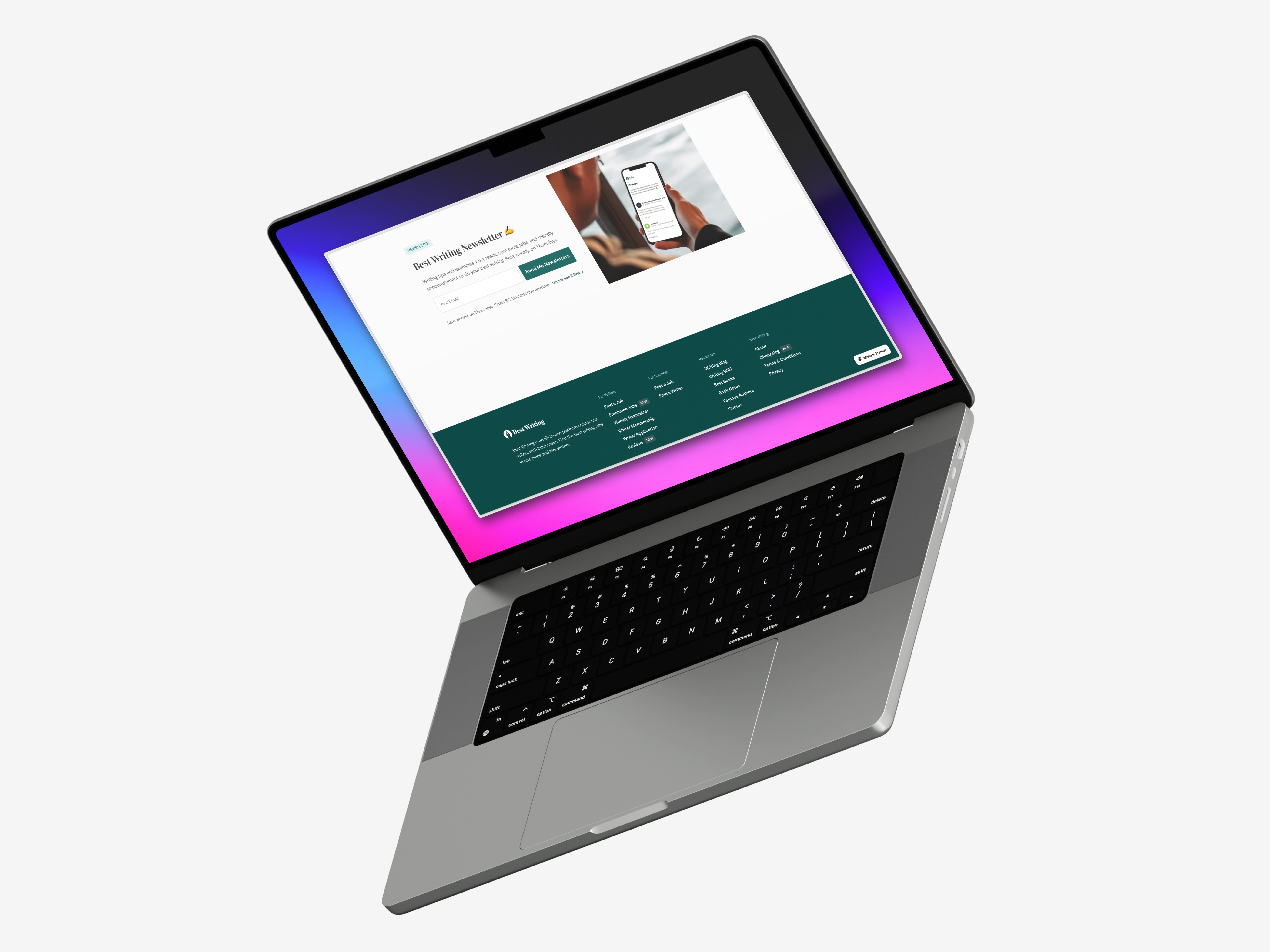
The newsletter section and the footer on the homepage.
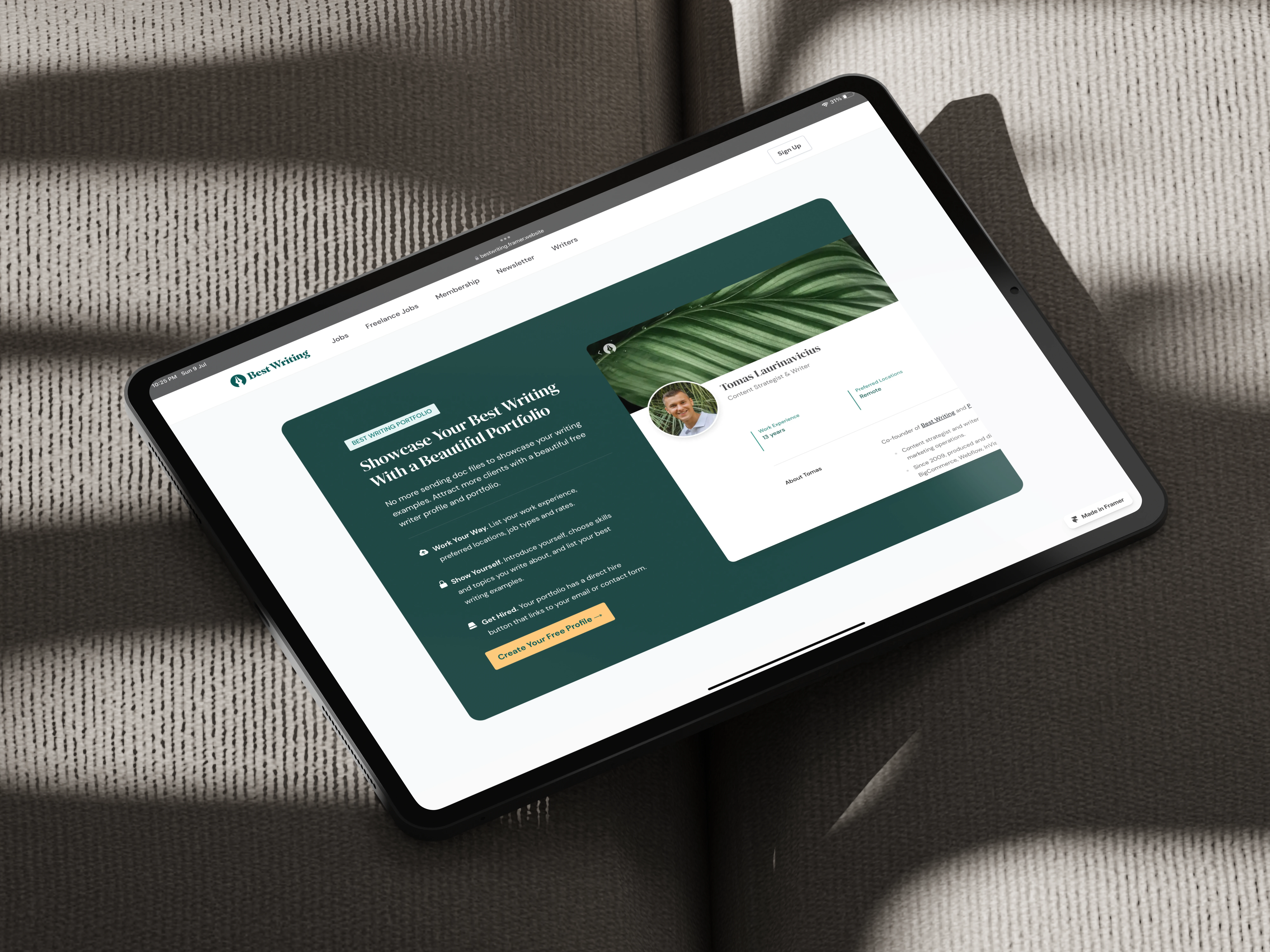
The features section on the homepage.
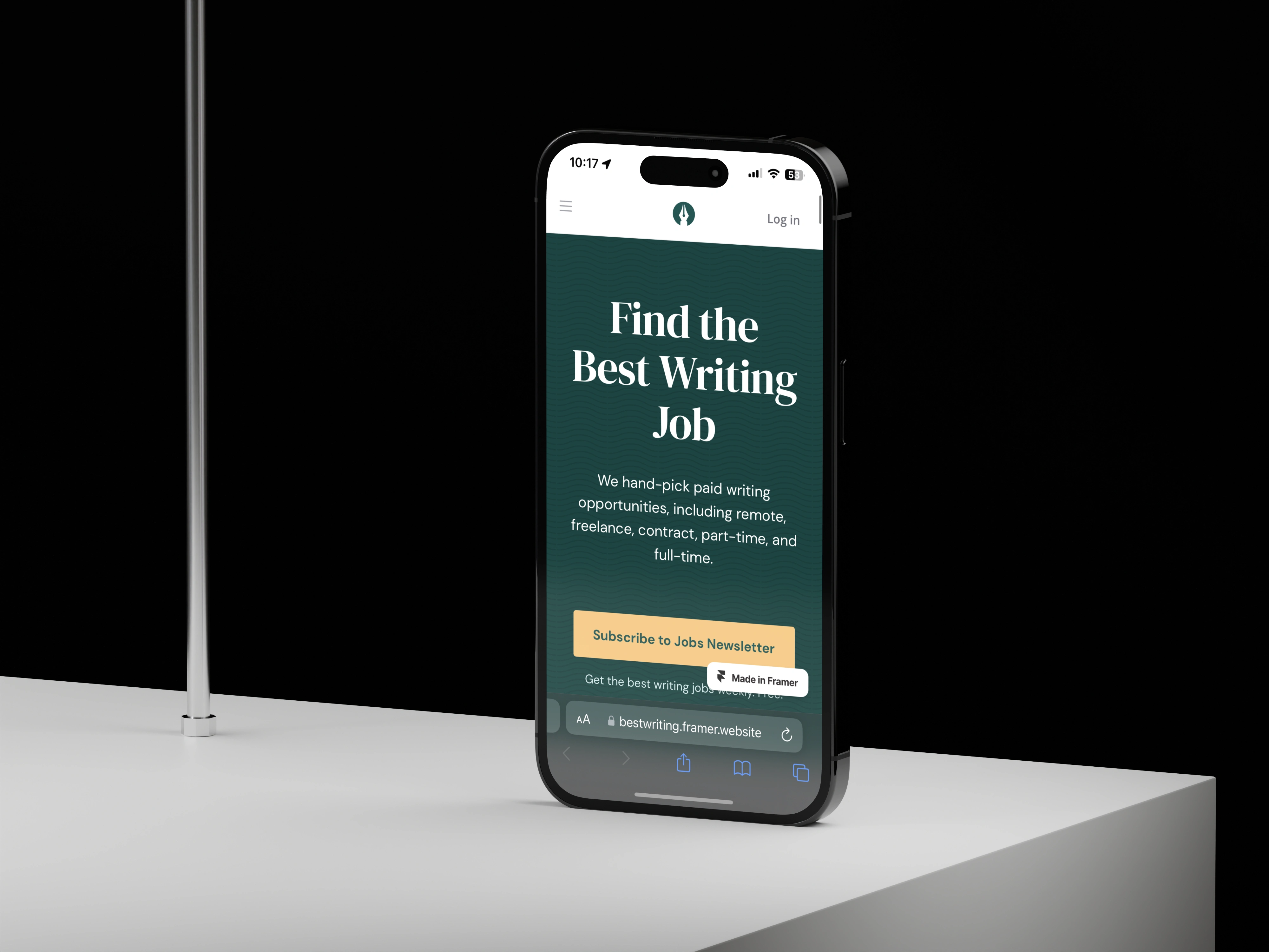
The homepage on a mobile device (iPhone 14 Pro).
📊 The Stats
✦ Timeline: 15-20 days
✦ Budget: $1000
✦ Number of components: 30+
✦ Deliverables: Framer Remix link and the published website link
💬 Client Testimonial
Vaibhav is a pleasure to work with. He's fast and clear communicator who always finds the best solutions to any Framer problem. His background in web development significantly contributes to his understanding of web design best practices.
— Tomas Laurinavicius, Co-Founder & Chief Editor at Best Writing.
Impressed? Want me to create a Framer website for you? Check my Framer service details here and send an inquiry! 🤝
Like this project
What the client had to say
Vaibhav is a pleasure to work with. He's fast and clear communicator who always finds the best solutions to any Framer problem. His background in web development significantly contributes to his understanding of web design best practices.
Tomas Laurinavicius
Jun 15, 2023, Client
Posted Jul 10, 2023
I created the homepage, membership and terms and conditions pages for Best Writing in Framer.
Likes
3
Views
1.8K
Timeline
May 10, 2023 - Jun 15, 2023
Clients
Best Writing

