Portfolios by Contra: Template Audit
Vaibhav Khulbe
🥱 TLDR;❇️ Project Overview✦ About the client: Contra✨ The Spark✦ What were the client's needs and goals?✦ Why did they choose me as an independent?🚀 The Process📊 The Stats✦ Timeline: 15-20 days✦ Budget: $1000✦ Templates reviewed: 6✦ Deliverables: The updated Notion doc with all the necessary information needed to improve the portfolio templates.💬 Client Testimonial
🥱 TLDR;
The Contra team wanted to review each of their newly made templates and themes for the Portfolios by Contra feature. So I performed a technical audit for each of them, from responsiveness to visual/technical bugs.
❇️ Project Overview
✦ About the client: Contra
Contra is the independent-first community and commission-free hiring platform shaping the future of work. The best part that I like about Contra is that it's commission-free, so what we earn is what we get with 0 platform fee. Plus, they have a wonderful set of new features and an equally awesome community.
✨ The Spark
✦ What were the client's needs and goals?
The Contra team wanted me to provide feedback, audit checks, and features/improvements to the Portfolios by Contra feature:
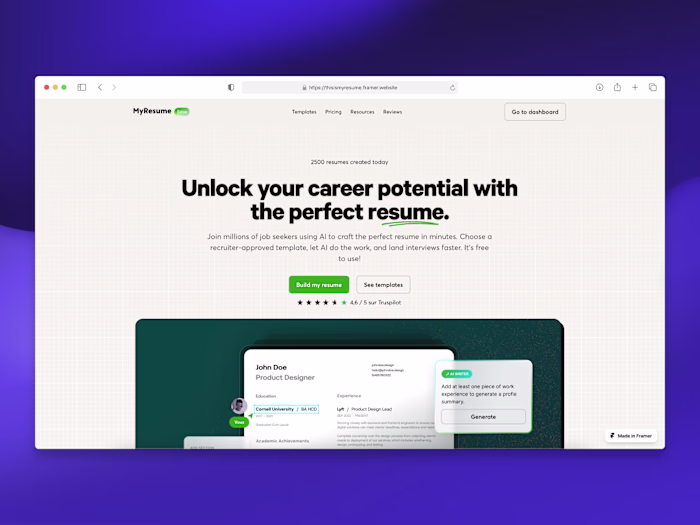
A screenshot of the webpage showcasing all about Portfolios by Contra.
This exciting new update to the platform showcases an independent's personal brand with a portfolio website designed and managed straight from their dashboard. The content is pulled from the user's Contra profile (check out mine for an example).
These were the main areas of auditing to consider:
All five themes for each template.
Desktop and mobile experiences.
Text accessibility across each component area.
Proper formatting and layout alignment.
Quality of project + service cards populating on the template.
Motion lag, disruption, or considerations.
Any visual or technical bugs.
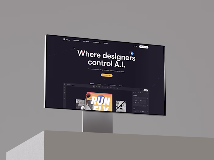
The initial 6 templates I worked on were the following:
🌴 Los Angeles: puts the spotlight on you and your visual work.
🇪🇸 Barcelona: the bold, colorful portfolio website template.
🦘 Sydney: show off your work and personality.
🌶️ Madrid: a clean, modern portfolio website template.
🍣 Tokyo: let your photography take center stage.
🇫🇷 Paris: an elegant, minimal portfolio website template.
Each of them had 5 themes: Midnight, Dusk, Midday, Morning, and Dawn:
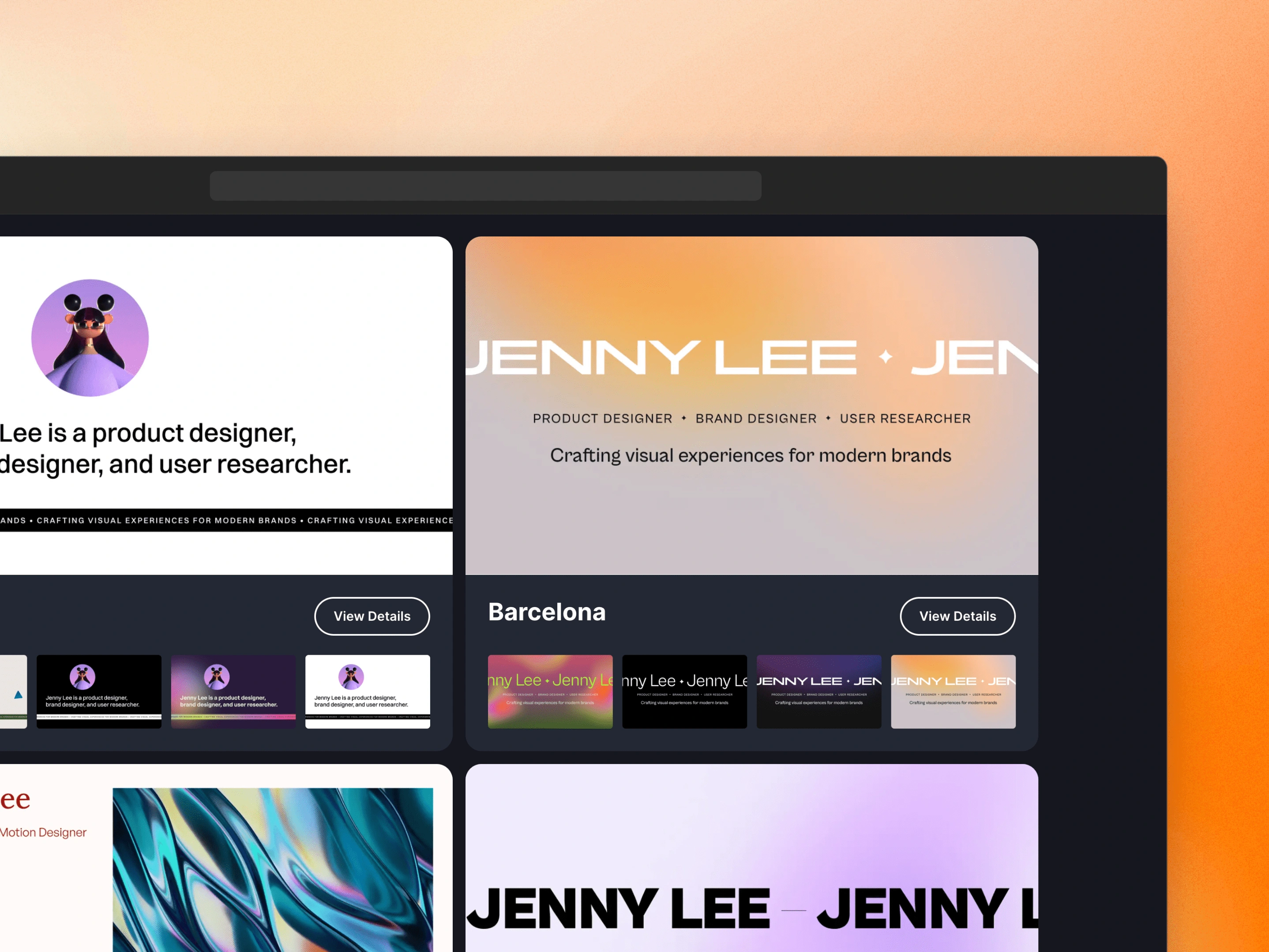
A screenshot of the webpage showing different portfolio templates available on which I worked.
✦ Why did they choose me as an independent?
I've been excited about Contra since joining this platform. Plus, after meeting with the Contra team (product, community, engineering, etc.) on their Slack community, I liked how passionate they were about building the product and the requests/feedback from their community member (users).
Being an active member, I got access to the Portfolios by Contra feature and was invited to discuss things around this specific addition. I sent 1-2 detailed pieces of feedback over there, which the Contra team noticed. After that, I received multiple messages asking me to take a look at each of the initial 6 templates as a paid opportunity!
I teamed up with Daniel Cruz, Creative PM at Contra, for this project. He says they chose me because:
As one of our earliest adopters of Portfolios, Vaibhav has been a steadfast supporter that the team could always count on to provide valuable feedback – both from a design and development perspective. Upon our beta rollout, we set out to formalize this valuable feedback loop with Vaibhav into a paid project; enlisting his services to provide an audit on our Portfolio templates and themes in order to put that final polish. Vaibhav delivered acute, timely, and valuable feedback on each template the team was able to implement and deploy to users.
🚀 The Process
Daniel gave me access to a Notion document prepared for me where everything was laid out, including the project brief, areas to consider for the audit, and a separate page where I could write down all the template feedback in detail.
I completed the project in the following steps:
✧ Getting a general feel of the webpage: I simply opened the website in a chosen template and noted anything that looked off. Be it in terms of design, accessibility, a bug, or a tweak to an already existing feature.
✧ Writing down my findings: using the provided Notion doc, I converted my notes from the first step into a piece of clear information inside the template page using the formatting tools of Notion, screenshots, annotated markups, etc.
✧ Noting down text accessibility issues: I used the Pika and the Chrome Dev Tool tool in order to check any text accessibility issues on each template/theme. Then I put the WCAG (Web Content Accessibility Guidelines) Contrast Ratio value of both the foreground and background color like this:
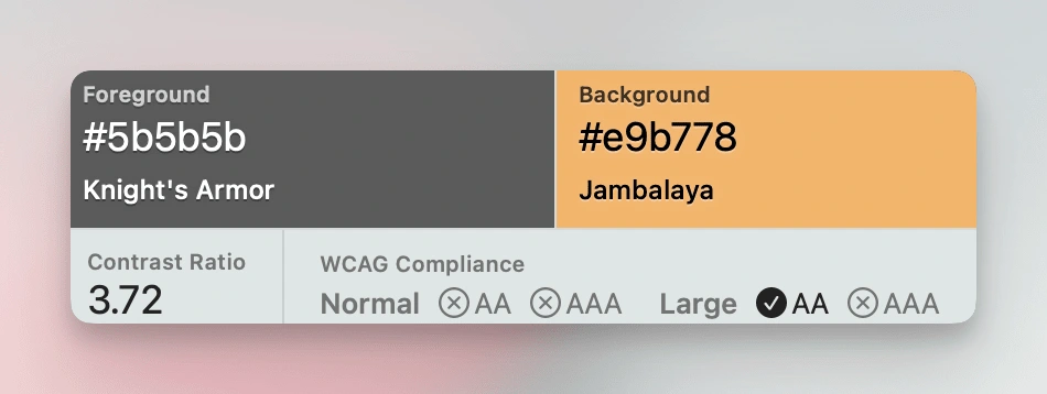
A screenshot of the Pika tool showing the contrast ratio value from one of the template themes.
I also suggested contrast improvement ideas. For example, improving the contrast of the emojis used in the text. Here's the previous version:

And here's the updated version with improved accessibility:

✧ Suggestion on formatting/layout: I suggested various new ideas to improve the overall formatting and layout of each of the pages of the portfolio website. For example, adding a new subheading before each section or lowering the
✧ Technical bug report: I would then test the same webpage on different browsers to check the compatibility across different browser engines, like some bug on a Webkit browser like Safari.
✧ Checking the performance: I tested the website load/stutter both manually as well as using Chrome's Lighthouse tool to generate the performance report. Then I also used Google's PageSpeed Insight to understand where things can be improved technically.
✧ Mobile experience: I would take screenshots, record the mobile screen, annotate them, and share some new features that could be utilized on a mobile screen.
📊 The Stats
✦ Timeline: 15-20 days
✦ Budget: $1000
✦ Templates reviewed: 6
✦ Deliverables: The updated Notion doc with all the necessary information needed to improve the portfolio templates.
💬 Client Testimonial
Vaibhav is an absolute dream to work with ✨ a true professional, he cares deeply about his work and field. Vaibhav is dedicated to delivering quality results and shares regular updates throughout the process. 10/10 recommend!
Creative PM, Contra
Like this project
Posted Mar 8, 2023
I worked on the design+technical auditing for the Portfolios by Contra website templates.