Increase retention with a personalized finance dashboard
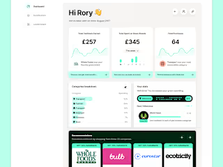
We designed an engaging way of approaching the financial Reports dashboard based on the customer’s goals.
Client: Cashwiser
Role: Product designer
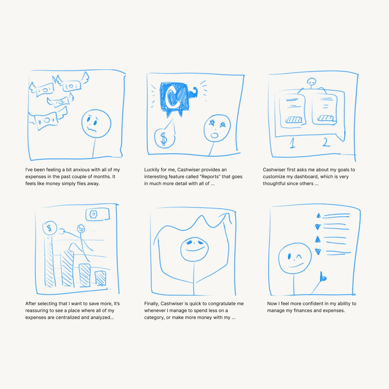
What is the point of drawing?
Usually, problem = sad face, good UX = smiley face. People understand storyboards because they humanize "the user".
During this Discovery exercise, I realized different groups of people may have different expectations and needs from their Reports- based on the emotions illustrated in my storyboards.
I prefer the jobs-do-be-done framework.
Whenever we bring about a new feature to be integrated, I like to think in terms of what the person on the other end of the screen is trying to accomplish.
During briefing, I used job stories to hone in on the goals of our clients.
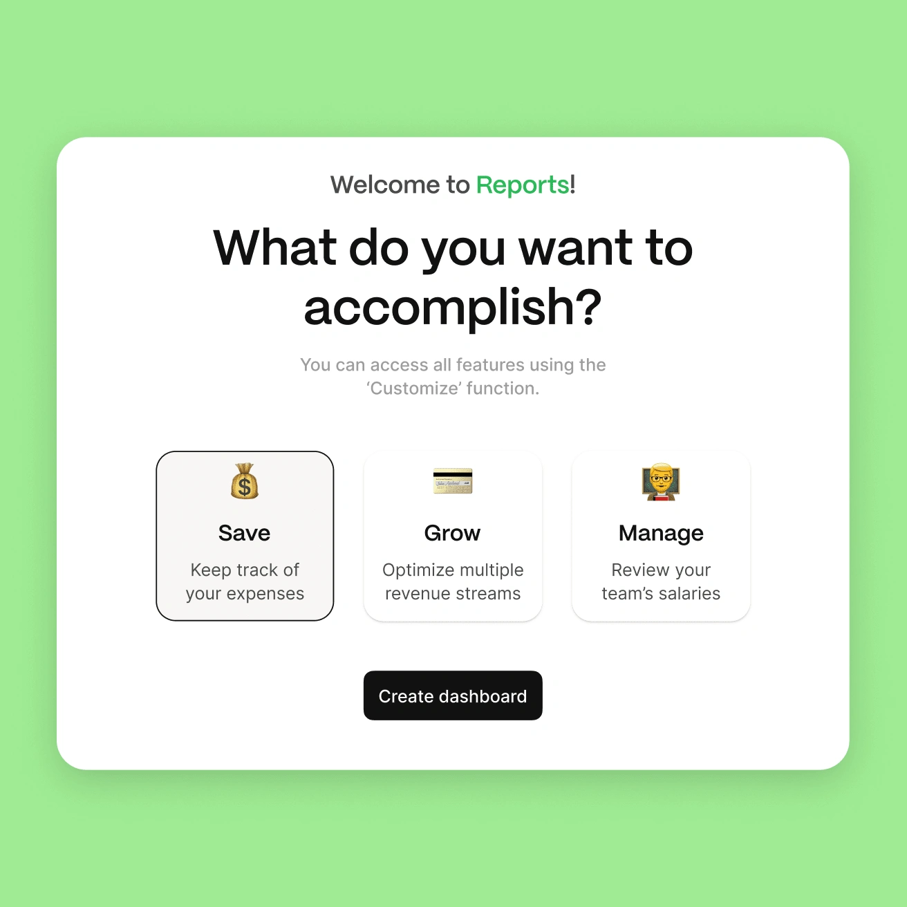
We established 3 main goals: to save money, to optimize income streams, and to manage the spending and income of multiple people or businesses.
To communicate clearly the purpose of each section during this soft onboarding, we use simple language.
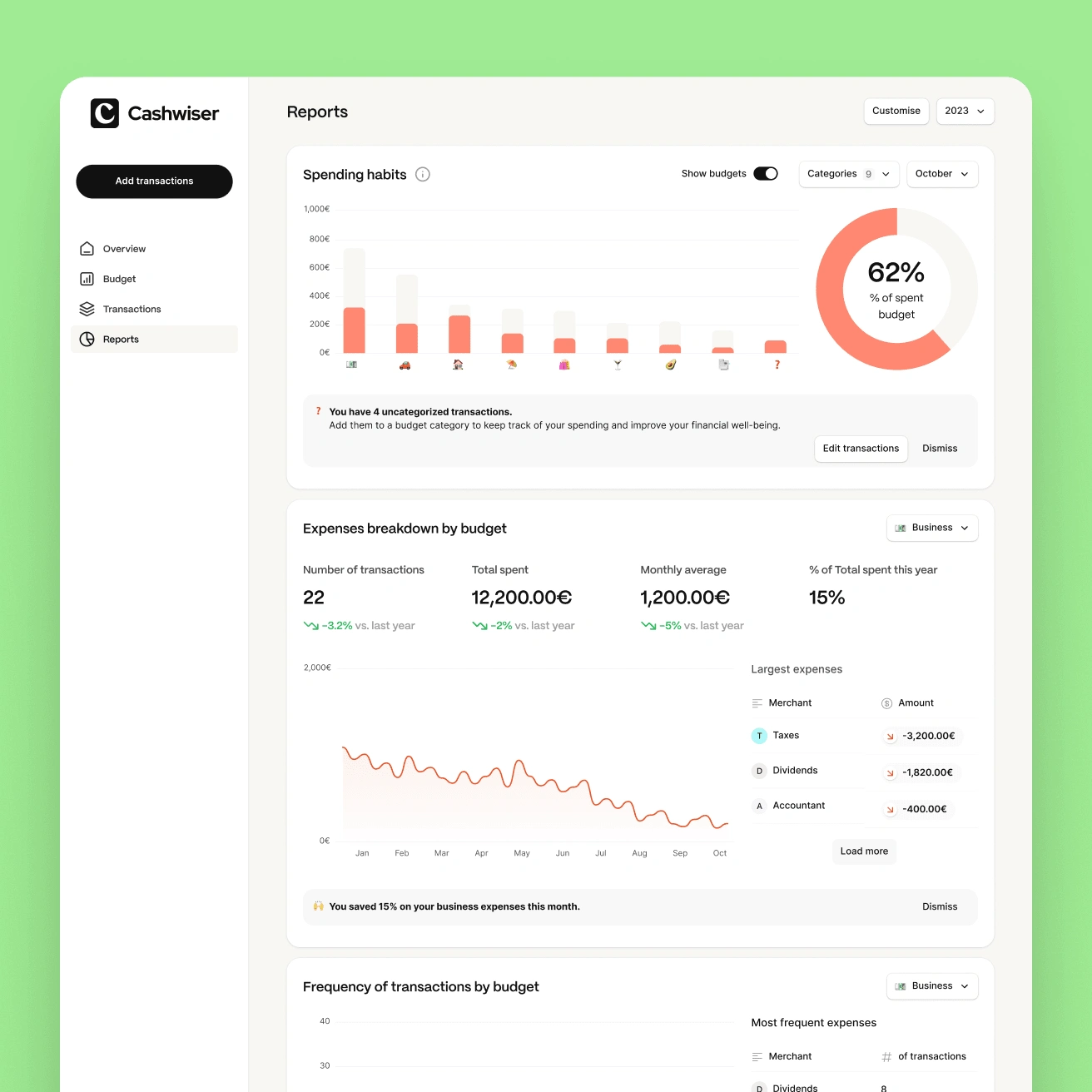
Powerful overviews at your fingertips
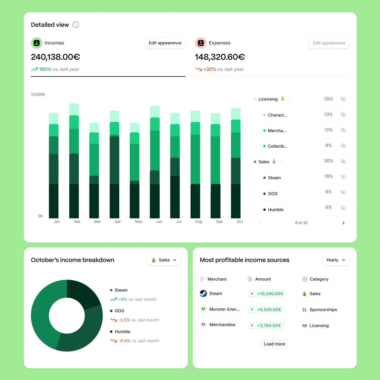
Each goal leads to a specific default dashboard.
In the example to the left, we see 3 widgets part of the “Manage” dashboard generated for an indie game studio.
Other types of dashboards feature different widgets. During the design stage, we created multiple widgets for each dashboard type: growth trends for “Grow”, or “Frequency of transaction by budget” for “Save”.
Flexibility is key
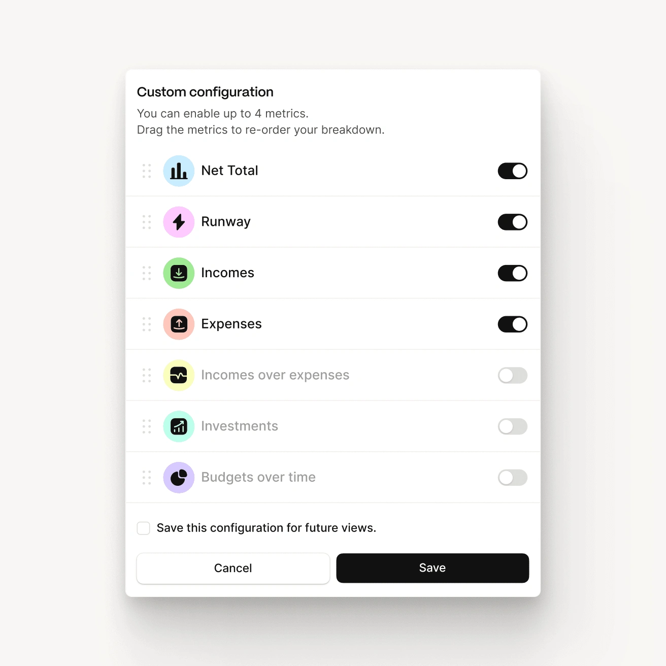
I knew that people and businesses evolve in time. Goals change, and a great product manages to keep up with the people it’s trying to help- this way, it stays relevant and maintains its customer retention.
A “Customize” function allows users a powerful overview of all the dashboard’s widgets. Via intuitive toggles, the person on the other end can enable and disable anything they wish, and their personal Reports dashboard follows suit.
Like this project
0
Posted Nov 21, 2024
I designed an engaging way of approaching the financial Reports dashboard based on the customer’s goals.


