Meridian GTM Brand Identity Design

Serkan Hürsgünel
Verified


Overview
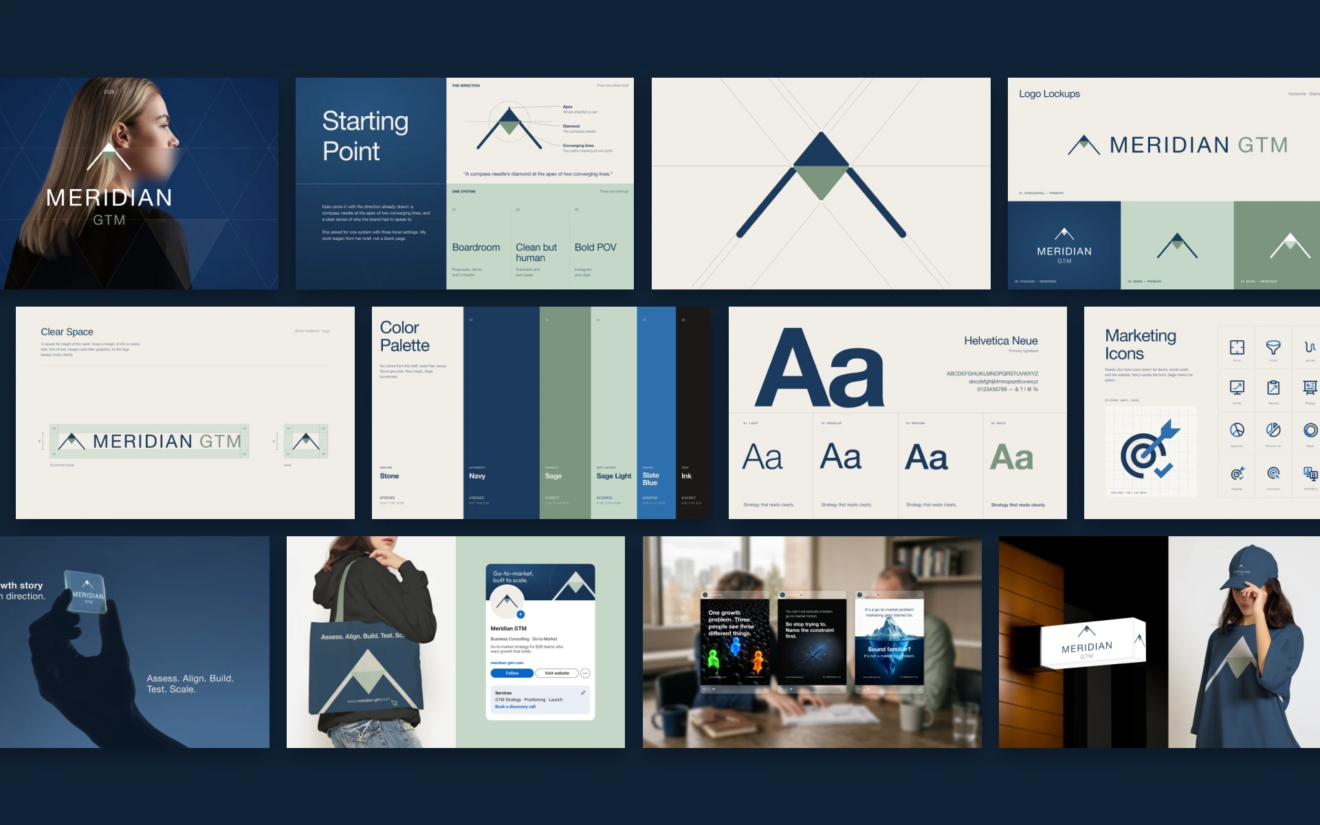
Meridian GTM is a go-to-market consultancy helping B2B teams build growth that holds. The founder came in with a defined direction and needed it turned into an identity that could ship on day one and stay consistent as the business grew.
Story
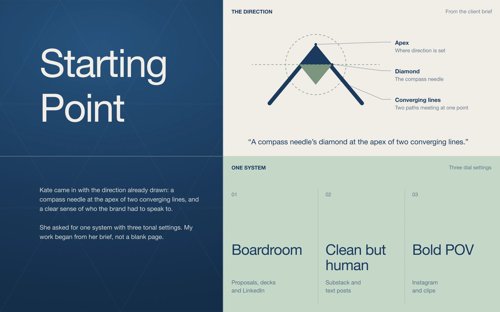
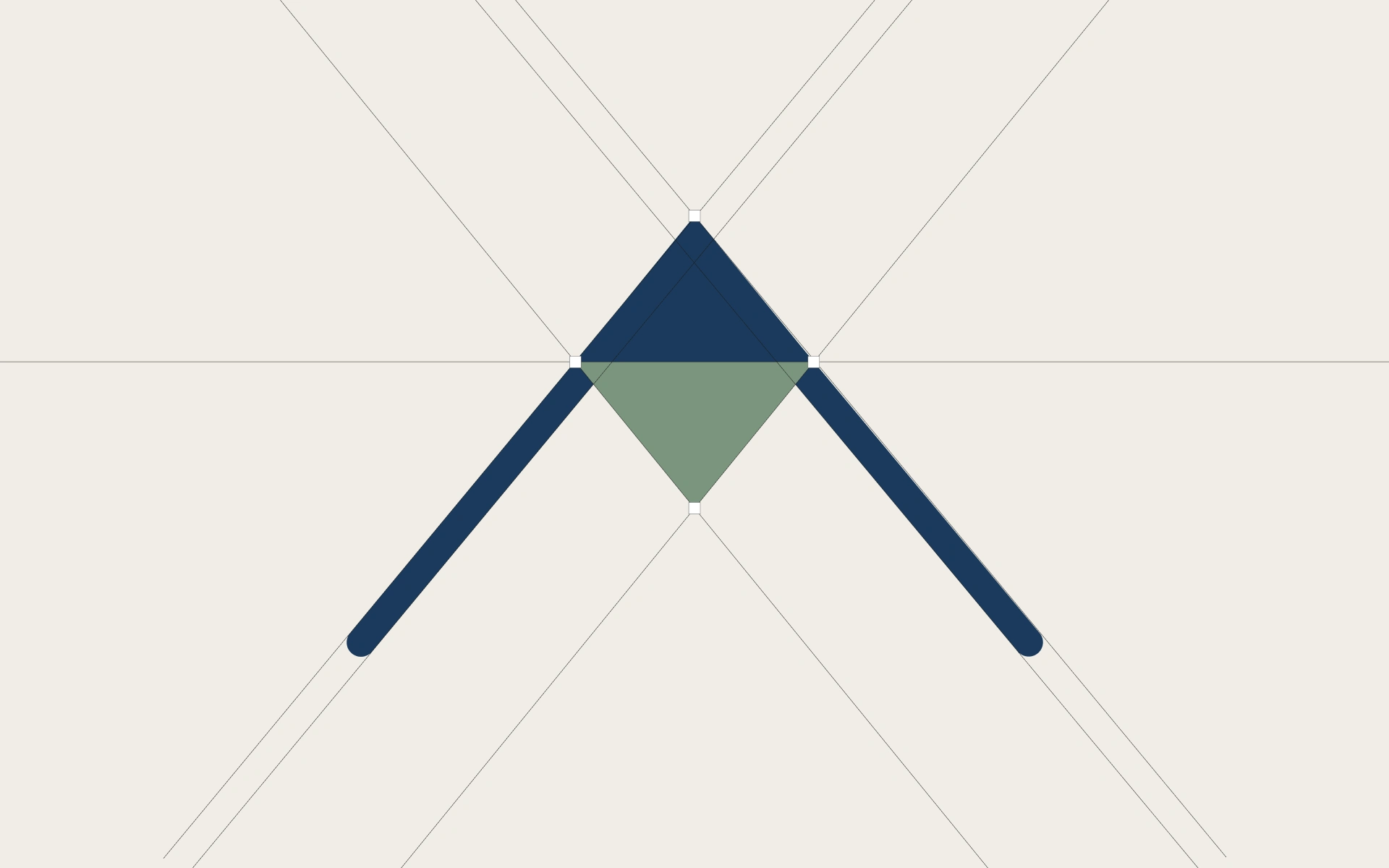
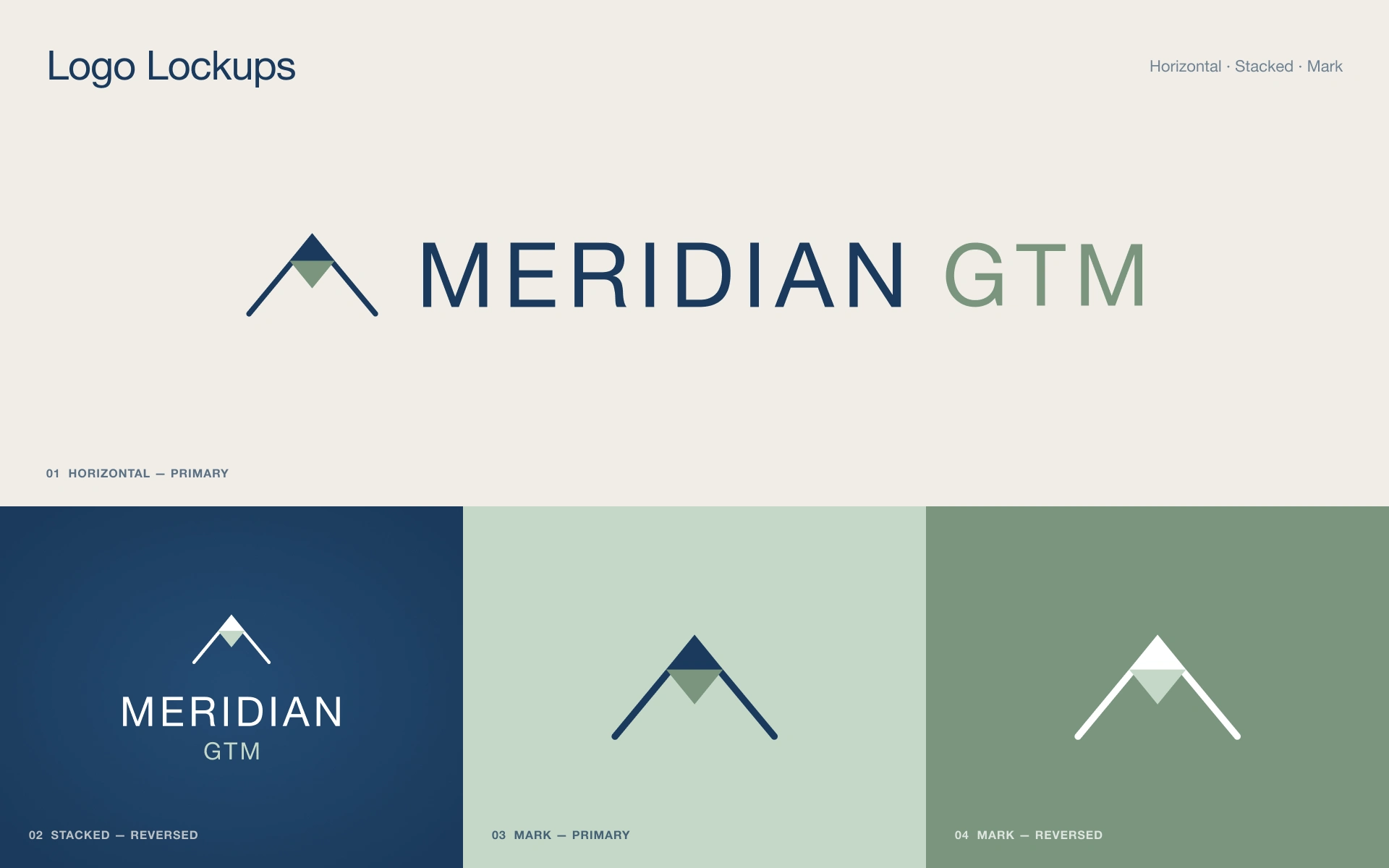
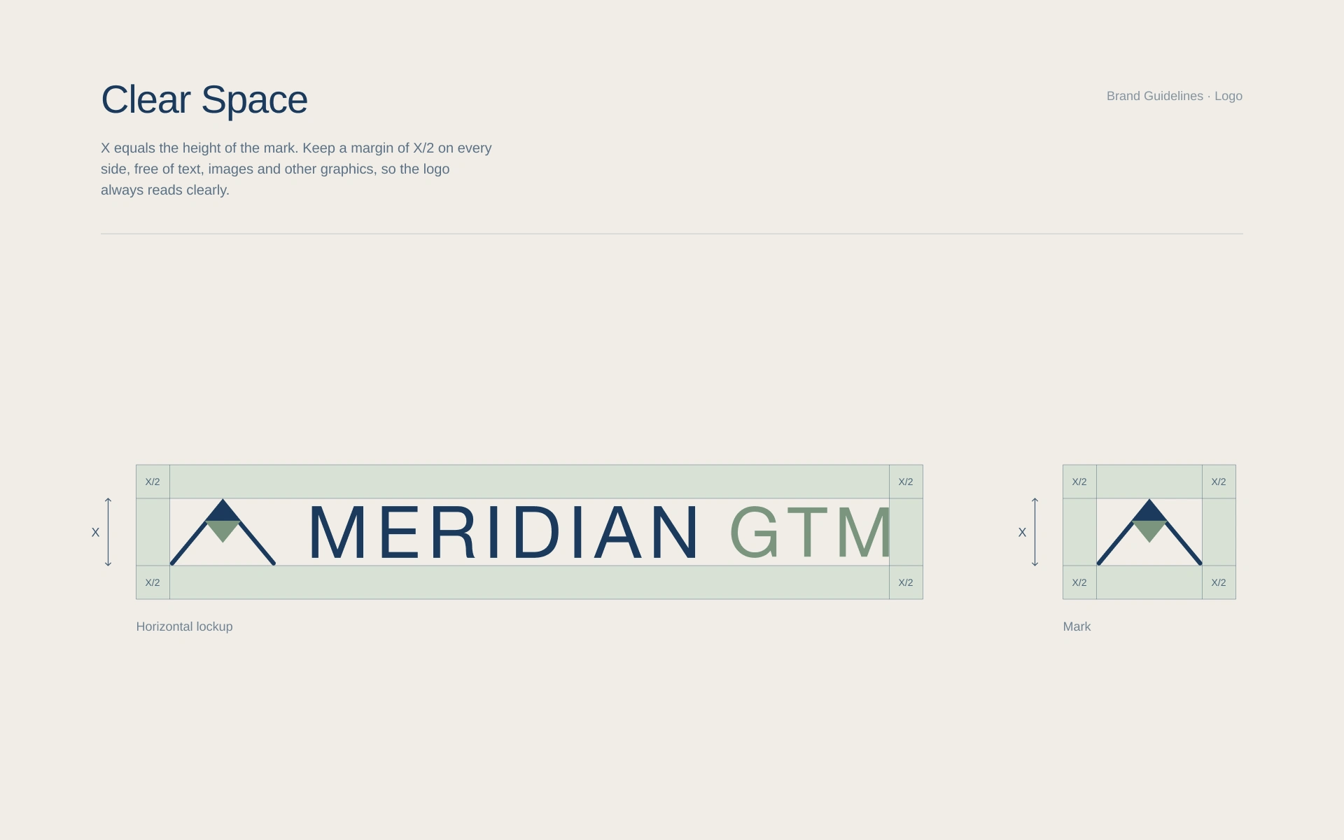
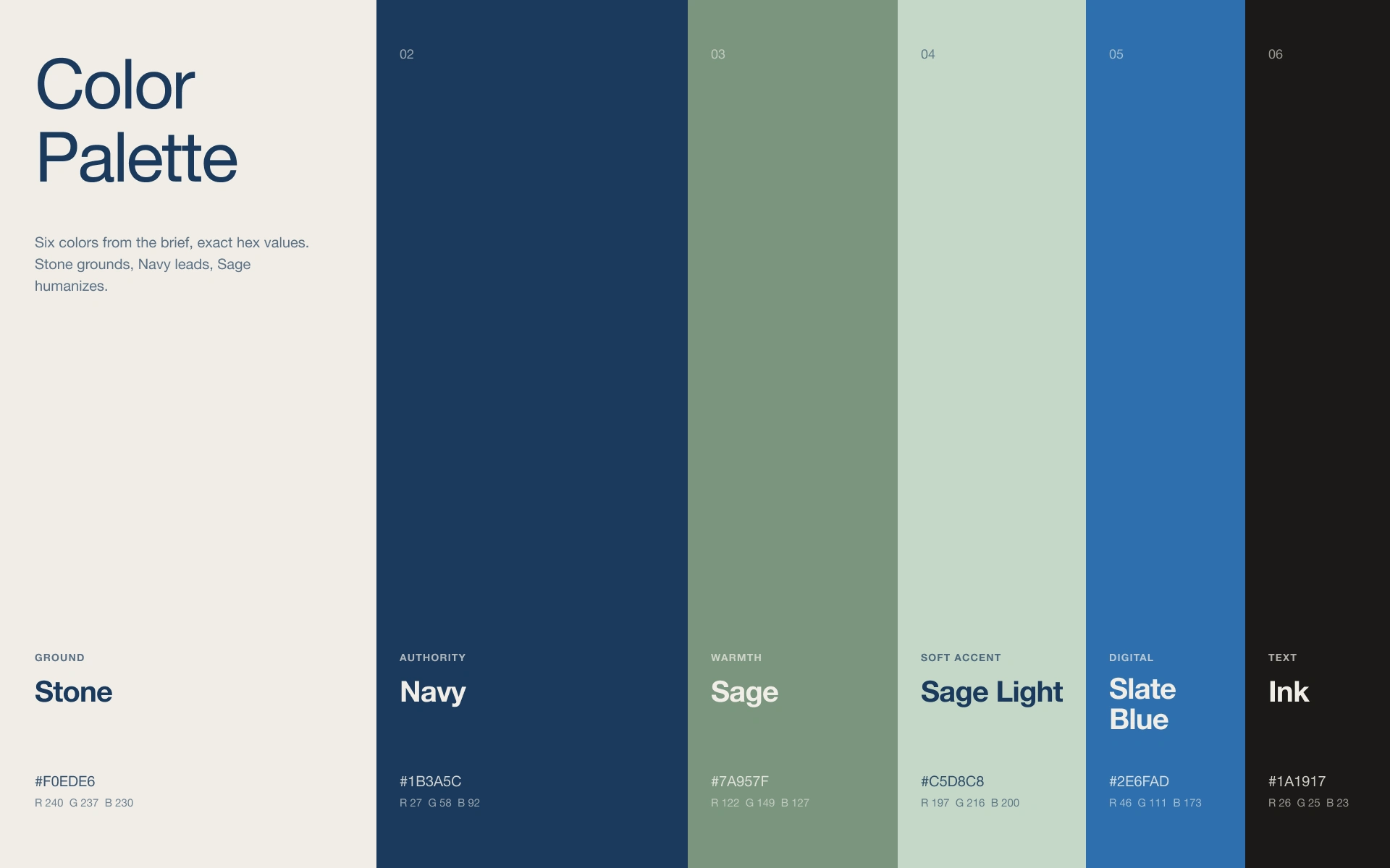
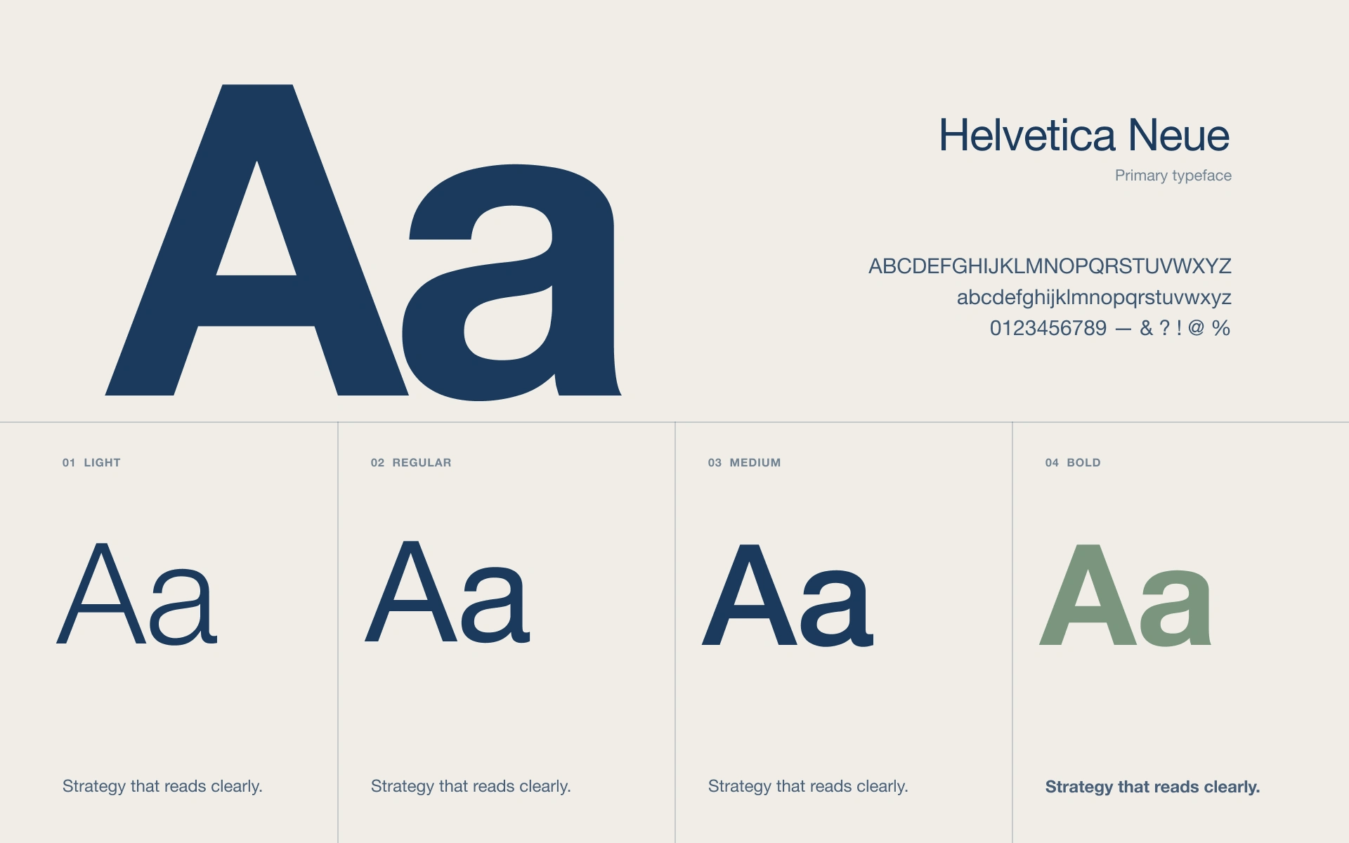
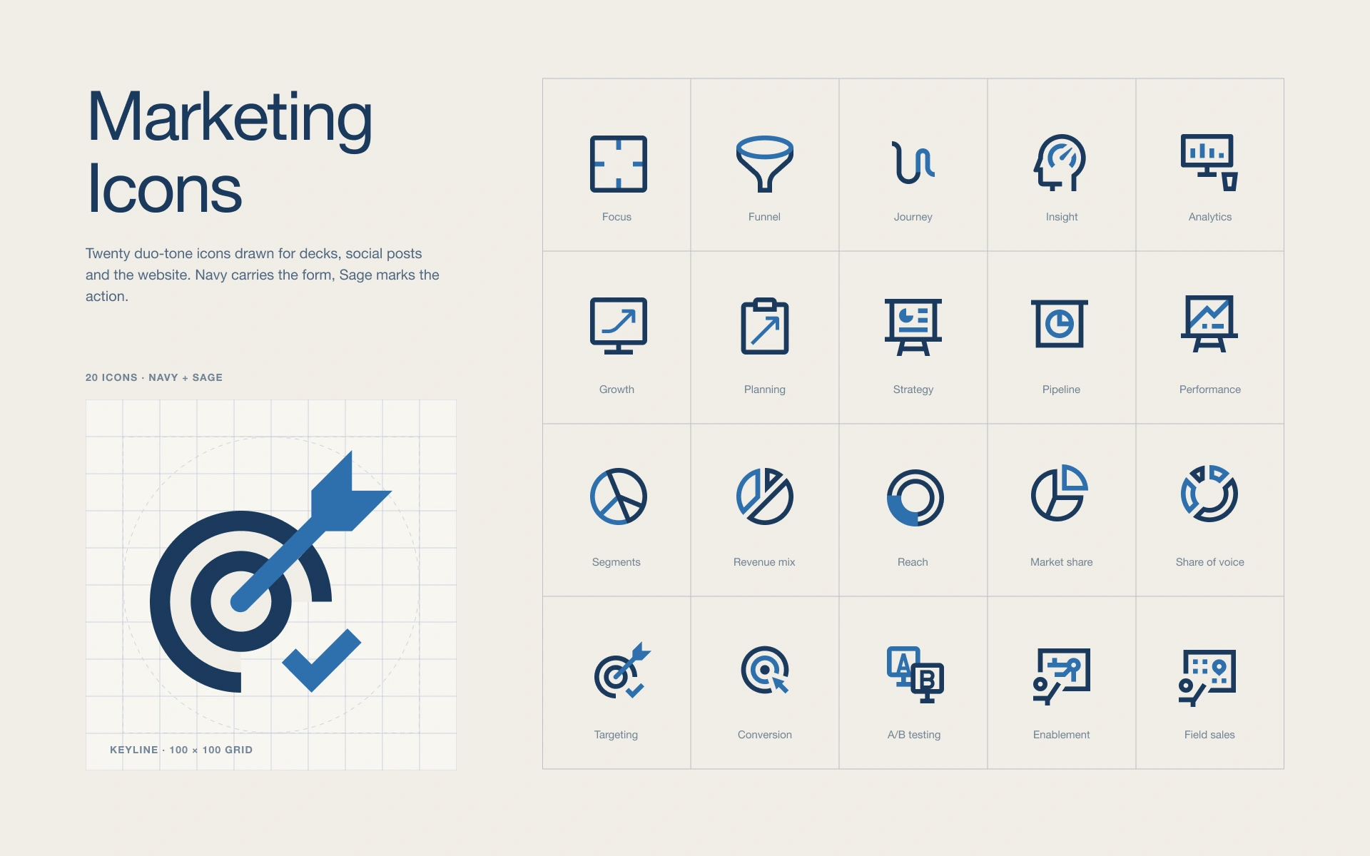
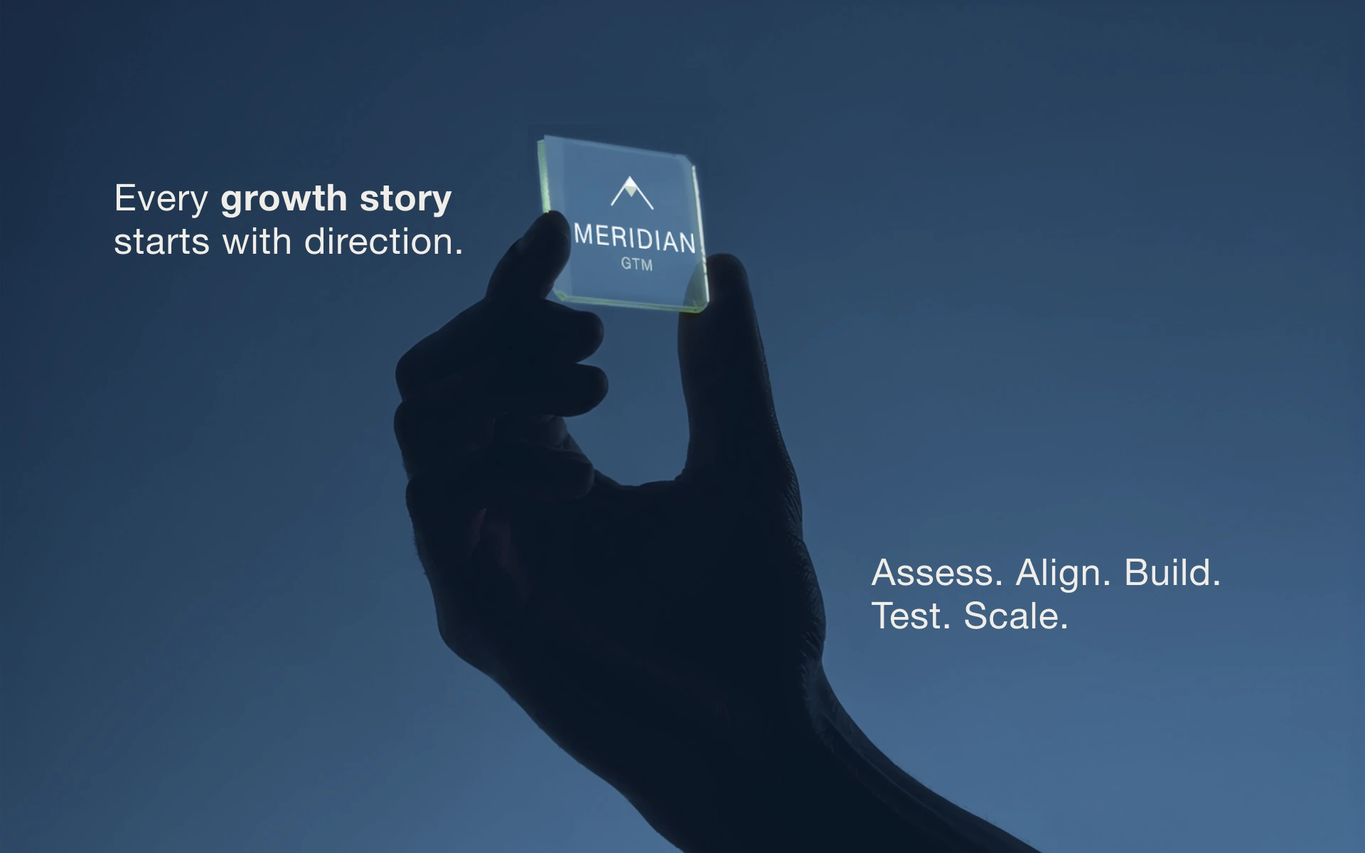
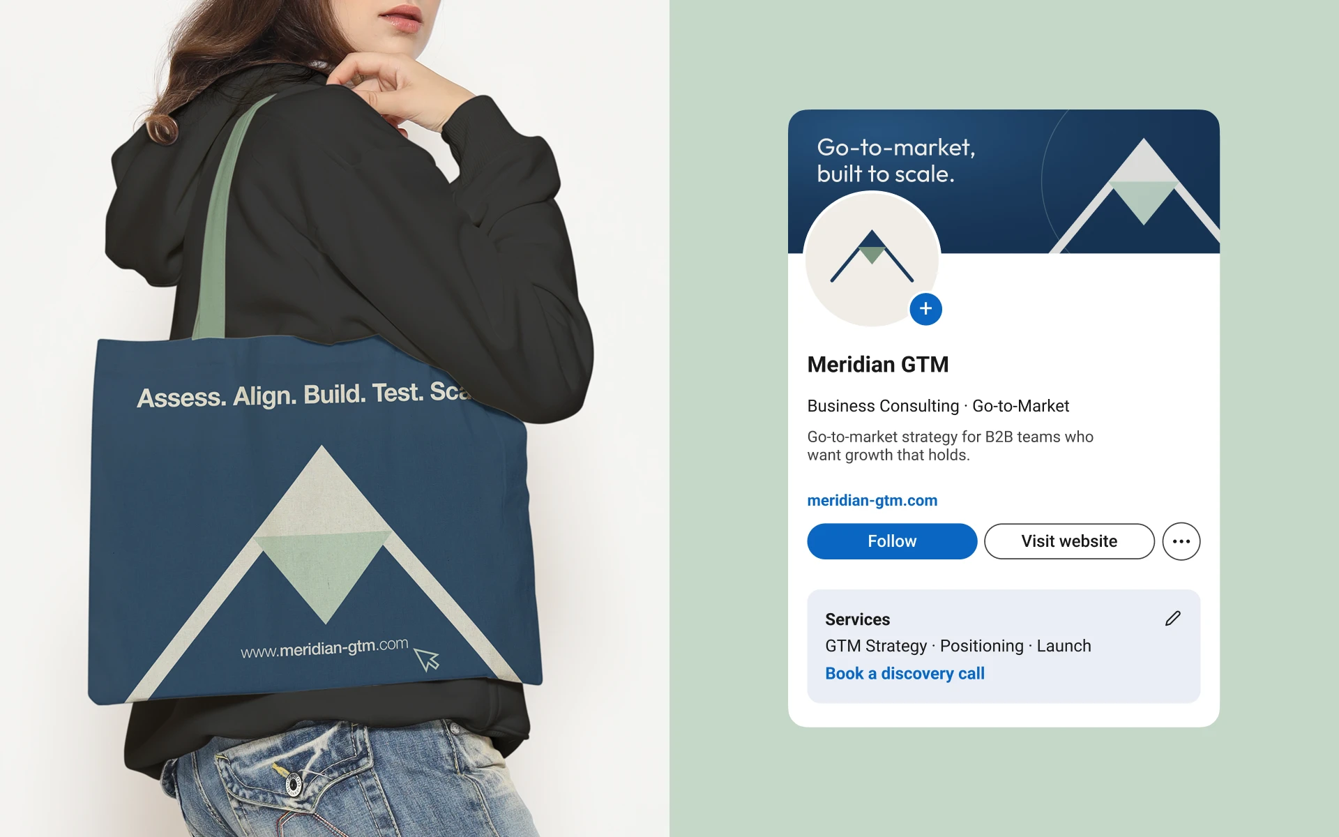
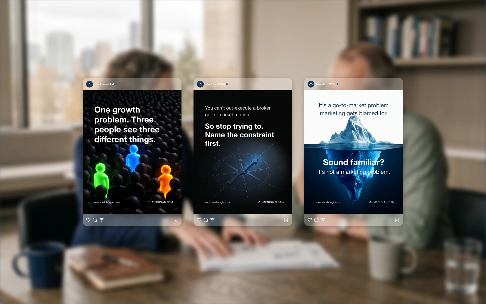
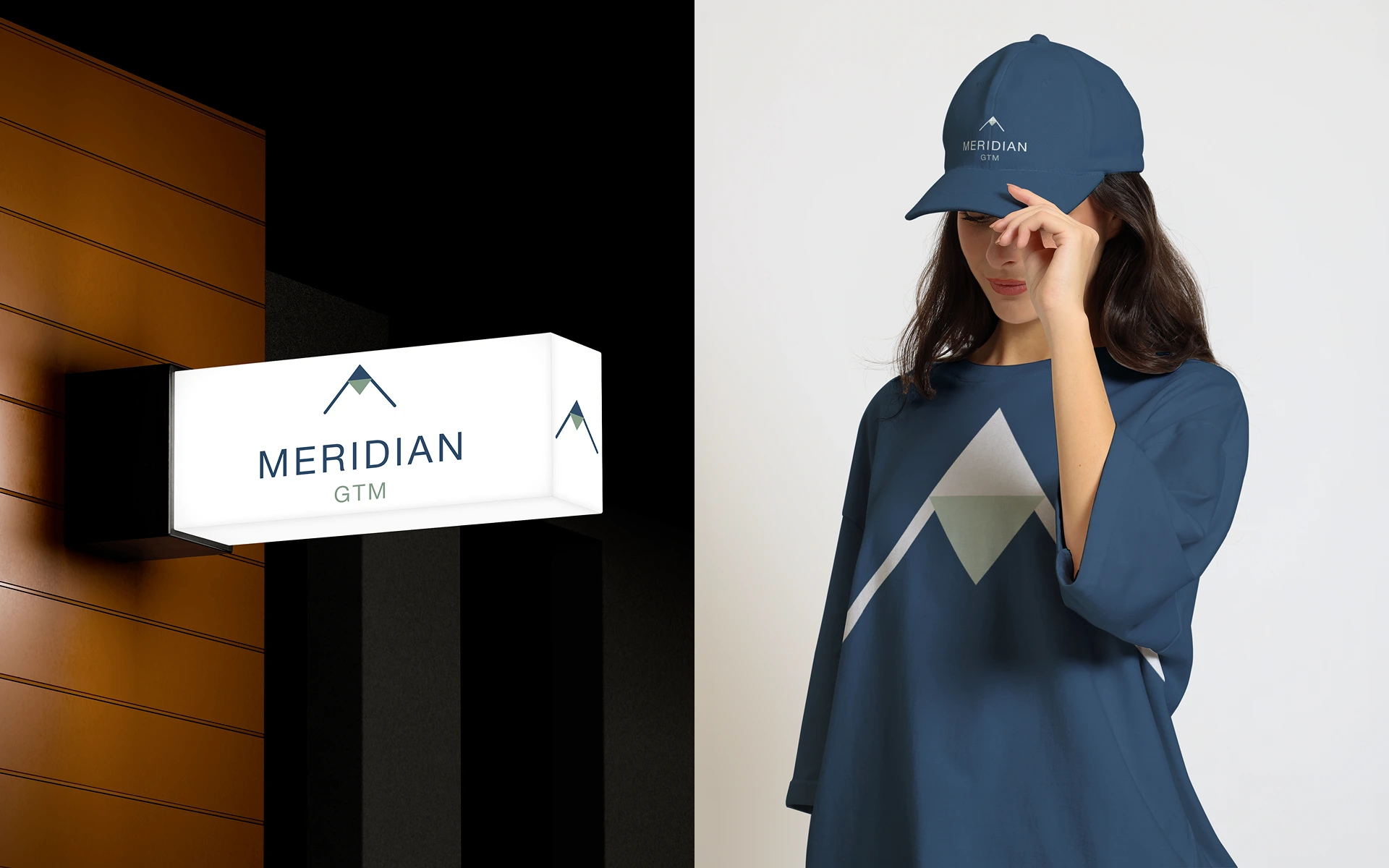
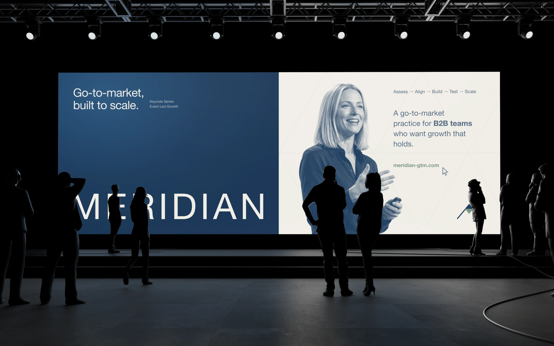
The concept was already on the table: a compass needle’s diamond at the apex of two converging lines. My role was to make it work everywhere. I tightened the geometry across two mark positions and recommended the one that read strongest as a compass and held up at favicon size; it was approved in a single round. From there I built the lockup and colorway system, a production-grade file structure any designer can pick up without a walkthrough, and brand guidelines covering clear space, color and type. The identity then extended into social templates, a Canva brand kit, marketing icons and event and merchandise applications, one system tuned to three settings: boardroom, clean but human, and bold.
Like this project
Posted Oct 25, 2026
Turning a founder’s compass-mark direction into a launch-ready identity for Meridian GTM: refined logo, brand guidelines, icons and a social system.
Likes
0
Views
0
Timeline
May 27, 2026 - Jun 15, 2026
Clients
Meridian GTM