Bilsoft Brand Identity Redesign

Serkan Hürsgünel


Short description
Bilsoft had earned the trust of 100,000+ businesses, but its brand didn’t show it. I rebuilt the identity so it looks as reliable as the company already is.
Project description
Bilsoft has made accounting software for Turkish businesses for over 20 years. The product had earned real trust, but the brand had grown piece by piece and no longer looked like one company. For software that handles people’s invoices and accounts, that inconsistency was a quiet problem.
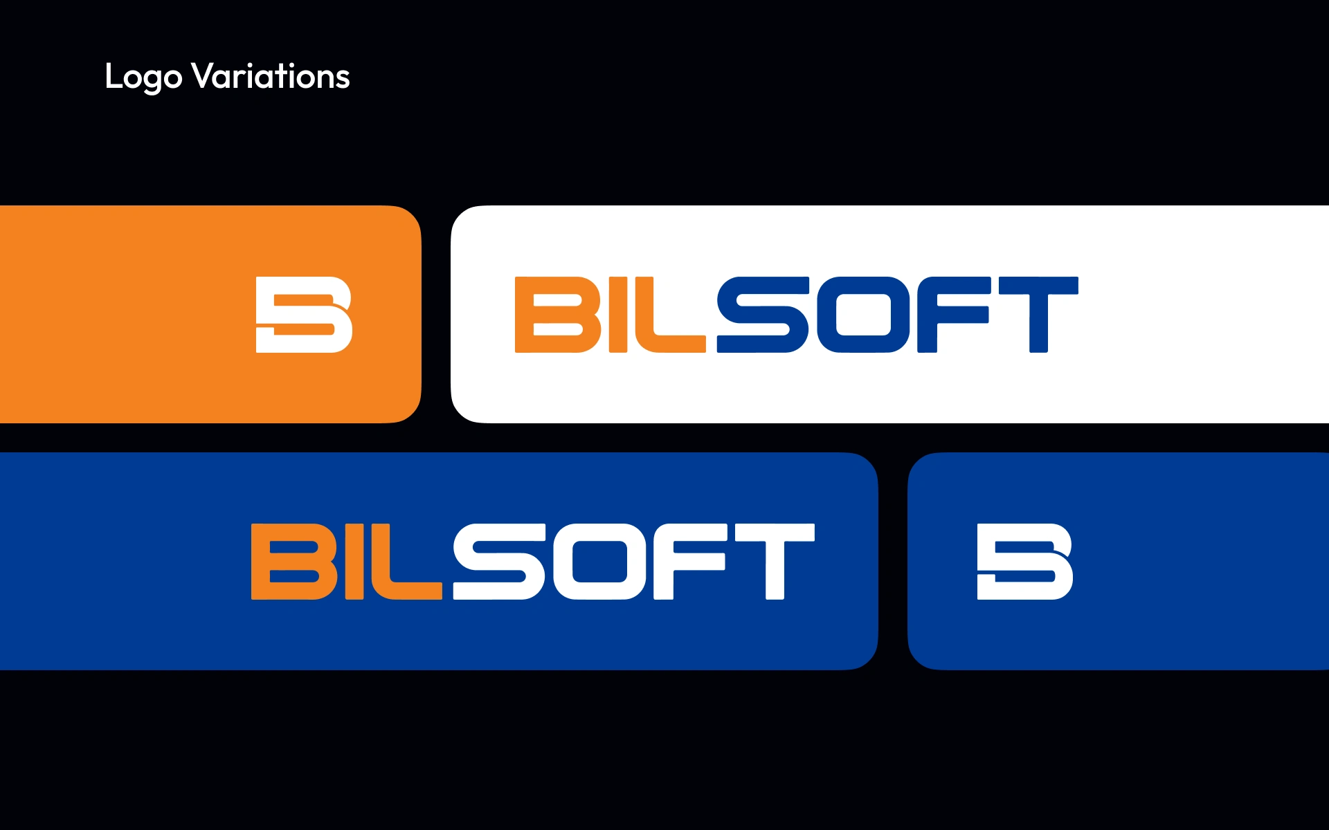
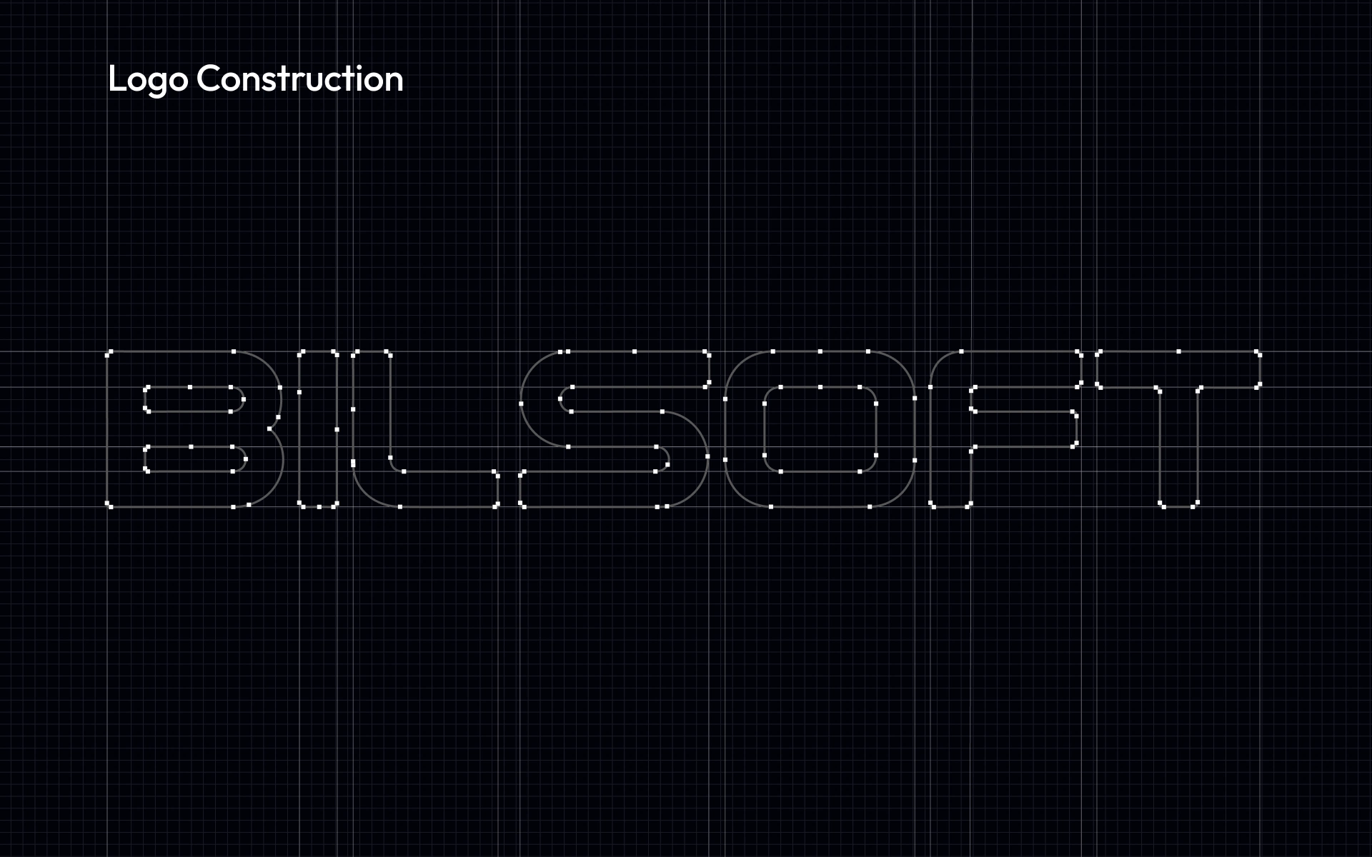
The challenge was balance. Financial software has to feel precise and serious, while its users are small business owners who want things to feel simple. I built the identity around that tension. The wordmark is drawn on a strict geometric grid for precision, with softened corners so it never feels cold. Its two halves split the brand’s personality: “Bil”, meaning knowing, carries the warmth and energy, and “Soft” carries the stability.
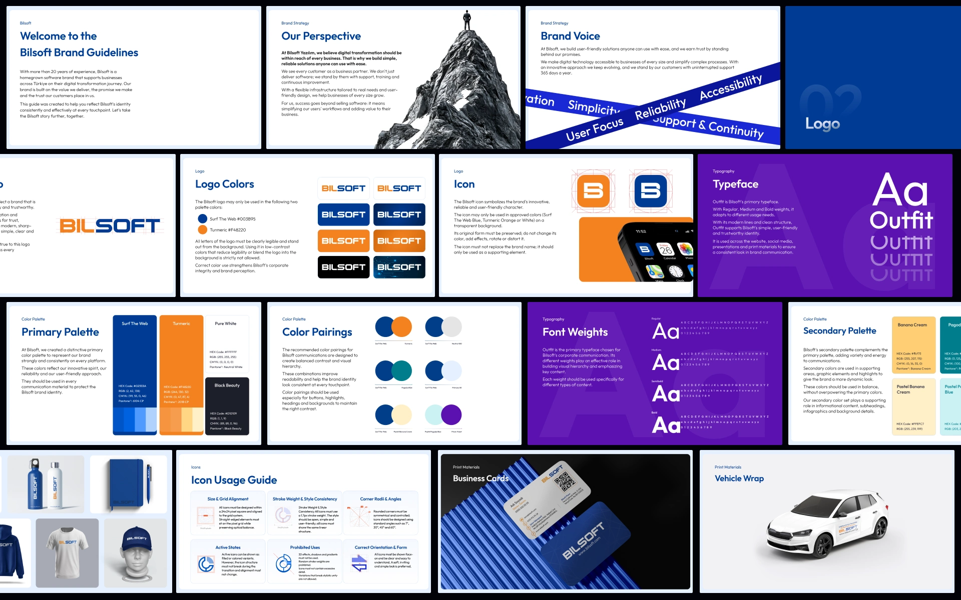
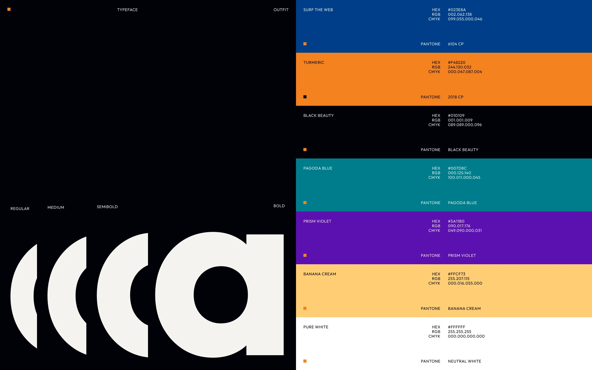
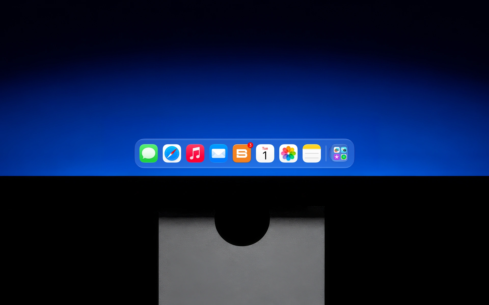
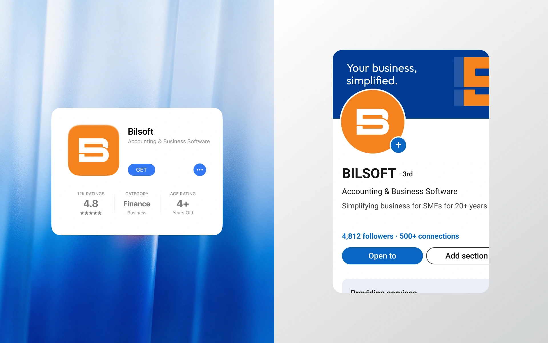
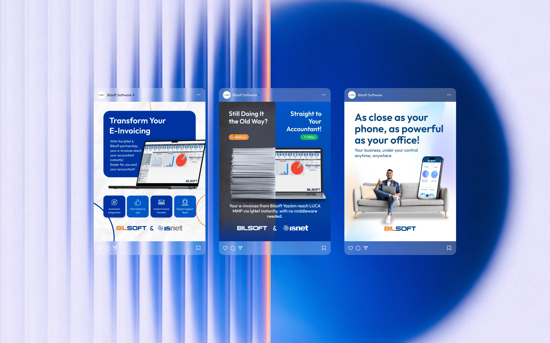
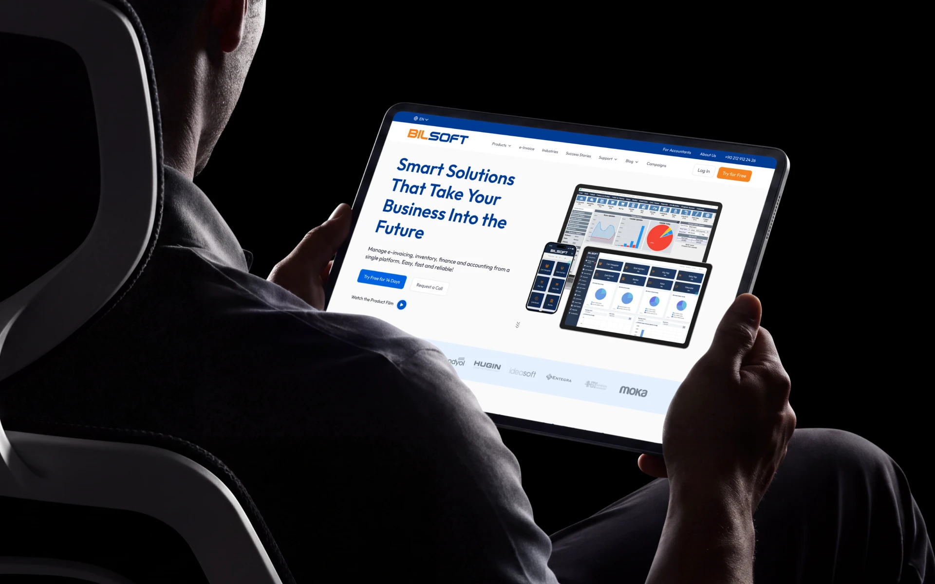
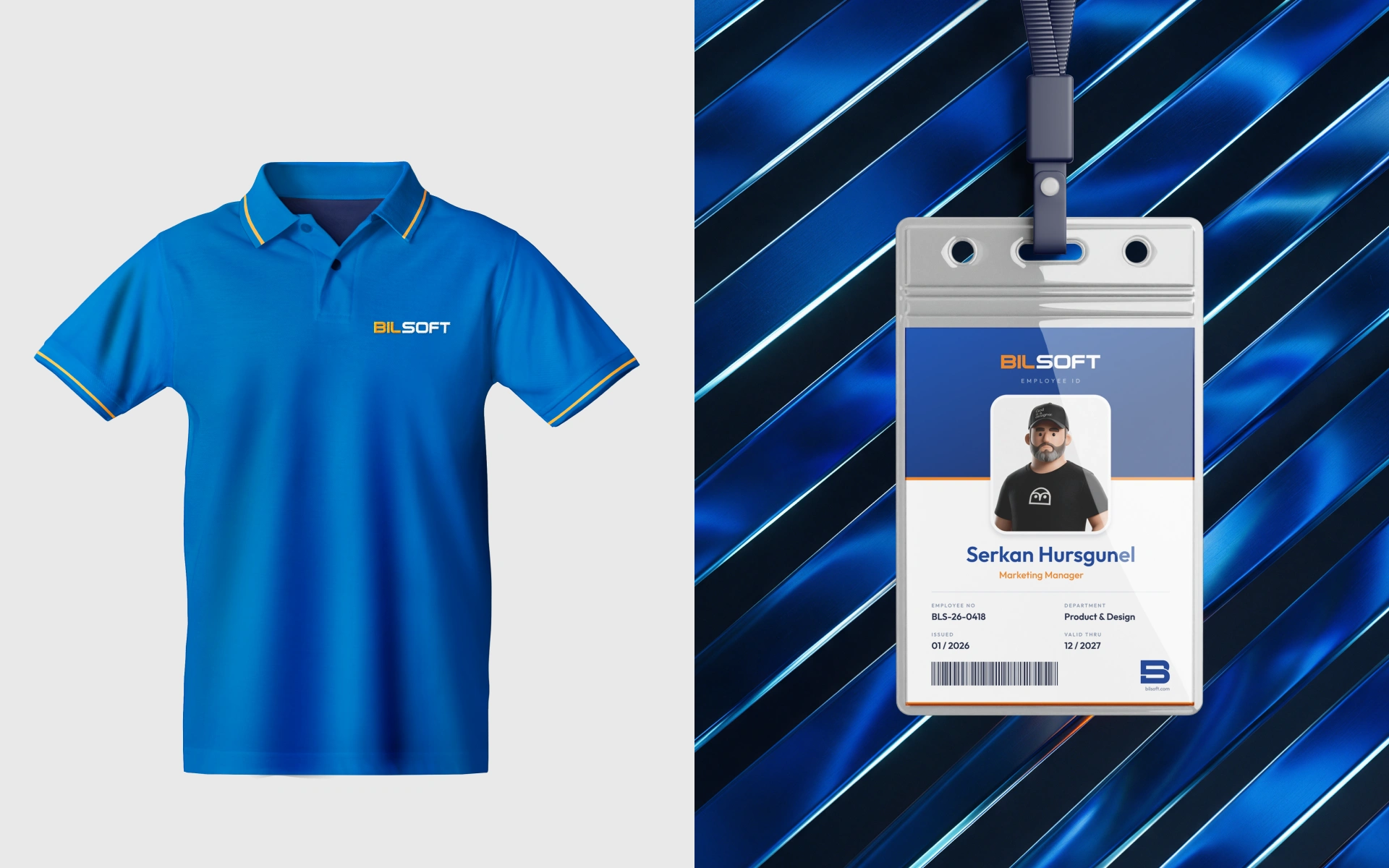
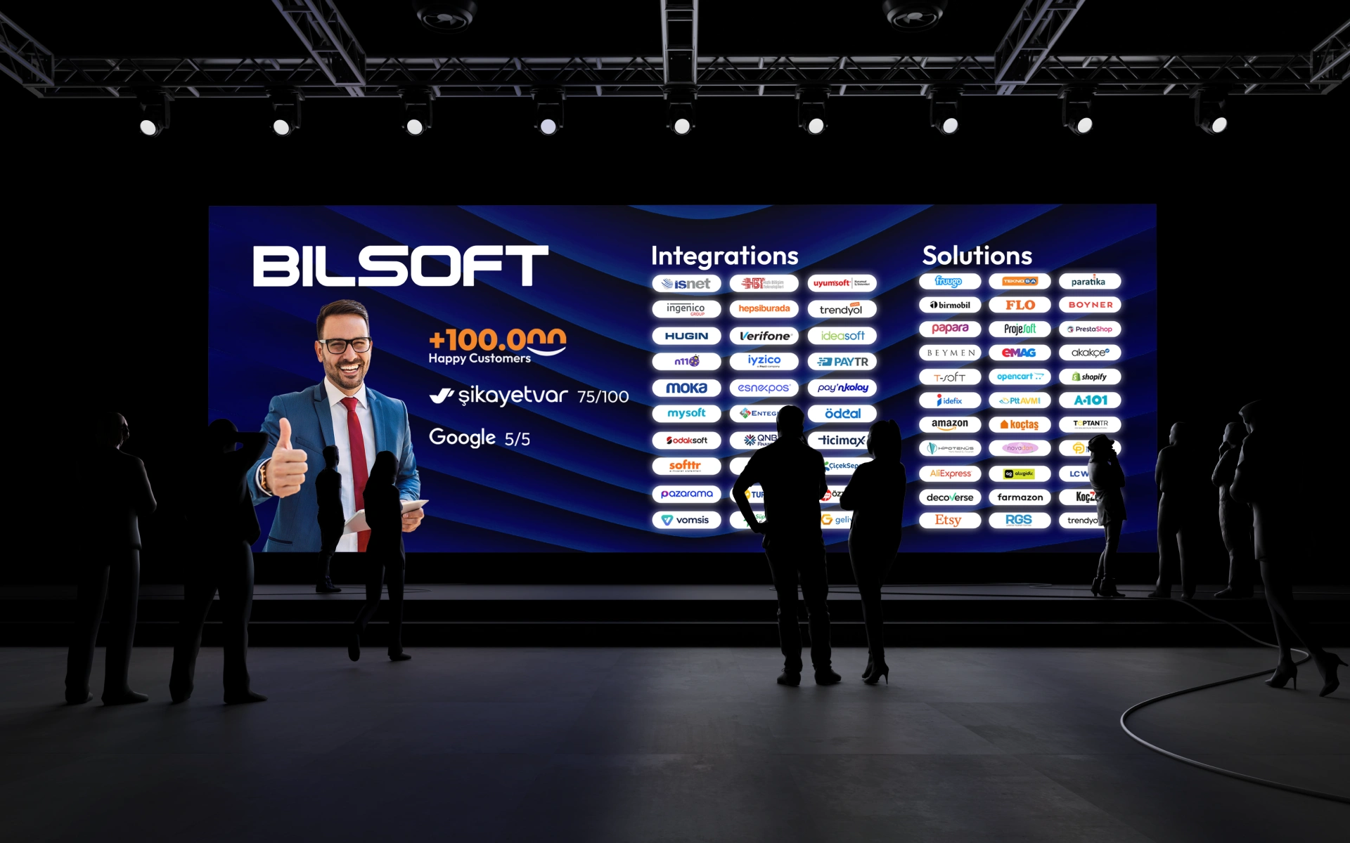
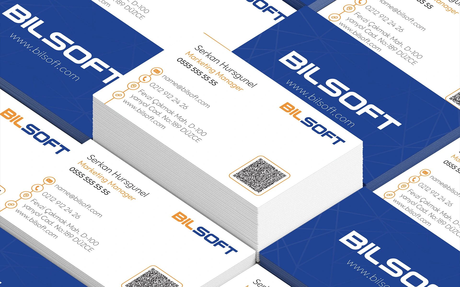
Since a brand only works if the team can keep it consistent on its own, I turned the system into a practical guideline for marketing, partners and developers. I then tested it across every place people meet Bilsoft, from the app and website to ID badges and event stages. The project closes with a motion piece that builds the wordmark letter by letter.
Like this project
Posted Oct 11, 2026
Bilsoft had earned the trust of 100,000+ businesses, but its brand didn’t show it. I rebuilt the identity so it looks as reliable as the company already is.
Likes
0
Views
0
Timeline
Mar 12, 2025 - Apr 15, 2025
Clients
Bilsoft