Velocert Brand Identity

Serkan Hursgunel


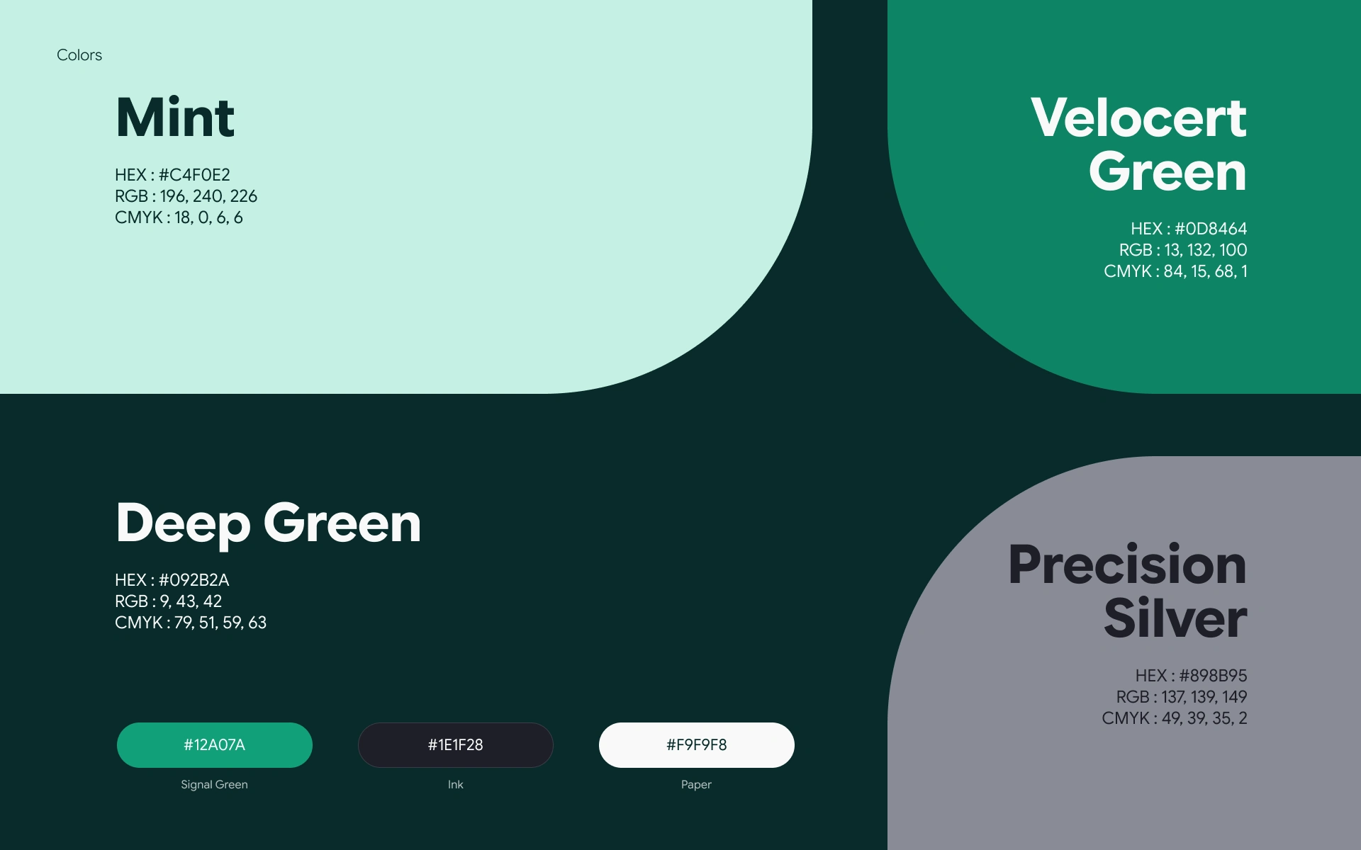
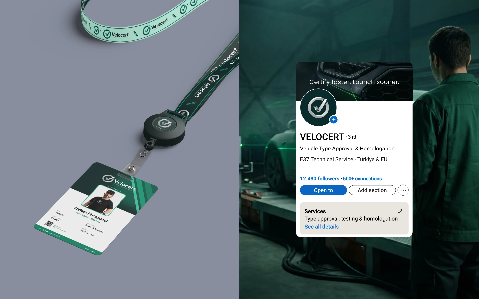
Velocert helps carmakers get their vehicles approved for the road. The brand promise is simple: make a slow, technical process faster without cutting corners. The identity needed to earn the trust of engineers and test labs, so it had to feel precise, calm and reliable.
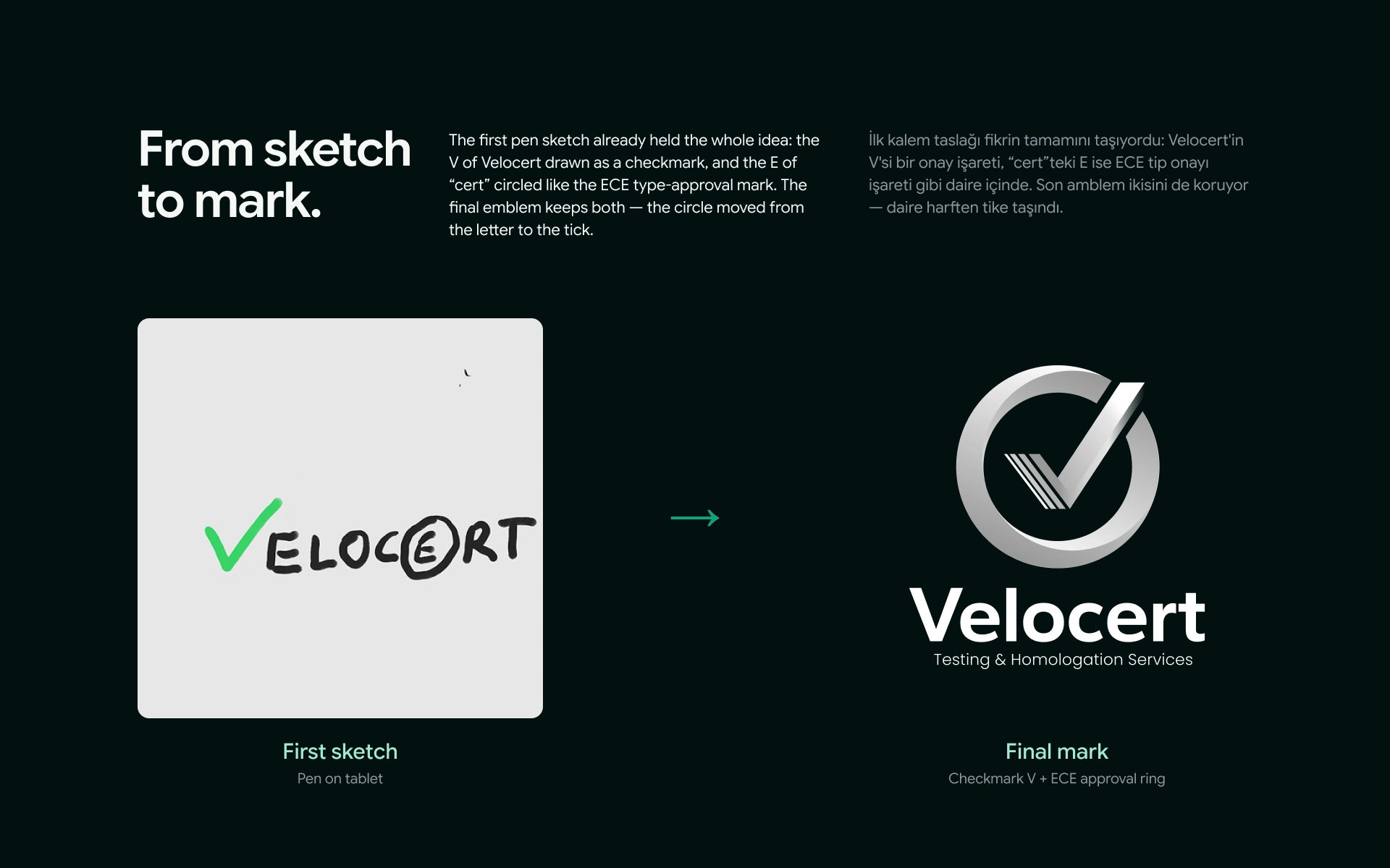
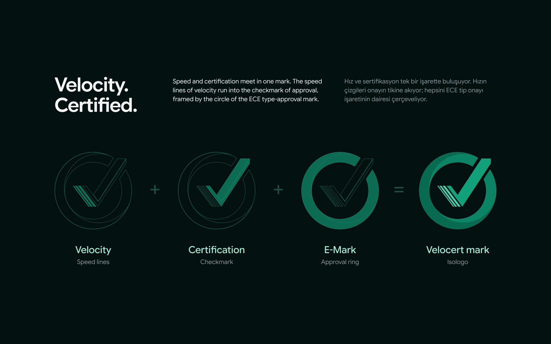
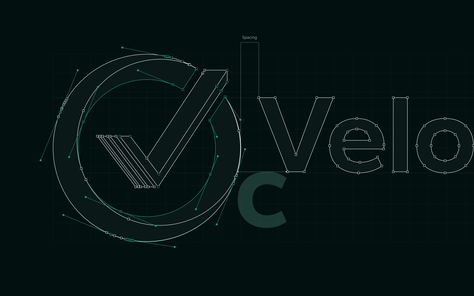
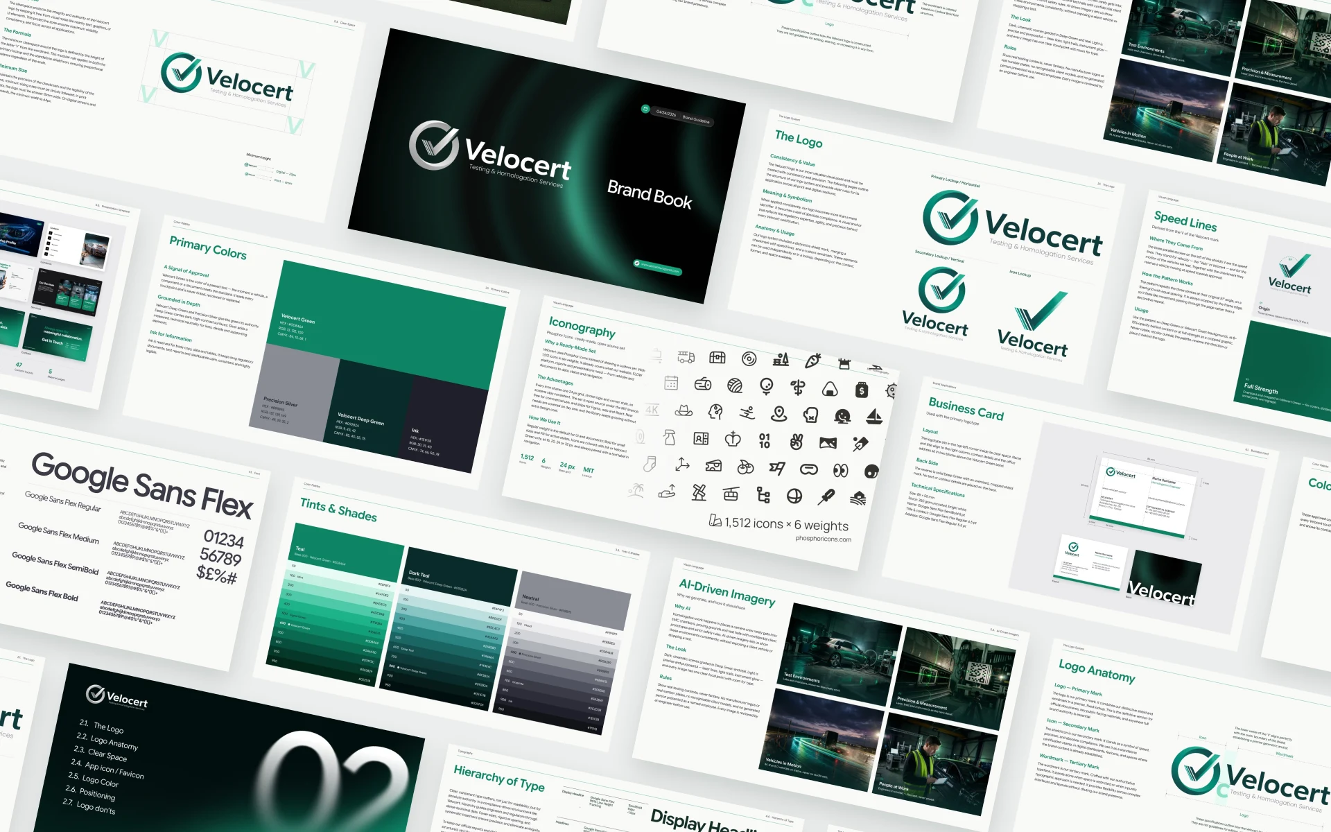
It all started with a quick pen sketch. The V became a checkmark and “cert” was circled like an approval seal. I refined that idea into one mark where speed lines, a checkmark and the ECE E-Mark ring come together: speed and certification in a single symbol.
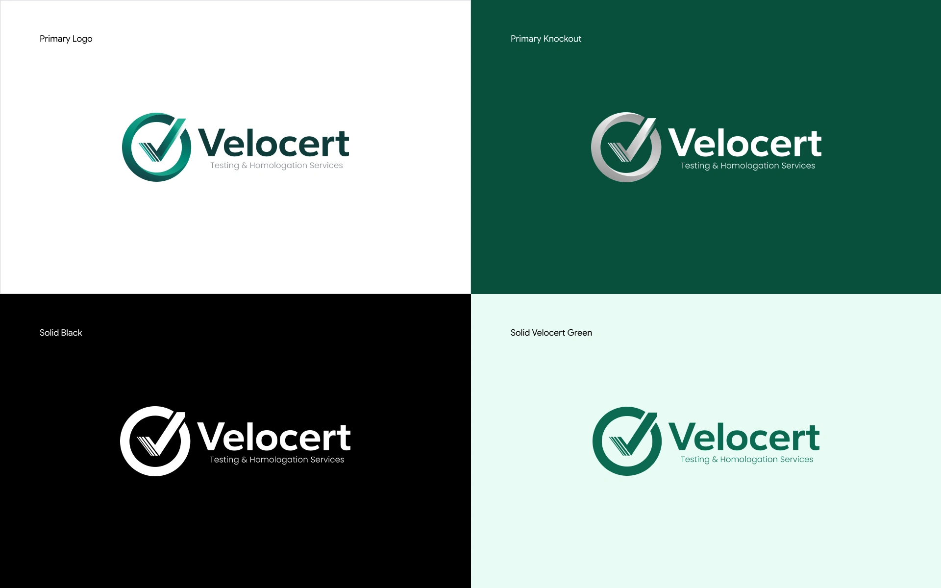
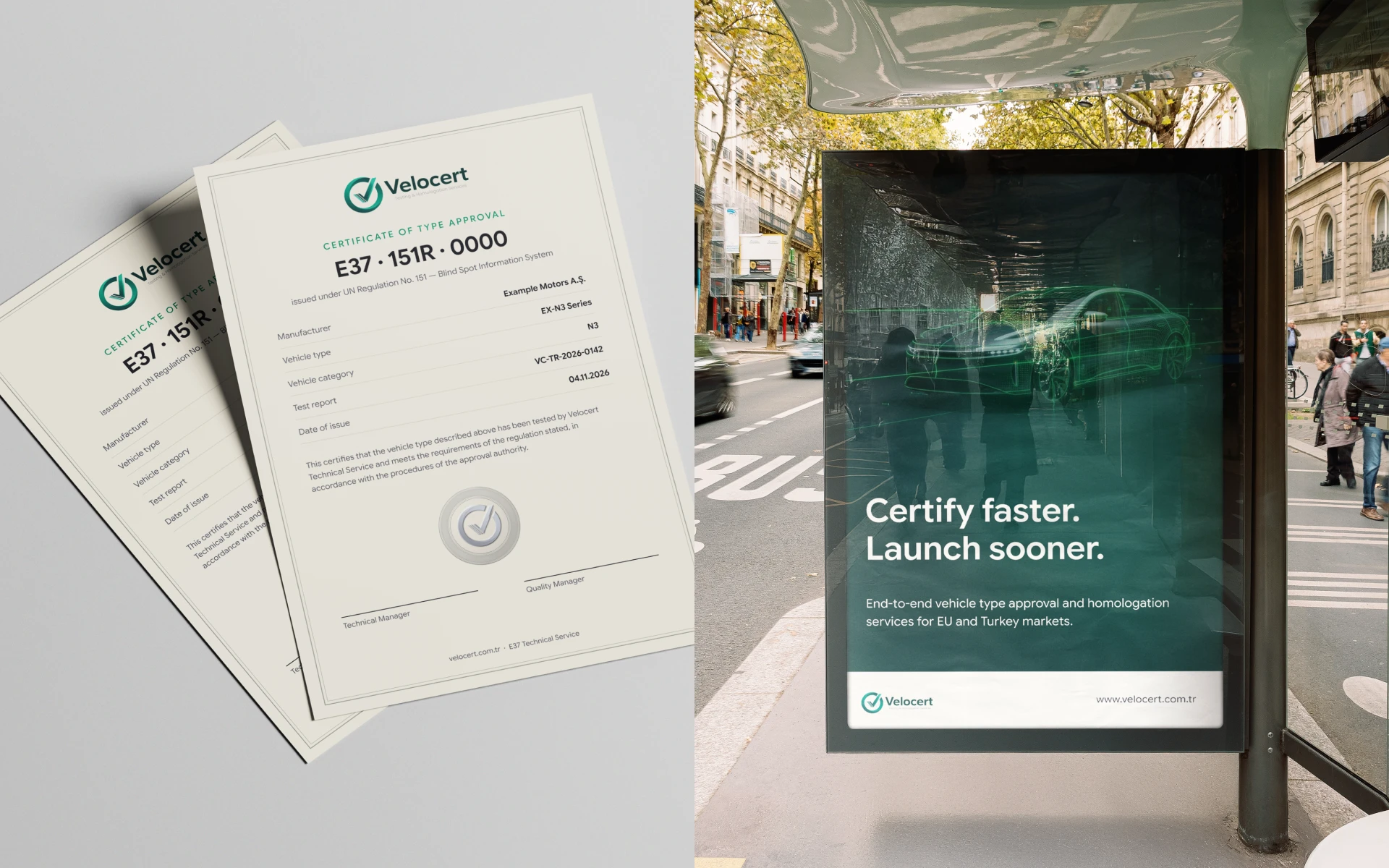
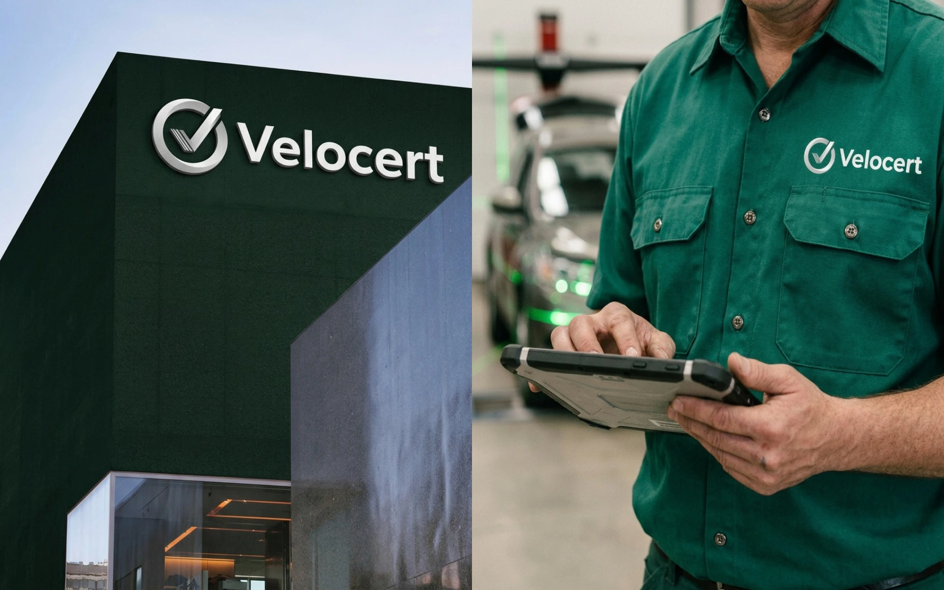
The result is a calm, engineered brand that feels the same on a test certificate as it does on a service van.




Like this project
Posted Nov 7, 2026
Brand identity for Velocert: a pen sketch turned into one mark where speed lines, a checkmark and the E-Mark ring meet. Speed and certification, one symbol.