Built with Jitter
Yage Logo & Visual Identity

Serkan Hürsgünel


Overview
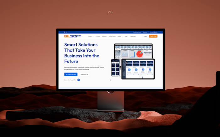
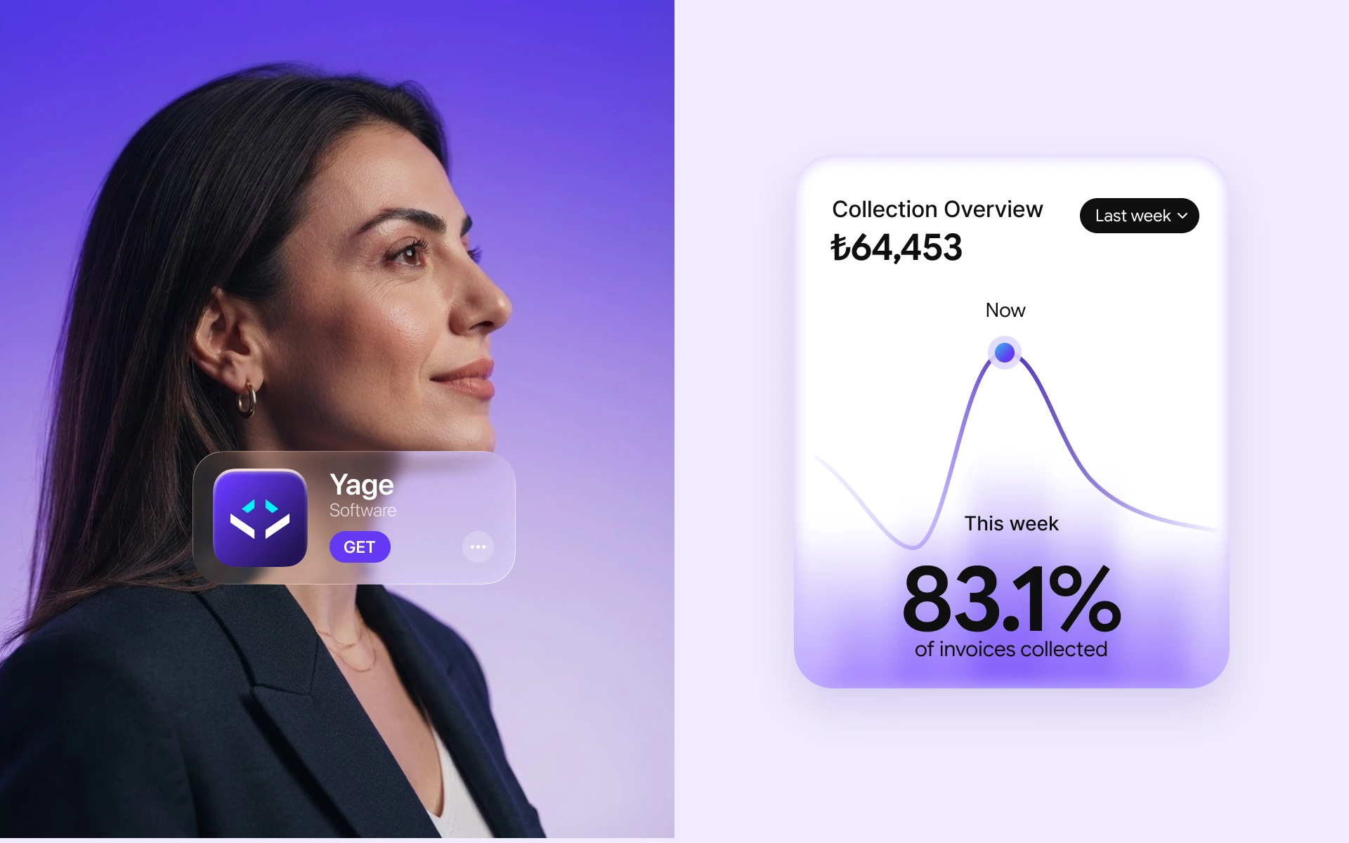
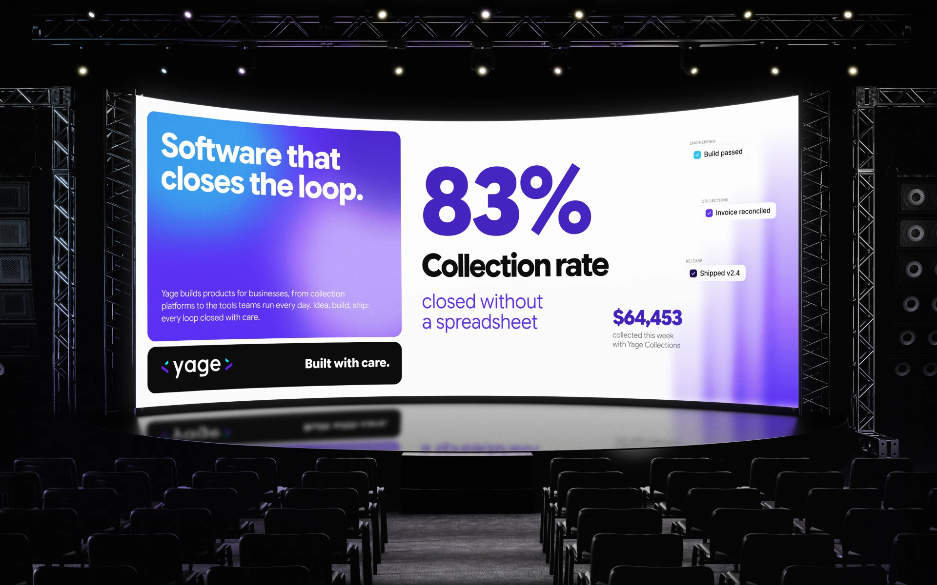
Yage is a software company that turns ideas into working products for businesses, from payment and collection tools to custom platforms. They needed an identity that says what they do, not just what they’re called. I designed the logo and the identity system, then coded the frontend of the Yage SaaS dashboard and landing page myself, so the brand and the product were built by the same hands.
Story
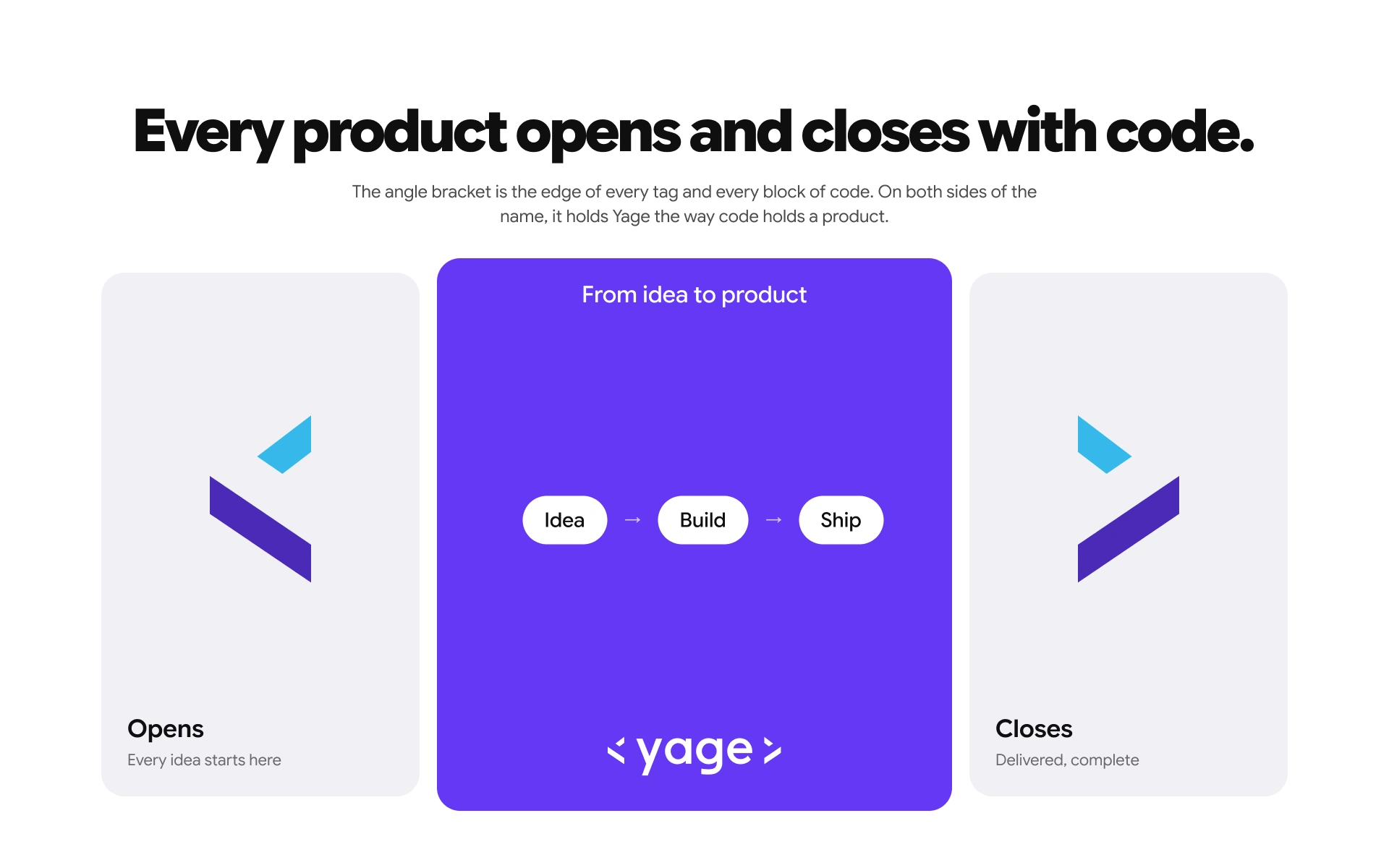
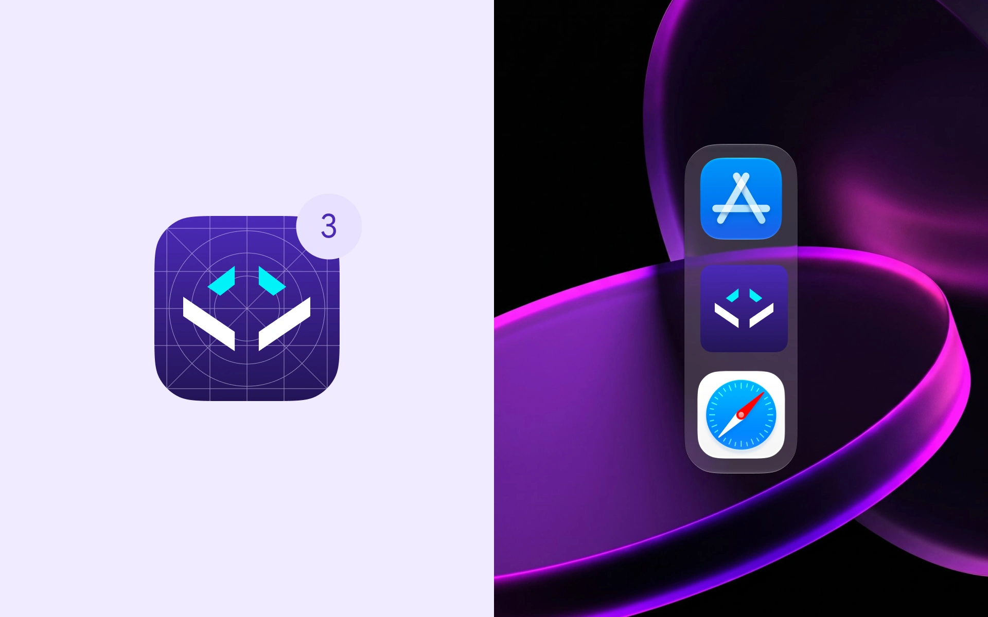
Every product Yage builds follows the same loop: idea, build, ship. Instead of a generic tech symbol, I wanted the logo to describe that loop in the language Yage’s team writes every day, so I built it from the angle bracket, the shape that opens and closes every block of code.
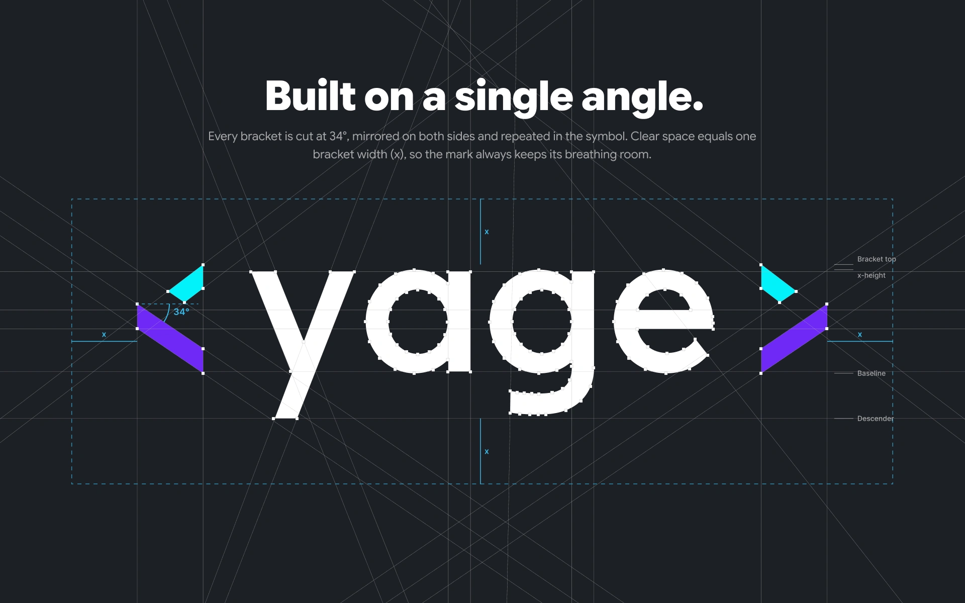
The opening bracket is the idea that starts a product. The closing bracket is the product that gets delivered. The Yage name sits between them as the work that happens in between. Both brackets are cut at the same 34° angle and mirrored, and the symbol uses the same cut, so the whole identity comes from one decision. The clear space equals one bracket width, which keeps the mark calm at any size.
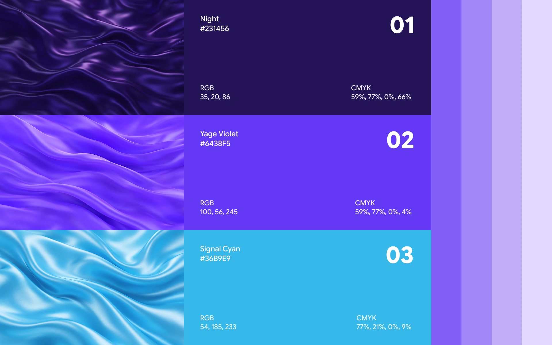
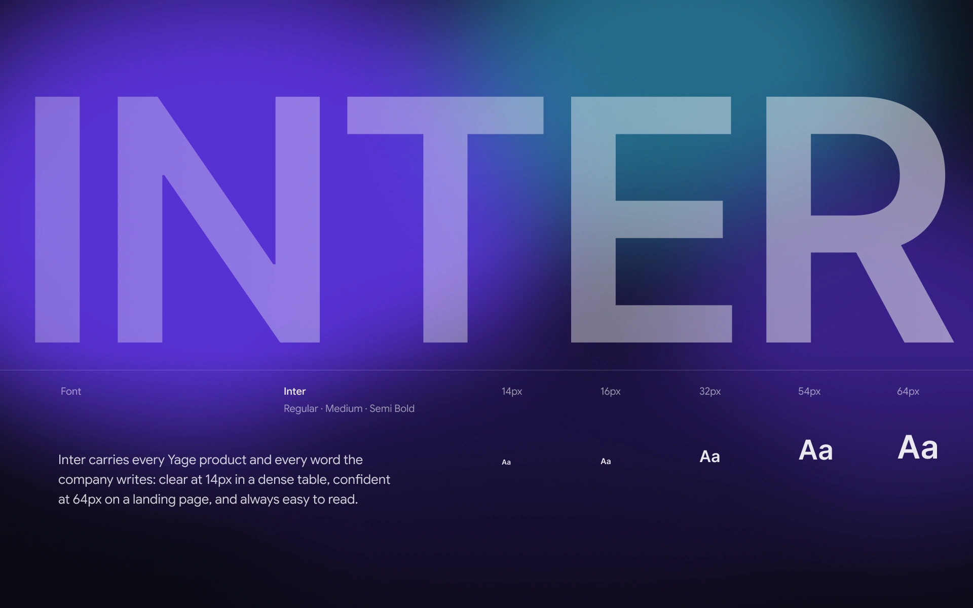
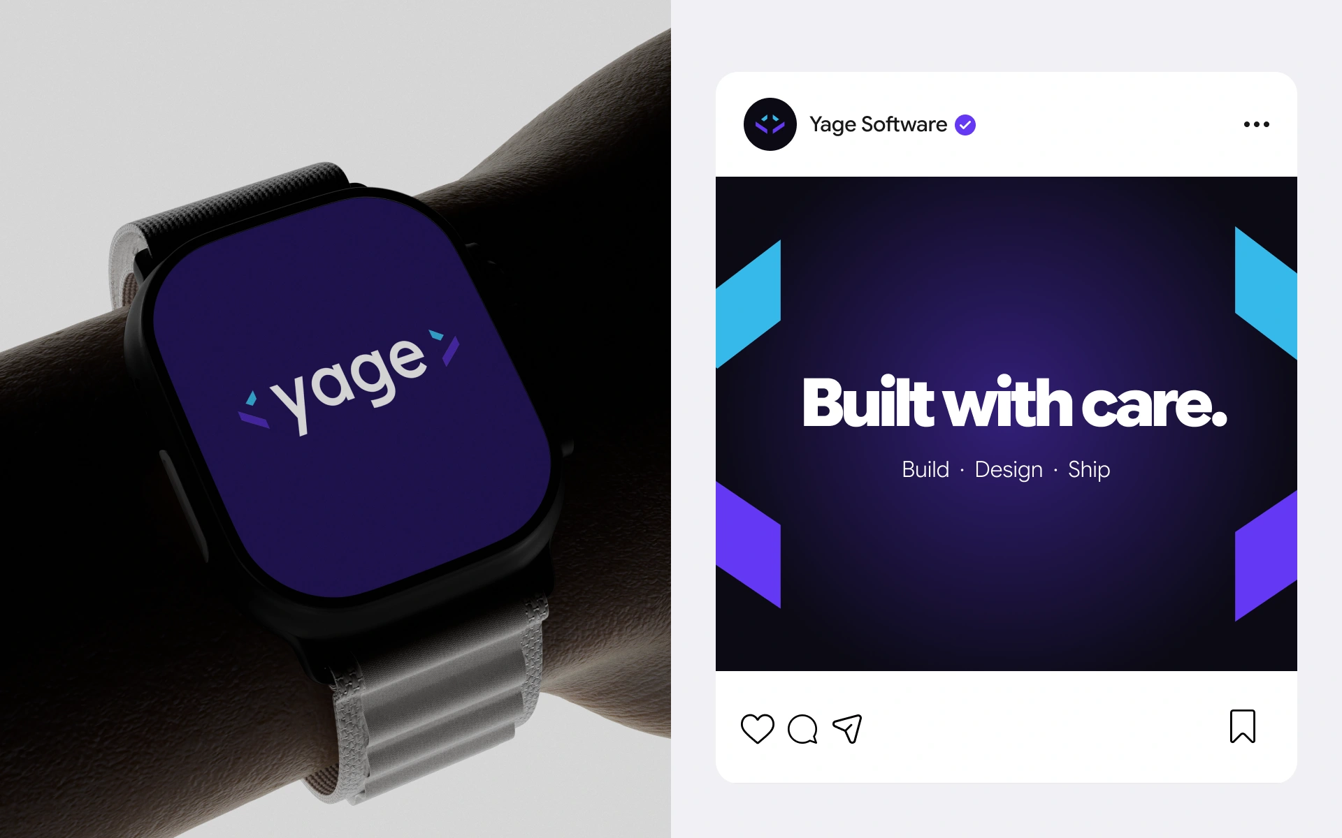
Night, Yage Violet and Signal Cyan carry the brackets with a night-mode tone that feels native to software. Inter does the rest, from dense 14px dashboard tables to 64px landing page headlines, so the brand works inside the product as well as in marketing.
The logo isn’t decoration. It explains the company: Yage opens an idea and closes it as a finished product.
Like this project
Posted Oct 22, 2026
Every product opens and closes with code. Yage’s logo frames its name between two 34° brackets: the idea and the shipped product.