Bilsoft Website Redesign & Development

Serkan Hürsgünel


Overview
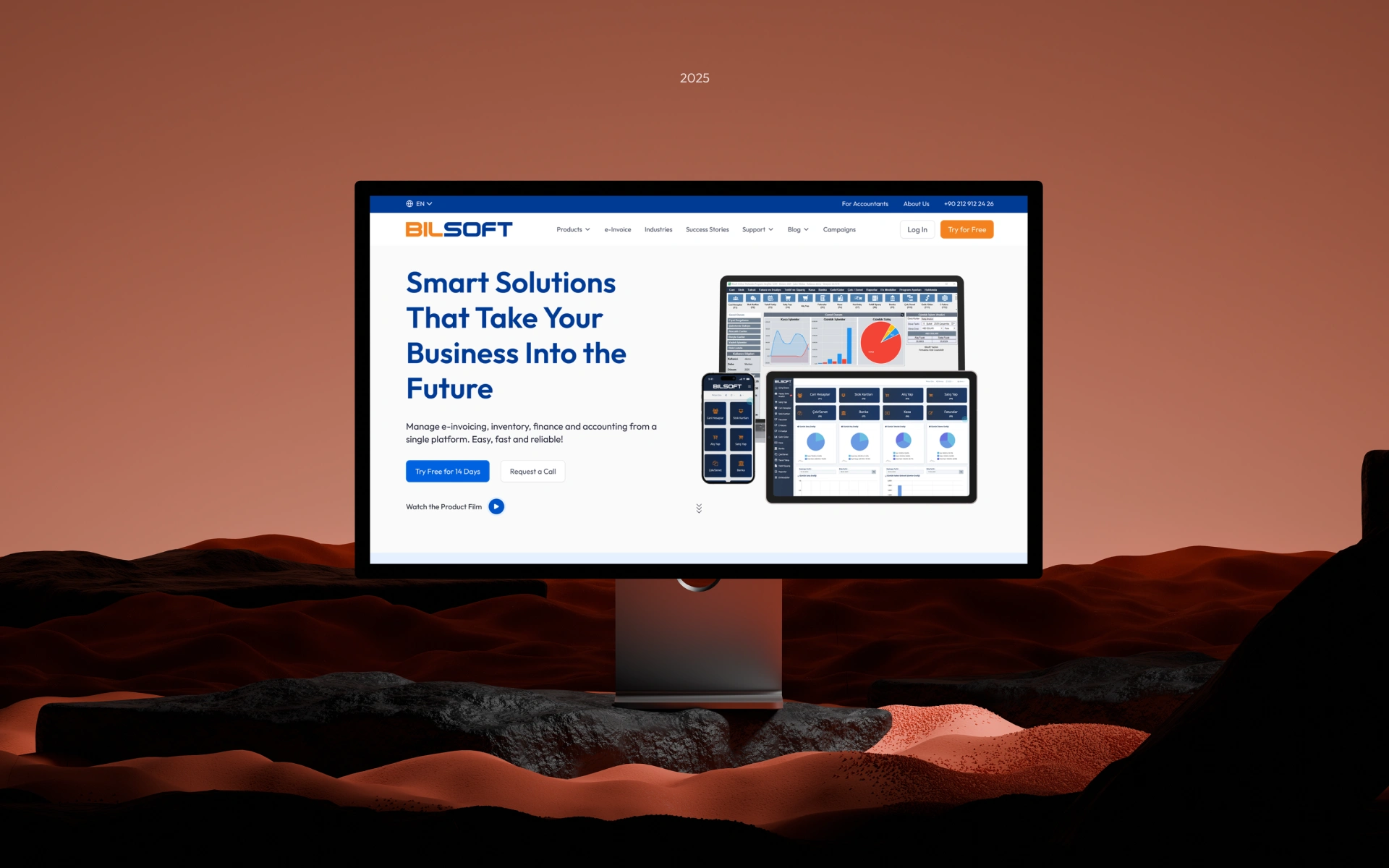
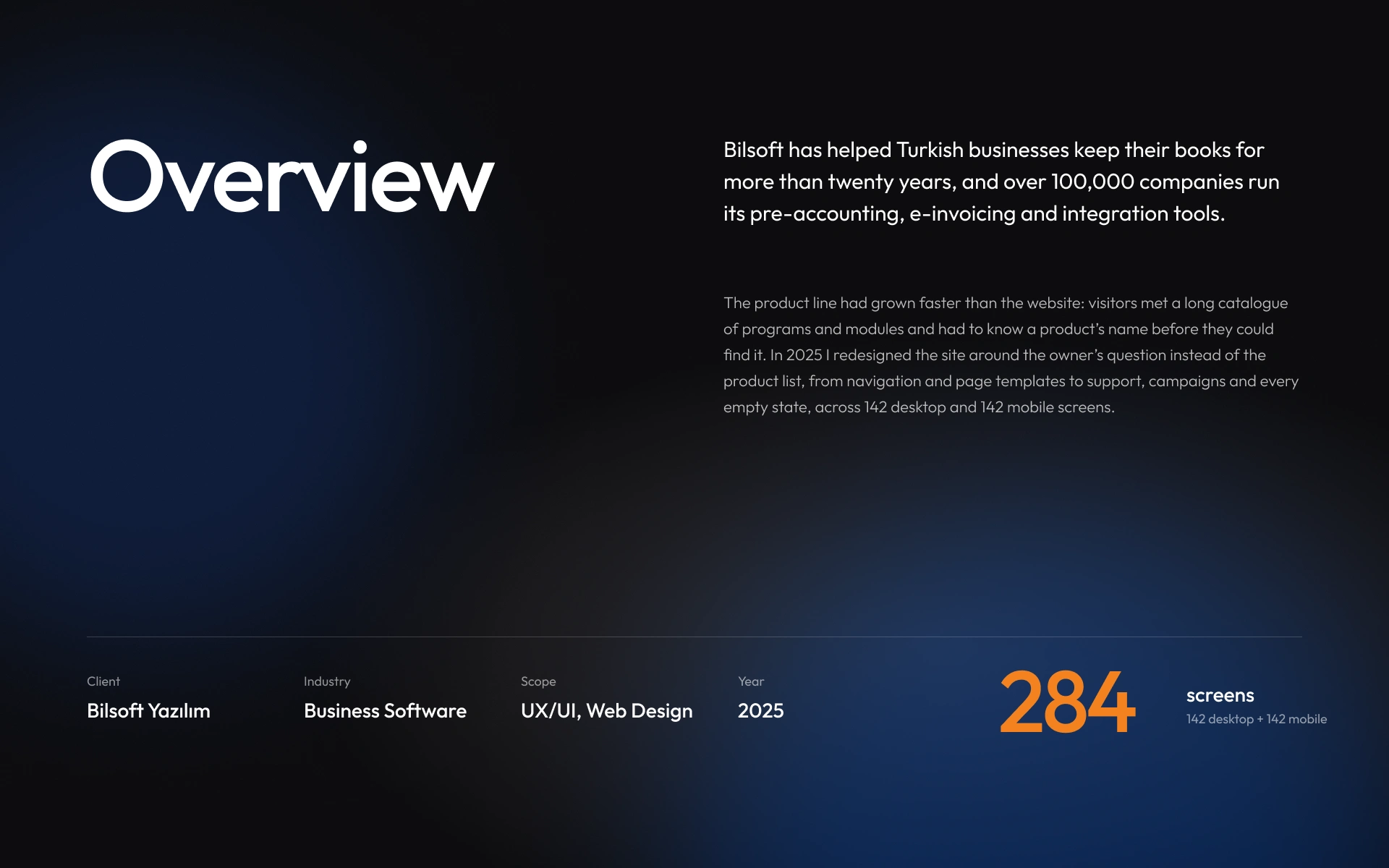
Bilsoft has made accounting software for Turkish businesses for over 20 years, and more than 100,000 companies use it every day. I redesigned its website so people can find what they need without knowing any product names.
Story
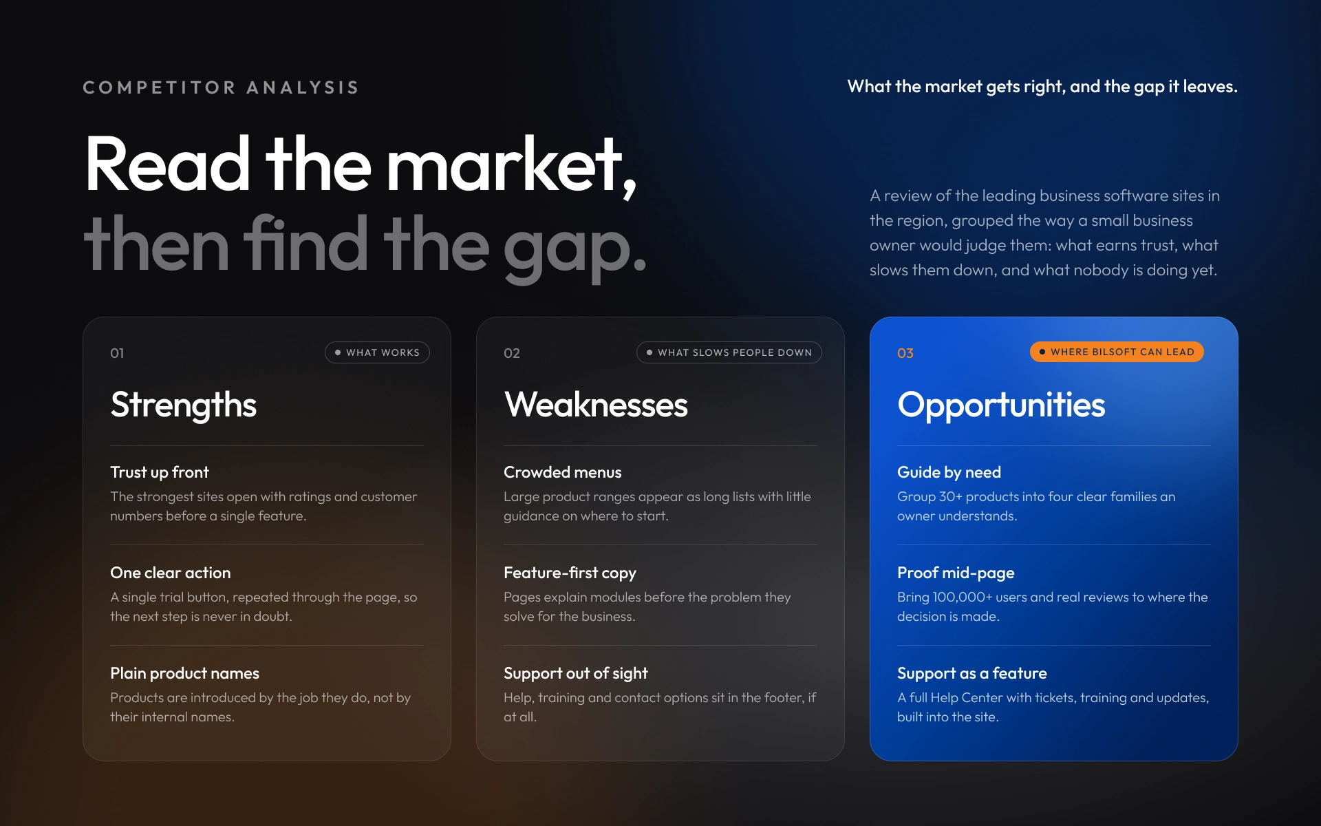
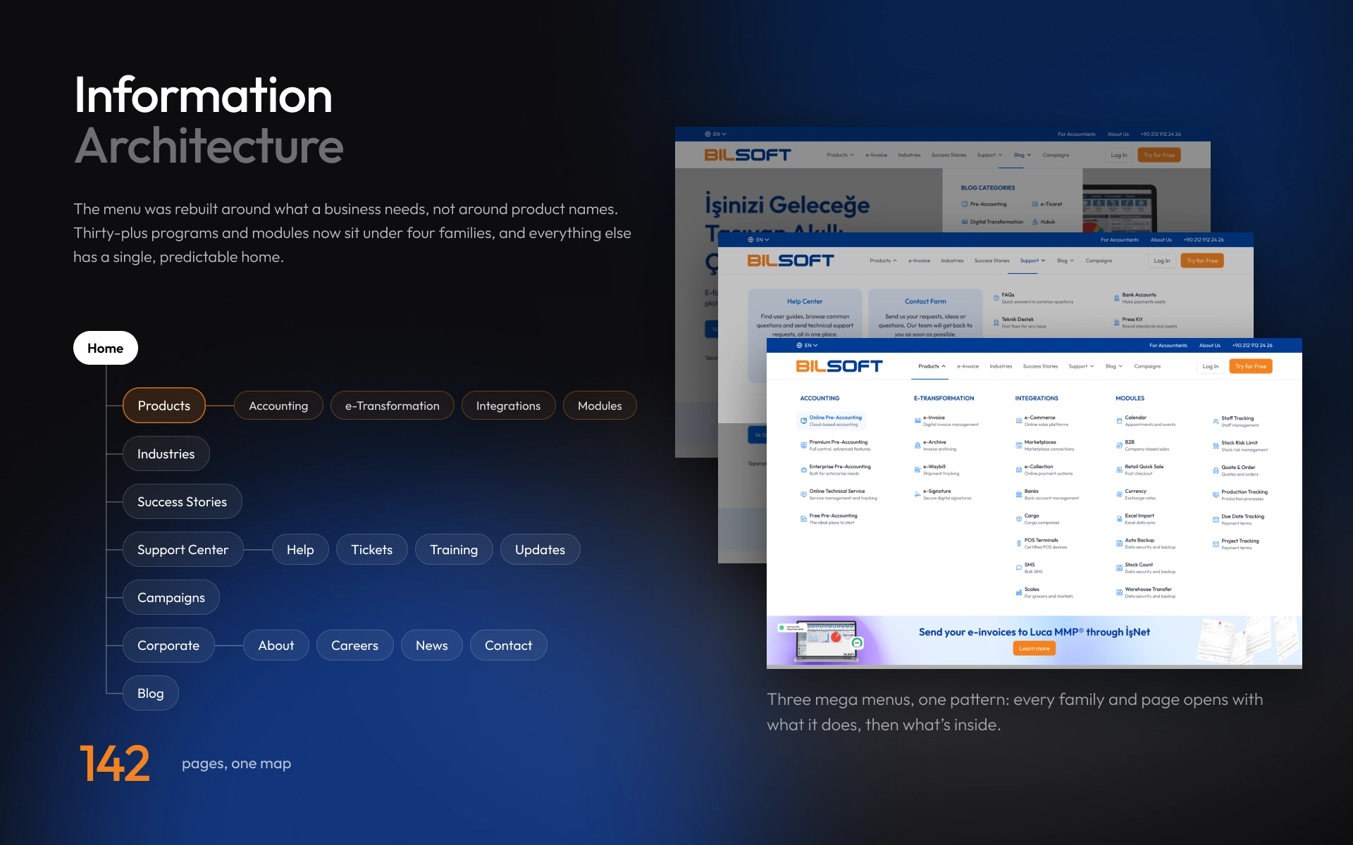
Bilsoft had more than 30 products, and the old website simply listed them all. To find the right one, you had to already know its name. But business owners don’t think in product names. They think in tasks: send an invoice, track stock, get help.
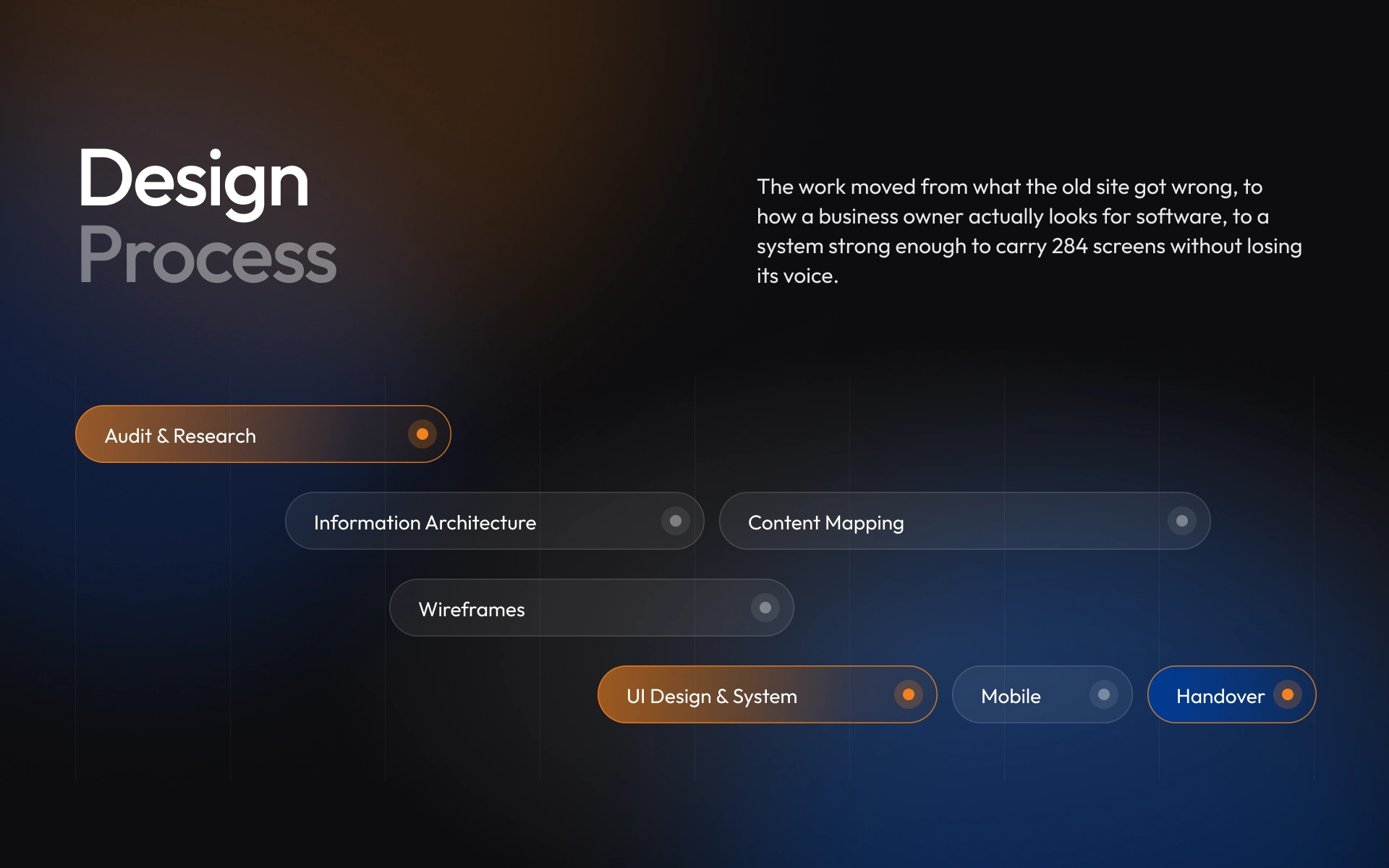
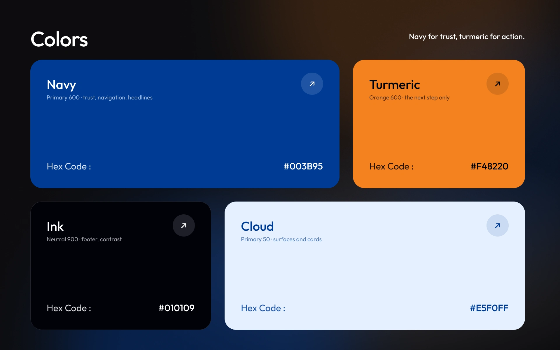
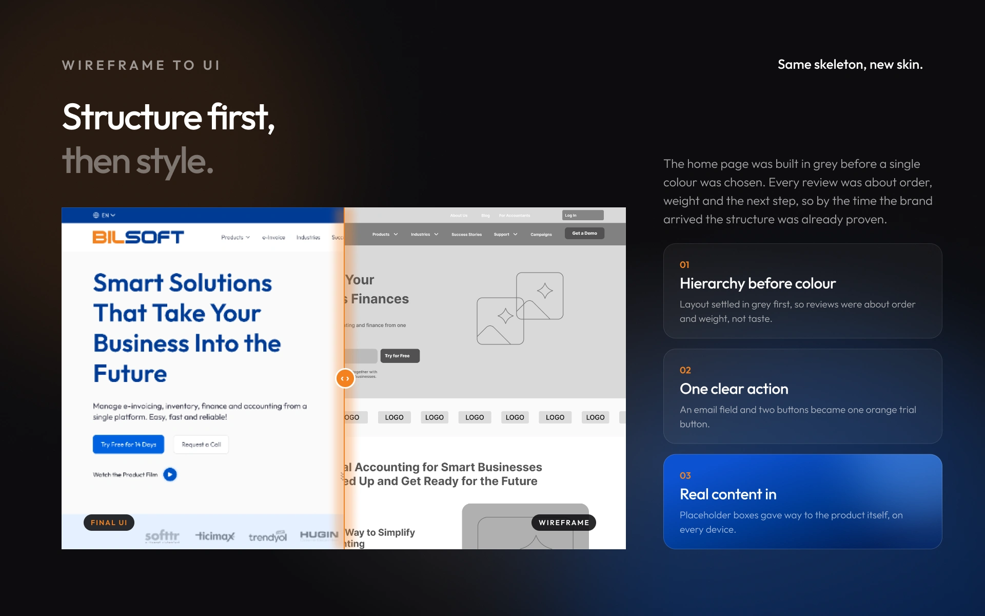
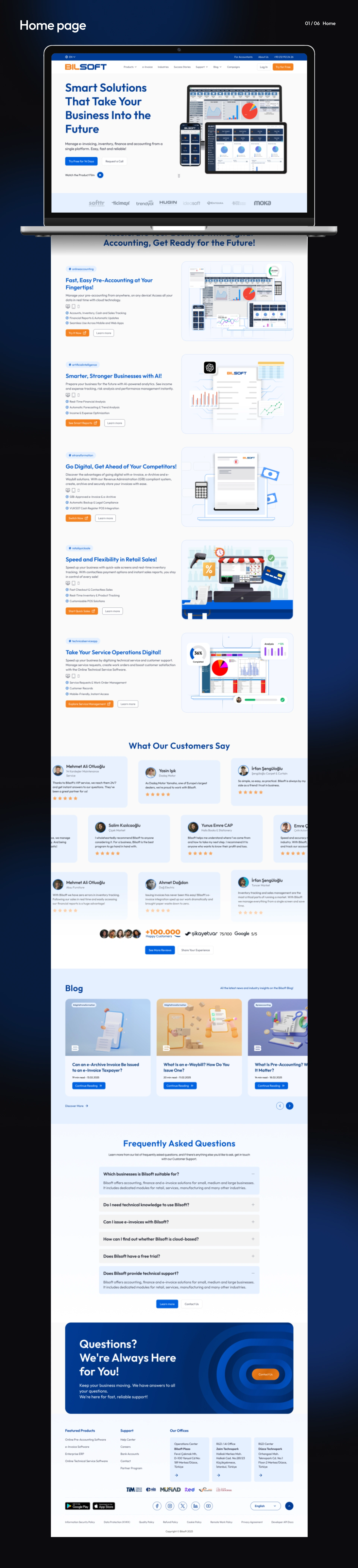
So I built the site around those tasks. The 30+ products were grouped into four clear families, and every menu works the same way. I designed the pages in grey first, so the layout and the next step were right before any colour went in. Then I kept the colours simple: navy for trust, orange only for the button you should click next.
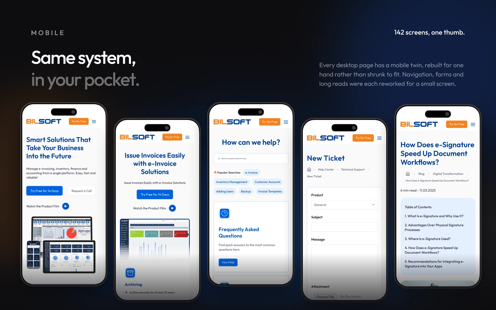
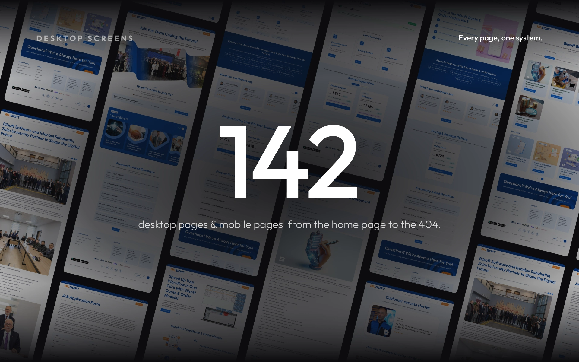
The same system runs across all 142 desktop pages, from the home page to the 404. Every page also has a mobile version made for one hand, not just a smaller copy of the desktop. Now visitors start from what they need, and the next step is always easy to see.

Like this project
Posted Oct 15, 2026
Redesigned Bilsoft’s website around what business owners need: 30+ products in four clear families, one design system across 284 desktop and mobile screens.