Verdiani Italian Bistro — Brand Identity

Anastasia Kornilova


VERDIANI / ITALIAN BISTRO
Brand Identity Project
DESCRIPTION
Verdiani is a second-generation family-owned Italian bistro named after the family behind it. The goal was to create an identity that reflects its heritage while feeling relevant today — timeless, understated, and built to last.
VISUAL IDENTITY
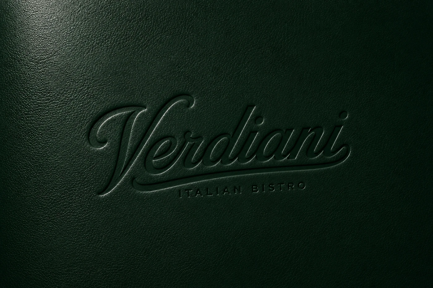
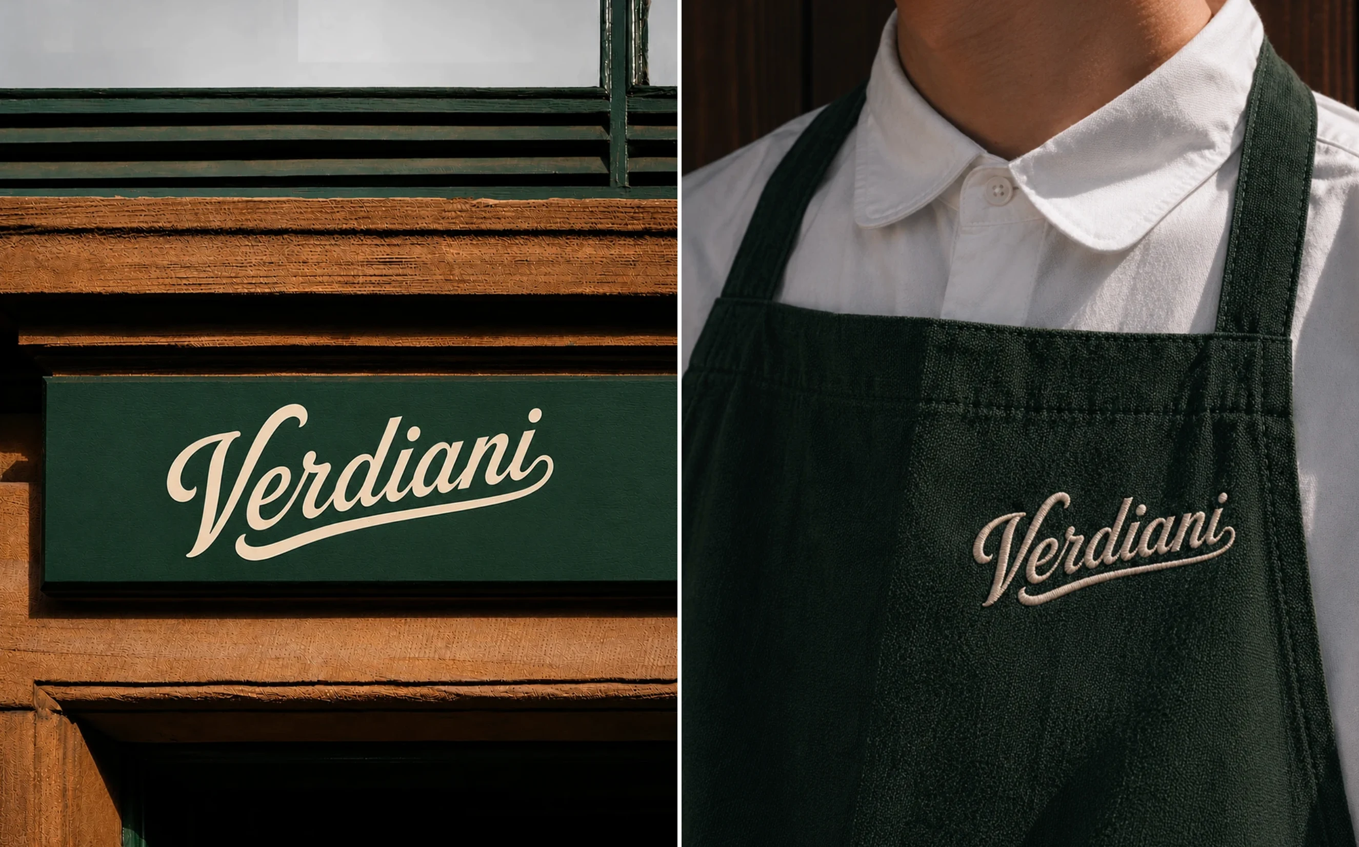
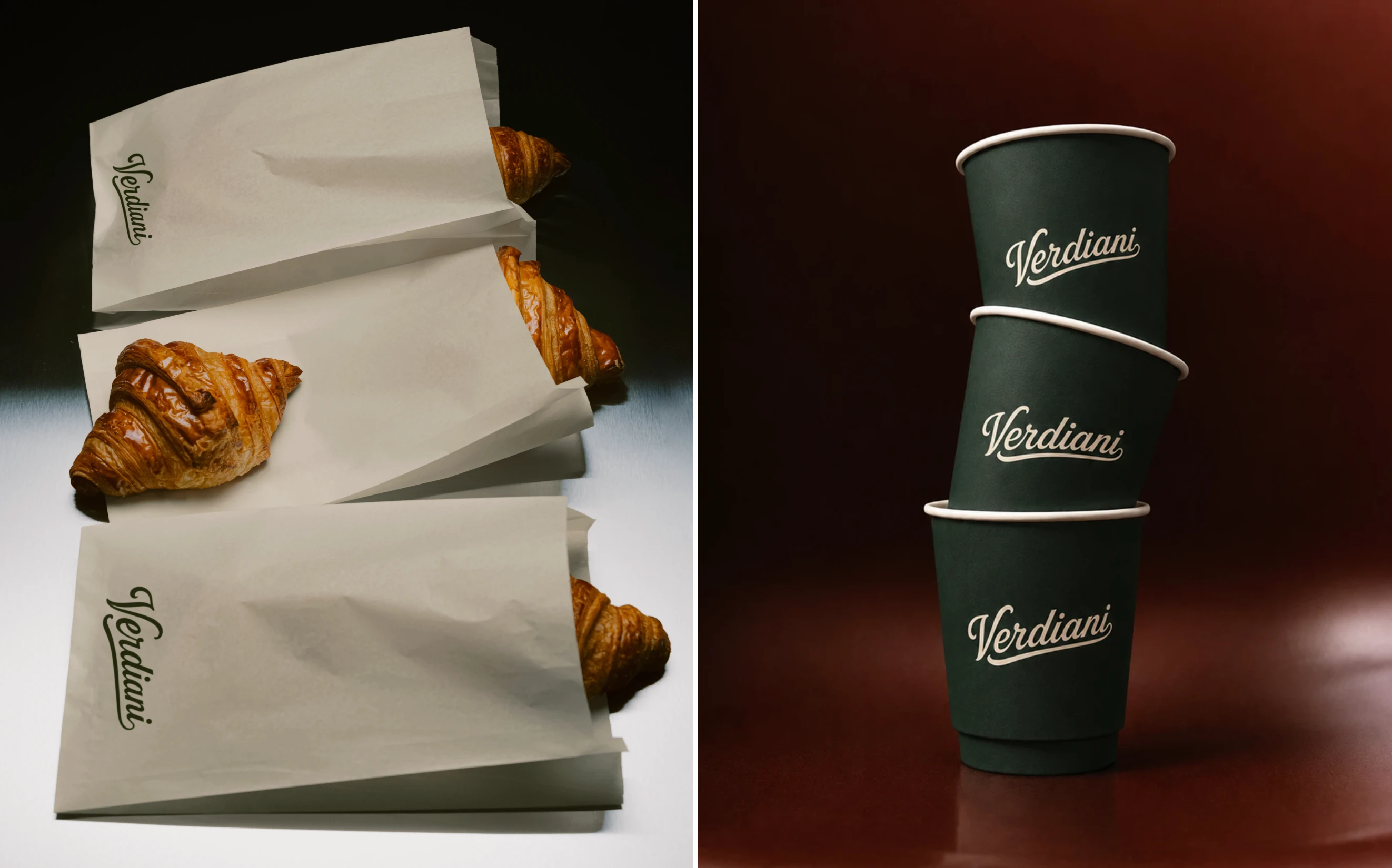
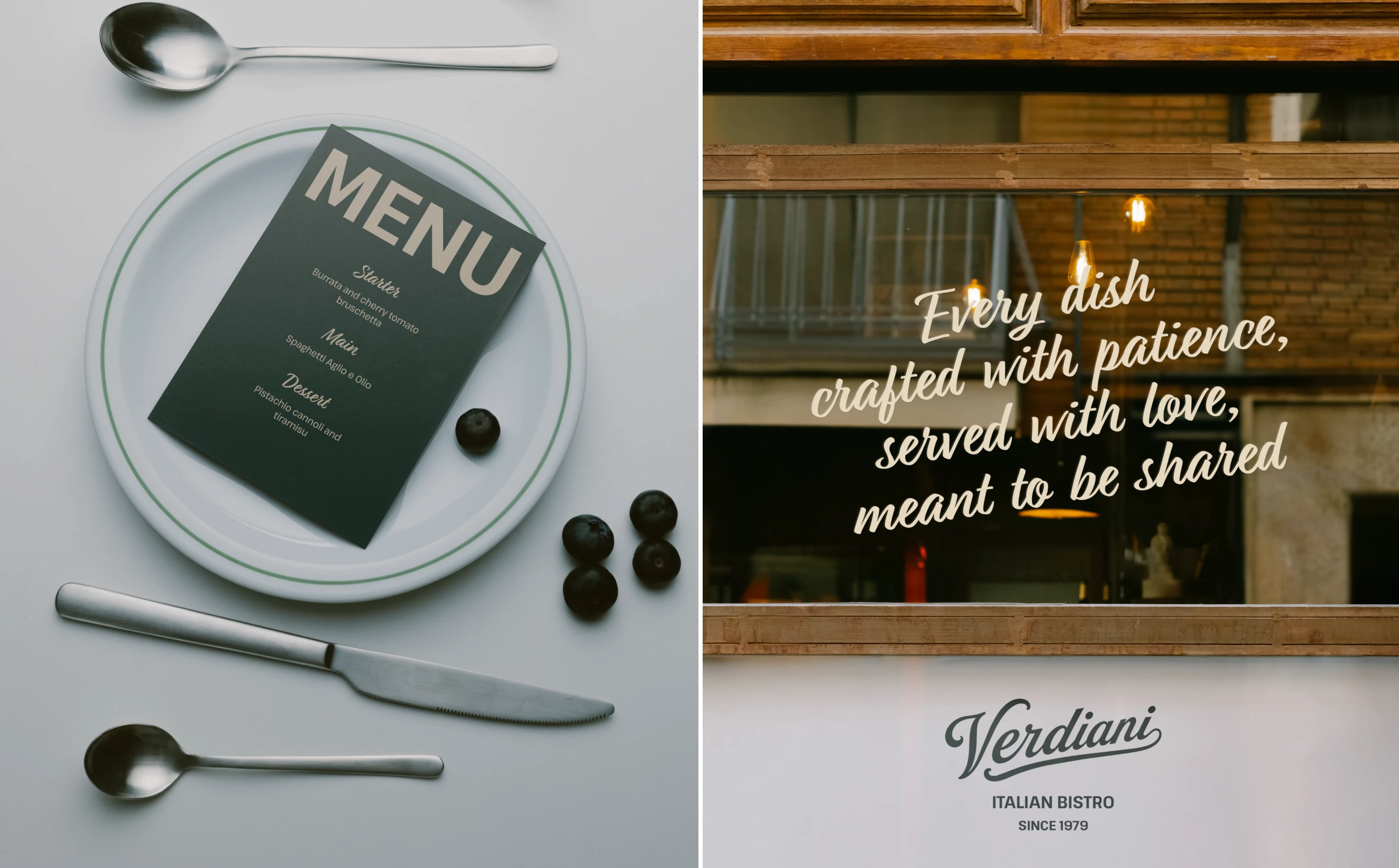
The identity is centered around a custom hand-lettered logotype inspired by classic Italian storefronts.
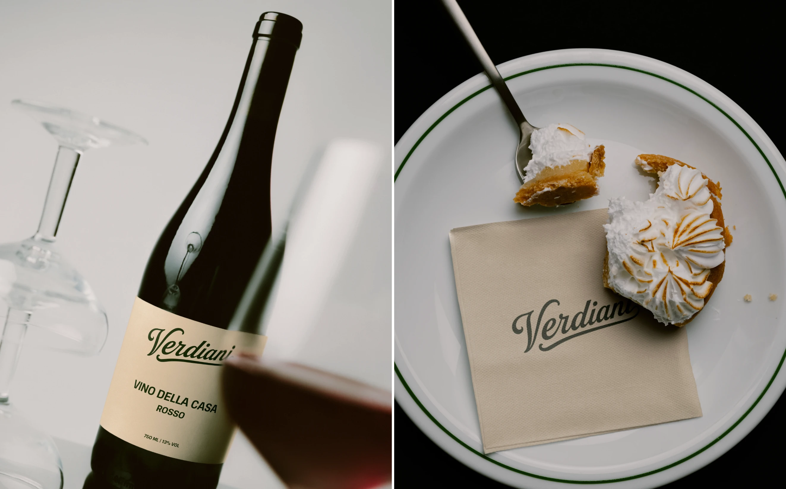
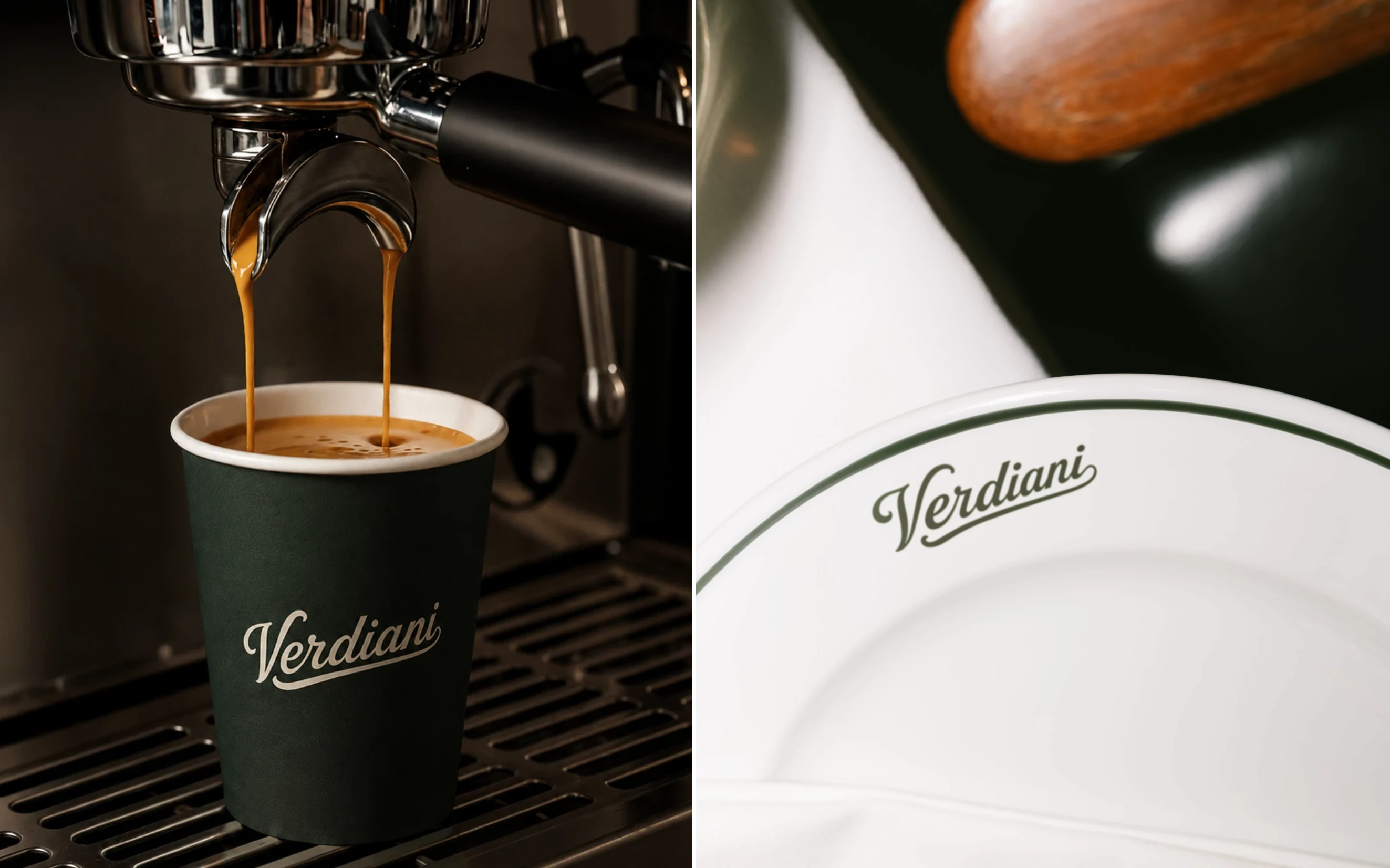
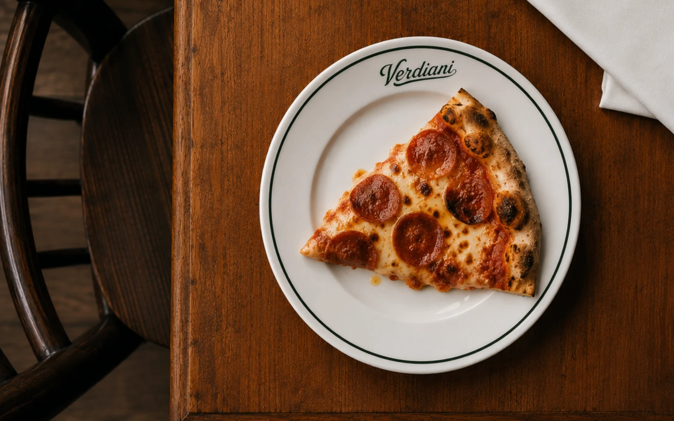
A palette of deep heritage green, aged linen, and porcelain white gives the brand a refined, familiar character. The system extends across every customer touchpoint — signage, menus, uniforms, tableware, takeaway packaging, and wine labels.
ART DIRECTION
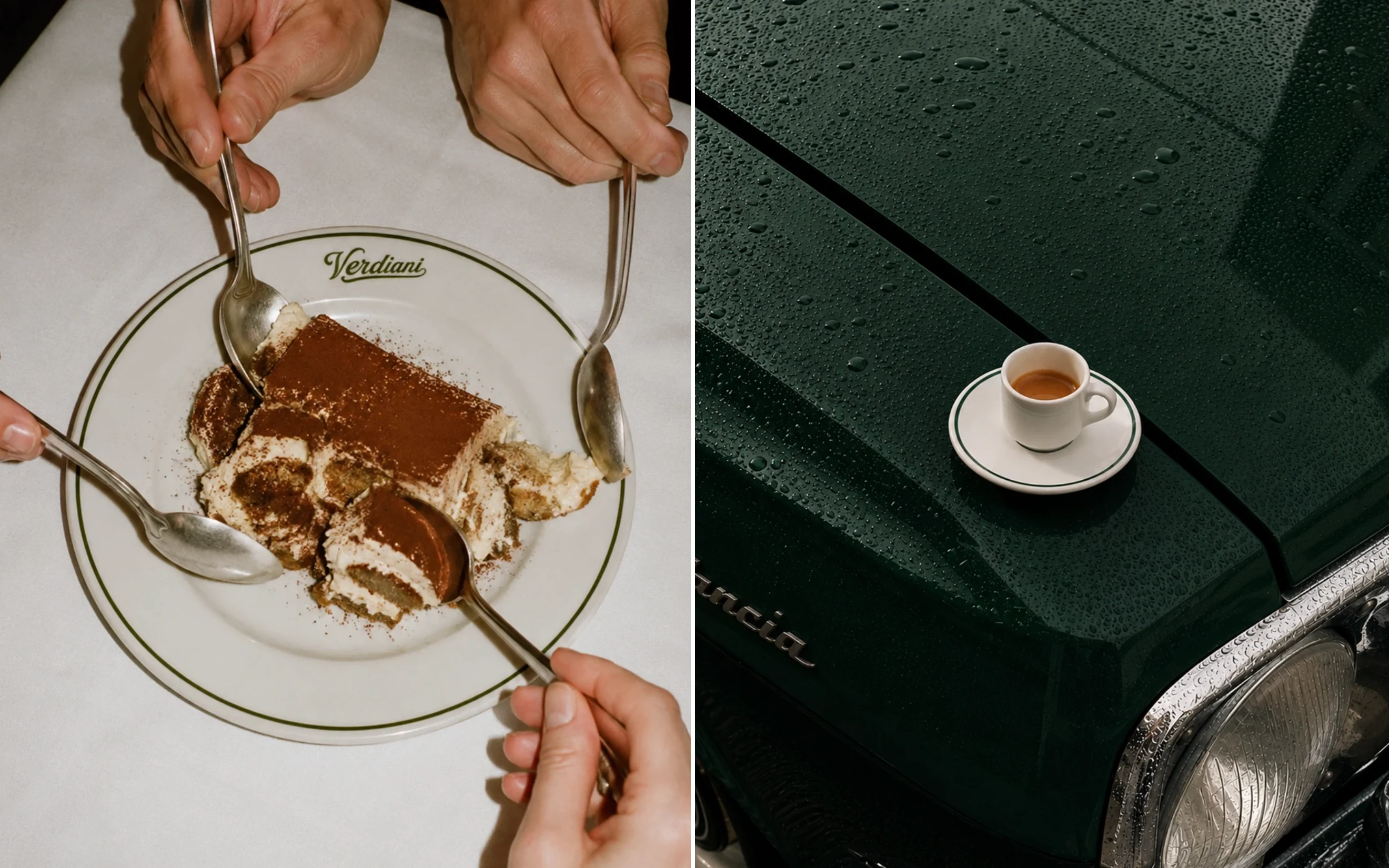
The photography focuses on real moments rather than staged compositions — espresso being poured, desserts shared at the table, simple details, and natural mate. The photography focuses on real moments rather than staged compositions — espresso being poured, desserts shared at the table, simple details, and natural materials. Together, the imagery reinforces the warm, everyday atmosphere of a neighborhood Italian bistro with a story.
Brand Identity, Art Direction & Photography
Anastasia Kornilova
2026
Thank you for watching, and you can contact me
on these social networks for cooperation:
Email: designerkornilova@gmail.com
Instagram
Like this project
Posted Jul 1, 2026
Brand identity and logo design for Verdiani Italian Bistro — a second-generation family-owned restaurant.
Likes
4
Views
23
Timeline
Jun 17, 2026 - Jun 25, 2026