Designed a software to prefill every form with your profile
Aymen Rouabehi
Context
Applying to jobs means filling the same fields over and over: LinkedIn, portfolio URL, past experience, location. Browser autofill and password managers store data, but without context. They can't distinguish a personal LinkedIn from a professional one, or understand that "Portfolio" and "Website" are asking for the same thing.
The problem scales with how often you apply. Freelancers juggling multiple identities (studio, personal, agency) and active job seekers hitting 10+ applications a day lose minutes on every form. Prefill started as a fix for my own workflow, then became a product.
Challenge
I used Claude Code + Paper.design to generate an MVP fast. Paper's architecture is better suited for LLM-driven prototyping, so the first pass was functional within hours.
But functional isn't designed. The AI made several UX decisions that didn't hold up:
AI-generated MVP — the starting point
Adding a field opened a full page. You lost visual context of where the field would land.
Fields could be saved to a different group than the one you came from. That breaks mental models. If I'm inside Profile A and I add a field, it belongs to Profile A. Allowing cross-group saves increases cognitive load for no real gain.
The apply flow required 2 clicks per field + a profile selection each time. For a form with 15 fields, that's 30+ clicks. The whole point of the product is to reduce friction, not redistribute it.
A "Manage in Prefill" button appeared in the UI. Unnecessary. If you're already in the app, you know where you are.
"Esc to dismiss" and "↑↓ to switch" hints were shown. Most users click outside to close a popover and use a mouse to navigate lists. Writing out known conventions adds visual clutter without helping anyone.
The AI added a sidebar navigation. The app has 2 pages: Profiles and Dashboard. A sidebar for 2 destinations wastes 21.11% of horizontal screen space.
Process
Prototyping method: I work vertically first (exploring different layouts: button placement, spacing, text hierarchy), then horizontally (variants of the chosen layout: colors, sizes, density). This lets me exhaust structural options before refining details.
Exploring layout directions — vertical then horizontal
Decisions
Removed the sidebar. 2 pages don't justify a persistent nav. Removing it recovered 21.11% of display space and simplified the layout. Less structure on screen means less cognitive overhead before the user even starts doing anything.
Sidebar comparison — before and after
Tightened the usable area by 3.61%. A subtle reduction, almost invisible, but it brings interactive elements closer together. Per Fitts' Law, shorter distance to a target means faster acquisition time. Small margins compound across repeated use.
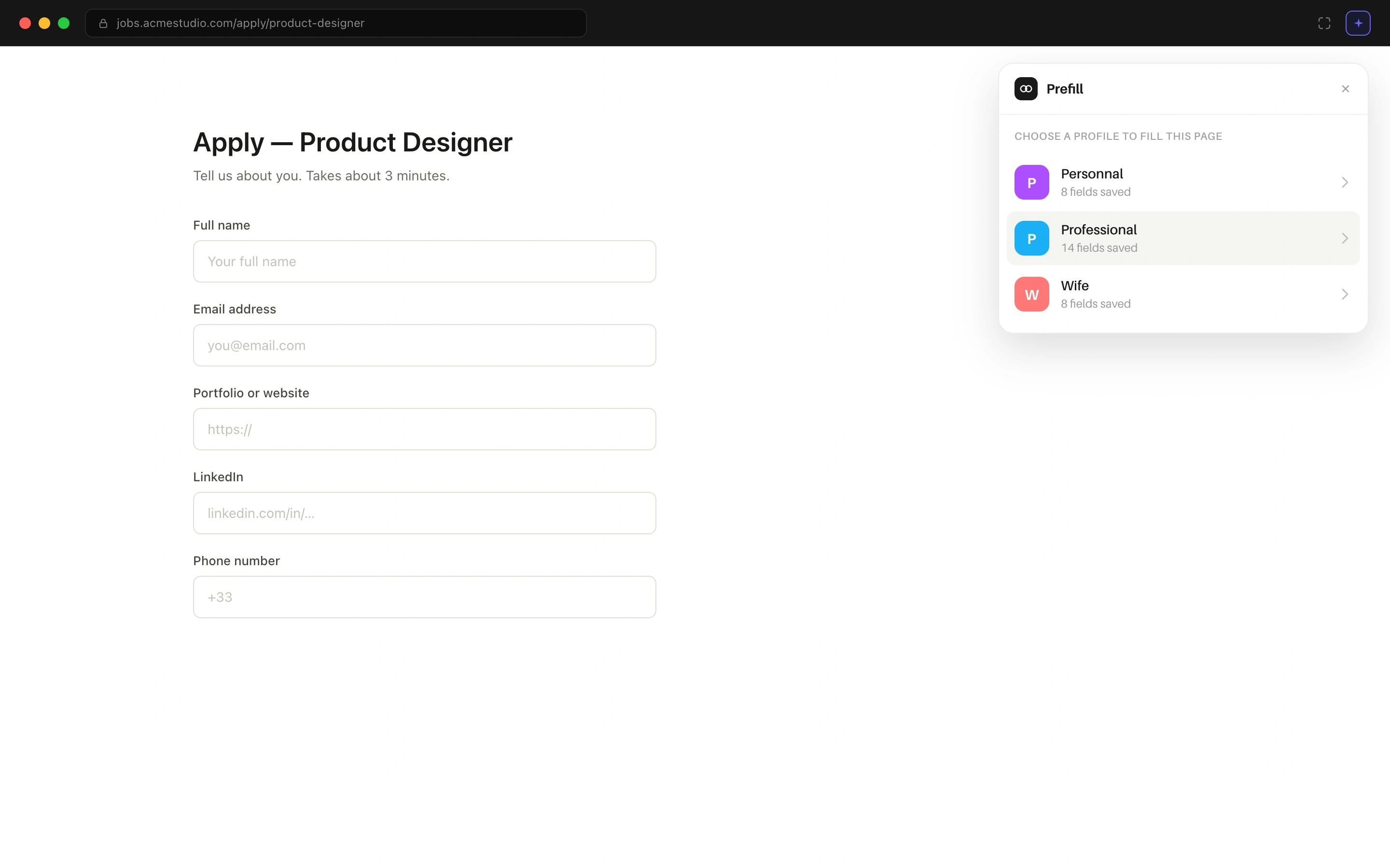
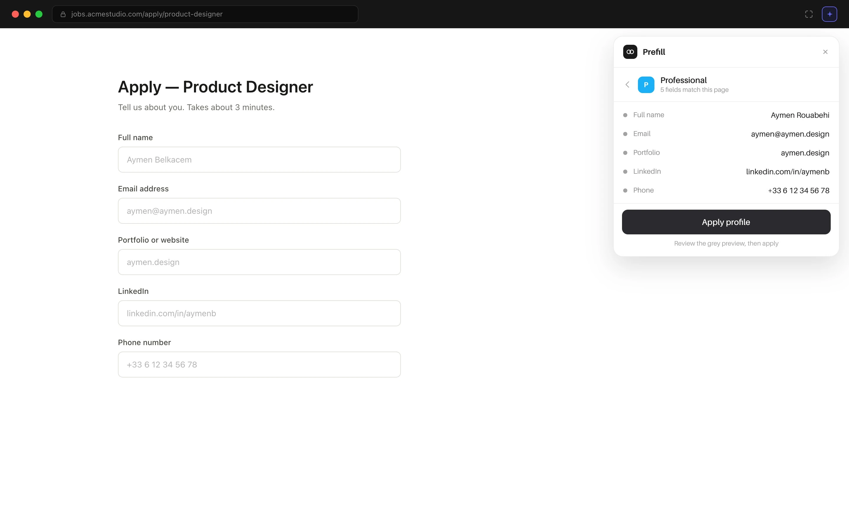
Switched from in-app flow to a browser extension. The core insight: regardless of how many fields a form has, the number of clicks should stay constant. The extension reduces every apply action to 3 clicks: select profile, apply, done.
Before applying, there's a double verification layer: the extension shows a preview of what will be filled, and the form fields display the data as placeholders. Nothing is committed until you confirm.
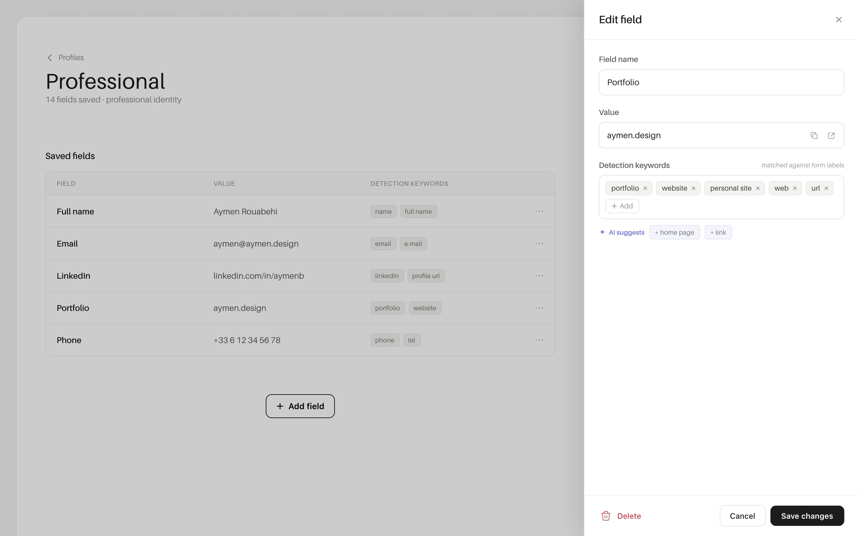
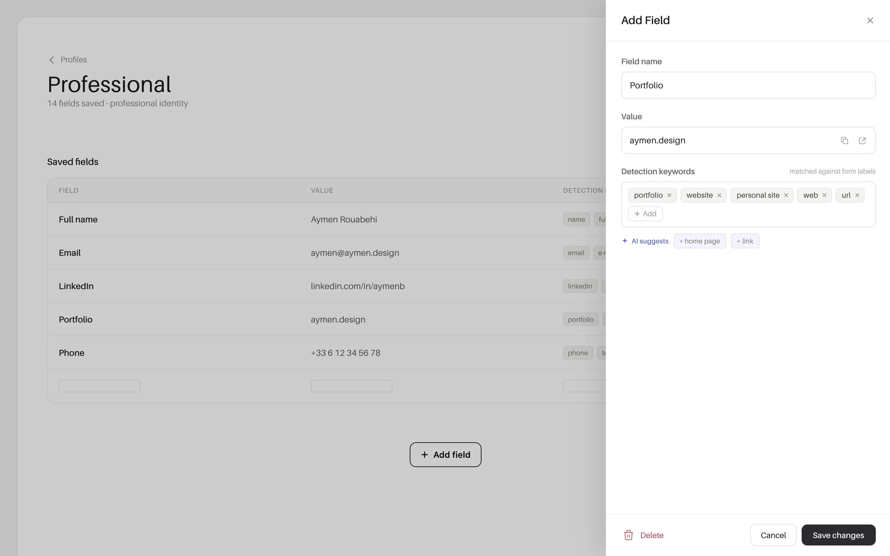
Add Field uses a side panel, not a full page. The table stays intact behind the panel. I considered retracting the table to show it in full, but that would require a transition animation that could feel disruptive for an action as lightweight as adding a single field. Keeping the background stable means zero context loss.
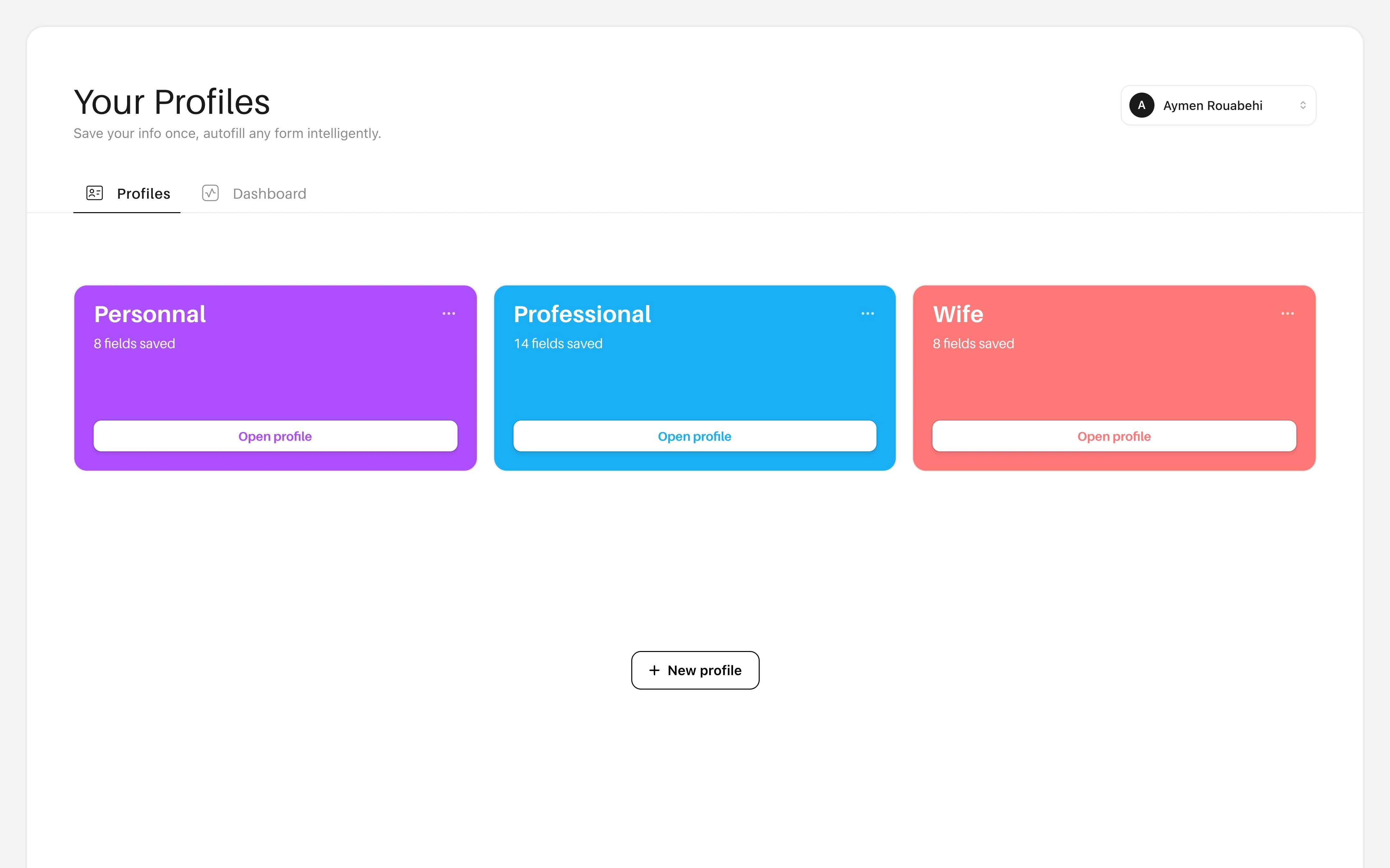
Home — the final app interface
Add Field button placement mirrors Add Profile. Same position, same pattern. Consistency: when the same action looks and behaves the same way everywhere, users don't have to relearn anything. One pattern, applied everywhere.
Removed all unnecessary UI hints. No "Esc to dismiss", no "↑↓ to switch", no "Manage in Prefill". Every element that doesn't help the user complete their task is noise. Per Hick's Law, fewer visible options means faster decisions.
Scoped actions to their context. You can only act on a profile's fields while inside that profile. No cross-group saves, no ambiguous destinations. This keeps the information architecture flat and predictable.
The Extension — Apply in 3 Clicks

Step 1 — Select your profile

Step 2 — Review and apply
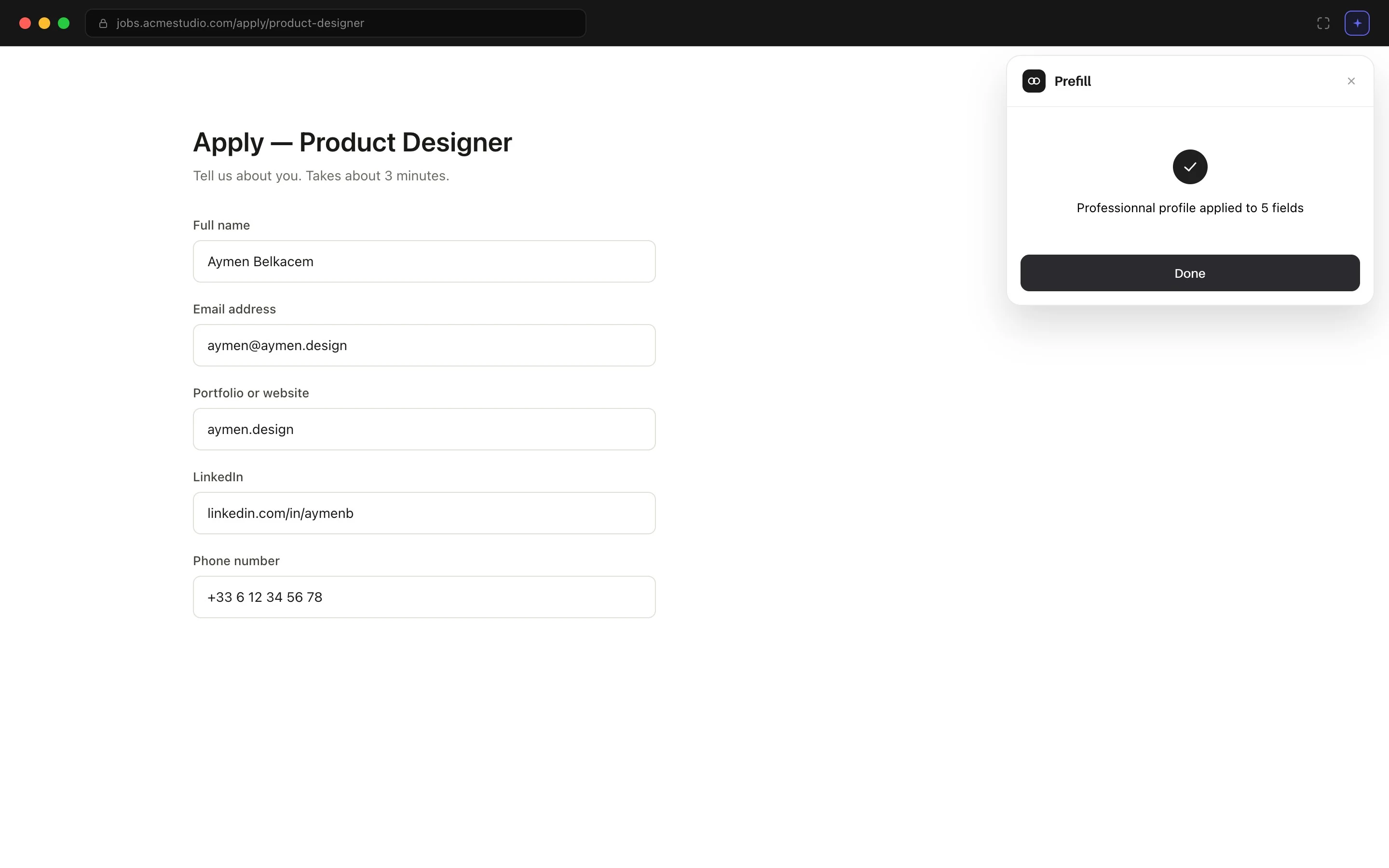
Step 3 — Done
Result
Prefill went from an AI-generated MVP with scattered UX decisions to a focused browser extension built around one metric: minimum clicks to apply.
3 clicks to fill any form, regardless of field count
21.11% more screen space after removing the sidebar
3.61% tighter layout for faster target acquisition
Zero context-switching during field management
One consistent pattern for all "add" actions across the app
Next
Field detection via DOM parsing to auto-match form inputs. Team profiles for agencies and studios sharing a common application identity. Analytics on fill rates and field match accuracy to improve detection over time.
Like this project
Posted Jun 25, 2026
Designed a browser extension that fills job application forms in 3 clicks using multi-profile autofill. AI-generated MVP, then redesigned every UX decision.
Likes
0
Views
3