Floor OS UI/UX Design for Industrial Machines

Aymen Rouabehi


Floor OS
Type: Fictional / Spec project
Status: Design only
Tools: Figma, Claude
Personas: Operator (on the floor), Manager (at the desk)
Presentation overview
Context
Fictional project, inspired by playing Satisfactory. I wanted to design a full operating system UI for industrial machines, not just a dashboard. The goal was the architecture and the logic: a design system that adapts to who's using it, not a complete set of pages and flows.
Most industrial software ignores the human standing in front of it. Floor OS started from a different premise: the interface should know who you are, where you are, and what you need right now, and adapt accordingly.
The goal was to design the full UI of an operating system for industrial machines: a complete, contextual interface system that works for every role in a plant, the operator running a single machine on the floor and the manager overseeing the entire facility.
One product. Two radically different experiences. One shared design system.
Challenge
Industrial UI design sits at the intersection of two hard problems: information density and cognitive load.
A plant manager works at a desk, has time to think, and needs to see the full picture: OEE across all lines, open incidents, production targets, shift reports. They can read small labels, navigate nested menus, and cross-reference data across panels.
An operator is standing 1-2 meters from the screen, in a loud environment, with their hands and attention partly on the machine. They need to know one thing immediately: is everything OK? If not, what exactly is wrong? They cannot afford choice overload (Hick's Law). They need large targets, fewer options, and high-contrast feedback.
The design challenge was to serve both without creating two separate products.
Process
Design system: one language, multiple dialects
Atomic Design as the foundation
I built the entire system on Atomic Design, from primitive tokens all the way up to full screens. Every element in the interface traces back to a shared foundation.
Atoms include the low-level visual building blocks: process path indicators (wave and square variants, in blue / yellow / red / green, active / inactive), info bubbles (Warn / Error / Success / Info / Neutre), buttons (Default / Selected / Hover), and process state cards (Success / Error / Warn / Next / Actual).
Molecules are purpose-built data display units, each designed for a specific type of industrial information:
Datas Bar — horizontal resource bar (Electricity, Coolant, Lubrication, etc.) with 5 semantic states (Ok / Warning / Error / Info / Neutre) and two sizes (Grand / Petit) for different interface densities
Logs — chronological event rows, color-coded by severity
Process Infos Graph — real-time cycle graph with multiple overlapping signals
Process Cycle — horizontal timeline showing current production step
Programs Buttons — program selector (Selected / Normal states)
The Slot System — Figma's Composition Feature
The most architectural decision in this project. Instead of building one card per data type, I used Figma's Slot feature to build a fully composable card system.
Every panel in Floor OS is built on a Background+Border+Component — a card shell available in two widths (220px / 1024px) that contains a Slot for its inner content.
Inside that slot lives a Spacer — a layout container that itself has a Slot. The Spacer adapts to the molecule that goes inside it: vertical for Logs, horizontal for Process Infos Graph, sized differently for Datas Bars vs. Process Cycles.
The same card component hosts any molecule, in any context, without duplication. Change the Spacer, change the molecule — the card shell stays the same. The result is a system that scales to new machine types or new data modules without redesigning the architecture.
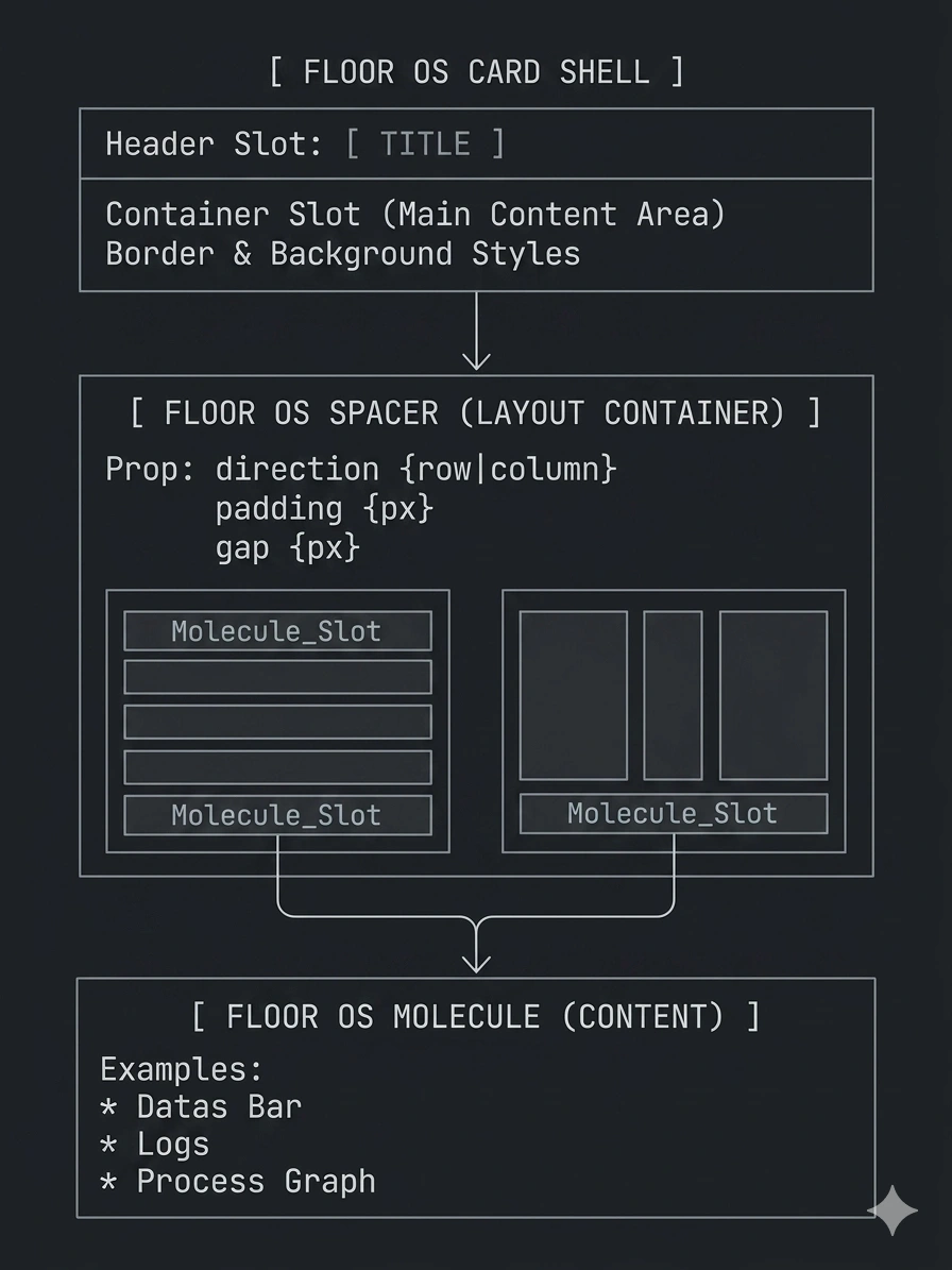
Architecture diagram
Design Tokens — Same Primitives, Different Contexts
The token system is the backbone of multi-persona adaptation. Both interfaces are built from the same primitive token set — spacing scales, color primitives, type scales, border radii — but each persona maps to its own semantic token layer.
The operator interface uses larger spacing tokens, larger type tokens, and fewer interactive elements per screen
The manager interface uses compact tokens, enabling dense data panels with multiple widgets in view simultaneously
Switching between contexts is a token swap on top of shared components, not a redesign.
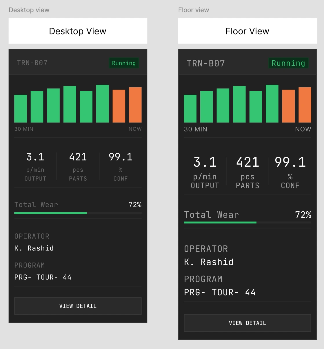
Token architecture
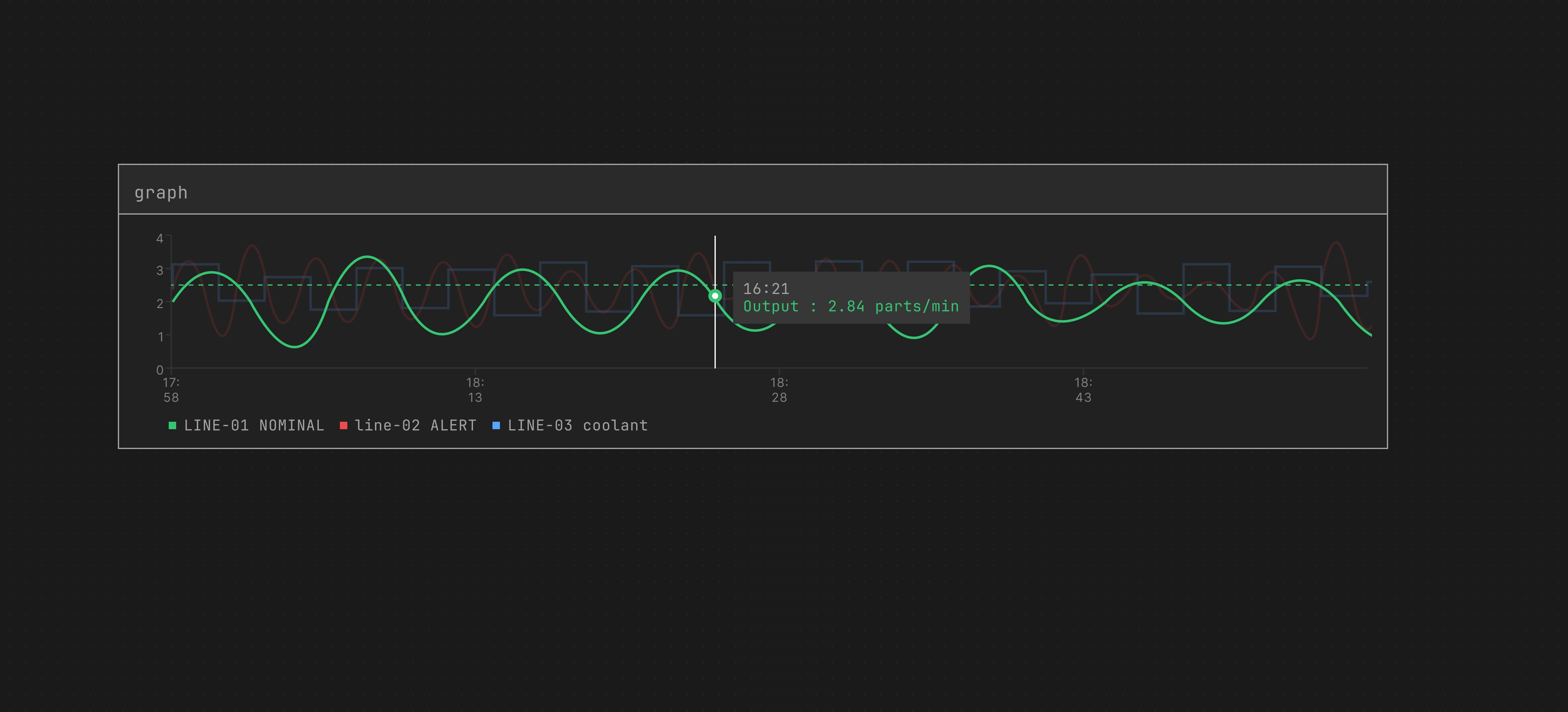
Graph dark mode final
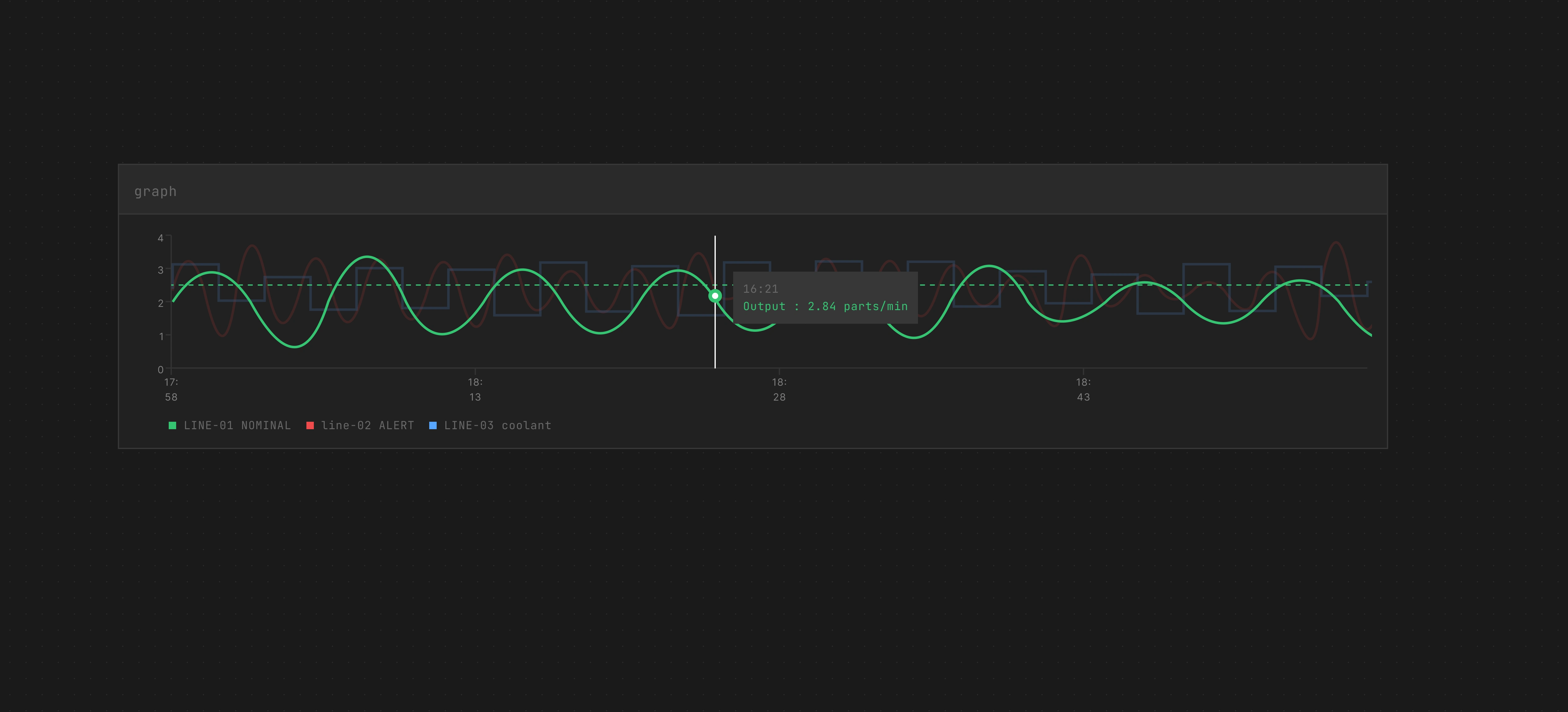
Graph dark mode
Presentation 1
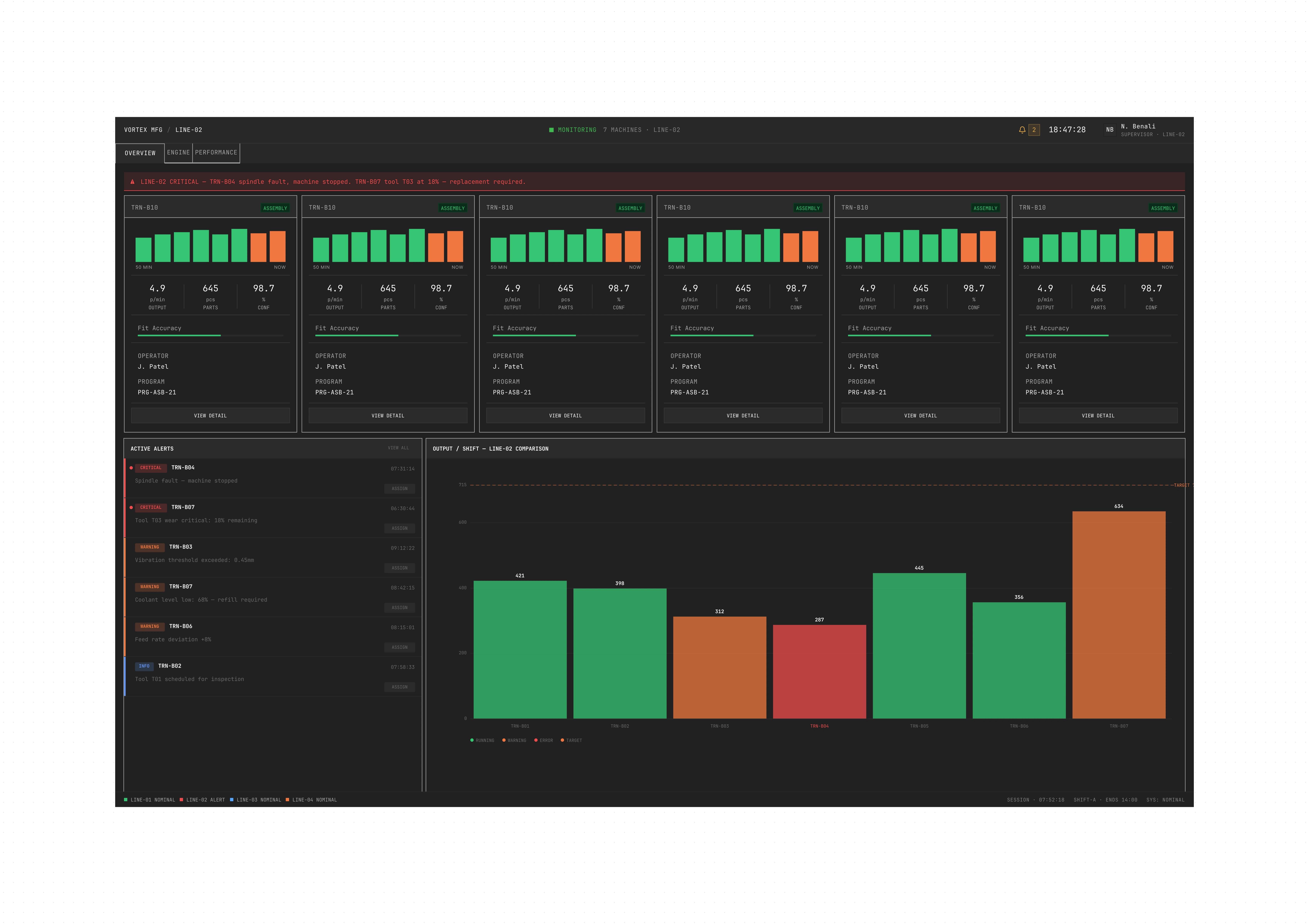
Presentation 4
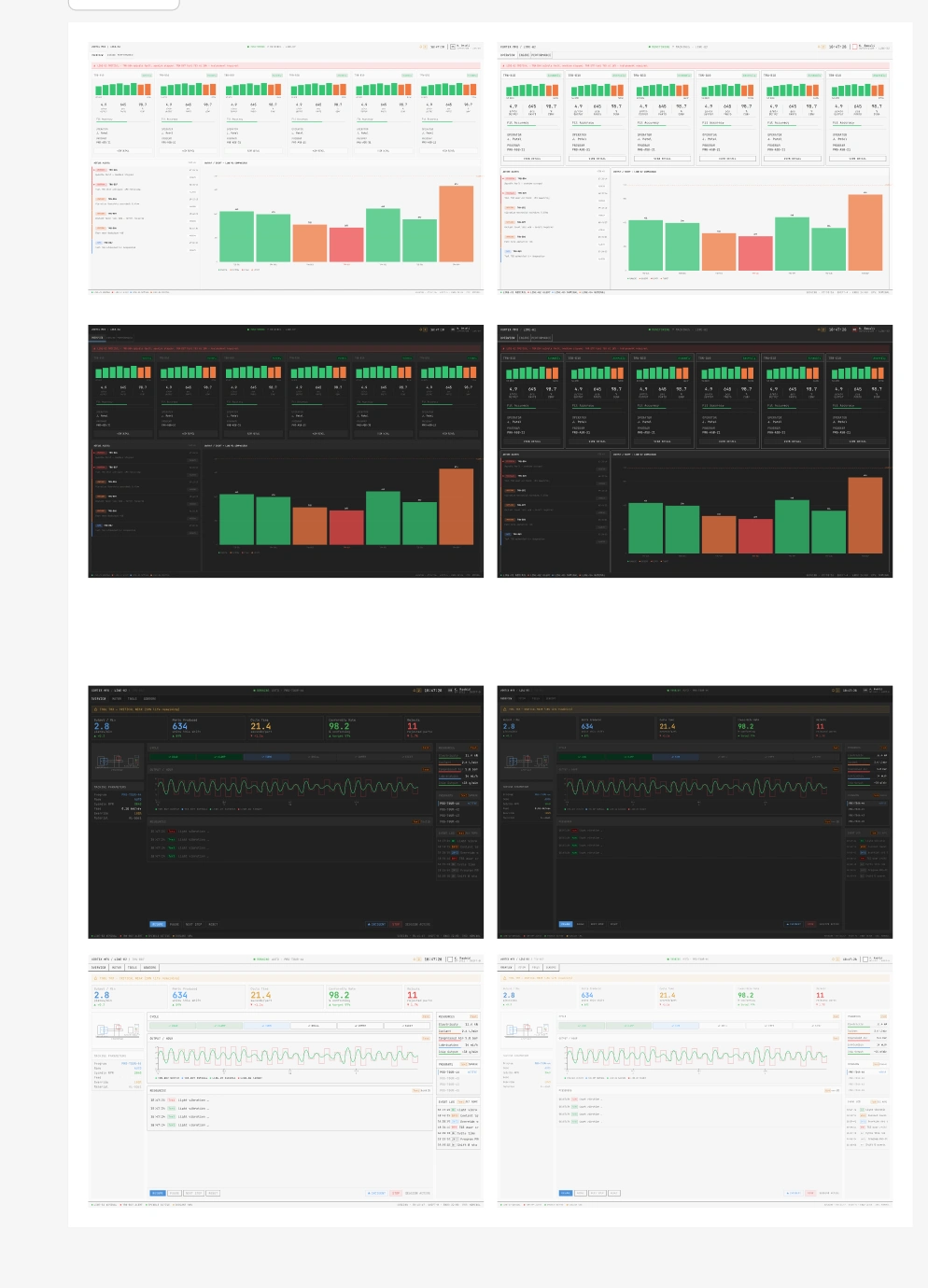
Component overview
Screens
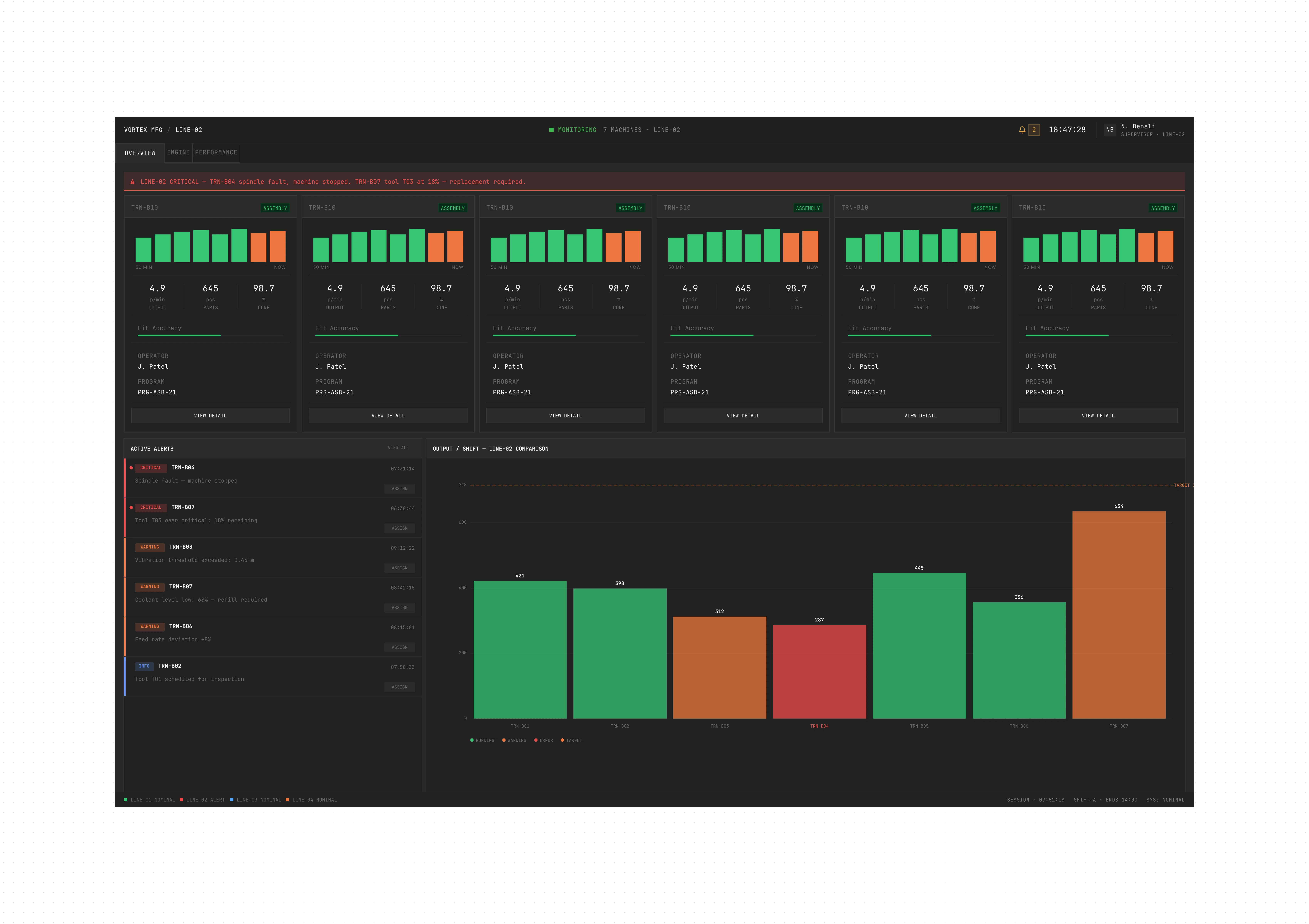
Operator View — P1: Machine Detail (TRN-B07)
The most granular view in the system. An operator opens this screen when assigned to a specific machine — here, a turning machine (TRN-B07) on LINE-02.
The layout is structured around immediate status legibility:
A persistent alert banner at the top (amber for warnings, red for critical) — always visible, never hidden by content. In an industrial environment, a missed alert is a production stop, or worse.
Five large KPI cards at a glance: Output/Min, Parts Produced, Cycle Time, Conformity Rate, Rejects — with delta indicators to show trend vs. target
A real-time cycle graph (Output vs. Noise) in the center
A schematic of the machine and its current parameters (program, spindle RPM, feed, override, material) on the left
Resources, programs list, and event log on the right
Actions are limited and large: Resume / Pause / Next Step / Reset — applying Hick's Law deliberately. The fewer choices visible at once, the faster the response time under pressure.
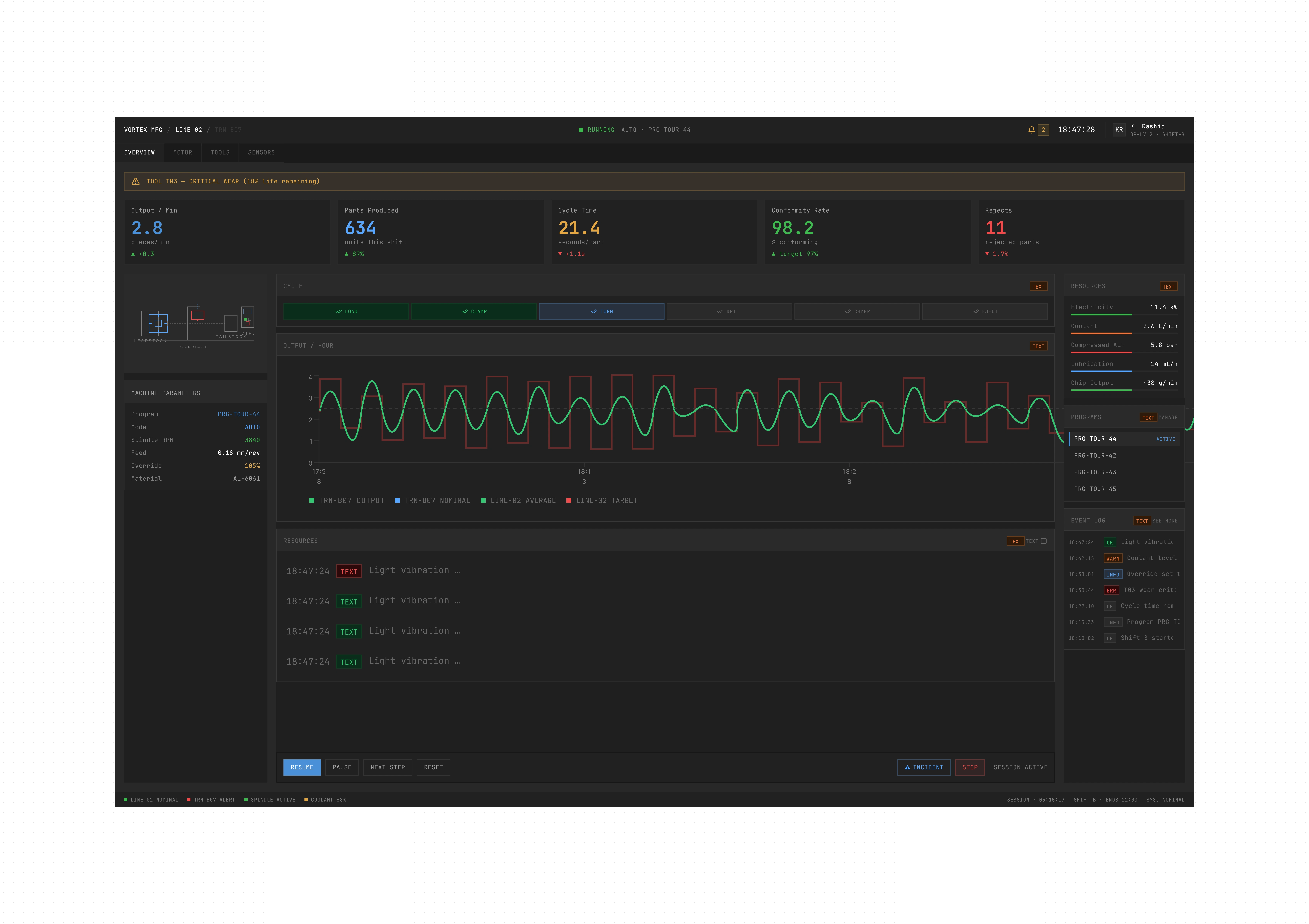
Operator view
Manager View — P8: Plant Overview
The manager's view is the densest interface in the system. They are at their desk, not on the floor.
Five global KPIs dominate the top: OEE Global (84.2%), Active Machines, Plant Output, Quality Rate, and Open Incidents, each with a trend indicator vs. target.
Below: a production lines panel (tabbed by line) with a real-time output graph, a shift overview summary (active lines, machines up, shift, supervisor, OEE), critical alerts ranked by severity, line status cards, and a full plant event log.
The interface uses smaller type, tighter spacing, and more panels in view — because the manager's cognitive context allows it. They are not reacting to alarms. They are reading the plant.
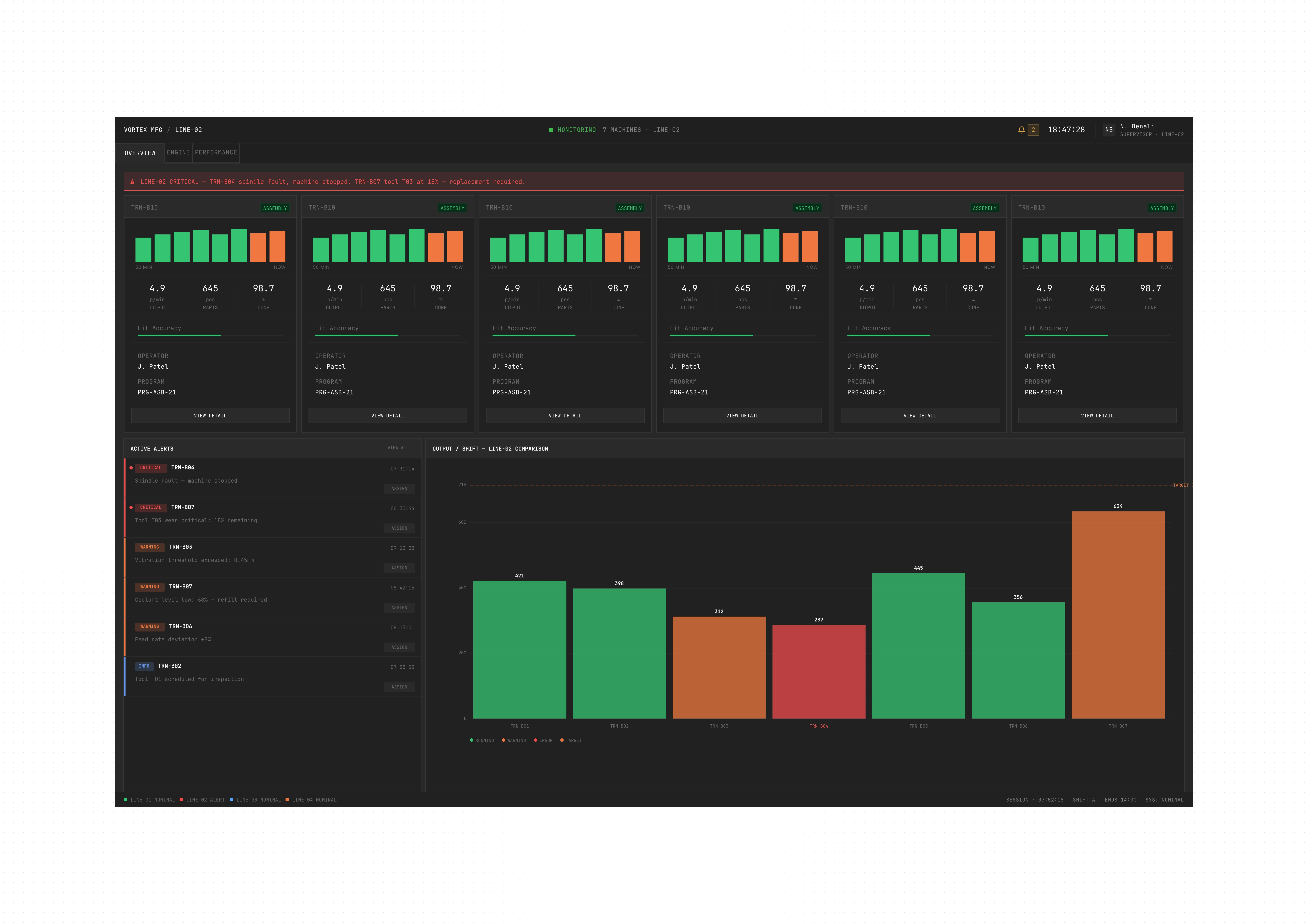
Manager view
Animated comparison
Key Design Decisions
Persona-first token architecture — Spacing, target size, information density, and choice architecture are all governed by who is reading the screen.
Slot composition over duplication — Instead of building one card per data type, the slot system allows one card architecture to host any molecule. This drastically reduces the number of components while maintaining complete visual consistency.
Alert hierarchy — Critical alerts always surface. The amber banner at the top of every screen is not dismissible and not hidden. In an industrial environment, a missed alert is a production stop, or worse.
Same layout for every page — The layout remains consistent across all pages. Only the KPIs and data modules change depending on the machine type and context. This allows operators to navigate any machine without relearning the interface (Fitts's Law: spatial consistency reduces reacquisition time).
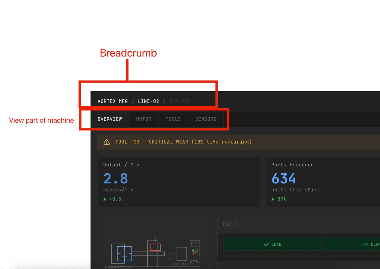
Layout consistency
Result
Design only. No implementation, no user testing, no production metrics.
What exists:
Complete design system (Atoms → Molecules → Spacers → Cards)
Design token architecture (primitives + 2 semantic layers)
2 full screens across 2 personas (Operator / Manager)
Figma Slot-based component library
The point of this project was to prove the architecture works: that one design system can serve two radically different cognitive contexts through token swaps and slot composition, without duplication and without building two separate products.
Like this project
Posted May 20, 2026
Fictional project inspired by Satisfactory. Full design system and token architecture for an industrial machine OS, with two persona-driven interfaces (operator and manager). Focus on system logic, not full page coverage.
Likes
0
Views
16