Pouch, Newsletter Reader

Aymen Rouabehi


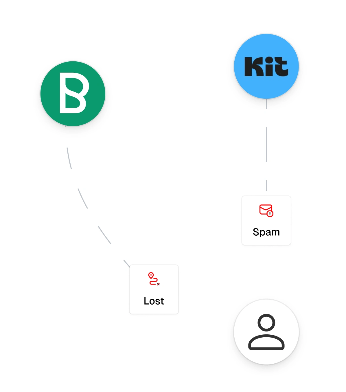
Newsletters arrive in a regular inbox. Mixed with promotions, notifications and spam, they get flagged as unwanted, forgotten, or lost in thousands of unread messages.
Pouch gives you a dedicated address for newsletters only. Everything arrives in one place, in an interface designed for reading.
Target User
Active newsletter readers: creators, developers, designers, founders. Someone subscribed to 10, 15, 20 different newsletters who actually wants to read them, not just accumulate them.
Process
Before opening Figma, I defined the product scope: who the user is, what matters most in the app, and what the onboarding needs to accomplish. Once those decisions were locked, I used Claude to generate screens based on that framework, then reviewed and refined everything myself.
The whole project took about a week, built in a single focused sprint. I deliberately limited the scope to 11 key screens (light + dark mode) rather than designing every possible state. The goal was to go deep on the core experience, not wide on coverage.
The design decisions came from me. Claude handled the execution.
Design Decisions
Dense and minimal interface
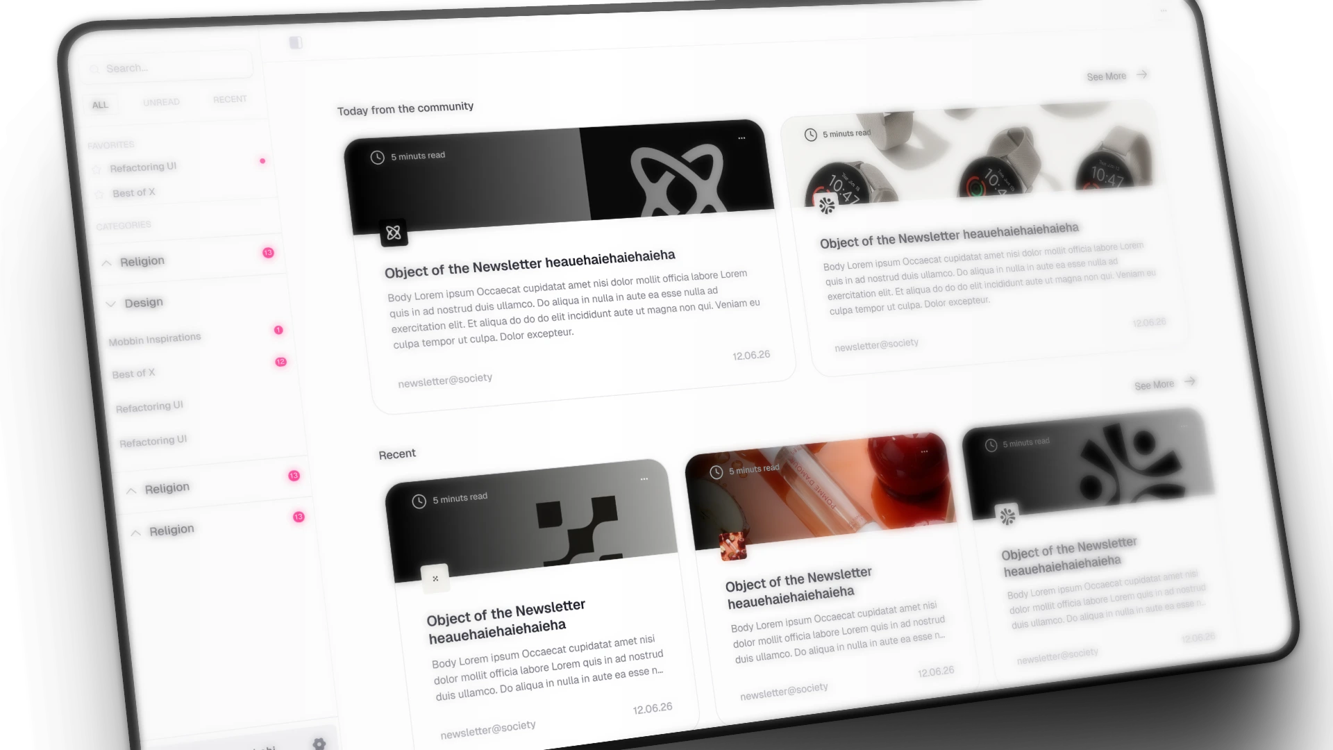
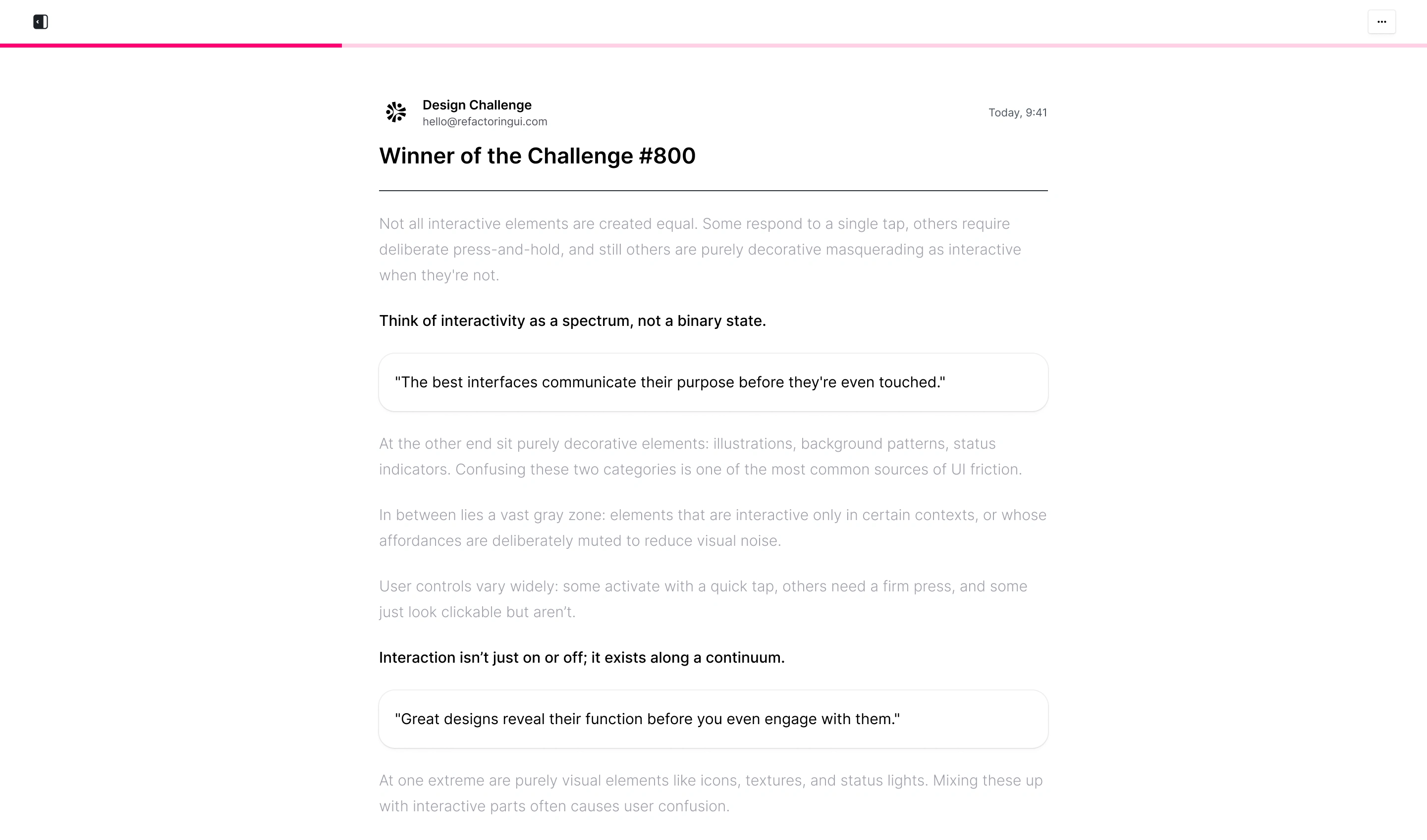
Pouch is a text app. Its core content is long-form reading. Every decorative element that doesn't serve that is visual noise. I kept the interface dense and minimal to leave room for what actually matters: text and typographic hierarchy.
Light mode and dark mode
I treated both modes as equal, with a slight preference toward light mode as the default.
Dark mode works in specific contexts: dim rooms, occasional use, OLED screens. For a reading app used throughout the day, light mode performs better. Dark text on a light background reduces reading effort and eye strain over time. Dark mode in Pouch is a valid option, not the primary direction.
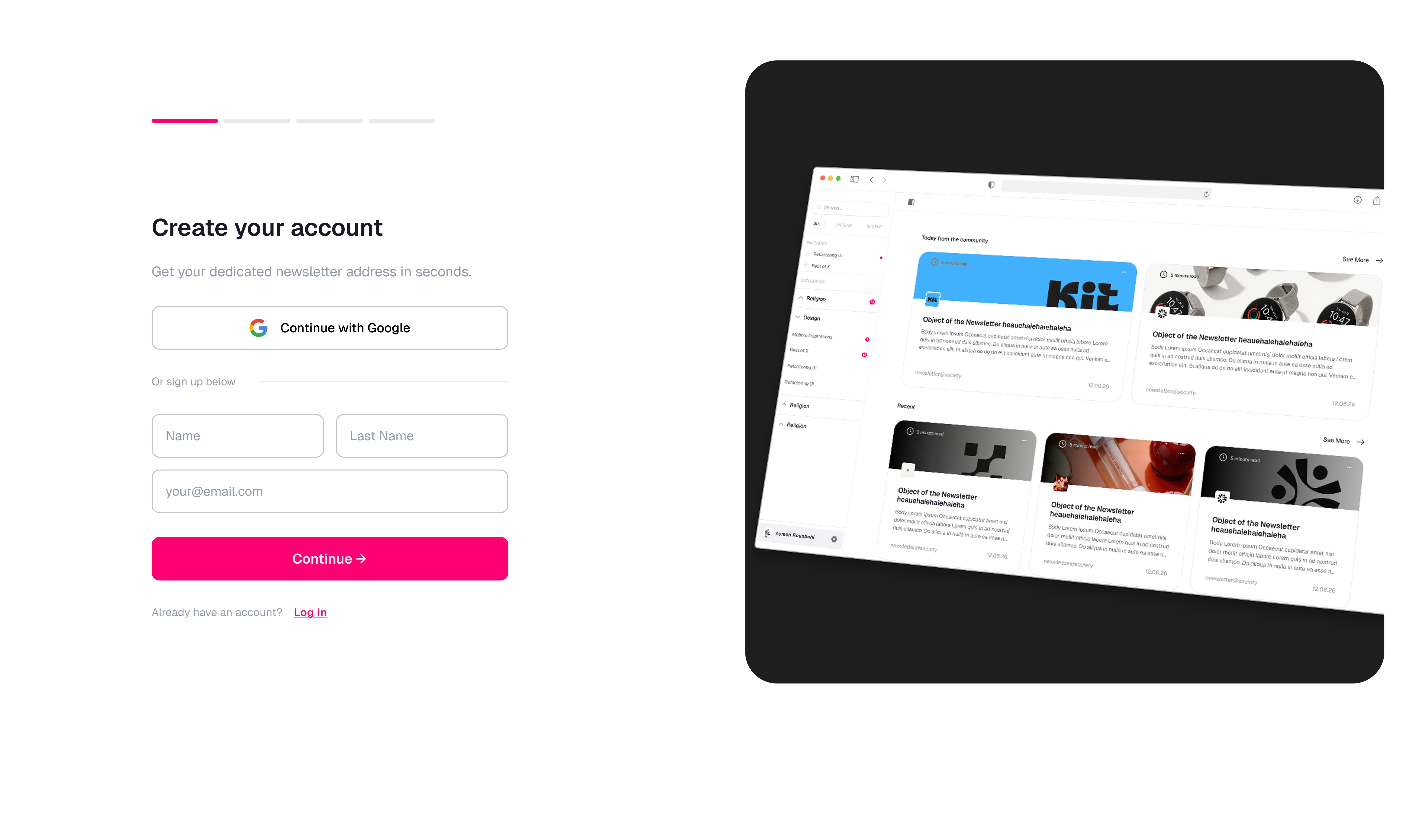
Onboarding split-screen
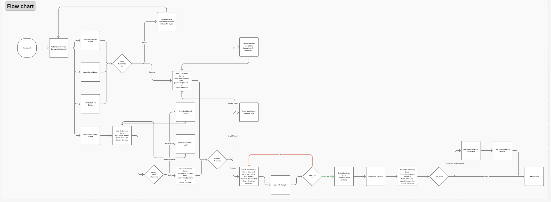
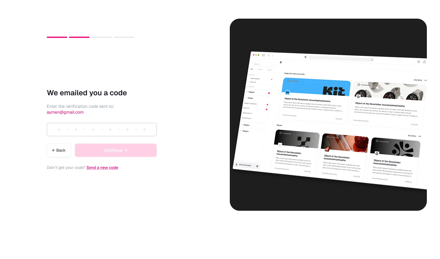
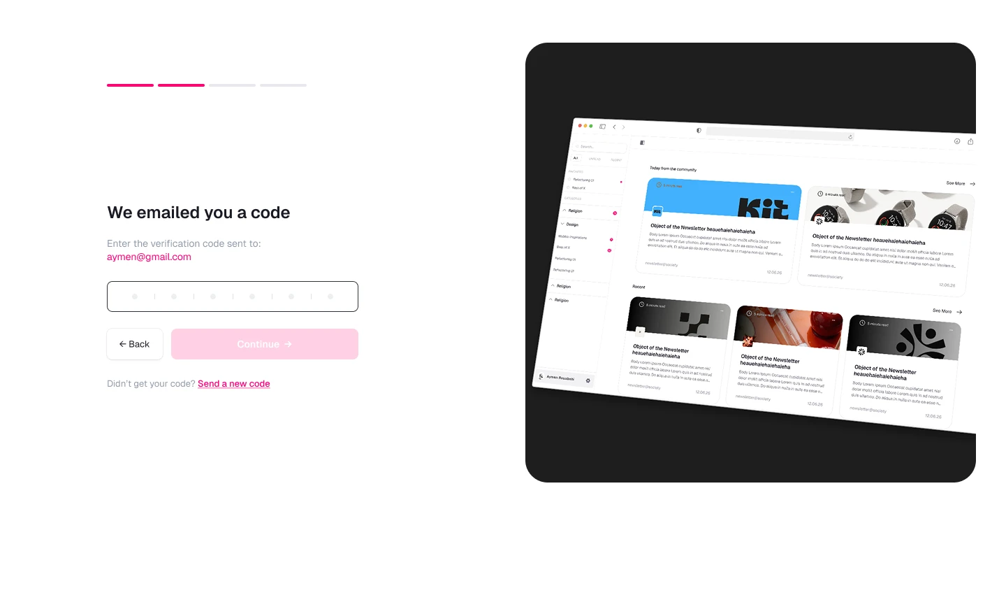
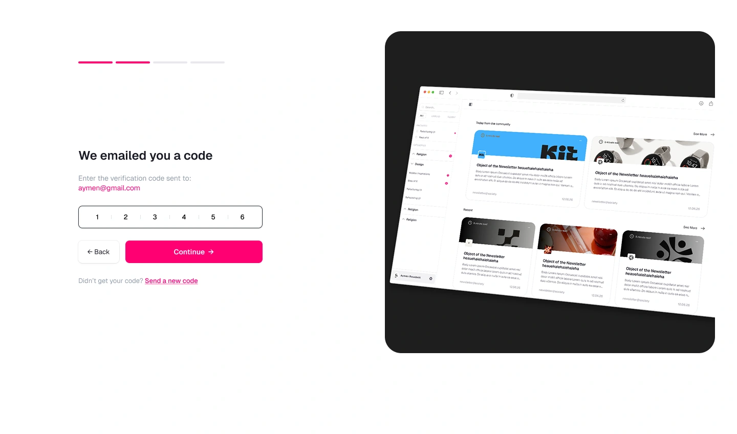
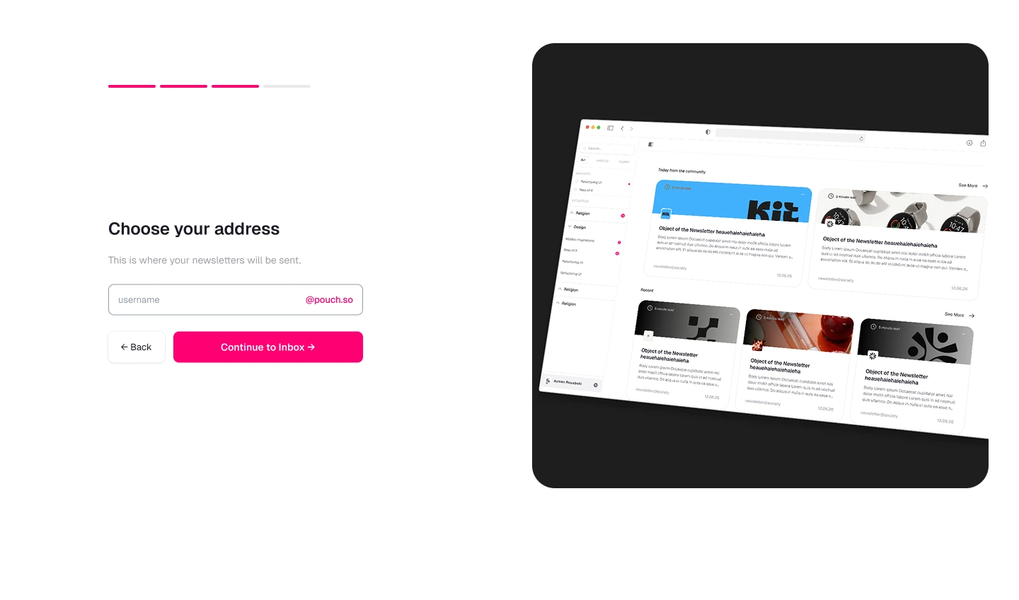
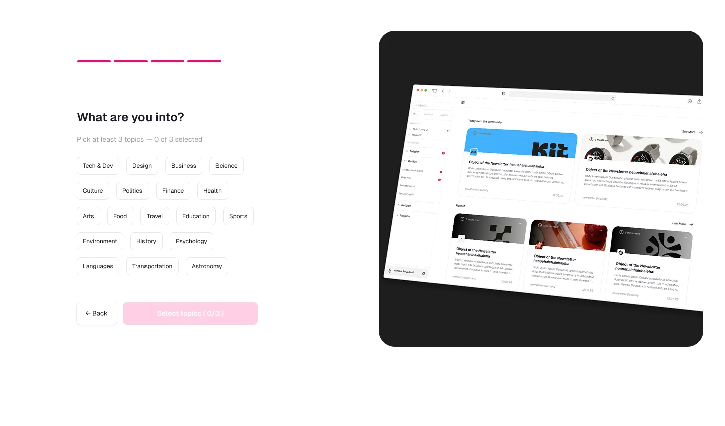
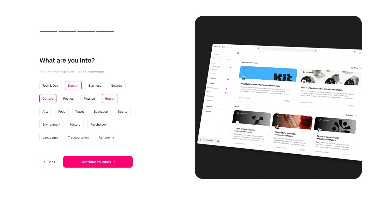
The onboarding uses a split-screen layout: form on the left, app preview on the right. Inspired by Sana. The user sees where they're going before giving their email.
When a newsletter has no image
I evaluated three options:
AI-generated image. Not viable at scale. It would require reading, summarizing and generating a banner consistent with each newsletter's brand. Massive cost, marginal benefit.
Category-based visual. Too generic. Users lose each sender's visual identity.
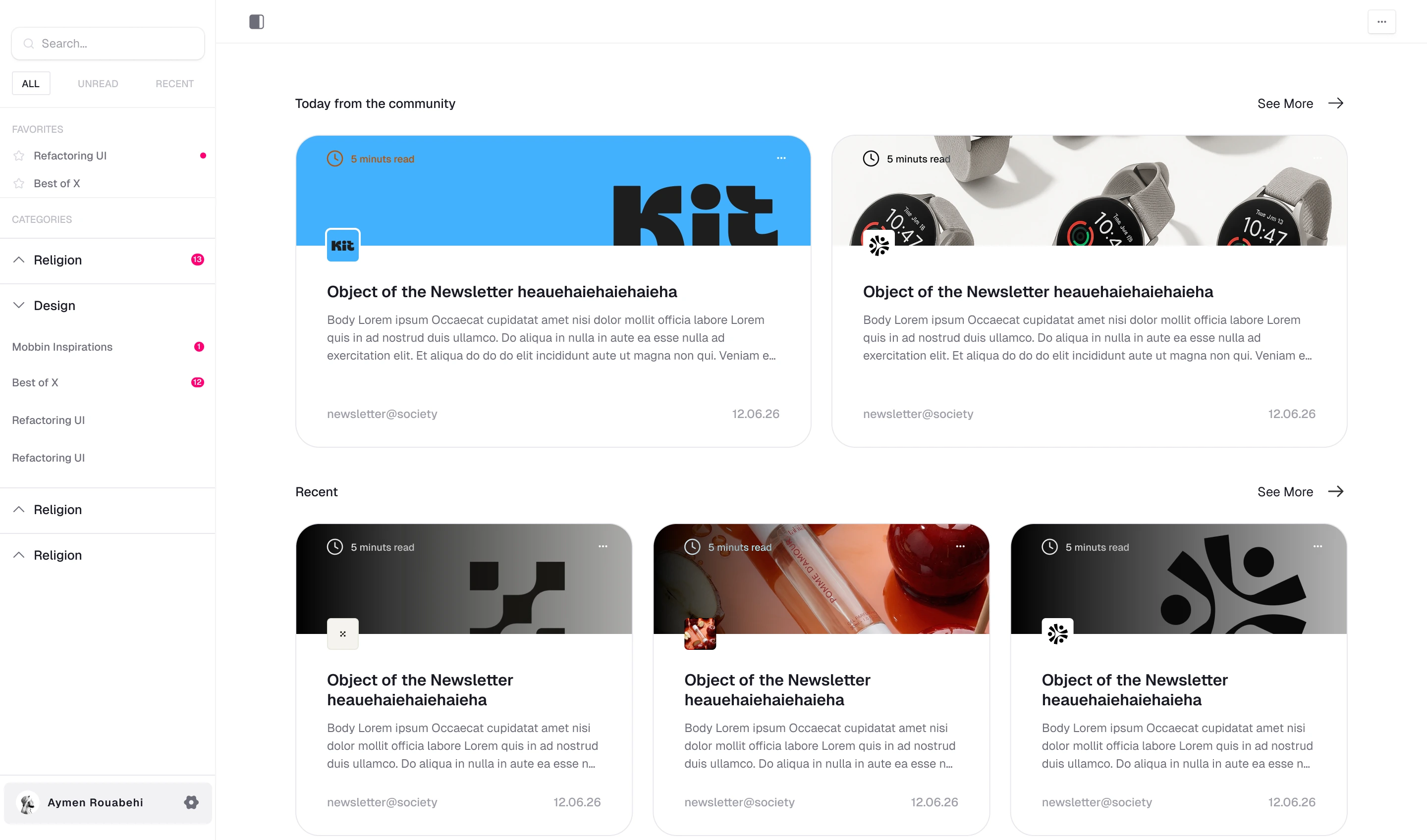
Sender logo + initials/unique color fallback. Fast, recognizable, scalable. Zero server cost.
I went with option 3. Familiar pattern, zero server cost, the user identifies their newsletter in a fraction of a second.
Sidebar navigation
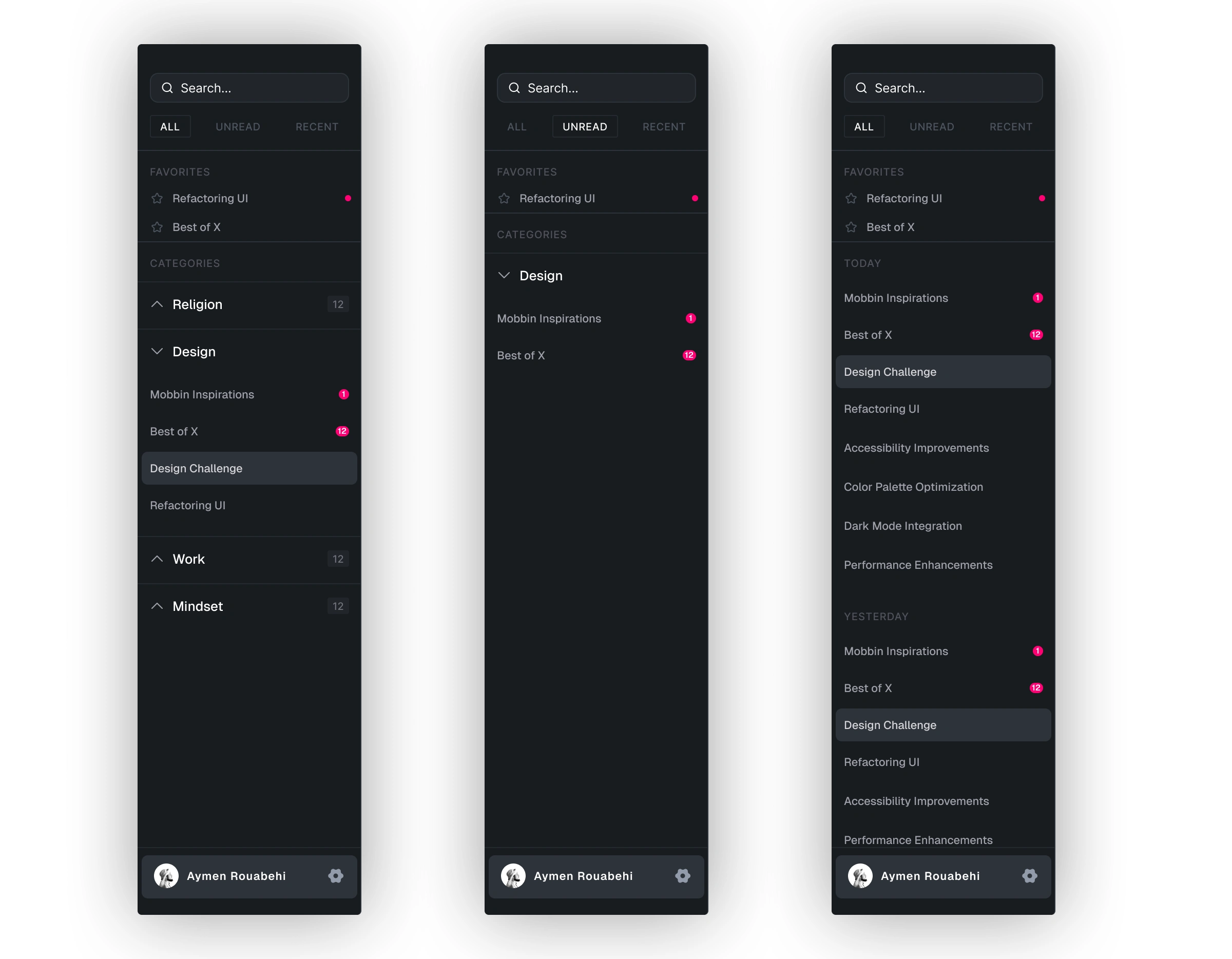
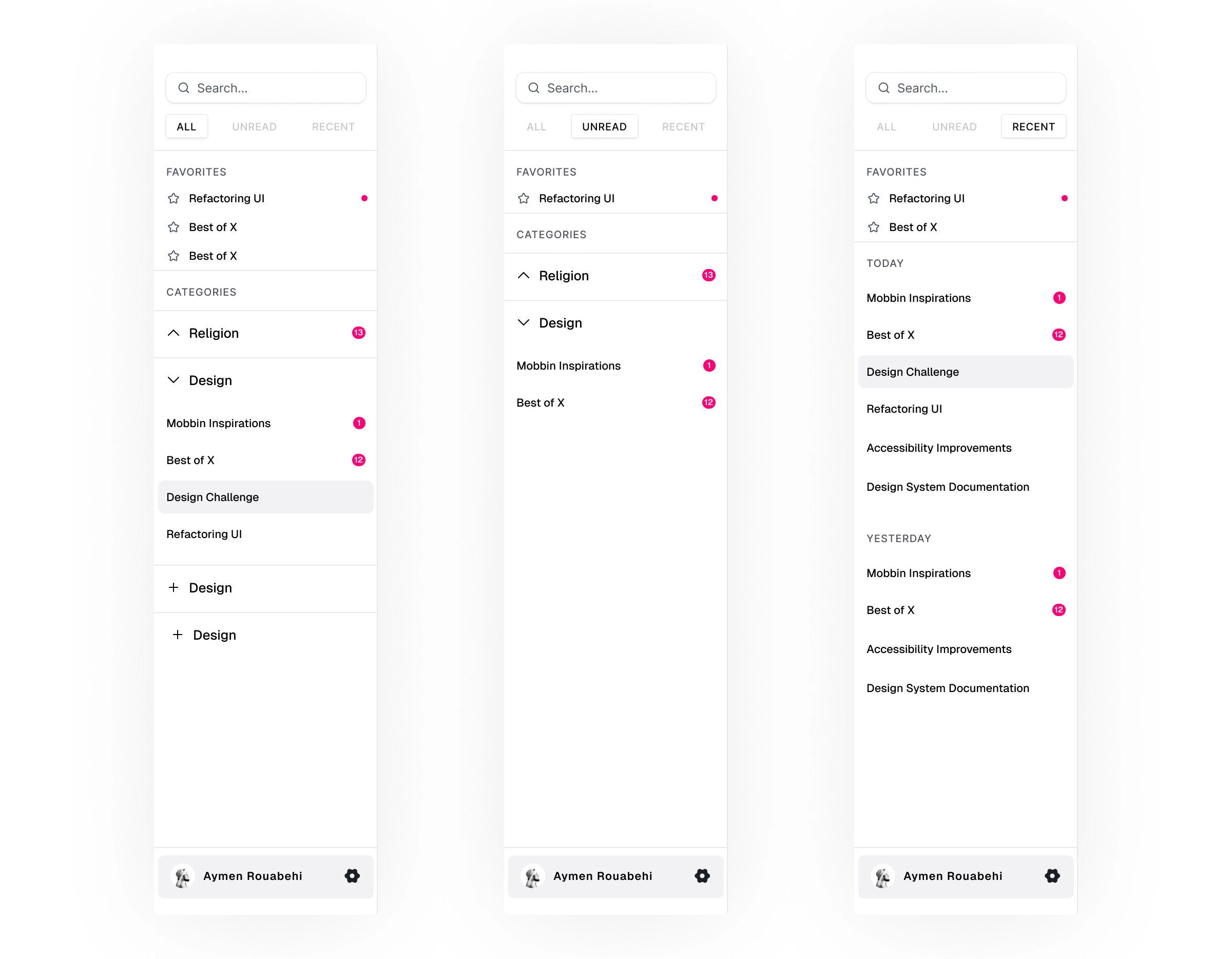
I added a search bar and 3 filters: All, Unread, Recent. These felt like the most essential ways to cover what most users actually need without overloading the interface.
I kept the filter selection deliberately subtle. It's not a feature that deserves high visual hierarchy. The sidebar layout already changes enough between the 3 modes that users know where they are without even looking at the active filter. Pushing more emphasis on those buttons would create noise for very little gain.
What the user actually wants is to read their newsletters. Everything else should get out of the way.
Inspirations
Sana for onboarding. Cloaked for menus and overall density spacing and component simplicity. Discord for sidebar logic and information density.
Screens
Onboarding (7 steps, light + dark)
Home
Inbox
Reader
Clickable Figma prototype
Why was it useful
Pouch was a self-initiated project, but the process mirrors how I work with clients: define the target user, identify the highest-impact features, then design and iterate around those priorities.
The most interesting decisions here weren't visual. Choosing sender logos over AI-generated images, defaulting to light mode for readability, designing an onboarding that shows before it explains. All of these came from thinking about the product problem first, then finding the simplest interface that solves it.
That's the approach I bring to real projects: start with the problem, strip the interface down to what actually serves the user, and justify every element that stays.
If Pouch were a real product
Here's what I'd measure:
Onboarding completion rate — % of users who finish all 7 steps and reach their inbox. Measures whether the split-screen approach reduces drop-off.
Weekly active readers — users who open and read at least 1 newsletter per week. Most newsletters publish weekly, so this is the natural engagement cadence for a reading-first app.
Average reading time per session — validates whether the dense, minimal interface actually encourages longer reading vs. skimming.
Newsletter-to-read ratio — % of received newsletters that get opened. Directly measures whether a dedicated inbox solves the "lost in spam" problem.
Filter usage rate — how often users switch between All, Unread, and Recent. Low usage would confirm the sidebar design is intuitive enough that users find what they need without filtering.
Like this project
Posted May 6, 2026
Designed a focused newsletter reader app with a dedicated inbox address, dense interface, and reading-first philosophy inspired by Linear and Discord.
Likes
0
Views
19