Crossovers Dashboard: Analytics and Performance Tracking
Muhammad Tayyab
Crossovers Dashboard: Comprehensive Analytics and Performance Tracking
I approached the design of this analytics dashboard with the goal of creating an intuitive and data-rich interface that empowers users to monitor key performance metrics, track financial health, and gain insights into business operations. The design focuses on clarity, interactivity, and actionable insights to enhance decision-making.
User Research :
The target audience includes marketing professionals, business analysts, and managers who need quick access to sales, revenue, and conversion data.
Key insights revealed the need for a clean, organized layout, real-time updates, and interactive visualizations to support informed decision-making.
Information Architecture :
The dashboard is divided into clear sections to provide a structured workflow:
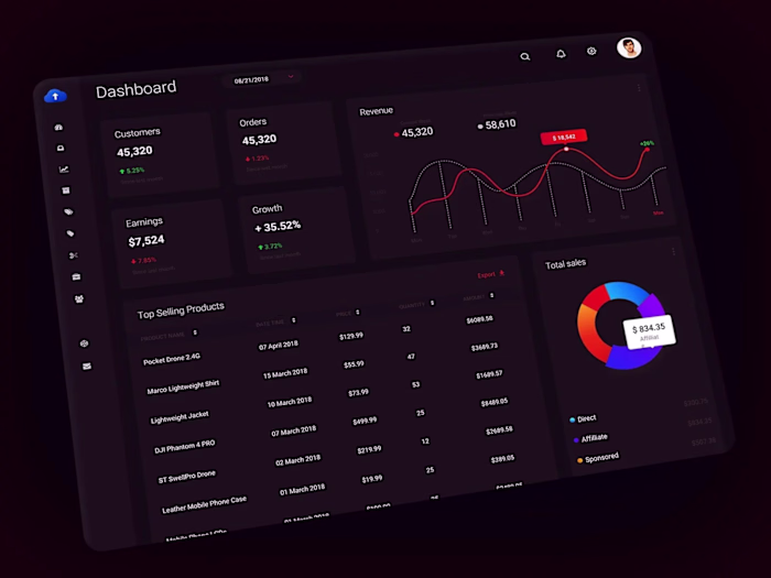
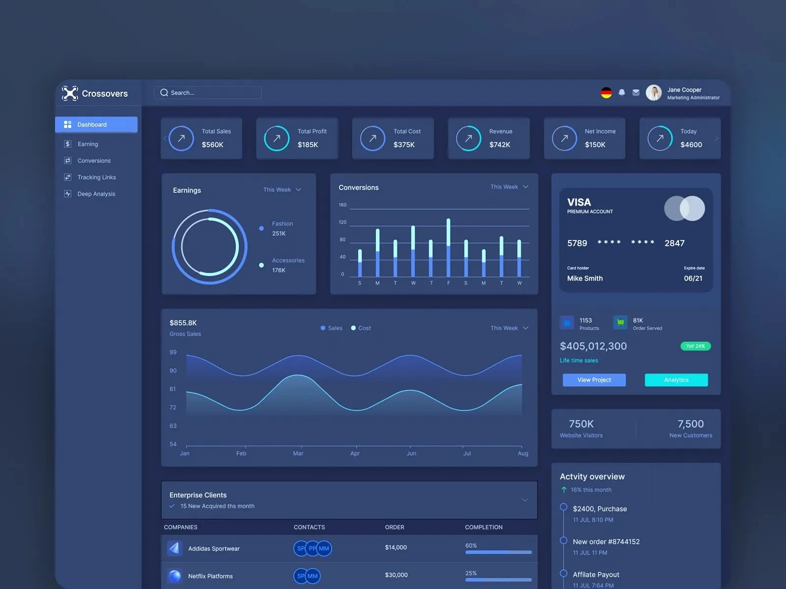
Sidebar Navigation : Includes categories like Dashboard, Earnings, Conversions, Tracking Links, and Deep Analysis, ensuring easy access to different functionalities.
Key Metrics : Displays critical financial indicators such as Total Sales, Total Profit, Total Cost, Revenue, and Net Income in concise, visually appealing formats.
Visualizations : Features charts and graphs (e.g., earnings pie chart, conversions bar chart, gross sales line graph) to provide detailed insights into performance trends.
Account Information : Shows essential details like bank account status, cardholder information, and project analytics for quick reference.
Activity Overview : Provides a timeline of recent activities, including purchases, new orders, and affiliate payouts, ensuring users stay updated on important events.
Visual Design :
Color Palette : Uses a dark mode theme with shades of blue and white to create a professional and focused look. Bright accents (like green for positive metrics and orange for warnings) ensure high contrast and readability.
Typography : Chose clean, readable fonts for clarity and consistency across all elements.
Icons and Imagery : Included simple, recognizable icons for each section (e.g., dollar signs for earnings, arrows for growth metrics) to enhance usability.
Personalization : Displayed the user's profile picture and name at the top to create a personalized experience.
Interactive Elements :
Dashboard Widgets : Designed interactive tiles for key metrics (e.g., Total Sales, Total Profit) with hover effects and drill-down capabilities for deeper analysis.
Charts and Graphs : Implemented responsive charts (e.g., pie chart, bar chart, line graph) with tooltips and zoom functionality to allow users to explore data in detail.
Filter Options : Added dropdown menus and toggles for filtering views (e.g., "This Week" for earnings and conversions), enabling users to customize their perspective.
Call-to-Action Buttons : Positioned prominently with labels like "View Project" and "Analytics" to encourage users to dive deeper into specific areas.
Usability :
Navigation : Kept the sidebar navigation simple and intuitive, allowing users to easily switch between different sections of the dashboard.
Accessibility : Ensured sufficient contrast between text and background for readability, especially during prolonged use.
Responsiveness : Designed the layout to adapt well to different screen sizes, maintaining readability and functionality on both desktop and mobile devices.
Data Visualization :
Metrics Cards : Showed critical financial data (e.g., $560K Total Sales, $185K Total Profit) in concise, visually appealing formats.
Earnings Pie Chart : Highlighted revenue distribution by category (e.g., Fashion, Accessories) to provide a quick overview of performance.
Conversions Bar Chart : Displayed daily conversion trends with clear labels and color coding to identify patterns and anomalies.
Gross Sales Line Graph : Provided a historical view of sales and costs over time, helping users understand seasonal fluctuations and growth trends.
Engagement :
Real-Time Updates : Included live data feeds for metrics like total sales, net income, and website visitors to keep users informed about current performance.
Notifications : Highlighted important updates (e.g., new clients, order completions) with clear visual cues to ensure timely action.
Personalized Insights : Showcased user-specific details like bank account information and activity timelines to build trust and relevance.
By focusing on clarity, interactivity, and actionable insights, this design aims to provide users with a powerful tool for monitoring and optimizing business performance. The combination of sleek visuals, robust data presentation, and seamless interactions ensures a productive and engaging user experience.
Like this project
Posted Jun 8, 2025
Designed a data-rich analytics dashboard for performance tracking.