Task Management Dashboard: Visual Productivity Tool
Muhammad Tayyab
Task Management Dashboard: Efficient and Visual Productivity Tool
As a UX/UI designer, I approached the design of this task management dashboard with the goal of creating an intuitive and visually engaging interface that helps users stay organized, track progress, and prioritize tasks effectively. The design focuses on clarity, interactivity, and actionable insights to enhance productivity.
User Research:
The target audience includes professionals who need tools to manage their daily tasks, monitor deadlines, and track project progress.
Key insights revealed the need for a clean, organized layout, real-time updates, and visual cues to keep users motivated and informed.
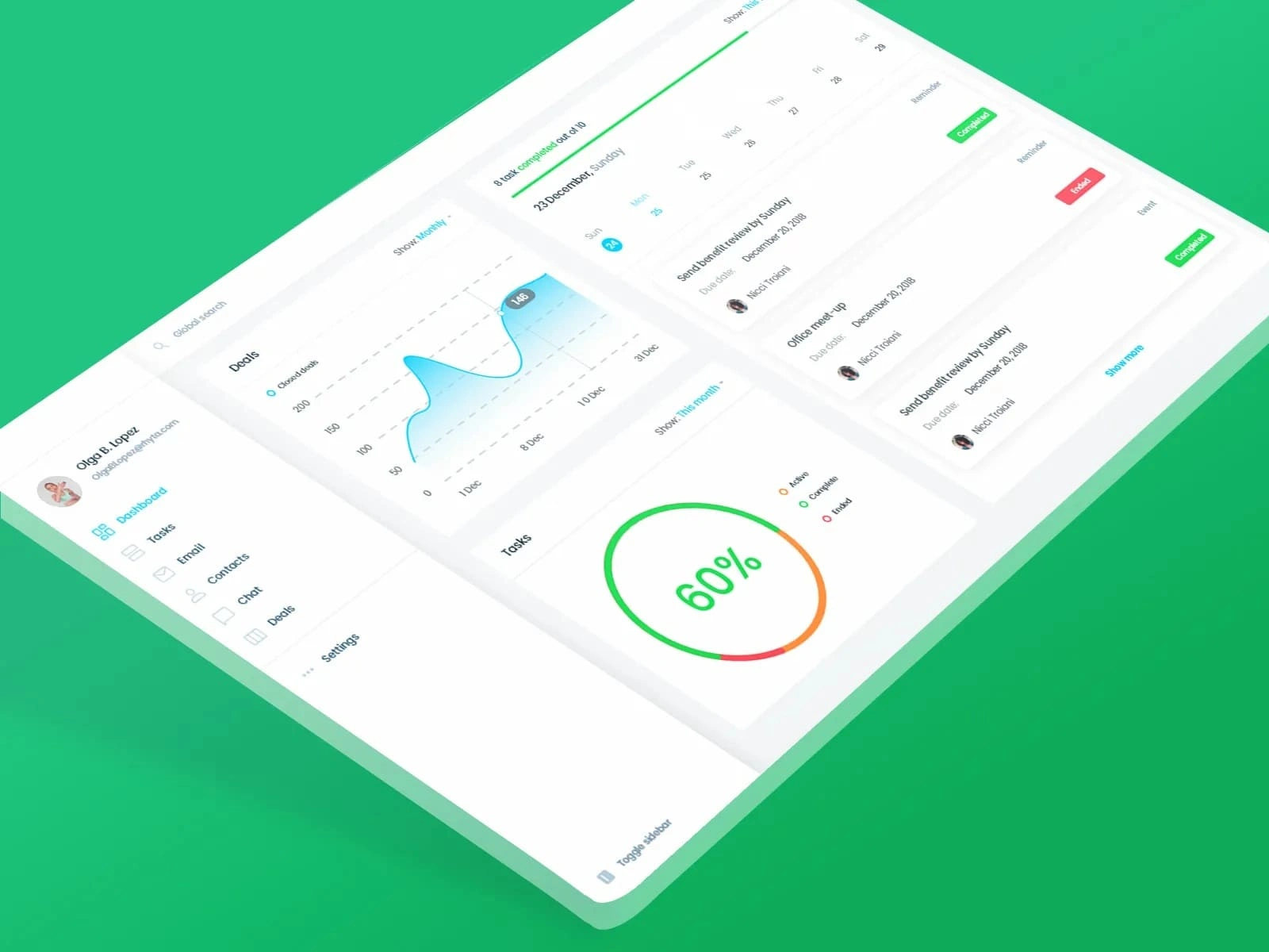
Information Architecture:
The dashboard is divided into clear sections to provide a structured workflow:
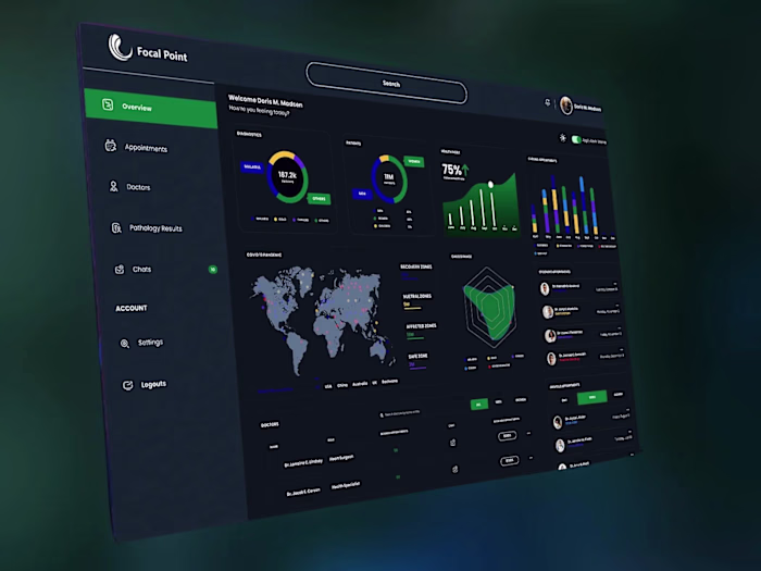
Sidebar Navigation: Includes categories like Dashboard, Tasks, Email, Contacts, Chat, Deals, and Settings, ensuring easy access to different functionalities.
Task Timeline: Displays a timeline view of tasks with due dates, reminders, and completion statuses, allowing users to quickly see what’s upcoming or overdue.
Progress Metrics: Shows key performance indicators (e.g., 60% task completion rate) in a circular chart for at-a-glance insights.
Closed Deals Chart: Provides a line graph showing the number of closed deals over time, helping users track their productivity and success.
Task List: Lists individual tasks with details like due dates, assignees, and status indicators (e.g., "Completed," "Expired").
Visual Design:
Color Palette: Uses a vibrant green theme with shades of blue and orange to create a fresh and energetic look. Bright accents ensure important elements stand out.
Typography: Chose clean, readable fonts for clarity and consistency across all text elements.
Icons and Imagery: Included simple, recognizable icons for each section (e.g., calendar for tasks, chat bubble for communication) to enhance usability.
Personalization: Displayed the user's profile picture and name at the top to create a personalized experience.
Interactive Elements:
Timeline View: Implemented a dynamic timeline with hover effects and clickable elements to allow users to explore task details and deadlines.
Progress Indicators: Used a circular chart to visually represent task completion rates, making it easy to gauge overall productivity.
Filter Options: Added dropdown menus and toggles for filtering views (e.g., "Show Monthly," "This Month") to enable users to customize their perspective.
Call-to-Action Buttons: Positioned prominently with labels like "Show more" and status indicators (e.g., "Completed," "Expired") to encourage users to take action.
Usability:
Navigation: Kept the sidebar navigation concise and intuitive, allowing users to easily switch between different sections of the dashboard.
Accessibility: Ensured sufficient contrast between text and background for readability, especially for critical information like task statuses and due dates.
Responsiveness: Designed the layout to adapt well to different screen sizes, maintaining readability and functionality on both desktop and mobile devices.
Engagement:
Real-Time Updates: Included live data feeds for metrics like task completion rates and closed deals to keep users informed about their progress.
Notifications: Highlighted important updates (e.g., completed tasks, expired reminders) with clear visual cues to ensure timely action.
Motivational Metrics: Showcased progress percentages and historical data (e.g., closed deals chart) to motivate users and provide a sense of achievement.
By focusing on clarity, interactivity, and personalization, this design aims to provide users with a seamless and productive task management experience. The combination of vibrant visuals, intuitive navigation, and actionable data ensures users can efficiently organize their work and achieve their goals.
Like this project
Posted Jun 8, 2025
Designed an intuitive task management dashboard for enhanced productivity.