✧ Roomi in Web and App
Phoebe Yan
OverviewContributionTimelineThe ProblemThe GoalEmpathize with the UserUser Research: SummaryUser Research: Pain PointsProblem StatementThe DesignSitemapKey parts in Roomi:Paper WireframingTransforming into Digital Wireframes Quick Navigation MenuSimilar Cards are placed togetherScreen Size AdaptationsUsability StudyFindings + Refinement Better Location of Reviews and MessagesBetter Terminologies High Fidelity PrototypeAccessibility ConsiderationsTakeawaysImpact:What I learned:Next Steps
Overview
Roomi is a second project I worked on for the Google UX Certificate program, the previous project is called Room for Roommates, both serve as a platform to allow students to find rooms or apartments for their upcoming off-campus housing and a place to meet possible roommates.
Roomi is a one stop place for matching potential roommates with housing
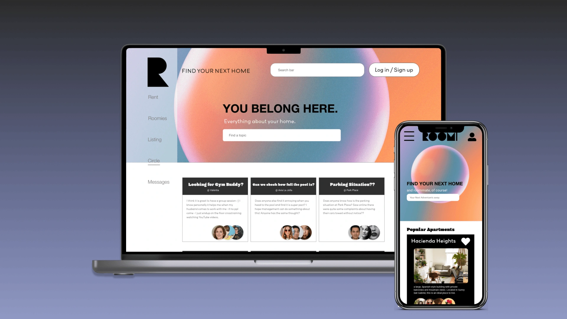
Hero Image of Website version and a mobile app version of Roomi
Contribution
Competitive Analysis, user Interviews
Sitemap with information architecture
Wireframing and prototyping using Adobe XD
Timeline
March 2022 - June 2022
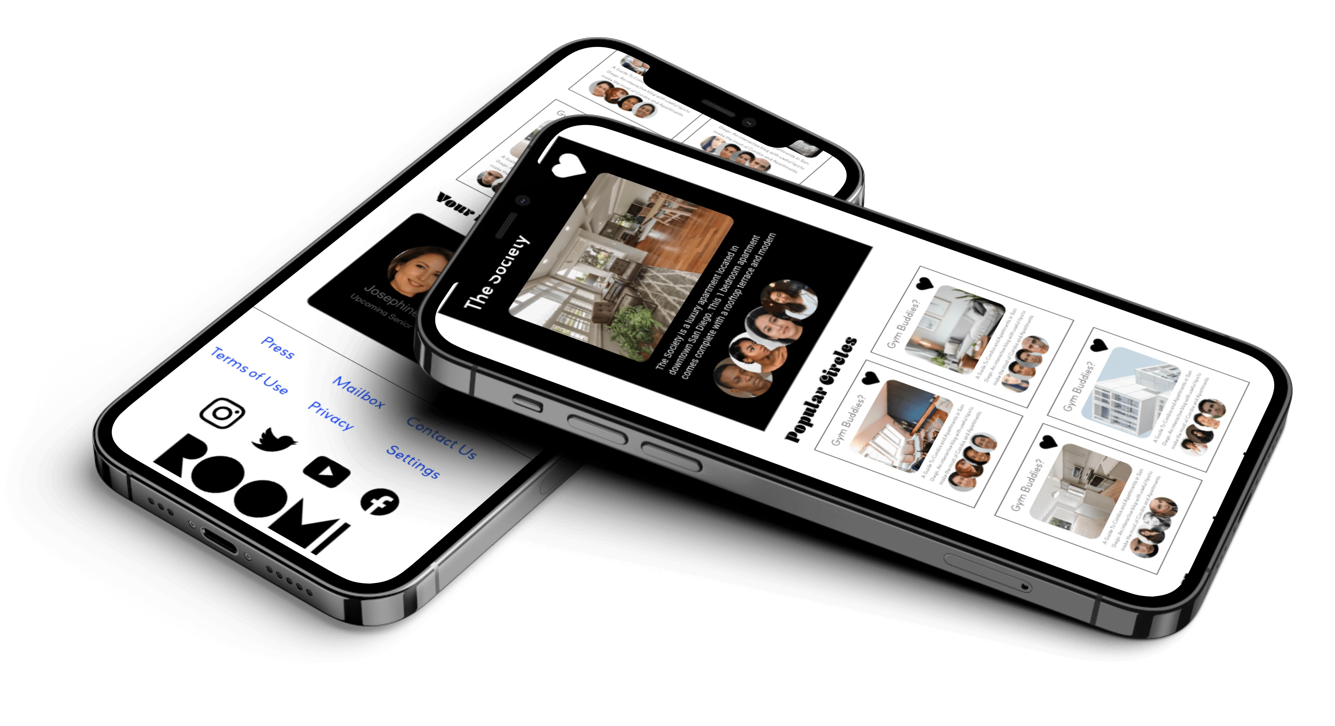
Mobile Version of Roomi
The Problem
College students often struggle to find their first off-campus housing for the first time without the help of the school.
Let alone they need to pair themselves up with another roommate to lease an apartment together.
The Goal
Ease the matching process with certification with neighboring schools
Create a one-stop marketplace for students to find their next apartment, pair them with roommates who have similar living habits, and simplify the process of leasing by partnering with off-campus housing
Roomi in web-based
Empathize with the User
To have a better understanding of the users, I conducted User Research and created a user persona, problem statements, and user journey map to help define who the user is.
User Research: Summary
I hypothesized undergraduate students who are looking for off-campus housing will emphasize pairing with roommates other than the price of the apartment.
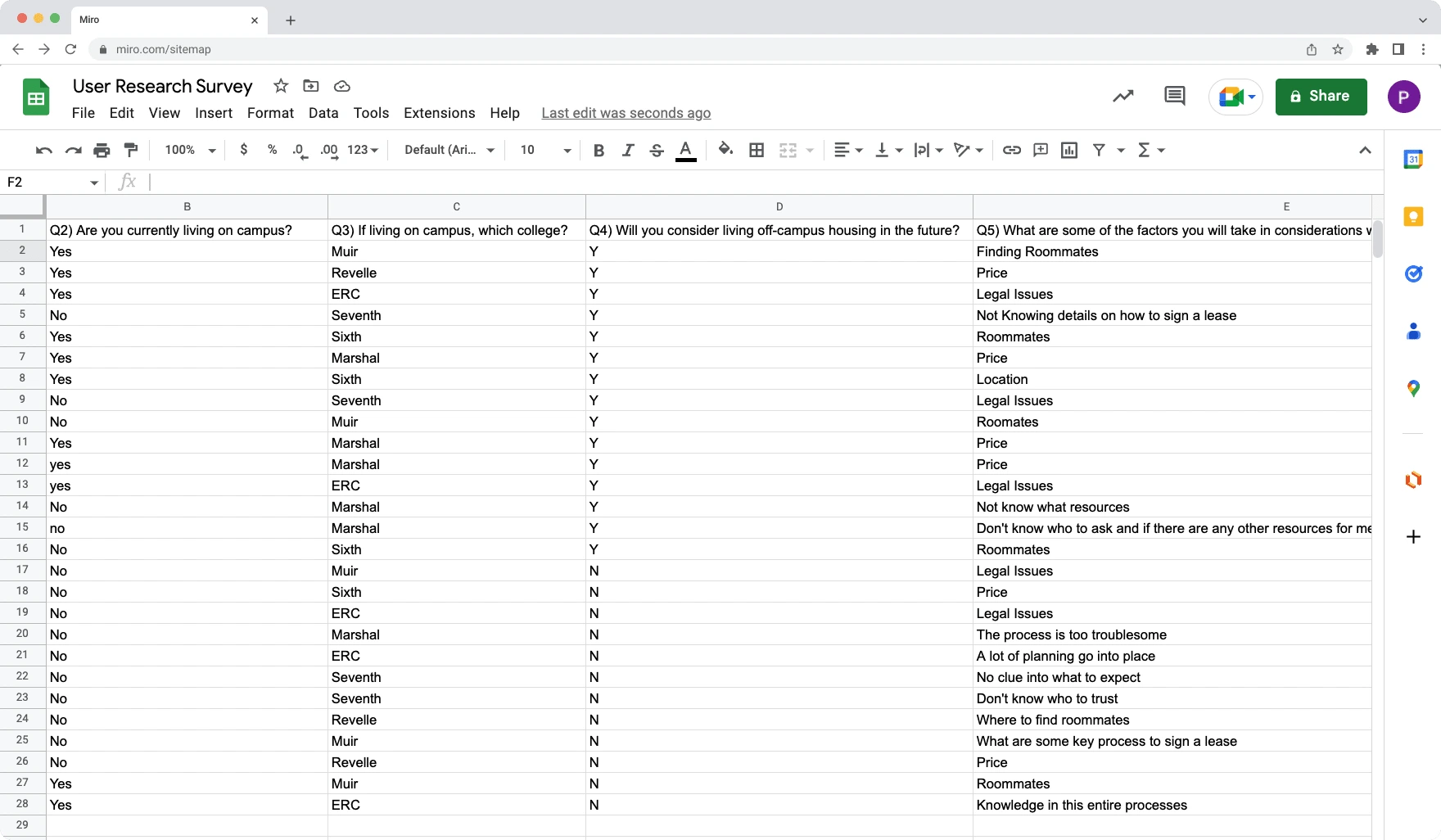
Screenshot of User Research Summary in Google Sheets
Result: My assumptions are only partially correct
For First Time students, who are looking for an apartment emphasize much more on WHO they pair with as roommates as it affects their daily living habits and will be mostly sharing the common living area with.
Only 8% of students are concerned on the pricing of the housing.
User Research: Pain Points
⛅︎ Lack of Knowledge in Leasing Apartments
💔 Lack of Trust in Finding Roommates Online
🌀 The Process is Troublesome
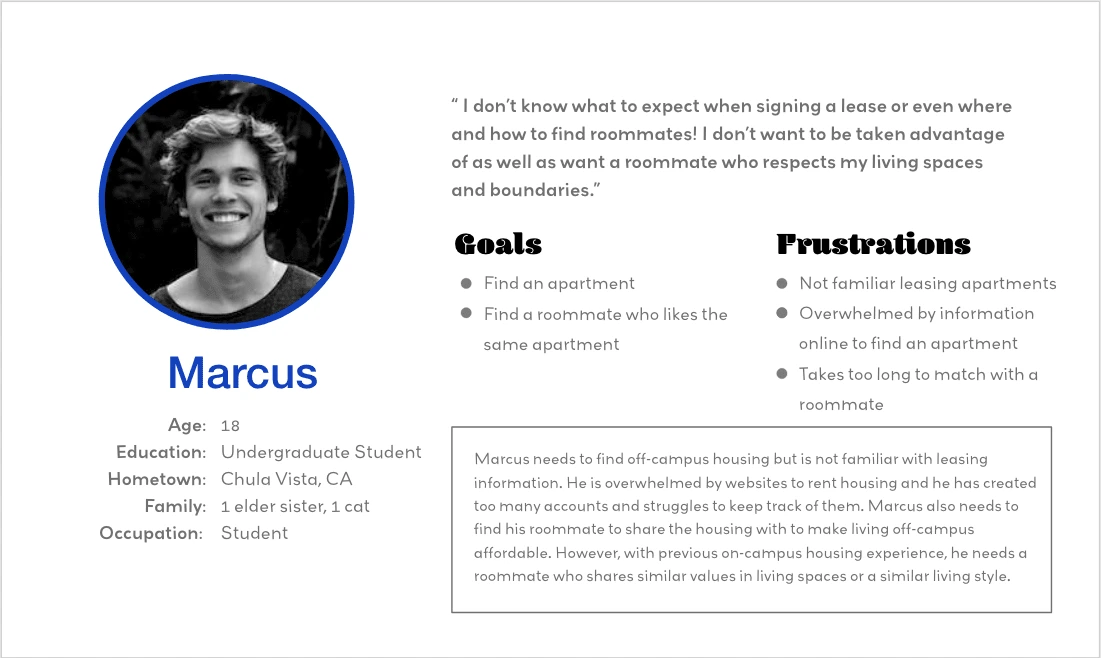
User Persona of Marcus
Problem Statement
Marcus is an undergraduate student who needs to find his first off-campus housing by the end of September because he can no longer live in on-campus housing.
The Design
Sitemap
Since Roomi is a one-stop marketplace for finding housing and pairing with a potential roommate, I have to include different genres of housing matching different roommates' preferences.
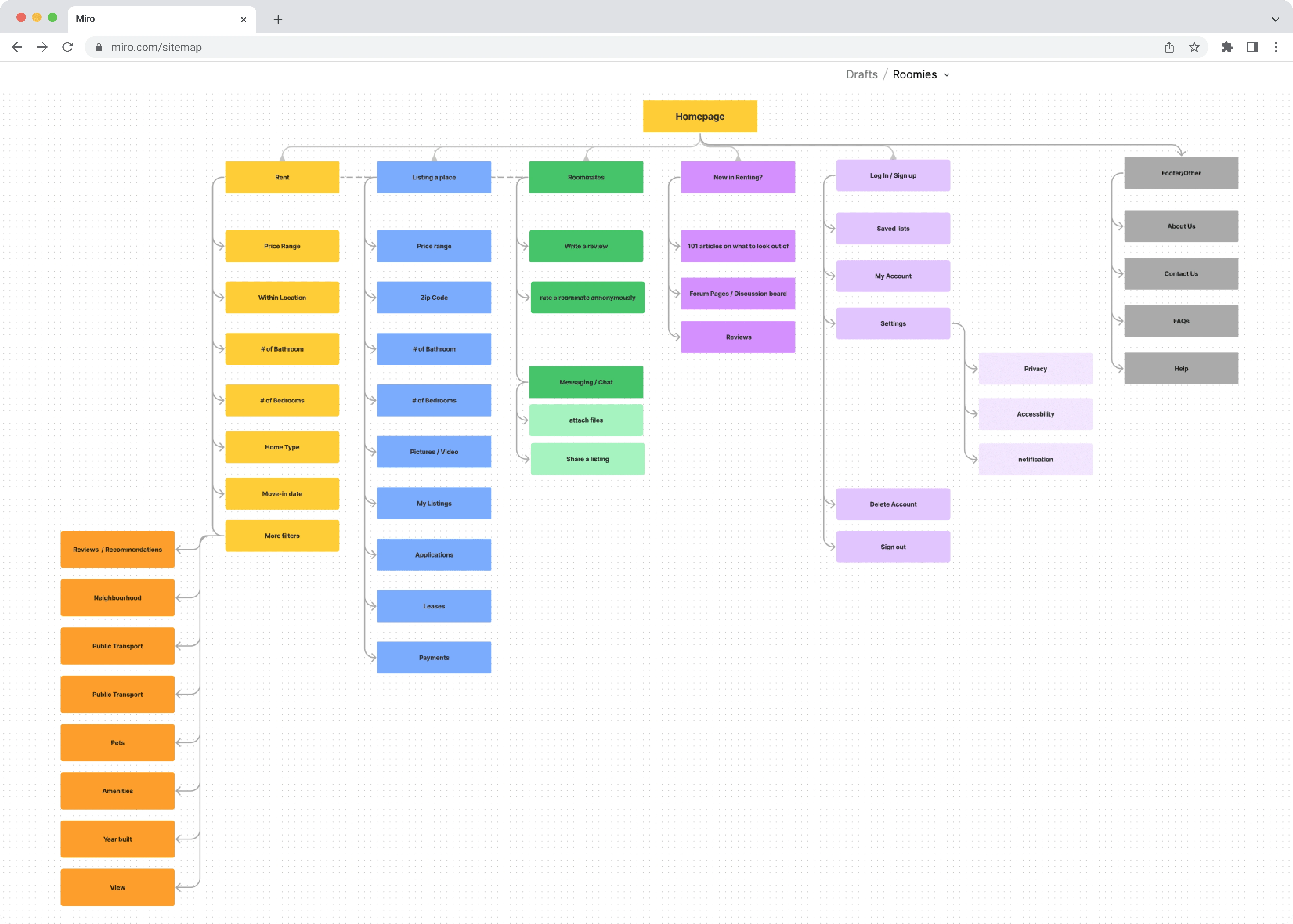
Sitemap of Roomi done in Miro
Key parts in Roomi:
Renting
Listing a place
Finding Roommates
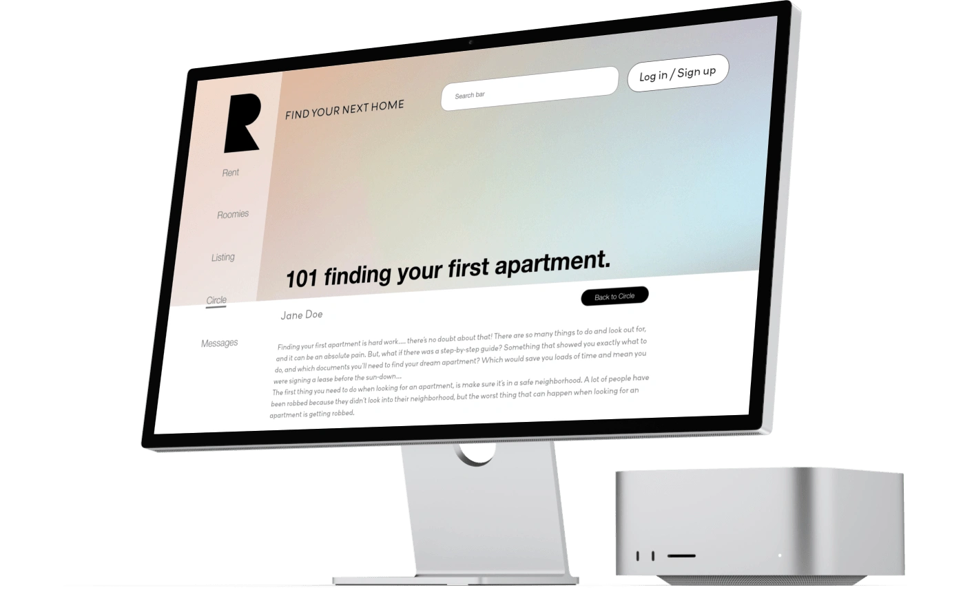
New in Renting Guidance
Paper Wireframing
I first started with Crazy 8s to come up with some key features or layouts of how Roomi could look like.
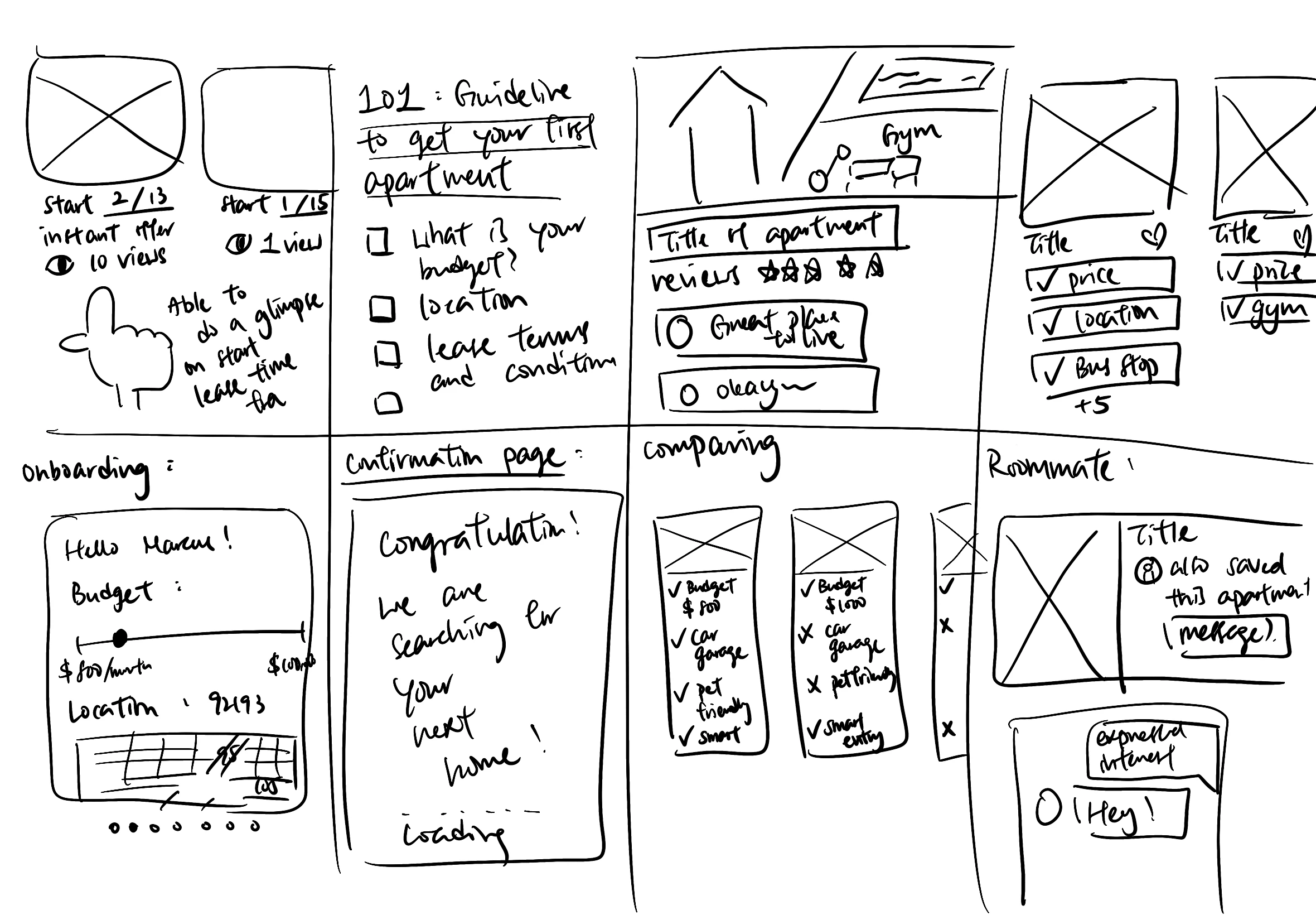
Crazy 8s
Eventually choosing some of the ideas over to a paper wireframe to test out layouts.
Paper Wireframes with different versions of layouts
And finalize the ones that are the most feasible into one single layout.
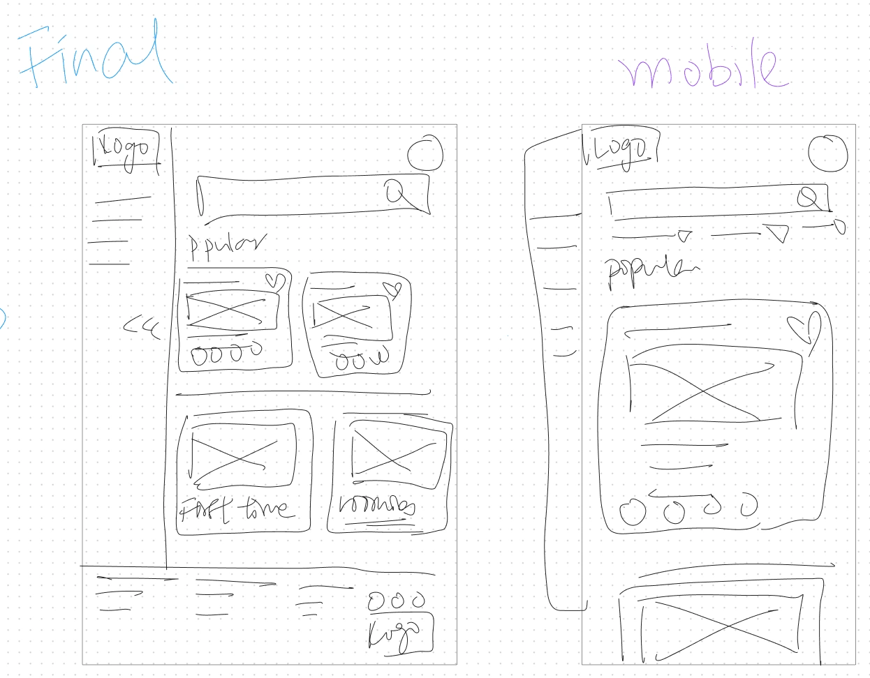
Final paper wireframe layout of both website and mobile version
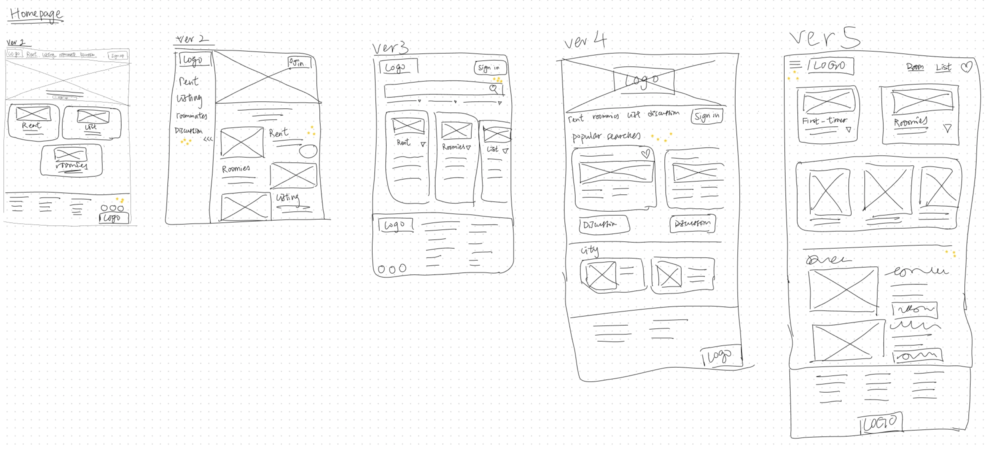
Transforming into Digital Wireframes
The majority of users want a quick glimpse into what Roomi has to offer.
Therefore, I have moved cards above the fold so it is perfect for users to explore during the first glance into Roomi.
Features that I love :
Quick Navigation Menu
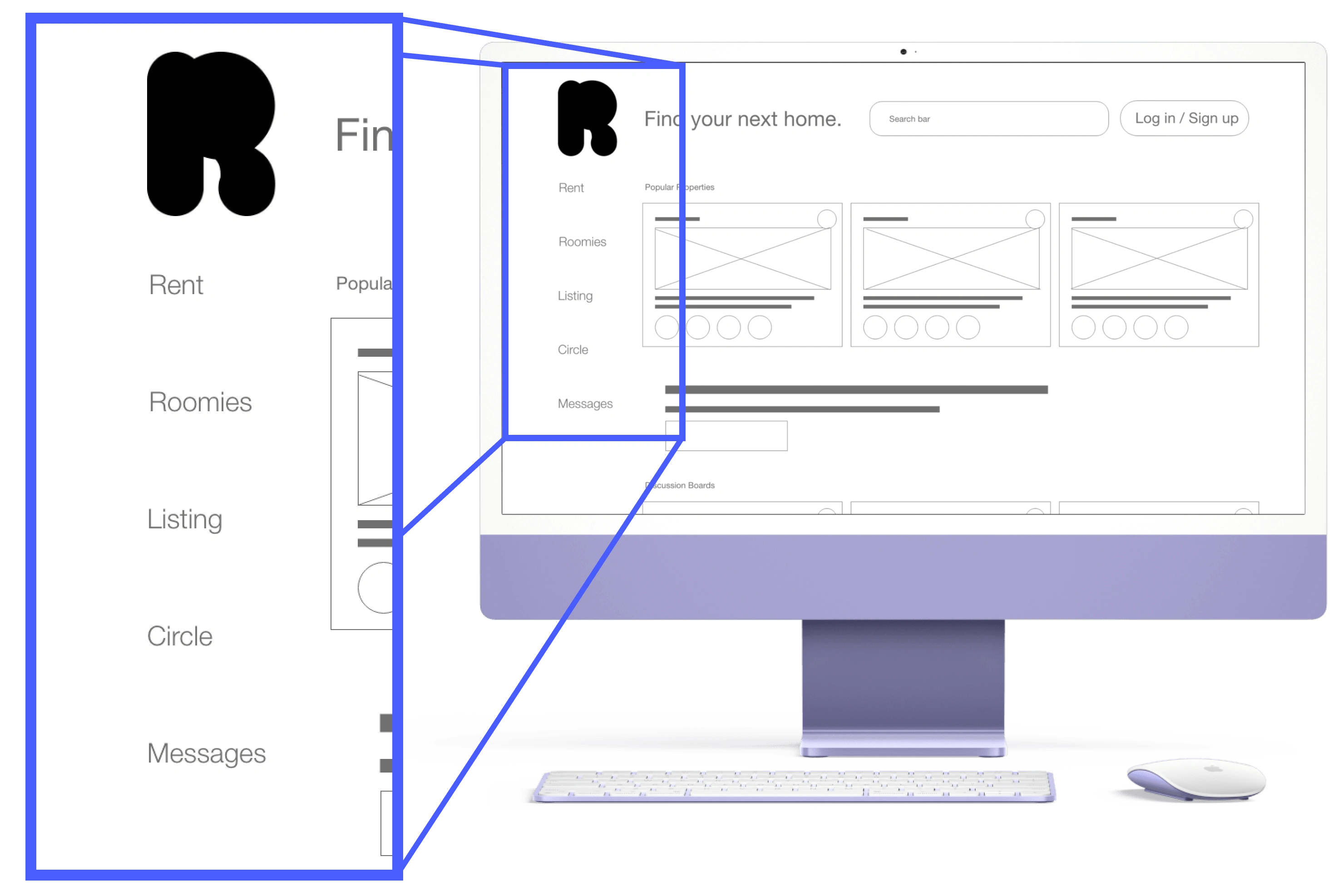
Representation of the Navigation Menu on the Left Side of the website
By default, there is a side navigation menu for the user to quickly understand there are different sections on this site that serves their needs.
Similar Cards are placed together
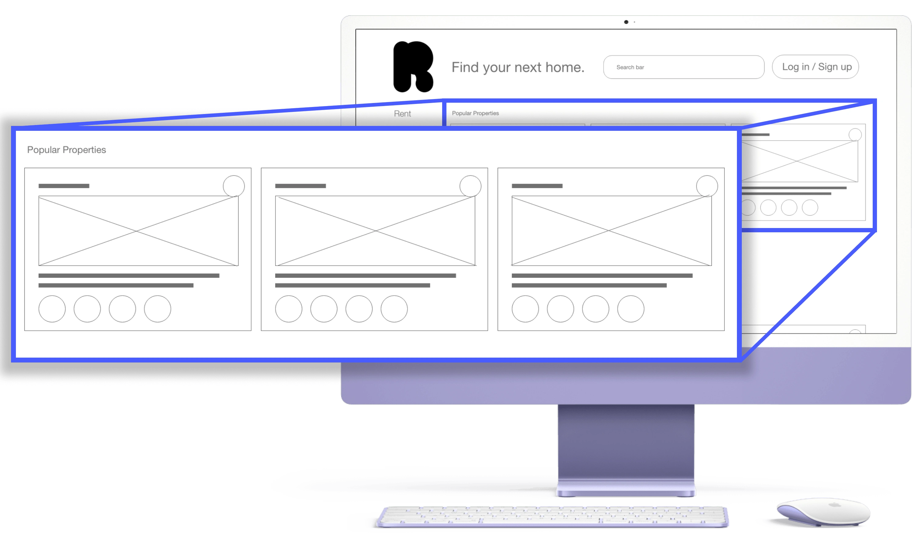
Similar Cards are placed together in the web version
In the law of proximity, placing relevant or similar items together allowed users to quickly realize they were in the same category and allowed them to browse through without much explanation provided.
Screen Size Adaptations
Some of the users declared it was the first time they found an apartment on their own and were confused about where to begin.
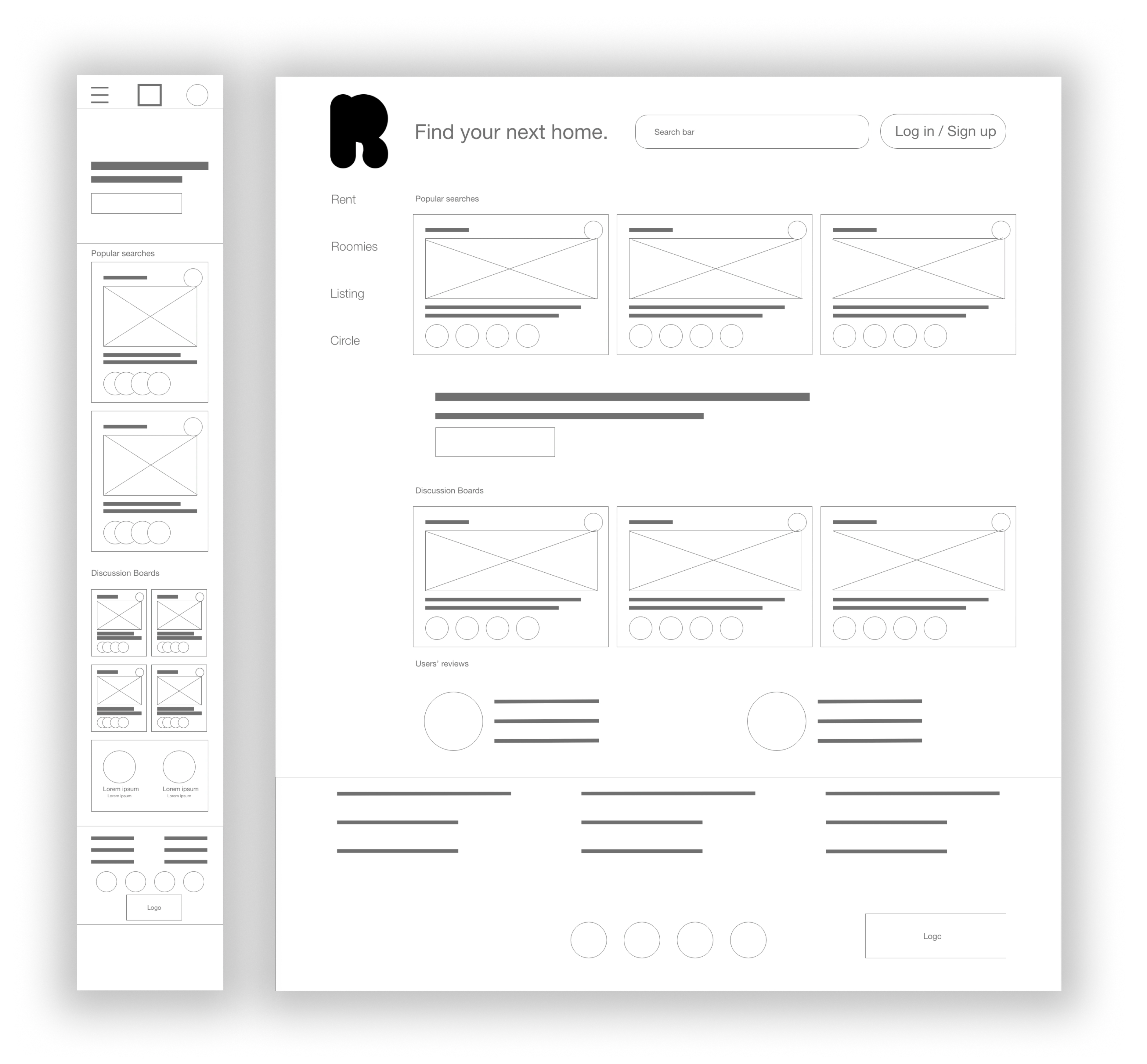
Size Adaptation in both Web and Mobile version of Roomi
A lot of them start by looking for housing through their mobile phones first, so having an adaptive design on screen sizes can increase the likelihood for users to use Roomi for their next housing or find their next roommates.
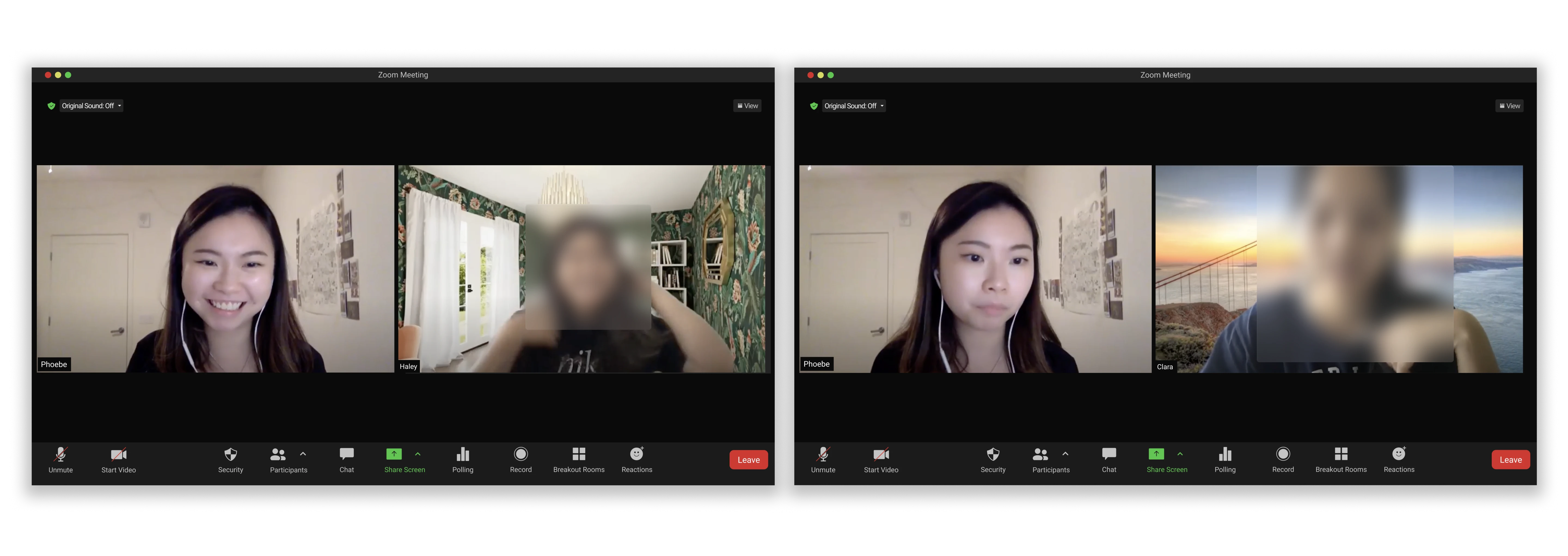
Performing Moderated Usability Study via Zoom
Usability Study
To discover any potential usability issues, I have undergone a moderated usability study:
📍 Location: US, remote
🙋♂️ Participants: 5 participants
⏱️ Length: 20 - 30 minutes
Findings + Refinement
Better Location of Reviews and Messages
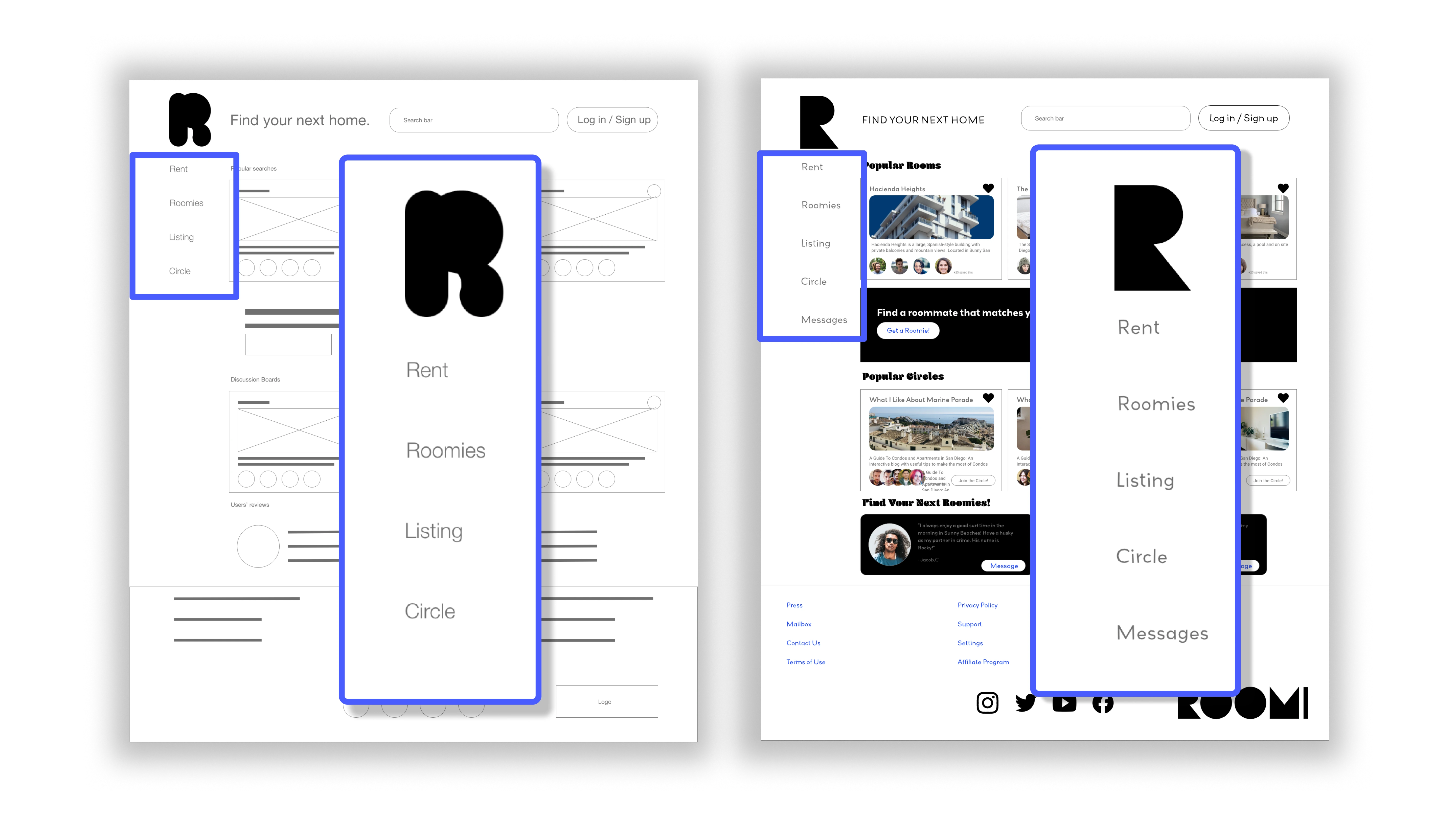
Before Usability Study (Left) vs After Usability Study (Right)
Users are confused about where to find reviews and messages as they keep going back and forth to the home page.
After going through users' feedback on the "Roomi" term is confusing as it directs them to a message.
I have re-wired them to appropriate screens and added "messages" to avoid confusion between roomi and messaging.
Better Terminologies
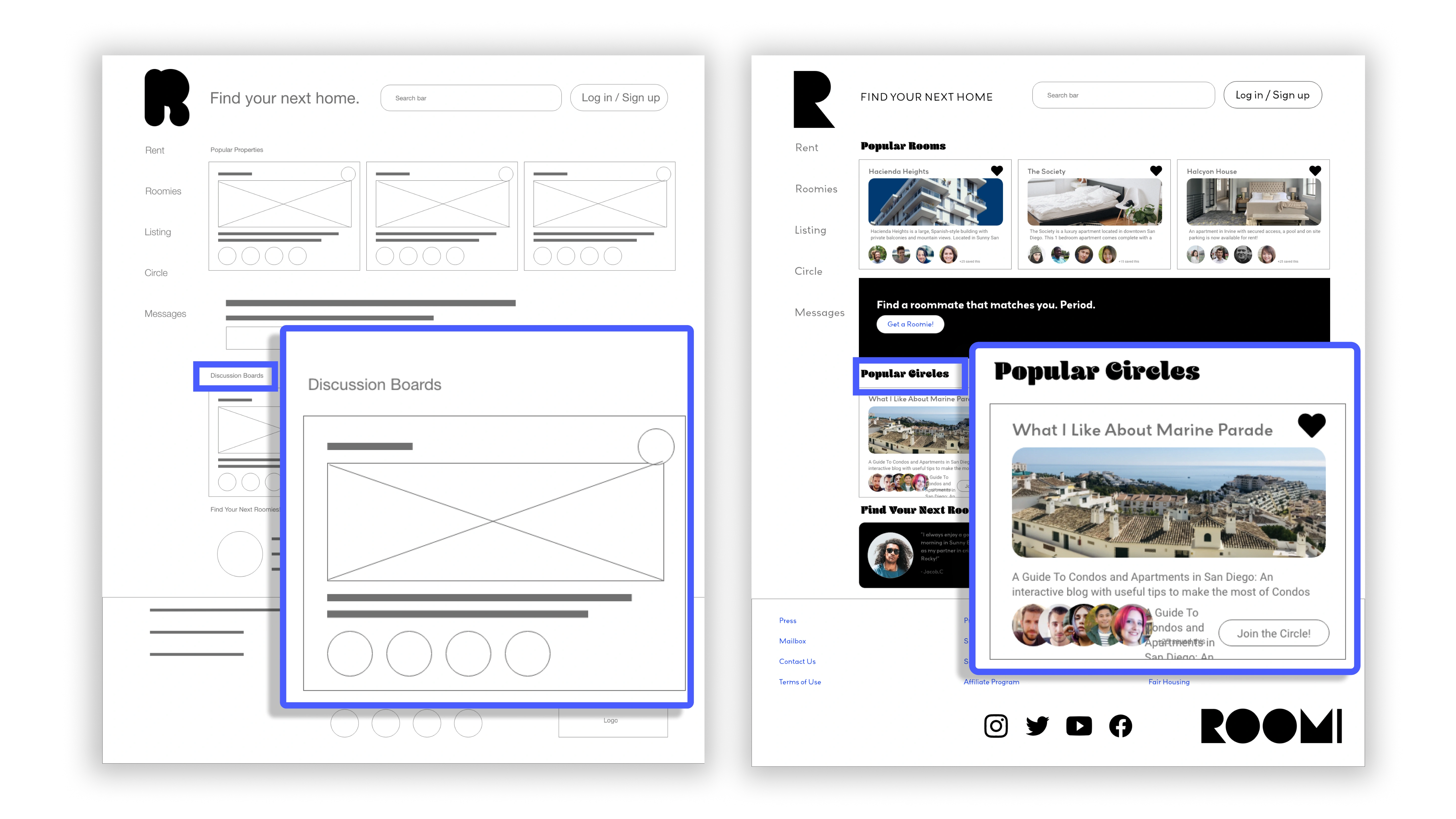
Before Usability Study (Left). vs After Refinement (Right)
Users are confused at the terms "Roomi" and "Circle" as they do not know what these terms refer to.
Before Usability Study
Discussion boards are named as it is but is confusing for users as there are another term "circle" for it.
Most users expressed confusion and has to click around to discover it
After Refinement
Minimize confusion on "discussion board" to the same term in navigation menu as "circle"
High Fidelity Prototype
I have re-arranged the location for reviews and created a specific location for messages.
From the home page, the user is able to decide whether they are in need of a room or a roommate directly.
Accessibility Considerations
Hierarchical Headings
Luminosity Color Contrast
Dark Mode vs Light Mode
Takeaways
Impact:
All the participants loved the placement of each section and the color combinations. They said if this is an actual product they would be regular user, especially during the summer season when they have to look for housing and roommates!
What I learned:
Adobe XD is a very useful tool especially when you are creating a mockup or a low-fidelity wireframe quickly with its quick scale feature. Its repeat grid feature saved me a lot of time and combined with its quickly adapted components, I was able to re-size components on different screens all at once.
Next Steps
Adding a Search Bar and Filters
Almost half of the participants find it natural to use the search bar as their preferred navigation.
With the abundance of information both on the apartment and potential roommates, having a filter option allows users to quickly skim through according to their needs.
Adding Depth and Shadows to show layers of different cards
This helps users to understand which cards belong to the same group without cluttering the screen.
It can also be used as a way to highlight previously saved apartments or potential roommates who have saved the same listing.
Start on Owner's profile and analytics
With the time limit on this project, I was not able to design in detail on the Owner's listings POV.
I have only added the basics on owners' foundational analytics including applications they receive and reject or approve applications. I would suspect more should be placed into the analytics as well as editing the owner's profile and listings page.
Like this project
Posted May 4, 2023
Redesigned Roomi in the overall branding and improved information hierarchy using usability study data.