✧ Boosts Sales Conversion in Simplifying UX Design in Shopify
Phoebe Yan
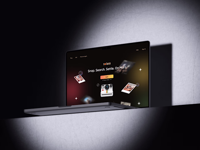
Inspirely
Inspirely is an e-commerce platform that offers DIY Kits, workshops, and camps for grade 1 - 8 students in Canada.
Overview
Joined in as Inspirely is in need to update their outdated website on Shopify which consists only one page with an information dump: wide variety of products like DIY Kits, Workshops and Camps for grade 1 - 8 students in Canada and that is affecting sales in Shopify.
Background of the project
Time: Feb 2024 - Jul 2024
Context: Inspirely’s outdated website on Shopify is affecting their sales due to information overload into one page website.
Goal: To re-design their shopify’s website by lowering client’s cognitive load while pushing promotional items onto home page.
My Role
Sole Product Designer - Product Design, Product Strategy, Interaction Design, Competitive Analysis, High - fidelity wireframe and prototype, Design Assets including icons and prototype components, Presentation Deck
Timeline & Status
March 2024 - Jul 2024
Project Focus: revamp home page for better sale conversion rates
Who is affected?
Re-purchasing customers who are Parents, Educators, Corporations
Why does this problem arise?
Too many information in one page --> create confusions for users as there are too many options to click on or scan through
Final Experience
Separated information into multiple pages within Shopify to cut down on confusion through information hierarchy and boost sales conversion with a 3-clicks design.
✧ Highlights ✧
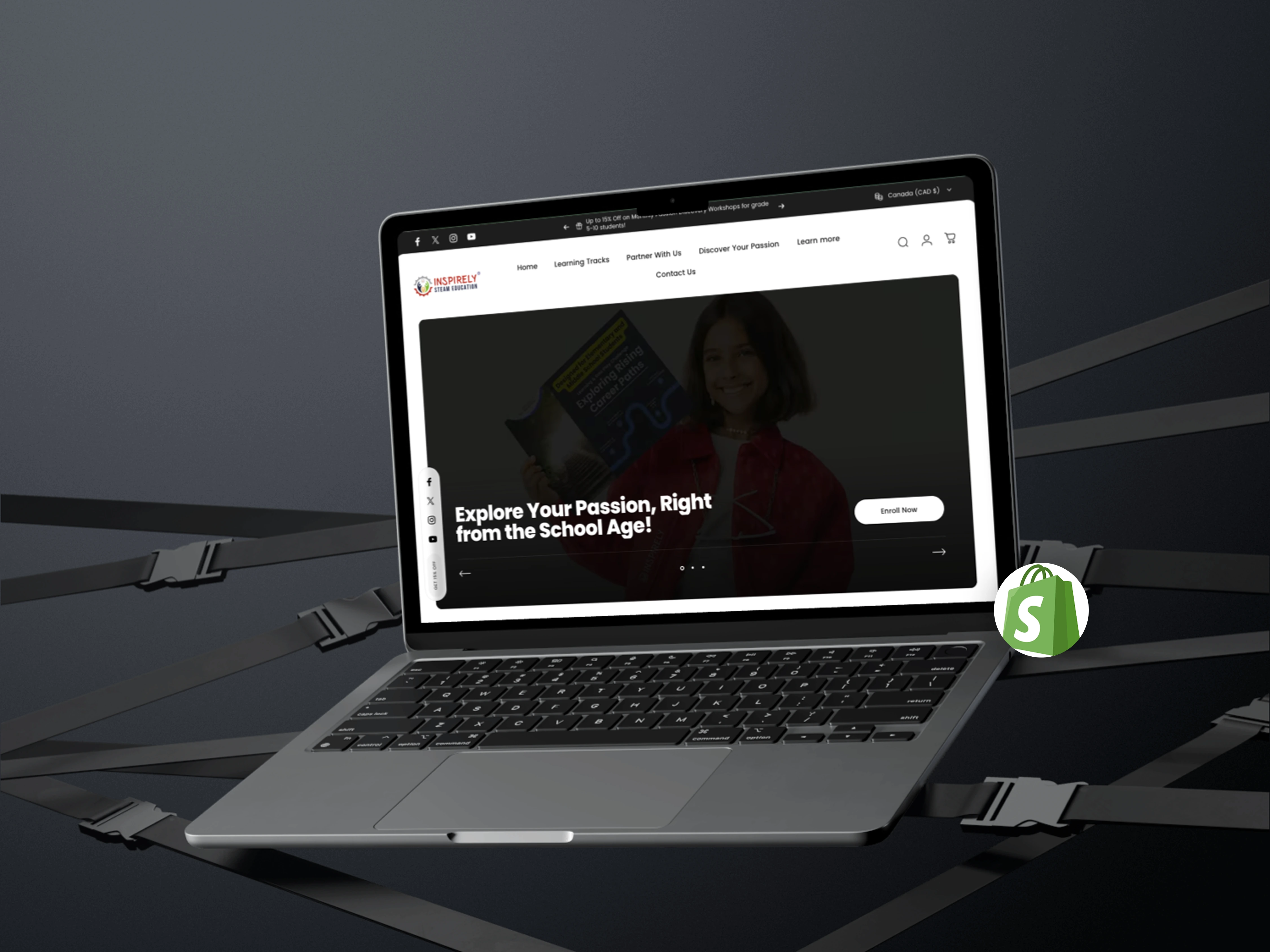
Walkthrough Inspirely's Home Page
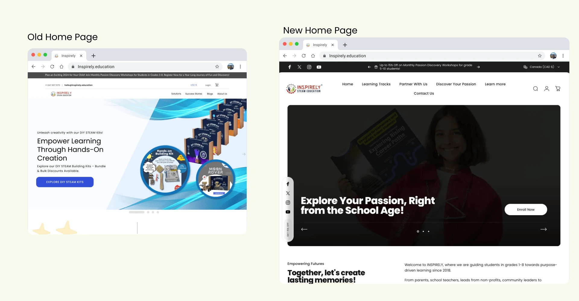
Home Page Before and After
Home Page Re-Design
Clearer Information Hierarchy with bolder font choice to highlight promotional items through a higher contrast CTA that guides user into purchasing flow within 3 steps design.
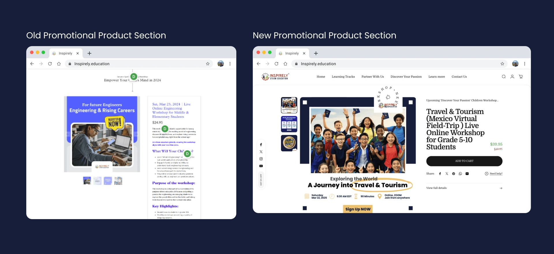
Better layout for promotional production section with information hiearchy
Easier to Read Product Highlight Section
Tucked away details of product and only focus on key title information
BIG CTA button to prompt users into purchasing flow --> boosted sales conversion!
Larger Pictures because it catches user attention
Simplified Footer Section
Simplified Footer Section
Minimize all information to only titles
Re-arranged "sign up for newsletter" to the same section as the footer to reserve space with clearer CTA button
Exploration Stage
What is wrong with the Home Page?
To find out in details what current Home page has, I have ran a UX Heuristic Review:
Too much information is jammed into ONE PAGE
Unable to find a CTA button due to too much texts.
Footer section is a jam of links with no clear labels.
But this isn't enough, I need user behaviors data to show the traffic to each section of the page:
Customers land on the Home Page and leave in less than 10 seconds due to the information overload.
No organic traffic to other pages other than direct link after they have purchased a product and directed through email confirmation.
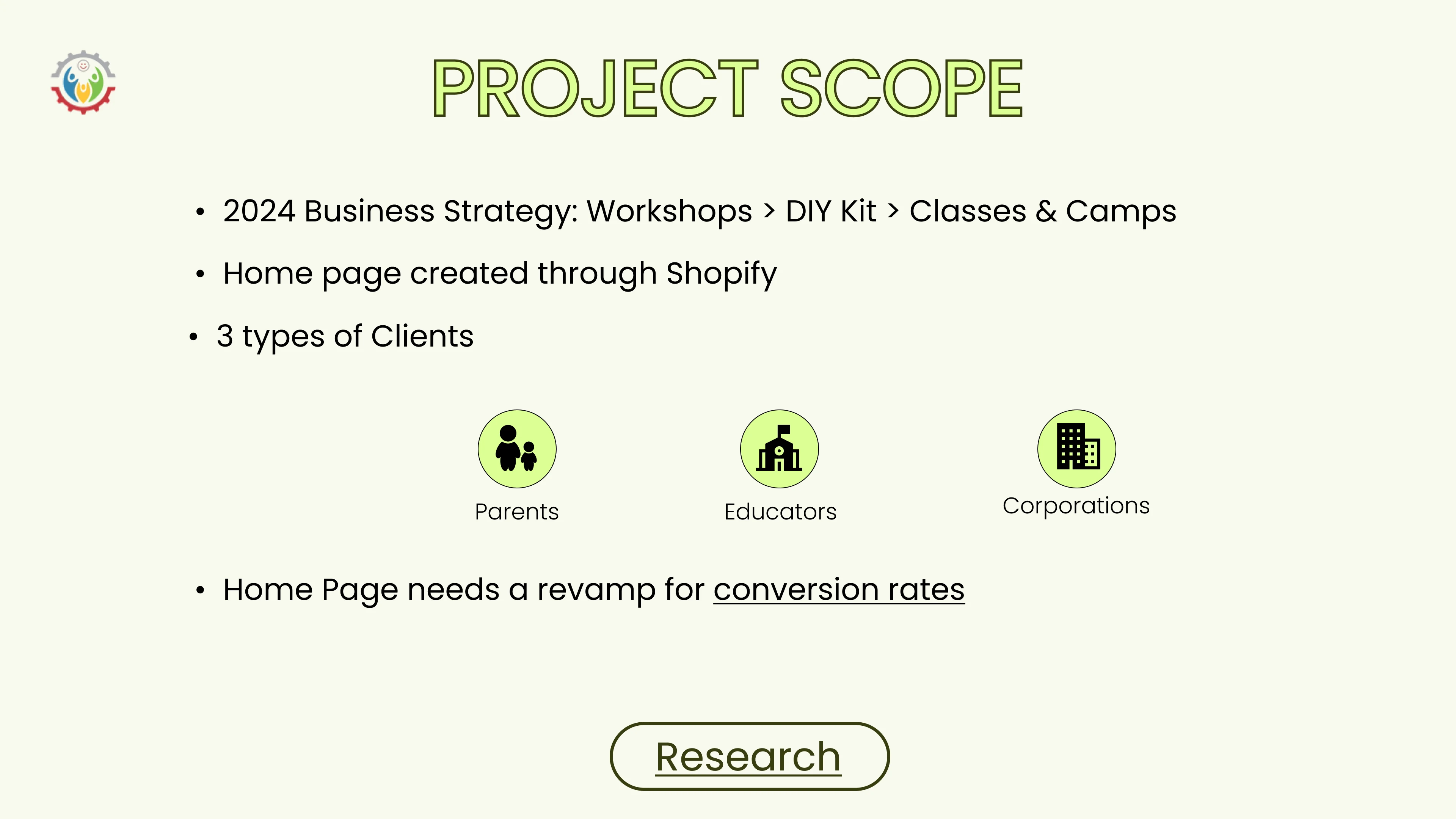
Business goals or Constraints?
Technical limitations in designs are only bound to use Shopify's templates
New Business strategy promotes Workshops > DIY Kits > Classes & Camps
currently, there is not promotion towards workshops but DIY Kits and Classes & Camps
There are 3 types of customers to balance: Parents, Schools and Corporations
Design Process
Site Map Progression
Since the main pain point for businesses and customers is information overload in homepage, we need to re-define each page.
After a few information hierarchy workshops with CEOs and a few customers:
Highlight promotional product in slider
Explain what Inspirely has to offer
Each section has one clear CTA to guide to checkout flow
Lists out all programs according to product categories: workshops, DIY Kits, Classes & Camps with filter for different grades
User Behavior Metrics: to find out which product is most popular
individual sites tailored for parents, schools and non-profits and corporations
a hub of all workshops with direct links to add to cart and finish the 3 steps checkout flow
hub for FAQs and educational blogs that are sent as newsletter to existing customers
Contact info to customer support
Takeaways
Shopify's own Sales Tracking tool is POWERFUL
Since this website is hosted on Shopify, I was able to go deep dive on user behavior metrics through Shopify's own customer metric tools
Customizable event tracking on checkout flow was amazing and I was able to track the success of sales conversion from 19% to 70% due to the new design is up and less customers leaving the home page when they first land into it.
E-commerce business owners might not understand what UX is
Business owners might not come from a tech background and mistake UX as web design.
I hosted a UX heuristic workshops with the CEO to highlight the difference between web design and UX Design and through information hierarchy workshops to show to CEO how information is layered can affect customer's decisions in driving sales.
Like this project
Posted Mar 8, 2025
Simplified content in Shopify to boost Sales Conversion with 3 clicks design through UX Research and UX Design.