✧ Introducing Triply: a smart travel itinerary app
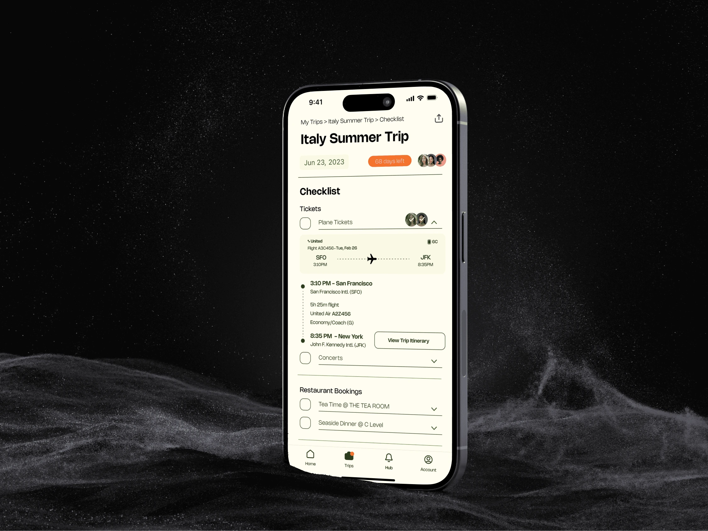
Travel Itinerary Space - Checklist
Triply
a smart travel itinerary app that provides an AI-infused travel itinerary editing space for individual or friends and family trip planning with real-time updates, cross-checking multiple platforms prices, AI-suggestions when plans don't pan out, etc for busy working professionals.
Overview
Triply is a smart travel itinerary app that provides one-of-a-kind travel itinerary editing space for individuals or group trip planning.
The idea comes from my love-hate relationship when planning to travel and became a project idea during my pursuit of Diverse Tech Talent Program (DTTP) with my group members to uncover the potential of Triply.
My Role
Product Designer - UX Research, Product Strategy, Consolidating insights, Competitive analysis, High-fidelity wireframe and prototype, Create Design Assets including icons, Presentation Deck
My focus in this project is to create the itinerary creation flow
Collaborated with 2 other Product Designers who worked on other user flows within Triply.
Timeline & Status
1 month, case study with DTTP and Skillhat
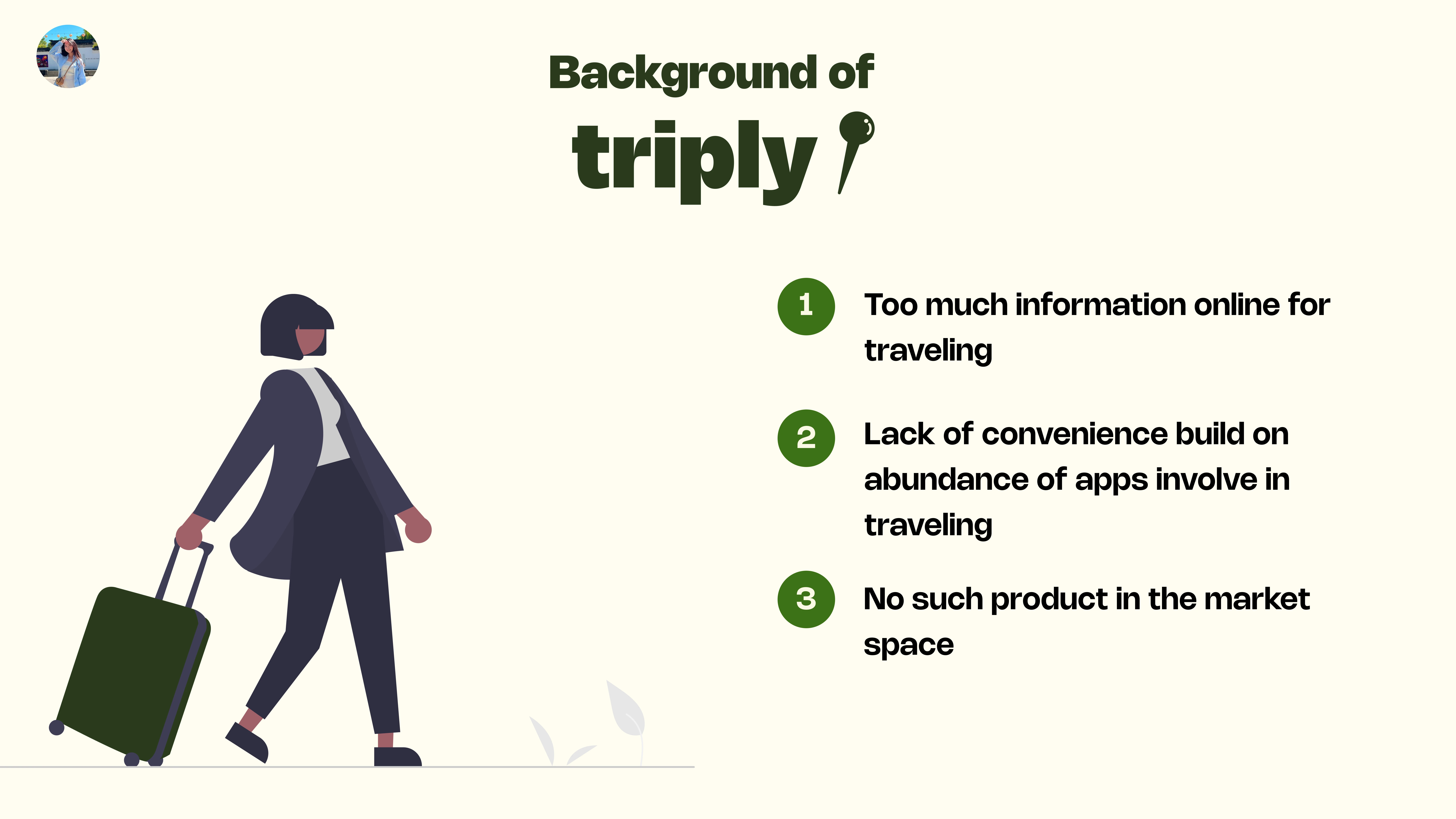
The origin of Triply
For this project we are focusing on based on marketing research:
Who is affected by this problem?
Why does this problem arise?
What is the impact of this problem on the travel booking market?
Final Experience
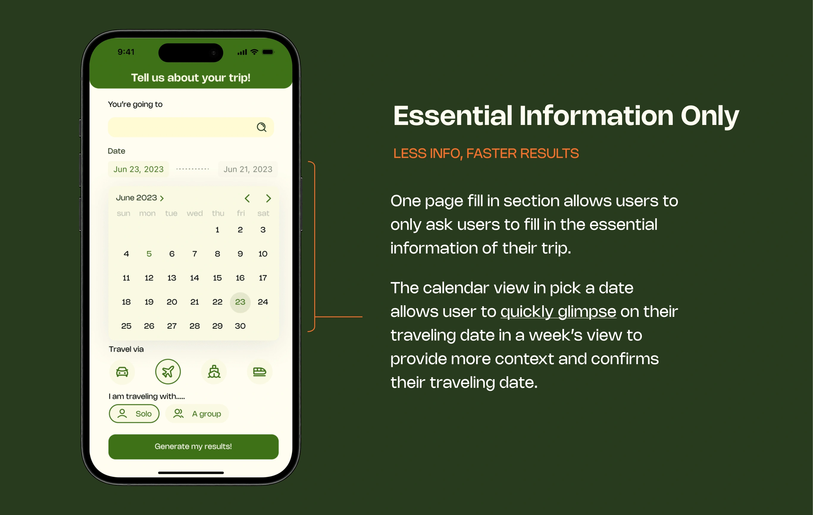
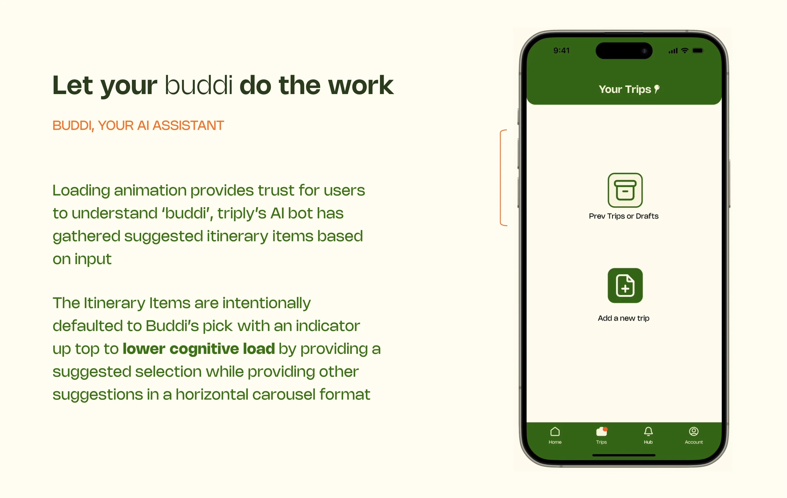
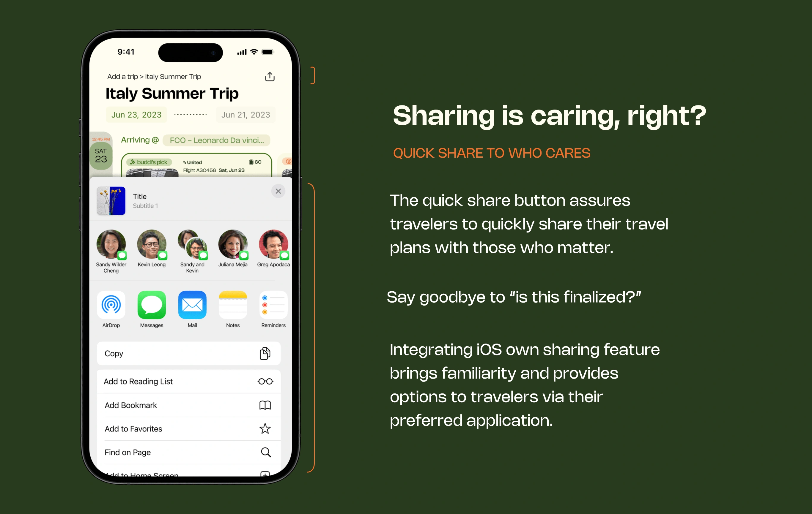
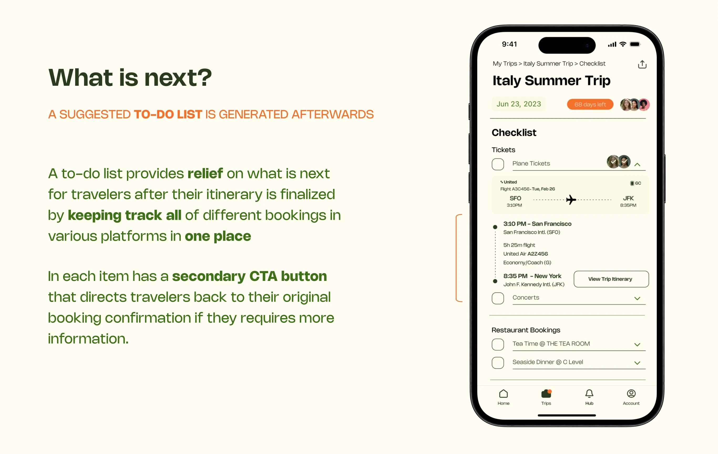
Designed a one-stop platform for travelers to create their travel itinerary with AI-suggested content based on real-time updates as they are traveling.
✧ Highlights ✧
Exploration Stage
Asking the right questions
To define the user types, user pain points, and user needs, I proactively collaborated with the other two product designers to conduct user interviews based on my existing knowledge assumptions. This approach aimed to foster empathy and enable our team a comprehensive understanding of what is causing travelers trouble in planning travel itineraries.
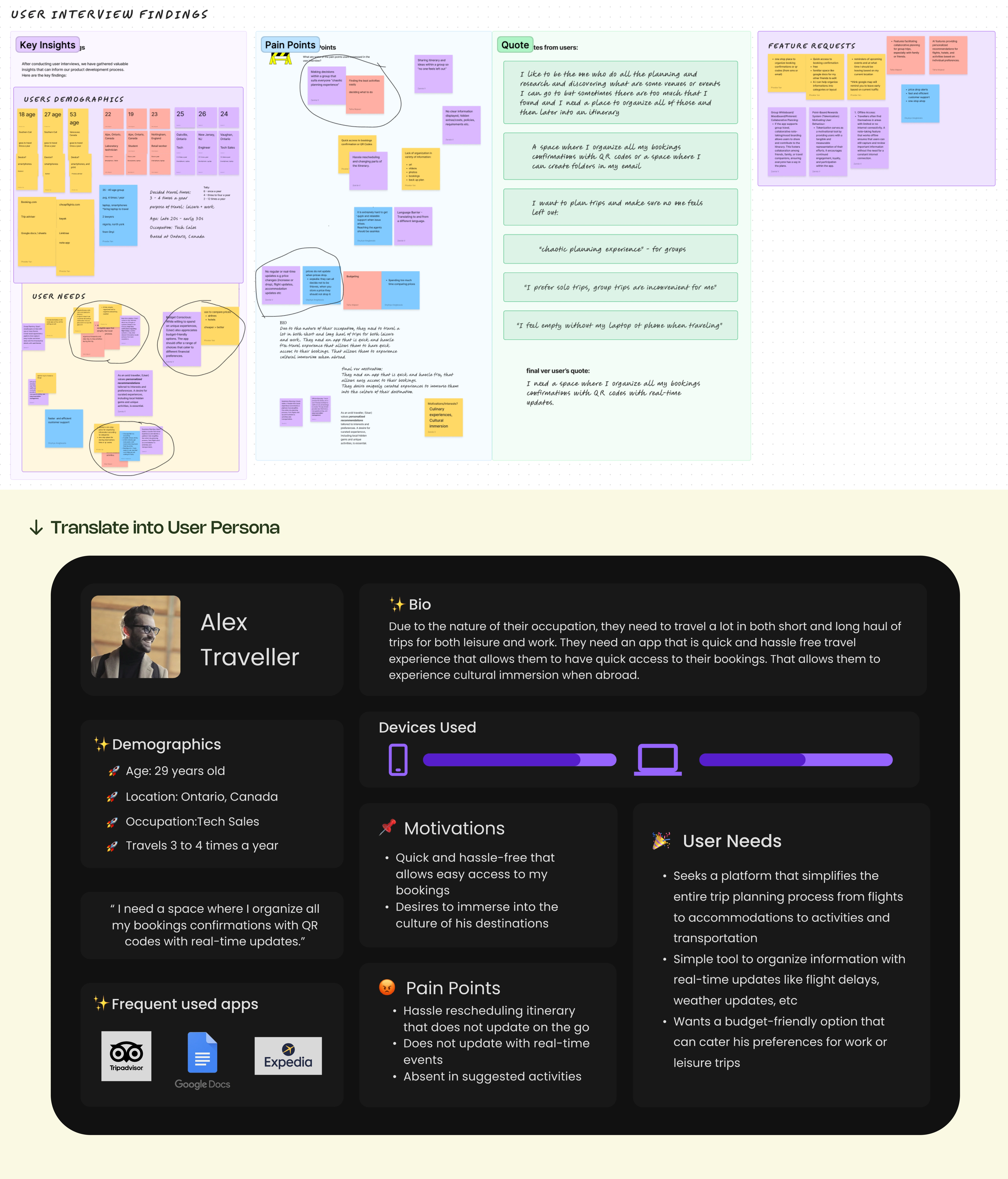
User Interview Results --> User Persona
Problem Statement
How might we combine simplicity and AI innovation that caters user’s travel needs with the ease of condensing all information in one place?
Design Process
What is the mood? What is the vibe in Triply?
After going through the user resesarch result workshops, and understanding what our users needs and what Alex needs in the travel planning sector.
I led a moodboard collaboration workshop where our team discuss what Triply looks like and discuss on some of the design inspirations we collect both in photos, and other competitors in the market.
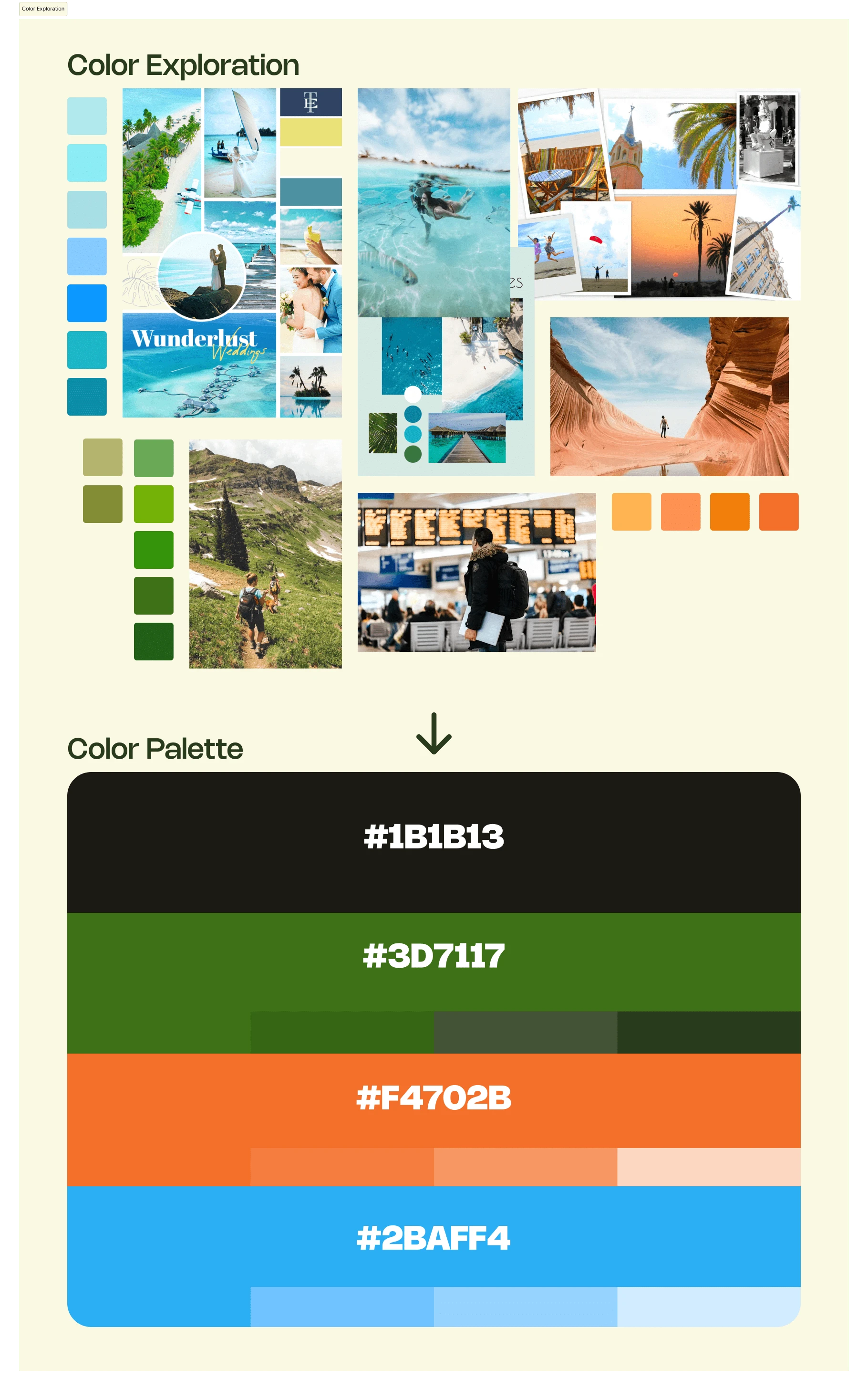
Color Exploration Moodboard --> Final Color Palette
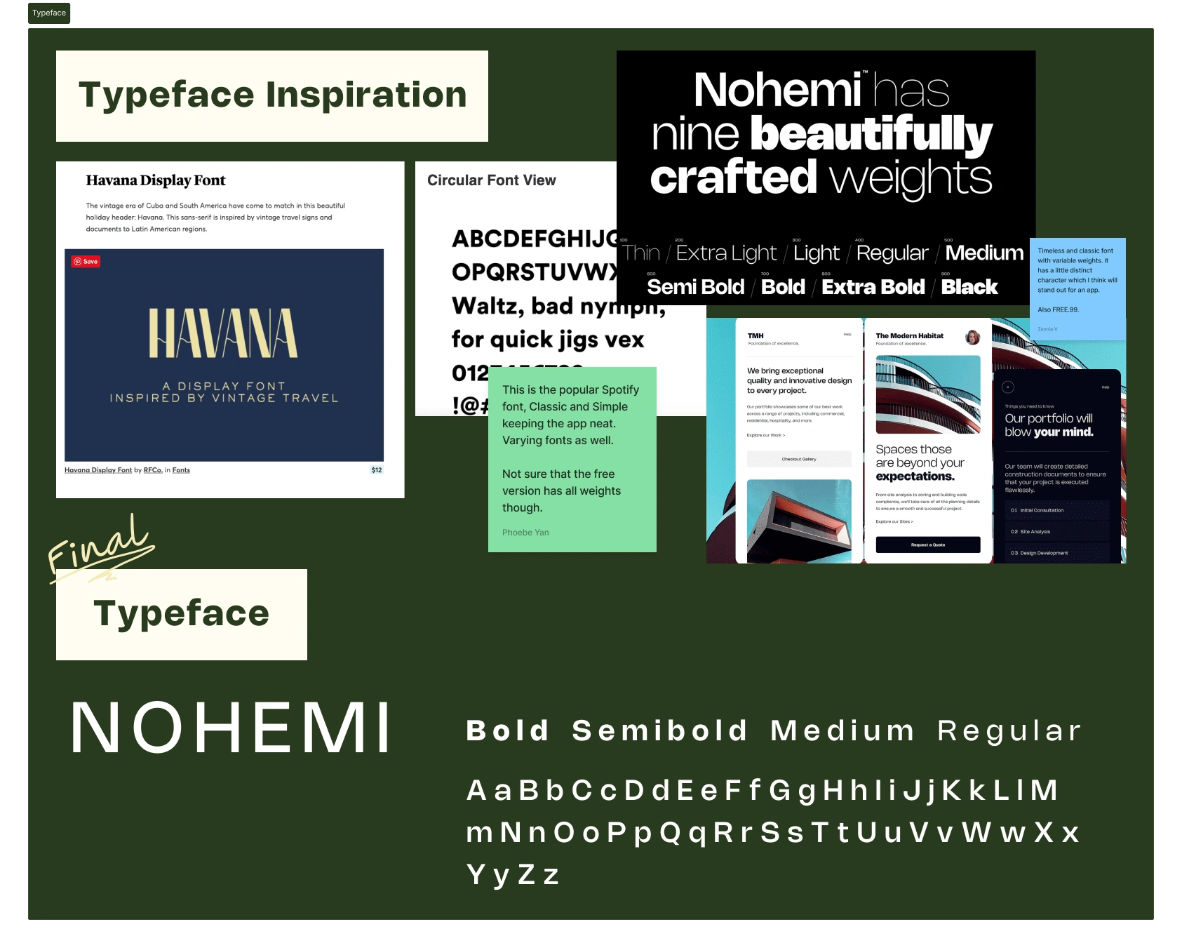
Typeface explorations --> Final Choice of Typeface
Workshop Result: Style Guide of Triply
Professional yet timeless designs --> provide trust to handle traveling transactions
Lively colors inspired by nature scenary --> mirror the tranquility of nature to lower the stressful emotion from planning travels
Site Map
To better design each user flow within Triply, I created a site map to visualize the entire user journey when using Triply. This serves as a guidance as each of the product designer is designin each user flow.
This is done thorugh our Sitemap and user flows kickoff sessions with other product designers.
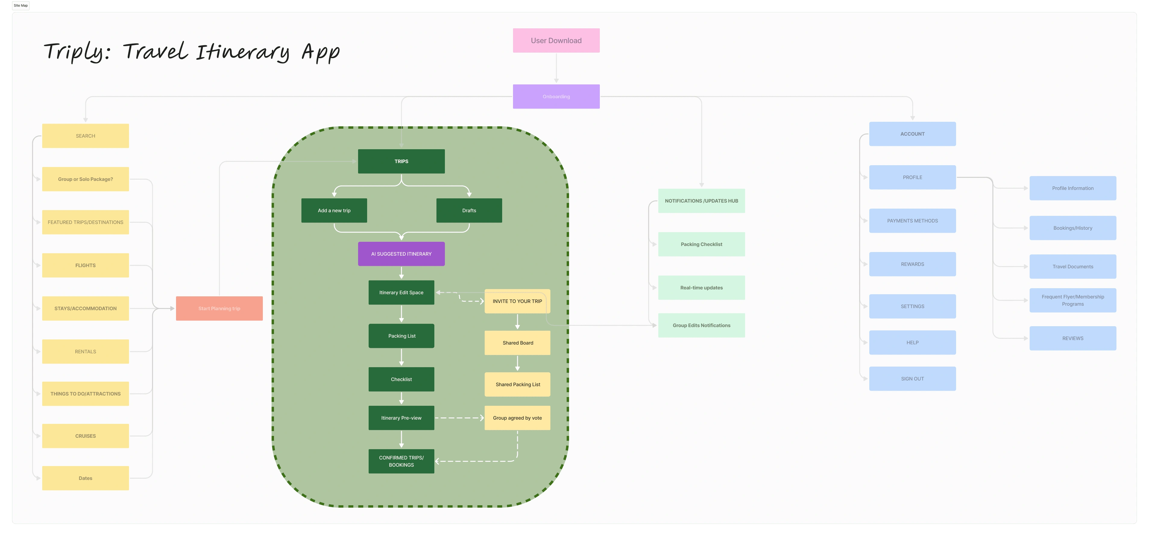
Site Map of Triply, Green selection is creating a Trip Itinerary user flow
User Flow
After distributing design responsibilities among other designers, my focus in this project is to create design specific for creating a Trips Itinerary user flow that comes after users going through an onboarding process or filter selection user flow.
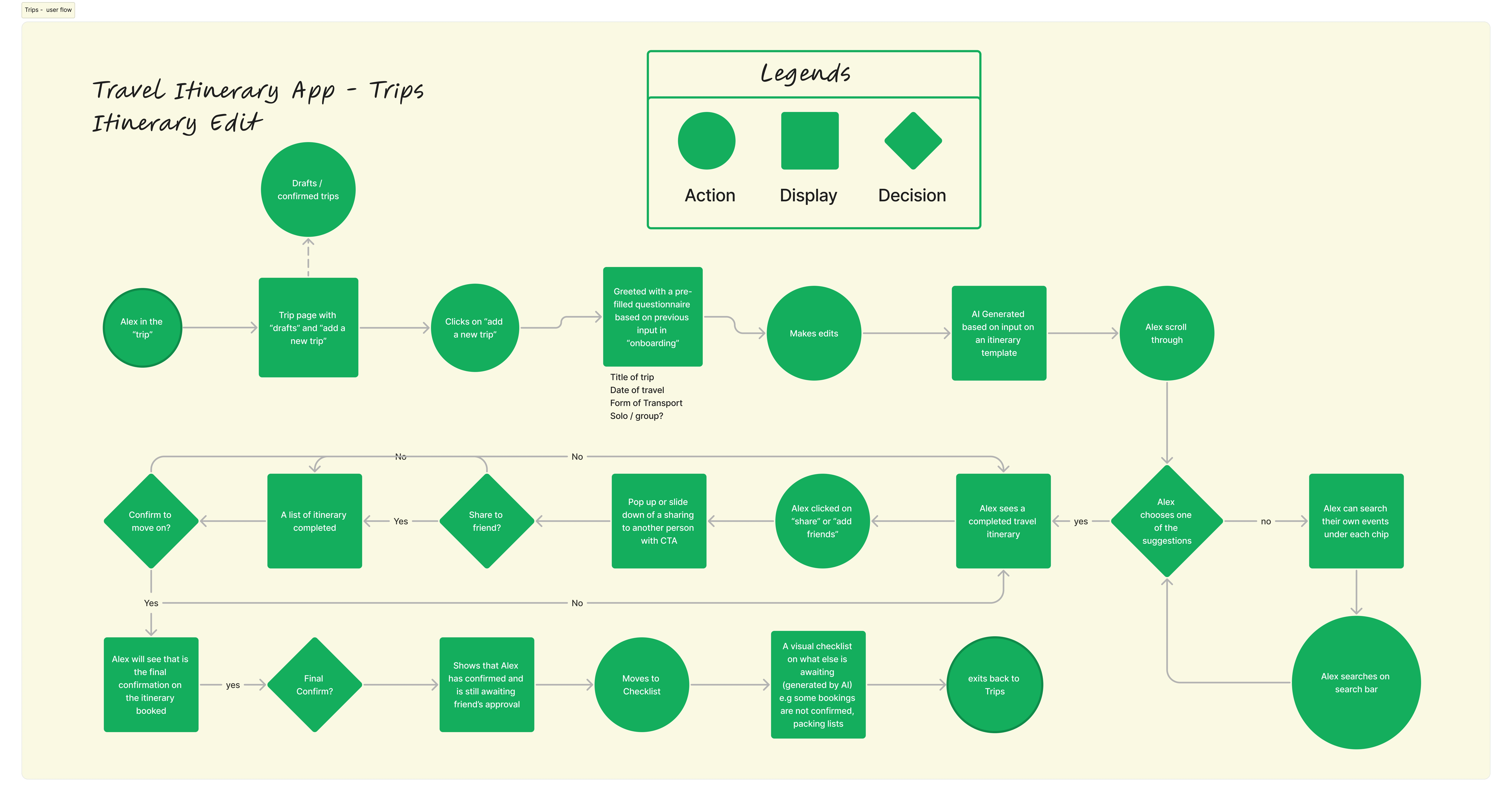
Trips Itinerary Edit User Flow
Drawing them out - paper wireframe
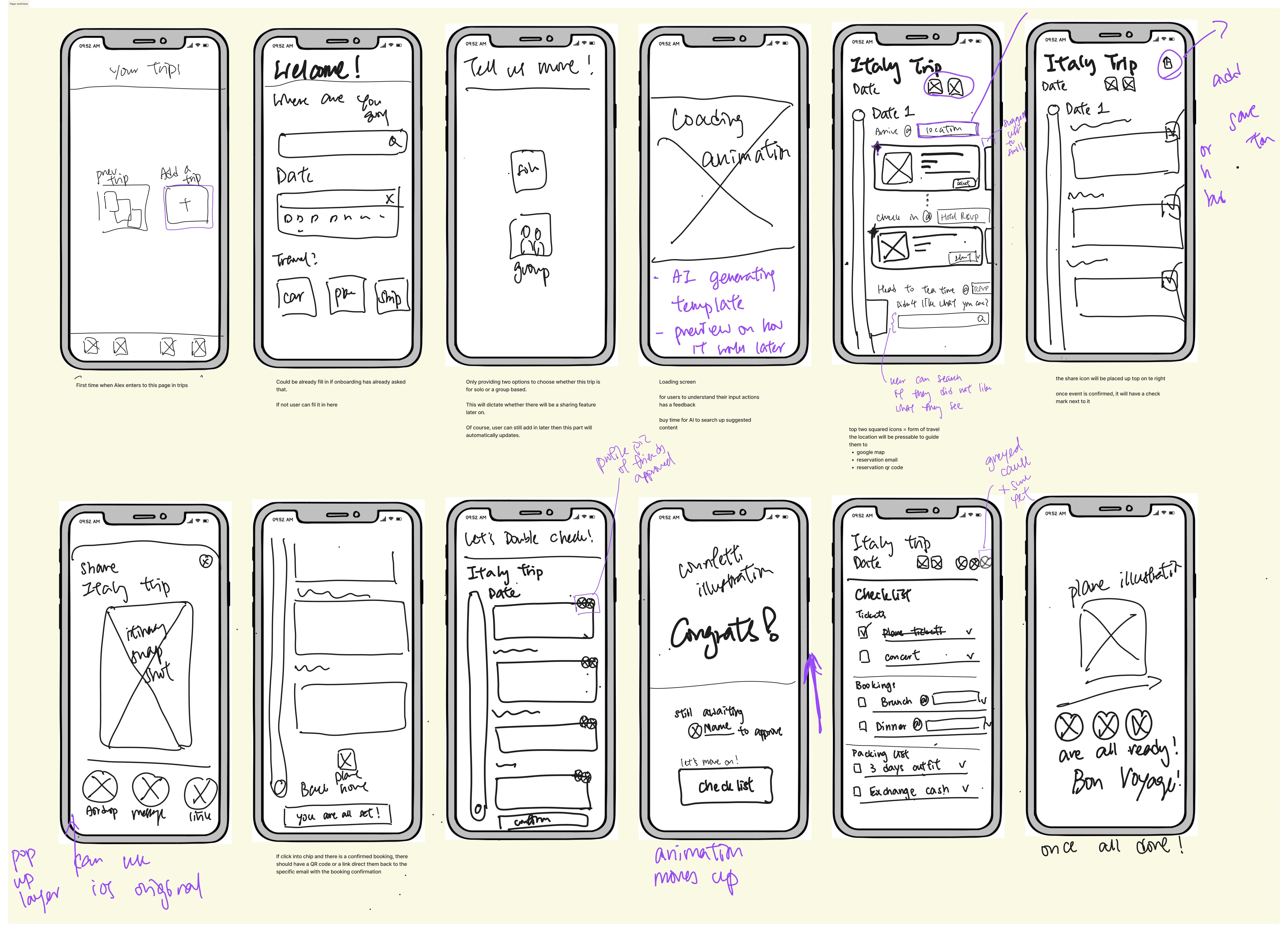
Paperwireframe with iterations
After sharing my wireframes to other designers and gather feedback, I moved on to digital wireframe to ensure usability and consistency with other user flows on interaction mechanics to ensure usability consistency.
Turn them into Wireframe!

Digital Wireframe
Final Design
User Flow - Creating a Travel Itinerary
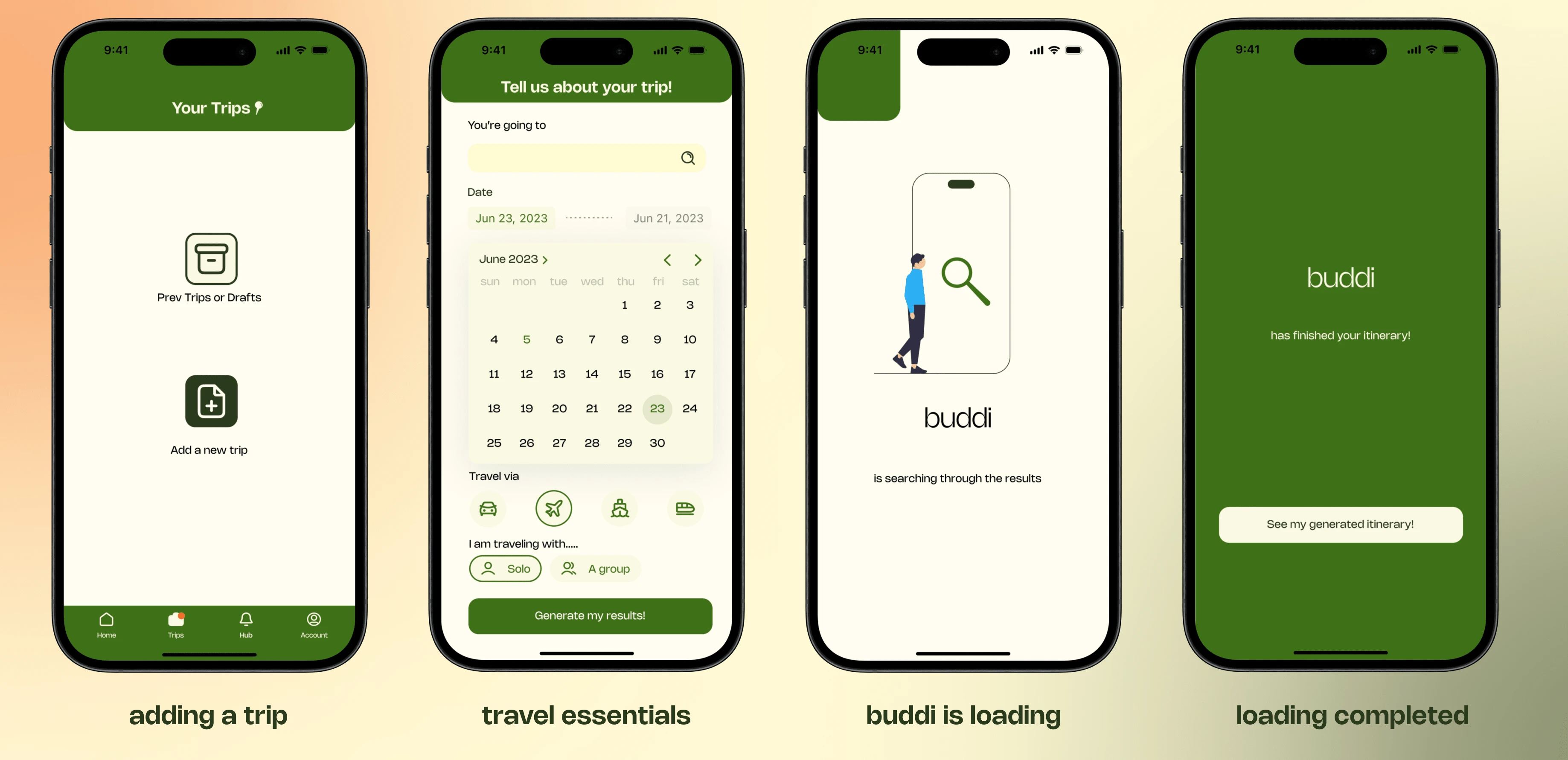
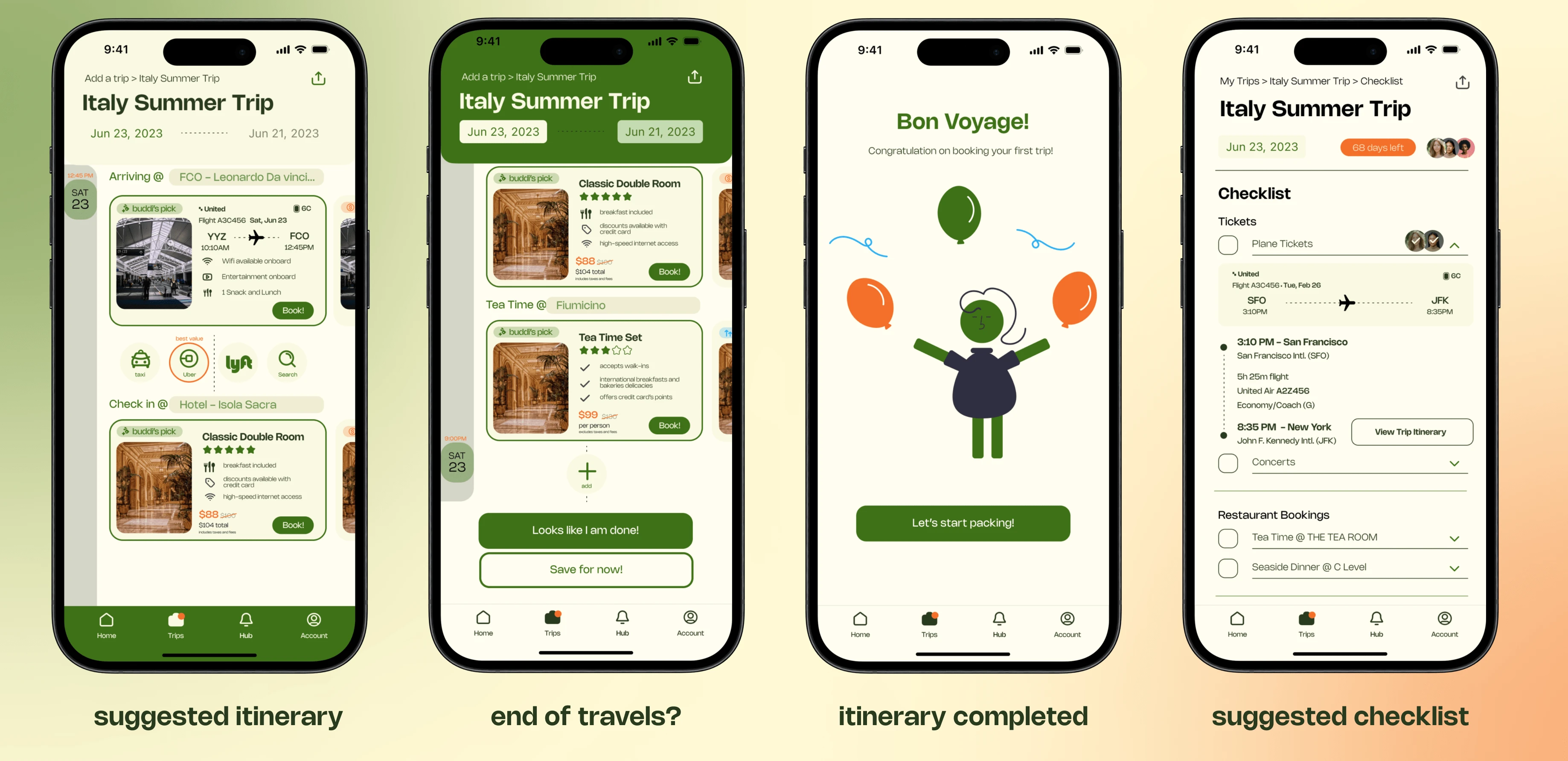
Close-ups
Loading Animations
Specific buttons and icons
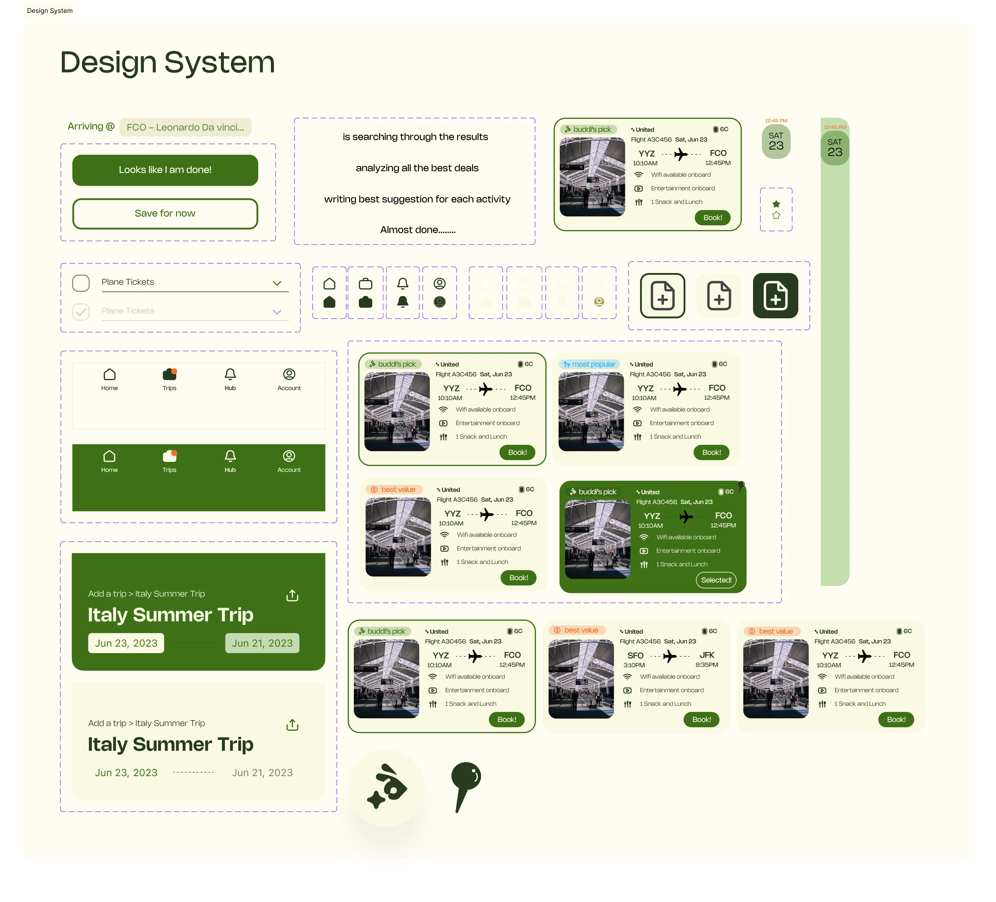
Snapshot of Design Assets
Takeaway
Great idea, future implementation?
From the idea formation to performing market research indicating there is a gap in today's travel itinerary booking space.
Google Gemini's update: AI suggestion in travel itinerary with real-time updates based on input.
Animations are key
As our team and I are putting up the screens to high fidelity, we quickly realize the importance of creating a suitable time frame for animation.
Too fast = users did not have time to react --> believe informations were inputted incorrectly
Too slow (screen froze for > 9 secs) = users are confuse and believe they need to go back to previous screens or quit app
*Find out more about our team's success in this project at this LinkedIn post.
Like this project
Posted May 30, 2024
Create Triply from 0 to 1 and utilizes AI suggestion as a guide to bring travel planning easier before and on-the-go.
